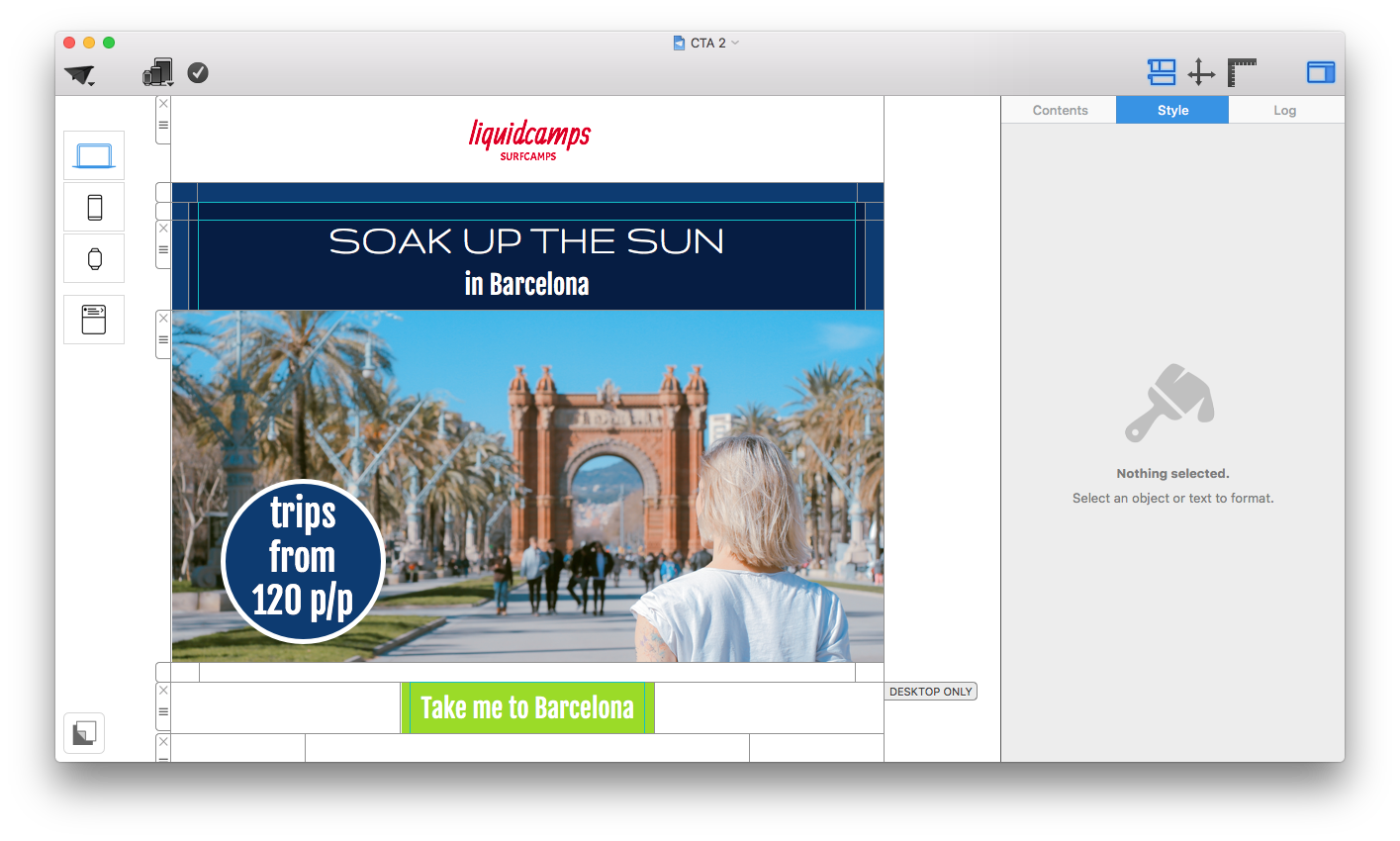
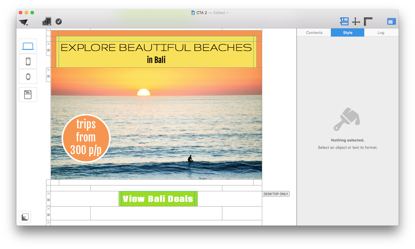
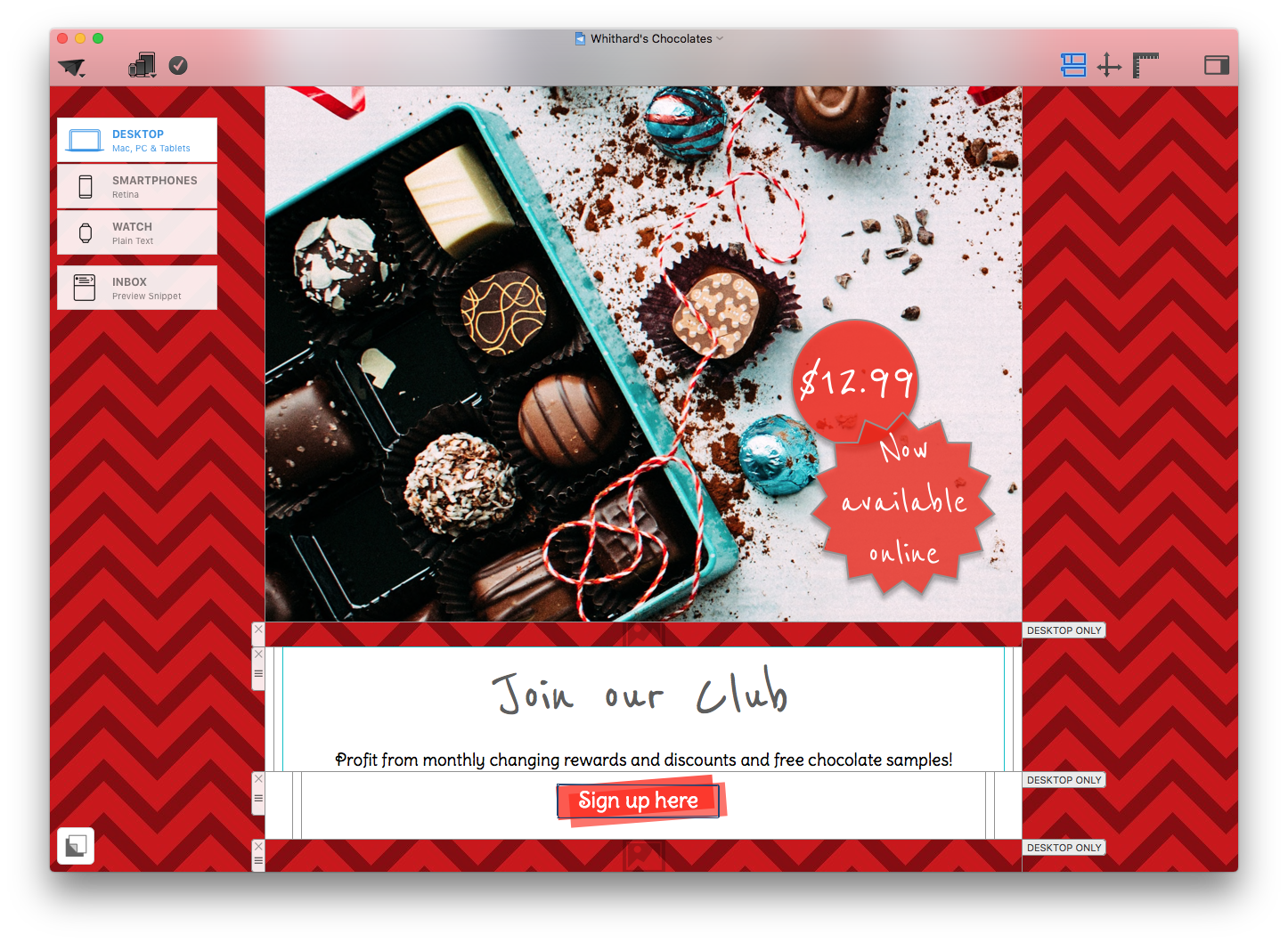
You can have the world's most dazzling email design, but without a clear and powerful call-to-action (CTA) it will never reach its full potential. The main purpose of a CTA is to summarize the main message of your email into one specific action which you wish to communicate to your customer (e.g. buy, subscribe, donate) in order to achieve your desired result.
This guide will take you through all the basics you need to create temptingly clickable CTA buttons for your email designs...
Why should I include call-to-action buttons in my design?
- Clarity: A CTA button summarises everything you want to communicate into just a few words. This is perfect for skim readers, avoiding misunderstandings/misinterpretations, and generally just to ensure that your audience has understood the message you wanted to share with them.
- Simplicity: CTA buttons provide you with the perfect opportunity to insert links which will be noticed by your customers and clicked on. The easier it is to find links in your email design, the more successful the outcome will be.
- Aesthetic: A big and brilliant button is a great, eye-catching addition to any email design. CTAs give you the chance to go one step further when creating an email template, as you can experiment with color, font and shapes for a standout design.
CTA Best Practice
So you've read all about the importance of a good call-to-action, and in this next step, we are going to share with you some of our top tips for creating effective CTA buttons which won't be missed by your readers. Here are the most important characteristics of a powerful CTA...
Text
Generally, we wouldn't recommend using more than 3-4 words in a button, depending on font size, as too much text looks untidy and quickly stops your message from being communicated clearly. In the example below, you will see the difference between a concise CTA and a CTA with too much text.
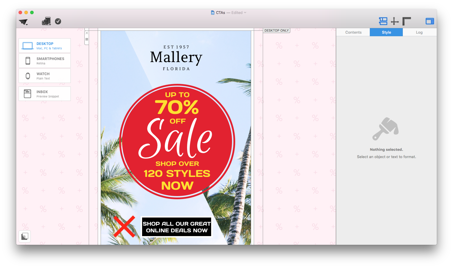
This example is not concise enough and takes away from the effect of the button by cramming in too much text.
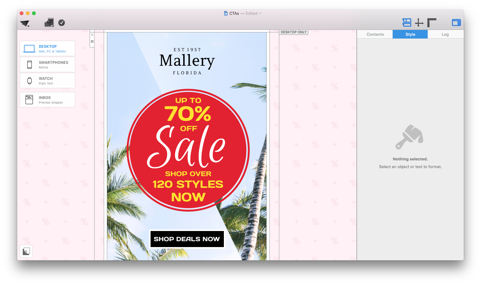
This is a much better example, as it manages to convey the message in half the amount of words, creating a much more direct and powerful effect.
Language
Try to be direct but also transparent; if you want them to sign up to something, say what it is (e.g. sign up to our free newsletter.) Your customers will appreciate the clarity and it will result in a lot less confusion and more clickthroughs.
Tip writing in the first person is a great way of making readers feel more reassured. Try out CTAs such as: "Get my free trial today", "Get my tickets", "Show me more deals." This type of language is effective, as it brings the CTA to a more friendly level.
Font
For an effective CTA, the right font is everything. If your customer can't read your text, the whole point of the CTA is missed. We have three golden rules when it comes to fonts:
1. Choose a font size which is big enough to read, but not too big that it's overpowering. We tend to stick between 30 and 50, depending on the amount of words involved.
2. Your font must be clear and legible. As a general rule, you should aim to stay away from calligraphy or alternative style fonts. Although they look great as a unique headline, they are often hard to read and don't allow your reader to easily see your message.
3. Where possible, try to use a bolder font. As previously mentioned, if the font doesn't stand out, your message will go unnoticed. Mail Designer has over 700 fonts which you can explore for effective CTAs.
Shape and size
The shape of your CTA is important, as this can have an effect on how your message is interpreted. For example, people often associate a triangle shape with a warning.
If you are looking to create a rectangular button, don't be afraid to play around with Mail Designer 365's rounded corners tool. Sharp 90 degree corners give off a slick and cool vibe; ideal for fashion or business. Rounded corners create more of a friendly and welcoming feel - great for a restaurant or a children's clothing store, for example.
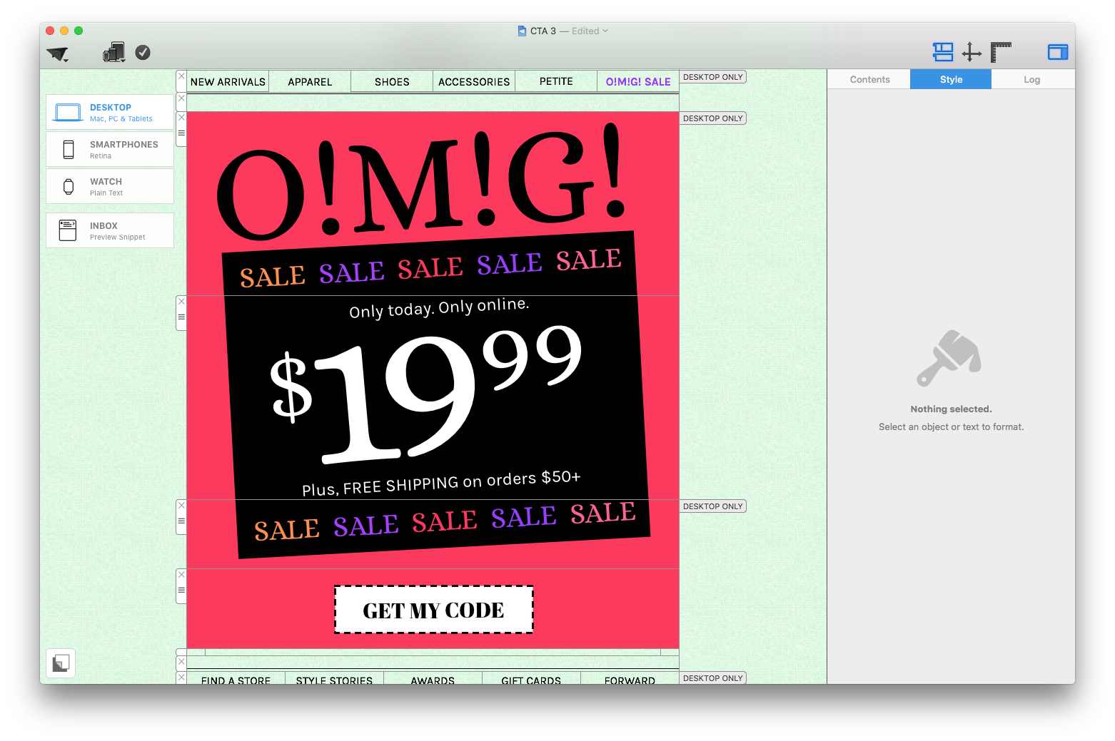
Rectangular buttons tend to be a more clear and effective choice for CTAs. Experiment with the cut-out style to create a coupon look.
Color
The color of your CTA button is very important. When you choose the color for your button, make sure that it is vibrant in relation to the rest of your design and stands out to readers. For example, if your design has a plain blackground such as white or pastel, choose a warm and bright colour to make it pop. If your background is a dark color such as black or grey, a bright white button with colored text could be the perfect way to create an eye-catching contrast in your design.
Link
It is crucial that the link you use is correct, relevant to the text in your button and also functioning properly! If customers click on a link which doesn't work, they will probably not spend their time searching for the correct link; resulting in you losing a potential sale. To avoid these mishaps, make sure to check and double check ALL links before sending out your emails to customers.
Location
Last but not least, the location of your CTA is also very important and worth considering. Although the main point of your call-to-action button is to capture attention, if it is positioned ineffectively, the effect may not be what you intended.
Spot what's wrong with the positioning of these CTA buttons...
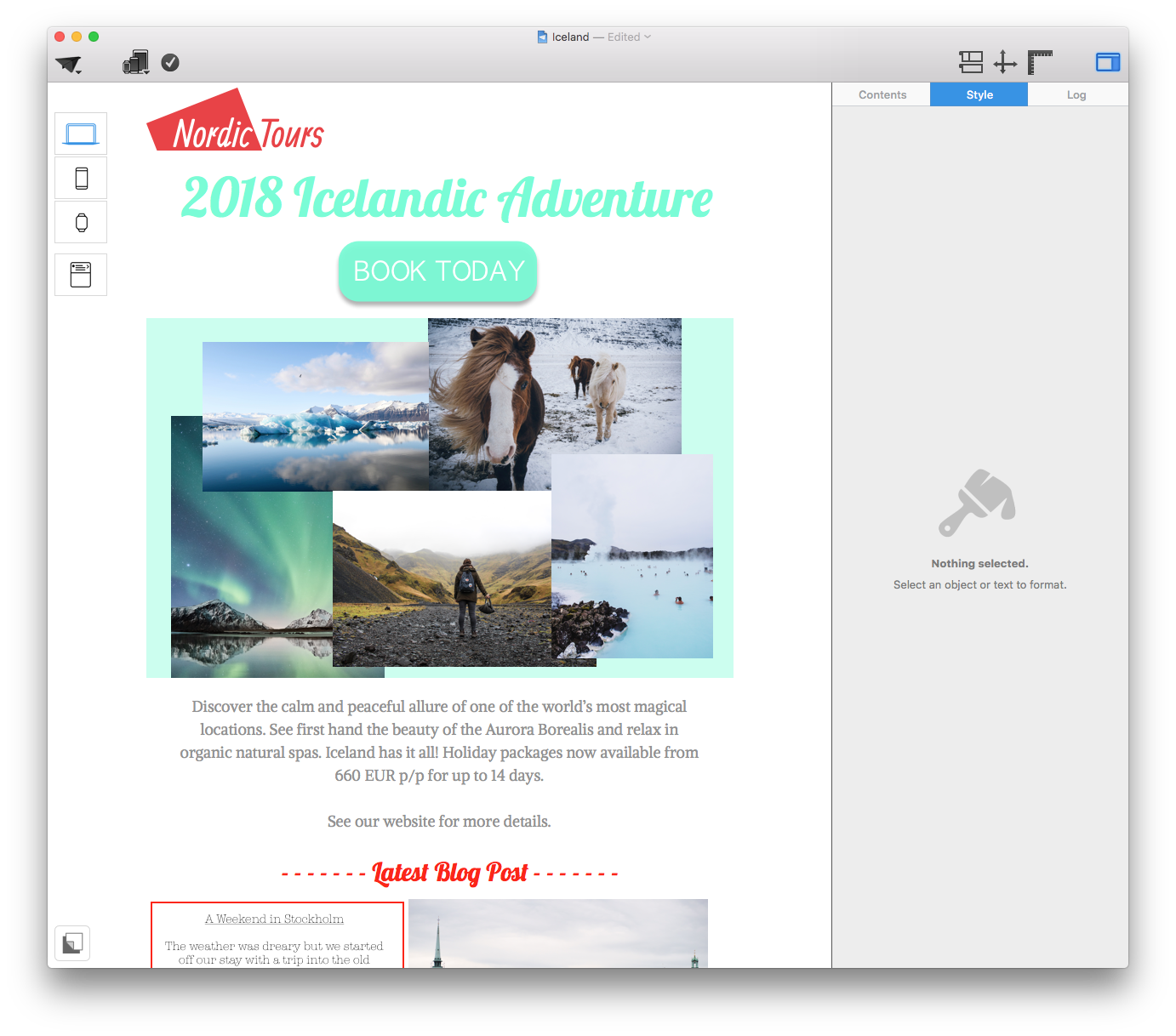
If your CTA precedes the main information of your email, your reader is not likely to want to click on it until after reading what your message is all about.
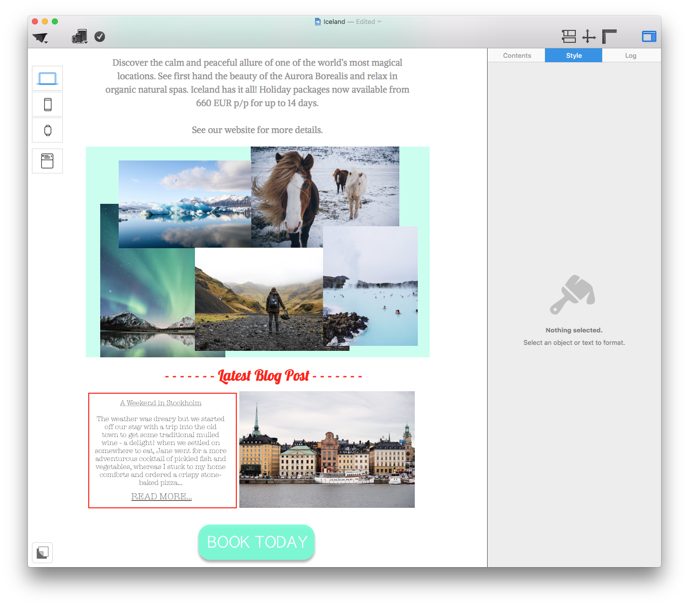
If your CTA follows too far after the relevant text, it will stop being clear what the button is related to; making it less effective.
Best practice:
We always recommend inserting your CTA directly after the relevant text so that your message is clear in the reader's mind and there is no time-gap to allow them to get distracted or delay action.
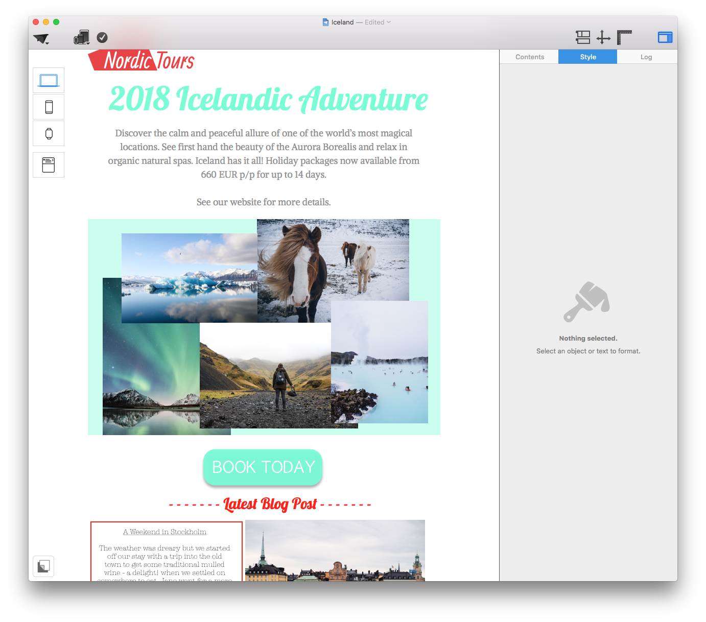
Make sure your CTA is closely positioned next to the relevant text or information to make its purpose clear to readers.
Creating call-to-actions using Mail Designer 365 is easier than ever. Choose a shape from the side menu, overlay with your chosen text, and then add the link to your website, online shop, etc to the button. From there on, you can customize to your heart's content.
Tip: Mail Designer 365 also offers pre-made CTAs. Simply go to the "Contents" menu in the app sidebar and select the "Shapes" tab, where you will find a selection of buttons to choose from. Great for ultra-speedy designing.
Key takeaways:
- Keep the text of your CTA concise and engaging. It should communicate your message in just a few, well-thought-out words.
- Bear in mind that our chosen font must be clear, legible, and eye-catching in order to be effective.
- When choosing a color, be sure to choose one which stands out from the rest of your design so your CTA button is noticeable.
- Make sure your CTA links through to the correct webpage, and always remember to test all buttons before sending.
Until next time,
Your Mail Designer 365 Team


