With Thanksgiving just around the corner, it's time for you to get started on an email campaign to send to your customers. In need of a little inspiration? We've scoured the internet for some of the very best Thanksgiving email designs and are sharing our top tips on how you can recreate these styles and techniques in your own campaigns.
Key imagery
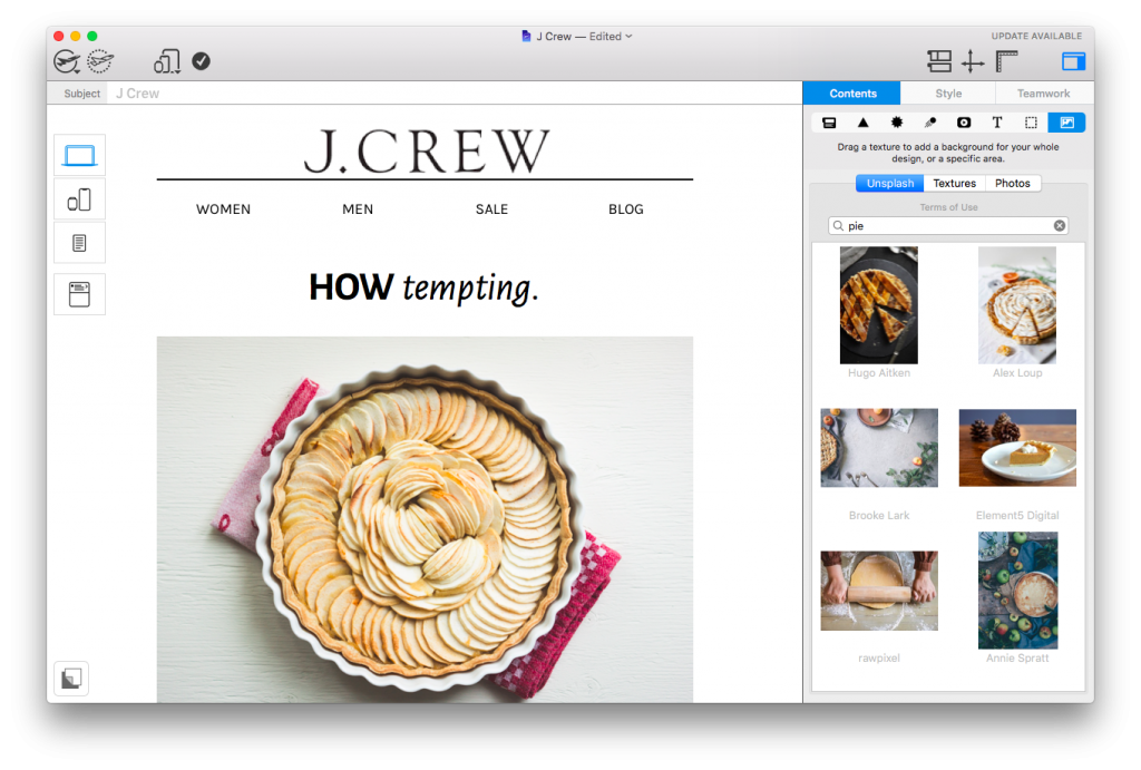
Including key imagery is an effective way to ensure your readers will associate your email with Thanksgiving. This simple yet effective example from J. Crew includes the classic Thanksgiving pie; immediately catching the attention of customers hungry for a sale.
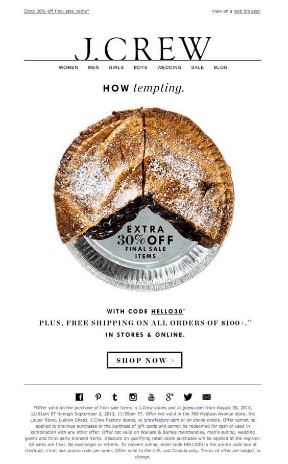
Use bold Thanksgiving imagery to get your readers feeling the holiday spirit.
Seasonal fonts
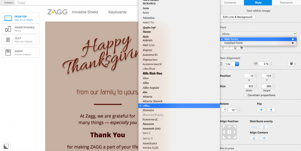
Every email designer knows the power of a good font. At this time of year, brush fonts dominate. A traditional brush font is an elegant choice for your Thanksgiving email and generates nostalgia due to its retro style. This is especially prominent in this fun design by ZAGG.
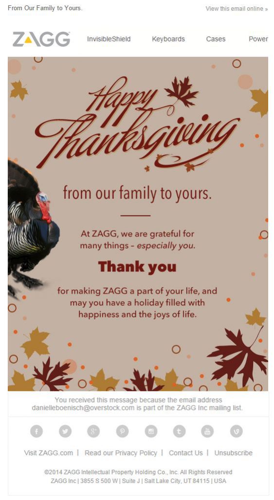
Use a brush font for your heading to recreate festive nostalgia in your design.
Vibrant colors
Viewed by many as the peak of the autumn season, it's important to use vibrant autumnal colors in your email designs to build up the Thanksgiving mood. Warm tones such as orange, red and gold are great for achieving this. As you can see in this design from Urban Outfitters, using vibrant colors makes a big difference...
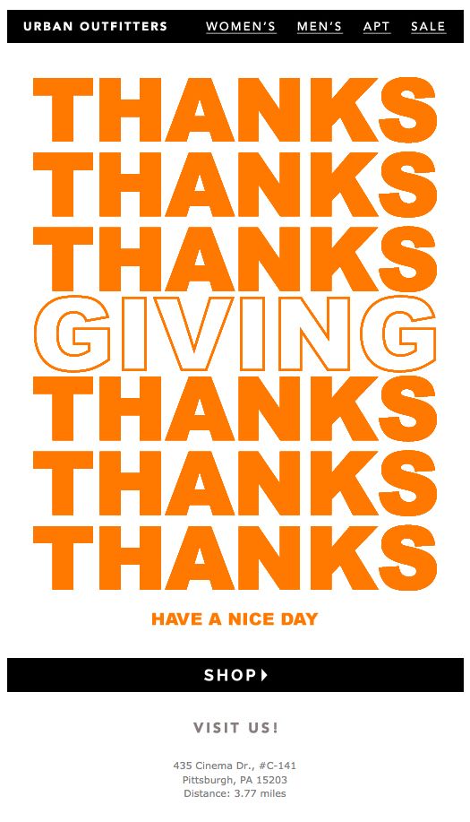
Use vibrant autumnal colors in your newsletter to make the message bold and eye-catching.
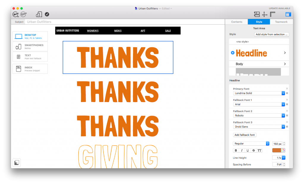
Clear call-to-actions
The call-to-action (CTA) is a central part to any email campaign; Thanksgiving included. As mentioned already, seasonal colors such as orange and gold are a great choice for your email design. Twinned with a bold font and a clear layout, your CTA should work wonders - just like in this design from Uber.
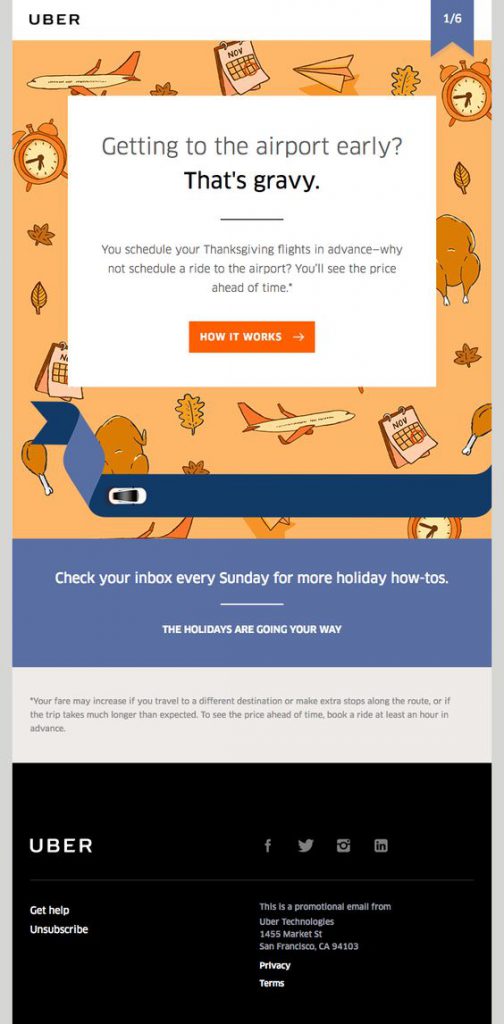
Clear CTA buttons will make your promotion even more effective.
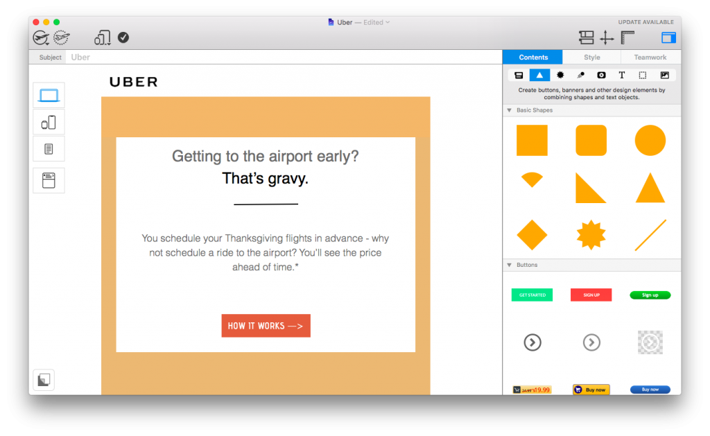
We hope you have found these awesome examples of Thanksgiving email designs inspiring. As you can see, it's easier than ever to recreate these professional design techniques in Mail Designer 365.
Sign up free today to try for yourselves and get well on your way to building standout Thanksgiving email campaigns.
Until next time,
Your Mail Designer 365 Team

