When putting together the final touches of an email design, there are many boxes to check to make sure your important message comes across to subscribers. Missing out any important elements could lead to your emails being ignored, undelivered or not working as intended.
With the stakes so high, there is no room for error when it comes to sending or exporting your finished email template. For this reason, in this guide, we've listed ten of the most important control points to check before you hit send on your next big campaign, plus 5 useful tools to help you avoid email fails.
Get expert email best practice tips delivered directly to your inbox!
Please check and try again.
We've just sent you an email for you to confirm your email address, if you haven't already.
10 Things to be Aware of Before You Hit Send
1. Mobile optimization
With so many of us checking our emails on the go, it's crucial to make sure your campaign also looks good and makes sense on mobile devices.
Sending emails which aren't mobile optimized can risk you excluding a large proportion of your target audience. You spent so much time working on your campaign so you want to be sure the content can be enjoyed by all your readers.
For the mobile version of the design, it's best practice to check the following:
- Font size: If the text is too small it can be difficult for mobile users to read
- Layout: Does the layout make sense for mobile? Generally, a one-column layout is easier to scroll through
- Image optimization: Many readers using smartphones may be viewing your email using mobile data. Always make sure your images are size-optimized so they can be downloaded faster on the go
- Target links: Where possible, use mobile-specific target links (e.g. "Open in the app" or "Download on the App Store") for a more personalized feel
This post by Campaign Monitor contains more specific design tips for mobile responsive emails.
2. Links and call-to-actions
Generally, your email is just a stepping stone to take the recipient to another destination. For this reason, it's important to test that your links and call-to-actions are all working properly before you hit send.
As well as checking the functionality of your links, you should also check you have set up all the required tracking elements for the post-campaign analytics. For example, you should check your Google Analytics campaign URLs have been set up correctly so you can track website traffic generated by your email campaigns.
Find out how to set up Google Analytics campaign URLs here.
3. Spelling and grammar
Typos and grammatical errors have no place in your email campaigns! Don't forget to run a quick spell check before you send your email to customers in order to avoid any embarrassing mistakes.
4. Email size
Depending on the type of content you include, HTML emails can end up being bigger than expected. In some email clients, this can lead to problems, such as the email not being delivered or being clipped.
For example, it's a well known fact that Gmail clips emails which exceed the 102 KB size limit. This is less than ideal, as it can lead to important aspects of your email (i.e. the unsubscribe link and disclaimer) being cut off.
For this reason, you should keep an eye on how much content you're adding to your email design and double check the size before you export it.
Here are some practical tips on reducing HTML email size.
5. Unsubscribe link and other placeholders
Email marketing 101: The unsubscribe link is a must-have element in all your promotional emails. Without this, you run the risk of being blacklisted or receiving a fine - so it's important you check that you have included it in the email.
As well as an unsubscribe link, you may also want to include other placeholders for personalization, such as customer name or current date, etc. If you do so, be sure to double check they are correct and working as expected before hitting send. There's nothing more awkward for you and your customers than receiving a "Dear (NAME)" email!
6. Subject line and preview text
Your subject line and preview text are both two really important aspects of your campaign as they create the first impression your recipients will see in their inbox.
In particular the preview text can often go forgotten but this is generally a great opportunity to include a sneak preview of your campaign to tempt more of your target audience to open the email.
When testing your subject line, you should also remember to look out for optimal length. A subject line that is too long could be cut off in the inbox and become less effective.
7. Fallback fonts
While many stylish web fonts are available to use in email designs, you should always ensure that you have one or more fallback fonts set up in case your recipient can view your first choice font.
Fallback fonts are used as a substitute for when your original font choice can't be shown to the recipient - i.e. if they have not installed the font on their device. Here, your best bet is to use an email-safe font, such as Arial or Times New Roman as a reliable back up.
Find out more about email-safe fonts.
8. Alt text
One hidden gem that often gets forgotten by marketers is alt text for images. If an image can't be rendered for whatever reason (e.g. the recipient is on the go and can't download them or they are being blocked by the email client), the alt text will be shown in its place.
Utilise alt text to describe the purpose of the original image so that your email design still makes sense if images can't be displayed. This is especially useful for describing image elements like buttons or badges that the recipient needs to click.
9. Accessibility
Alt texts also play a huge part in making your emails more accessible. In particular, if you have recipients with visual impairments or reading difficulties, the alt text will be read by the screen reader device to help them understand the email better.
In addition, there are also other measures you can take to make your emails more accessible. For example, choosing an appropriate color scheme, setting up a plain text version of your email, and using a clear font.
Find more tips for sending accessible emails here.
10. Disclaimer
Lastly, you should always remember to check over your email disclaimer before sending any email. Typically, this section of your email contains all the most important legal information, including your company's contact details and any relevant copyright information.
Double check that your contact details are all up to date and any links to your website, imprint or privacy policy are also included.
Useful Preflight Checking Tools for Your Email Templates
Mail Designer 365 offers a range of useful tools which you can use to thoroughly test and perfect your email templates before sending or exporting. Here are our top 5 picks...
1. Smartphone editor and preview
When you build your email design in Mail Designer 365, a mobile responsive version is automatically generated. You can edit the mobile version separately and set up mobile-specific text styles and mobile only content which is optimized for smaller screens.
Preview your mobile design on the latest devices using the smartphone preview tool:
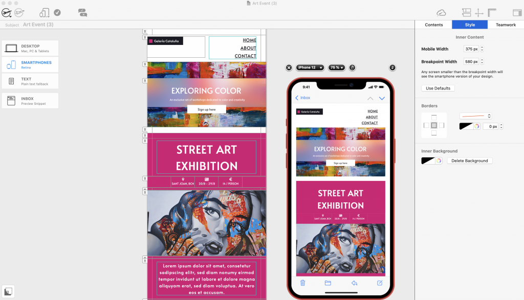
Create mobile optimized content and preview designs on the latest devices.
2. Image optimization
Use the image optimization tool in order to keep the size of your images and your overall email down.
To access this tool, click on an image, then select "Edit link and background" > "Optimize image". Here you can choose to optimize selected images or all images.
Choose Smart Mode and Mail Designer 365 will run a quick check of your design and then automatically suggest the best image format to save space without compromising on quality:
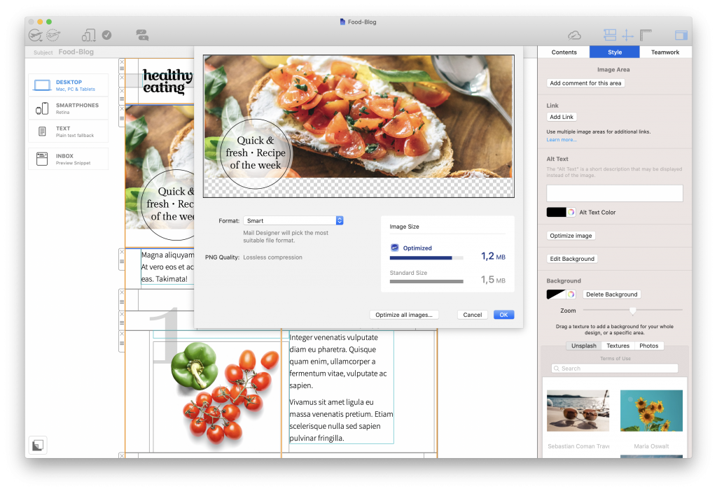
Optimize images to keep the size of your newsletter as low as possible
3. Preflight test
Mail Designer 365's built in preflight test checks your email through and flags issues such as broken links, email-safe fonts, and spelling and grammar problems.
In addition, you will also receive a warning if your email is close to exceeding the 102 KB limit.
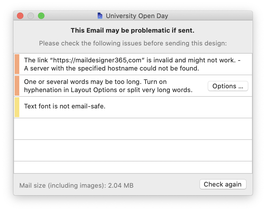
The preflight check tool looks over your email and flags any major issues
4. Inbox preview tool
To test out different subject line variants and put together an effective snippet text, take advantage of the inbox preview tool:
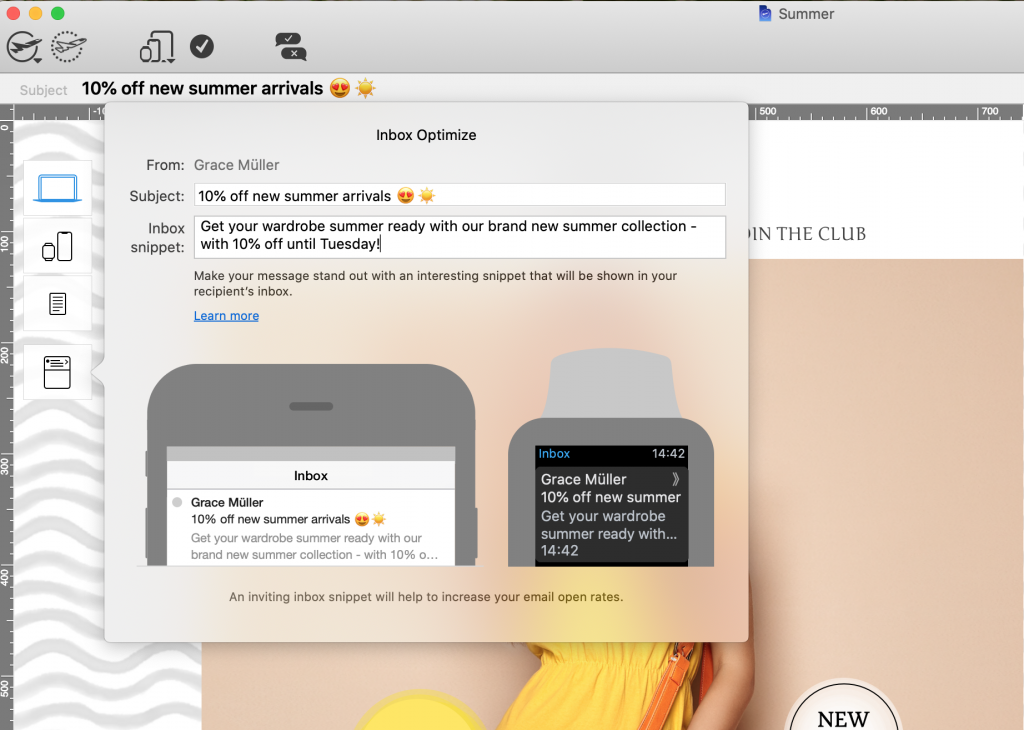
Use the inbox preview tool in Mail Designer 365 for a live preview of your subject line and snippet
5. Testmail service
Finally, try Mail Designer 365's Testmail service to preview your email in your inbox and test with different email clients. Here's how it works...
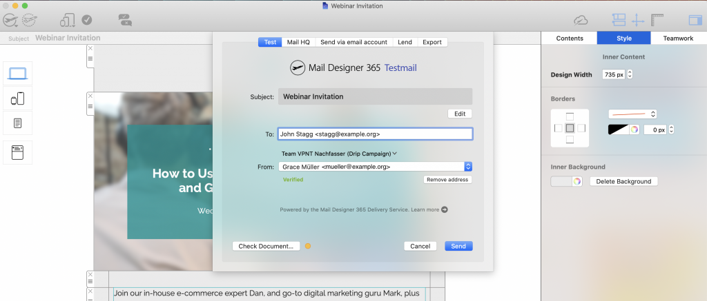
Send a test version of your email via the Mail Designer 365 Testmail service
We hope you have found this list of preflight tips useful and will consider them when finishing up your next email campaign.
Mail Designer 365 provides you with all the tools you need to create flawless templates that look great on all devices. Don't have Mail Designer 365 plan yet? Try the app today free!
Get started with Mail Designer 365 today
Enjoyed this post?
Get more inspirational tips, tricks, and best practice examples in the Mail Designer 365 Newsletter Academy -
your one stop hub for all things email marketing strategy and newsletter design.
