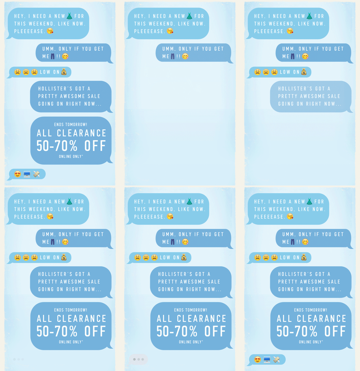
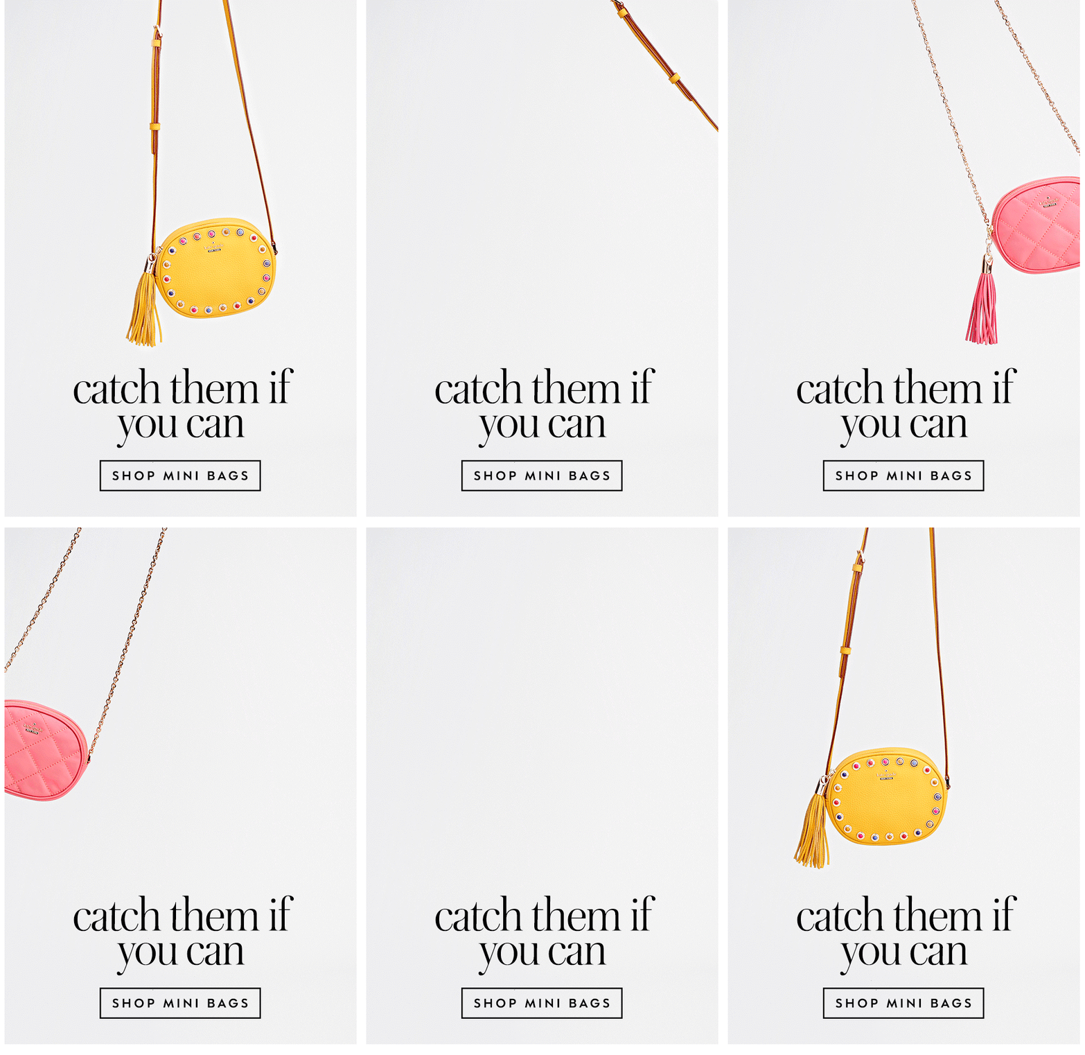
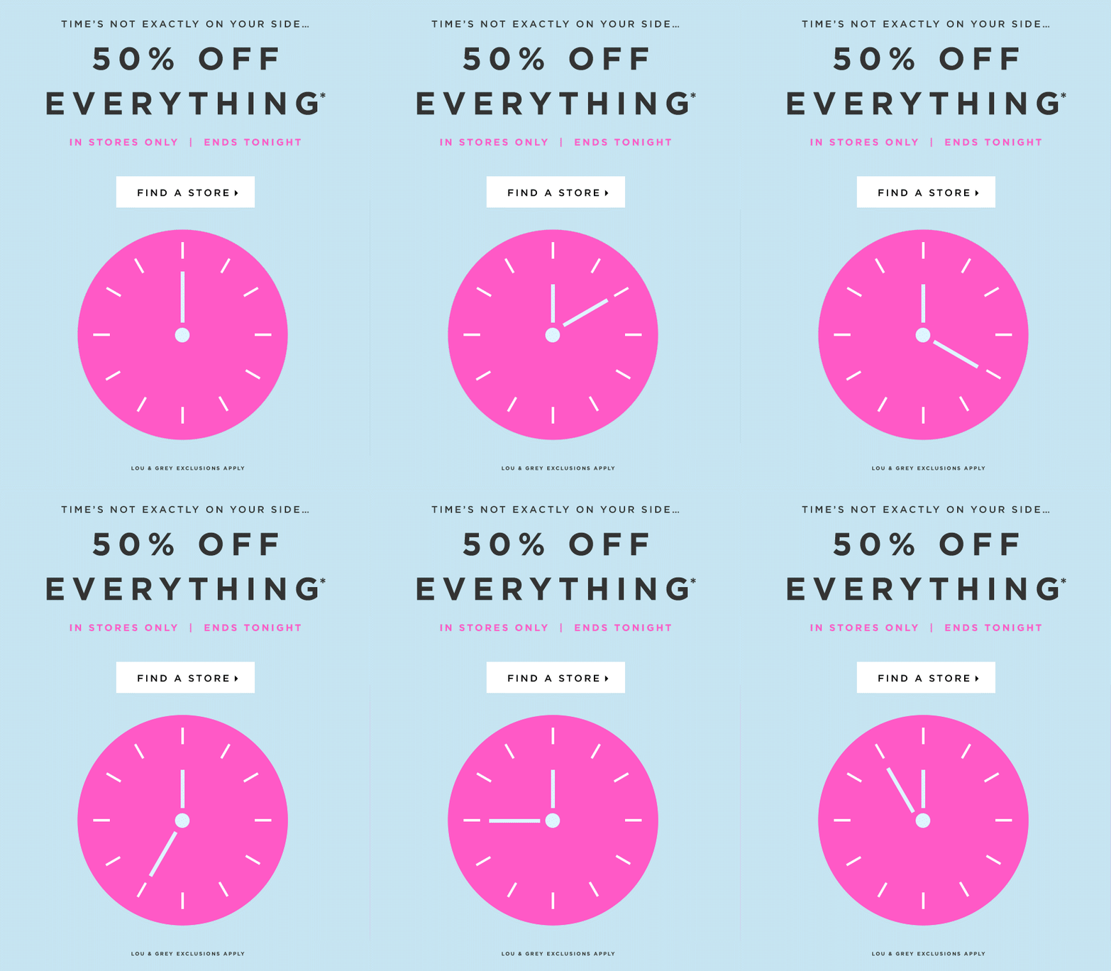
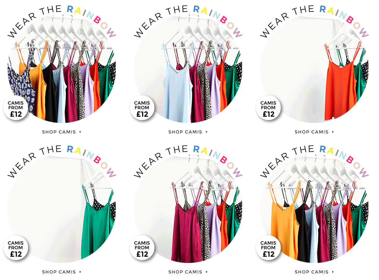
Our Top Tips for Egg-cellent Email Campaigns this Easter

By Uncategorized

Easter is a happy time of the year where many families come together to celebrate and enjoy treasured traditions. Reflecting these positive emotions in your email campaigns this year could be the key to your email marketing success. Here are our top tips for egg-cellent Easter emails...

Play on people's sweet tooth

It is a no-brainer that your business will jump at the opportunity to create an Easter marketing campaign centred around sweets/chocolate if that is your primary product. However, it doesn't mean that other businesses can't use chocolate to their advantage too!

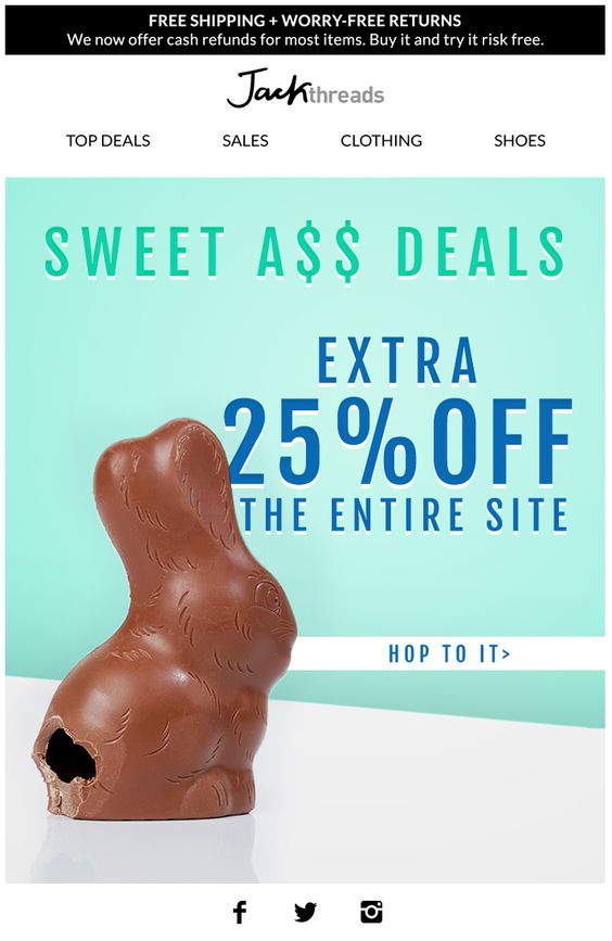
This email design from Jack Threads is a cute and clever way to incorporate seasonal themes into a standard sales email. We're hungry!

Try and incorporate the chocolate theme into your email design to keep things seasonal.

Create colorful designs

Keeping to the spring theme, Easter is also a very colorful holiday which is best represented with brightly decorated eggs and decorations. To help your readers make the association between Easter and your email campaign, you should try to make it as fun and colorful as possible.

This design from Paperchase is super colorful and fun and does a great job of showing off their Easter range. Pretty pastel colors paired with bright oranges and yellows creates the perfect springtime feeling.

Pastel tones are the perfect choice for your Easter email design.

Think about the kids

Easter, like all big holidays, is a time for family. It is also a good idea to try and represent families in your email campaign so your customers can relate to your business better. One clever way of reaching out to parents (aka your customers) is by suggesting fun activities to keep children amused during the school holidays.

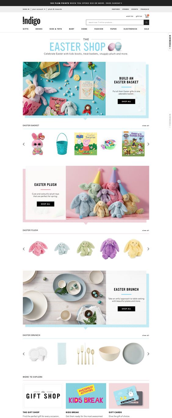
This clever gift guide from Indigo suggests creative ideas for kids, as well as other seasonal gift ideas to inspire parents.

Easter is largely centered around children and families. Try to reflect this in your design.

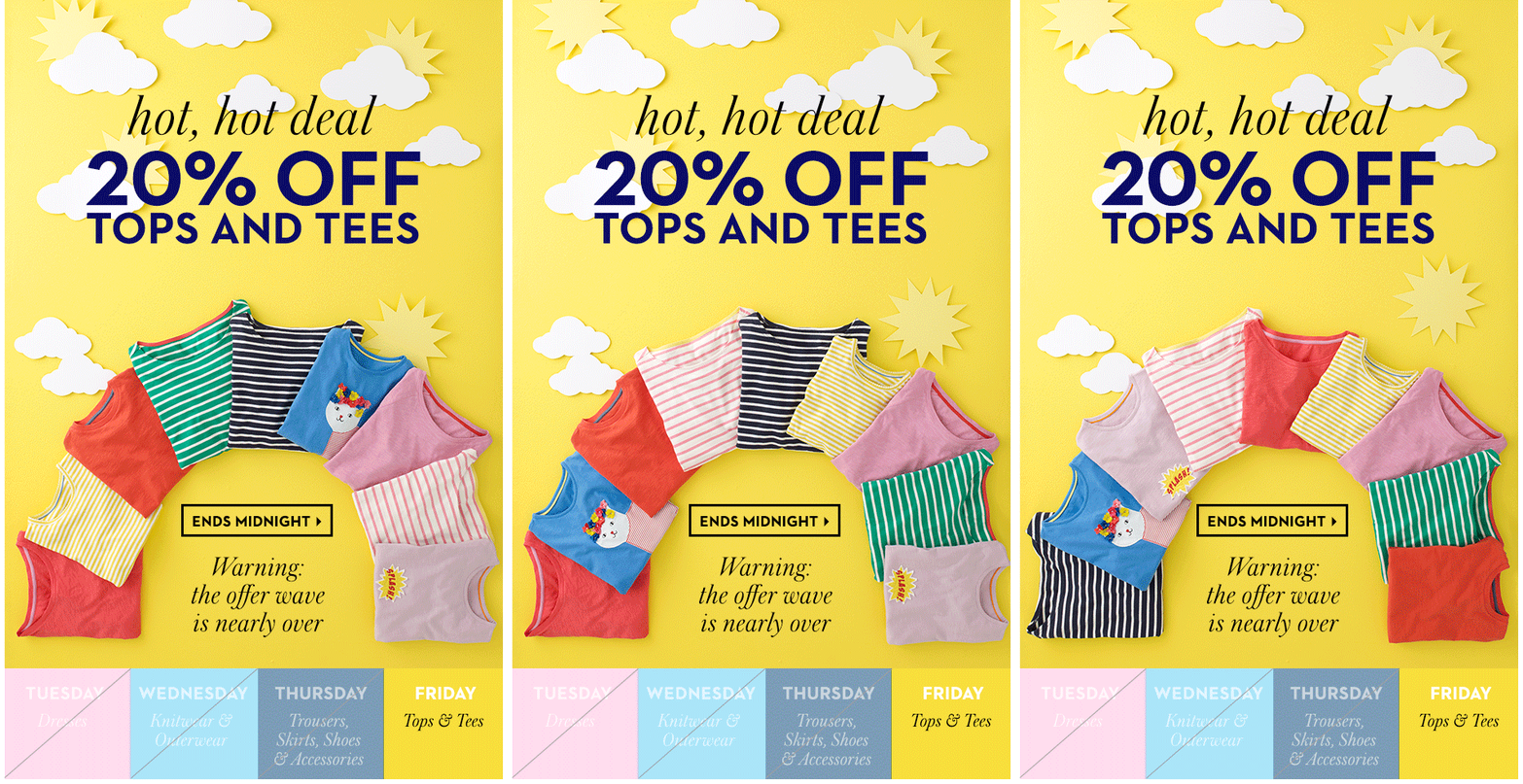
We also really love this email from Boden. The main image is super effective in portraying traditions that most of us know and love. Nostalgia is always a highly effective marketing tool!

Try and include children in your campaigns to help customers make the connection to family traditions.

Don't just think about the big day

For many of us, Easter is the perfect time to plan a little getaway or weekend trip. Think of the Easter weekend as the appetiser to your all-out summer holiday marketing campaign. It may be shorter and a bit more low-maintenance, but it is still a very much important part of the holiday season.

Try tailoring your marketing strategy towards the entire Easter weekend rather than just the day itself. If you are a travel agency, you can advertise last-minute short city breaks, spas and leisure centers can also get on board by offering a special weekend promotion for the bank holiday.

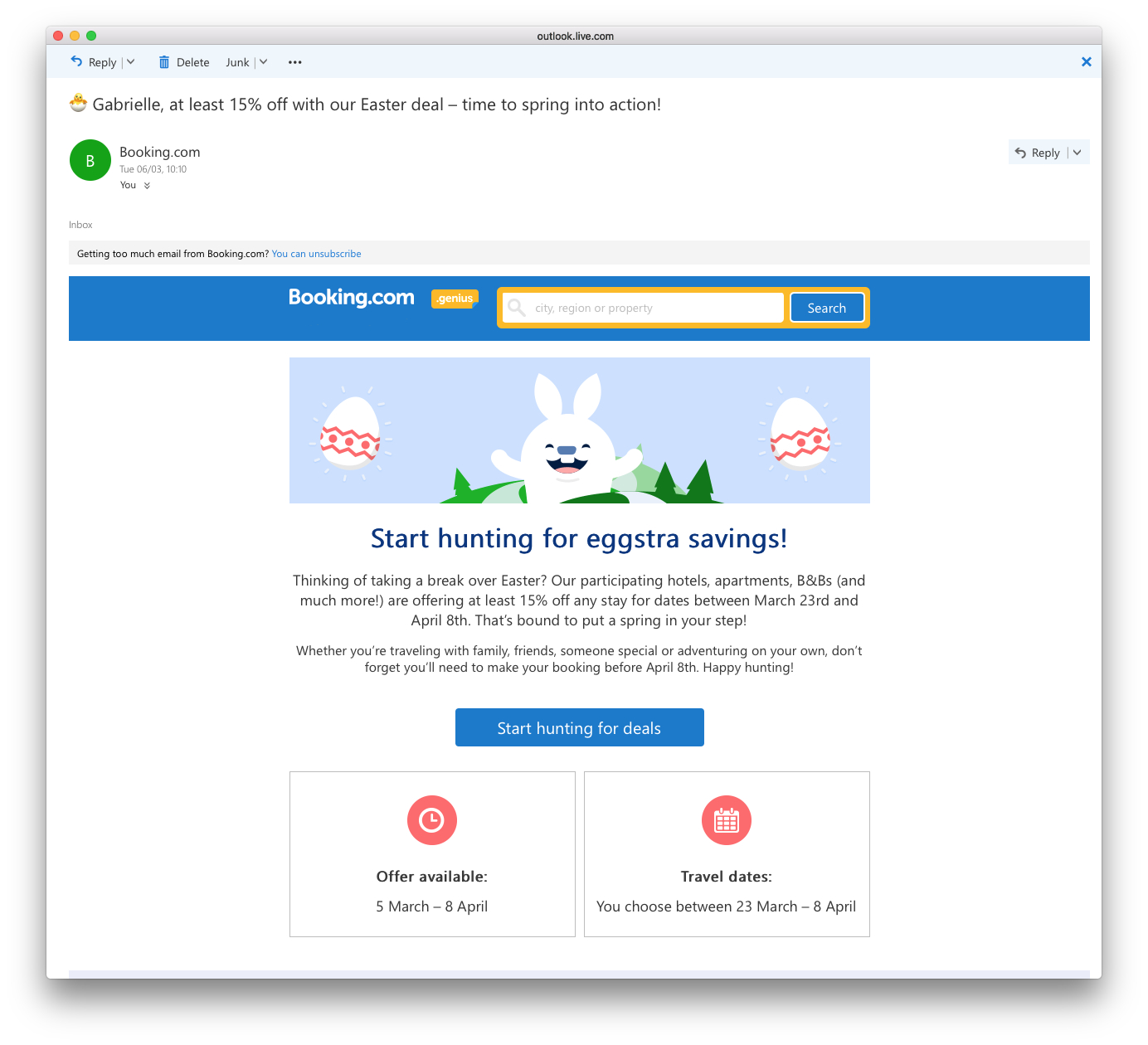
This example from Booking.com is a great way of getting subscribers thinking about booking a last minute break, and the extra incentive of an offer is the perfect little nudge to get them booking ASAP.

Use the holiday as an opportunity to entice customers into booking a getaway break.

Try to involve animals

We've all heard of the Easter bunny... Whether it's a spring chicken, a little lamb, or a fluffy bunny - adorable animals are an integral part of this holiday. Having this positive imagery definitely helps your readers associate your design with Easter, and will most likely tug on their heartstrings a little.

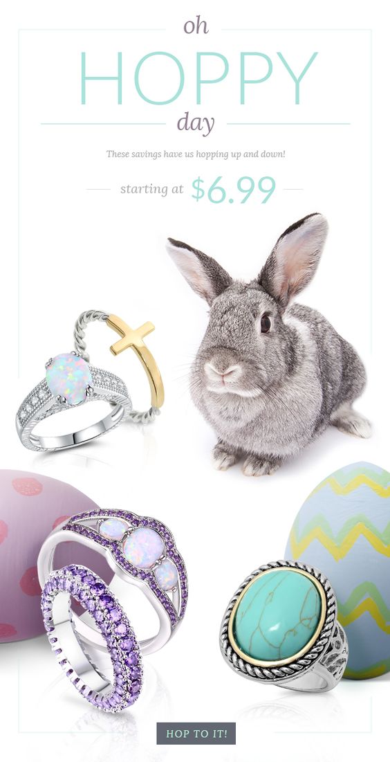
This adorable email by Chic Market is a super cute way to advertise an Easter sale. The colors are great too!

Animals are a great way of making an attractive email campaign seasonally relevant.

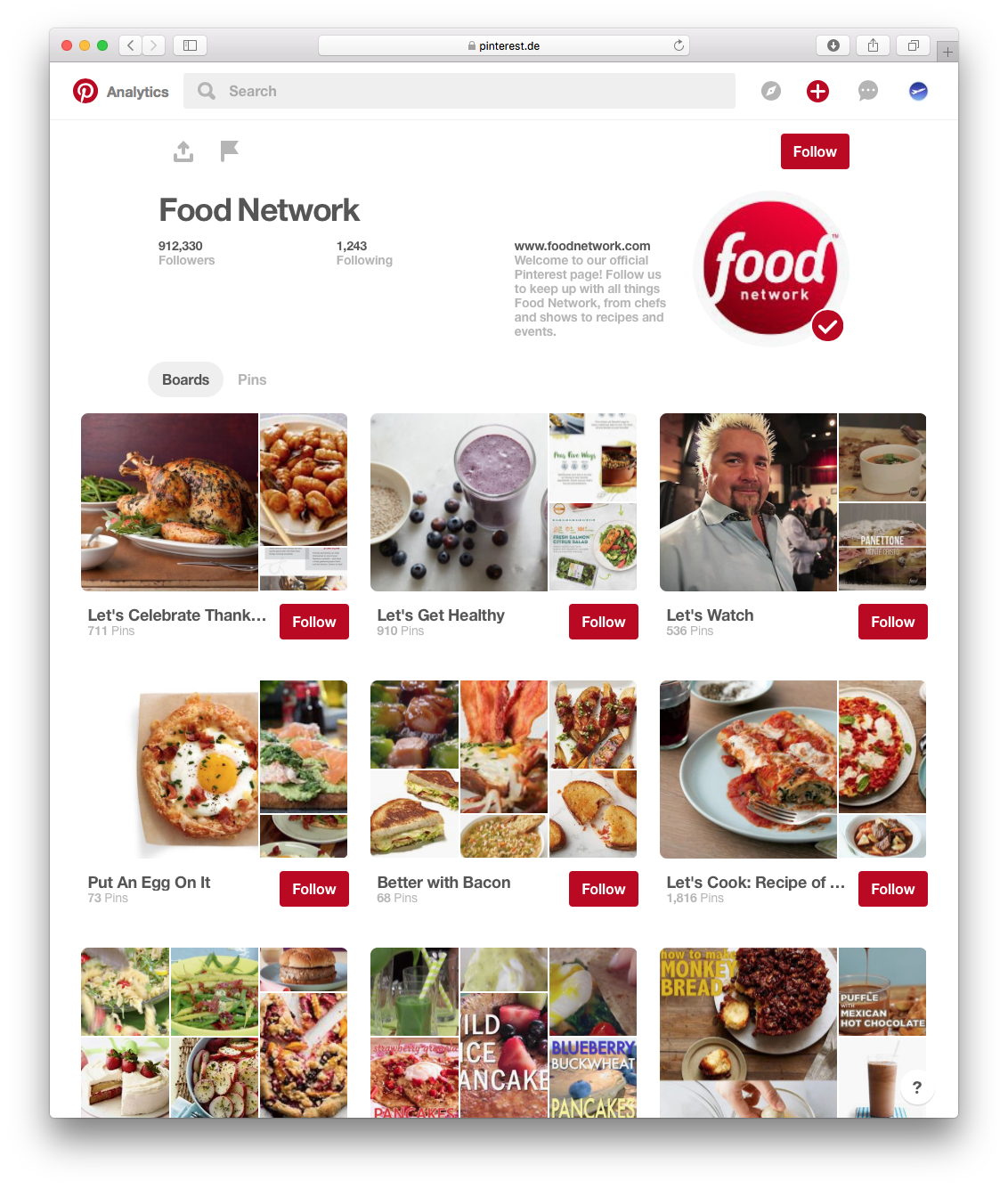
We hope you're inspired by these tips for Easter email marketing. If you are in need of some more design inspiration, check out our Easter Pinterest board for more examples of Easter emails we find great!

Until next time,

Your Mail Designer 365 Team

Give Mail Designer 365 a try today for free...

Mail Designer 365 helps you create stylish, professional HTML emails on your Mac. Download for free to see what you can achieve.


Try for free

The Best Fonts for Email Marketing

By Uncategorized

We love fonts here at Mail Designer 365. However, with so many different fonts to choose from and so many styles and sizes, it can be difficult to choose the right one for your design. This week we're going to take you through some of our favorite fonts and show you how you can use them effectively in your email designs. Let's get started!

Email-safe font options

When designing an email newsletter, you have two main font options for your design: "Email-safe fonts" and web fonts.

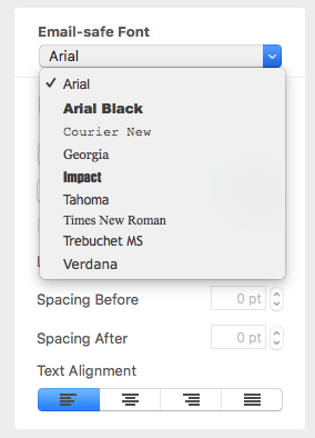
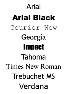
Email-safe fonts are the standard font types which are supported universally in every email client. Some examples of common email-safe fonts are: Arial, Georgia, and Times New Roman.

With Mail Designer 365, you have the option to always include an email safe "fallback" font in all of your text areas to ensure your text will always be displayed.

Email-safe fonts

Email-safe font choices

This being said, you are by no means restricted to these nine fonts in your designs.

Web fonts are fonts which are designed for use online and can be downloaded from the internet and installed in Mail Designer 365. We always source ours from Google Fonts, because they are free to download and open source, so you don't need a license to use them in your designs.

Web fonts are a great way to make your design unique, eye-catching, and most importantly, well-suited to your brand.

Google Fonts are also fully supported in some of the most popular email service providers including, Apple Mail, AOL Mail, iOS Mail, Android's native mail app, Lotus Notes, and most versions of Microsoft Outlook.

Here are some more great benefits of web fonts:

  • Displayed regardless of whether images are supported.
  • Quick to load.
  • Crisp and sharp in designs in comparison to images, which can sometimes be out of focus, or low resolution.
  • Super easy to import into Mail Designer 365. Here's how!

Here are some ideas on how you can use web fonts in your designs. For even more font inspiration, you can check out our font infographics on Pinterest!

Fonts for Headlines

The job of a headline is to catch the reader's eye and alert them towards the most important parts of your email. This means a good headline should be able to stand out in your design. In terms of email-safe fonts, both Impact and Arial Black offer a HD effect to your headline, but if you want to be more adventurous, try one of these three Google fonts:

Molle

Full of character and style, Molle has a slight retro vibe and looks great in a fun, informal newsletter design.

Julius Sans One

This ultra light font is a great choice for a more fashionable and modern headline. Try it out for your online clothing store.

Abril Fatface

This smart font is perfect for a more professional design. It's a great eye-catcher and stays classy at the same time.

Fonts for Body Text

The main body of your email needs to be a font that's clear and easy to read, so that your email subscribers really pay attention to what you're saying. A serif font is usually a more traditional typeface which is normally used for lengthier and more formal text such as newspapers, academic writing, etc. In terms of serif email-safe font options, Times New Roman and Georgia are both good and reliable options. However, when it comes to web fonts, there is a lot more choice. For a sophisticated effect, we particularly like:

Antic Didone

Cormorant Garamond

Sans serif fonts are a lot more informal and work really well for blogs, generic email text (i.e. welcome messages) or statistics. Email-safe sans serif fonts include Arial and Tahoma. As for web fonts, the Mail Designer 365 brand always uses Open Sans, but for a cool and modern look, we especially like:

Roboto Light

Didact Gothic

Other Font Styles

Perhaps you want your font to stand out from the crowd. No problem! The great thing about web fonts is that there is a font available for every possible use case. Here are some ideas of font styles you may want to use in your designs:

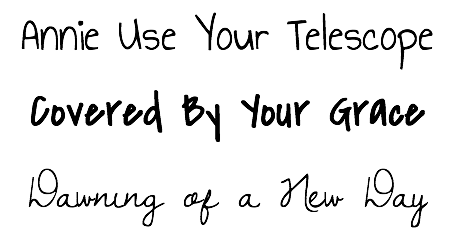
Handwriting Style

A handwriting style font can really add a personal touch to your email design. You can this style of font to sign off an email and give the illusion of a signature, or to make your subscribers feel extra special when inviting them to an exclusive event.

Handwriting style fonts

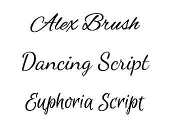
Brush style

Brush fonts are glamorous and sophisticated and work really well for headlines if you're looking for something a bit more artistic and outside of the box. The right brush font can work wonders on a standard design and transform it into an elegant masterpiece.

Brush style fonts

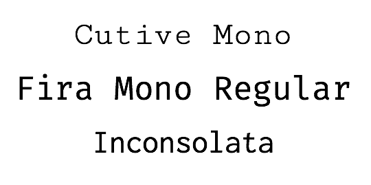
Typewriter style

Typewriter fonts are a classic and perfect for adding a vintage vibe to your design. Think murder mystery night or exclusive first look at your new book draft. Typewriter typefaces are here to stay!

Typewriter style fonts

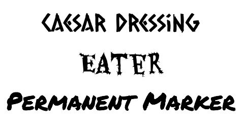
Alternative

This covers everything from festive font types, to flower power, to artistic typography. In Mail Designer 365 you can find an alternative font for practically anything. Here are some of our most abstract examples...

Abstract font styles

We hope you were able to take some inspiration from these font styles. The most important thing is that your font effectively reflects your brand and the message you are trying to communicate in your email design. Sign up free and try some of these unique and eye-catching web fonts out in Mail Designer 365 today!

Until next time,

Your Mail Designer 365 Team

Get expert tips straight to your inbox!

Sign up here for our email newsletter and enjoy regular tips, tricks and advice for everything relating to email design – delivered directly to your inbox.
 
 
There was a problem registering your email address.
Please check and try again.
Thank you for registering! Please check your email inbox.
We've just sent you an email for you to confirm your email address, if you haven't already.

Give Mail Designer 365 a try today for free...

Mail Designer 365 helps you create stylish, professional HTML emails on your Mac. Sign up for free to see what you can achieve.


Try for free

Setting up Google Analytics for Your Email Campaigns

By Mail Designer 365 Newsletter Academy

Do you have Google Analytics set up for your website? Why not set it up for your newsletters too! This is a great opportunity to find out how many of your customers access your site via the links in your newsletter. It's easy to set up and expands your understanding of customer behaviour even further. Find out how you can get started...

Setting up Google Analytics for your newsletters

Google Analytics links for email campaign tracking are made up of three key elements which follow after your target link. The prefix to any tracking link is a "?" (i.e. www.yourwebsite/store?...........)

  1. The source "utm_source": This refers to the type of email the tracking refers to. The main purpose of the link is to help you identify what the email in question was about or which list it was sent to (e.g. abandoned cart, upgrade offer for existing customers, welcome for new customers.)
  2. The medium "utm_medium": This is straightforward. The medium refers to what type of marketing campaign this was (i.e. website, email, newsletter, etc .) When tracking your emails, you should write "utm_medium=email".
  3. The campaign "utm_campaign": The third and final element of this link refers to the name of your email campaign (e.g. Spring Newsletter 2018.)

Here is an example of a Google Analytics link after all elements have been put together:

www.yourwebsite.com/store?utm_source=existingcustomers&utm_medium=email&utm_campaign=spring2017

For help setting up your analytics tracking links, check out this useful tool.

Viewing your email stats in Google Analytics

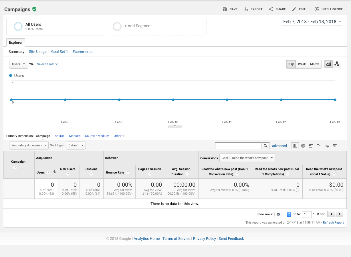
To verify your tracking links are working, go to the real-time view in Google Analytics, open the Traffic Sources report, and click on a link in your test email. You should see your click show up on the real time view. 24 hours after sending your newsletter, you will see your readers' clicks appear under Acquisition > Campaigns.

Important: Please note, you can only track links in your emails to your own website (i.e. your buy/subscribe page) and not to other third-party platforms such as YouTube or Twitter.

Here's How You Can Create Temptingly Clickable CTA Buttons

By Mail Designer 365 Newsletter Academy

You can have the world's most dazzling email design, but without a clear and powerful call-to-action (CTA) it will never reach its full potential. The main purpose of a CTA is to summarize the main message of your email into one specific action which you wish to communicate to your customer (e.g. buy, subscribe, donate) in order to achieve your desired result.

This guide will take you through all the basics you need to create temptingly clickable CTA buttons for your email designs...

Why should I include call-to-action buttons in my design?

  1. Clarity: A CTA button summarises everything you want to communicate into just a few words. This is perfect for skim readers, avoiding misunderstandings/misinterpretations, and generally just to ensure that your audience has understood the message you wanted to share with them.
  2. Simplicity: CTA buttons provide you with the perfect opportunity to insert links which will be noticed by your customers and clicked on. The easier it is to find links in your email design, the more successful the outcome will be.
  3. Aesthetic: A big and brilliant button is a great, eye-catching addition to any email design. CTAs give you the chance to go one step further when creating an email template, as you can experiment with color, font and shapes for a standout design.

CTA Best Practice

So you've read all about the importance of a good call-to-action, and in this next step, we are going to share with you some of our top tips for creating effective CTA buttons which won't be missed by your readers. Here are the most important characteristics of a powerful CTA...

Text

Generally, we wouldn't recommend using more than 3-4 words in a button, depending on font size, as too much text looks untidy and quickly stops your message from being communicated clearly. In the example below, you will see the difference between a concise CTA and a CTA with too much text.

This example is not concise enough and takes away from the effect of the button by cramming in too much text.

This is a much better example, as it manages to convey the message in half the amount of words, creating a much more direct and powerful effect.

Language

Try to be direct but also transparent; if you want them to sign up to something, say what it is (e.g. sign up to our free newsletter.) Your customers will appreciate the clarity and it will result in a lot less confusion and more clickthroughs.

Tip writing in the first person is a great way of making readers feel more reassured. Try out CTAs such as: "Get my free trial today", "Get my tickets", "Show me more deals." This type of language is effective, as it brings the CTA to a more friendly level.

Using first person language can give your CTA more of a direct impact.

Font

For an effective CTA, the right font is everything. If your customer can't read your text, the whole point of the CTA is missed. We have three golden rules when it comes to fonts:

1. Choose a font size which is big enough to read, but not too big that it's overpowering. We tend to stick between 30 and 50, depending on the amount of words involved.

2. Your font must be clear and legible. As a general rule, you should aim to stay away from calligraphy or alternative style fonts. Although they look great as a unique headline, they are often hard to read and don't allow your reader to easily see your message.

3. Where possible, try to use a bolder font. As previously mentioned, if the font doesn't stand out, your message will go unnoticed. Mail Designer has over 700 fonts which you can explore for effective CTAs.

Make sure the font you choose for your CTA is big, bold and easy to read.

Shape and size

The shape of your CTA is important, as this can have an effect on how your message is interpreted. For example, people often associate a triangle shape with a warning.

If you are looking to create a rectangular button, don't be afraid to play around with Mail Designer 365's rounded corners tool. Sharp 90 degree corners give off a slick and cool vibe; ideal for fashion or business. Rounded corners create more of a friendly and welcoming feel - great for a restaurant or a children's clothing store, for example.

Rectangular buttons tend to be a more clear and effective choice for CTAs. Experiment with the cut-out style to create a coupon look.

Color

The color of your CTA button is very important. When you choose the color for your button, make sure that it is vibrant in relation to the rest of your design and stands out to readers. For example, if your design has a plain blackground such as white or pastel, choose a warm and bright colour to make it pop. If your background is a dark color such as black or grey, a bright white button with colored text could be the perfect way to create an eye-catching contrast in your design.

Choose a vibrant colour for your CTA button to make it stand out from the rest of your design.

Link

It is crucial that the link you use is correct, relevant to the text in your button and also functioning properly! If customers click on a link which doesn't work, they will probably not spend their time searching for the correct link; resulting in you losing a potential sale. To avoid these mishaps, make sure to check and double check ALL links before sending out your emails to customers.

Location

Last but not least, the location of your CTA is also very important and worth considering. Although the main point of your call-to-action button is to capture attention, if it is positioned ineffectively, the effect may not be what you intended.

Spot what's wrong with the positioning of these CTA buttons...

If your CTA precedes the main information of your email, your reader is not likely to want to click on it until after reading what your message is all about.

If your CTA follows too far after the relevant text, it will stop being clear what the button is related to; making it less effective.

Best practice:

We always recommend inserting your CTA directly after the relevant text so that your message is clear in the reader's mind and there is no time-gap to allow them to get distracted or delay action.

Make sure your CTA is closely positioned next to the relevant text or information to make its purpose clear to readers.

Creating call-to-actions using Mail Designer 365 is easier than ever. Choose a shape from the side menu, overlay with your chosen text, and then add the link to your website, online shop, etc to the button. From there on, you can customize to your heart's content.

Tip: Mail Designer 365 also offers pre-made CTAs. Simply go to the "Contents" menu in the app sidebar and select the "Shapes" tab, where you will find a selection of buttons to choose from. Great for ultra-speedy designing.

Key takeaways:

  • Keep the text of your CTA concise and engaging. It should communicate your message in just a few, well-thought-out words.
  • Bear in mind that our chosen font must be clear, legible, and eye-catching in order to be effective.
  • When choosing a color, be sure to choose one which stands out from the rest of your design so your CTA button is noticeable.
  • Make sure your CTA links through to the correct webpage, and always remember to test all buttons before sending.

Until next time,
Your Mail Designer 365 Team

Give Mail Designer 365 a try today for free...

Mail Designer 365 helps you create stylish, professional HTML emails on your Mac. Download for free to see what you can achieve.


Try for free
Privacy Settings / Datenschutz-Einstellungen