
Creating Project Status Reports using HTML Tables

By Uncategorized

Project status reports are a super productive way to help you and your team keep track of an ongoing project or business venture. Although they are usually built using Excel or similar programmes, you can actually build a detailed project status report right inside an email.

Sounds complicated? It's definitely not! Here are our top tips on how you can use Mail Designer 365 to build a visually effective report which you can integrate into your email...

What to include in your report

The exact contents of your project status report will vary depending on what your project is and who is involved. In order for your report to be as effective as possible, you need to consider what it is that you want to communicate to the rest of your team. Here are some of the most important criteria associated with any project:

  • Financial status: Are you inside your planned budget? What is the total cost so far?
  • Progress made since the last report: Which actions have been taken? How does this compare to planned progress?
  • Risk assessment: Are there any new risks? How could they delay completion?
  • Outstanding tasks: What is yet to be completed? Will this delay completion of the project?
  • Timeline: What is the expected completion date? How does this differ to the planned completion date?

How to present your report

There are a number of popular ways of effectively presenting a project status report. Here are some key factors to include:
Color
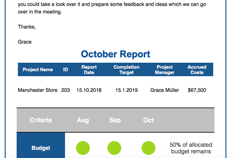
Using color is a great way to make the information in your table more visually effective.You can use whatever color scheme you like to brighten up your report, but one popular choice is the traffic light system. Use green for the positive aspects of your project (e.g. what is going well), amber for the aspects which need improvement, and red for the things which need to be addressed urgently (e.g. risk factors.) Here is an example of a project status report using the traffic light system.

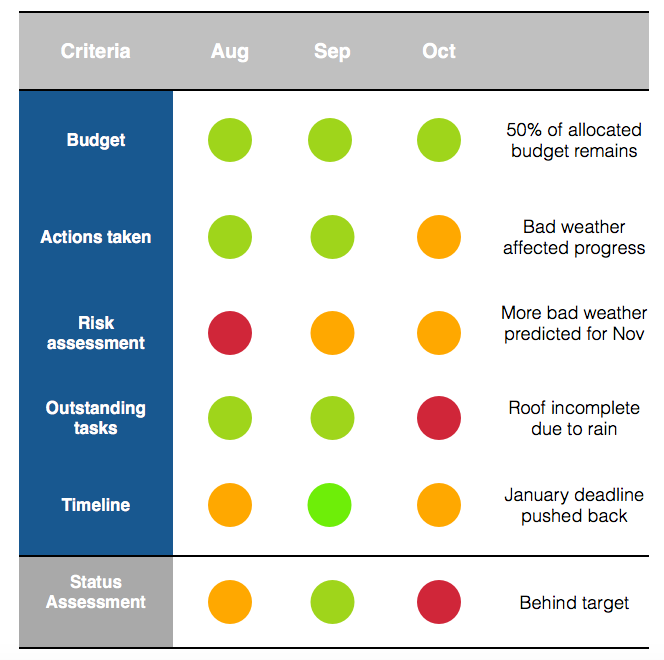
An example report using the traffic light system

Scope of the report
Depending on the length of your project, you may have to present the information in your report differently. Reports can be sent out weekly, monthly, quarterly, or, in some cases, as a one off. If possible, it is good to include some way of comparing progress with previous reports. You can do this by including a simple summary of the previous reports (e.g. the previous 3 months.)

Key information
As well as the evaluation criteria for your report, a well-presented report should also contain the key information about the project. Particularly in bigger businesses where multiple projects may be happening at once, it is useful to label the report correctly to avoid confusion for yourself and other team members. Most importantly you should include:

  • Project name and ID code (if applicable)
  • Date of report
  • Name of project manager
  • Target completion date

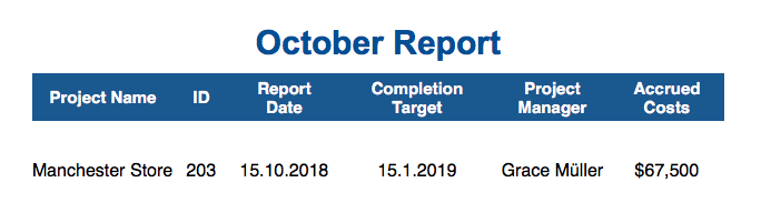
Example of key information for a project report

You can also include the following information if you feel it is relevant:

  • Project department
  • Project phase
  • Project budget
  • Priority level
  • Project sponsor
  • Costs so far
  • Start date of project

How to build your report in Mail Designer 365

Step One: Set up a table in Mail Designer 365

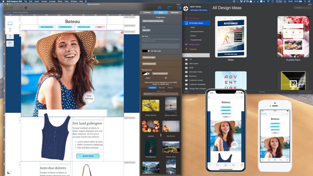
In Mail Designer 365, project status reports can be quickly built up using the tables feature. Go to "Contents" > "Layout Blocks" and scroll down to the bottom to find the table blocks. You can then drag and drop a block into your email design.

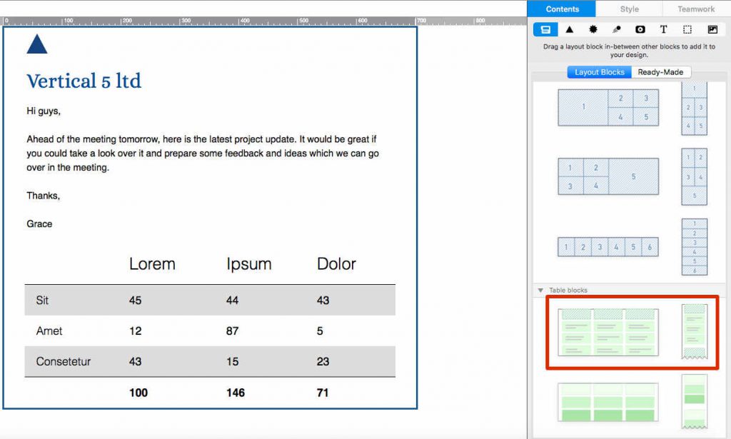
Drag and drop a table block into your design to get started

Step Two: Fill in your evaluation criteria

Double click on a table cell to edit text. You can insert as many components as you like depending on your needs. To adjust the amount of rows and columns, click on the table. This will open the style menu. Click on "Structure" and use the formatting tools to build up your table.

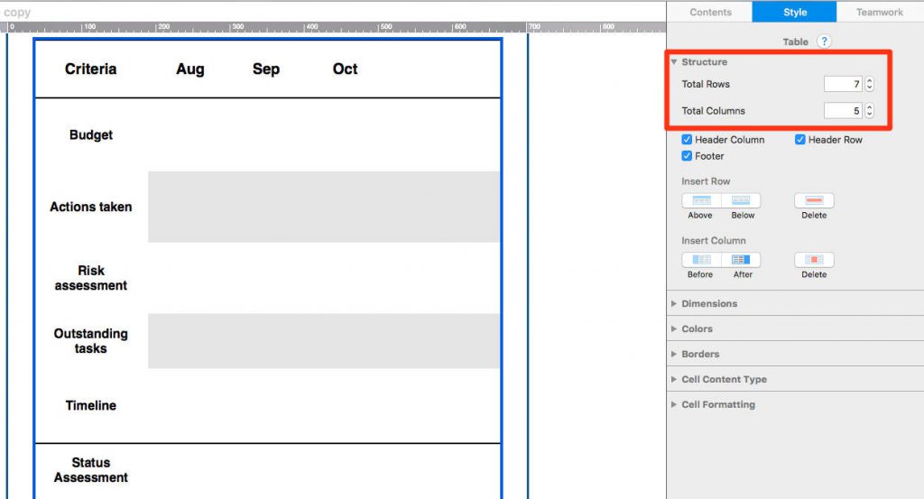
Add rows and columns for your evaluation criteria

Step Three: Add some color

We talked about the importance of using color in your report. Customize the color layout of your table by clicking on a cell and opening the "Color" section in the "Style" menu. Here you can change the color of one cell, or an entire column or row.

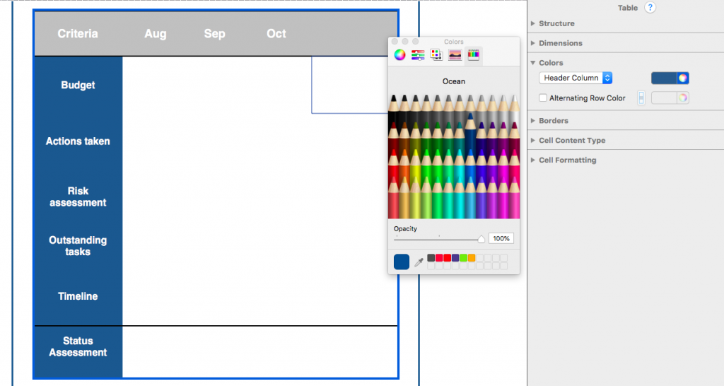
Adjust color settings to make your table more visually effective

There are several ways you can incorporate the traffic light system. We suggest using shapes, as this is visually effective and easy to copy and paste. In this example, we are using circles:

  • Set the cell content to image block. You can do this in the "Cell Content Type" section.
  • Head to the "Contents" tab in the sidebar, find "Shapes" and drag a shape into the cell.
  • Click on the shape to change the color according to the traffic light system.
  • Copy and paste the shape until you have filled up all of the criteria.

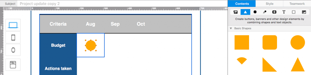
Use shapes to recreate the traffic light style

Step Four: Add information

The traffic light system is useful, but it is much better to have some written information included in the table to give your team some context. In the last column, you can write down your notes as to why each section has been graded red/amber/green. Make sure to change the cell content type for this column to text:

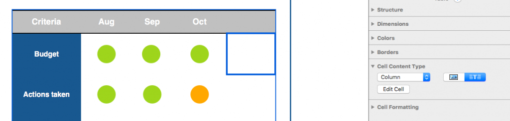
In the final column you can include written notes for your team

It's up to you how you present the key information about the project. We simply inserted another mini table above the main report with 2 rows and enough columns for the key information. This clearly labels the project report and gives your colleagues some context before they start reading.

For context, add a table with your key information above the report

Extra Tip: Save your table layout

Although setting up a table in Mail Designer 365 is super straightforward, it's not actually something you have to do each time you want to send a report out to your team. You can save your table layout so that all you have to do next time is edit the cell contents. To do this, go to the "Layout blocks" menu again, open the "Ready-Made" tab, then hold down the "cmd" key and click on the layout handle of your table(s) and drag it into the sidebar to save.

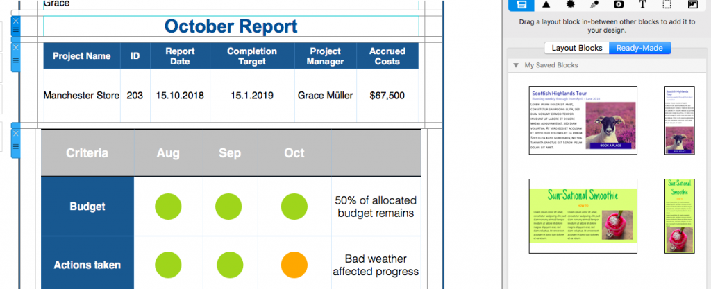
Save your table blocks in the ready-made blocks section for next time

Reports made easy with Mail Designer 365

 
Take the hassle out of building and sharing project status reports and do everything in one app. With Mail Designer 365 you can build brilliant HTML emails using drag and drop and create a report to rival Excel. Use the tables feature to build up a professional report which is fully integrated into your email and then send directly via the app from your own email address. No attachments, no fuss, just one app.
 

Give Mail Designer 365 a try today for free...

Mail Designer 365 helps you create stylish, professional HTML emails on your Mac. Download for free to see what you can achieve.


Try for free

Mail Designer 365 1.4.4 Update Guide

By Uncategorized
Hey Mail Designers - as promised, we have yet another brand new update for you! The Apple Watch preview tool in Mail Designer 365 now supports previews for HTML emails. This, along with more useful improvements, can be found in Mail Designer 365 version 1.4.4. Here's all you need to know about the latest update...

Read More

How watchOS 5 Will Transform Your Email Marketing Strategy

By Uncategorized
It's no secret that the number of people checking their emails on the go has significantly risen in recent years. One mobile device which has massively grown in popularity since its initial release in 2015 is the Apple Watch. With the recent release of watchOS 5, email creators and recipients alike are all breathing a collective sigh of relief. Finally, no more scrolling through long plain text emails...

We're taking a look at how the latest update could transform your email marketing strategy.

Read More

Mail Designer 365 1.4 Update Guide

By Uncategorized
Hey designers! As you may have heard, macOS Mojave launched on Monday and to celebrate, we've got a brand new version of Mail Designer 365 for you which works perfectly on the new OS! Version 1.4 comes loaded with a huge new range of features including colorful image effects, brand new device previews, as well as a sleek new interface for Mojave's long awaited dark mode.

Mail Designer 365 in Mojave Dark Mode

Read More

How to Make Your Email Campaigns More Inclusive and Accessible

By Mail Designer 365 Newsletter Academy

Our world is diverse and your customer base is too. With marketing becoming increasingly globalised, it's important to ensure that your campaigns reflect and support the huge variety of customers your business has. Even small businesses cater to a large range of people differing in age, gender, race, religion, physical ability, etc. These are all qualities which make your customers unique and for this reason, it's great for your business to celebrate and recognise them where you can. Here are some ways you can make your email campaigns more inclusive and accessible to your customers.

Get to know your target audience

The more you know about your customers, the more you can directly target your campaigns. For example, if you know the majority of your customers are from one country, you can make an effort to recognise national holidays which would be important to them and form a closer bond. You can use questionnaires, Twitter polls, and detailed sign up forms to try and find out more about the demographic of your customer base and adapt your marketing strategy accordingly.

This fun email design from Love Culture Clothing gives back to customers of Mexican origin with a 20% discount for their Cinco de Mayo celebrations.

Avoid generalisations or stereotypes

Because our world is so diverse, it is important to recognise that your customers are not a homogenous group - they each have different needs and different interests. In the past, businesses have experienced problems by trying to use stereotypes in their marketing campaigns. These types of generalisations may be funny to some, but will cause offence and upset to others. A prime example of stereotypes gone wrong is this very subjective idea of the "perfect body" from Victoria's Secret. This marketing campaign received a barrage of complaints for featuring just one body type and failing to represent its hugely diverse global customer base.

This shortsighted Victoria's Secret campaign rightfully sparked complaints from customers worldwide.

Think carefully about your images

Continuing from the previous point, it's also important to show diversity in any images you're using in your email designs. A picture is worth a thousand words, so it's important to choose the right image for your campaign. If you can, try to choose a photo where you can see a range of different people doing different things. The more diverse the photos you include in your emails are, the more inclusive they become. Here are four great examples of brands who use diverse imagery to create inclusive marketing campaigns...

Nike's Pro Hijab campaign

Dove's Real Beauty campaign

Lloyd's TSB 2012 Paralympics campaign

Tesco's Food Love Stories campaign

Make your emails accessible

One way you can ensure your email designs are inclusive is by making them accessible to people of varying abilities. Here are three simple steps you can take to make your email design more accessible using Mail Designer 365:

Create a plain text version of your email design. Customers with visual impairments may use a special screen reading device to read your email message. These devices struggle with HTML emails, which is why it is good practice for you to always include a plain text version which summarises the contents of your email. This is easy to do in Mail Designer 365, simply switch to the plain text/Apple Watch view to create the non-HTML version.

Create a plain text version for visually impaired recipients using screen readers

Be careful with your colors  For readers with visual impairments such as color blindness, it can be difficult to decipher a HTML email design. Some popular color combinations which can be particularly confusing for users with color blindness include: green & blue, green & red, blue & grey, and blue & purple. Try and avoid these combinations where possible. Strongly contrasting combinations work well - use a light hue for the background and a darker, bolder hue for your text to make it more prominent.

Use a clear typeface There are also many steps you can take for recipients with reading difficulties such as Dyslexia or Alexia. Try and use a sans serif font where possible, as the individual characters are easy to identify. You should also try to avoid using italics or calligraphy style fonts, as these distort the words even more. Use a fairly large font size and avoid using justified text, as this is very difficult for the majority of dyslexics to read.

Mail Designer 365 has a range of text options to make your email easy to read

Celebrate everyone

We touched upon this earlier on, but it's good to get involved in as many celebrations as you can. Celebrations and holidays such as Pride Month, Black History Month, International Women's Day, etc, are all super positive ways of celebrating our diverse world and will make your email campaigns much more inclusive. This inspiring campaign from Everlane acknowledges Pride Month by celebrating humanity.

This email design from Everlane is super positive and inclusive

We hope we've managed to inspire you with these tips on how to make your marketing campaigns more inclusive and accessible for your diverse email audience. With just a few small changes, you can work wonders with an inclusive email marketing campaign. Try it out in Mail Designer 365!

Until next time!
Your Mail Designer 365 Team

Get expert tips straight to your inbox!

Sign up here for our email newsletter and enjoy regular tips, tricks and advice for everything relating to email design – delivered directly to your inbox.
 
 
There was a problem registering your email address.
Please check and try again.
Thank you for registering! Please check your email inbox.
We've just sent you an email for you to confirm your email address, if you haven't already.

Give Mail Designer 365 a try today for free...

Mail Designer 365 helps you create stylish, professional HTML emails on your Mac. Download for free to see what you can achieve.


Try for free

Epic Email Design Fails and How You Can Avoid Them...

By Mail Designer 365 Blog, Mail Designer 365 Blog, Mail Designer 365 Blog, Mail Designer 365 Blog, Mail Designer 365 Blog, Mail Designer 365 Blog, Mail Designer 365 Blog, Mail Designer 365 Blog

We don't know about you, but when it comes to email fails, we've witnessed a lot go wrong over the years... We've seen everything from mobile design disasters, to missing call-to-actions, and list segmentation blunders that have left even big name brands feeling red faced!

As email geeks, we want to make it our mission to prevent these epic fails from occurring ever again! In our latest Newsletter Academy post, we've collected some of the most facepalm-worthy email design fails, along with tips on how you can avoid them with a little help from Mail Designer 365.

Head over to the Newsletter Academy for more!

Useful Email Marketing Resources for Small Businesses

By Mail Designer 365 Newsletter Academy, Mail Designer 365 Newsletter Academy

Finding email marketing resources for small businesses often seems like an impossible challenge. It's clear that there are plenty of expensive resources in place for corporations and big businesses with massive budgets and years of experience, but what about those of us who are just starting out?

Here are some of our top recommendations for useful email marketing resources designed to help out small businesses.

Stage One: Planning and strategy

One of the first big steps to take when planning your email marketing campaign is developing an email marketing strategy unique to your business. In our experience, blogs are a great place to find ideas and tips about best practice for email marketing.

There are loads of email marketing blogs out there but two which we would really recommend are the Email on Acid blog and the Campaign Monitor blog. Both of these are run by email experts and regularly cover a wide range of interesting topics. It's definitely worth checking them out.

SendGrid also offer a ton of useful email marketing resources for small businesses, such as this guide.

Use email marketing blogs to get ideas and tips

Stage Two: Design inspiration

Even if you don't have a professional designer on hand, or if you're just starting out, you don't need to panic! There are plenty of resources out there to provide you with design inspiration and cool ideas for your next email.

Really Good Emails is a great resource for businesses looking for ideas. They post best practice examples of really good email designs (the clue is in the name really) to inspire businesses and designers.

Really Good Emails showcases some of the best email designs

Pinterest is also a great tool for your business. Thousands of designers use Pinterest to collect ideas and inspiration, and it's easy to find amazing email designs to help you gain some new ideas. Create your own board of pins, or check out our huge selection of curated email design examples.

Check out Pinterest for creative inspiration

Stage Three: Creating your email

There's no beating around the bush here, HTML can be hard work. Especially for small businesses and startups with a lot going on, email design can be time consuming, and, if you don't know the ins and outs of coding, it can also be expensive to try and hire someone who does.

With Mail Designer 365, you can make the most of a drag and drop email builder with countless design resources and creative tools for building mobile-responsive email designs. Sign up for free here to test Mail Designer 365 for yourself.

Mail Designer 365 is brilliant for quickly creating stunning HTML emails

Another great tool to help you build up your email is Unsplash. The Unsplash platform offers you free access to a huge library of license-free stock photos to use in your email designs.

These images are fully licensed for use in both creative and commercial ventures, so you can find the perfect image for your design without having to worry about high costs or copyright issues. The best part? Unsplash is fully integrated within the Mail Designer 365 app, so you can search for amazing, high-quality images with no extra hassle.

Explore Unsplash for a huge range of license-free photos

Stage Four: Compatibility check

One hugely popular resource for testing the compatibility of your HTML email is Litmus. Litmus is a great resource, as it allows you to preview your email in dozens of different email clients, and also offers tools for spam testing.

Litmus is a good option for compatibility testing if you have the budget.

Included in the price of a Mail Designer 365 plan, users also have access to the Test Flight feature. With this, you can send a test version of your email design to up to 8 different email addresses for inbox preview.

By using test accounts from the most popular email clients (e.g. Outlook, Apple Mail, Gmail, etc.), you will still gain a pretty good overview of your design's compatibility:

Mail Designer 365's Testflight service for testing emails before sending

In terms of spam testing, you can use the free spam checker at mail-tester.com to find out how your email rates in terms of spam filters etc. Also not a bad idea for those of you looking to save money.

Check your email for spam risks at mail-tester.com

Stage Five: Email Service Providers

After you've tested your email and been given the all clear, you're ready to send. There are tonnes of different services available for you to use to send your emails, but one of the most popular options is MailChimp. With flexible plans and the option to directly send emails from Mail Designer 365, this is definitely a resource we would recommend.

Depending on the size of your email list and the volume of emails you send out per month, you may even be able to use MailChimp completely for free.

Send directly via MailChimp in Mail Designer 365

Stage Six: Performance review

The work isn't over just because you've sent your email out! You want to be able to check how well your email performed so you can improve your strategy and start the cycle all over again for next time. Good marketing is all about learning and adapting from past experiences.

One great tool to help you keep track of your email performance is Google Analytics. You can set up Google tracking links to help you assess how many of your readers clicked on a particular link in your email. For more detailed advice on how to set this up, check out this guide.

Use Google Analytics to check your email's performance

We hope that you find these email marketing resources for small businesses helpful in planning and creating your next email campaigns.

Until next time!

Your Mail Designer 365 Team

Get started with the Mail Designer 365 service today for free...

Mail Designer 365 helps you and your team create stylish, professional HTML emails.
Sign up free today to see what you can achieve.
Sign up

Best Google Fonts for Business Email Designs

By Mail Designer 365 Newsletter Academy

Professionalism, branding, and consistency are all hugely important in business designs, which could put many users off the idea of web fonts. Of course, it's easy to stick to the familiar email-safe fonts we are used to, but actually, there are fair few web fonts out there which you can use to create professional, refined email designs that still look good.

Here's our quick guide on the best Google fonts for business designs.

Quick reminder

Before you get started, as much as we encourage you to try out these business-style fonts, please remember to include at least one fallback font in the style section of your design. While the majority of email clients nowadays do support web fonts, there are still some that don't (*ahem* we're looking at you Outlook...) You can easily configure a fallback font for every text style in Mail Designer 365 by clicking on "Add fallback font." This font will then be displayed if the web font is not supported.

Always add an email-safe fallback font to your text style

Open Sans

To kick things off, we're starting with our go-to font, Open Sans. Open Sans is a great choice for minimalist business designs. With a variety of different styles available, there is something for everyone. Use the "Light" style for modern, stylish feel in your meeting minutes, or go all out and define key points with "Bold" or "Extrabold."

Open Sans is great for minimalist business designs

Roboto

Similar to Open Sans, Roboto is a very simple all-rounder. This clear, easy to read font style is perfect for the main text of your newsletter and still makes a change from the likes of Arial and Times New Roman. Because this is such a simple typeface, it is easy to pair with another, more unique font (e.g. your logo or typical brand font) without appearing to clash or be distracting.

Roboto is a clean option for professional newsletter text

Athithi

Athithi is a nice choice for a tech newsletter. If your business is tech oriented or you work in the IT business, you might want to try using this font to add a modern twist to your design while still remaining serious and professional. Try using "Medium" or "Bold" to give your headlines some emphasis.

Athithi is a stylish choice for tech firms

Cormorant Infant

Breaking away from the sans serif styles, Cormorant Infant is a serif font which offers a much more traditional feel. While sans serif fonts are more modern and simplified, serif fonts are great for the more classical business vibe. Try using "Bold" for an assertive headline for your business consultancy agency or legal practice. Alternatively, "Light" and "Regular" work well for a twist on standard newsletter text while still remaining clear and elegant.

A very traditional serif business font. Great for legal practices.

Montserrat

Another highly popular Google font, Montserrat brings a bit more attitude to your design. This font choice would work extremely well as a CTA for your email newsletter.

A powerful typeface to bring definition to your CTA

Playfair Display

A slightly more interesting choice, Playfair Display is an elegant, serif typeface, well-suited to announcements, updates, or company news. Give this font a go in your shareholders' newsletter or your monthly round up.

An elegant font great for business announcements

We hope you have found these Google font tips for business designs helpful and that you'll give them a go in your next email newsletter. As you can see, it definitely makes a nice change to always using Times New Roman and Arial and all fonts are available license free in Mail Designer 365. For more help with downloading web fonts, check out this FAQ.

Until next time,

Your Mail Designer 365 Team!

Give Mail Designer 365 a try today for free...

Mail Designer 365 helps you create stylish, professional HTML emails on your Mac. Download for free to see what you can achieve.


Try for free
Privacy Settings / Datenschutz-Einstellungen