
Whether you're an indie app developer, a giant software house, or somewhere in-between, convincing a customer to download your demo is the first big step towards you getting a new user on board with your product.
However, once you've got a potential new customer in your sights, what can you do to keep them engaged and convince them to stick around?

What is onboarding?
In terms of SaaS products, the onboarding process describes the time from when your customer firsts downloads your demo or creates an account, until them choosing a plan and becoming paid users. More generally, it is the period where your customers first start using your product.
The step between free and paid is generally a big one. As a business, it's your job to give potential customers the best possible experience during the trial period. Not only will this allow them to get used to you as a business, it also increases the likelihood that they will want to carry on using your great product.
Why design an onboarding campaign?
Customers lose interest quickly. Research has shown that the first 10 days after signup are critical in determining whether a customer will continue to use your product, or become disengaged (leading to customer churn.)
The most effective way to keep customers engaged is to develop an onboarding campaign to guide them through the early stages of using your product.
In this article, we've shared some of our best tips on how you can design an effective onboarding campaign for your business and help increase customer engagement.
Set up a sender name and image
Traditional sales reps play on a sense of familiarity when convincing customers face to face to purchase a product. This one-on-one contact is hard to reproduce via an automated onboarding email. Before getting started, there are a few tricks you can try to make yourself more recognisable in the customer's inbox.
Setting up a legitimate from-address takes away any anonymity for your customers and means they will know exactly who has sent them the email. This is much better than using a generic no-reply address, which can come across unfriendly or untrustworthy. It is also best practice to configure a sender name, such as your company name. This stands out more to customers and is generally more recognisable.

LinkedIn clearly use their company name when sending out email notifications to make it easy for the user to see where the messages are coming from.
In addition, uploading a sender image for your business via Gravatar is another good way of appearing more familiar to customers in their inbox. Many email services such as Gmail and Outlook will display your online avatar if you have one set up for your sender address.
This is great, as customers realise straight away that the email is from you and are more likely to open it. This blog post is a good guide on how to set up your sender image.
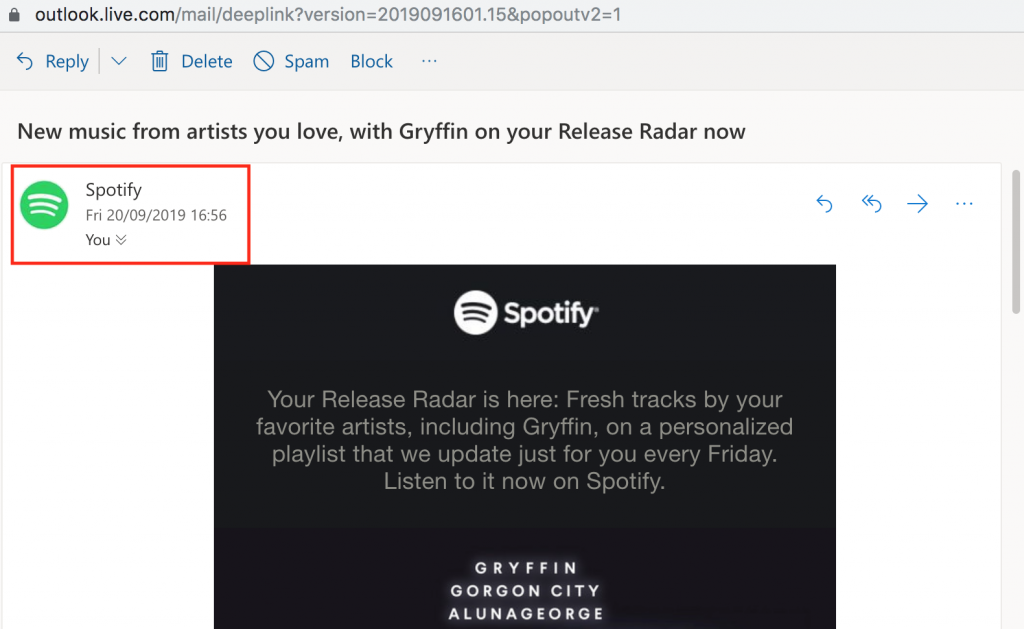
Spotify have configured both a prominent sender name and image to make themselves more recognisable to customers.
Nail the welcome email
Recent stats show that sending a welcome email can increase your email engagement by up to 33%. This is seriously impressive.
The welcome email is one of the most important emails you will send. It is your first chance to introduce your customer to your product or service and the official start of your onboarding campaign. This sets the tone for the rest of your emails; meaning it's critical that you get it right.
What to include?
Every business is different and no two welcome emails will be the same. However, there are a few key points to consider when designing your company's welcome message:
- Use personalisation - This instantly connects the reader to your business.
- Thank the customer for signing up to your service.
- Briefly explain how to get started.
- Include links to useful resources such as tutorials or FAQs
- Add a call-to-action button so the customer knows what their next step is.
This welcome email by Voi is one great example of how to introduce new customers to your service. Not only is it friendly and informative, it also contains an infographic with all the most important information users need before they get started.
Voi are also super smart in introducing an incentivised referral scheme in the very first email:
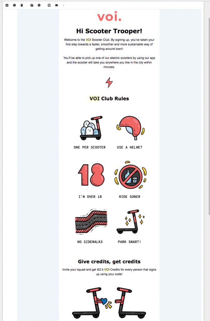
This welcome email by Voi contains all the important information the customer needs before getting started, plus a cool referral scheme.
Send tutorial-style emails
The aim of your onboarding campaign is to get customers using your product. If they don't know how it works, or the setup process is too confusing, they will quickly become disengaged. Making your product enjoyable and easy to use is the most effective way to ensure customers will want to stay onboard.
Refer to your support channels, FAQs and your own experience to identify the most common problem areas. Target these in your email campaign to help users avoid running into these issues.
It's also a good idea to condense the information in your email as much as possible. Huge chunks of text will only confuse readers. Break up the key points into a simple, step-by-step list. You can always link out to blog posts, tutorials or videos on your website if they need more help.
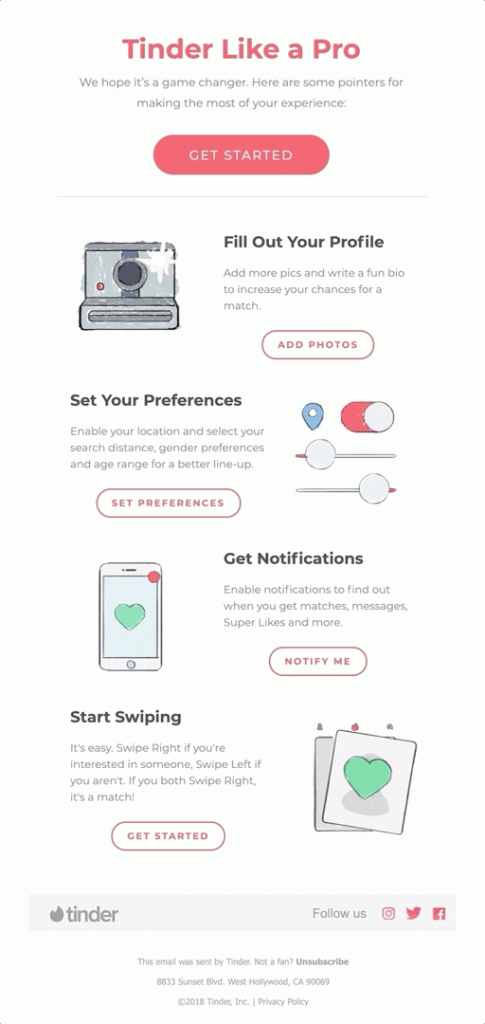
Tinder help new users get their profile set up by providing some useful tips. Including CTAs after each step is also super effective.
Make every email actionable
Every email in the campaign needs to have a clear CTA (call-to-action). Think about the logical steps a user needs to take in order to become engaged and interested in your product and plan your emails accordingly.
Welcome new users onboard and encourage them to carry out specific actions. Actions can include downloading the app, creating a profile, etc. By doing all of these things, the new user slowly learns more about the product and becomes engaged.
Whatever the goal is, you must clear the path for your customers. Use email to point users in the right direction and get them using your service. This email from Webflow is a great example. The CTA "choose a template" is super clear and gets the user straight on the right path:
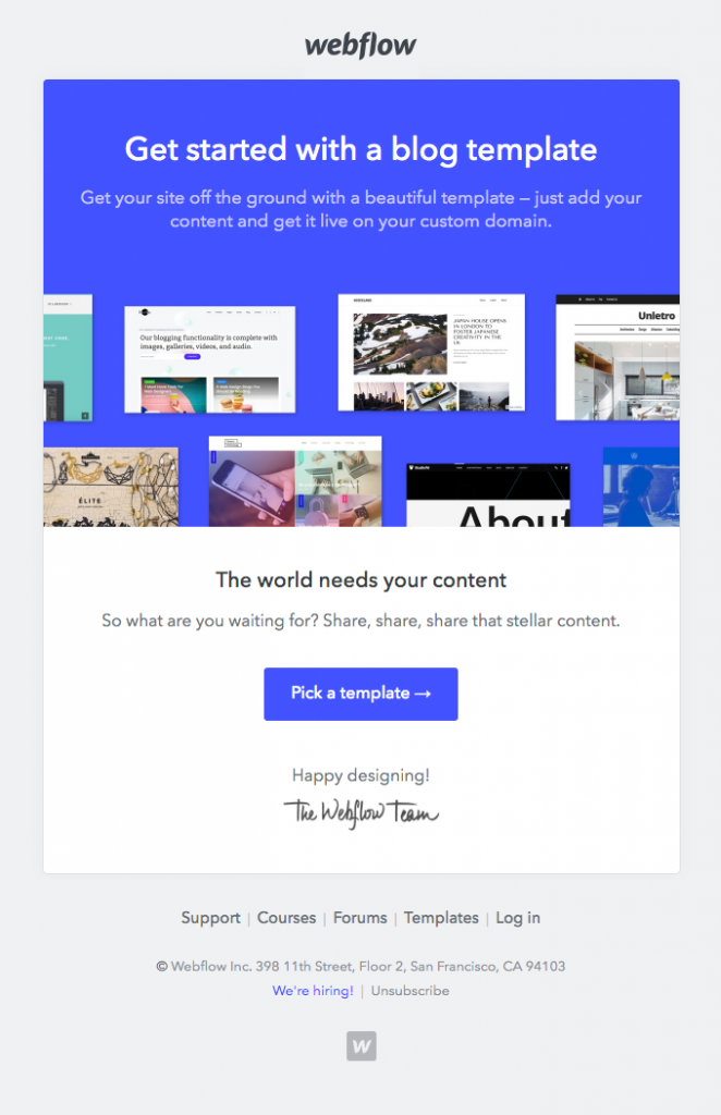
Make sure every email has a clear CTA to help get the user started with using your product.
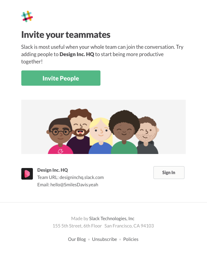
Slack gets the ball rolling with this CTA encouraging users to invite their team.
Re-enforce the USPs of your product
While a new user is getting started with your product, you should remind them of its key benefits. Reiterate to the user what makes your product or service different from others. This will help convince them that they should stick around.
Many users sign up on a whim - especially if it's free. Using your onboarding campaign to re-enforce what makes your product special helps you to persuade the customer the product is worthwhile. With this mindset, they are more likely to complete the conversion from inactive trial user to active full user.
Use your emails to highlight key USPs, exciting features and any other aspects you think make your product better than the rest. Don't be afraid to experiment with GIFs, videos and bold images to make your email more visually exciting.
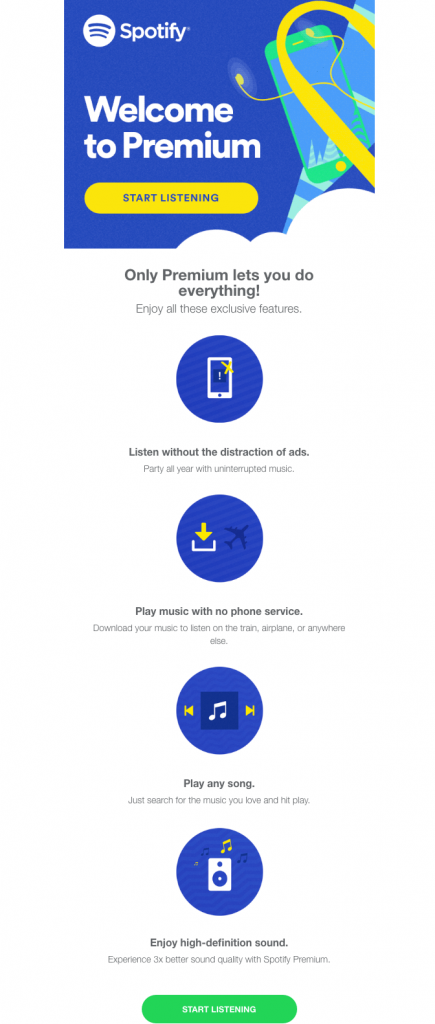
Spotify clearly re-enforces the benefits of a Premium plan here.
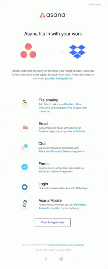
Asana lists integrations to convince new users of the benefits of using their service.
Be flexible with your trial period
Let's say you have a fixed trial period of 2 weeks. This is great and may be enough time for most customers to decide whether to purchase. However, for some customers it might not be long enough.
If you see a user has used up all of the time on their demo and not purchased a paid plan, consider offering them an extension. Even just one more week could be all they need to help them make up their mind.
In this example from NOW TV, the user is offered another free trial period. This is a smart strategy, as the customer has more time to explore the service and decide they do want to sign up.
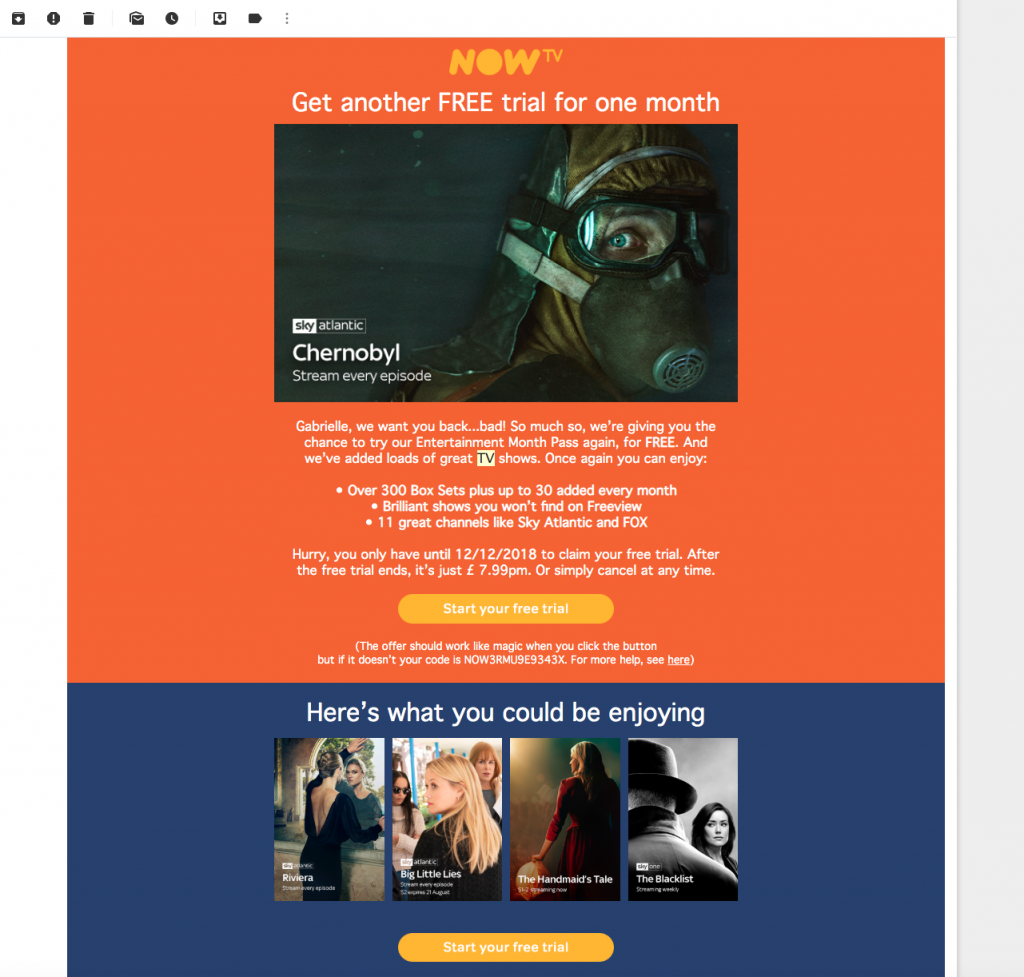
NOW TV try hard to tempt back trial users with the offer of another 30 days free.
Consider a re-engagement email
A re-engagement campaign can also be part of your onboarding process if it means the customer re-connects with your product. By monitoring user activity within your app or online platform, you will see which users are starting to disengage. If you spot this early enough, you could prevent customer churn.
How to re-engage inactive users:
If you notice a customer has left the setup process incomplete, you can reach out to them and encourage them to finish what they started. Often, people get distracted or something else comes up. A helpful reminder is a good way to re-engage potential users and get them back on track.
This email by airbnb is productive because it strikes off the steps the user has already completed; leaving the rest of the list as todos. This is a subtle way of showing the user they are almost ready to go:
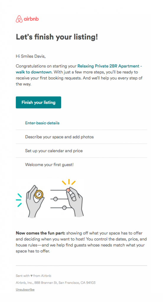
Airbnb give the user the final push they need to finish off their listing.
Alternatively, you could try a more indirect approach. A common reason for users becoming disengaged is them becoming stuck on a problem. If you notice an inactive user, try getting in touch and offering support. This strategy is used in the following example by Webflow:

Webflow extend a helping hand to try and offer support to new users who may be struggling.
Find out what went wrong and learn from it
No business has a 100% conversion rate and no matter how good your onboarding campaigns are, you should always expect some customer churn. In the case of customers who decide not to continue using your product, it is important you try to find out why.
Try and reach out to customers who decided not to purchase a plan in order to figure out what went wrong. You could send out a simple survey, or write a personalised message in the hope of getting a more direct response.
Your onboarding campaigns will always be evolving with your product. Keep analysing their performance (e.g. open rates, click-throughs) together with your conversion rates in order to keep emails optimised and as effective as possible.
We hope you have found these tips for creating onboarding emails useful and that they will help you increase your conversion rates. All our examples were either sourced from our own inbox, or from the awesome collection over at reallygoodemails.
P.S. Did you know Mail Designer 365 templates are compatible with dozens of leading marketing automation tools? Build up your Mail Designer 365 email design and export as HTML to use with ActiveCampaign, SendinBlue, Drip, ConstantContact, MailerLite, and many more... Find a list of compatible ESPs, along with step-by-step export guides on our Integrations page.
Until next time!
Your Mail Designer 365 Team
Get expert tips straight to your inbox!
Please check and try again.
We've just sent you an email for you to confirm your email address, if you haven't already.
As a modern business, your online reputation is super important and the best way to strengthen it is through receiving reviews and testimonials from your customers. With the brand new Review Request Design Idea now available in Mail Designer 365, you have all the basics you need to confidently ask your customers to leave you an online review...

Today, businesses rely more and more on their online image as a means of strengthening their reputation and standing out from competitors.
Most potential customers are massively influenced by what your previous customers have to say. In fact, 97% of potential buyers depend upon online reviews when deciding whether to purchase. Thanks to the recent rise in review sites, all it takes is quickly googling the name of a business to help a customer make up their mind.

People care a lot about reviews when choosing a product or service.
If a customer wants information about your business and can't find anything online, they are much more likely to seek out a competitor whose customers have left testimonials. Because of this, it's more important than ever for you to build up your profile of online reviews.
Getting customers to share their experiences of your business online can be hard. Even if a customer had a great time at your restaurant or loved your hair salon, there's no guarantee that they'll rave about it online. For some, the process is too time consuming, others will wonder what's in it for them and a lot of customers will simply forget.
In this guide, we'll take you through some key tips to consider when using email as a strategy to increase your online reviews and strengthen your brand image...
Sign up to a review website
There are so many independent review platforms available today. Rather than go it alone, take advantage of the options available and consider signing up to a review site. Your customers will feel much more motivated to leave a review on a popular, third-party platform, as they are independent, trustworthy sites that aren't screened.
Here are just a few examples of reputable platforms you could start using:
- Google My Business - Use the world's #1 search engine to give customers the chance to write or read reviews about your business.
- TripAdvisor or Airbnb - Perfect for those of you in the travel and tourism industry looking for more exposure.
- Amazon - Great for small businesses wanting to give their products a larger platform.
- Facebook - A free and easy way for local businesses to connect with customers in their area and let them share their experiences.
- Trustpilot - A convenient, independent platform for customers to review any type of business.
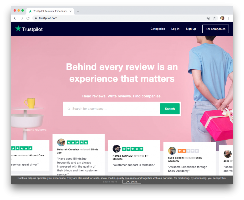
Popular, independent review sites such as Trustpilot are a great place to collect customers' experiences of your business.
Once you have established yourself on one of these platforms, you can use your email to directly link customers to your business's review page. Make sure to include the logo of the site in your email to make it more recognisable to customers. This is a much more clean cut way of asking for a review.
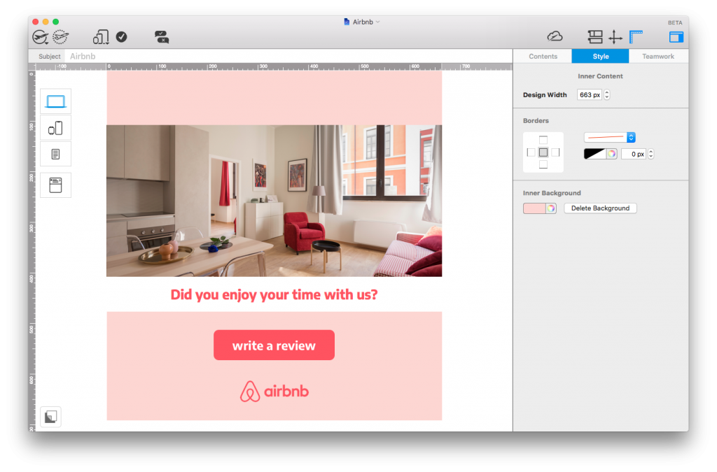
Include a link or call-to-action box to an independent review site to give your email a more clean-cut feel.
Remember to thank the customer
When writing your email copy, keep in mind that you are sending out your review requests to customers who have already bought your product. This means that thanking them for their purchase should be high on your list of priorities. Show your customer that you appreciate them and include a brief thank you message in your email.
In this example, eFlorist does a great job of politely thanking the customer before proceeding to ask for a quick rating:
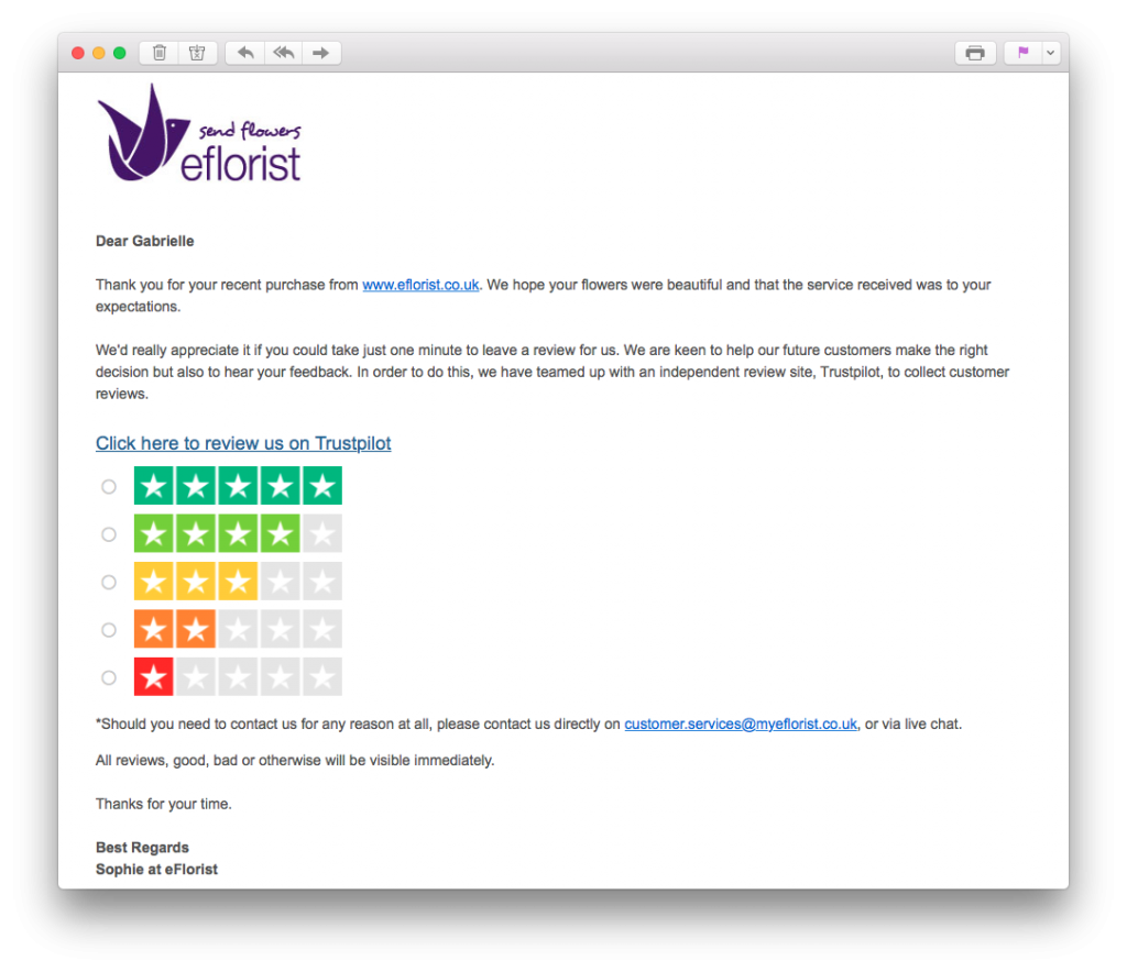
Before asking your customer to leave a review, remember to thank them for their purchase.
Timing is everything
In order for your emails to be most effective, you have to ensure the timing is right.
If you leave it too long to ask your customers for a review, their experience of your business may no longer be fresh in their minds and they won't have much to say. Similarly, if you ask a customer too soon to review a product they have just purchased, they may not have had the chance to test it yet.
For this reason, it's important you send your emails out at the right time. Naturally, every business is different, so there is no one size fits all model. One good strategy to adopt here is A/B testing. Try sending the same email out at different time periods after purchase and analyse which gets the best response from customers.
Offer different review options
Sometimes the classic review style isn't for everyone. For customers who don't have time to leave a full text review of your business, a scale rating is a fast and easy alternative. With just one click, customers can review your business numerically; letting you know exactly how you are doing in your customers' eyes.
Tip: Remember to create some sort of a landing page for once your customer has clicked on one of the star ratings. Here you can also give the customer the opportunity to leave further comments, or simply thank them again for taking part.
This example by BarkBox is super straightforward and easily allows readers to submit their rating:
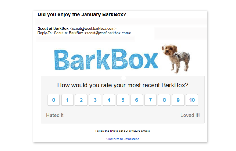
Scale ratings are an easy way for customers to quickly review your business.
Making a rating panel in Mail Designer 365 is easy thanks to the library of shapes and layout blocks, but remember to only include one link per image area.. Here's an example ratings chart for you to try out:
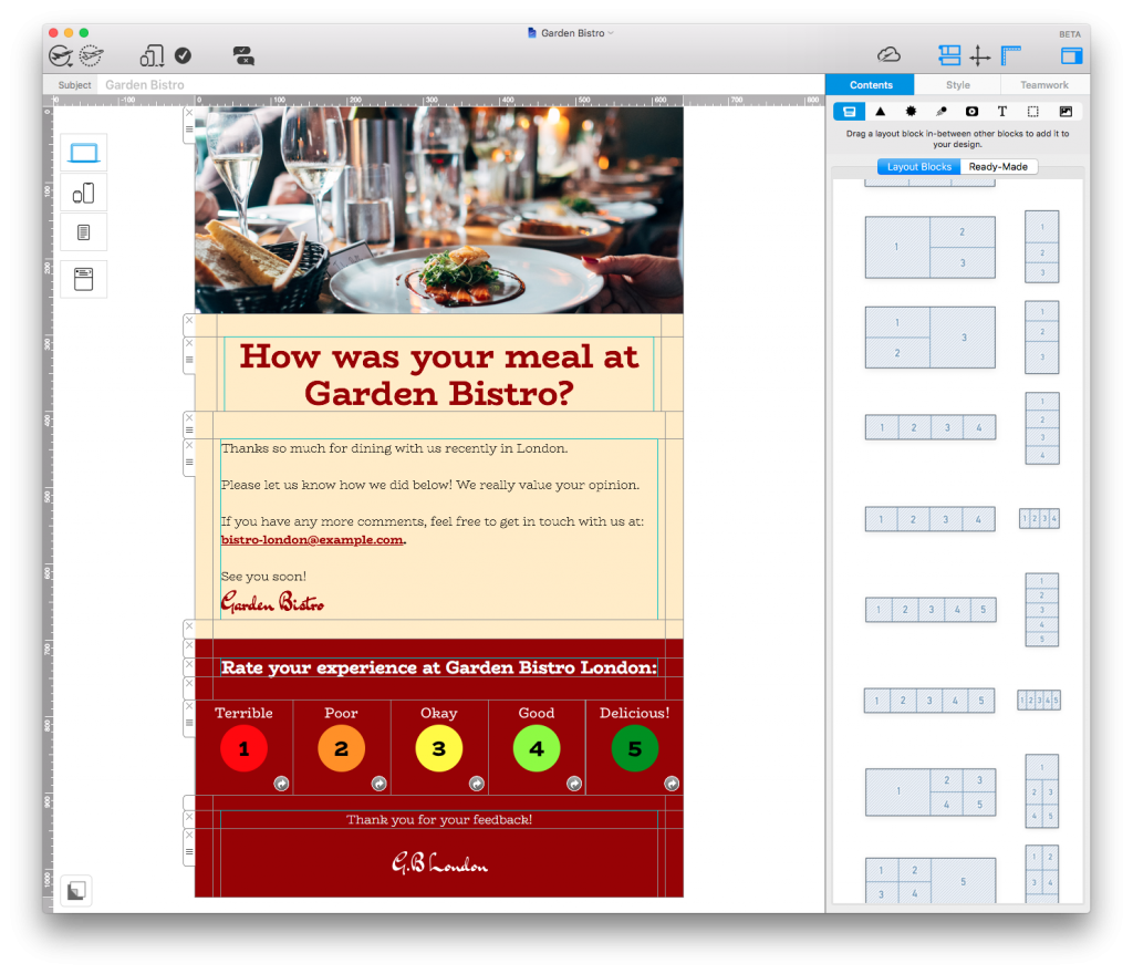
Use the tools and layout options in Mail Designer 365 to create a colorful rating panel for your customers.
Try to incentivise
Because most customers won't feel the need to leave you a review, providing an incentive is an effective way to get more of your customers on board. By offering customers something in return for an honest review, they are much more likely to take the time to share their experience.
In this email by Argos, the customer is given the chance to enter into a £100 voucher giveaway. Including a 2 week time limit is also effective here, as it subtly creates a sense of urgency. For the customer, it's definitely a great tradeoff, considering a review only takes two minutes to write.
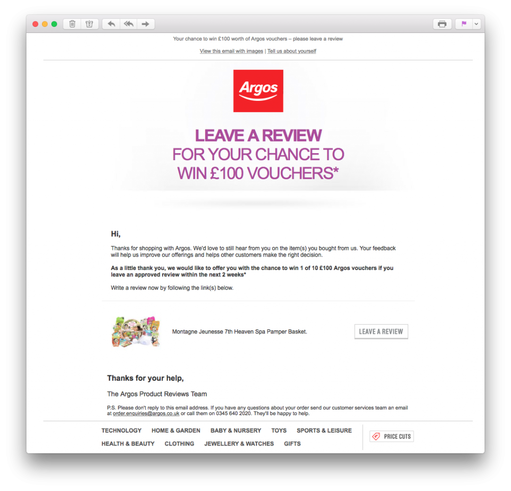
Provide some kind of incentive to motivate customers to leave a review.
Don't send too many emails
One mistake which is also easy to make is sending out too many emails asking the same thing. Ultimately, if a customer was willing to leave you a review, they would likely have done so after the first email. Persistence is good in some cases, but it's important to not become too forceful, as this could lead to customers unsubscribing completely.
Sending the same email multiple times is bad practice and could even be perceived as spam. If you are going to send a repeat email, be sure to try a different strategy. For example, if your first email is ignored, you could follow up the next week with an offer of an incentive. This way you'll have covered all bases and will know when it's time to back down.
Secure more online reviews with Mail Designer 365
We hope you have enjoyed reading through these tips. In today's business environment, online reviews are crucial to building up a strong brand reputation and finding out how your customers really feel about your business.
Strengthen your chances of getting more online reviews with the 'CityHotel' Design Idea in Mail Designer 365:
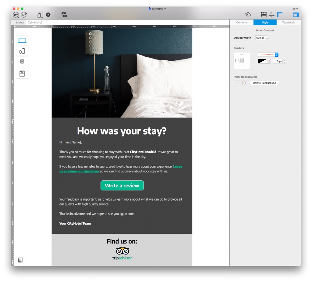
The template has all you need to convince your customers to review your business online. Open in the app to start editing or download Mail Designer 365 free to get started.
Stay creative,
Your Mail Designer 365 Team
Subscribe for more great tips!
Please check and try again.
We've just sent you an email for you to confirm your email address, if you haven't already.
Trying to convince customers to take the time to fill out a survey or leave a review is difficult. Of course, anyone can send out an email with a link to a questionnaire, but is this enough? With so many businesses asking for the same thing, how can you make sure your feedback request comes across genuine?
Following these 6 simple tips should make it much easier for you to gain useful customer insights and create an effective survey system to use again and again.
1. Find the right survey tool
Surveys are an integral part of your marketing strategy and there are countless tools out there to help you reach out to customers. Whether it's a designated agency, a system you've built in-house or a third party platform, it's important to find the right tool for you needs.
For many businesses, opting for an agency or premium-style service can be unrealistic. In most cases, it is possible to create and host your survey using a free tool. This will save you money and also a lot of time. Free web-based tools such as Google Forms are perfect for generating questionnaires to send via email. If you're looking for something on a larger scale, Survey Monkey offer a range of different plans to suit your business's needs. Alternatively, check out this post for some more great options.
Check out Google Forms as a free resource to help build your survey.
Once you've settled on your tool, you can create your survey, generate a link, and include this in your email to send to subscribers.
2. Grab customers' attention through your subject line
The subject line is always important and here is no exception. Using a generic subject line which customers have read hundreds of times is a bad idea, as it will only get ignored. For example: "We need your help!" As an email subject, this is vague, uninteresting and massively overused.
Use your subject line as the chance to clearly outline why the customer should take time to open your email and give you feedback. Here are a few effective examples we have come across recently:
Moonmail: "Last chance to get a $25 Amazon card!" Generating a sense of urgency is a proven effective way to motivate readers to act.
Frye: "$50 for your thoughts" Including a monetary value naturally will spike the attention of the reader and make them curious to discover more.
Thumbtack: "Tell us what you think of Thumbtack in 30 seconds" Outlining how quick the feedback process will be should help convince the customer that the survey won't be too time consuming for them.
Handy: "What do you hate most about cleaning?" Asking the question outright in the subject lets the reader know what to expect from the email and creates a more direct approach.
3. Use personalisation to make the reader feel important
The aim of your feedback campaign is to get as much information from the customer as possible, while also demonstrating to them how important their opinion is to you. Using personalisation is one great way to do this.
By addressing your customer directly, you naturally give them a sense of importance which they wouldn't receive from a mass email. Instinctively, when we see or hear our own name, we are much more likely to pay attention. This email from Specsavers asks the customer directly to take part in their survey. This personalisation, paired with the tagline "We value your feedback", makes the customer feel important:
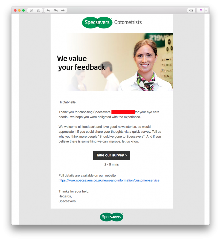
Specsavers use personalisation to make the customer feel their opinion is important.
Inserting a name placeholder into your email design is fast and effective way to integrate personalisation. Mail Designer 365 offers you direct integration of popular placeholders from Mailchimp, Campaign Monitor and Direct Mail for Mac so your design is ready to export and send:
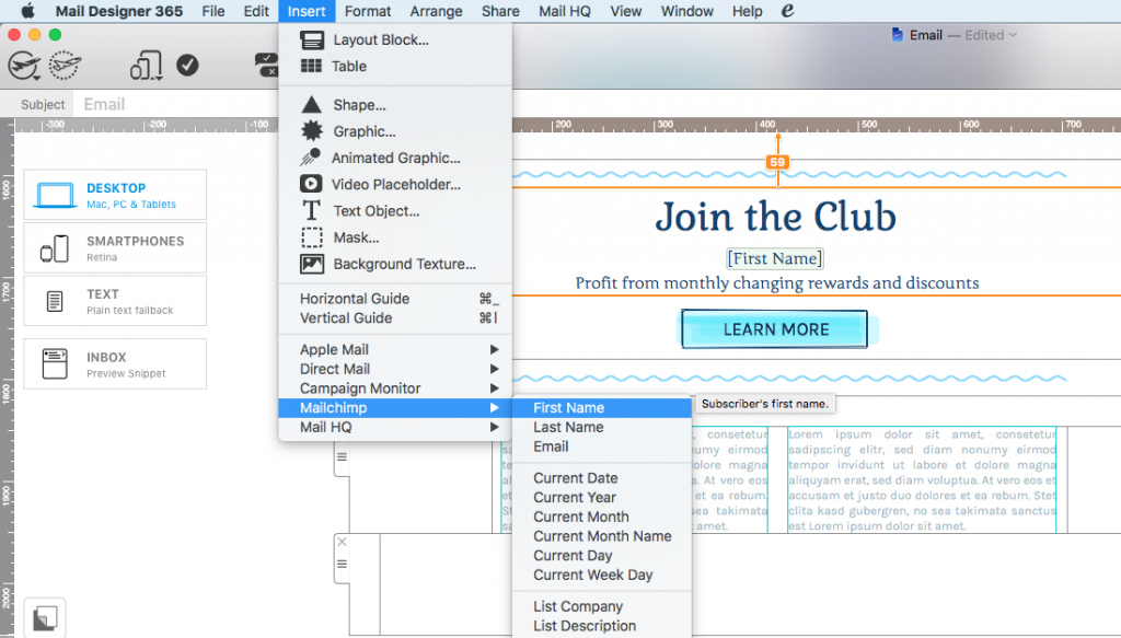
Insert placeholders directly in Mail Designer 365 to easily adopt personalisation into your feedback emails.
4. Make the action areas bright and clickable
Making the action areas in your email vibrant and colorful is another effective way to capture the customer's attention and keep them interested. CTA (call-to-action) buttons and ratings charts should look extra clickable, so they instantly stand out in your email and draw in the reader.
Quick guide: What makes a button "clickable"?
- Position - Central and hard to miss
- Size - Large enough to read, but not overwhelmingly big and spammy
- Color - Vibrant and stands out well against your email background
- Message - Clear and concise. The customer should know exactly what will happen when they click
This example by Insurify makes it super easy for customers to give a quick rating. The color-coded chart is just asking to be clicked. No reader could resist!
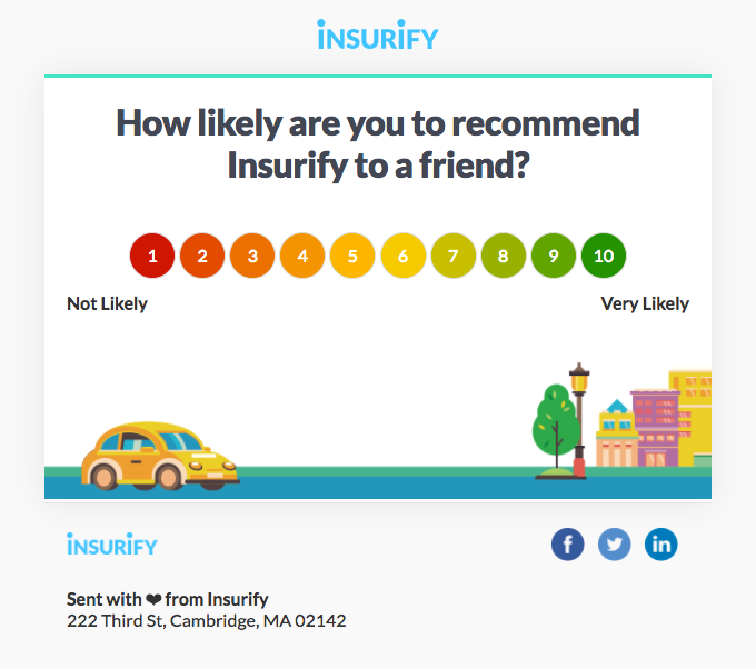
The color-coded ratings chart in this email is super straightforward and really clickable.
When you create your CTA for your survey, make sure to stick to these tips to ensure the button stands out and makes customers want to click. An extra tip would be to specify the duration of the survey just under the button. This way, readers know exactly what they are getting in to.
5. Offer a reward
If you want to go the extra mile to encourage your customers to take part in your survey, you may want to consider offering a reward. A much larger proportion of your customers will be willing to take the time to help you if they can see the benefit for themselves.
One reward you could offer is a special offer on your products. Ask customers to complete your survey in exchange for money off their next purchase. This strategy is used well by Tailor Brands. In this email, they offer a 50% discount in exchange for customer feedback:
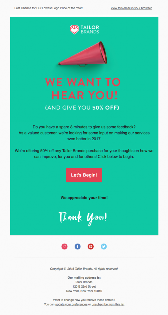
Offer customers money off their purchase in exchange for completing your survey.
Alternatively, if you want to offer a bigger prize, try tempting your customers with a competition or giveaway. Convince customers to take part in your survey in exchange for entry into a prize draw. The bigger and better the prize is, the more effective!
In this email, Morrisons offer customers the chance to win a seriously exciting prize of £1,000 to spend in their stores. Seeing an incredible prize like this is super tempting for readers and will increase the chance of them participating in your survey.
Tip: For bonus points, tease the grand prize in your subject line. This will surely result in an increase of your open rates.
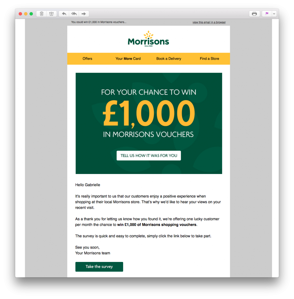
Get readers geared up to take your survey by offering the chance to win an exciting prize.
6. Make the survey process quick
Last but not least, you should also do everything you can to ensure the process is as quick as possible. You've gone through all the hard work of getting your customers through to your survey, make sure it pays off! Many customers will quickly lose interest if they feel your questionnaire is too long-winded. Here are some tips to help shorten the process:
- Prioritise - Although you probably want to know as much as possible, you should first determine what is most important to you. This will help you narrow down what you want to ask customers.
- Keep it concise - Overly wordy questions will only overwhelm and confuse participants.
- Make text-based questions optional - Answering multiple choice questions is easy, but not everyone has time to write long answers. Make your text-based questions skip-able, as some feedback is better than none at all!
- Give customers options - Similarly, if customers are pressed for time, they may not want to answer all questions. Build a cut-off point into your survey so participants can choose to end there or continue to more questions.
Survey emails made easy with Mail Designer 365
We hope you have found these tips useful and will take them on board when sending out customer surveys. Getting good quality feedback from your customers is the first step towards optimising your business.
If you want to find out more about what your customers really think, use the Customer Survey HTML email Design Idea in Mail Designer 365 to encourage your customers to give you the feedback you need to improve your business:
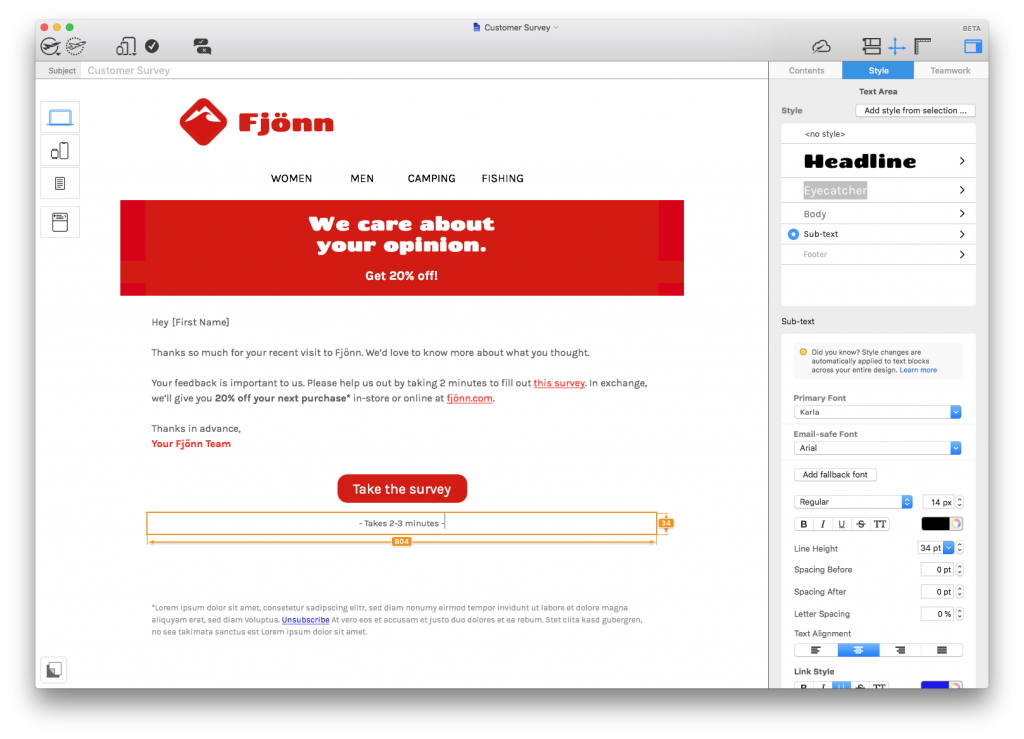
Try the Customer Survey HTML email template in Mail Designer 365
Not got a Mail Designer 365 plan yet? Download today for free to test this template and over 100 more.
Stay creative,
Your Mail Designer 365 Team
Subscribe for more great tips!
Please check and try again.
We've just sent you an email for you to confirm your email address, if you haven't already.
Hey Mail Designers,
We have a favor to ask of you. As dedicated app users, we really value your opinion and would love to know more about your experience using Mail Designer 365. If you could spare just 2 minutes to fill out this survey, we would be super grateful!
Nowadays there is a blog for everything. In fact, it is estimated that there are currently over 500 million blogs in the world!
For many, blogging is no longer a simple hobby or online diary, but a genuine business opportunity. As seen in recent years, a successful blog has the potential to gain a huge following and generate revenue through ads, merchandise, fan events, and more. For this reason, it's more important than ever for you to maintain your traffic, in order to stand out from competitors and allow your blog to succeed.

Get expert tips straight to your inbox!
Why should I consider email marketing?
Due to the sheer amount of content on the web, even if a reader stumbles across your blog and finds it super interesting, there's unfortunately not much likelihood that they will remember to keep checking back in the future.
This is where email comes in. Unlike social media, email is a more personal channel between you and your readers. Rather than competing in a sea of thousands of social media posts, you can use email to directly inform subscribers about your latest news.
This guide will tell you all you need to know about creating an email marketing strategy for your blog, as well as some useful tips and examples to help get you started...
Getting subscribers to opt in
The biggest challenge to begin with is building up your mailing list. To do this, you will need to get your blog readers to opt in to receiving your email updates. This is massively important, as GDPR regulation means sending unsolicited emails can land you with a hefty fine.
The simplest way to encourage your audience to opt in is by including a sign up box on your blog. Generally speaking, you should consider every visitor to your blog as a potential lead. If they are already checking out your blog, they clearly have an interest in your content and would likely be open to receiving email updates. We've included a few examples of how you can encourage more email opt ins below.
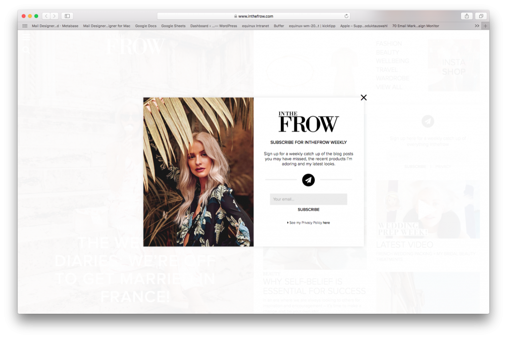
Lifestyle blogger InTheFrow has a pop-up window to make sure her readers don't forget to subscribe.
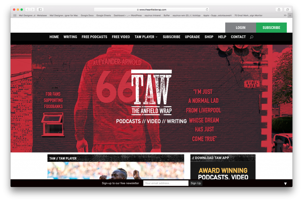
Football blog The Anfield Wrap grabs readers' attention with a prominent, green CTA (call-to-action) button at the top of the page.
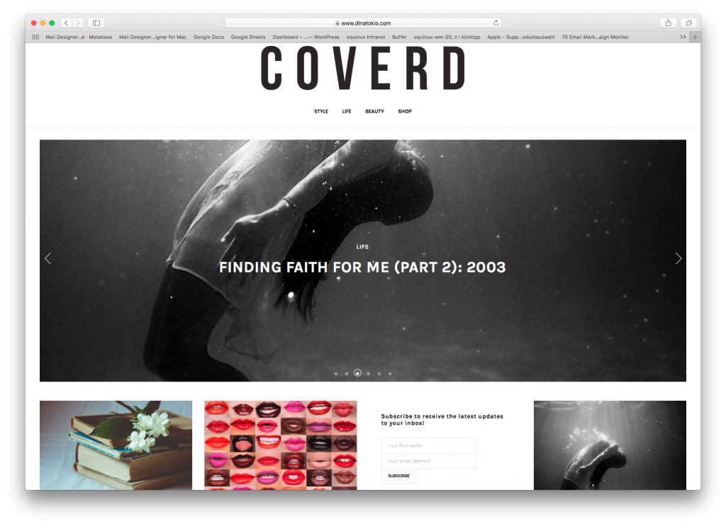
Fashion blogger Dina Tokio keeps things stylish by integrating this minimalistic sign up box into her blog content.
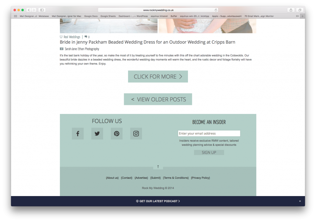
RockMyWedding keep things simple, yet effective with a sign up box in the website footer, alongside their social media pages.
Alternatively, if you really want to grow your list, you can also try to include an incentive to get your readers to sign up. Food blog Pinch of Yum offer their readers a free eCookbook when they subscribe to their email newsletter. For some, the promise of a free gift could be the deciding factor of whether or not to sign up!
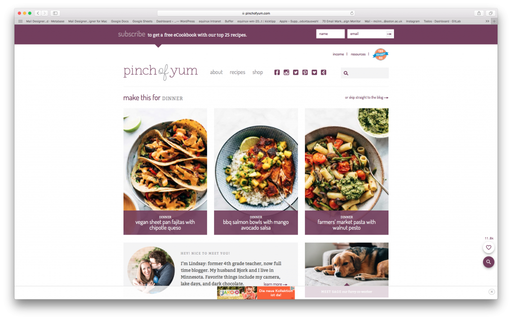
Pinch of Yum tempt their readers to sign up with the offer of a free eCookbook.
Drip campaigns
Now that you've started to get your list set up, it's a good idea to think about how you want to kickstart your email strategy. One great way to get new subscribers on board is by using drip campaigns. This is a set of pre-designed email templates which are automatically sent out after a specific event (e.g. signing up to your newsletter.)
One example of where this type of campaign comes in useful is the welcome email. Typically, after a reader subscribes to a blog, they will be sent an email to thank them for subscribing and welcome them on board. Setting up a drip campaign to be sent out across the first few weeks is a great way to introduce your new subscribers to your blog.
Here is an example set of emails you could send over the course of a few weeks:
- Thank you for subscribing
- Welcome email and introduction to blog
- Showcase most popular blog posts
- Sign up to social media
Remember, the key here is to find the right balance for your blog and your subscribers. Sending too many emails could act as a deterrent, whereas not sending enough could result in subscribers quickly losing interest.
Another way to improve your drip campaigns is by including personalisation. Using your subscribers' name not only makes them feel important, it also helps you capture their attention straight away.
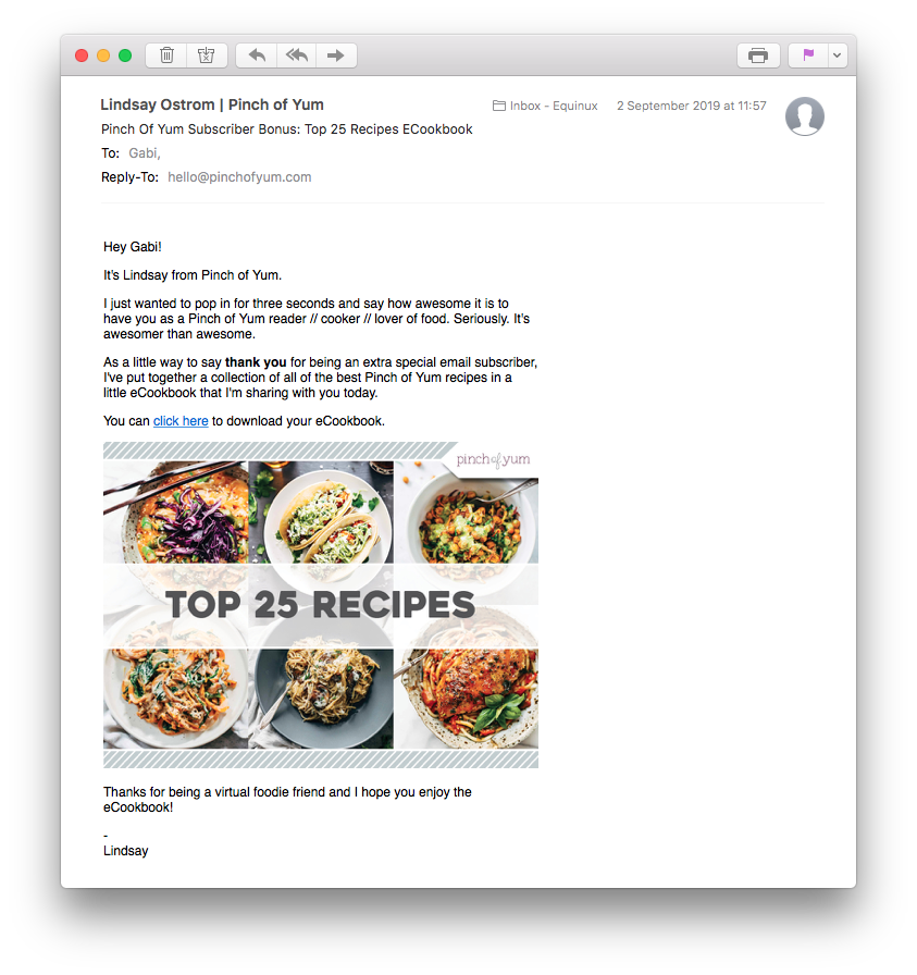
After subscribing to Pinch of Yum, I received this friendly welcome message. Although it's just a generic email, the personalisation made it seem like it was written just for me.
Other types of Content
It's important to remember that the work doesn't stop after you've completed your initial drip campaign! Use your email list to keep your subscribers engaged and interested in what's going on with you and your blog. Here are some further examples of emails you could send to your blog subscribers...
New blog post alert!
These types of emails are very important in terms of keeping subscribers interested. Tease your latest blog posts by showcasing a short extract in the email and don't forget to include a direct link to the rest of the article so they can keep reading! If you publish a large amount of content, you could consider sending subscribers a weekly digest of your newest articles.
Ultimately, regularly alerting your subscribers about your latest blog content is the best way to ensure they keep coming back and, with an effective strategy, you should notice a rise in impressions over time.
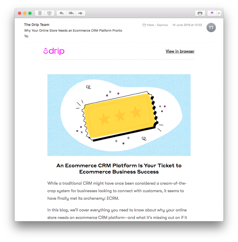
In this email by Drip, they've included an interesting snippet which encourages the reader to check out the rest of the blog post.
Giveaways or competitions
Hold a competition or giveaway to really get your subscribers ready and willing to engage with you and your blog. Announcing the giveaway in the subject line of your email is a guaranteed way to get your readers excited to open your email and increases the chance of them visiting your blog.

Photography blog Moment held this exciting $5k giveaway to celebrate International Women's Day.
Promotion or product launch
If you have an e-commerce business linked to your blog, or have merchandise for sale, you can use your email campaigns to promote this. Use email to showcase your latest products to an even wider audience. Remember to include lots of attractive product photos, as well as appropriate pricing and a clear link to buy from your site.
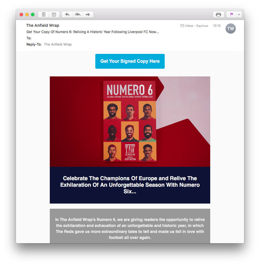
The Anfield Wrap do a great job of advertising this collector's magazine to their football-loving subscribers.
Final tips
With all those key points out of the way, here are some of our top tips for all emails, which you can bear in mind when working on your email strategy:
- Think about your subject line and snippet text. These are your best (and only) assets when trying to win over readers in their inboxes.
- Be sure to send a test mail or get feedback from a colleague or team member before you send. Mistakes are embarrassing and could damage your blog's reputation.
- Include a clear CTA (call-to-action.) Every email you send should have a clear intended outcome for the recipient e.g. purchasing a product, reading a blog post, etc. This helps you measure the success of the email.
- Avoid image-only emails. These are a great risk, as they could result in your email being deemed untrustworthy and getting sent to spam. They're also larger and can take much longer to load.
- Include a sender name. It's nice for your readers to be able to identify where emails are coming from. Anonymity doesn't do much for the friendly impression you're trying to create for you and your blog.
Remember to check out the rest of the Mail Designer 365 Newsletter Academy for even more tips, ideas and examples for your next email marketing campaign.
Until next time,
Your Mail Designer 365 Team
Get started with Mail Designer 365 today
As an email marketer, one of your biggest challenges is achieving successful open rates. Convincing subscribers to open your email when they first see it in their inbox can be difficult, as you are relying entirely on the strength of your subject line, as well as your customers' interest in your brand to try and win them over.
Put yourself in the customer's shoes. How many of the dozens of emails you receive each day do you actually open and read? Not many, right?
According to research from 2018, the average email open rate lies at around 17-18%. Although this sounds extremely low, it is a realistic figure to aspire to and anything above this should be considered a great success.
What influences open rates
There are a whole host of key factors which can impact upon your customer's decision to open your email. Here are some of the most significant aspects to keep note of:
- Key words and triggers: Using the correct key words can make a seasonal email campaign stand out in a crowded inbox.
- Brand identification: How likely are you to open an email from a brand or sender you don't recognise?
- Day of the week: Emails sent during the week may have slightly higher open rates, as people check their emails more whilst at work.
- Time of year: Sales and promotions may be more popular in the build up to the holidays, as people are actively looking for great deals.
- Deliverability: Naturally, emails that don't appear in the customer's inbox at all don't get opened. This means stay away from spam traps at all costs!
Keeping these influential factors in mind, following these five simple tips should help you achieve brilliant open rates and massively improve the success of your email campaigns...
1. Stay relevant
Because email providers such as Gmail have separate tabs for promotional, marketing-style emails, you will have to work hard to make sure your customers actually notice you in the first place. The best way to do this is by identifying the needs of your target audience.
Use detailed market research and customer analysis to find out what your target group is looking for. In doing so, you'll be able to highlight key words and concepts to include in your subject line and draw in readers.
New Look have been clever with this email subject line. University and Back to School are both massive seasonal topics. If you know your target group is students, mentioning this buzzword in the subject line is a guaranteed way to pique interest and hopefully increase open rates.
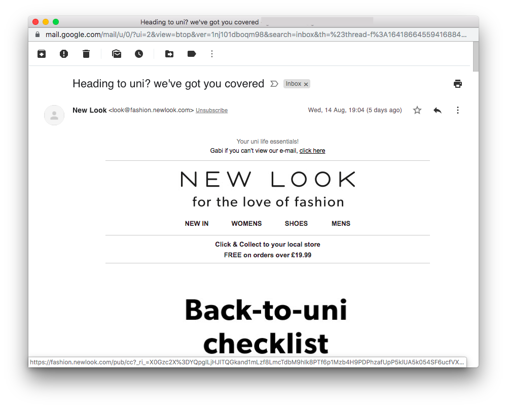
Use the relevant buzzwords for your target audience to entice them to open.
2. Use personalisation
It's one of the oldest tricks in the book for a reason! Using personalisation in your emails is a certain way to grab your readers' attention straight away. By capturing your readers' attention, you will also see a rise in open rates, as they will be curious to find out more.
Not only is it an instant eye-catcher, personalisation is also a great way to make your customer feel special and creates a sense of exclusivity.
Research by Deloitte suggests that including your customer's name in the email could increase open rates by over 5%. In this email from Booking.com, the use of the customer's first name instantly makes the subject line more eye-catching.
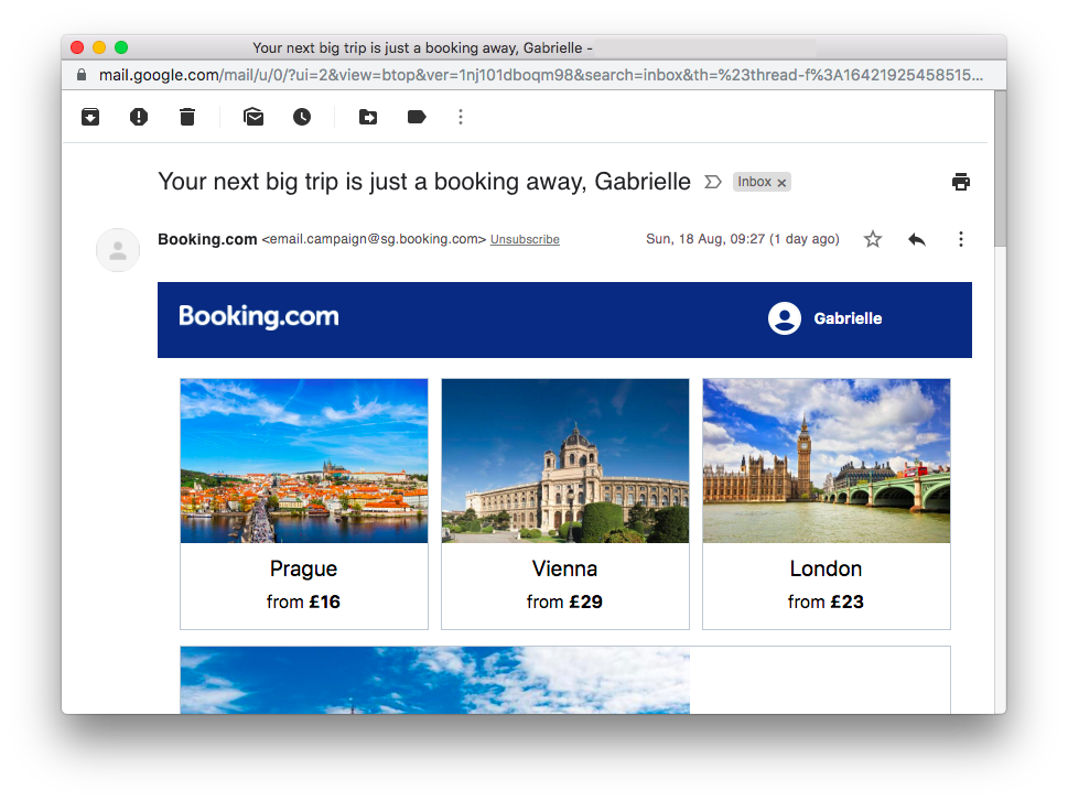
Using your customer's name in the subject line is an effective way to grab their attention and increase open rates.
3. Outline the sender
Nobody likes receiving emails from an unknown sender or no-reply address. As well as appearing untrustworthy, they're also confusing and prevent the recipient from connecting with the brand. To combat this, be sure to provide a from-address which readers will be easily able to recognise.
It's much more likely your customers will open your emails if they instantly recognise your brand in their inbox. Using your company name as the sender should improve your chances of increasing your open rates. As shown in the example, Thomas Cook always make sure their subscribers can immediately tell when an email is from them.
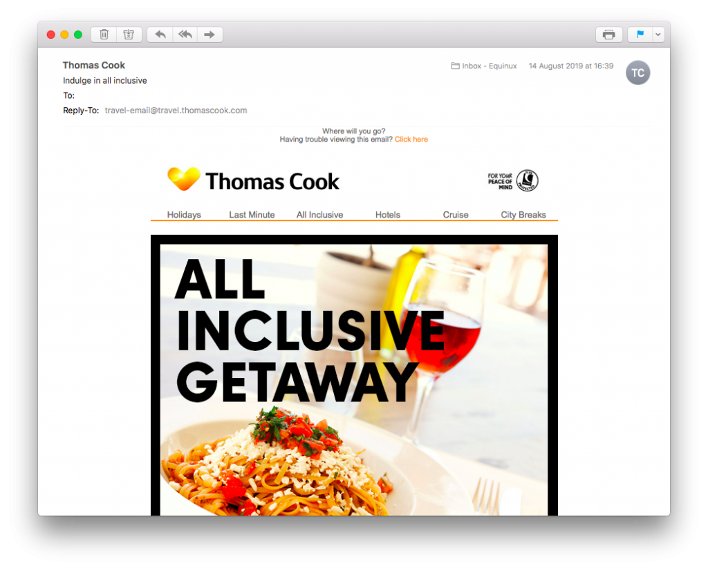
Thomas Cook always make sure you know the email is from them.
4. Have fun with emojis
In order to increase open rates, you need to think of ways to make your email stand out against competitors in your customers' inbox. Emojis are a fun way of adding color to your subscribers' inboxes. As well as helping you say more with the few words you have, emojis will help your email be more eye-catching to your customers.
This email campaign from Boots is a great example of how to effectively use emojis in your subject line. The fire emoji brings the heat to customers' inbox while also complimenting the rest of the text.
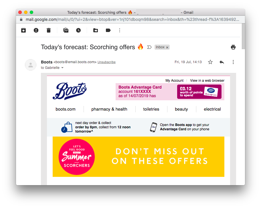
Adding emojis to your subject line makes it much more eye-catching for customers.
5. Include a snippet text
One common and unfortunate error made by many email designers is to leave out the snippet text. Your snippet text is your extra opportunity to sell your email to customers and gives you a chance to summarise your message for them.
In Mail Designer 365, you can use the inbox optimisation tool to craft the perfect subject line and snippet text for your email campaign. Your subject line will then remain visible at the top of the design window so you can view it alongside your design:
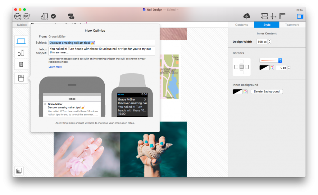
Craft the perfect subject line and snippet text with Mail Designer's inbox optimisation tool.
Key Takeaways
- Use tricks like emojis and personalisation to make sure your subject line is interesting enough to stand out in a sea of similar emails.
- Always include a recognisable sender name so customers know who you are.
- Keep your subject line concise and use clear keywords which are relevant to your readers.
- Use the snippet text to convincingly outline the main message of your email.
We hope you have found these easy tips for increasing your open rates useful and will keep them in mind when building your next email campaign. Want awesome emails that everyone wants to read? Download Mail Designer 365 free today and check out the inbox optimisation tool, as well as tonnes more exciting design features!
Until next time,
Your Mail Designer 365 Team
Get expert tips straight to your inbox!
Please check and try again.
We've just sent you an email for you to confirm your email address, if you haven't already.
The end of summer is drawing near, which can only mean one thing... Labor Day Weekend is coming up! It's time for you to get to work on building your email campaigns, with a little help from Mail Designer 365. Celebrate Labor Day in style with this brand new Design Idea - now available to edit in the Design Chooser...
Email marketing is a simple and affordable way for your startup to communicate with potential customers and showcase your product or service. In addition to being direct and efficient, email is also a super flexible channel that allows your business to try out different ideas for your marketing campaigns.
Here are some tips and ideas you should consider when building an email marketing campaign for your startup...
1. Build a Strong Mailing List for Your Startup
From a marketing standpoint, building your mailing list should be one of your key priorities during the early stages. For a startup, it is vital to secure a list of valuable contacts who will have a genuine interest in your business.
The main thing to remember when building a list is quality over quantity. Try and identify contacts who will be interested in learning more about your startup and are more likely to engage with your emails.
Include a sign up box on your website! Someone that has consciously made the effort to subscribe is a high-potential lead. Beauty box startup Birchbox use this technique on their website to help grow their mailing list. The 15% discount acts as an added incentive.
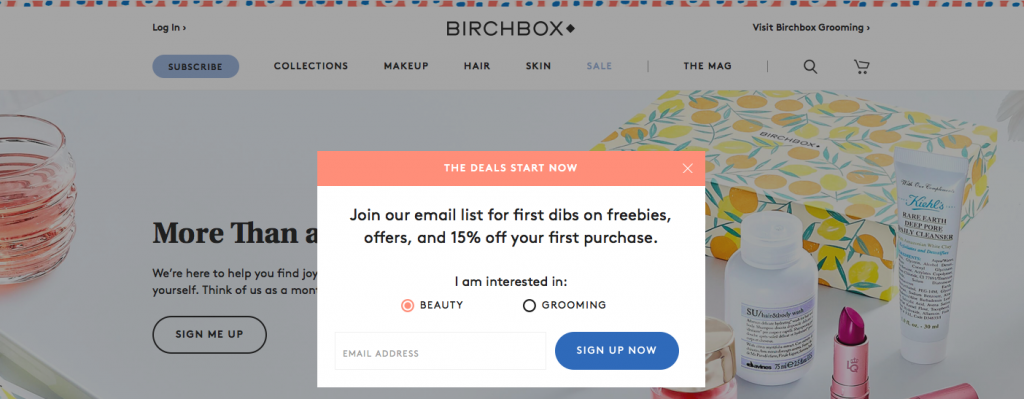
Birchbox include a pop up window on their site to encourage customers to subscribe to their newsletter.
2. Produce Good Email Copy
As a startup business, it is important that your emails are able to make a good impression on customers who don't yet know your brand. This means you have to pay extra attention to spelling and grammar, as well as the tone of your email messages.
Smaller businesses should adopt a more friendly and inviting tone, in order to help establish a connection with new customers. Let the personality of your startup shine through in your emails to give readers a sense of who you are.
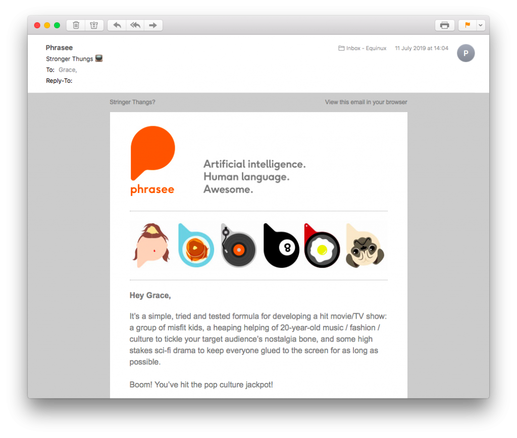
Phrasee's emails always include interesting copy which you can use as inspiration.
Good copy is also vital in your email subject line. Avoid spammy subject lines, as these could result in your email being ignored, or sent to the spam folder. Words like "free", "win", "cash", or use of all caps and excessive punctuation are all no-go's. This guide should help you prevent your email from being marked as spam.
3. Carry Out A/B Testing
For a brand new startup, it can be hard to find a marketing style that works. Email is great, as you have the opportunity to test out different ideas until you've found your perfect formula. This is where A/B testing can come in super handy.
Whether it's a subtle change like logo size or background color, or a more drastic change such as subject line or intro text, testing both variants with your mailing list is a great way to see what works and what doesn't. In Mail Designer 365, you can duplicate your master template and make as many different versions as you like to trial on customers.
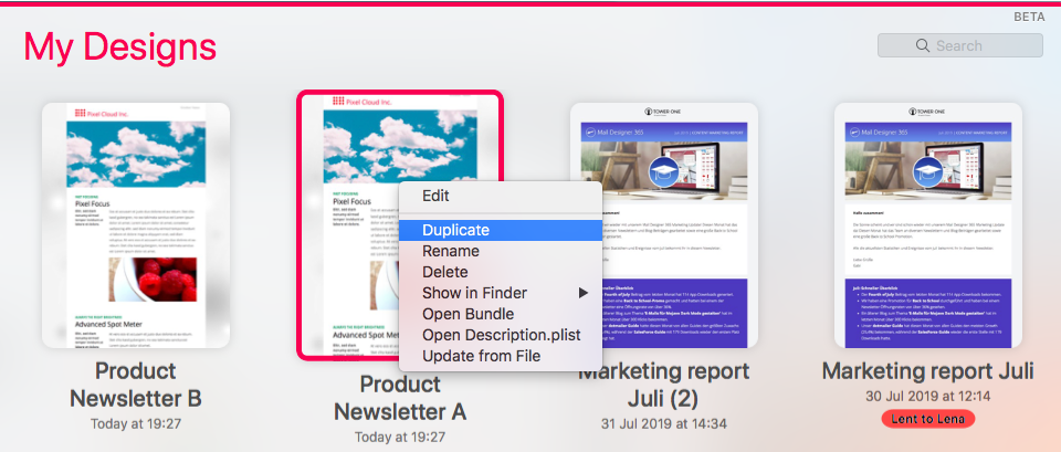
Duplicate designs to carry out minor changes and compare using A/B testing.
Tip: Make sure you track the results to identify which email design performed the best. Find out more about this later on in this post...
4. Include a Clear Call-To-Action
One common error made by businesses big and small is to create a stunning email design but forget to make the CTA (call-to-action) clear to readers. Without a clear CTA, your email will not reach its full potential, as readers will not be able to move on the the next step.
You can use a CTA button to encourage customers to: visit your website, download your software, subscribe to your social media page, read a blog post, and much more...
There are many ways to create stand-out CTA buttons, as demonstrated in this guide. The main tips to keep in mind are:
- Keep text short and concise
- Use a colour which stands out in your design
- Make sure the font is bold and legible
- Test all links are correct before sending.
The below email by Lyft (source: reallygoodemails) is a great example of an effective CTA button. The white button contrasts well with the blue background and the text is clear and concise.
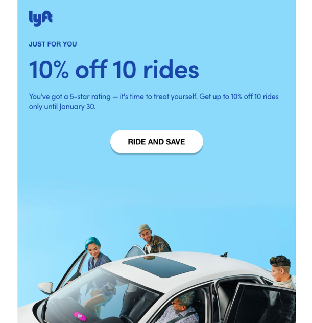
Lyft make their CTA super bold and clear in this promotional email.
5. Work Together with Your Team
For all businesses, your relationship with your colleagues and team members is one of the key factors for your success. During the early stages in particular, you should be constantly sharing feedback and ideas for potential email campaigns with your team.
Check out Mail Designer 365 Approval as a straightforward, efficient way to share email designs with your team and get all their feedback and comments in one place. The process could not be easier:
- Build an email template in Mail Designer 365.
- Upload to Approval and invite team members to make comments or suggest feedback.
- Carry out changes until your design is approved by your team and send via the app or your preferred ESP.
Click here to learn more about Approval and how you and your team can get started.
6. Concentrate on Transactional Emails
Transactional emails are the types of emails your startup will be sending most often to clients and customers. These cover anything from on-boarding emails, drip campaigns, order confirmation emails, or shipping emails, and generally contain the information your customers find most valuable.
Treat your transactional emails with the same amount of importance as any other sales campaign. They represent your startup on an operational level and should be clear and effective.
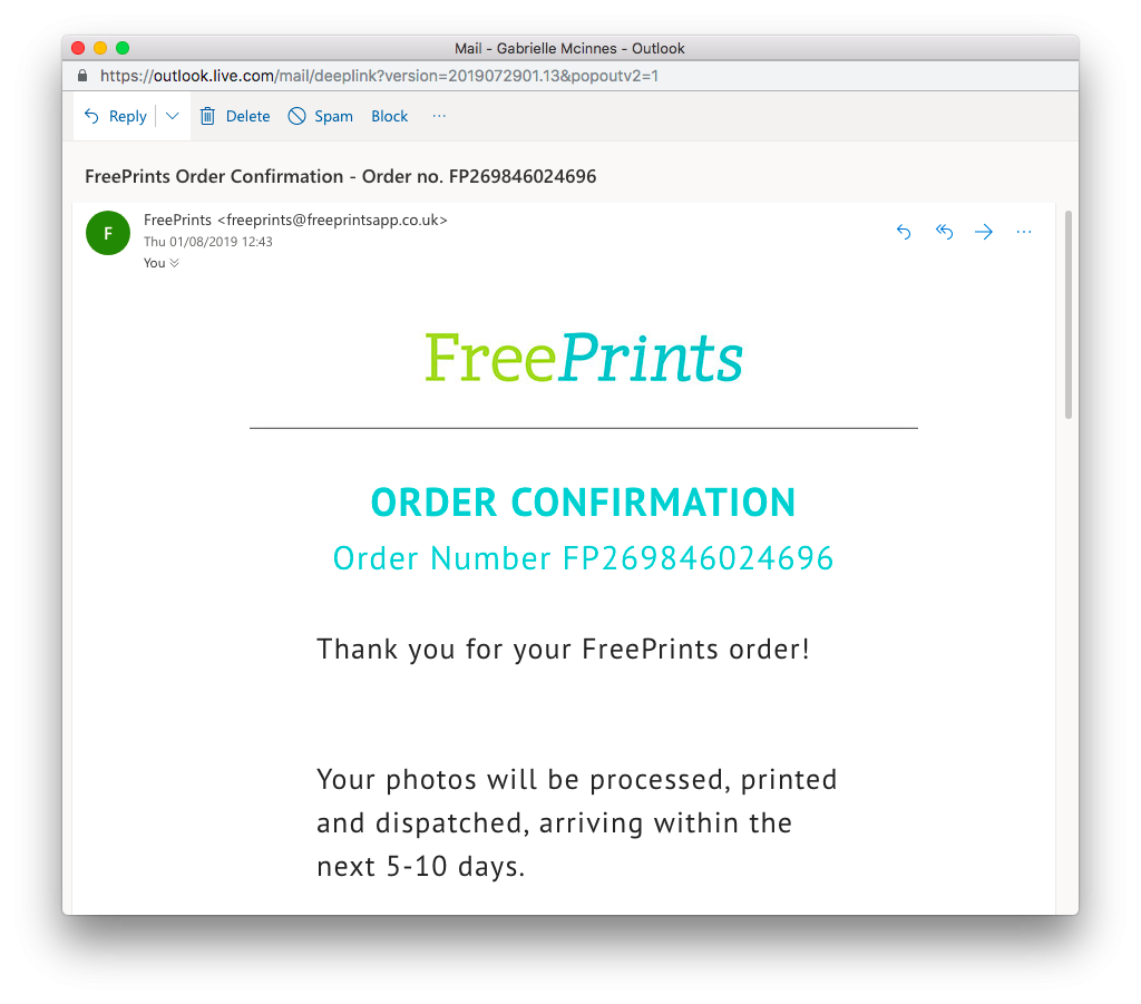
This order confirmation email from FreePrints is a nice example of a transactional email. The email represents the brand well in terms of logo and color scheme, and contains all the information the customer needs regarding their order.
7. Encourage Referrals and Testimonials
As a new startup, a great amount of your success will be based on how willing your first customers and clients are to recommend you to others. Before your brand becomes more established, you will find yourself heavily reliant on customer referrals and positive testimonials to attract new customers.
You can use email marketing as a way to encourage existing customers to share their experience of your business. Many companies operate referral schemes which offer the customer an incentive such as a discount, when they refer your business to a friend.
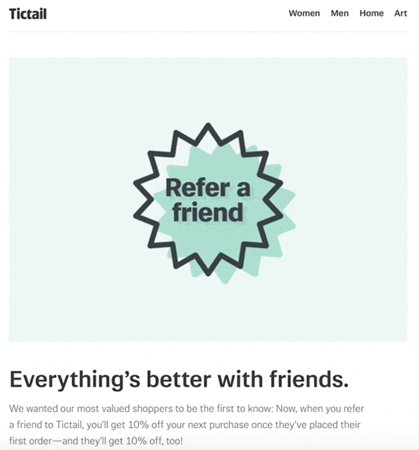
This email campaign from Tictail (source: reallygoodemails) is a great example of how you can advertise your referral schemes using email and build up a solid reputation for your startup.
8. Run Analytics for Future Improvement
Last but not least, just like any business, a startup business should always be looking for ways to improve themselves.
Using tools such as Google Analytics to analyse the performance of your newsletters is super helpful. For example, Google's campaign tracking links are easy to generate and are a great way to see how much one link (e.g. a CTA button) has been clicked in comparison to another.
Head over to Google Analytics to analyse the individual performance of your links. You can then use this data to determine which button style/message works best for future email campaigns.
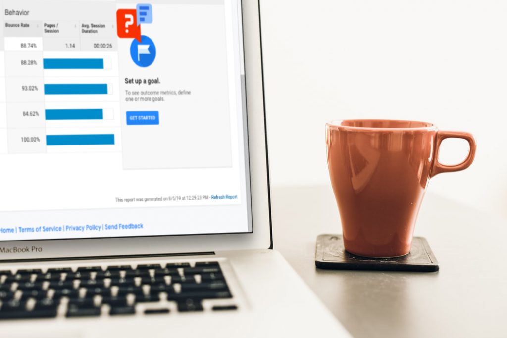
Use Google Analytics to track links, analyse performance and improve for the future.
We hope you have found this guide useful and will consider using these tips for your email marketing campaigns. Mail Designer 365 is the perfect email solution for startups and offers a wide range of tools and resources to help your startup business hit the ground running. Find out more about how we can help your startup here.


