Hey Mail Designers! We've got another new update for you which welcomes three brand new festive Design Ideas to the app, as well as some all important stability improvements. Here's everything that's new in Mail Designer 365 version 1.9.2...

Hey Mail Designers! We've got another new update for you which welcomes three brand new festive Design Ideas to the app, as well as some all important stability improvements. Here's everything that's new in Mail Designer 365 version 1.9.2...


Just like that, another 12 months have passed and it's time to start looking towards a new year. Working on a New Year email campaign gives you the perfect chance to refresh your marketing strategy ready for the coming months.
A new year gives you a blank canvas to start again after all that holiday hype. Take this opportunity to get inspired by these awesome New Year email campaign ideas which you could use for your business...
If you're stumped on what to say, or just want to keep things simple this year, the humble New Year greeting is for you!
A simple and sweet "Happy New Year" message like this one from SumAll is a thoughtful way to wish your customers all the best for the coming year. The fireworks motif is also super fitting for the exciting occasion.
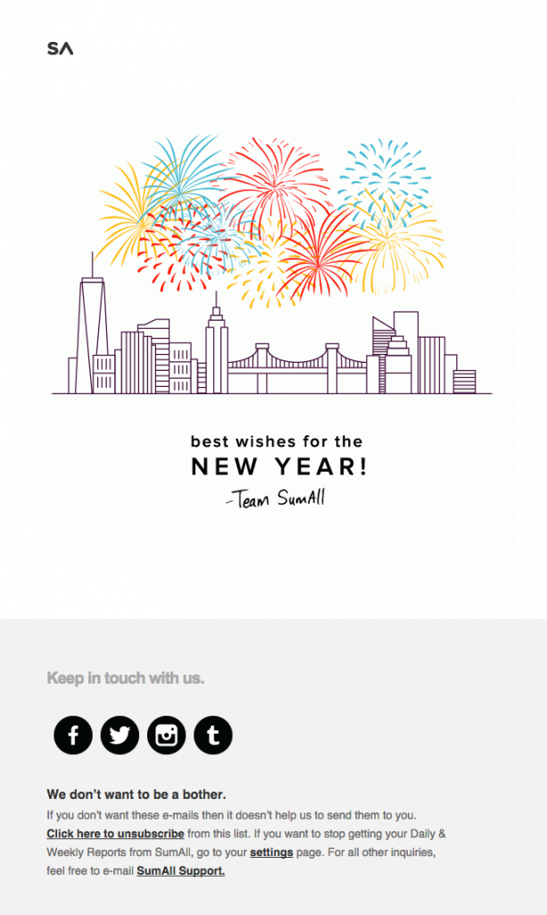
A simple New Year's greeting is always a safe bet for any business.
Think your customers are bored of sales? Think again! Everyone loves a chance to save money - especially after the holiday season.
Launching a sale or promotion to start the New Year is a great way to get your customers shopping with you again. In the run up to the holidays, your customers were spending money on gifts for others, now they can start treating themselves!
This design by Giraffe is a nice way to advertise their exclusive New Year promotion with their customers and get them dining in their restaurant.
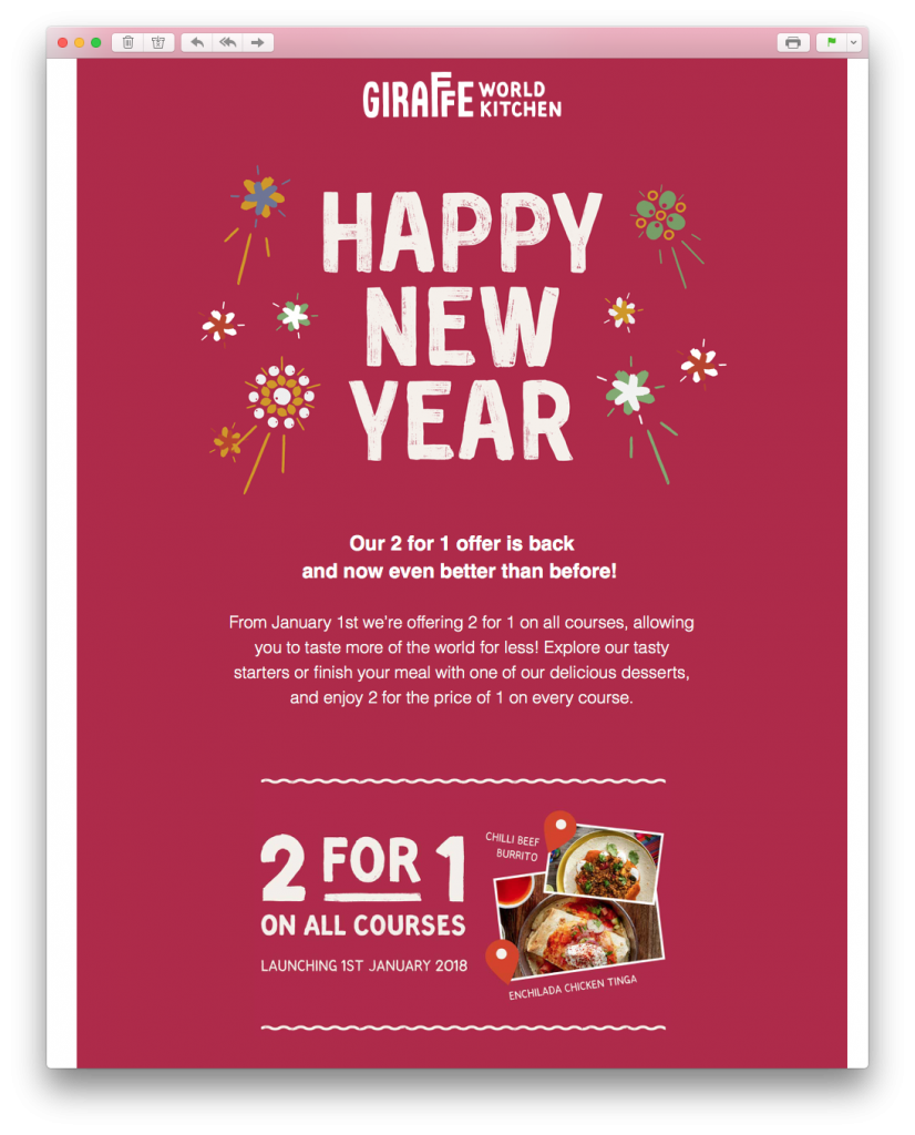
Launch a sale or promotion to celebrate the New Year with your customers.
Before we move forward to a new year, many of us like to look back. This is what makes the year in review concept great for your New Year email campaign.
Looking back on the previous year is a fun way to celebrate together with your customers. This could be significant events in your sector, important business achievements, or the customer's personal milestones.
This email is a nice take on the year in review concept. Boohoo invites customers to look back on some of their best styles by including images of influencers and celebrities wearing their clothes.
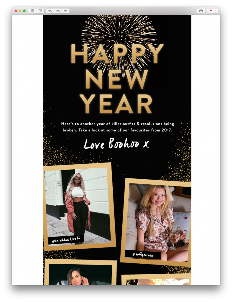
Celebrate the start of a new year by looking back on the previous one.
Each year, many of us make New Year's resolutions to try and better ourselves. If your business can play on this, it would be a great theme for your New Year email campaign.
Popular resolutions include reading more, working out, learning a new skill, or finding a hobby. Try and find ways your business can capitalise on this and encourage your customers to get on board.
This inspiring example by Duolingo is perfect for anyone wishing to improve their skillset in the coming year. The simple layout and bold CTA (call-to-action) help customers get started right away.
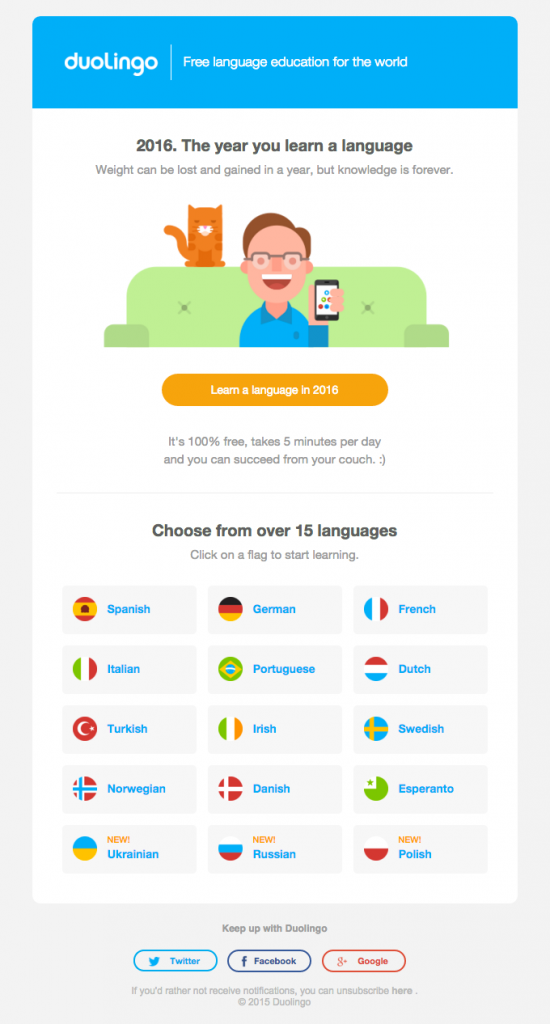
Use your New Year email campaign to inspire your readers to make good on their New Year's resolution.
If your business operates in the travel and tourism sector, a New Year email campaign gives you the perfect opportunity to get your customers booking a trip.
The New Year means new adventures for many of us. Use striking feature images and bold, eye-catching headlines to really target readers experiencing wanderlust.
This email by tripadvisor certainly gets readers excited about the prospect of a holiday. The bold "Where will you travel in 2019" headline is also super direct and personal; getting straight to the point.
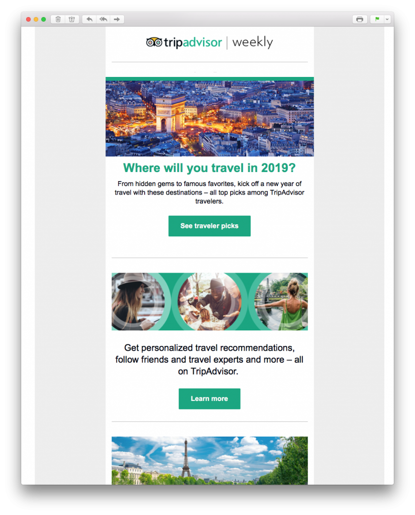
Tempt customers with an exciting trip to look forward to in the New Year.
This New Year email campaign idea is particularly effective for the fashion and beauty industry. Encourage your customers to try something new this January and use your email to showcase the latest trends to them.
This email by New Look is all about the neon trend and encourages customers to add some color to their wardrobes for the coming year.
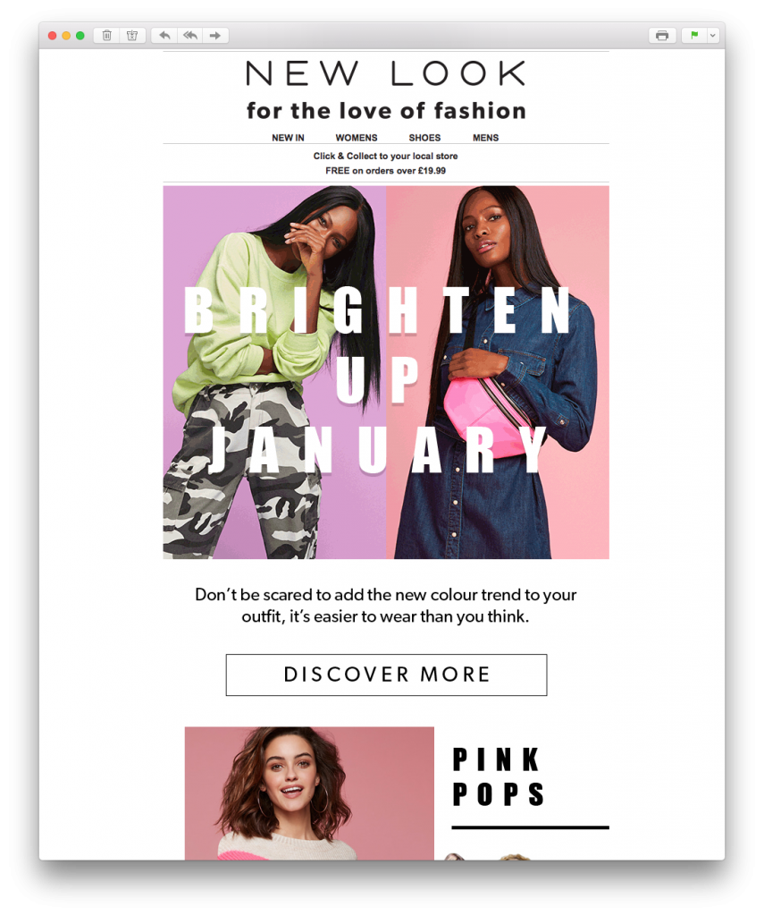
Encourage customers to get adventurous and try out some daring new styles in the New Year.
We hope we've managed to get you inspired in time for the New Year. You can try out all of these New Year email campaign ideas in Mail Designer 365.
Sign up for free today to test the app and discover all of the creative tools and design resources you need to build your New Year email templates.
Happy New Year!
Your Mail Designer 365 Team
Last year we took an in depth look at some of the email trends we noticed over the "Black Friday" weekend. We had so much fun analysing all the email marketing campaigns (#EmailGeeks) that we couldn't resist doing another one this year. Here's our 2019 roundup of everything that went down in the world of email marketing...
Hey Mail Designers! We're back with a brand new update for you and this one's definitely not one to miss. As well as some important fixes and performance improvements, version 1.9 also introduces an exciting new design feature to the app that allows you to create stunning image effects...

Although they aren't as flashy as the sales email, transactional emails are, without a doubt, the cornerstone of your email marketing strategy. Building an automated email strategy based on just a few transactional email templates will not only save you time, but also help you achieve important marketing goals for your business.
Transactional emails are triggered by customers carrying out certain actions, reaching specific milestones, or completing events which you deem important to your business. Because of the clear cause-effect relationship, it's easy to integrate these types of emails into your standard marketing strategy to specifically target certain types of customers.
Here are 5 easy-to-implement use cases for the humble transactional email that you can adopt for your email marketing arsenal to drastically improve your business's performance in multiple areas.
Mastering the onboarding process is crucial for any business; making your welcome email one of the most important you will ever send.
Sending out an email when a customer signs up to your newsletter or creates an account for your service is a great way to welcome them into your community. Here are three key things to include:
Use the welcome email to introduce new customers to your business and show them how to get started.
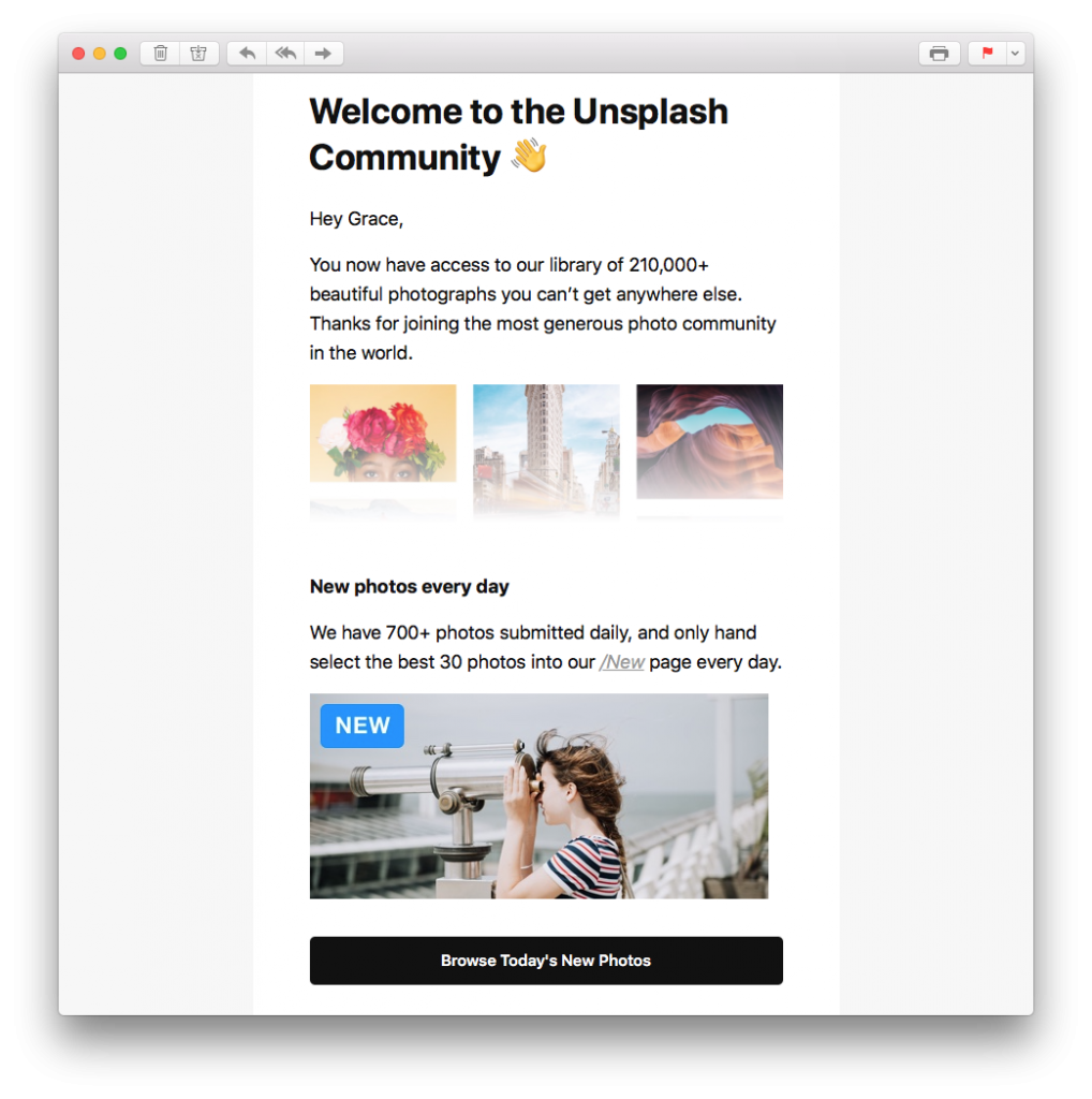
This welcome email from Unsplash ticks all the right boxes and shows users how to get started browsing the latest photos straight away.
Whether tangible products, software, event tickets, or something else, if your business is selling something, you need to include the purchase confirmation email as one of your transactional email templates.
When making an online purchase, customers naturally seek more reassurance than in a physical store where there is a clear exchange of goods for money. A purchase confirmation email acts as a receipt and also confirms to the customer that their transaction was completed successfully.
Be sure to include all of the important information including product ordered, price, payment method and delivery date so that the customer has this for their records. It is also a good idea to include your contact information in case the customer has any questions about their order.
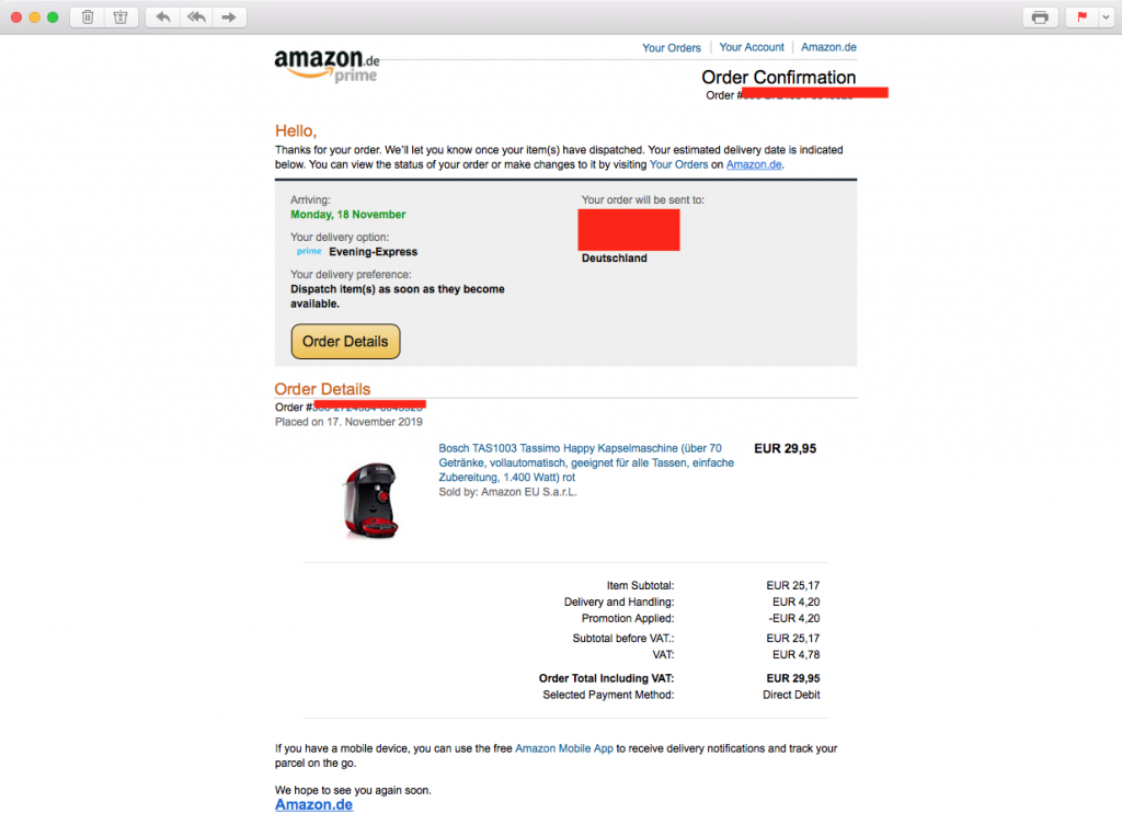
This email by Amazon contains all the most important information the customer needs concerning their purchase.
The subscription model is becoming more and more popular. Take Netflix, Spotify, Adobe, etc. as an example. Because many of us use so many different subscription services, it is a good idea to remind users when it's time to renew their license for your product. Not only is this a helpful gesture, it also helps prevent you losing out on customers because they've forgotten to renew.
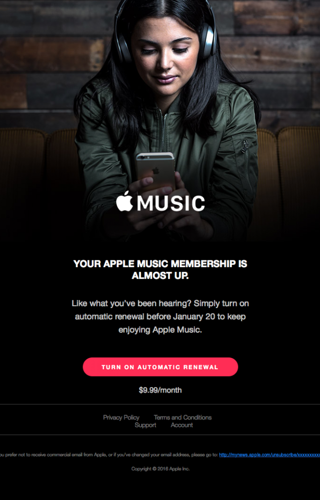
Apple Music keep things short and simple in this renewal prompt. The CTA (call-to-action) button also takes the customer right to where they need to go.
Many services auto-renew without the customer having to do anything. It is also important to remind your customer that their auto-renewal is about to occur, as they may wish to make changes to their subscription details. You'll definitely thank yourself later when you're not receiving complaints and refund requests.
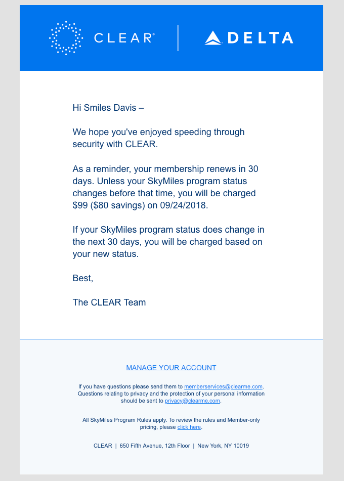
As shown by Clear, reminding your customer about auto-renewals is not only the decent thing to do, it also helps to reduce complaints and refund requests later on.
We've talked about this in detail before, but an abandoned cart email is also a super important part of your transactional email strategy.
Rather than missing out on potential sales opportunities, make sure to encourage re-engagement wherever possible. Keep track of incomplete transactions and send out a friendly reminder to your customer to pick up where they left of.
In many cases, customers may have simply become distracted or forgotten to finish their order. Even if just a small percentage choose to resume their purchase, sending an abandoned cart email is a good way to maximise all potential sales opportunities.
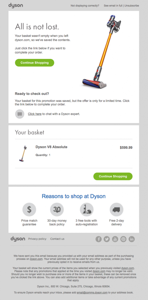
Dyson make it easy for customers to continue shopping with a bright CTA. Including the key product details is also a good way to help jog the reader's memory.
Feedback is the key to optimising your business to suit your customers' needs. For this reason, including some form of feedback request in your transactional email collection is also a good idea.
Here are a few examples of things customers could do which may trigger the need for you to collect feedback from them:
Sending customers a quick request for feedback after they've carried out certain events is a good way to determine how to improve your product or service for your target audience. The key to a good feedback email is to keep things concise and to send on time so the experience is still fresh in the customer's mind.
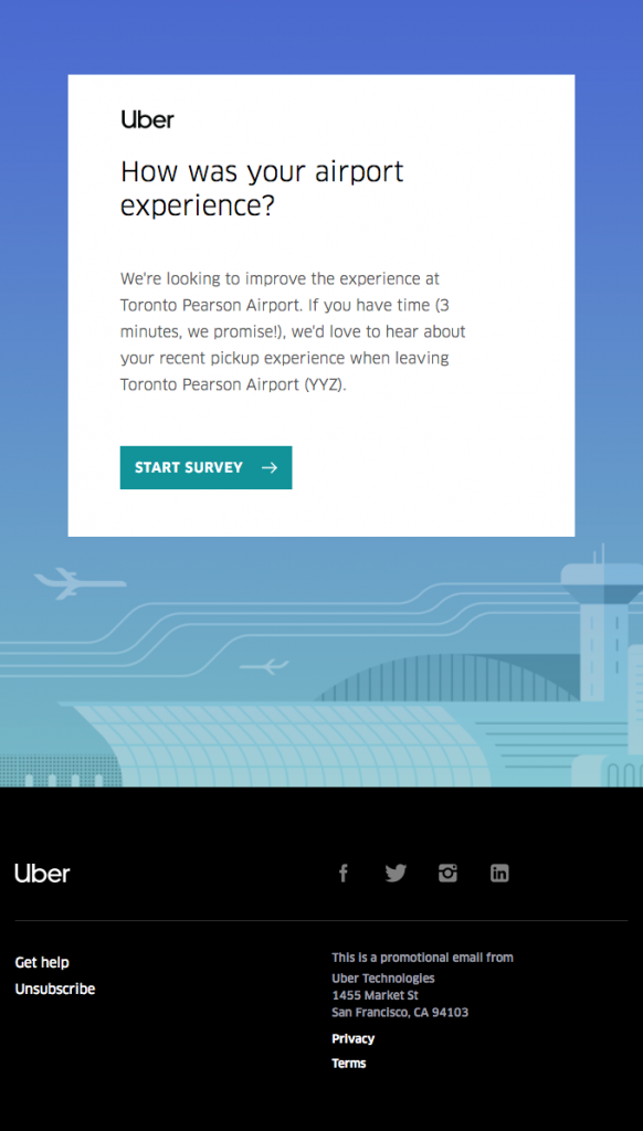
This email by Uber is nicely worded and allows the customer to give them a direct response about a specific topic.
As well as a stylish selection of easy-to-adapt, ready-made transactional email templates to fit all these use cases, Mail Designer 365 also provides you with all the creative tools you need to design effective transactional emails from scratch. This post shares some important tips about what to include when designing your own transactional email templates.
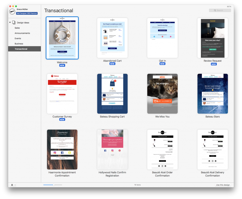
Mail Designer 365 offers you an array of ready-to-send transactional email templates.
Once your template is ready, explore a variety of export options to use it with the automation tools provided by your chosen ESP. Export directly to Mailchimp, DirectMail or Campaign Monitor, or export your design as HTML to use with all leading ESPs and marketing tools.
Not got a Mail Designer 365 Plan yet? Sign up to Mail Designer 365 today for free and start creating transactional email templates for your automated email strategy.
Until next time!
Your Mail Designer 365 Team
The hottest shopping event of the year is just around the corner and this year, we want to make it your biggest ever. Check out these two brand new Design Ideas which you can use to make your Black Friday email campaigns better than ever before...
There's no denying that the online fashion market is massively on the rise. In the last few years, dozens of fashion websites have appeared and their popularity has skyrocketed. What is it that makes them so successful and how can you mimic this success for your own online boutique?
One of the major keys to success for massive online fashion brands is a water-tight email marketing strategy. Email is proven to be an effective converter. In fact, a study by SaleCycle showed that 50% of respondents claimed to buy from marketing emails at least once a month. Nailing your email marketing strategy is the best way for you to guarantee more website traffic and, in turn, more sales.
However, as a smaller online boutique, it can be challenging to get up and running with an email marketing strategy. Creating an email campaign to rival the big guns is hard; especially when they're so experienced and have been in the game so long.
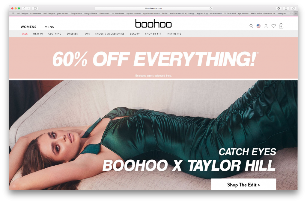
Creating an email marketing strategy to compete with the likes of huge online retailers such as Boohoo seems impossible.
To help you out, we've done some digging to try and find out more about the techniques used by some of the leading brands in the online fashion industry. Get inspired and adapt your email marketing strategy using example emails from online giants such as Boohoo, ASOS and Missguided.
Here's how you can learn from the best and use email marketing to boost sales for your online boutique...
In order to perfectly optimise your emails for your recipients, you first need to know who you are sending to. It's important not to think of your customers as one homogenous group. It's also important that you make email content specific and don't try to create generalised emails to suit multiple readers.
Find out more about your customers during the newsletter sign up process. Asking a few quick and straightforward questions is a useful way to get the information you need from customers to make your emails better for them.
On their website, Zalando asks customers opting in to receive the newsletter whether they are interested in men's or women's fashion. Knowing this information allows Zalando to send them the email content most relevant to their shopping preferences:
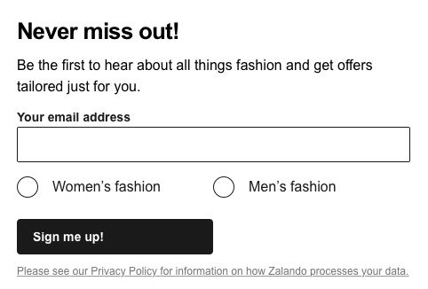
Find out more about your customers' interests and preferences during the sign up process.
You should also consider giving subscribers the chance to determine the email content they want to receive from the get go. This increases the likelihood that they will stay subscribed, as the content they're receiving is content they have actively shown an interest in.
During the sign up process, ASOS allows new customers to choose which types of email newsletter they want to receive. They also go the extra mile by including a brief explanation of each newsletter type. This kind of clarity is something readers will definitely appreciate.
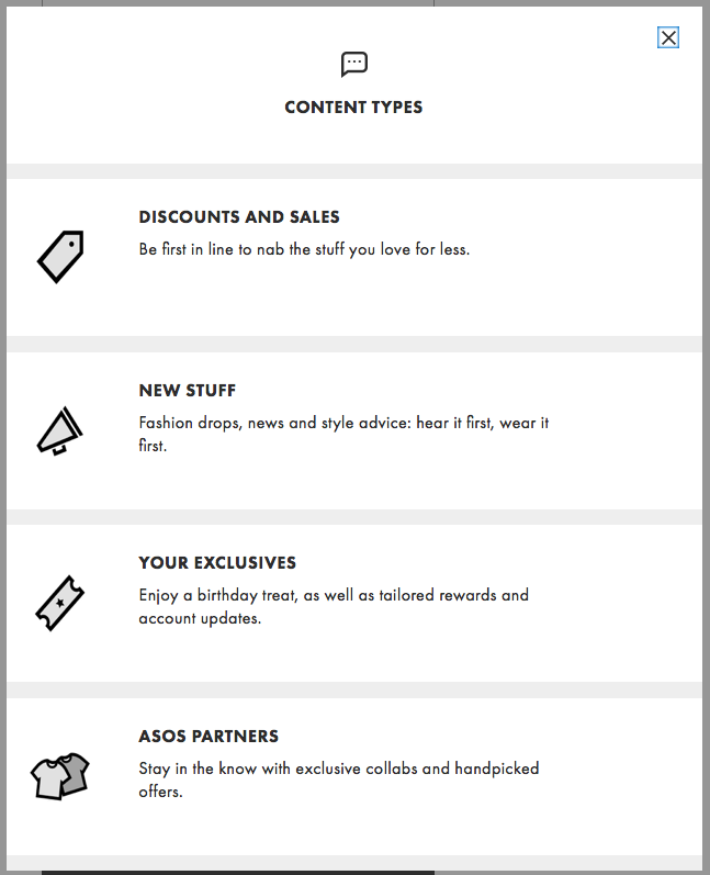
Let customers determine the content they will be receiving to help prevent them from unsubscribing in future.
Getting your customer to sign up to your mailing list is just the first step. Entice them to make their first purchase on your online boutique by sending out a tempting welcome offer.
Whether it's a percentage discount, $x off, free shipping, or a special free gift, any kind of special offer will act as an incentive for new customers and encourage them to get shopping.
Moreover, a welcome offer is also a nice way to thank new customers for showing an interest in your site and will hopefully help keep shoppers interested and engaged with your business.
I Saw It First treat subscribers to an impressive 50% off in this great example of a welcome email. This huge discount is bound to get more customers browsing on their site to see what they can save money on:
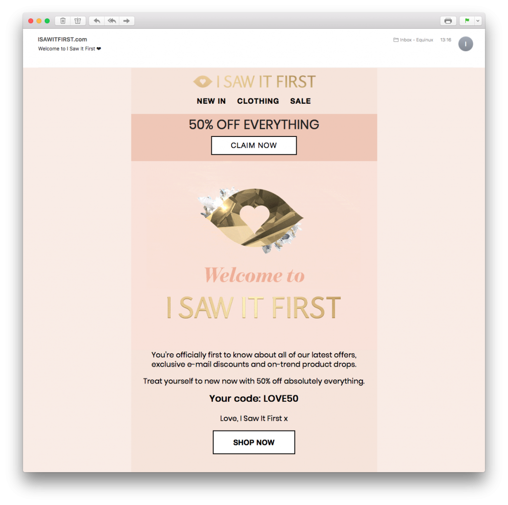
Tempt new customers into making their first purchase with an exciting welcome offer.
One common denominator between the most successful online fashion retailers is that they all have a strong presence on social media. Social media is a great platform for brands to interact in a fun way with customers while also gaining more exposure (e.g. through viral posts and ads.)
In particular, Instagram is a great platform for any online boutique, as it gives you the chance to share your best new styles with a huge audience. The Instagram shopping feature also lets your followers directly shop products you feature in your posts, which is a super modern and convenient shopping workflow. Don't forget to also use relevant hashtags for more visibility.
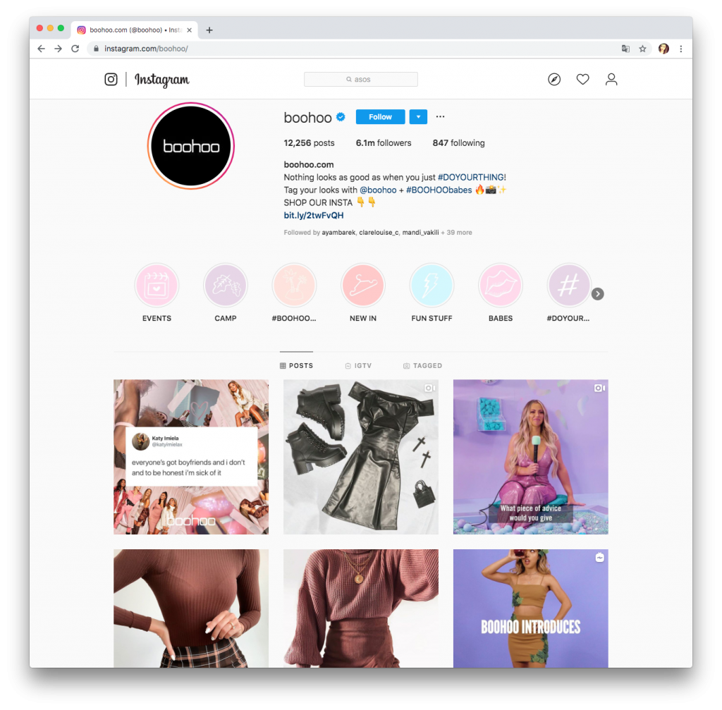
All the big online fashion brands also have a strong social media presence.
Combine your social media marketing with your email campaigns for maximum exposure. Include a link to your Instagram or Twitter page in your email to let your subscribers know of other ways to keep updated.
This welcome email by Nasty Gal has a whole section dedicated to their Instagram page. Here they showcase their latest Instagram posts and include a direct link to follow them. This is much more effective than a simple icon in the footer and really puts the emphasis on online engagement:
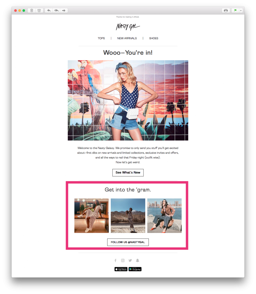
Use your emails to also draw attention to your social media pages.
As a fashion brand, optics are everything. This is why your newsletter designs need to be on point.
When it comes to creating email designs, don't be afraid to take a few risks and opt for bright colors and fun styles. All of the major online retailers are well known for their daring designs, as it's what gets them noticed by customers. Here are a few bold examples:
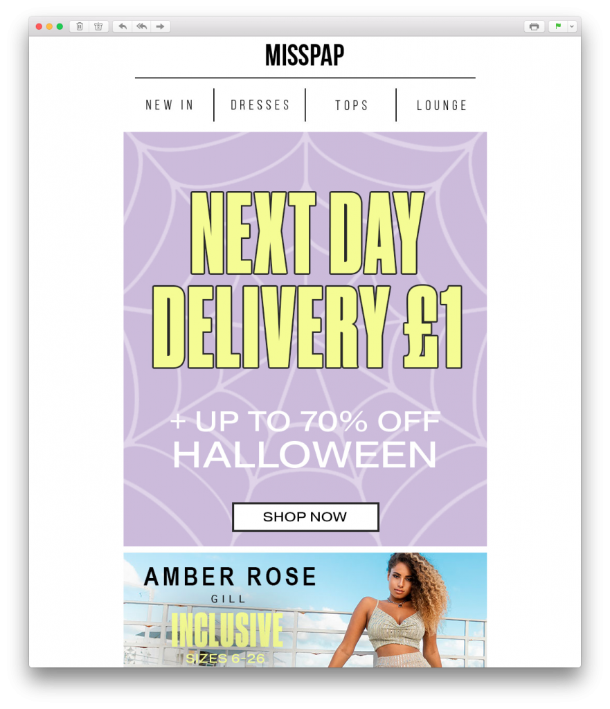
MissPap wow customers with this Halloween themed design.
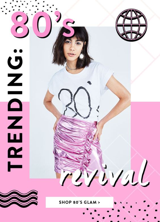
Boohoo are taking customers back in time with this retro email design.
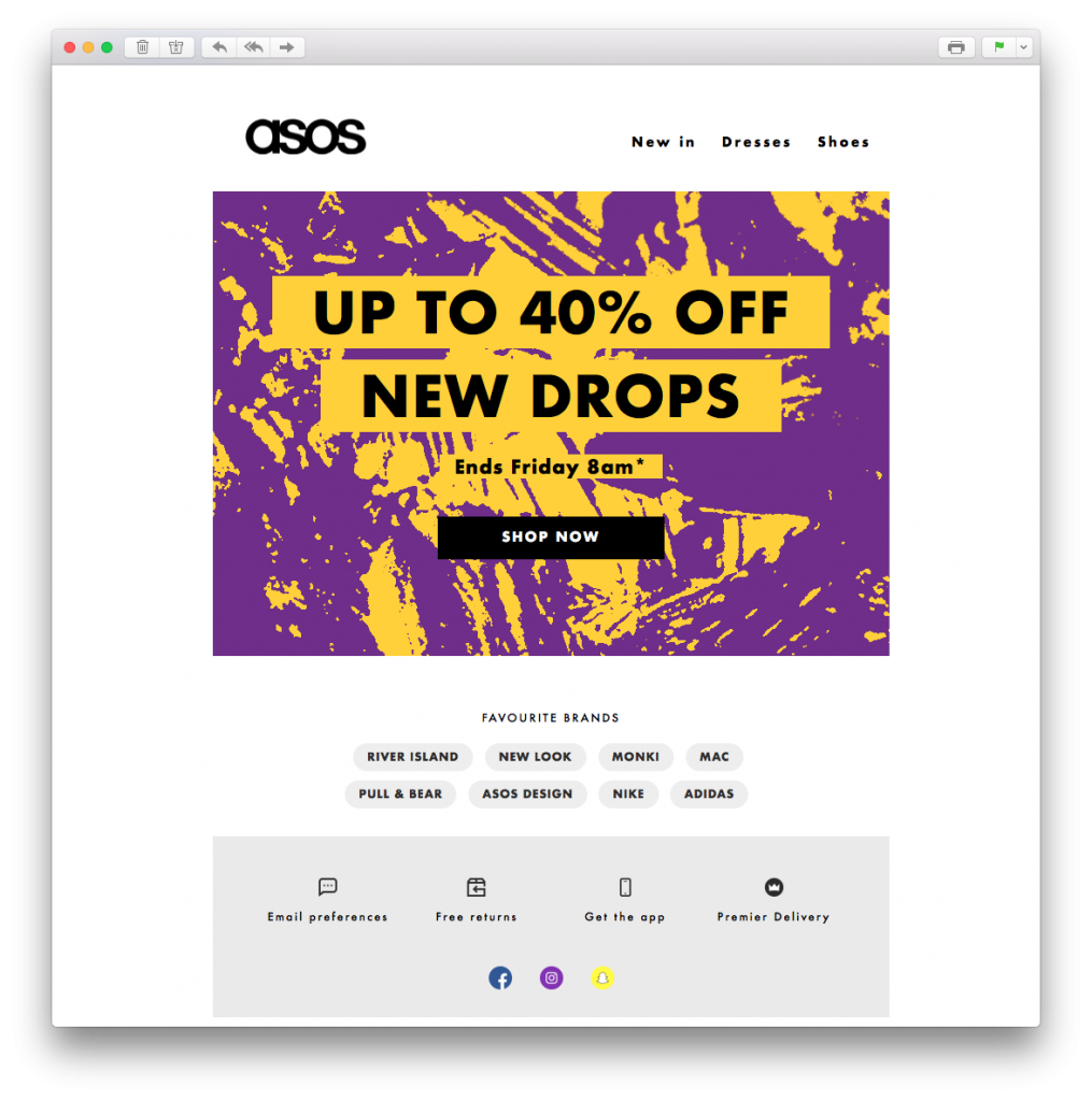
ASOS get daring with color in this bright design.
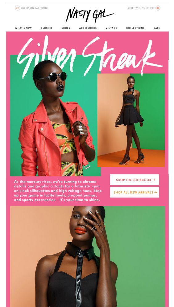
Color blocking works well in this email by Nasty Gal.
Unless your customers are actively looking for specific items of clothing, you will need to work hard to keep them coming back to your site regularly. One of the most effective ways of doing this is by holding sales and promotions.
We al love a good sale. The chance to save money and get great deals is often far too tempting. Moreover, many customers will inadvertently end up spending more money in the sale if your offers are too hard to resist. Not only will this increase your sales revenue, it also keeps traffic flowing back to your site and helps you stay relevant to your customers.
Boohoo shows that you can hold a sale for any given occasion. This payday sales concept is clever, as customers will be more willing to splash the cash on new clothes just after they've been paid:
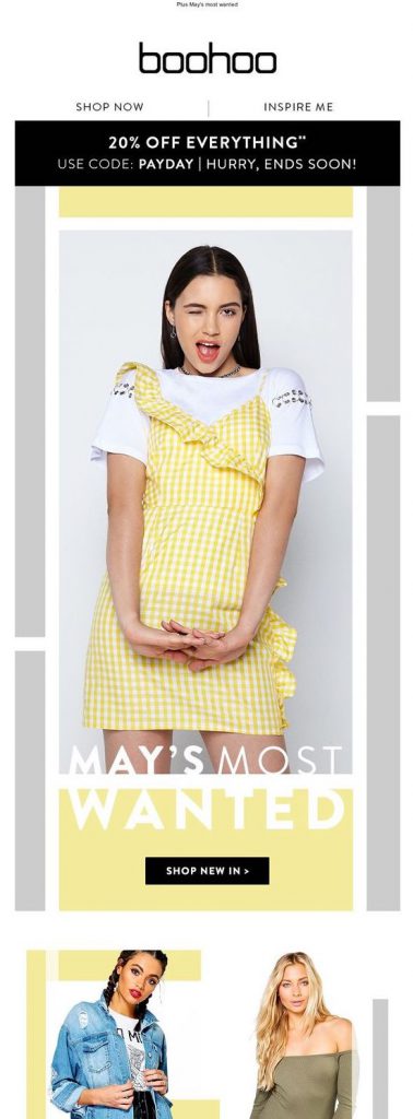
Hold sales and promotions on a regular basis and keep traffic coming to your site.
Another way to keep customers coming back to your online boutique is by keeping them informed of your newest items. Your subscribers opted in because they're interested in your brand and what you have to offer. Use your email newsletter to showcase your latest drops and get readers browsing your website for more.
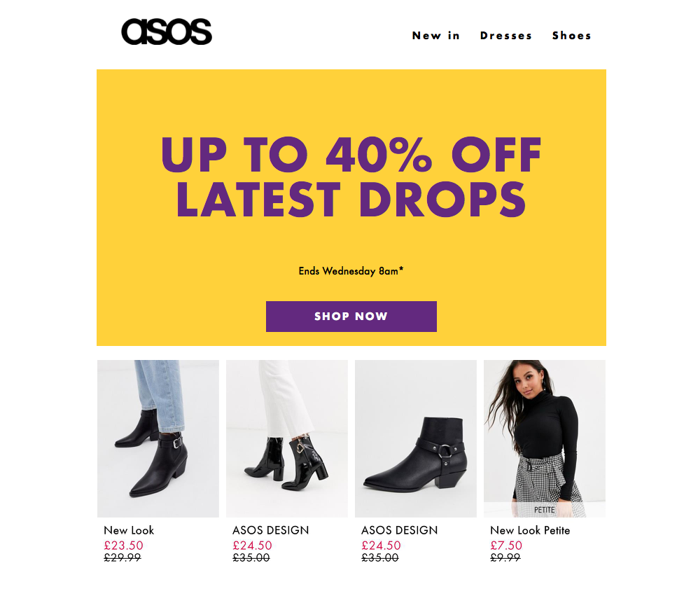
Tempt customers to browse your site and discover more of your new additions.
Keeping customers informed whenever you have re-stocked a product or collection is also vital. After all, if a customer doesn't know the product they missed out on is back in stock, they're not likely to actively go looking for it.
Emails such as this one from Missguided are exactly the reason why many subscribers signed up to your list in the first place. Being the first to know about new products or re-stocks means that customers won't run the risk of missing out.
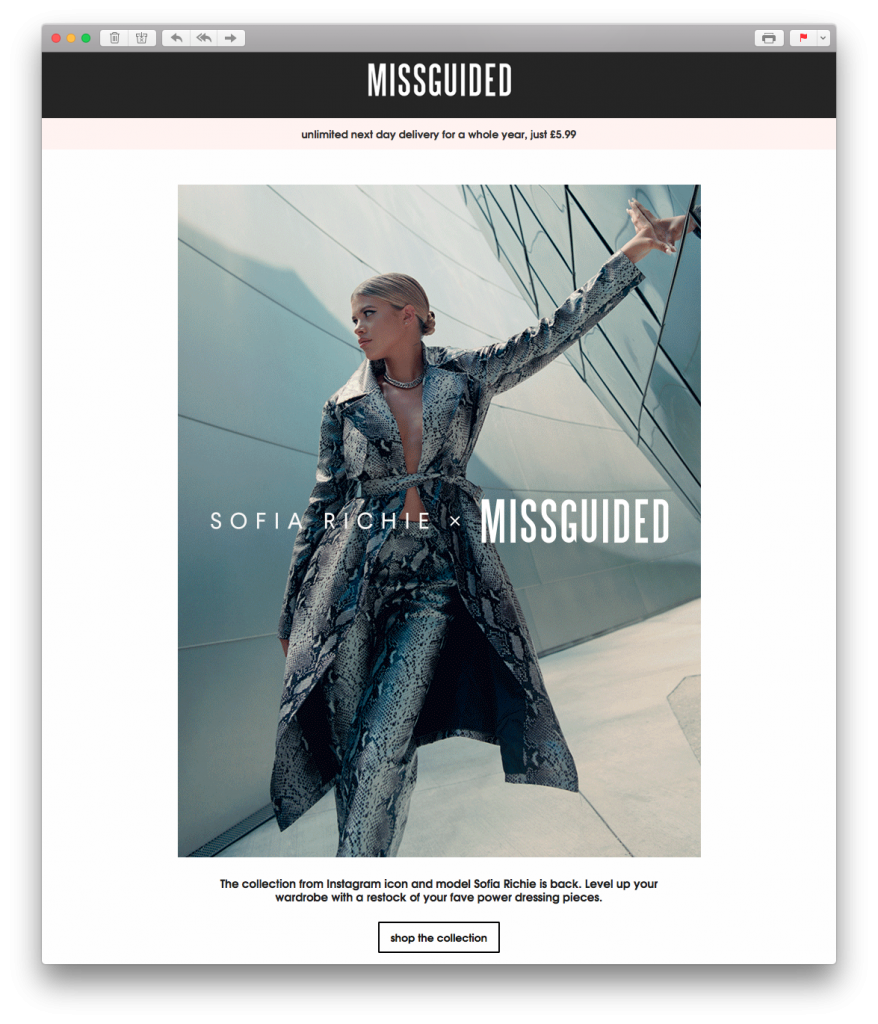
Keeping your customers informed about re-stocked products is a great way to keep them engaged with your site.
Because of its convenient and accessible nature, many online retailers depend on spontaneous, impulse purchases to increase their sales. One guaranteed way of increasing the amount of impulse buys is by generating a sense of urgency in your email.
When customers are aware that your sale is only running for a limited time, they'll be more likely to go and check your site straight away to see what they can find. Play on your readers' fear of missing out and integrate time-sensitive slogans and eye-catchers into your design.
As shown in this email by ASOS, phrases such as "last chance" or "ending soon" are exactly the motivation customers need to check out your sale before the best deals are gone:
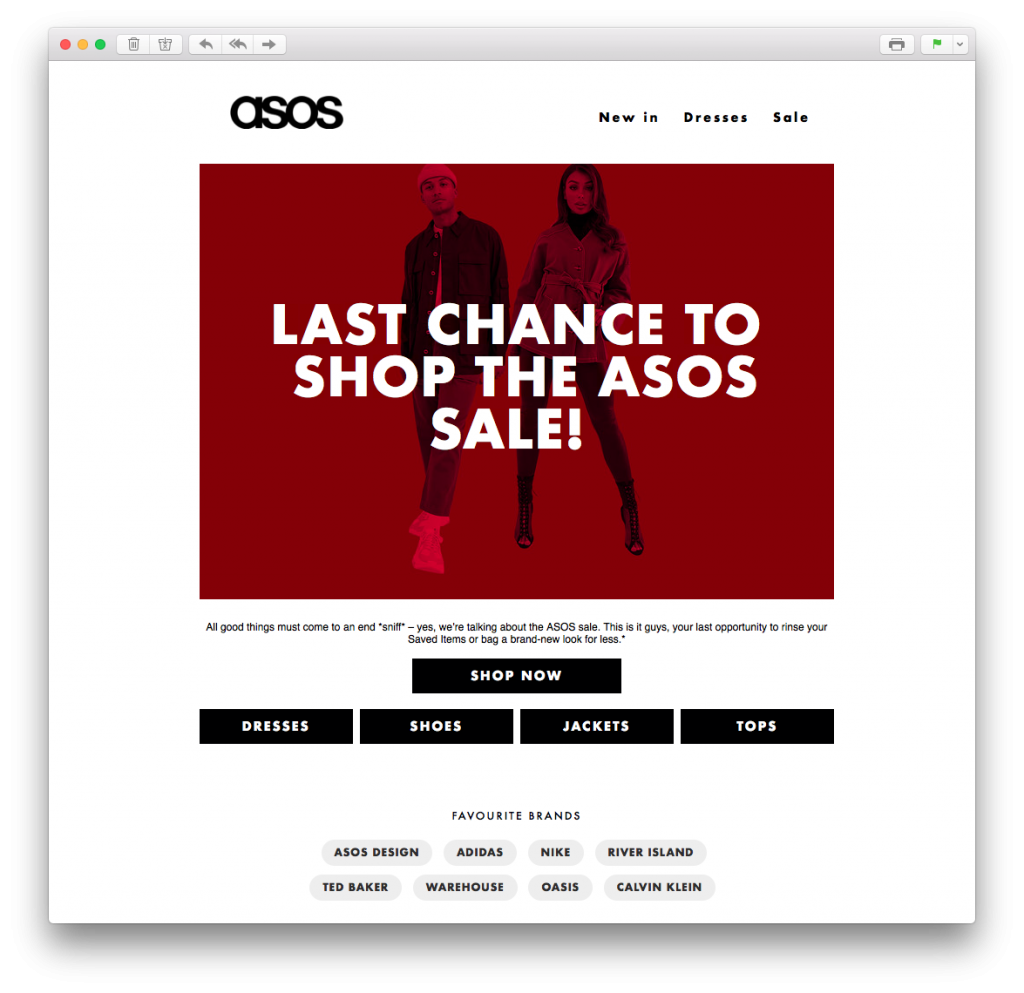
Generate a sense of urgency by including clear, time-sensitive messaging in your email campaign.
When shopping online, your customers can get distracted for a number of reasons. For example, a poor internet connection, low battery, or an incoming phone call could all interrupt the checkout process and cause customers to forget about their purchase.
Rather than losing out on potential sales, take this opportunity to be proactive and send out an abandoned cart email. This will act as a reminder to customers to pick off their purchase where they left off and stops you from missing out on important revenue.
In this example by Nasty Gal, the customer is tempted back to their shopping cart with a vibrant and colorful email design. Adding a sense of urgency and a bold CTA makes the email even better:
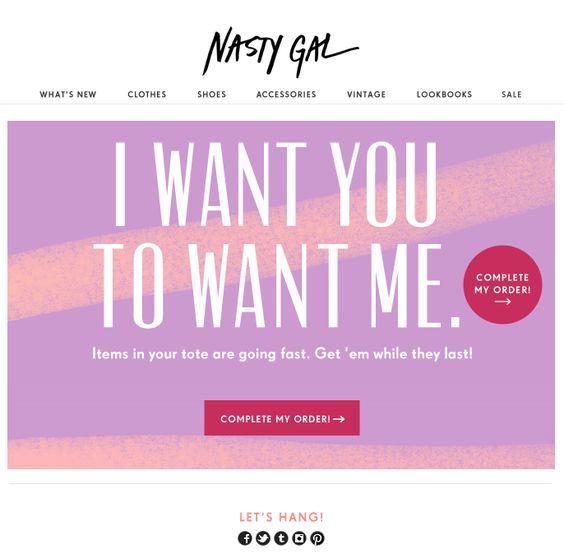
Send out abandoned cart emails to get your customers back on track with their purchase.
Now you've seen how the top dogs do it, we hope you're feeling inspired to get started with building up your own email strategy for your online boutique. Looking for the perfect place to get started out with email design? Sign up free to Mail Designer 365 today and discover a huge range of easy to edit HTML templates and creative tools.
Until next time!
Your Mail Designer 365 Team
With Halloween just a few weeks away, we have a few spooky surprises in store to help you magic up some extra creepy email campaigns.
Read More
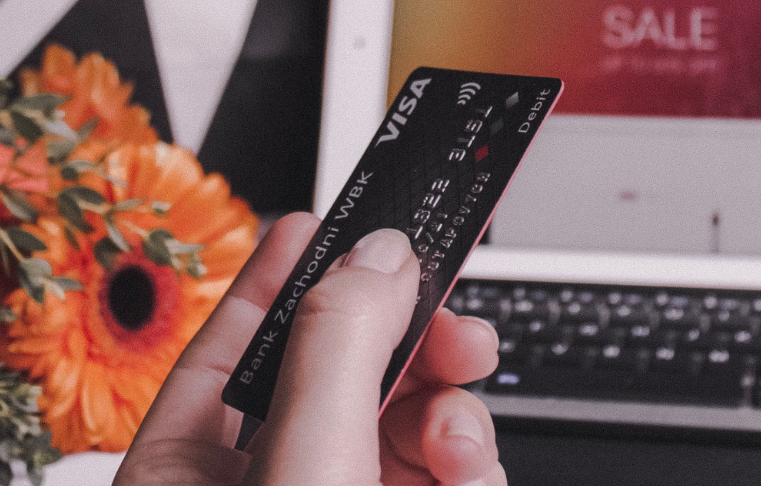
As one of the biggest dates on the email marketing calendar for many businesses, "Black Friday" is an event that raises the bar for you and your marketing strategy. Building an effective email campaign is a crucial part of your business's success.
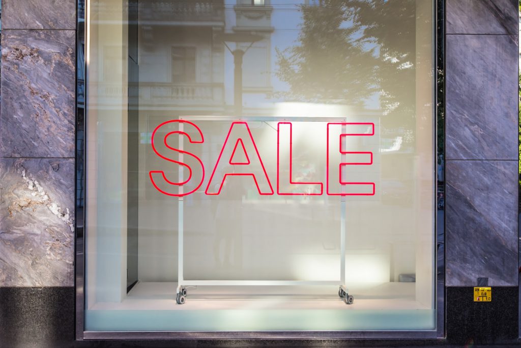
As always, the key is to start planning early so you are feeling confident in your campaign when the big day comes around. This way, you avoid any last minute panic and have time to tackle any obstacles encountered along the way.
The pressure to create an email campaign that stands out against competitors and drives sales is something every business owner knows all too well. To make things a little easier, we're sharing some awesome examples of businesses who really got it right in previous years.
Keep reading to discover excellent email campaign examples, plus tips on how to steal these expert ideas for your own campaigns...
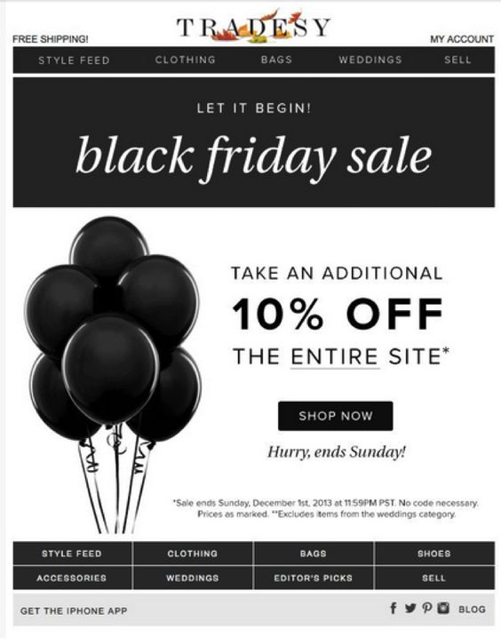
What better way to to celebrate a sale than with balloons? This monochrome email design by Tradesy is a slick and sophisticated way to advertise an exciting "Black Friday" promotion.
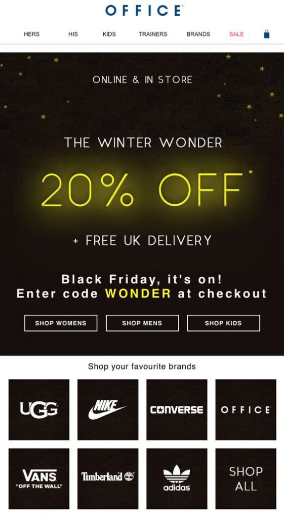
The yellow accents in this email by Office work great as eye-catchers. The 20% discount stands out and really manages to grab the reader's attention.
Recreate this effect in Mail Designer 365: Create glowing text effects with the shadow tool. Choose your colour, blur and offset angle to create eye-catching shadow effects.
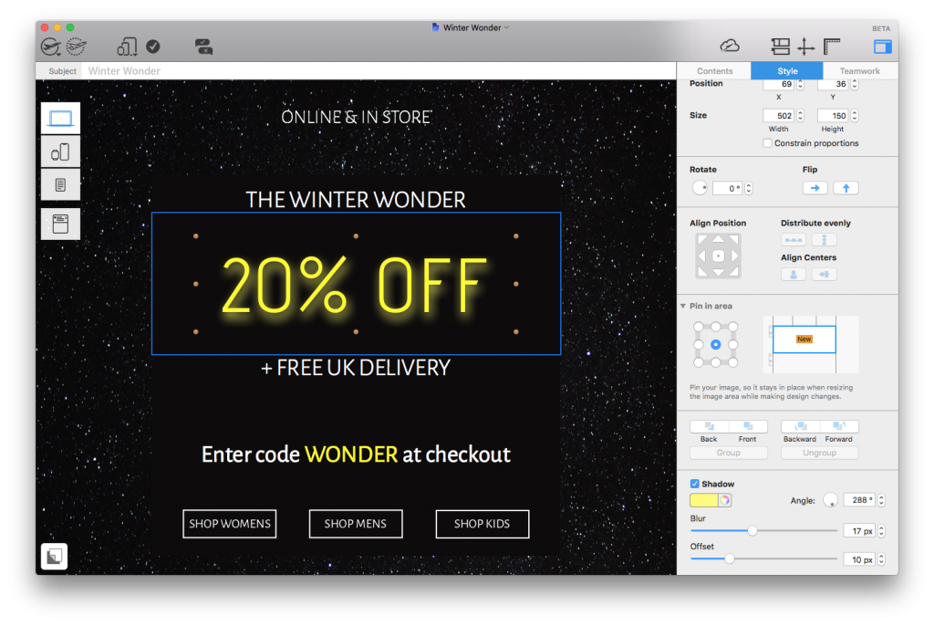
Use the shadow tool to highlight important elements of your design with a vibrant, glowing effect.
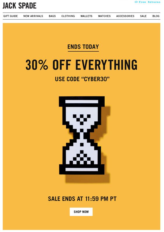
Cyber Monday is essentially the online equivalent to "Black Friday" and you should definitely factor it into your email campaign.
Jack Spade cleverly generates a sense of urgency by using a timer as their main graphic. We love how it's pixelated to stay in line with the "cyber" theme.
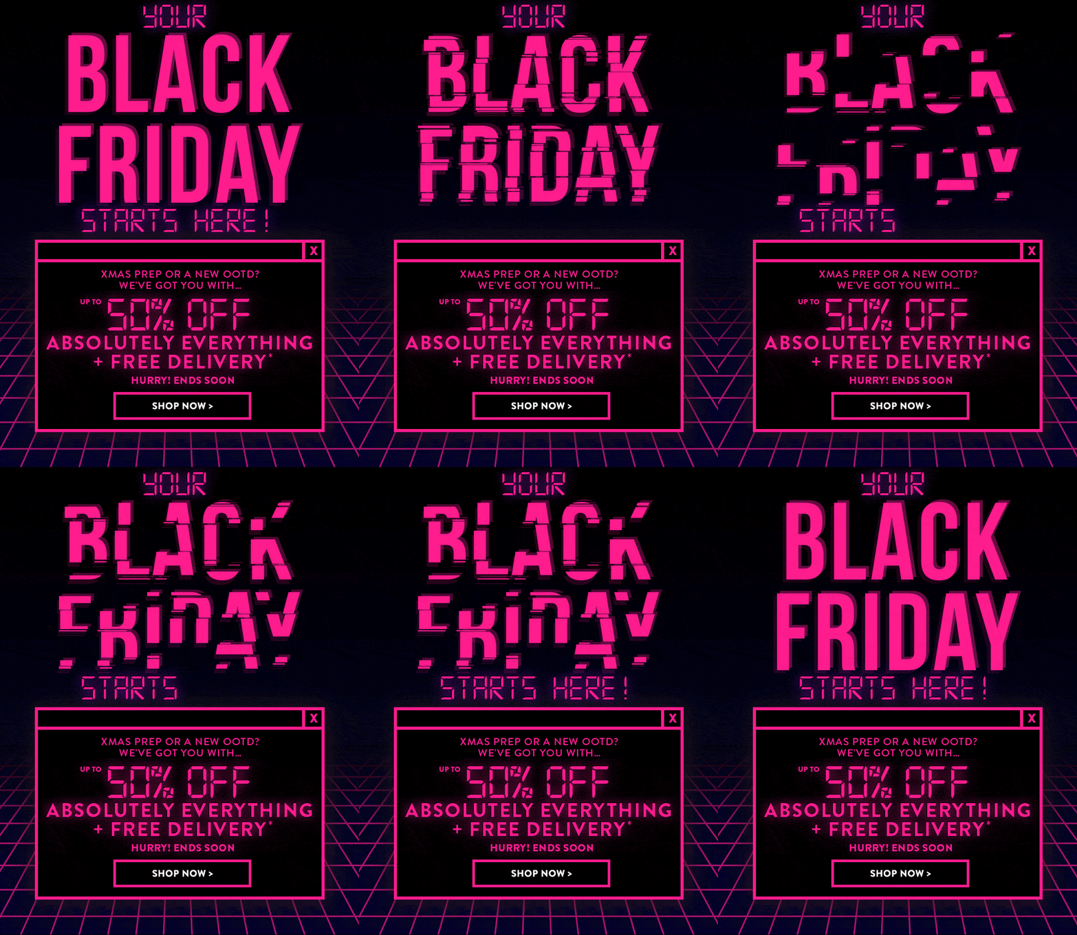 This fun design by Boohoo also adopts a clear cyber theme. The bright pink GIF is great at drawing attention the the message of the campaign and the design as a whole is certainly unique enough to win over customers.
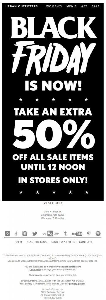 This monochrome design is basically all text but gets straight to the point. Urban Outfitters do a good job here of using contrasting fonts to give their simple design more character.
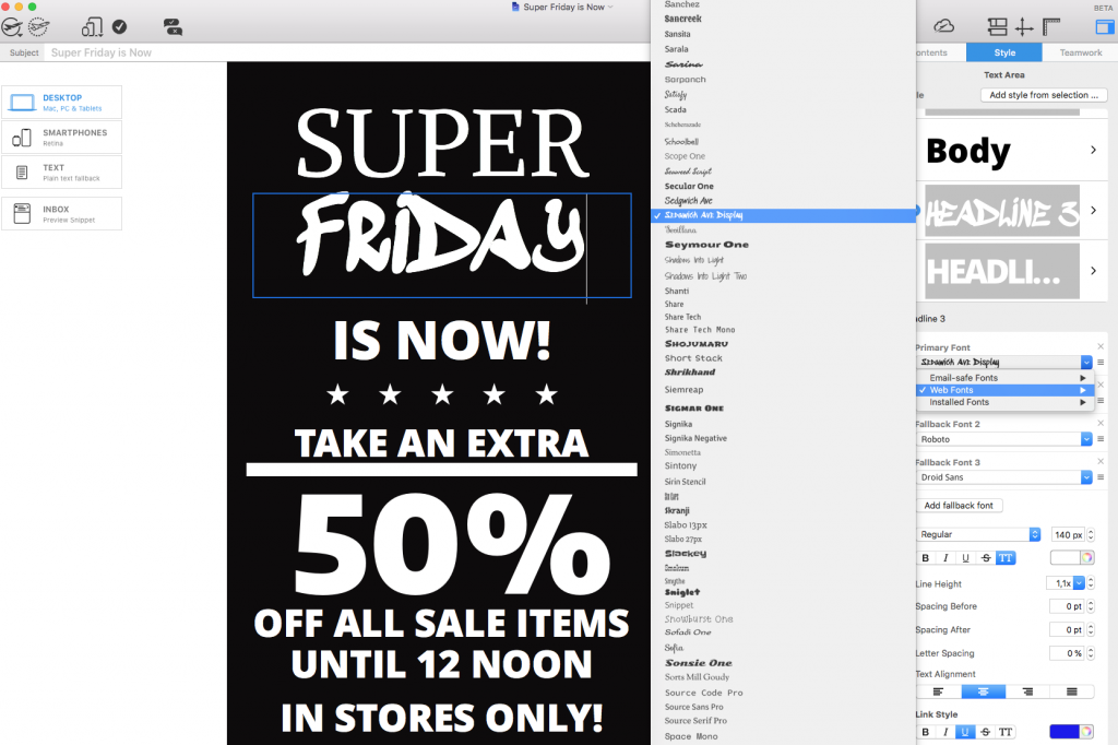
Recreate this in Mail Designer 365: Experiment with different web fonts to give your email campaign more of a unique edge. Remember to use text layout blocks to avoid any compatibility issues:
 6. Chicago Tribune
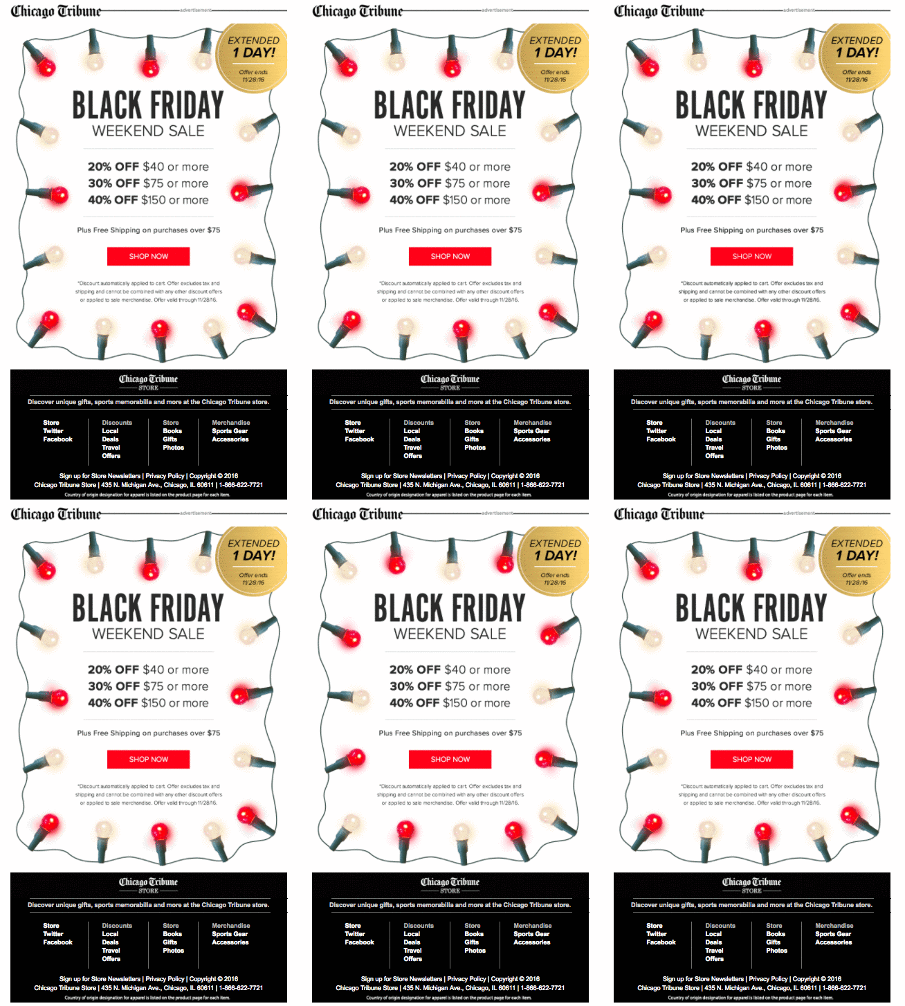 The Chicago Tribune gets super festive with this colorful email design. The fairy lights GIF is a good way to attract attention while also getting readers in the holiday shopping mood.
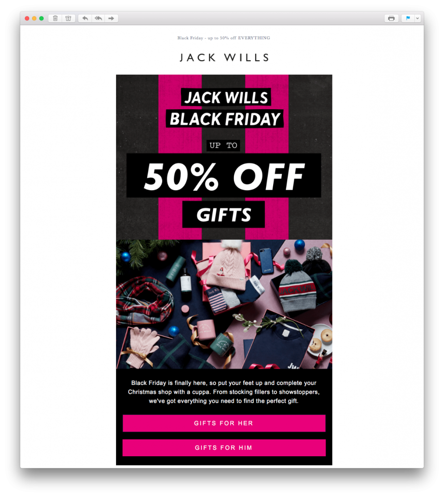 This email by Jack Wills definitely gets us in the holiday mood. The festive feature image is really effective in recreating the ultimate Christmas morning feeling. The pink striped background also creates a gift wrap effect and fits perfectly with the theme of holiday gift shopping.
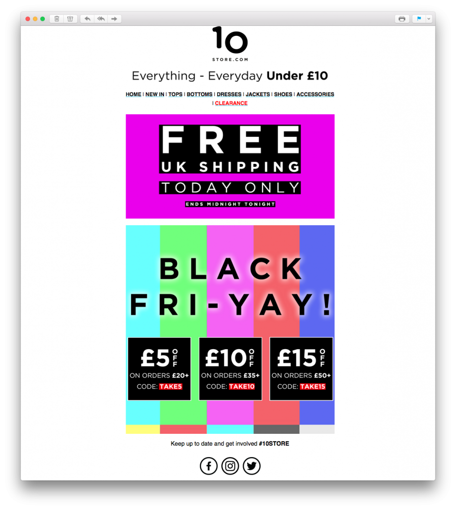 Here's a risk that paid off. Although perhaps a little adventurous for some, there's no denying that this loud, colorful email design by 10 Store grabs your attention straight away.
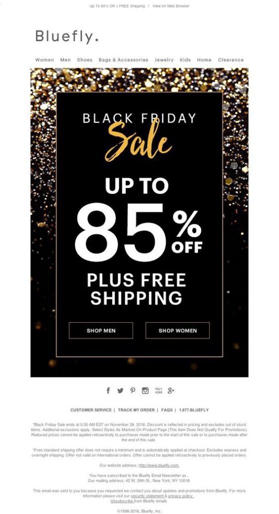 The gold, glittery vibe of this email campaign by Bluefly is super festive and exciting. The combination of black, gold and white works great for a big sales event and the text is big and bold enough to instantly make the message clear.
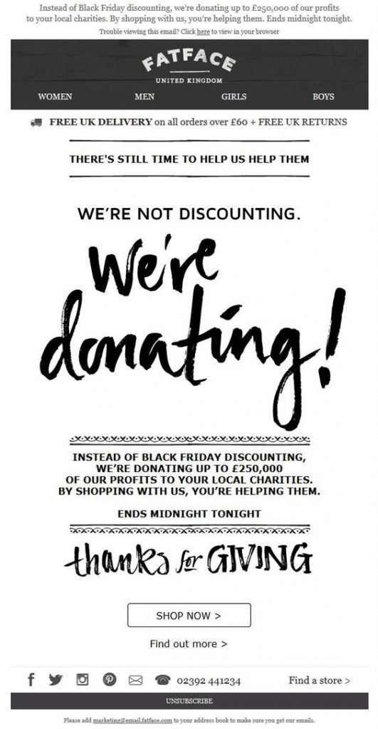 This campaign by FatFace has a really nice sentiment and makes a change from standard sales emails. Giving back campaigns such as this one are very effective around the holidays. Customers are encouraged to shop in order to put their money towards worthwhile causes.
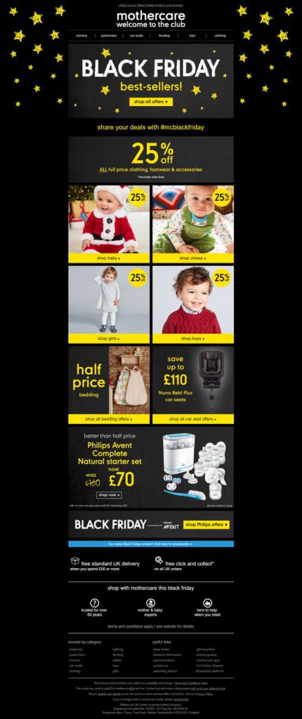 Mothercare show off their star offers in this stellar email design. The contrast between black and yellow tones make the CTAs (call-to-actions) and eye-catchers really pop in this email. The catalogue layout also makes accessing the deals much easier; which is great on this busy shopping occasion.
Recreate this in Mail Designer 365: Experiment with shapes to make CTAs and explore different layout options to recreate this catalogue style design.
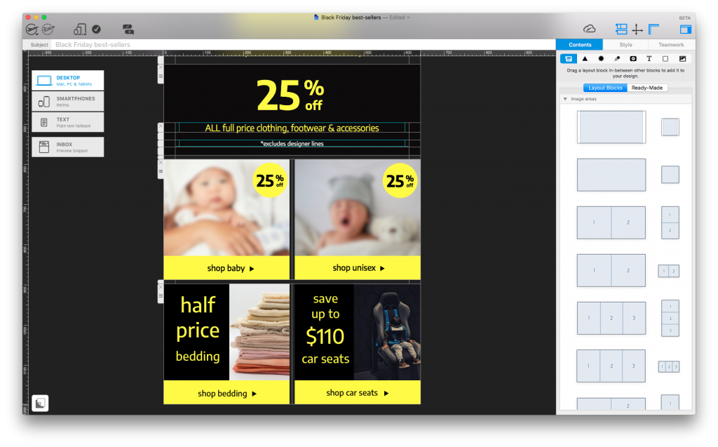
Build a similar catalogue layout with bold CTAs and eye-catchers using shapes and layout blocks.
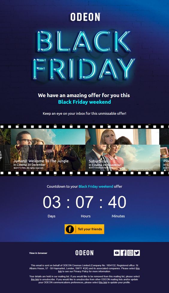 As shown here by Odeon, a bold feature font is a nice way of grabbing your readers' attention. The countdown is also a great touch to get customers geared up for your special promotion.
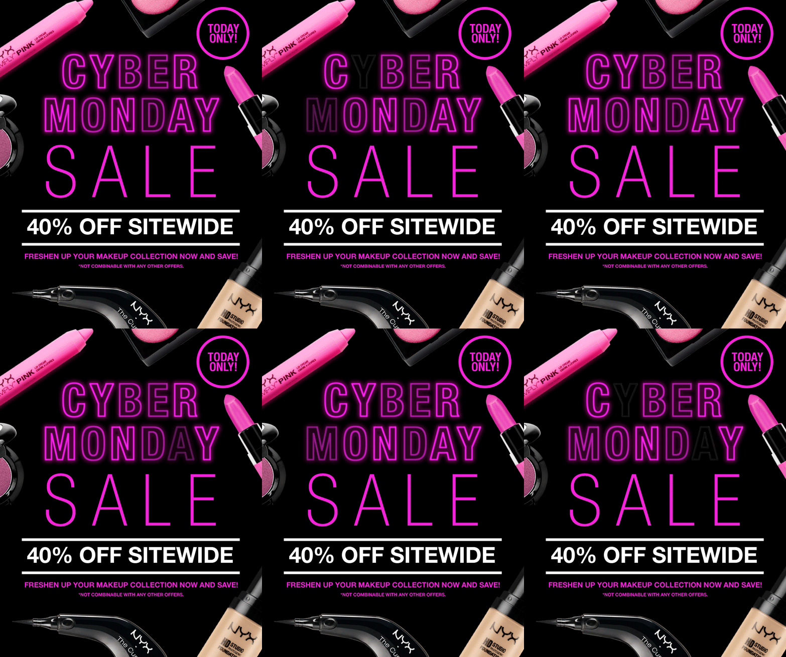 NYX really promote their products with this inventive layout. Hot pink accents make the message hard to miss and the LED effect GIF is both cool and creative. The "today only" tag is also a clever way to generate a sense of urgency.
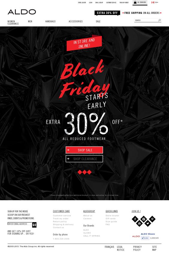 Aldo keep things pretty simple in this design, but the festive red combined with the cool, textured black background creates a noticeable contrast. Again, they've gone for a mix of font styles to liven up the design even more.
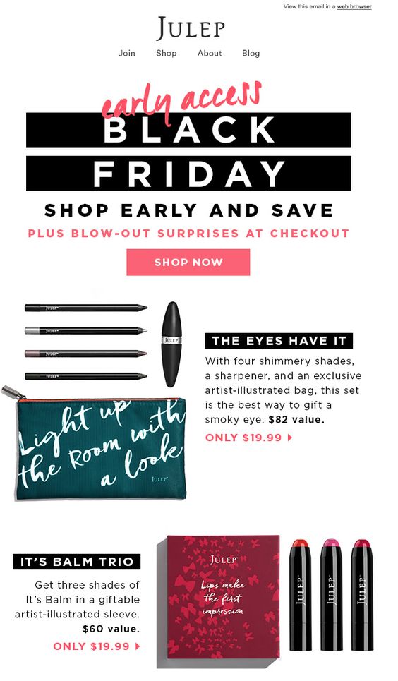 In this campaign, Julep have gone for a slightly different approach. The "early access" sale gets customers shopping before the big day and alluding to surprises at the checkout will certainly boost those click-through rates. We also like the design's balance between images and text to keep things visually interesting yet still informative.
Recreate this in Mail Designer 365: Combi layout blocks are a great way to balance out text and images side by side. Write inspiring product descriptions or include a bullet list of key features:
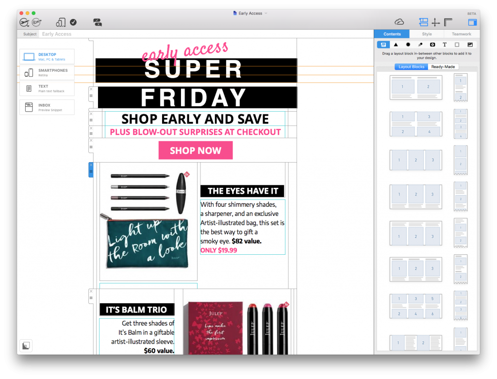
Try out combi layout block styles to balance out images with interesting product descriptions.
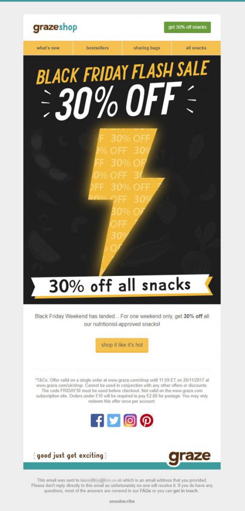 Graze have taken us by storm with this lightning bolt design. This is a great way to stand out from competitors and the color combination also hits the spot.
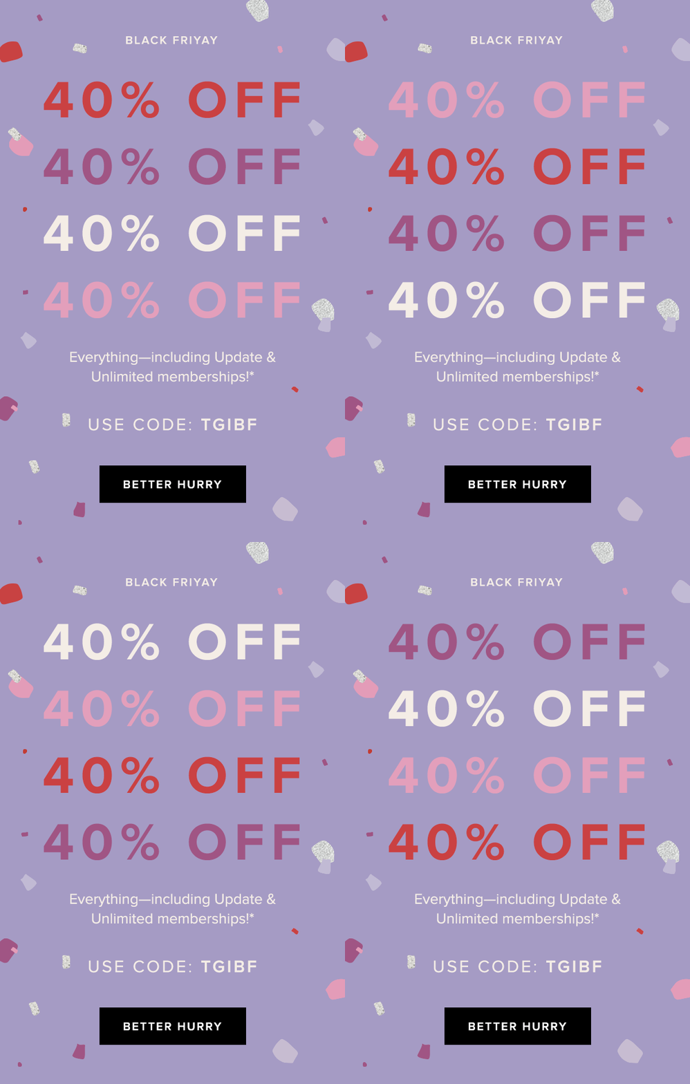 As shown here by Rent the Runway, sometimes simple does the trick. The bold GIF clearly highlights their 40% off promotion whilst also bringing some fun to the design. The "better hurry" CTA button is also inventive and adds a sense of urgency to the campaign.
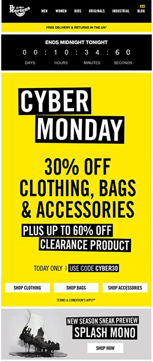 Dr. Martens demonstrate yet another drastic color scheme with this vibrant design. The countdown at the top again creates a sense of urgency and big, bold lettering communicates their offer well. It's also smart how they think ahead and include a product preview at the bottom of the email.
"Black Friday" email campaigns get some of the highest open rates, so you might as well use the chance to promote your business while you can!
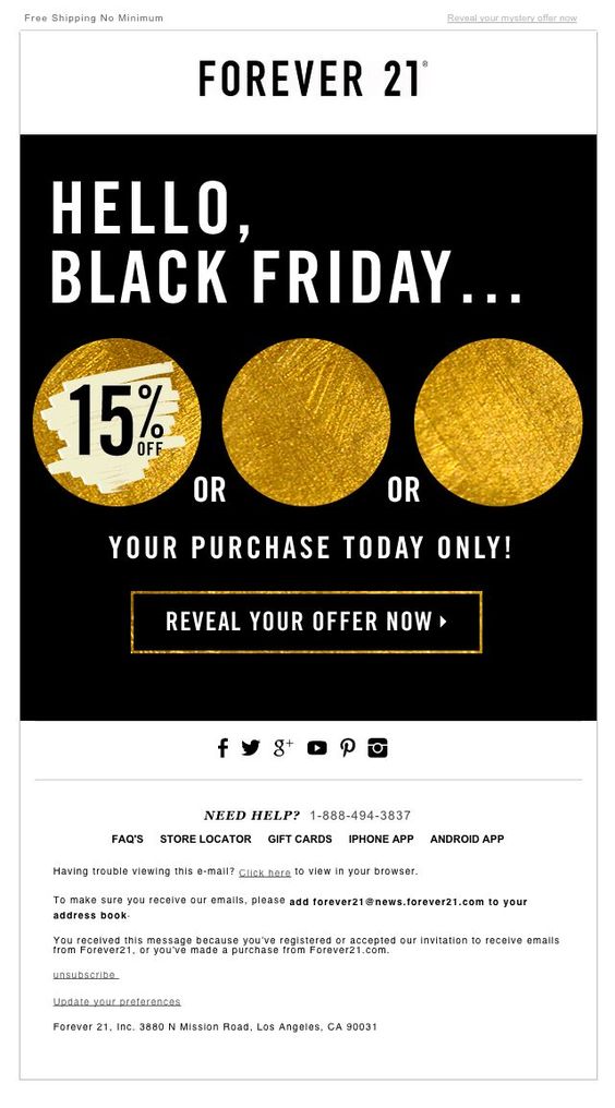 Forever 21 sneak an element of mystery into this "Black Friday" themed design. The temptation to click and reveal their discount is too much for many customers to resist. The gold accents also add a festive tone to the design and get customers in the money-spending mood.
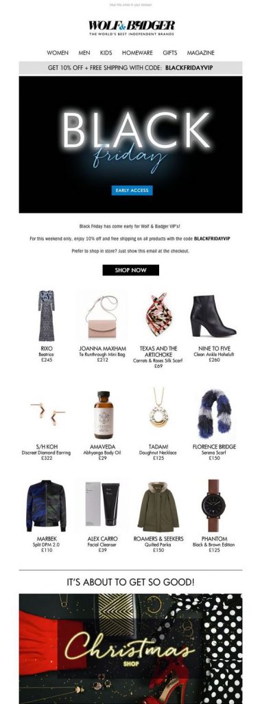 In this email, Wolf & Badger proudly showcase their best products to celebrate with their customers. As well as the eye-catching feature graphic, the clear layout also makes the promotion more effective and the deals easier to shop. The Christmas Shop graphic in the bottom of the email also does a good job of getting readers ready for holiday shopping.
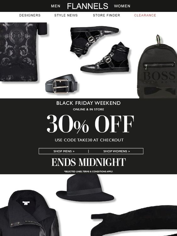 This monochrome design by Flannels is super cool. Using only black products in the background of the email is a clever take on the "Black Friday" theme. The font choices are also bold and stylish, and the "Ends Midnight" tagline incorporates that all-important sense of urgency to the campaign.
Whether you're planning a promotion for "Black Friday" or holding another large sales event, we hope these 21 awesome examples have come in useful, and that you will try out some of the techniques and ideas mentioned in this article when designing your own emails.
Want to get started? Sign up free to the Mail Designer 365 service today to test all of the tips in this article.
Good luck & until next time!
Your Mail Designer 365 Team

Building a charity email campaign can be challenging. How do you keep your readers interested in your content? What should you include in your campaign? When should you send emails?
For charity organisations, the typical email marketing strategy differs from that of a business. With generic sales campaigns, it's widely accepted that you can fill your email with bold CTA buttons (call-to-action) and exciting text and graphics in order to win over your customers. However, for a charity, the approach needs to be different. Finding the balance between driving donations and sharing information is key.
Here are some useful tips you can apply to your charity email campaigns to increase your donations and raise awareness for your important cause.
It doesn't matter if your email list has 100,000 subscribers, or just 10. When it comes to charity email campaigns, it's important to establish a direct connection between your organisation and your reader. If subscribers feel a personal connection with you and your cause, they are much more likely to respond to your appeals.
One great way of achieving this connection is through personalisation. Speak directly to customers and address them by name. Not only does this help grab their attention, it also gives them more of a sense of responsibility; leading to more engagement with your charity.
This powerful email from Cancer Research UK uses personalisation effectively. In addressing me by my name, the email makes me feel compelled to donate and help make a difference.
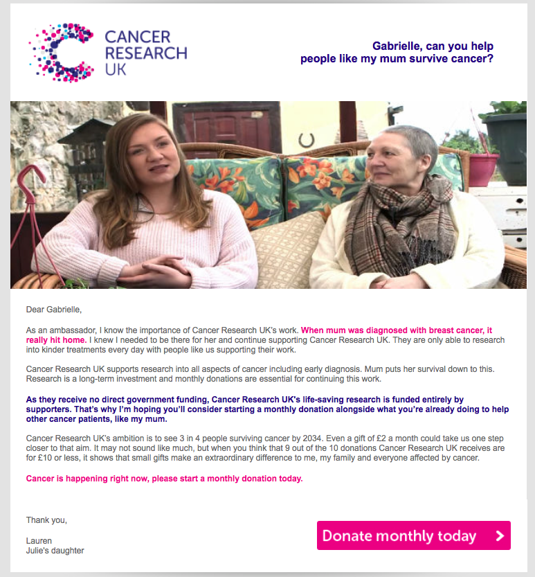
Use personalisation to make every recipient feel compelled to take action.
It's often said that a picture speaks a thousand words. Using powerful, emotive images in your email campaign is a guaranteed way to pull on readers' heartstrings and get them on board with your important cause. Compared to a 100% text email, an email that includes a strong feature image will have a much greater effect on the recipient.
This email from charity: water is a prime example of how effective a strong image can be in your email design. The heartwarming father and son photo highlights the Father's Day theme and helps trigger an emotional response in the reader; encouraging them to donate to the cause.
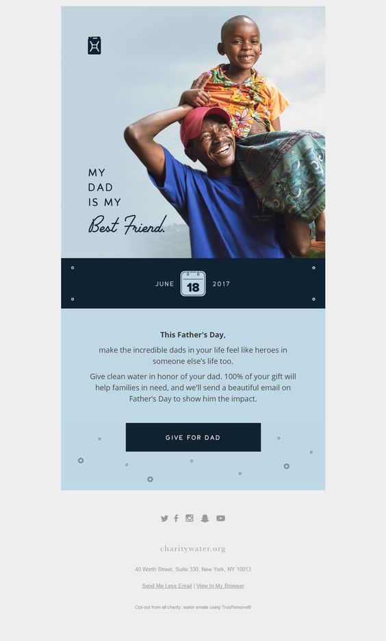
Use powerful images to help get readers on board.
Although the main goal of a charity email campaign is to get as many donations as possible, you can't come across to desperate to your subscribers. Use email marketing as an opportunity to update your readers on your great work. Try sending out a regular email newsletter with the latest news and information about your cause. This will help readers better understand what your organisation is working towards and also encourage more donations.
Here are some examples of what you could include in your newsletter:
The ALS Association send out a monthly e-newsletter to keep their subscribers up to date. This is an effective strategy, as they regularly remind readers of their cause without being too pushy and putting them under pressure. As well as important news and updates, they're also sure to include the all-important donation link as a subtle reminder:
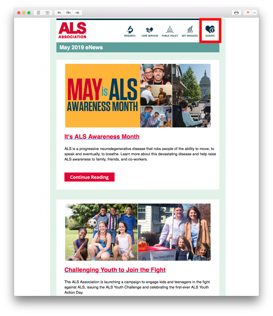
Sending a regular email newsletter is a great way to keep subscribers informed and up to date while subtly encouraging more donations.
People often respond better to a cause when it is something they can relate to. By including real life stories in your email newsletters, you give the reader an idea of where their donation is going and help them relate better to your cause. Think about how testimonials and good reviews help a regular business. Sharing your charity's success stories will also help show your subscribers what their money can help achieve.
Don't forget, the majority of your subscribers signed up to your list because the cause is close to their heart. These heartwarming stories will help remind them of why they want to support your charity.
This email from Cancer Research UK shows how money donated goes towards life-changing research. This is the kind of success story which will help encourage subscribers to continue donating and carrying on the good work.
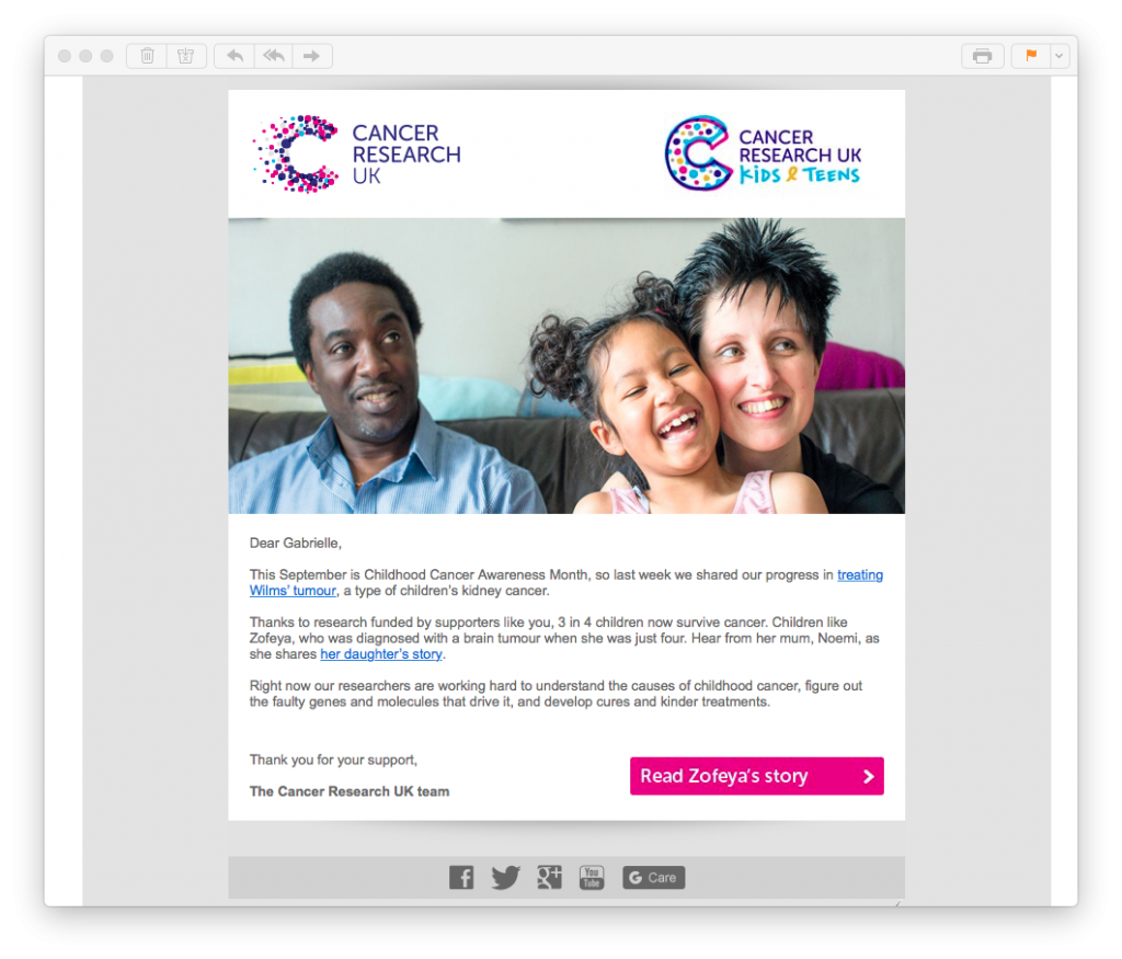
Sharing success stories is a great way to remind readers of the great work your charity is doing.
Amnesty International also used powerful success stories in this New Year themed email. This approach is particularly effective, as they also list examples of ongoing problems which need support from donations. This is a good balance between celebrating achievement whilst still recognising what still needs to be done.
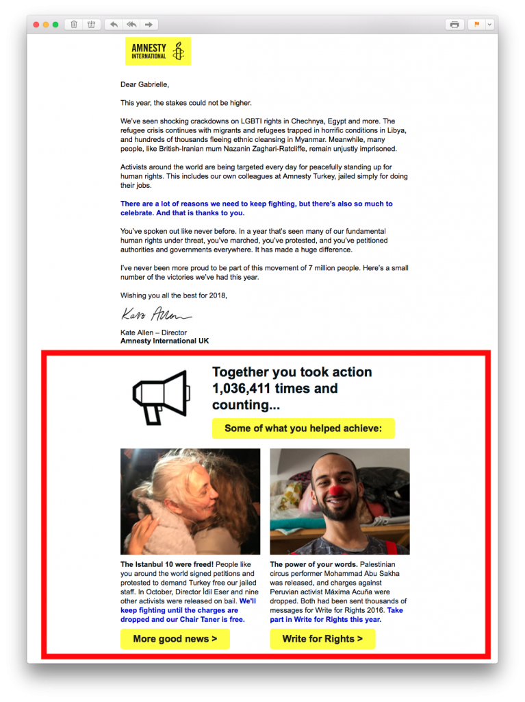
Putting success stories alongside ongoing cases is a great way of showing readers how their money is still needed to carry on the good work.
Thanking your subscribers for their support and donations is also an integral part of your charity email campaign. Even though we may not like to admit it, people like having their contributions recognised from time to time. Send out a thank you email as a way to show your subscribers how grateful you are.
A thank you email can be super effective for your charity, as it makes a nice change from asking for donations. Moreover, many readers will subconsciously feel the urge to keep on donating to your cause when they notice how much you appreciate it.
Try linking a thank you email together with a success story. This example by charity:water is super positive and a great way to show appreciation by rewarding donators with good news:

Thanking your subscribers for their donations helps encourage them to continue donating in the future, as they can see how much it is appreciated.
The holidays are one of the most effective times to run a charity email campaign, as people are usually in the mood for giving (think Giving Tuesday.) Take a break from your regular campaigning efforts and focus on creating a seasonal email campaign. This is a fun way to get into the holiday spirit and also plays on readers' festive goodwill.
Typically, consumers are willing to spend a lot during the holidays. Make your seasonal email campaign home in on this trend and convince subscribers to spend money on your good cause.
This holiday-themed email by WE has a clear festive feel to it, while also sharing an important message to donate clean water.
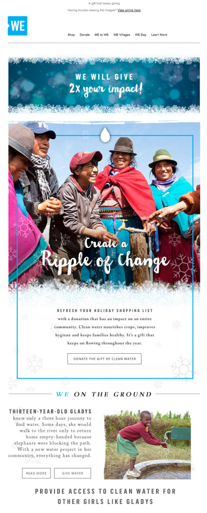
Use the holiday season as an opportunity to encourage more subscribers to give back.
You can also use a seasonal email campaign as the chance to do something out of the box and just have fun. Cats Protection use this email to link to a fun animated video and celebrate the holidays together with their readers.
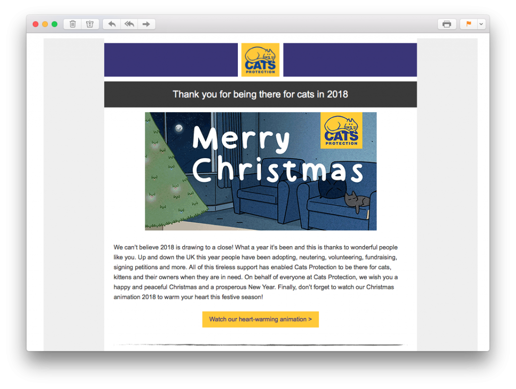
Use the holidays as a way to show your fun side and do something different. This will help keep readers interested in your email content.
Email is a great way to update your subscribers about your charity work, but don't forget to make the most of other marketing channels. Include links to your social media pages and show subscribers even more ways they can follow your work. They've gone to the effort of signing up to your newsletter list, so your cause is obviously of interest to them. Utilise this opportunity to grow your social media following too.
JustGiving include prominent links to their social media sites in their email footer:
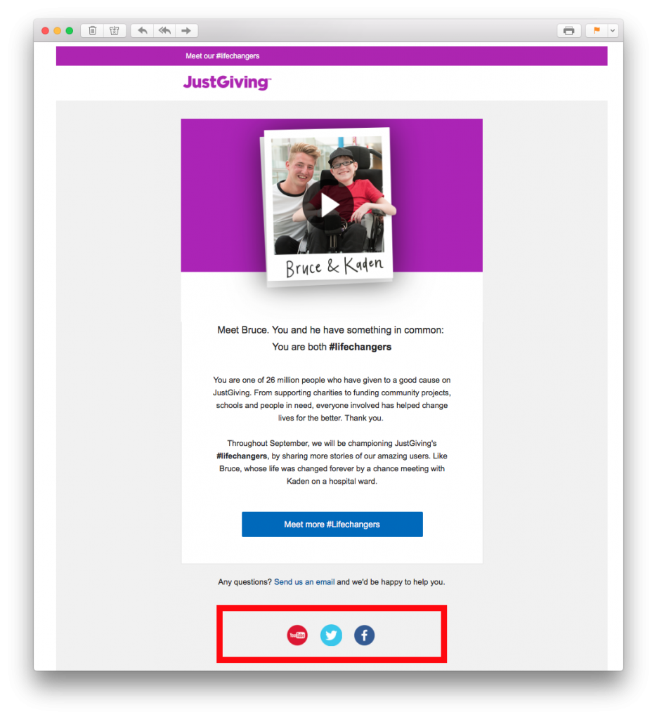
Integrate your social media pages into your email campaigns to help grow your online following.
We hope you will take these tips and ideas on board when creating email campaigns for your charity to truly make sure your good cause will benefit. Sending out regular emails is a great way to stay in touch with your audience and spread important information about your cause.
Struggling to find the right tool for your charity email campaign? Mail Designer 365 is a practical HTML email design service for Mac that allows you to easily create impressive email newsletters to spread your important message. Find out more here.
Until next time,
Your Mail Designer 365 Team