Whether you're an indie app developer, a giant software house, or somewhere in-between, convincing a customer to download your demo is the first big step towards you getting a new user on board with your product.
However, once you've got a potential new customer in your sights, what can you do to keep them engaged and convince them to stick around?

What is onboarding?
In terms of SaaS products, the onboarding process describes the time from when your customer firsts downloads your demo or creates an account, until them choosing a plan and becoming paid users. More generally, it is the period where your customers first start using your product.
The step between free and paid is generally a big one. As a business, it's your job to give potential customers the best possible experience during the trial period. Not only will this allow them to get used to you as a business, it also increases the likelihood that they will want to carry on using your great product.
Why design an onboarding campaign?
Customers lose interest quickly. Research has shown that the first 10 days after signup are critical in determining whether a customer will continue to use your product, or become disengaged (leading to customer churn.)
The most effective way to keep customers engaged is to develop an onboarding campaign to guide them through the early stages of using your product.
In this article, we've shared some of our best tips on how you can design an effective onboarding campaign for your business and help increase customer engagement.
Set up a sender name and image
Traditional sales reps play on a sense of familiarity when convincing customers face to face to purchase a product. This one-on-one contact is hard to reproduce via an automated onboarding email. Before getting started, there are a few tricks you can try to make yourself more recognisable in the customer's inbox.
Setting up a legitimate from-address takes away any anonymity for your customers and means they will know exactly who has sent them the email. This is much better than using a generic no-reply address, which can come across unfriendly or untrustworthy. It is also best practice to configure a sender name, such as your company name. This stands out more to customers and is generally more recognisable.

LinkedIn clearly use their company name when sending out email notifications to make it easy for the user to see where the messages are coming from.
In addition, uploading a sender image for your business via Gravatar is another good way of appearing more familiar to customers in their inbox. Many email services such as Gmail and Outlook will display your online avatar if you have one set up for your sender address.
This is great, as customers realise straight away that the email is from you and are more likely to open it. This blog post is a good guide on how to set up your sender image.
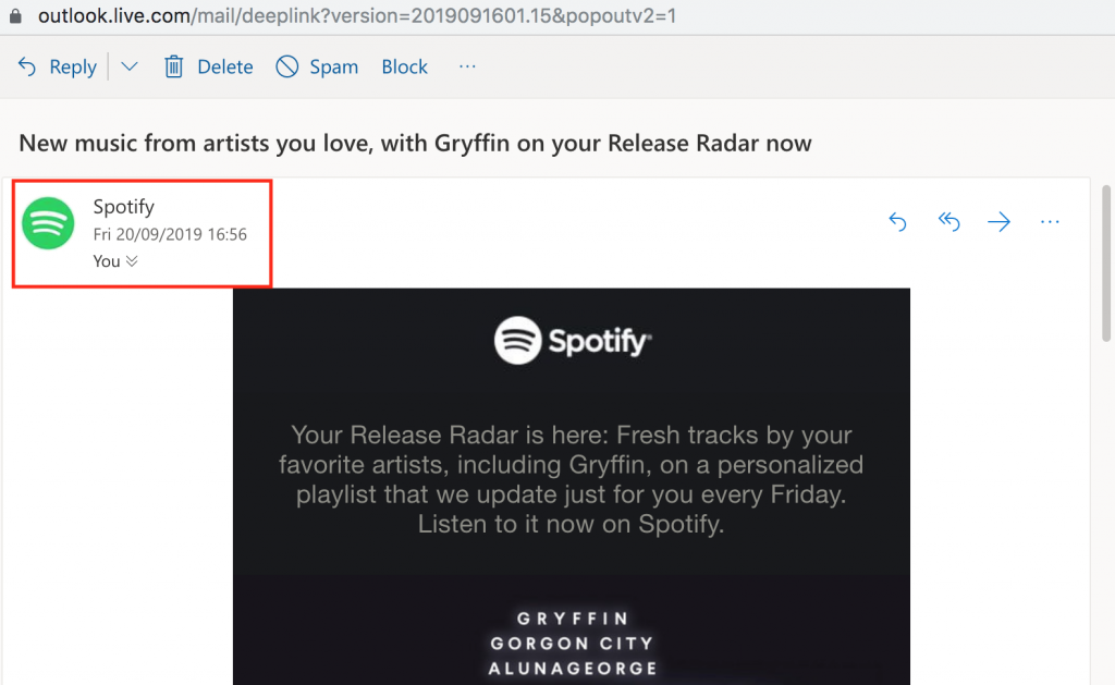
Spotify have configured both a prominent sender name and image to make themselves more recognisable to customers.
Nail the welcome email
Recent stats show that sending a welcome email can increase your email engagement by up to 33%. This is seriously impressive.
The welcome email is one of the most important emails you will send. It is your first chance to introduce your customer to your product or service and the official start of your onboarding campaign. This sets the tone for the rest of your emails; meaning it's critical that you get it right.
What to include?
Every business is different and no two welcome emails will be the same. However, there are a few key points to consider when designing your company's welcome message:
- Use personalisation - This instantly connects the reader to your business.
- Thank the customer for signing up to your service.
- Briefly explain how to get started.
- Include links to useful resources such as tutorials or FAQs
- Add a call-to-action button so the customer knows what their next step is.
This welcome email by Voi is one great example of how to introduce new customers to your service. Not only is it friendly and informative, it also contains an infographic with all the most important information users need before they get started.
Voi are also super smart in introducing an incentivised referral scheme in the very first email:
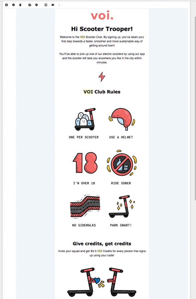
This welcome email by Voi contains all the important information the customer needs before getting started, plus a cool referral scheme.
Send tutorial-style emails
The aim of your onboarding campaign is to get customers using your product. If they don't know how it works, or the setup process is too confusing, they will quickly become disengaged. Making your product enjoyable and easy to use is the most effective way to ensure customers will want to stay onboard.
Refer to your support channels, FAQs and your own experience to identify the most common problem areas. Target these in your email campaign to help users avoid running into these issues.
It's also a good idea to condense the information in your email as much as possible. Huge chunks of text will only confuse readers. Break up the key points into a simple, step-by-step list. You can always link out to blog posts, tutorials or videos on your website if they need more help.
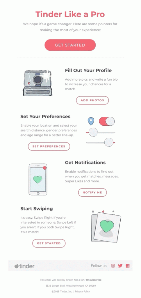
Tinder help new users get their profile set up by providing some useful tips. Including CTAs after each step is also super effective.
Make every email actionable
Every email in the campaign needs to have a clear CTA (call-to-action). Think about the logical steps a user needs to take in order to become engaged and interested in your product and plan your emails accordingly.
Welcome new users onboard and encourage them to carry out specific actions. Actions can include downloading the app, creating a profile, etc. By doing all of these things, the new user slowly learns more about the product and becomes engaged.
Whatever the goal is, you must clear the path for your customers. Use email to point users in the right direction and get them using your service. This email from Webflow is a great example. The CTA "choose a template" is super clear and gets the user straight on the right path:
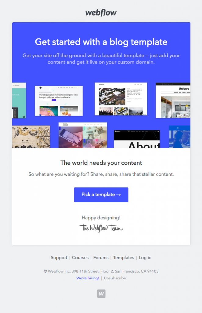
Make sure every email has a clear CTA to help get the user started with using your product.
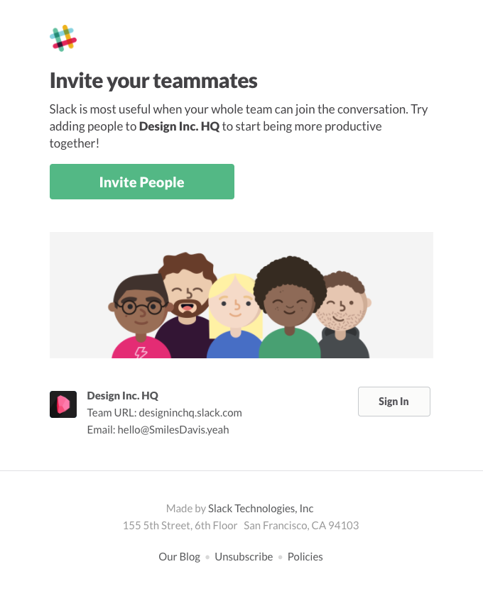
Slack gets the ball rolling with this CTA encouraging users to invite their team.
Re-enforce the USPs of your product
While a new user is getting started with your product, you should remind them of its key benefits. Reiterate to the user what makes your product or service different from others. This will help convince them that they should stick around.
Many users sign up on a whim - especially if it's free. Using your onboarding campaign to re-enforce what makes your product special helps you to persuade the customer the product is worthwhile. With this mindset, they are more likely to complete the conversion from inactive trial user to active full user.
Use your emails to highlight key USPs, exciting features and any other aspects you think make your product better than the rest. Don't be afraid to experiment with GIFs, videos and bold images to make your email more visually exciting.
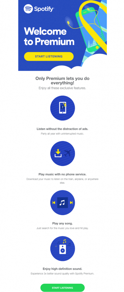
Spotify clearly re-enforces the benefits of a Premium plan here.
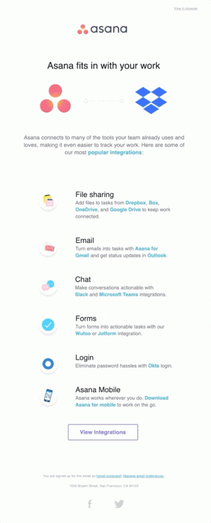
Asana lists integrations to convince new users of the benefits of using their service.
Be flexible with your trial period
Let's say you have a fixed trial period of 2 weeks. This is great and may be enough time for most customers to decide whether to purchase. However, for some customers it might not be long enough.
If you see a user has used up all of the time on their demo and not purchased a paid plan, consider offering them an extension. Even just one more week could be all they need to help them make up their mind.
In this example from NOW TV, the user is offered another free trial period. This is a smart strategy, as the customer has more time to explore the service and decide they do want to sign up.
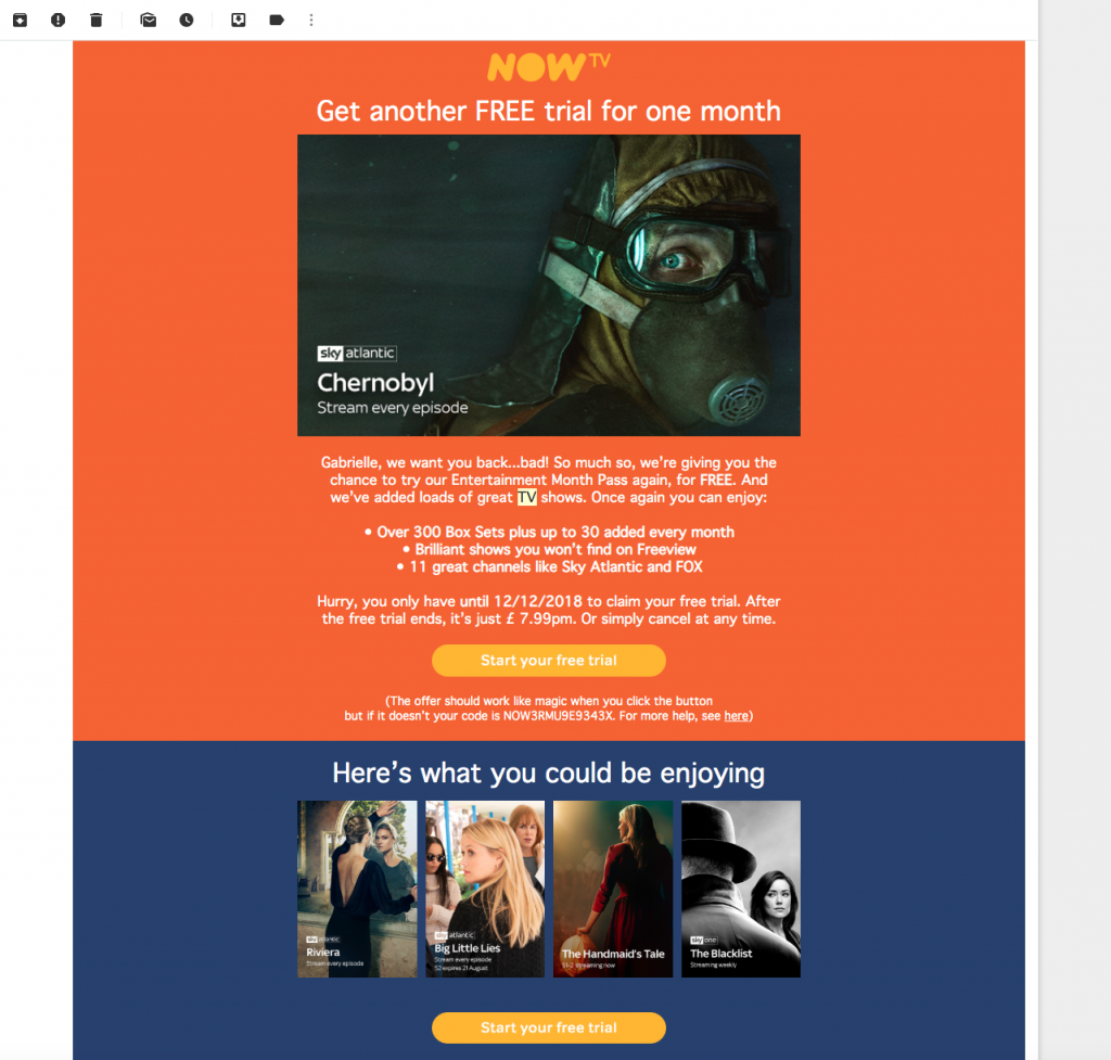
NOW TV try hard to tempt back trial users with the offer of another 30 days free.
Consider a re-engagement email
A re-engagement campaign can also be part of your onboarding process if it means the customer re-connects with your product. By monitoring user activity within your app or online platform, you will see which users are starting to disengage. If you spot this early enough, you could prevent customer churn.
How to re-engage inactive users:
If you notice a customer has left the setup process incomplete, you can reach out to them and encourage them to finish what they started. Often, people get distracted or something else comes up. A helpful reminder is a good way to re-engage potential users and get them back on track.
This email by airbnb is productive because it strikes off the steps the user has already completed; leaving the rest of the list as todos. This is a subtle way of showing the user they are almost ready to go:
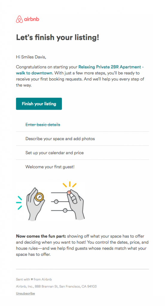
Airbnb give the user the final push they need to finish off their listing.
Alternatively, you could try a more indirect approach. A common reason for users becoming disengaged is them becoming stuck on a problem. If you notice an inactive user, try getting in touch and offering support. This strategy is used in the following example by Webflow:
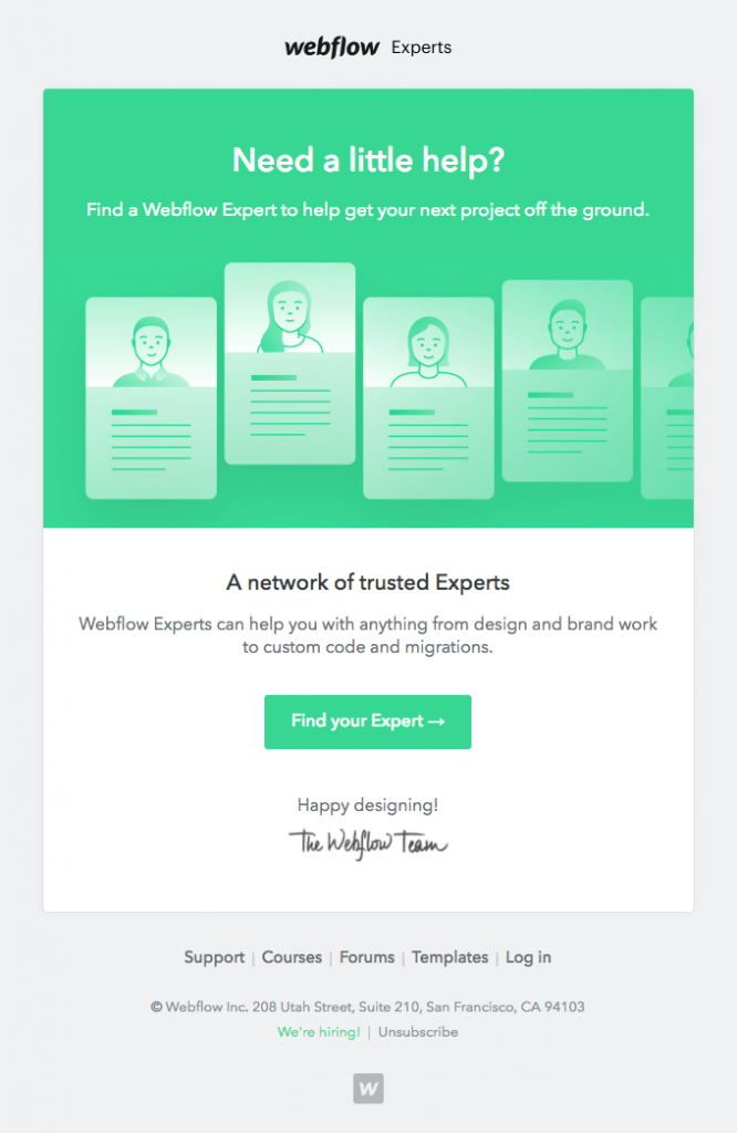
Webflow extend a helping hand to try and offer support to new users who may be struggling.
Find out what went wrong and learn from it
No business has a 100% conversion rate and no matter how good your onboarding campaigns are, you should always expect some customer churn. In the case of customers who decide not to continue using your product, it is important you try to find out why.
Try and reach out to customers who decided not to purchase a plan in order to figure out what went wrong. You could send out a simple survey, or write a personalised message in the hope of getting a more direct response.
Your onboarding campaigns will always be evolving with your product. Keep analysing their performance (e.g. open rates, click-throughs) together with your conversion rates in order to keep emails optimised and as effective as possible.
We hope you have found these tips for creating onboarding emails useful and that they will help you increase your conversion rates. All our examples were either sourced from our own inbox, or from the awesome collection over at reallygoodemails.
P.S. Did you know Mail Designer 365 templates are compatible with dozens of leading marketing automation tools? Build up your Mail Designer 365 email design and export as HTML to use with ActiveCampaign, SendinBlue, Drip, ConstantContact, MailerLite, and many more... Find a list of compatible ESPs, along with step-by-step export guides on our Integrations page.
Until next time!
Your Mail Designer 365 Team
Get expert tips straight to your inbox!
Please check and try again.
We've just sent you an email for you to confirm your email address, if you haven't already.

