To make your design more suitable for mobile users, you may want to make some changes to the layout. You can do this in the Smartphone view without affecting your main design.
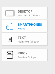
To get started, head to the Smartphone view:

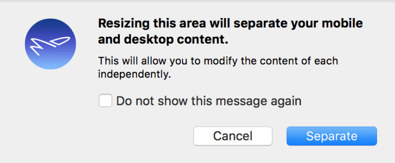
When you first make changes to your mobile design in the Smartphone view (for example, by resizing a layout block), a popup window will appear:

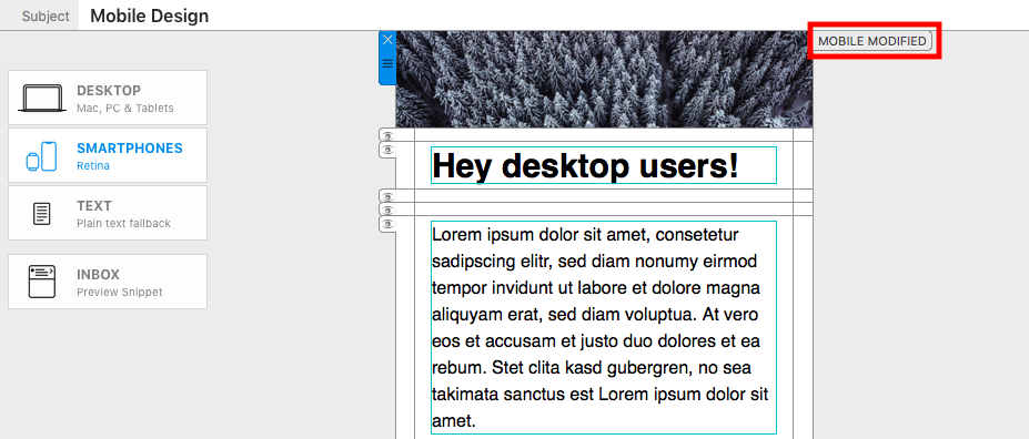
By clicking on "Separate", you will detach the mobile version of your design from the desktop version. Any changes you go on to make will only be applied to the mobile version. This will be indicated on layout blocks by the "Mobile Modified" label:

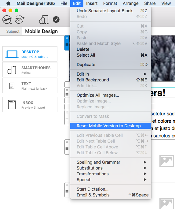
If you decide you no longer want to have two separate designs, you can revert your mobile design back to the original by going to "Edit" > "Reset design to desktop version." This will undo all of the changes you have made in the mobile version.

How Can We Help?
A Quick Tour of Mail Designer 365
Background
Layout Blocks
TextScout
Editing Text
Links and Buttons
Configuring Text Styles
Tables
Image Areas
Images
Using Retina Images with your Design
Graphics and Other Objects
Creative Tools
Advanced Design Techniques
Blend Modes
Optimizing your Template for Mobile
Plain Text
Preview your Design
Feedback and Sharing
Preparing your Design for Sending
Contacts and Audiences
Sending Emails
1:1 Emails
Email Analytics
HTML Export
Other Sharing Options
