How to Set Up a Fallback Font in Mail Designer 365

By Hans-Peter Configuring Text Styles

Some email clients cannot display a chosen typeface. A fallback font gives each text style a reliable alternative, helping your Mail Designer 365 email remain readable when the preferred font is unavailable.

What is a fallback font?

A fallback font is a backup typeface used when the preferred font is unavailable. The receiving device checks the font stack in order and displays the first available option. In Mail Designer 365, a text style can contain multiple fallbacks and includes at least one email-safe option.

Setting up a fallback font

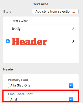
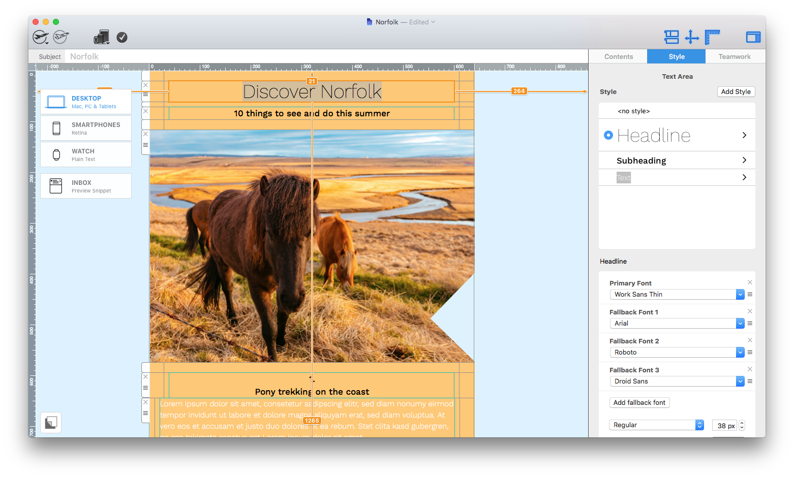
After you have added a text style to your email copy, you will see a box labelled "Email-safe Font" under the "Style" menu.

Email-safe Font setting in the Mail Designer 365 Style menu

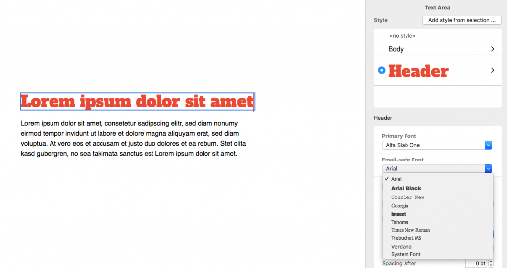
To choose from the selection of email-safe fonts, click the dropdown menu. Your email-safe font will then be displayed if your first choice of font isn't.

Fallback font dropdown with email-safe font choices

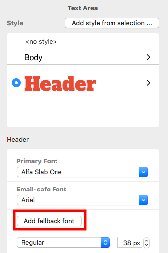
To add another fallback font, click the add button next to the font list.

Add another fallback font to a Mail Designer 365 text style

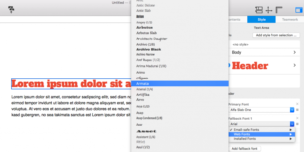
As long as you already have an email-safe font set up, you can choose any font in Mail Designer 365 as a fallback:

Choose the next font in a Mail Designer 365 fallback stack

Repeat the last step if the text style needs another fallback. Keep the stack short and place the most visually similar reliable option first.

Test the fallback-font result

Send the design to representative desktop and mobile inboxes, then compare line breaks, button labels, headings, and text wrapping. A replacement font can be wider or taller than the preferred typeface, so confirm that important text remains visible and that buttons do not wrap. Also review contrast using the W3C contrast guidance, because readable typography still needs sufficient contrast.

Fallback font checklist

  • Choose an email-safe option that is visually close to the preferred font.
  • Apply the stack consistently to every related text style.
  • Check headings, body text, links, and buttons at narrow widths.
  • Send inbox tests before distributing the final campaign.

Mobile Only Text Styles for Responsive Email Design

By Hans-Peter Configuring Text Styles, Optimizing your Template for Mobile

Mobile-only text styles let you tailor typography for smartphone readers without changing the desktop version of your Mail Designer 365 email. This responsive email text styling workflow is useful when a headline wraps awkwardly, body copy feels too large, or spacing that looks balanced on a Mac takes up too much room on a phone.

When to use mobile only text styles

Start with a complete desktop design, then switch to Smartphone view and review each important text block. A mobile only adjustment is appropriate when the same wording should remain in both layouts but its font size, line height, alignment, or spacing needs to change for a narrower screen. Keep the message itself consistent so recipients see the same offer and information on every device.

Create a mobile only text style

Select a text block in Smartphone view and make a typography adjustment. In this example, reducing the line height saves vertical space while keeping the copy readable. Use small changes first and check that headings, paragraphs, and links still have enough separation.
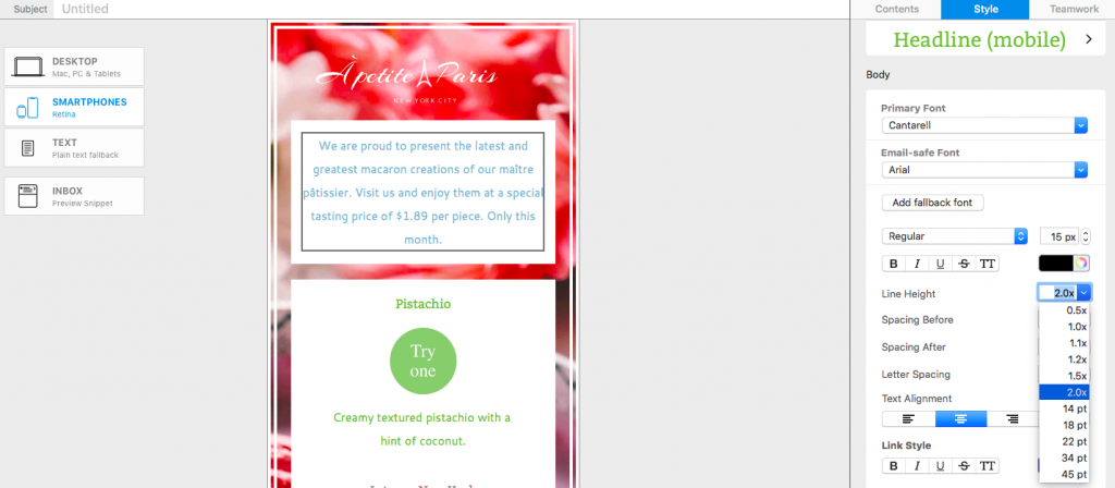
Adjusting line height for a mobile only text style in Mail Designer 365

After the first mobile only change, Mail Designer 365 displays the adjustment in a blue box in the Style menu. This visual marker helps you distinguish smartphone-specific formatting from the shared desktop style.
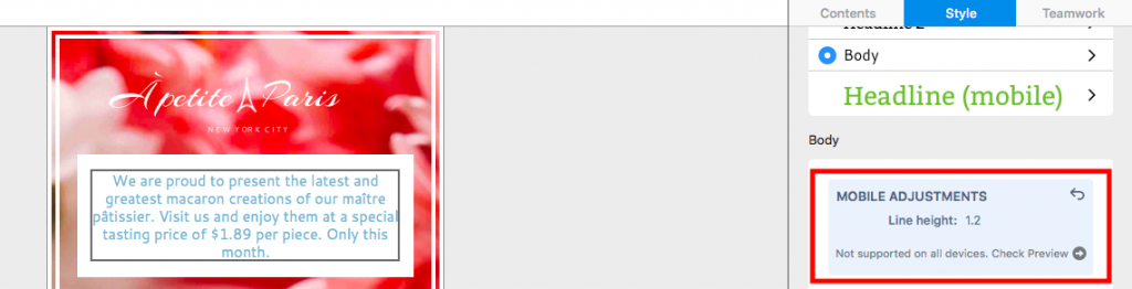
Blue mobile only style indicator in the Mail Designer 365 Style menu

You can continue refining the same style for mobile. For example, adjust font size, line height, text alignment, or spacing only when it improves scanning on a narrow display. Avoid shrinking text so far that it becomes difficult to read.
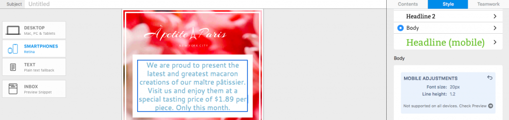
Additional mobile only text style settings for responsive email design

Compare the mobile and desktop styles

Return to Desktop view after making your mobile only text styles. The blue box remains visible in the Style menu, reminding you and other collaborators that the selected text has smartphone-specific formatting. The desktop typography itself remains unchanged.
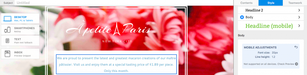
Desktop view showing the mobile only style reminder

Review both layouts whenever you change shared copy. A longer headline or translated sentence may wrap differently even though the mobile style settings are still active. This comparison is an important part of responsive email text styling because it prevents a desktop edit from creating an unexpected mobile layout.

Reset a mobile only text adjustment

To remove the smartphone-specific formatting, click the undo arrow in the top corner of the blue style box. Mail Designer 365 then returns that text style to the desktop version across both layouts. Resetting is useful when the desktop settings already work well at both widths or when you want to rebuild the mobile treatment from a clean baseline.
Resetting a mobile only text adjustment to the desktop style

Preview mobile typography before sending

Important: Mobile Style Adjustments are not supported by non-Gmail addresses in the Gmail mobile app. Check the design with the Gmail (IMAP) preview before sending. Choose Check Preview to open the device preview and confirm that font size, line height, wrapping, links, and spacing remain readable.
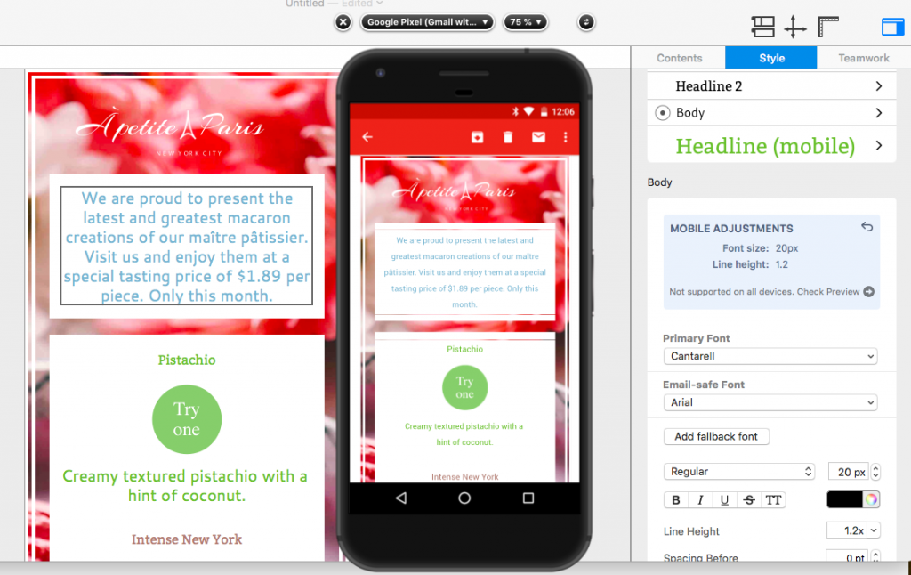
Gmail IMAP preview for checking mobile only text styles

For a reliable final check, preview several representative text blocks, including the main headline, body copy, buttons, and legal information. Also send a test email when possible. If a line wraps poorly, return to Smartphone view and make the smallest useful adjustment rather than changing every text style.

You can also review the mobile layout block guide for related responsive design controls in Mail Designer 365.

Mobile text style checklist

Before you finish, compare the desktop and smartphone versions side by side. Confirm that the headline does not wrap into an isolated word, body text remains comfortably readable, and linked text is easy to tap. Check that line height provides breathing room without making the email unnecessarily long. Keep brand typography consistent unless a mobile adjustment is required for clarity.

Finally, use Check Preview for the inbox environments that matter to your audience and send a test message to a real device. These checks help you use mobile only text styles as a focused accessibility and layout improvement instead of a separate redesign. If the mobile version already reads well, retain the shared desktop style.

How to Highlight Text in an Email

By Hans-Peter Configuring Text Styles

How to Highlight Text in an Email

To highlight text in an email without changing an entire text block, select the specific word or phrase and use Mail Designer 365’s Emphasis controls. You can apply bold, italic, color, and other supported text formatting only to the selected characters while preserving the main style of the surrounding paragraph.

Use emphasis for information that genuinely deserves extra attention, such as a deadline, price, short benefit, or important qualification. Applying several competing styles to every sentence makes the message harder to scan.

Select the Word or Phrase

  1. Open the email design and click inside the relevant text object.
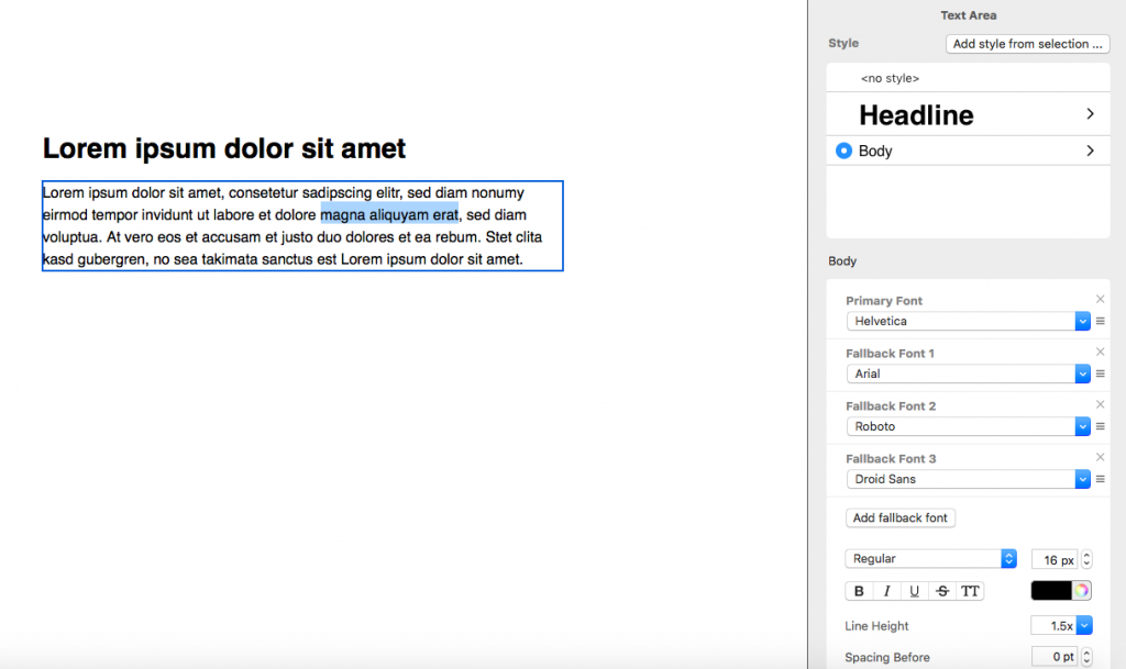
  2. Drag across the exact word or phrase you want to emphasize.
  3. Confirm that only the intended characters are selected.
  4. Keep the selection active while opening the Style controls.

Select words to highlight text in an email

Selecting a specific range is important. The standard text-object style controls can affect the full object, whereas Emphasis is intended for a smaller selection inside that object.

Apply Emphasis Formatting

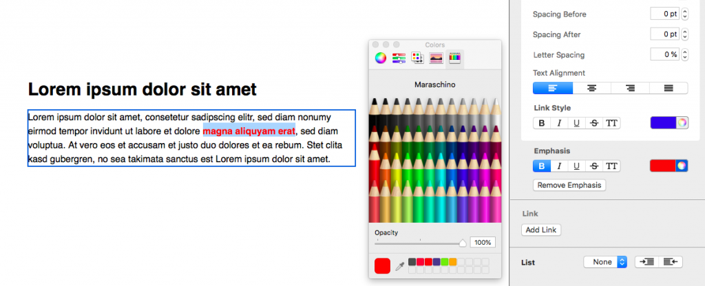
With the text selected, locate Emphasis in the Style sidebar. Choose only the formatting needed for the message. For example, bold can add weight, italic can distinguish a short phrase, and a carefully chosen color can draw attention while remaining consistent with the campaign design.

Open the Emphasis controls in the Style sidebar

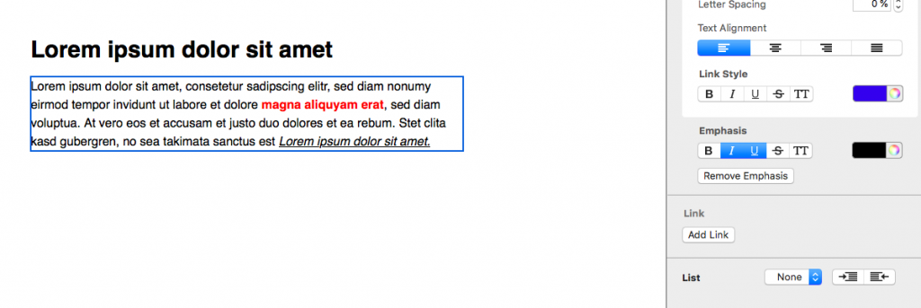
The selected formatting is applied to the highlighted range rather than the whole paragraph. You may emphasize more than one range in a text object, but keep the overall hierarchy predictable. If every phrase looks different, recipients will not know which element is most important.

Apply emphasis formatting to selected email text

Choose an Accessible Emphasis Style

  • Do not rely on color alone: combine color with clear wording or another visual distinction when the information is important.
  • Keep contrast readable: check emphasized text against its background.
  • Avoid very small italic text: readability matters more than decorative variation.
  • Preserve link clarity: do not make ordinary emphasized words look like clickable links.
  • Use a consistent hierarchy: the same type of information should receive similar treatment throughout the email.

Keep Emphasis Separate from Link Styling

Emphasis changes the appearance of selected words; it does not create a destination. When the text should be clickable, create or edit the link and follow the separate text-link formatting guide. This keeps visual emphasis and interactive behavior clear.

Remove Emphasis from Text

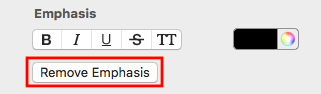
To restore the original style, click the emphasized text, select the relevant range, and choose Remove emphasis. The selected text returns to the underlying style settings for that text object.

Remove emphasis from highlighted email text

If only part of the formatting is wrong, select the affected range carefully before removing or replacing it. Review adjacent spaces and punctuation so the transition back to the base style looks intentional.

Test Highlighted Email Text

  • Preview the desktop and mobile layouts.
  • Check that emphasized words remain readable at both widths.
  • Confirm that line wrapping does not separate a highlighted phrase awkwardly.
  • Make sure emphasized text cannot be confused with a link or button.
  • Send a test email and review the received message, not only the editor.

Common Emphasis Problems

The Whole Text Block Changes

Undo the change, select only the intended characters, and use the Emphasis section rather than a control that applies to the complete text object.

The Highlight Is Too Strong

Reduce the number of simultaneous changes. Bold or color alone may be sufficient; combining bold, italic, underline, and a bright color can overwhelm the surrounding message.

The Text Looks Different on Mobile

Review line breaks and spacing in the mobile layout. Shorten the phrase or adjust the text object if the emphasis creates an awkward wrap.

Effective emphasis helps recipients find one important point quickly. Select a precise range, apply a restrained style, and verify the result in a delivered test email.

Letter spacing for text styles in Mail Designer 365

Adjust letter spacing for text styles

By Hans-Peter Configuring Text Styles

Adjust letter spacing for email text styles

Adjust letter spacing in Mail Designer 365 when a heading, label, or short text element needs more or less space between characters. Letter spacing can help create a distinctive text style, improve the visual balance of uppercase headings, or make compact typography easier to read.

Use the setting carefully: large changes can reduce readability, especially in body copy and on small screens. This guide explains how to select text, enter a precise spacing value, save the result in a text style, and test the finished email.

Select the text you want to change

  1. Open the email design in Mail Designer 365.
  2. Click inside the relevant text area.
  3. Highlight the word, line, or paragraph whose spacing you want to adjust.
  4. Open the Style tab.

Select only the text that should receive the new spacing. If the entire text area uses one style, you can select all of it. For a single emphasized phrase, limit the selection so surrounding copy keeps its existing appearance.

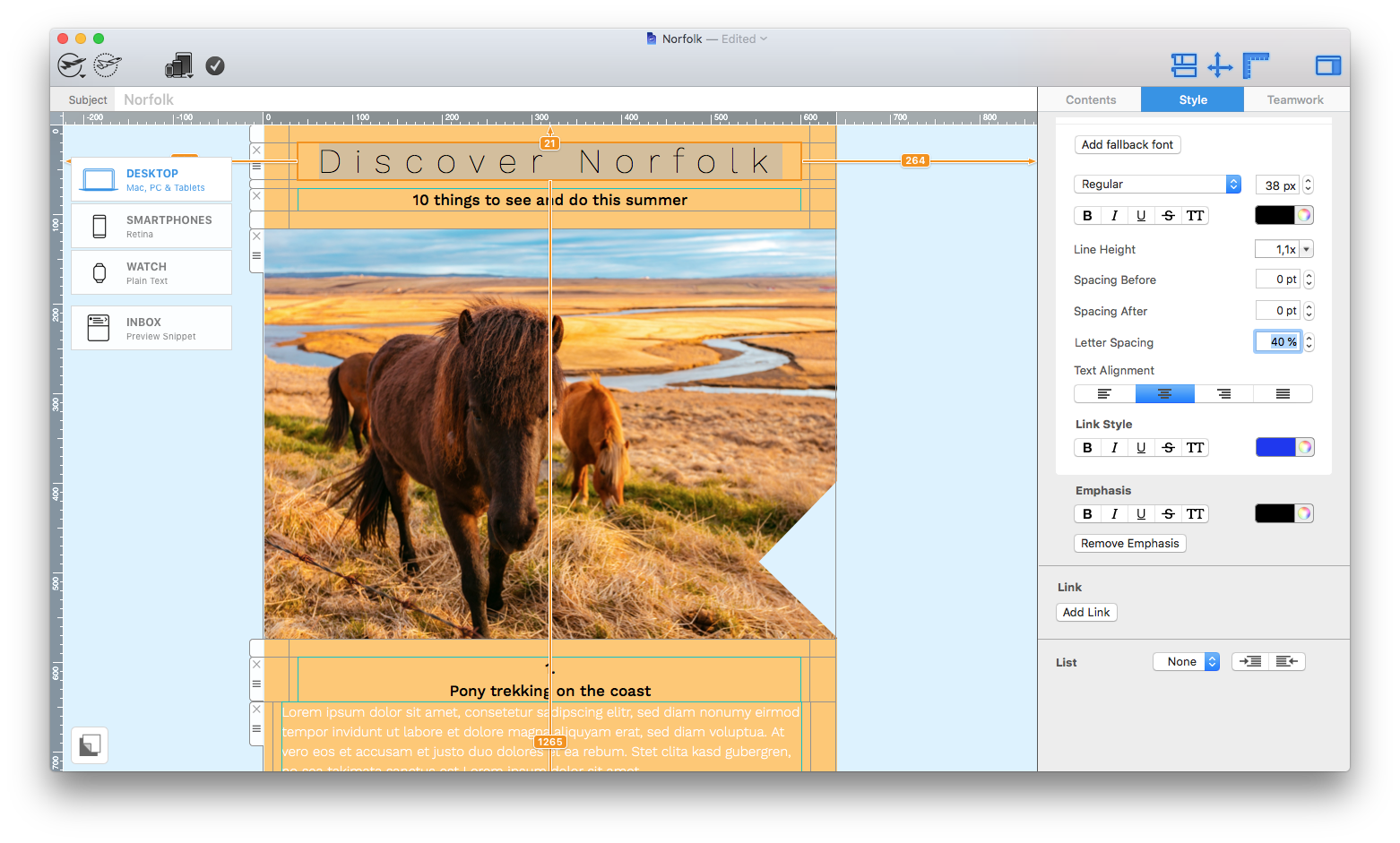
Select email text and open the Style tab to adjust letter spacing

Enter a letter-spacing value

Scroll in the Style controls until you find Letter spacing. Enter a precise percentage value, or use the up and down arrows to compare small changes. Watch the selected text in the design while adjusting the value.

Start with a modest change. Headings may benefit from a little extra space, while body text usually needs tighter and more consistent spacing. Negative values bring characters closer together; positive values move them farther apart.

Set a precise letter spacing percentage in Mail Designer 365

Choose spacing for the type of text

Uppercase headings often tolerate wider spacing because the individual letters have strong shapes. Short labels and buttons may also benefit from a subtle increase. Long paragraphs, narrow columns, and small text should usually stay close to the font’s default spacing.

Consider the font as well. A value that looks balanced with one typeface may appear too loose or too tight with another. Review the actual words used in the campaign rather than judging the style from placeholder text.

Save the setting in a text style

Mail Designer 365 saves the letter-spacing setting as part of the text style. This helps you reuse consistent typography across the email. When you apply that style to another text element, check that its different word length and container width still produce a good result.

If you need a style that is used only in the mobile version, see creating mobile-only text styles.

Check line breaks and layout width

Changing character spacing also changes the total width of the text. A heading may wrap to another line, a button label may no longer fit, or a paragraph may become taller. Check the surrounding layout after every significant adjustment.

Do not reduce font size solely to compensate for excessive spacing. A smaller spacing value or shorter wording usually preserves readability more effectively.

Preview desktop and smartphone versions

  • Check headings and body copy at both layout widths.
  • Look for unexpected line breaks or clipped text.
  • Confirm that button labels remain centered and readable.
  • Compare the visual hierarchy with nearby sections.
  • Review text contrast as well as spacing.

Mobile layouts have less horizontal space, so a wide letter-spacing value can cause wrapping that does not appear on desktop. Make separate adjustments where the design workflow supports them.

Send a test email

Previewing in the editor is useful, but a test email shows how the typography renders in actual email clients. Open the message on a phone and desktop computer, then compare important headings, buttons, and paragraphs.

When the spacing looks consistent and the text remains easy to read, save the design and reuse the style where appropriate. Treat letter spacing as a refinement that supports the message rather than a decorative effect applied to every text element.

Paste and Match Style command in Mail Designer 365

Paste and Match Style in Mail Designer 365

By Hans-Peter Configuring Text Styles

Paste and Match Style in Mail Designer 365

Paste and Match Style lets you insert copied text while using the formatting of the destination text area in Mail Designer 365. This is useful when the source comes from a website, document, note, or another app with fonts, sizes, colors, or spacing that do not belong in your email design.

The important distinction is that the command does not preserve the source formatting. It keeps the destination style. The words are inserted into the selected text area and adopt its existing typography, helping headings, body copy, and links remain consistent with the rest of the newsletter.

When to use Paste and Match Style

Use this command when the copied text contains formatting you do not want to bring into the email. For example, a blog post may use a different font and size, a word-processing document may contain hidden paragraph styling, or copied website text may include colors and links that conflict with the design.

If you are copying content between two Mail Designer 365 text areas and want the destination area to control the appearance, Paste and Match Style is also a useful choice. For complex content, paste one section at a time so you can review headings, paragraphs, lists, and links separately.

Text selected before using Paste and Match Style in Mail Designer 365

How to paste text and keep the destination style

  1. Copy the text from the original document, webpage, note, or application.
  2. In Mail Designer 365, select the destination text area and place the insertion point where the new text should appear.
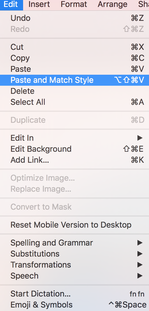
  3. Open the Edit menu.
  4. Choose Paste and Match Style.
  5. Review the pasted text and confirm that it uses the destination font, size, color, and paragraph styling.

Paste and Match Style command in the Mail Designer 365 Edit menu

What to check after pasting

  • Confirm that paragraph breaks and list items appear in the intended order.
  • Check bold, italic, and linked text instead of assuming every inline format should remain.
  • Verify link destinations and remove any links copied unintentionally from the source.
  • Review quotation marks, dashes, special characters, and nonbreaking spaces.
  • Preview the text at desktop and mobile widths to catch awkward wrapping.

Source content may contain hidden characters or spacing even when its visible formatting has been replaced. If a paragraph still behaves unexpectedly, paste a smaller section, remove unnecessary line breaks, or type the affected characters again inside the destination text area.

Regular paste versus Paste and Match Style

A regular paste may retain some source formatting depending on the copied content and application. Paste and Match Style is intended for the opposite situation: you want the inserted words to follow the design already established in the destination text area. Choose the option that produces consistent typography and then inspect the result rather than relying on the command name alone.

When building a newsletter from several sources, define the text styles in Mail Designer 365 first. Create the heading and body areas you need, then paste content into the appropriate destination. This reduces manual cleanup and makes future editions easier to update.

Troubleshooting pasted text

If the pasted text does not match the surrounding content, confirm that you selected the correct destination text area before opening the Edit menu. If copied links or unexpected line breaks remain, edit them directly after pasting. For content with tables, columns, or other complex structure, rebuild the layout with Mail Designer 365 elements instead of trying to transfer the entire source as formatted text.

Before sending, read the pasted content once more and send a test email. Check the typography, link behavior, line breaks, accessibility, and mobile layout in the email clients your audience uses most.

Keeping destination styles consistent also makes later global design changes easier, because pasted paragraphs continue to follow the typography already defined for the campaign.

Using Text Styles

By jstawska Configuring Text Styles

Why use text styles?

Text styles help ensure your email text stays consistent throughout your design. They make editing faster and more streamlined and help prevent compatibility issues after sending your email template.

Within a text style, you can define a primary font and an email-safe fallback font. The fallback font is displayed if the primary font is unavailable to your recipient.

Accessing text styles

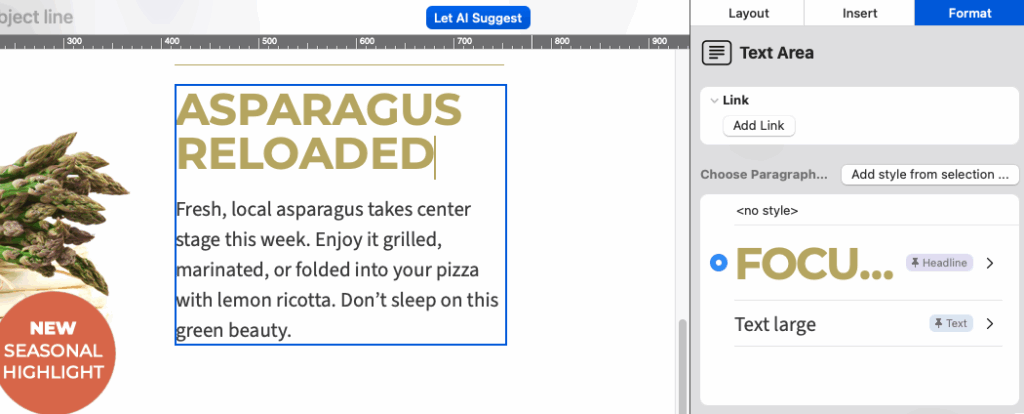
To access text styles, select text from a text area to open the Format section of the sidebar. Here you can see any existing text styles your team has created and add new ones if needed.

access text styles in the format sidebar menu

Access text styles in the sidebar under Format

Default text styles

All Mail Designer designs include predefined default styles for your headline and body text. When you add a new layout block, the default style will automatically be applied.

To change the default text style for your document:

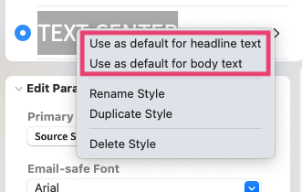
  • Go to the styles list and click the arrow next to the style you want to set as default.
  • Select Use as default for....
changing a default text style for a Mail Designer 365 email template

Update the default style for your newsletter

Switching between text styles

Click into the paragraph you want to edit, then select a different style from the sidebar. This will apply the chosen style to the entire paragraph.

Adding additional text styles

If you need more than the default Headline and Body styles:

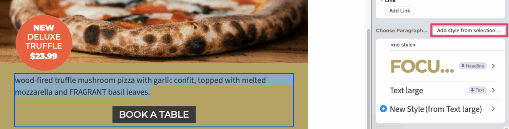
  1. Highlight the text you want to create a style from
  2. Click Add style from selection in the sidebar:

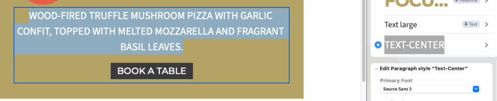
  3. Enter a name for your new style so it’s easy to find in the style menu
  4. Choose the font and adjust other formatting options such as color or font size in the sidebar

Updating text styles

When you edit a text style, the changes will apply everywhere that style is used in your design.

For minor changes to specific words or sentences within a paragraph, use the Emphasis tool. This allows you to adjust only a section of text without creating a new style.

Privacy Settings / Datenschutz-Einstellungen