It's no secret that the number of people checking their emails on the go has significantly risen in recent years. One mobile device which has massively grown in popularity since its initial release in 2015 is the Apple Watch. With the recent release of watchOS 5, email creators and recipients alike are all breathing a collective sigh of relief. Finally, no more scrolling through long plain text emails...
We're taking a look at how the latest update could transform your email marketing strategy.

HTML emails are now available on the Apple Watch!
HTML email designs on mobile devices are nothing new; iOS devices have offered solid support for HTML email since 2011 and since then, email marketers have been striving to create perfectly responsive designs for smartphones. However, since the first release of the Apple Watch back in 2015, the question on the lips of many email geeks was "when will HTML emails be supported?"

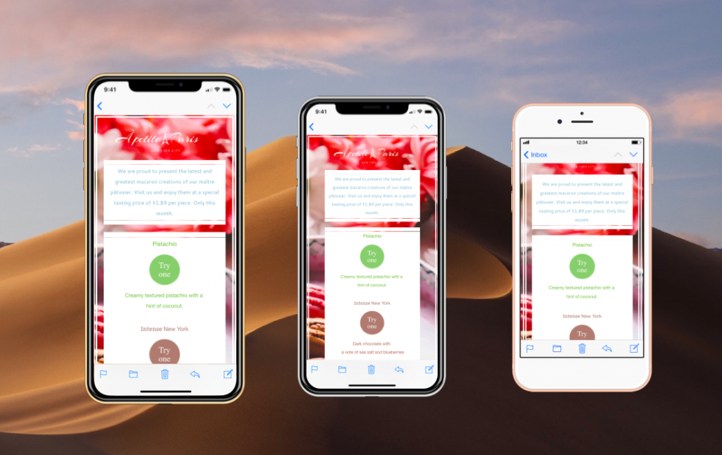
HTML emails have always been supported on iOS.
The newly announced support for HTML emails on watchOS 5 is massive for email marketers. Previously, the Apple Watch could only offer support for plain text emails which, despite seeming super cool at first, do not provide the same eye-catching effect of a well-designed HTML email template. Emails on your wrist sounded good, but it turns out scrolling through long plain text mails isn’t much fun.
What can be expected from HTML emails on watchOS 5?
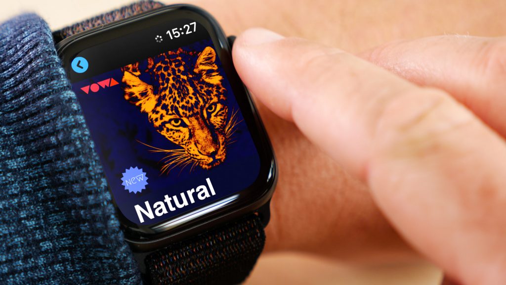
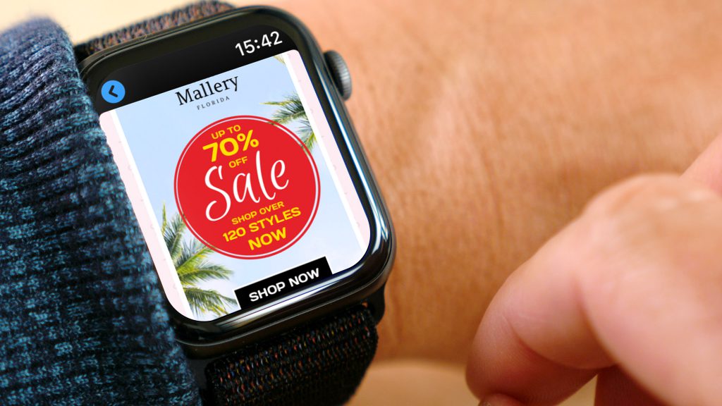
With watchOS 5, your recipients can now gain immediate access to your HTML email designs on their wrists. Readers can scroll, tap to zoom, and even click on links and CTA (call-to-action) buttons just as they would on a smartphone.
Wherever your customer is, if your email is effective enough, all it takes is a few clicks, and they will be transported to your website via their watch.

How can I adapt my marketing strategy?
Here are our three top tips for creating email designs perfect for the Apple Watch:
1. Watch your word count
Just like designing for smartphones, it is important to check your text is as concise and to the point as possible. The super small design of the Apple Watch makes this even more important - the more the reader has to scroll through your design, the less interesting it becomes.
2. Check your landing pages
Remember to keep your landing pages watch-friendly too! There's nothing worse than your recipient clicking on a link which takes them to a page which can't be viewed on the small watch screen.
3. Preview your design
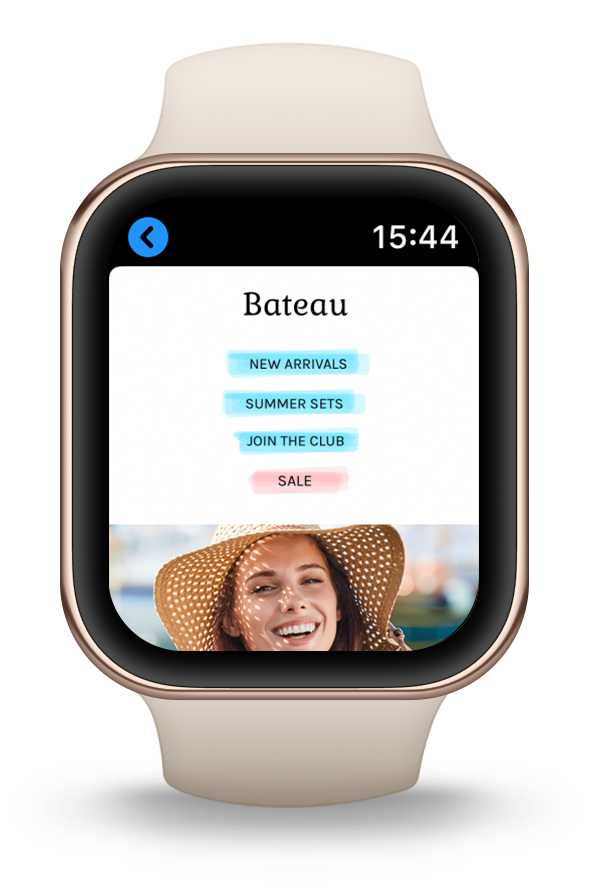
It's good practice to test and preview all kinds of email designs before sending. In particular, it is crucial to preview your design on the Apple Watch, as the dimensions may be unfamiliar to you. The preview will help you identify the perfect size for design elements such as font, CTAs, and images.

Why Mail Designer 365?
In Mail Designer 365, you can enjoy two separate design views: one for desktop layout and one for mobile. Use the mobile layout to build a special mobile design which will be used for smartphones and Apple Watches using watchOS 5 and later.
Want to test out your design? The latest Apple Watch previews will be available in the next Mail Designer 365 update so you can view your HTML email in realtime on Series 4 of the Apple Watch.

