Whether you're informing customers about an upcoming product launch, sharing a statement, or communicating important changes to subscribers, being able to write effective announcement emails is a key skill needed by businesses of all sizes.
What is an announcement email?
In this article, "announcement email" is very much an umbrella term for your core communication with customers (outside of standard sales emails.) An announcement email can take many forms, including but not limited to:
- Internal company news
- Product news or updates
- Public statements
- Announcing a show of support OR taking a stand
- Crisis communication
- Event invitations
- Customer information
Also important to consider: Oftentimes, announcement emails are much more text-heavy than a standard marketing-style email, as the sender usually has a lot to say.
Why should I use email for my announcement?
As a business owner, email is the most reliable way to make important announcements to your subscribers. Although social media is booming, complicated algorithms often mean many of your subscribers on platforms like Instagram, Facebook and Twitter don't even see your posts - resulting in important information going unread.
Email is a direct channel between you and your customers with very little background noise to take away from your key message. For this reason, when done correctly, an announcement email has the potential to lock in high open rates and get better conversions.
Here are some useful tips to consider when sending an announcement email, plus some great examples of announcement emails we have collected from around the web and our own personal inbox.
Our recipe for effective announcement emails
Strong email copy
One way of ensuring your announcement email is a success is through great communication. This can be achieved by producing strong and convincing email copy to really make your message clear to readers.
Think carefully about the context of your announcement. This will help you determine the tone you want to use and will help you choose your words more carefully.
For example, if your email announcement is of a serious nature, it is probably more fitting to opt for a formal and professional tone. For an exciting announcement like a product launch or a new store opening, you can afford to have a little fun with your email copy and adopt a more relaxed tone.
Other important aspects that will help elevate your email copy include:
- Good spelling and grammar
- Varied sentence structure
- Clear paragraphs and sub-headings - especially if you are conveying a large amount of information
In this email statement, CreativeMornings use powerful, well-thought-out prose and a clear layout to show their solidarity with the #BlackLivesMatter movement.
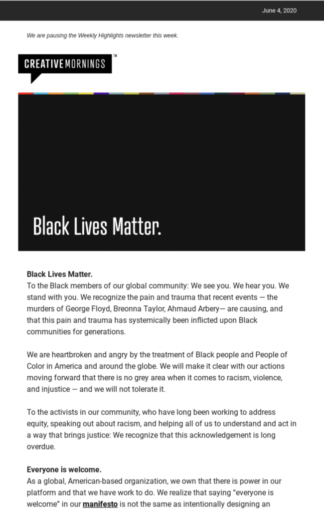
CreativeMornings show their support for the #BlackLivesMatter movement through powerful prose.
Great design
The way your email looks is - in many ways - just as important as what it says. An eye-catching header graphic or a strong feature image can be all it takes for your reader to pay more attention to your email.
Take this announcement email from Avanti West Coast - Although the rest of the email is quite plain, Avanti do a great job of drawing in readers using a colorful and abstract header design. The simple title "Important information" is enough to let the reader know this is something they should be paying attention to:
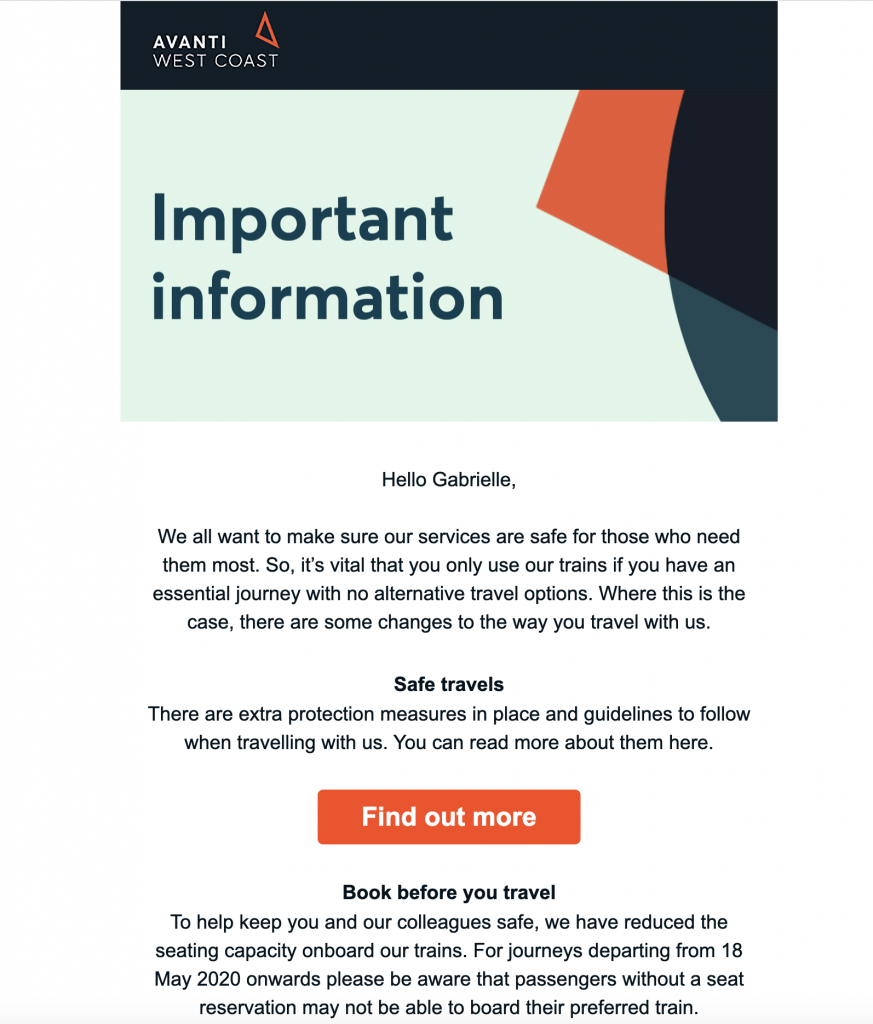
A great header design helps this announcement email by Avanti capture readers' attention.
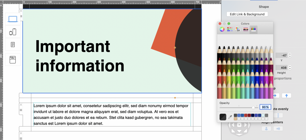
Tip: You can create a similar header effect in Mail Designer 365 by layering shapes and adjusting the opacity:
Another style element which is important to your design's overall effect is your font choice.
While it's tempting to get creative when it comes to fonts, oftentimes, simple is best. Especially when your message is so important, you don't want to run the risk of a poor font choice getting in the way of clear communication.
Choose a clean, easy-to-read font in a sensible weight to apply to your email copy. You should also avoid overusing bold or italic, as this appears confusing to readers. When you're done, remember to configure an email-safe "fallback" font to ensure your email text is displayed properly in all clients:
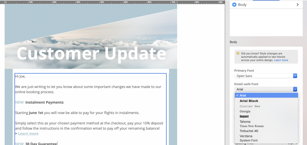
Always include an email safe fallback font to ensure better compatibility with other email clients
Clear call-to-action
Any marketing email needs to be able to demonstrate a clear call-to-action. Whether you want your readers to sign up for an event, pre-order a new product, or simply visit a landing page, you need to point them in the right direction first.
Use a CTA (call-to-action) button which clearly stands out against the rest of your email in order to make it prominent to readers. You should also make sure the text of your button is short and snappy and check that the link leads to a sensible destination.
By choosing a vibrant shade of red for the CTA in this tour announcement email, Live Nation are able to convey a sense of urgency and encourage readers to sign up for event access:
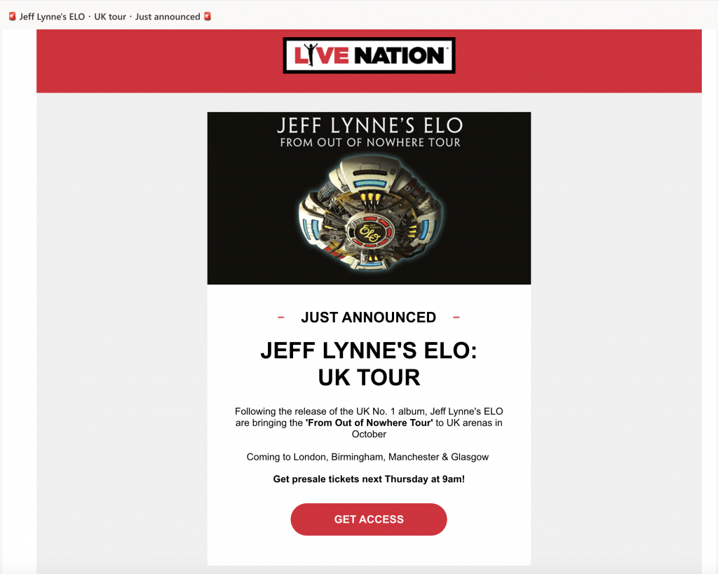
The bold, red CTA button in this tour announcement email by Live Nation jumps out at readers.
Experiment with shapes and font styles in Mail Designer 365 to create dazzling CTA buttons for your own email designs:
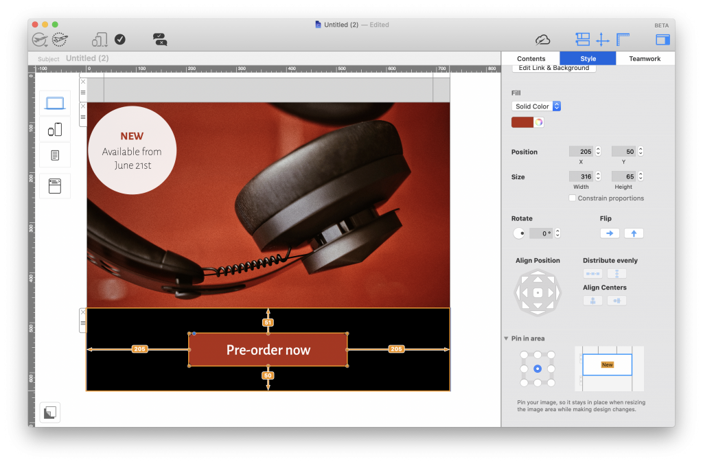
Mail Designer 365 has all the shapes and text styles you need to create bold and effective call to action buttons.
Engaging subject line
Your email's subject line is the very first thing that recipients will see and is often the determining factor in whether or not your email gets opened. For this reason, you need to ensure your subject line is interesting and intriguing enough to pique your customers' interest.
When you are coming up with a subject line, be sure to include key words such as "new", "announcement", "exciting news", etc., in order to let your readers know what the email is about. By teasing your new product, upcoming event, important news, etc., you are bound to make your readers curious and encourage them to open up your email.
Furthermore, using emojis in your email subject is another great way to ensure it will stand out in their inbox.
Mobile optimization
Because so many people today now check their emails on the go, it's crucial that your announcement email has also been optimized for mobile devices. This is a key part in ensuring that your message is effectively communicated.
Mobile optimization includes aspects such as:
- Checking the font is legible on mobile devices
- Choosing target links which make sense on mobile devices (i.e. iOS App Store versus Mac App Store links)
- Resizing images to look good on mobile devices
- Including tailored content for mobile users (e.g. special offers, mobile app download links, etc.)
Mail Designer 365 automatically creates a mobile responsive version of your email design, which you can optimize and edit separately to your main desktop design. Simply navigate to the Smartphone view and detach a layout block to begin creating mobile-only content:
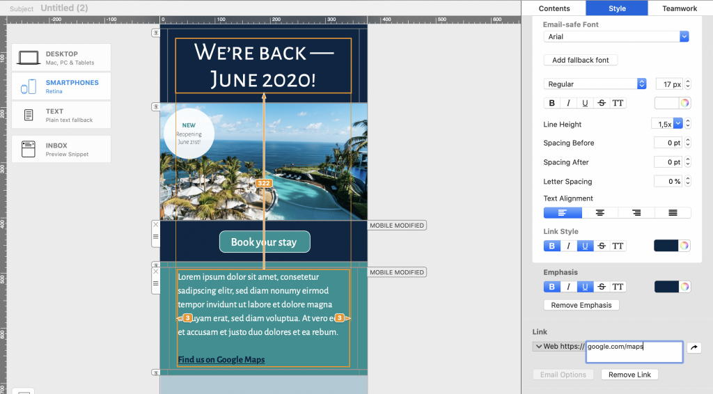
Use the Mail Designer 365 smartphone editor to create mobile optimized announcement emails.
Smart segmentation
The final way of ensuring your announcement email is a success is by making sure you send it to the right target audience. Sending one email to your entire list is usually a bad idea and is generally only reserved for exceptional circumstances (i.e. major business announcements.)
When you are setting up your campaign in your email marketing platform, think about who will find this information most relevant. This group should be your first priority, as they are more likely to engage with your email. If you can think of other groups who may also find the email beneficial, you can go back to adjust and optimize your template accordingly.
Looking for tips? Here are some useful segmentation techniques you could try out:
Email List Segmentation Techniques to Learn More About Your Subscribers
More examples of great announcement emails
If you are in need of some inspiration, here are a few more announcement emails which we found particularly effective...
Product Hunt
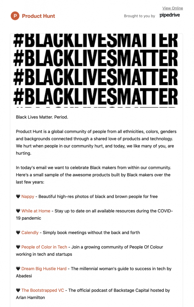
The striking header graphic in this email by Product Hunt gets their important message heard loud and clear.
Unsplash
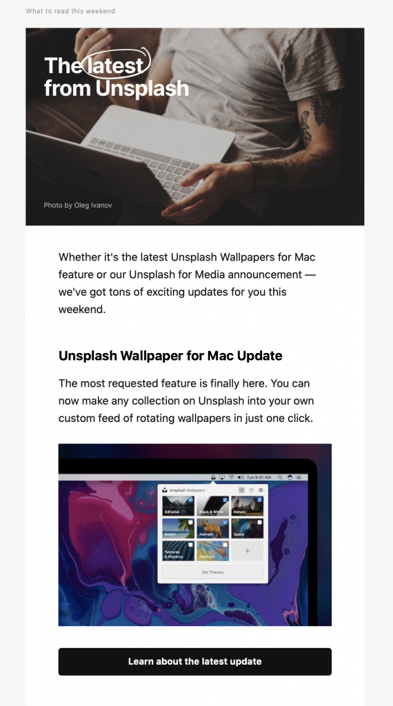
This simple newsletter-style announcement email by Unsplash is both informative and interesting for users of the service.
easyJet
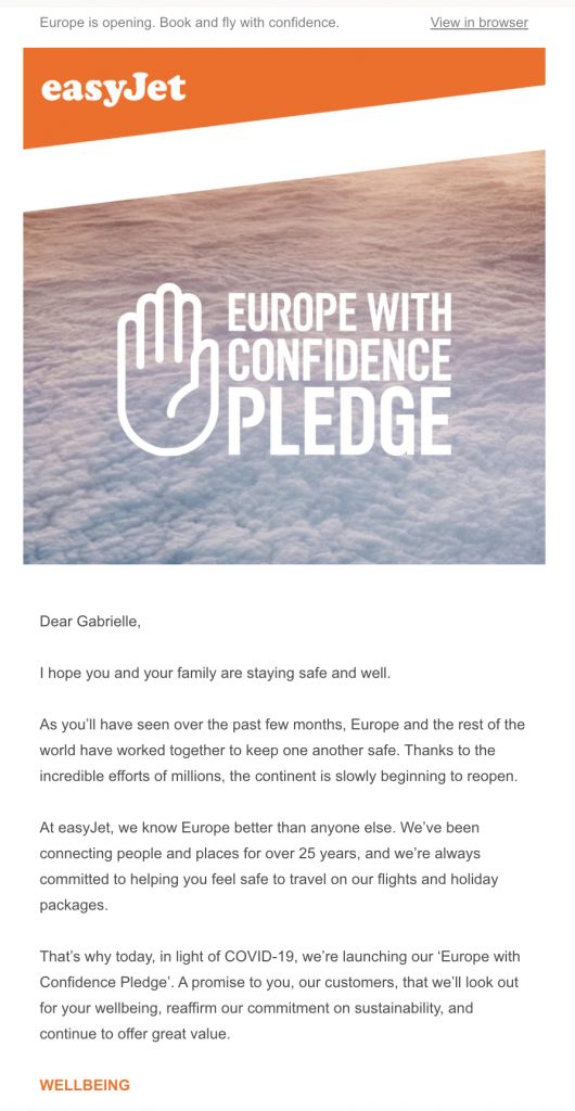
easyJet use the header of this announcement email to grab readers' attention before sharing their important update.
Shinola

Shinola use bold design techniques to win customers' attention in this new product announcement email.
allplants
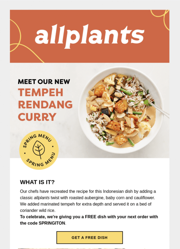
allplants do a great job of using a colorful CTA button together with a clear layout to introduce a new dish to their menu.
YO!Sushi
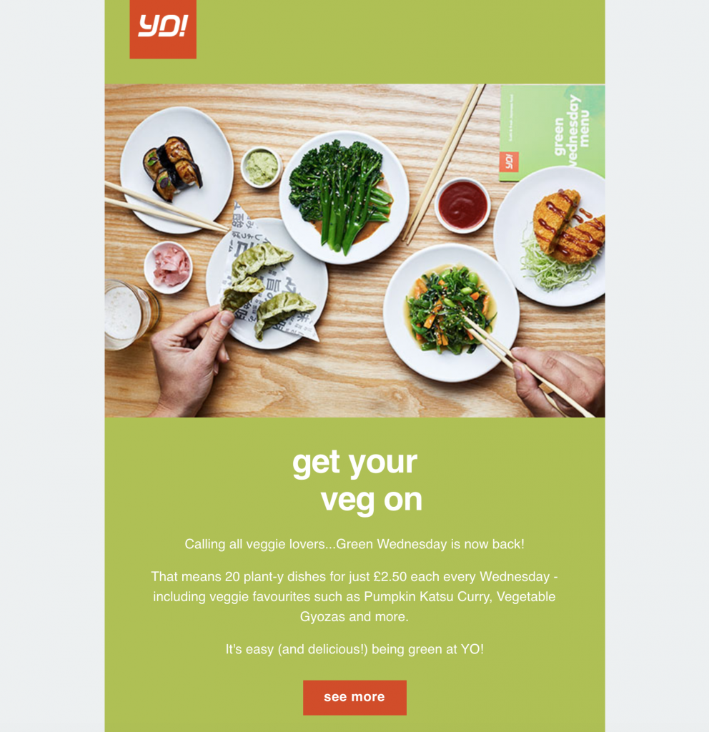
YO!Sushi also mix contrasting color combinations with a big feature image to get customers excited about the return of their "Green Wednesday" promotion.
Mailchimp
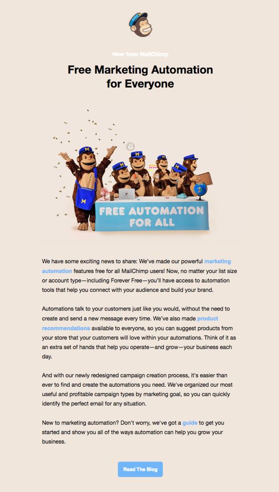
This announcement email by Mailchimp concentrates a lot on great email copy and an effective CTA button.
Discover how Mail Designer 365 can help you build announcement emails
We hope you are feeling inspired and will take these tips on board the next time you ned to make an important announcement for your business.
Mail Designer 365 has all the tools and email template options you need in order to create a fabulous announcement email and share your great news with your subscribers. Sign up today for free to get started!

