For a lot of businesses, Halloween is one of the most exciting events on the marketing calendar. Building a Halloween email campaign gives you the chance to get super creative and try out loads of exciting new ideas. Like all holidays, it's also a great opportunity for holding a sale or special promotion.
However, it can also be daunting to try and come up with a new idea when the stakes are so high. To help you get inspired, we've collected some of the very best Halloween email campaign examples, as well as easy-to-follow tips and tricks on how to recreate them...
P.S: Don't forget to check out our spooky Halloween template collection - ready for you to edit in Mail Designer 365 on your Mac and send via Delivery Hub...
Halloween Email Template Ideas for Your Business
1. Uber
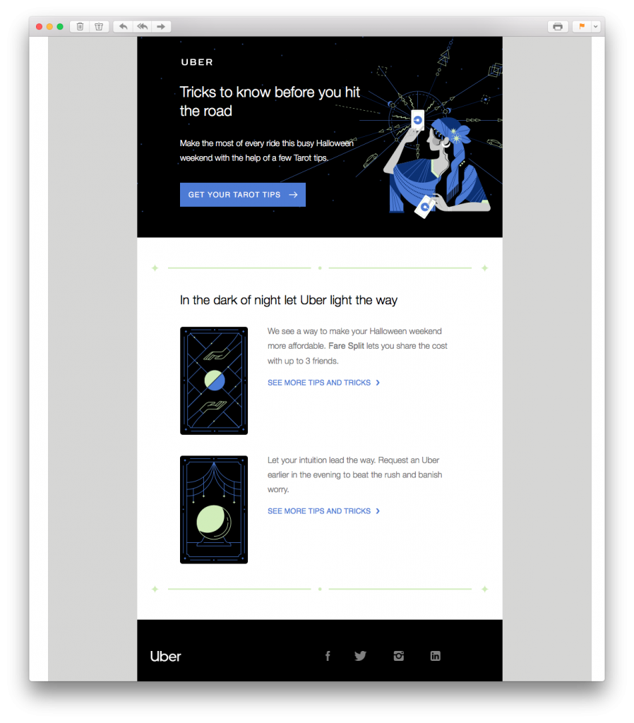
This tarot themed email design by Uber is a great way to kick off our examples. Although not necessarily a traditional Halloween theme, Uber still manage to incorporate some spookiness into their email to keep readers interested.
What we love: Including Halloween survival tips is something many customers will massively appreciate.
2. JackThreads
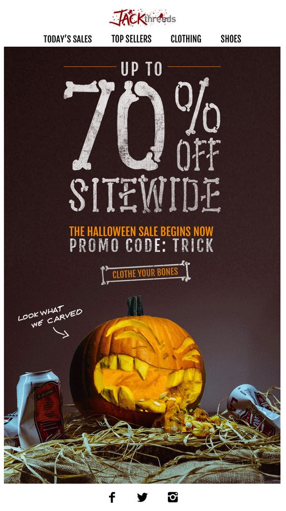 In this email promotion, JackThreads have opted for the classic Halloween sale. 70% off is impressive and will instantly pique readers' interest. The funny pumpkin graphic is also a clever way to grab the attention of the reader and get them in the Halloween spirit.
What we love: The skeleton font is super unique and perfect for Halloween. We also love the blood spatter effect they've used on their logo to make the email even more scary.
3. Hotel Chocolat
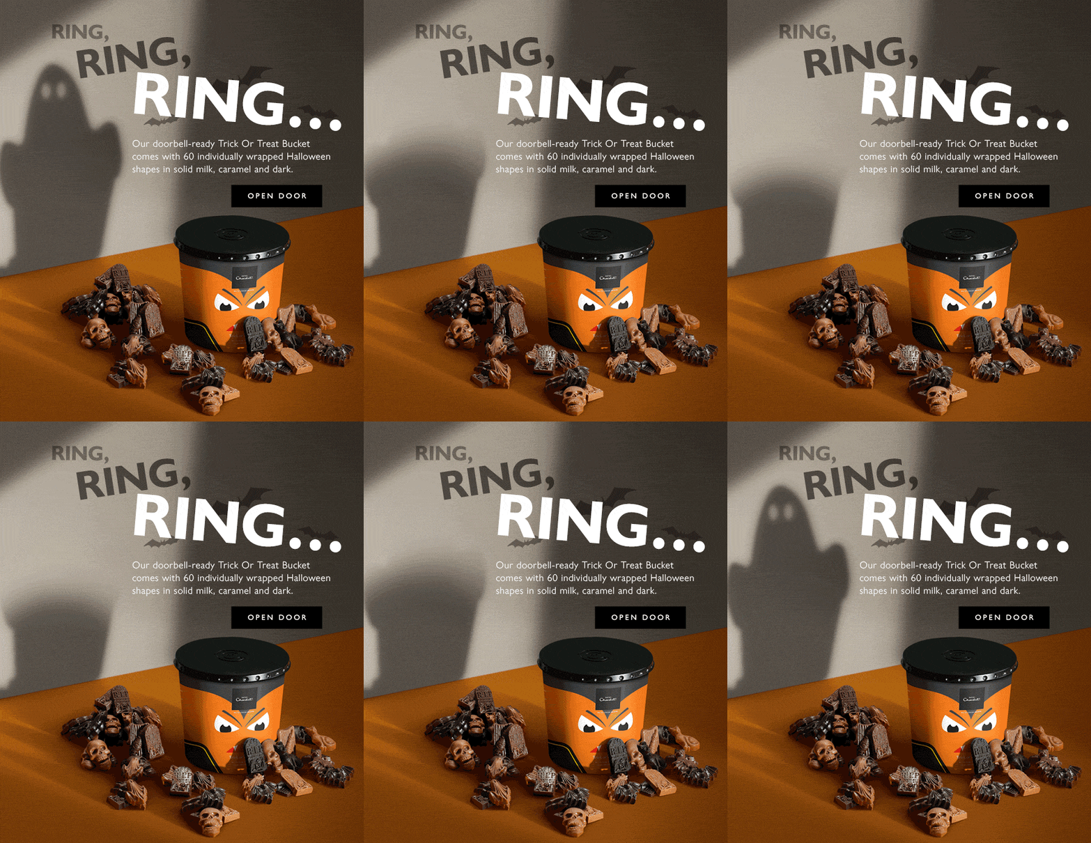
Bring on the first of the GIFs! This simple yet effective email by Hotel Chocolat is super clever and plays on the classic trick or treat theme which everyone associates with Halloween. The spooky ghost in the background paired with the creepy "ring, ring, ring..." makes the design extra exciting.
What we love: The playful CTA button (call-to-action) is smart in this email design. Using a less serious CTA makes readers more willing to play along at Halloween.
4. thredUp
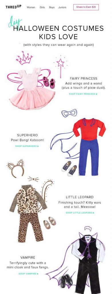 This email by thredUP is a bit less on the scary side, but still seriously cool. Dressing up and having fun is what Halloween is all about so these DIY costume ideas are ideal for kids and parents alike. The CTA links are also easy to locate, making shopping for the perfect costume even easier!
What we love: The costume tips are really inspiring for parents planning a fun Halloween for their kids. thredUp also stresses how the clothes can be worn again and again (not just on the big day) which we think is super productive.
Tip: Build a similar layout in Mail Designer 365 using combi text-image layout blocks:
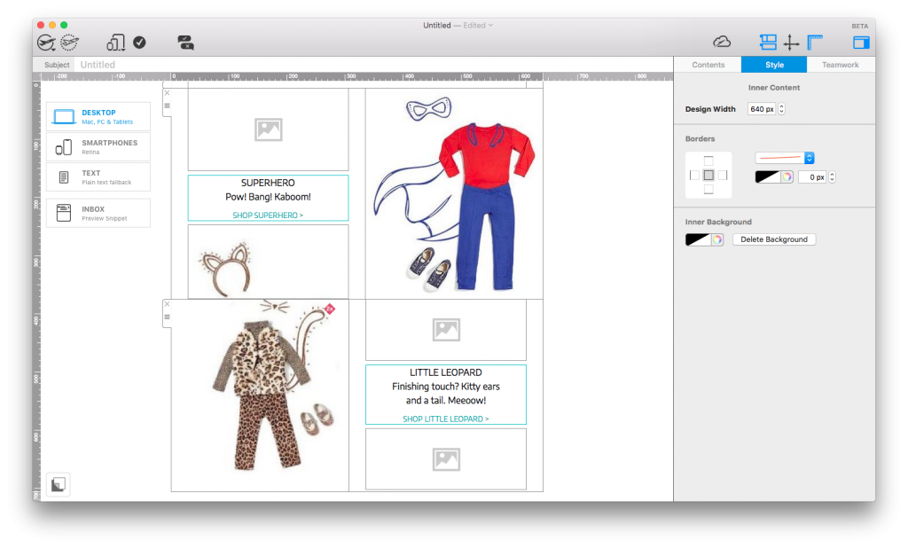
Use Mail Designer 365's combination layout blocks to create easy-to-follow catalogue layouts.
5. Graze
 Graze are making us hungry with this snack-themed Halloween email! Concentrating on the health benefits of pumpkin seeds is smart at this time of the year and gets readers hungry to find out more about this nutritious snack. The little pumpkins scattered throughout the design also help add to the seasonal theme without going overboard.
What we love: The pumpkin shaped eye-catcher at the top of the design instantly introduces the Halloween theme and helps Graze show off their special offer.
6. Boohoo
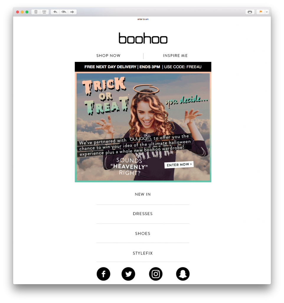
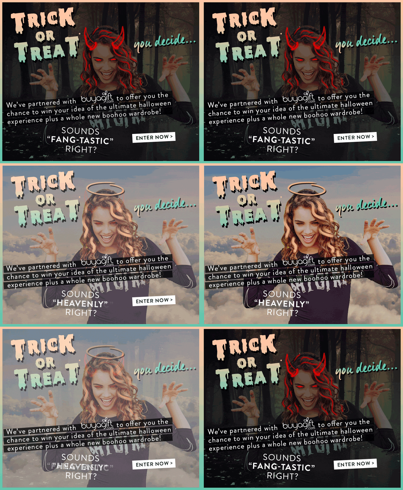 Boohoo also get creative with GIFs in yet another trick or treat inspired email design. Although the rest of the email is pretty simple, the main eye-catcher is the heaven vs. hell GIF animation at the top of the design which instantly makes the theme clear.
What we love: As well as the really clever GIF, the retro Halloween font choice in this email is also great. Using all of these aspects together helps Boohoo create the perfect basis to advertise their Halloween competition.
Tip: Try out the range of web fonts in Mail Designer 365 to create cool text effects like the one in this email. We personally recommend "Nosifer" or "Creepster" for this time of the year!
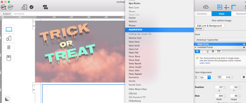
Use a Halloween style webfont such as Nosifer to recreate the spooky text effect used by Boohoo.
7. Sainsbury's
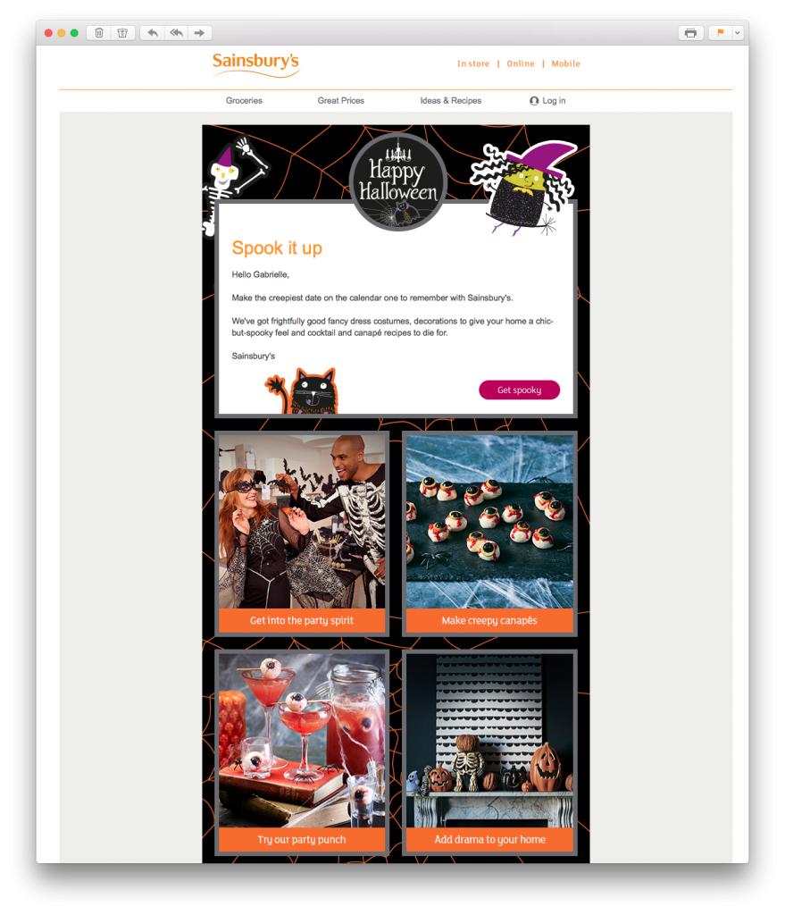 This email from Sainsbury's is yet another example of how you can use your Halloween email campaigns to offer customers practical tips and advice. The email has a great balance of text, images, fun graphics and CTA buttons.
What we love: The call-to-actions in this email work perfectly with the rest of the design. The orange stands out against the dark background, but also is completely on point for the season. It's also super effective how they're placed under eye-catching, Halloween themed images.
8. Land's End
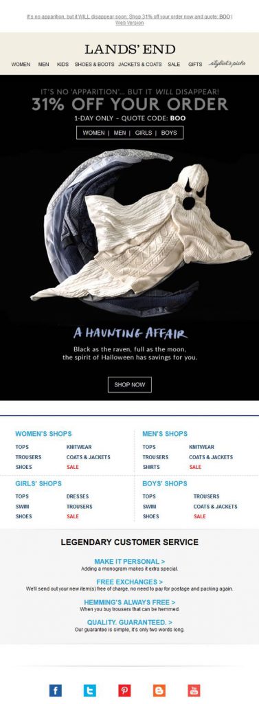 Land's End have pulled out all the stops on this email design. The 31% offer paired with the spooky ghost and the "Boo" discount code makes it no secret what the theme of this campaign is...
What we love: The ghost, obviously! The ghost feature image made out of clothing is a clever way for Land's End to incorporate Halloween into their usual branding.
9. Pizza Hut
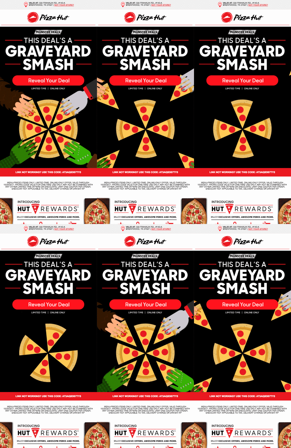 We've found yet another food-themed email! Pizza Hut have embraced the Halloween theme with this vibrant email design. The CTA is super tempting and makes the reader want to click straight away to discover their exclusive deal.
What we love: In this email, it's the color combination of red and black which stands out the most. We also love the fun pizza GIF which helps get readers in the party mood, as well as subtly making them crave pizza!
10. Kohl's
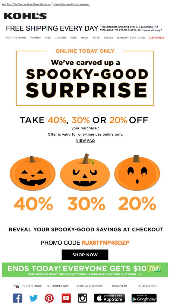 Kohl's have hit the nail on the head with their Halloween themed discount draw. There is a lot going on in this promotion. As well as the mystery discount offer, they also offer money off a threshold spend. All of these offers go along with the exciting nature of Halloween and encourage readers to get shopping.
What we love: Including a sense of urgency was a great way for Kohl's to make sure they attract as many customers to their website as possible. After all, it's now or never! The three pumpkins are also a great, central eye-catcher to keep the email in line with the theme.
11. Unidays
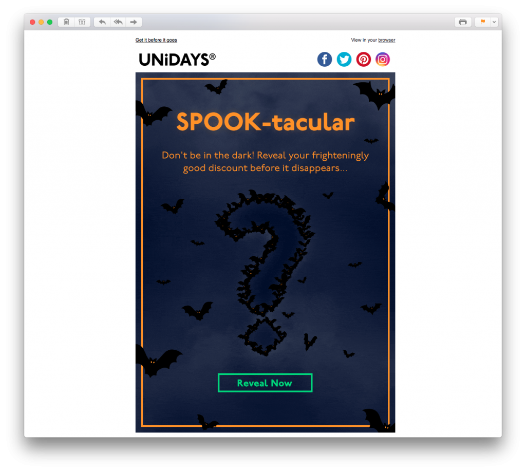 This email by Unidays is a similar concept to the previous email. In this example, there is even more of a sense of mystery thanks to the question mark graphic. The glowing green CTA button is also super prominent and entices the reader to click.
What we love: Thanks to the bats, the whole vibe of this email is really creepy mysterious. This adds even more to the overall effect of the promotion. The orange border paired with the headline font also helps make the design pop; giving it that Halloween feel.
Tip: Recreate this unique border effect in Mail Designer 365 with the borders tool. Customise the color, width and style of your border to suit your spooky email.
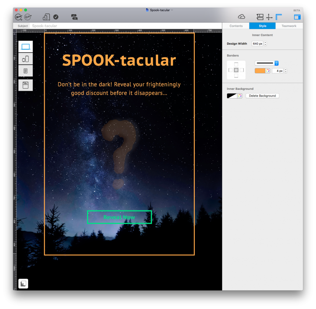
Use the borders tool in Mail Designer 365 to create spooky Halloween emails that really stand out.
12. American Eagle Outfitters
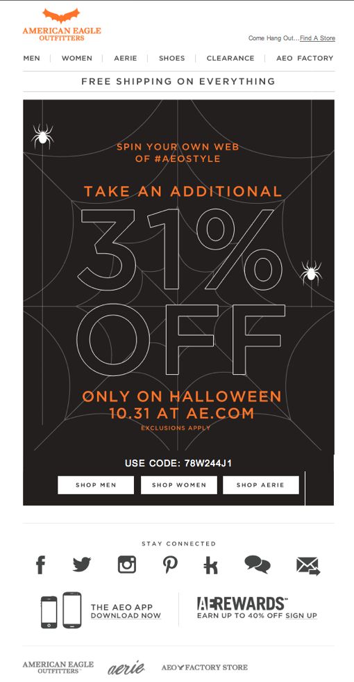 Look away now if spiders aren't your thing! This design by American Eagle Outfitters is pretty simplistic, but perfectly captures the Halloween theme thanks to the spooky spiderweb graphic. Also notice the little bat icon in the top left corner which they've swapped their usual eagle logo for. Just small changes like this can be super effective during the holidays.
What we love: The 31% off discount is clever because it differs from the norm and relates perfectly to Halloween. They have also managed to create a sense of urgency with the "only on Halloween" tagline.
13. BKNR

Last but not least, BKNR have gone for a more laid back approach in this email rather than concentrating too much on horror and spooky imagery. The subtle, orange accents throughout the email are great for Halloween and the trick or treat theme is also super effective.
What we love: The email is bang on trend for the Halloween season without going overboard. The quirky orange frames and bold CTA buttons mean customers are instantly drawn to the new products. We also give 10/10 for the Halloween kitty!
Tip: Use the shape creator in Mail Designer 365 to create a similar frame and CTA effect for your images. The color picker will give you exactly the shade of orange you are looking for to make your design Halloween ready.
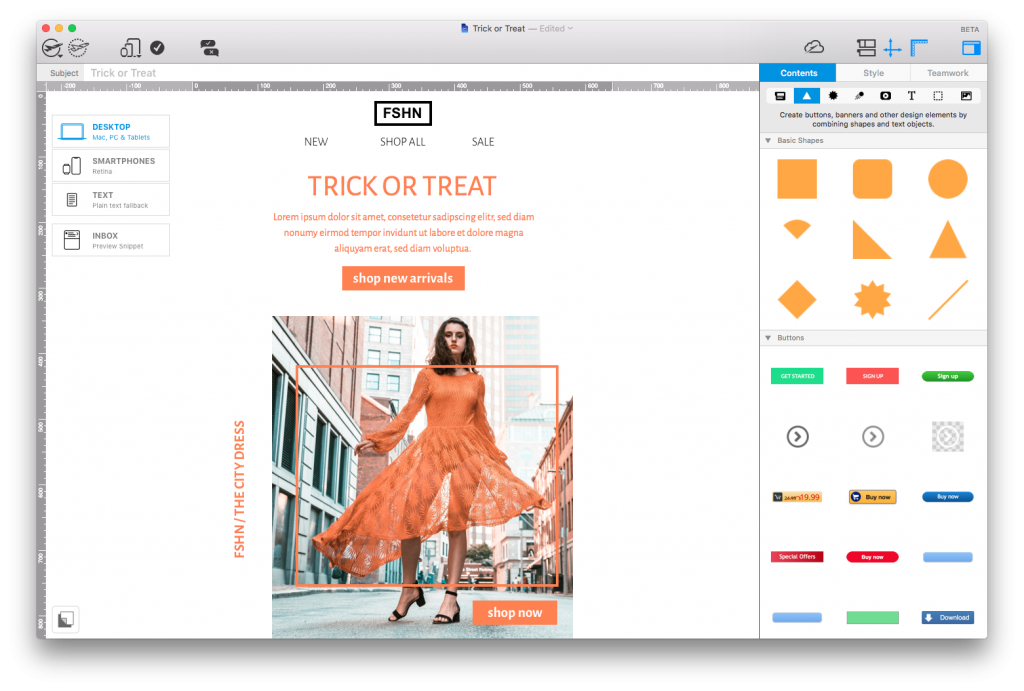
Use the shape creator in Mail Designer 365 to recreate quirky frame accents and build strong CTA buttons.
Awesome HTML Email Templates for Halloween:
We hope you've enjoyed these great examples of Halloween email designs. We've also got two exciting, Halloween templates for you over in Mail Designer 365! Get inspired and edit them in the app today!
Hungry for more Halloween tips? Check out our other awesome guides:
- 5 Things You Can Do to Build Devilishly Good Designs this Halloween
- 10 Spook-tacular Tricks for Halloween Email Campaigns
Happy Halloween!
Your Mail Designer 365 Team
Get started with Mail Designer 365 today
Enjoyed this post?
Get more inspirational tips, tricks, and best practice examples in the Mail Designer 365 Newsletter Academy -
your one stop hub for all things email marketing strategy and newsletter design.

