Trying to convince customers to take the time to fill out a survey or leave a review is difficult. Of course, anyone can send out an email with a link to a questionnaire, but is this enough? With so many businesses asking for the same thing, how can you make sure your feedback request comes across genuine?
Following these 6 simple tips should make it much easier for you to gain useful customer insights and create an effective survey system to use again and again.
1. Find the right survey tool
Surveys are an integral part of your marketing strategy and there are countless tools out there to help you reach out to customers. Whether it's a designated agency, a system you've built in-house or a third party platform, it's important to find the right tool for you needs.
For many businesses, opting for an agency or premium-style service can be unrealistic. In most cases, it is possible to create and host your survey using a free tool. This will save you money and also a lot of time. Free web-based tools such as Google Forms are perfect for generating questionnaires to send via email. If you're looking for something on a larger scale, Survey Monkey offer a range of different plans to suit your business's needs. Alternatively, check out this post for some more great options.
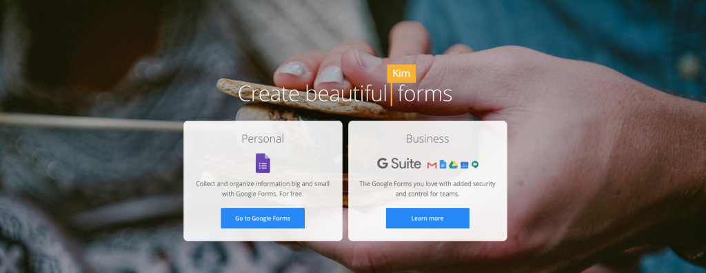
Check out Google Forms as a free resource to help build your survey.
Once you've settled on your tool, you can create your survey, generate a link, and include this in your email to send to subscribers.
2. Grab customers' attention through your subject line
The subject line is always important and here is no exception. Using a generic subject line which customers have read hundreds of times is a bad idea, as it will only get ignored. For example: "We need your help!" As an email subject, this is vague, uninteresting and massively overused.
Use your subject line as the chance to clearly outline why the customer should take time to open your email and give you feedback. Here are a few effective examples we have come across recently:
Moonmail: "Last chance to get a $25 Amazon card!" Generating a sense of urgency is a proven effective way to motivate readers to act.
Frye: "$50 for your thoughts" Including a monetary value naturally will spike the attention of the reader and make them curious to discover more.
Thumbtack: "Tell us what you think of Thumbtack in 30 seconds" Outlining how quick the feedback process will be should help convince the customer that the survey won't be too time consuming for them.
Handy: "What do you hate most about cleaning?" Asking the question outright in the subject lets the reader know what to expect from the email and creates a more direct approach.
3. Use personalisation to make the reader feel important
The aim of your feedback campaign is to get as much information from the customer as possible, while also demonstrating to them how important their opinion is to you. Using personalisation is one great way to do this.
By addressing your customer directly, you naturally give them a sense of importance which they wouldn't receive from a mass email. Instinctively, when we see or hear our own name, we are much more likely to pay attention. This email from Specsavers asks the customer directly to take part in their survey. This personalisation, paired with the tagline "We value your feedback", makes the customer feel important:
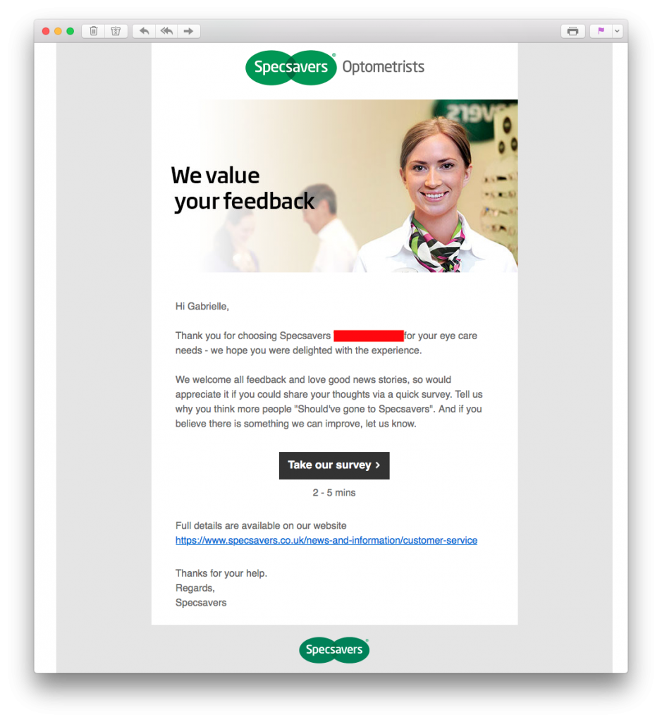
Specsavers use personalisation to make the customer feel their opinion is important.
Inserting a name placeholder into your email design is fast and effective way to integrate personalisation. Mail Designer 365 offers you direct integration of popular placeholders from Mailchimp, Campaign Monitor and Direct Mail for Mac so your design is ready to export and send:
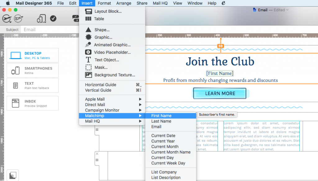
Insert placeholders directly in Mail Designer 365 to easily adopt personalisation into your feedback emails.
4. Make the action areas bright and clickable
Making the action areas in your email vibrant and colorful is another effective way to capture the customer's attention and keep them interested. CTA (call-to-action) buttons and ratings charts should look extra clickable, so they instantly stand out in your email and draw in the reader.
Quick guide: What makes a button "clickable"?
- Position - Central and hard to miss
- Size - Large enough to read, but not overwhelmingly big and spammy
- Color - Vibrant and stands out well against your email background
- Message - Clear and concise. The customer should know exactly what will happen when they click
This example by Insurify makes it super easy for customers to give a quick rating. The color-coded chart is just asking to be clicked. No reader could resist!
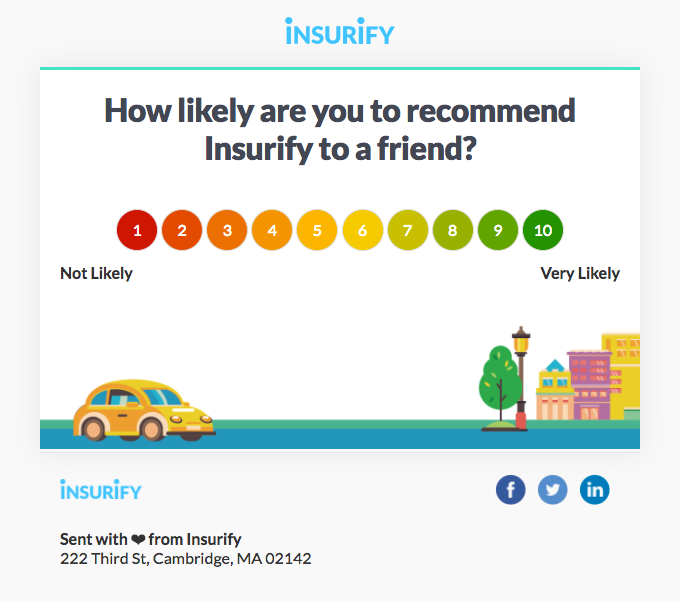
The color-coded ratings chart in this email is super straightforward and really clickable.
When you create your CTA for your survey, make sure to stick to these tips to ensure the button stands out and makes customers want to click. An extra tip would be to specify the duration of the survey just under the button. This way, readers know exactly what they are getting in to.
5. Offer a reward
If you want to go the extra mile to encourage your customers to take part in your survey, you may want to consider offering a reward. A much larger proportion of your customers will be willing to take the time to help you if they can see the benefit for themselves.
One reward you could offer is a special offer on your products. Ask customers to complete your survey in exchange for money off their next purchase. This strategy is used well by Tailor Brands. In this email, they offer a 50% discount in exchange for customer feedback:
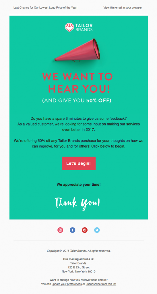
Offer customers money off their purchase in exchange for completing your survey.
Alternatively, if you want to offer a bigger prize, try tempting your customers with a competition or giveaway. Convince customers to take part in your survey in exchange for entry into a prize draw. The bigger and better the prize is, the more effective!
In this email, Morrisons offer customers the chance to win a seriously exciting prize of £1,000 to spend in their stores. Seeing an incredible prize like this is super tempting for readers and will increase the chance of them participating in your survey.
Tip: For bonus points, tease the grand prize in your subject line. This will surely result in an increase of your open rates.
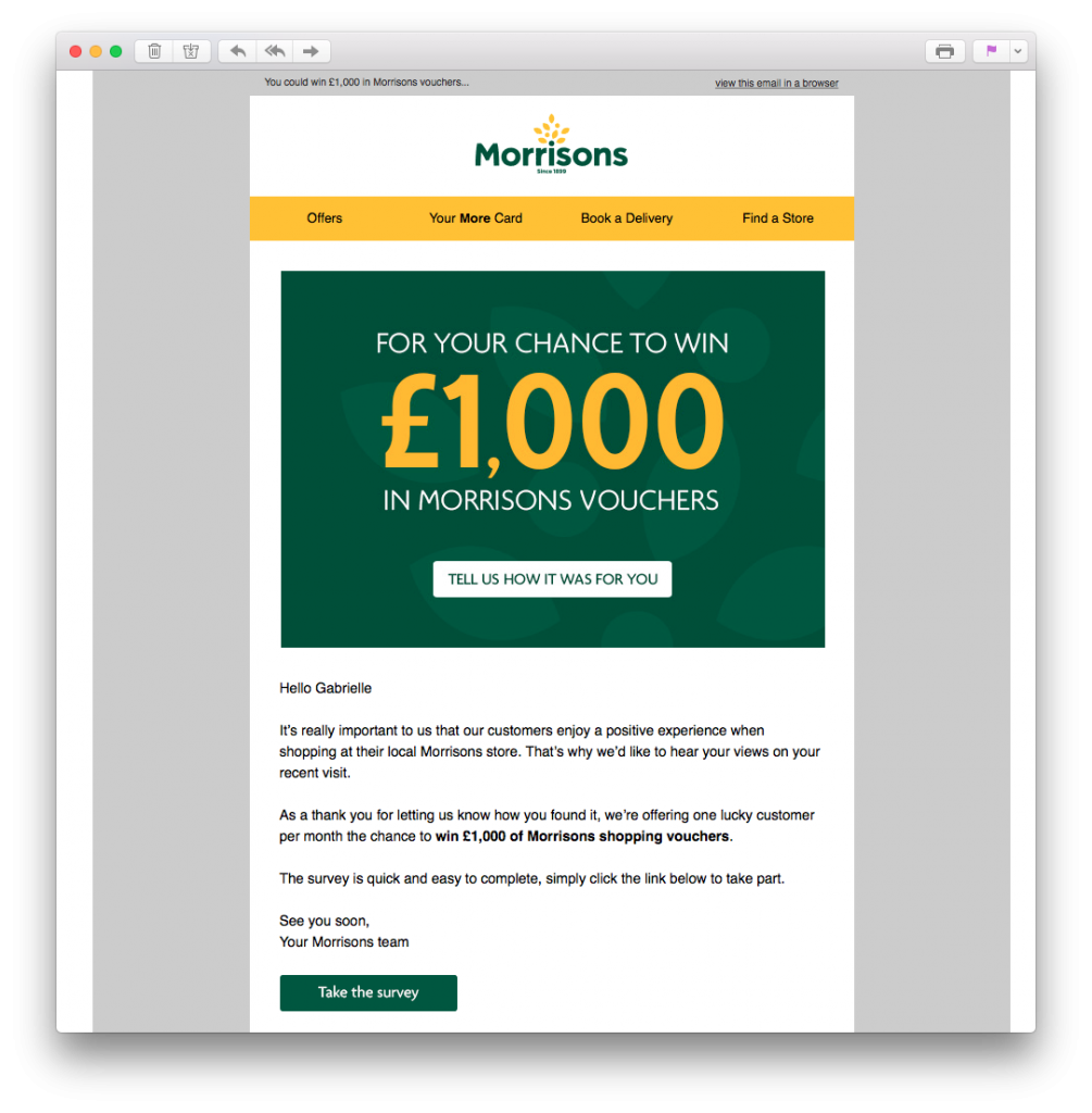
Get readers geared up to take your survey by offering the chance to win an exciting prize.
6. Make the survey process quick
Last but not least, you should also do everything you can to ensure the process is as quick as possible. You've gone through all the hard work of getting your customers through to your survey, make sure it pays off! Many customers will quickly lose interest if they feel your questionnaire is too long-winded. Here are some tips to help shorten the process:
- Prioritise - Although you probably want to know as much as possible, you should first determine what is most important to you. This will help you narrow down what you want to ask customers.
- Keep it concise - Overly wordy questions will only overwhelm and confuse participants.
- Make text-based questions optional - Answering multiple choice questions is easy, but not everyone has time to write long answers. Make your text-based questions skip-able, as some feedback is better than none at all!
- Give customers options - Similarly, if customers are pressed for time, they may not want to answer all questions. Build a cut-off point into your survey so participants can choose to end there or continue to more questions.
Survey emails made easy with Mail Designer 365
We hope you have found these tips useful and will take them on board when sending out customer surveys. Getting good quality feedback from your customers is the first step towards optimising your business.
If you want to find out more about what your customers really think, use the Customer Survey HTML email Design Idea in Mail Designer 365 to encourage your customers to give you the feedback you need to improve your business:
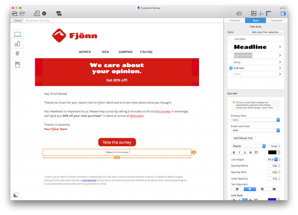
Try the Customer Survey HTML email template in Mail Designer 365
Not got a Mail Designer 365 plan yet? Download today for free to test this template and over 100 more.
Stay creative,
Your Mail Designer 365 Team
Subscribe for more great tips!
Please check and try again.
We've just sent you an email for you to confirm your email address, if you haven't already.

