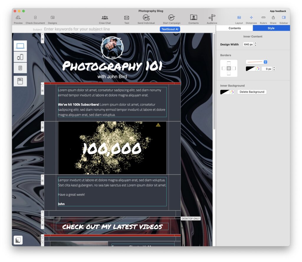
Full surface backgrounds leave lasting impressions in any inbox.
Mail Designer includes Design ideas incorporating this style, giving you a taste of how affective they can work. With Mail Designer and Mail Designer Pro, it’s easy to create this newsletter style.

Back support: It’s all about the background
Search for a template with a background picture or just start a new Design from scratch. Click on the paint roller symbol to get to the background mode. This is where you can determine the background for both the inner and outer areas of your newsletter. To remove a background that has already been defined in a certain area, jut click the area and delete the content.
In order to place a picture over the inner and outer areas, you just have to drag the picture to the outer area. This also works when you’re not in background mode.
Your background picture
Mail Designer centers the pictures in your newsletter layout, so you’ll get the best results when you’ve tailored your background picture before hand. To make sure that the pictures are optimally placed, they should have a width of 1600px and depending on how long your newsletter is, be around 2400px long.
This way, the recipients get something fun in their inbox and they can change the size of the window without limits.
Need a picture? Here are some tips…
The internet is full of image collections offering license free pictures for use. One example is, pexels.com - don’t forget to cite the photographer in your newsletter. Once you’ve placed your image, you can continue by switching to layout mode.
Better readability
Colorful backgrounds and text-blocks can also easily be removed (left mouse click: then delete or back-key). Take care that your text color always stands out on top of your chosen background since when the window size is changed the text moves over a new background area.
For better readability, you can also position your text with the shape overlays.
- Just drag a shape into your layout
- Then step by step, push the rest to the back
Transparency:
If you’d like, you can also control the opacity of your surfaces. This only works in a picture section of a layout-block. By using layout-blocks with text, you have the possibility to choose separate colors for your text backgrounds.
Adjust for mobile devices
You’ll need to restructure your Deign in order to make it mobile-friendly.
Here are some tips:
- First decouple all layout-blocks
- Start off with a layout-block with a picture
- Drag your background image in here as am eye-catcher
- Now position your image to make it grab attention
Now you’re ready to add headlines and text. The rest of the content can be organized piece by piece, creating a flowing Design.
As always - before you send your newsletter, check the details with the Mobile Simulator and send yourself a test email.
To get the latest version of Mail Designer 365, click here.
Until next time,
Your Mail Designer 365 team
