
Picture the scene: You’ve spent ages designing the perfect email, only to hit send and realize it looks completely different in your recipients' inbox. Is there anything more frustrating?!
Email rendering issues are more common than you think – especially with so many different email clients and devices out there. From missing images and broken layouts to dark mode fails, these display problems can majorly affect your email's success rate and even land you in the dreaded spam folder!
In this guide, we’ll walk you through some of the most common email rendering mistakes and share expert tips on how to avoid them so your emails always look great, no matter where they’re opened!
Missing images in emails
As the old saying goes, "a picture speaks a thousand words". These days, HTML emails and images go hand in hand, and for good reason: adding images to your email design makes it much more interesting to read and gives you the chance to showcase products directly within your newsletter.
However, many email clients now block images by default, either to save data (a common feature on mobile devices) or to protect users from potential spam. For example, Gmail and Outlook often display a "Show blocked content" message, leaving a blank space where your carefully crafted visuals should be.
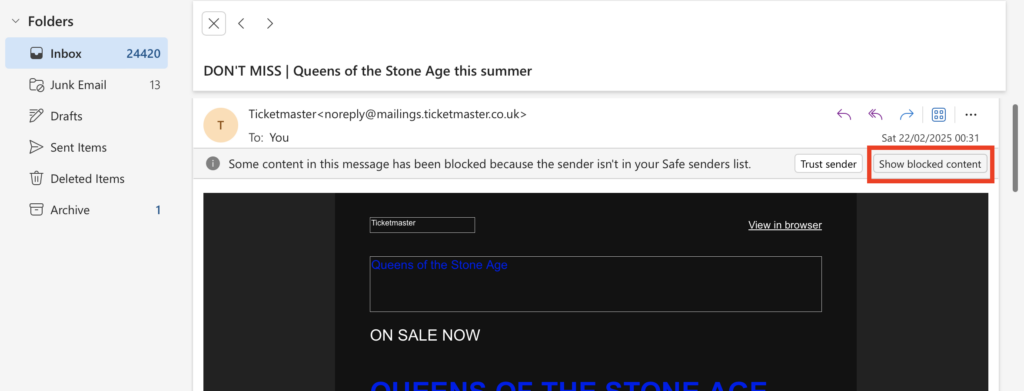
Image blocking in Outlook
If your email largely consists of or is heavily reliant on images, here are some important things to consider:
Avoid image only emails
Emails that are 100% image-based or too image heavy are much more likely to be caught out by spam filters, as these look for a high ratio of images to text as an indicator of suspicious or unsolicited messages. Furthermore, even if they do get through, if the images are not rendered, your recipients will end up seeing a blank email with no content.
Generally, it's recommended to design emails with a 60:40 text to image ratio.
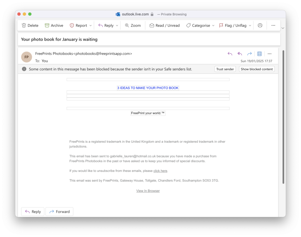
This email from FreePrints is a clear example of why image-heavy emails should be avoided at all costs. All of the main content is image-based and therefore completely invisible in the email client:
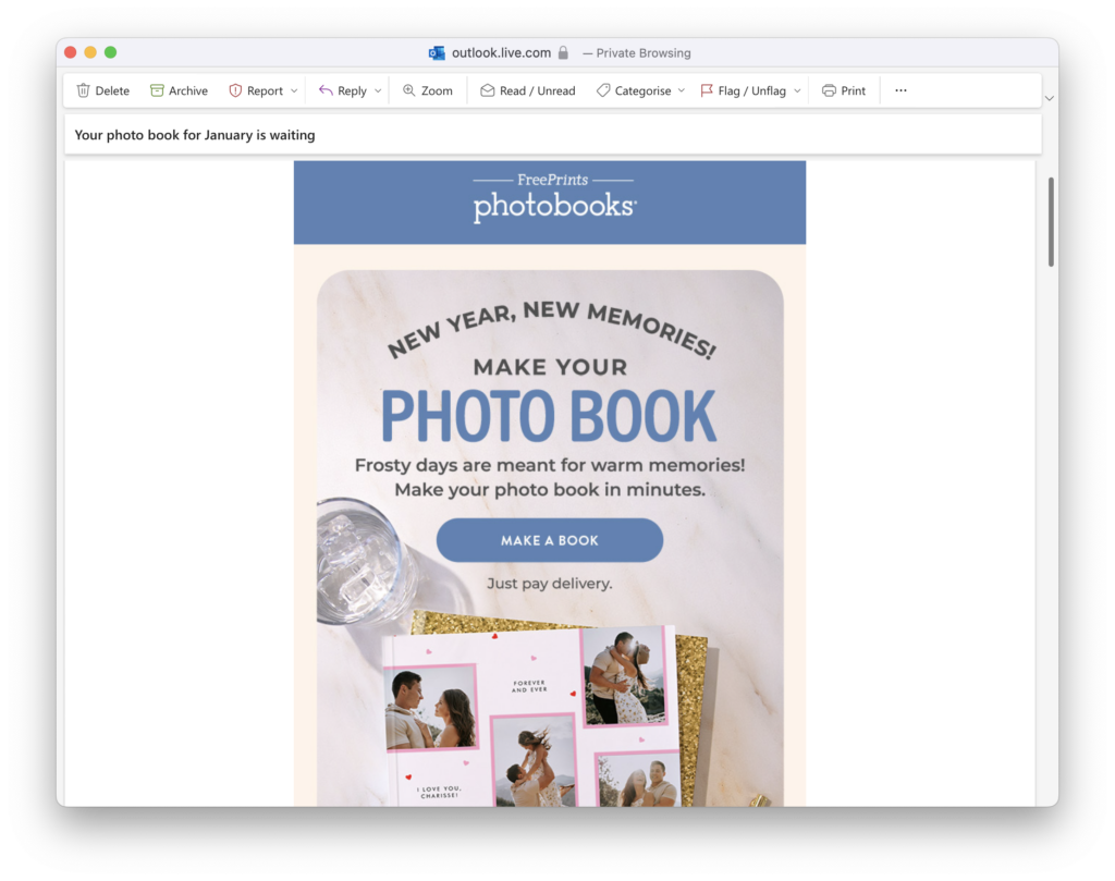
Here's how the email should look. Big difference!
Always include alt text
Of course you can't completely avoid images in your emails and nor should you! Including alt text is a great backup plan in case your images aren't rendered correctly. Alt text is a short, descriptive text that appears in place of an image when it can't be displayed, giving you the opportunity to describe the gist of your image to recipients. Not only that, it's also best practice for accessible emails and ensures users with screen readers are also able to consume your content effectively.
Check out this example from Ryanair. The main message and selling point of the email "Flights from €16,99" is completely image-based:
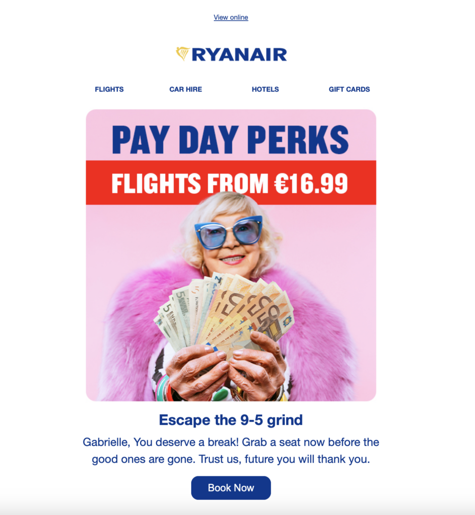
However, when images are deactivated in the email client, this is completely missed out:
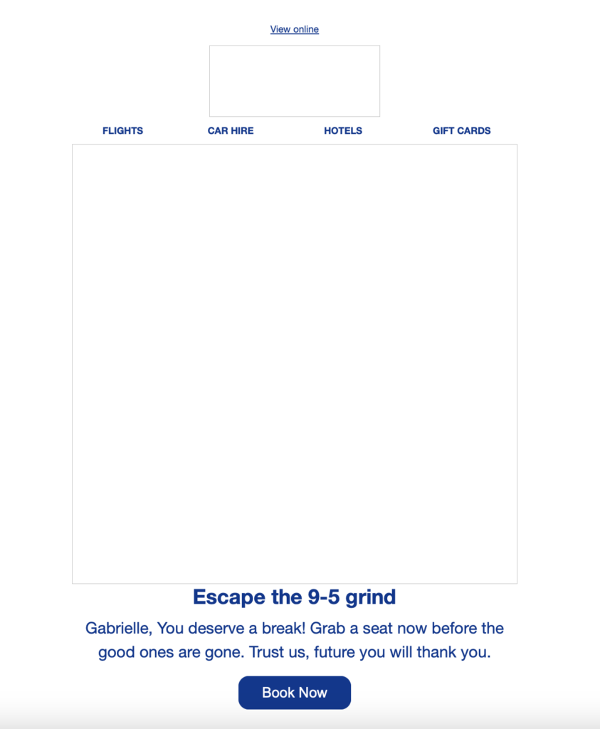
If an alt text had been used here, a much higher percentage of their audience would have seen the low prices and been more likely to click.
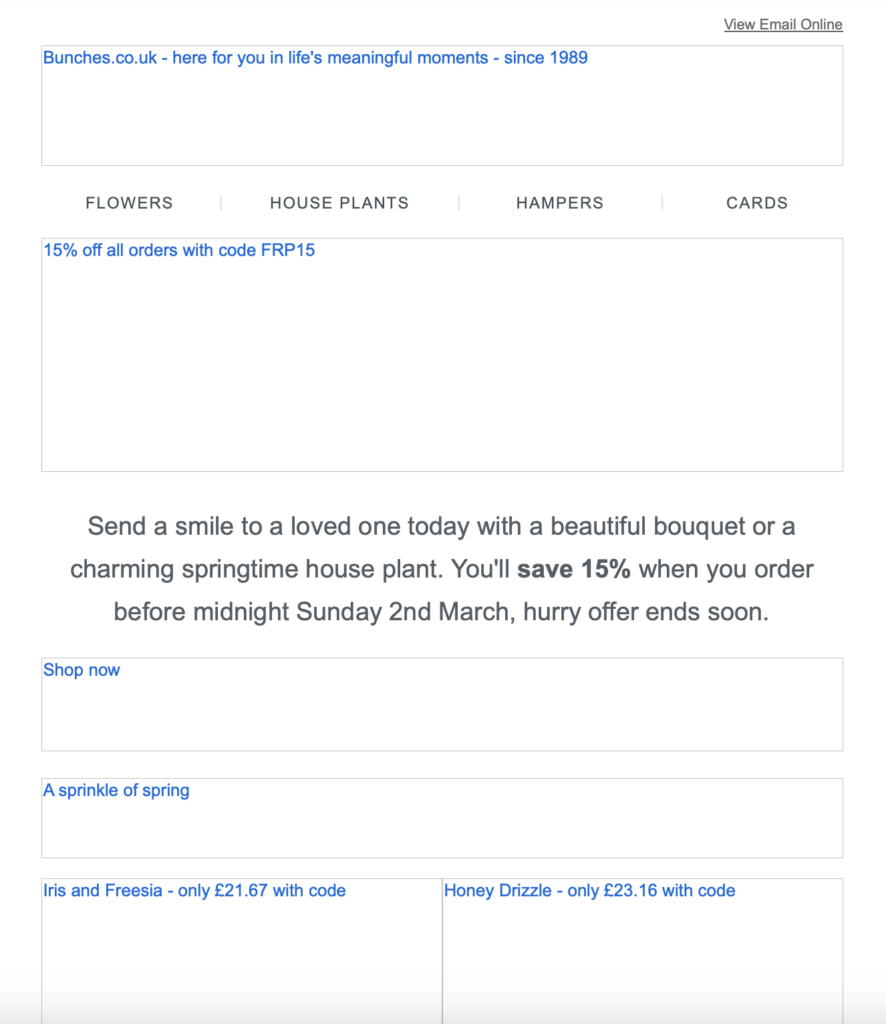
On the other hand, this email from Bunches shows how to correctly use alt text in your email designs:
Learn how to add alt text to image areas in Mail Designer 365 →
Use text buttons for CTAs
If your email's main call to action (CTA) is image-based, you’re taking a risk. Images may not render in all email clients, meaning a large chunk of your recipients might not see your CTA at all. When that happens, your click-through rate and overall campaign success will likely suffer.
The solution? Use text buttons in place of image-based buttons– especially for important call to actions like "buy now", "download", "shop the sale", etc. This ensures that your recipients will always be able to see your CTA, regardless of whether images have been loaded or not.
Text buttons vs alt text
Although some senders only opt to add an alt text to their image-based button, text buttons give you the best of both worlds: guaranteed rendering and great visuals. Mail Designer 365 allows you to easily insert text buttons into your emails and perfectly style them to match your design. Here's how it works →
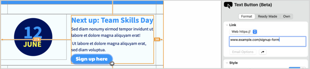
Inserting a text button in Mail Designer 365 is easy
Rendering Issues in Dark Mode
Since dark mode gained popularity around 2018, many email marketers have encountered rendering issues due to the way different email clients handle content in dark mode. Take Gmail, for example: in dark mode, it adjusts brightness to improve readability, which can result in white backgrounds turning dark gray, and dark text turning lighter. This is particularly problematic for designs with black text on a white background (or vice versa), as it can make your carefully crafted email copy difficult or impossible to read!
The solution? Stick to color schemes and design practices that will be legible in both dark and light mode, ensuring your message gets across clearly regardless of the user’s display settings.
Mobile layout problems
These days, more emails are opened on mobile devices than on desktops, so getting your mobile layout right is crucial. If your email isn’t optimized for smaller screens, you risk broken layouts, unreadable text, and a wasted email campaign that doesn't hit the mark with your readers.
One of the biggest culprits? Fixed-width designs. If your email is too wide and doesn’t adapt to different screen sizes, mobile users will be stuck zooming and scrolling sideways just to read your content. Another common issue is tiny, hard-to-tap buttons—if a recipient has to pinch and zoom just to click your CTA, chances are they won’t bother.
Mail Designer 365 has a separate mobile editor to ensure fully responsive email design. Here are some helpful ways Mail Designer 365 ensures your email also looks great on mobile:
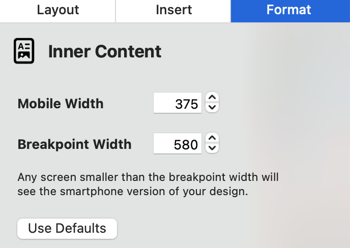
- Adjustable mobile width: Ensure your content looks perfect whether it’s viewed on a small phone screen or a larger tablet
- Mobile breakpoint: Your recipients will see the mobile version of your design if they are viewing on a screen narrower than the chosen width. This avoids content being cut off
- Mobile-only layout blocks: Optimize elements of your design using mobile only blocks. Make images bigger or opt for vertical instead of horizontal layouts. These adjustments will be made for mobile devices while your desktop layout stays the same
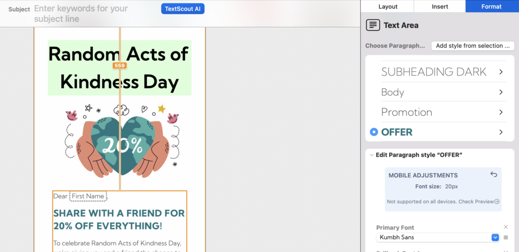
- Mobile text styles: Adjust the font size, line height and letter spacing for mobile to make your text easy to read on all devices
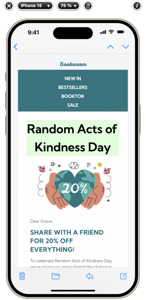
- Integrated mobile previews: Preview and test your email design on the most popular devices to see exactly what your recipients will, then optimize where needed
Missing Email Content and Email Clipping
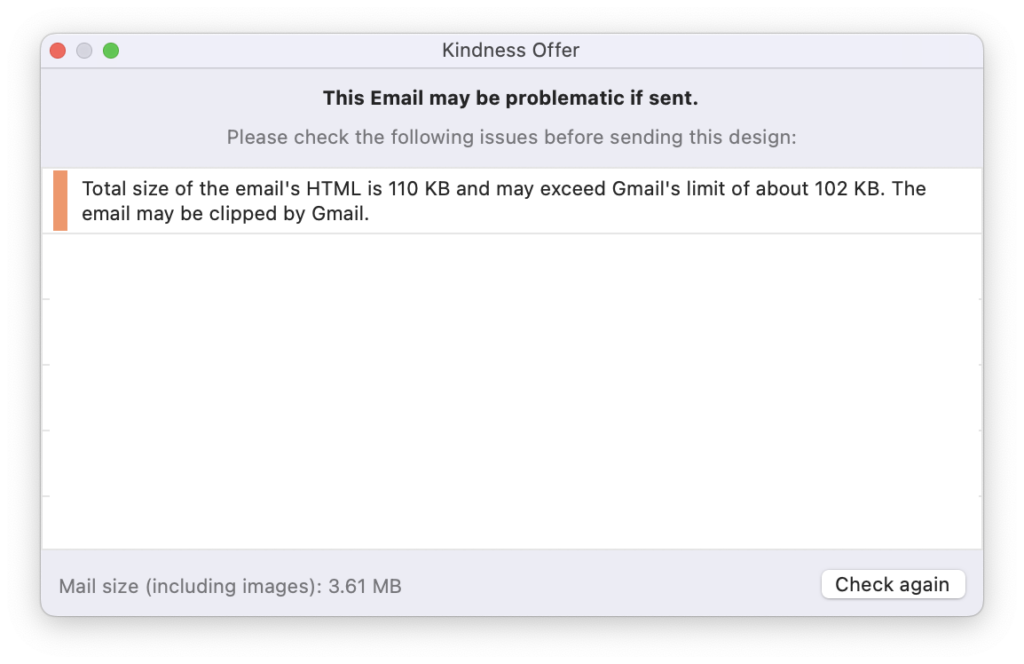
Certain email clients – including Gmail – impose strict size limits for emails. Once an email reaches a certain size, it will be clipped, meaning emails over that size will not be completely rendered. For example, in Gmail the size limit is 102kb and in Yahoo it's 100kb.
Email clipping could be especially problematic if you have important information or call to action links at the end of your email, as this content may be missed by your recipients. Furthermore, if your disclaimer containing the unsubscribe link is clipped, this could even result in legal issues.
Here are some quick tips on how to reduce email size. For more detailed information, check out this guide.
- Keep email copy short and concise and link out to long form content
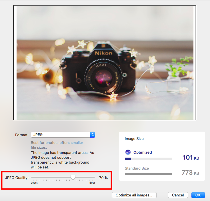
- Compress images and don't include images that are too large. Mail Designer 365 contains a handy image optimisation tool that helps you compress images directly within the app
- Use lightweight text buttons instead of images for CTAs
- Finally, before sending, double check your email's size. Mail Designer 365's preflight checker alerts you when your design is over the 100kb size limit
We hope you found these best practice email design tips useful. Try them out in your next newsletter to ensure your email campaign doesn't fall victim to common email rendering issues!