Category

Mail Designer 365 Newsletter Academy

How to optimize your back to school communication

How to Use Email to Optimize Your Back to School Communication During the Coronavirus

By Uncategorized

Back to School season is upon us again and many of you will be working through your last minute preparation. With the outbreak of the COVID-19, schools, colleges, universities, and other educational institutions around the world are facing even more challenges this year.

Whether you plan to fully or partially reopen in September, or to remain closed, you'll need to share the message with your students. Email is a great tool for you to quickly and easily communicate important information to students, staff, parents, school board members, and any other interested parties.

Below, you'll find useful tips on best practice for communicating an urgent message, what to include in your back to school emails, and how to build and send your email announcement to your email list.

Get expert email best practice tips delivered directly to your inbox!


There was a problem registering your email address.
Please check and try again.
Thank you for registering! Please check your email inbox.
We've just sent you an email for you to confirm your email address, if you haven't already.

Sending Back to School Emails during the Coronavirus

Use familiar branding elements

During times of uncertainty and while making an important announcement, it is always good for your recipient to have a sense of familiarity when they open your email.

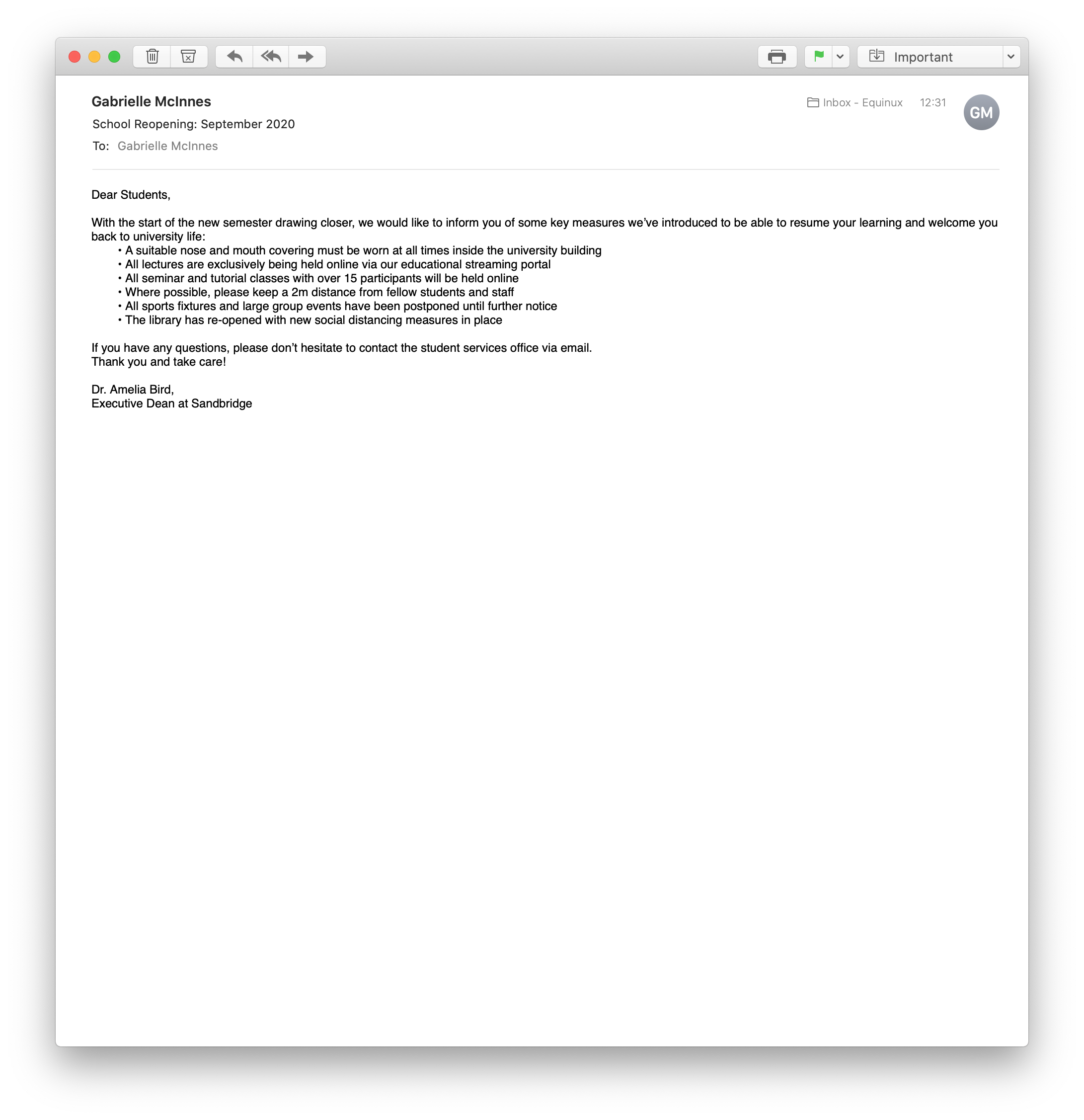
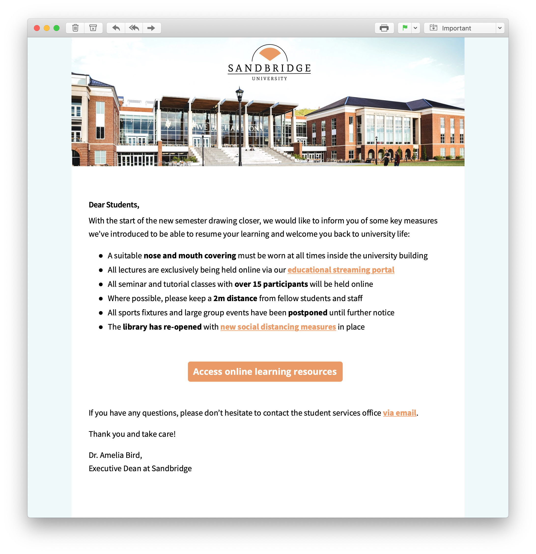
Although it may seem easier to write a quick plain text email, sending a HTML email allows you to incorporate familiar branding elements such as your institution's logo or badge, your font choice, color scheme and other important formatting aspects.

This makes your email message much more powerful and allows it to resonate more with the reader.

Plain text email announcement for schools and universities HTML email announcement for schools and universities

Format text sensibly

Many schools and universities that are opening their doors again will have introduced a range of new safety measures. Your email is the best place to communicate these to students, staff or parents.

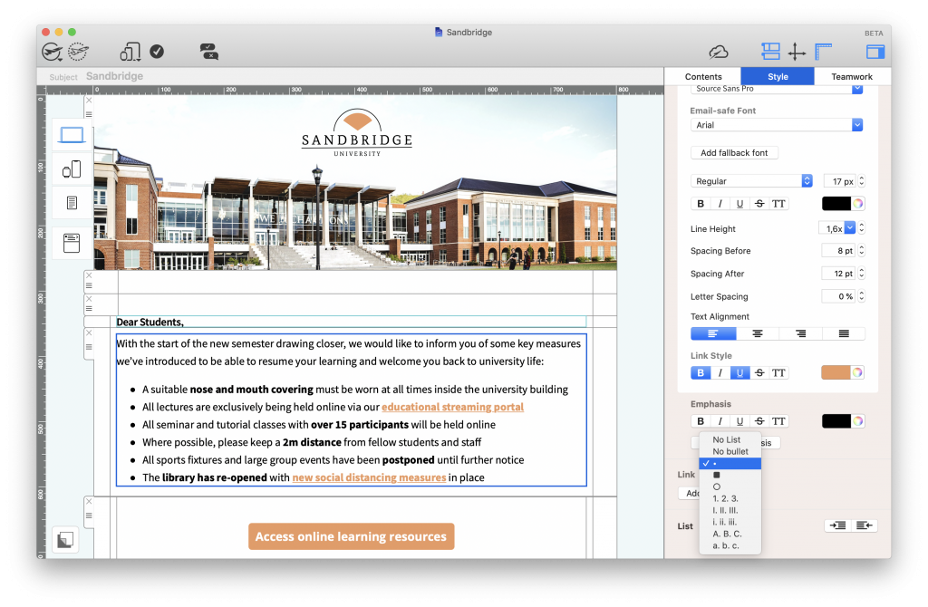
Opt for a list layout to present the most important changes to readers. This way, you can be certain that nothing important gets overlooked by people skim reading the text.

Using a list layout in a back to school email

A list layout is a good way to clearly present large amounts of information.

Tip: Mail Designer 365 offers you various list styles that you can use in your designs to highlight key information.

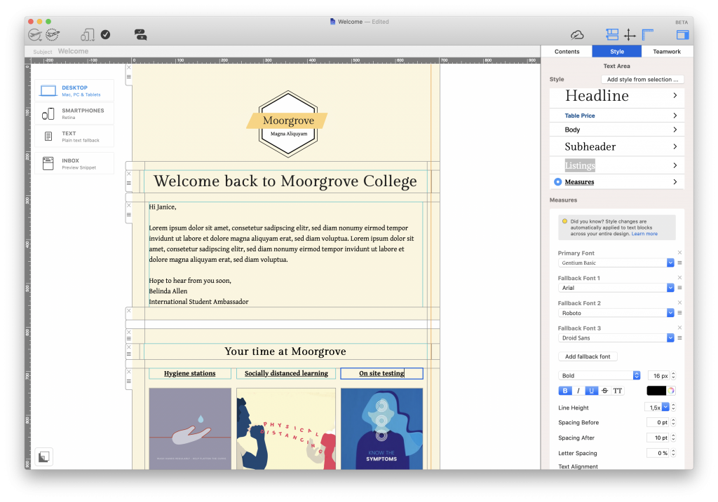
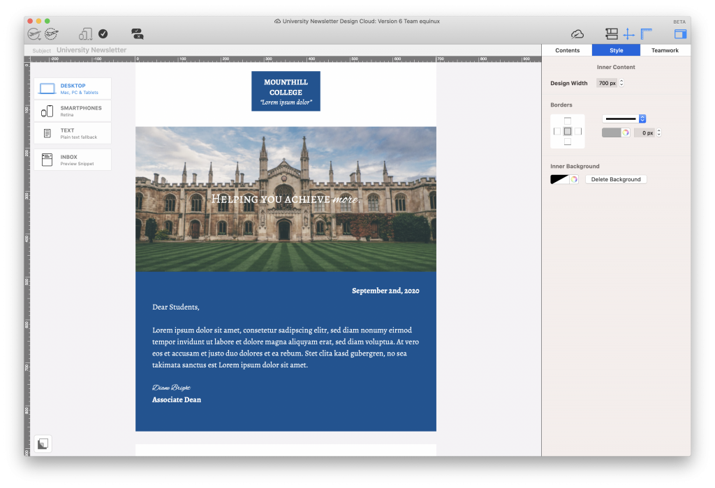
Choosing appropriate styling options for your text is also essential in ensuring it is clear and easy to follow. After choosing a sensible font, you can also format the size, weight, line height and spacing of your text to optimize the reading experience.

For example, italicising or making certain words or phrases bold can be an effective way to emphasise their importance:

Using text formatting in an email design for back to school announcements

The bold and underlined emphasis on these headlines make them clearer and more effective in the email.

Link out to further information and resources

Rather than allowing your email to become too saturated with information, it's much more effective to link out to extra resources.

You've introduced a new set of rules for your sports teams? Instead of listing them alongside your core guidelines, you can link out to them on a separate page or document so that they don't take up too much space in your email and distract from the core message.

Doing this makes your email much easier to read and allows recipients to actively click on the story or news they want to know more about.

How to link out:

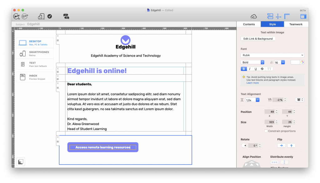
As well as regular text links, Mail Designer 365 also allows you to create stylish buttons and eye-catchers. You can use these to signpost further information in your emails:

Creating a button in an email design for schools and universities

A button linking to further resources looks much better in your design than masses of information.

All you need to do is select a shape from the contents library, apply a color of your choice and use text objects to point readers in the right direction. When you are done, apply a link to the entire image area to your preferred landing page.

Learn more about creating buttons and eye-catchers.

Optimize your design for mobile

It's a well known fact that many of us regularly use our phones to check emails on the go. The same goes for your students, staff and other recipients.

In order to ensure your email is also clear and effective on smartphones and tablets, we recommended that you optimize your design for mobile.

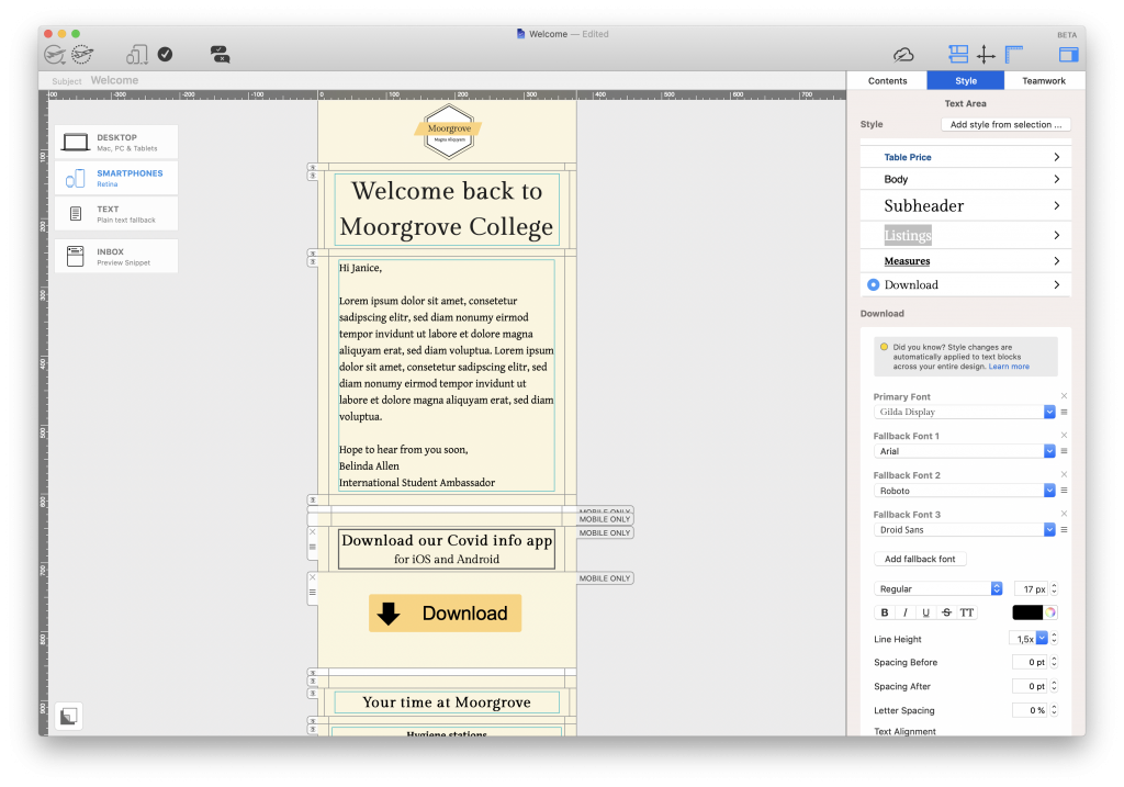
Mail Designer 365 automatically creates a mobile version of your design which you can then adapt to make more suitable for smaller screens. This includes creating separate text styles for mobile and using mobile blocks to create exclusive, mobile-only content like app download links:

Creating a mobile optimized back to school email

Optimizing your emails for mobile devices allows you to also create exclusive mobile-only content.

Create Back to School Emails in Mail Designer 365

We hope these tips will help you when putting together an email announcement for your school, college or university this fall.

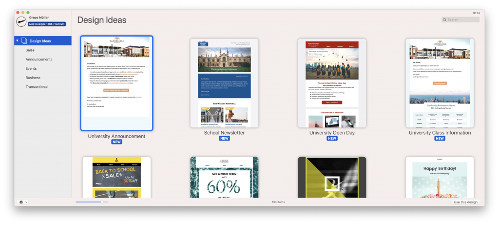
If you're considering building up an email strategy for your institution this year, Mail Designer 365 has all the resources you need to get started, including dedicated email templates for education:

Mail Designer 365 email templates for education

Don't have a Mail Designer 365 plan yet? Download the app free today to discover the email templates as well as a wide range of design tools to help you get started with email for education.

Get started with Mail Designer 365 today

Start your 7 day free trial and use your Mac to create stylish email newsletters for your business.
No credit card required
Compatible from Mac OS X 10.11 onwards

Enjoyed this post?

Get more inspirational tips, tricks, and best practice examples in the Mail Designer 365 Newsletter Academy -
your one stop hub for all things email marketing strategy and newsletter design.

Email marketing for schools and universities

Best Practices for Email Marketing for Schools and Universities

By Mail Designer 365 Newsletter Academy

Email is a flexible communication channel with a huge range of possibilities, including for schools and universities. Getting started with email marketing is a guaranteed way to help your institution connect with your chosen audience.

Sending out internal updates, contacting recent graduates and promoting your institution to new recruits are just a few of the ways you can use email to your advantage.

In this guide, we're taking you through all the ins and outs of successfully creating an email strategy for your educational institution.

Why use email marketing for education?

As well as having the potential to save your institution thousands on printing costs each year, email is a modern and easy to implement way to optimize your communication strategy.

In a world where students (and many teachers!) are constantly checking their smartphones and tablets, email provides a direct channel straight to them which you can utilise to share important messages and news.

What can I do with email for my school, college or university?

When we think of email marketing, it's easy to automatically think of flashy sales and e-commerce emails. In reality, email has the potential to be a highly effective way of providing your target audience (e.g. teaching staff, current students, alumni or new recruits) with essential information.

Here are just some great ideas of how you can use email to promote your institution and improve both internal and external communication.

Newsletters

Most schools and colleges are already familiar with the concept of sending out a regular newsletter or magazine to staff, students, parents, governors, etc.

Switching your institution over to email newsletters allows you to continue sharing all your latest news and updates, whilst saving money on printing costs and helping out the environment.

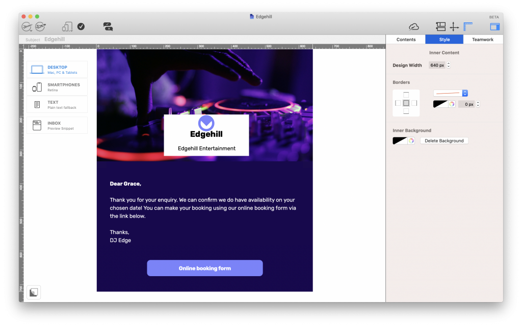
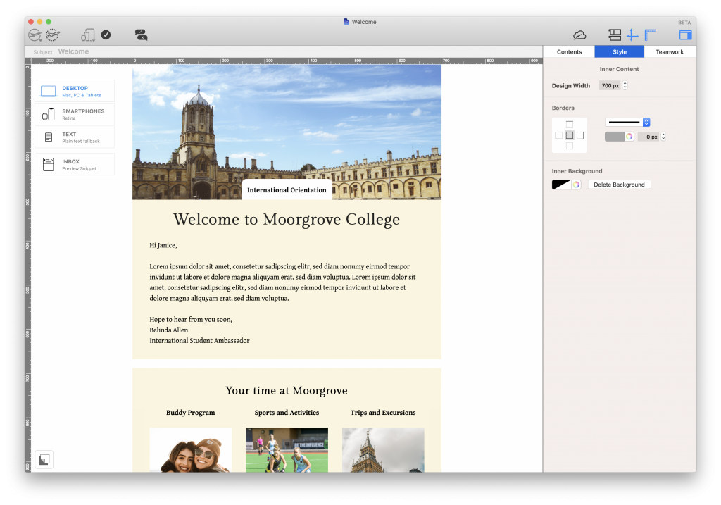
Email newsletter for schools or universitiesStudent orientation

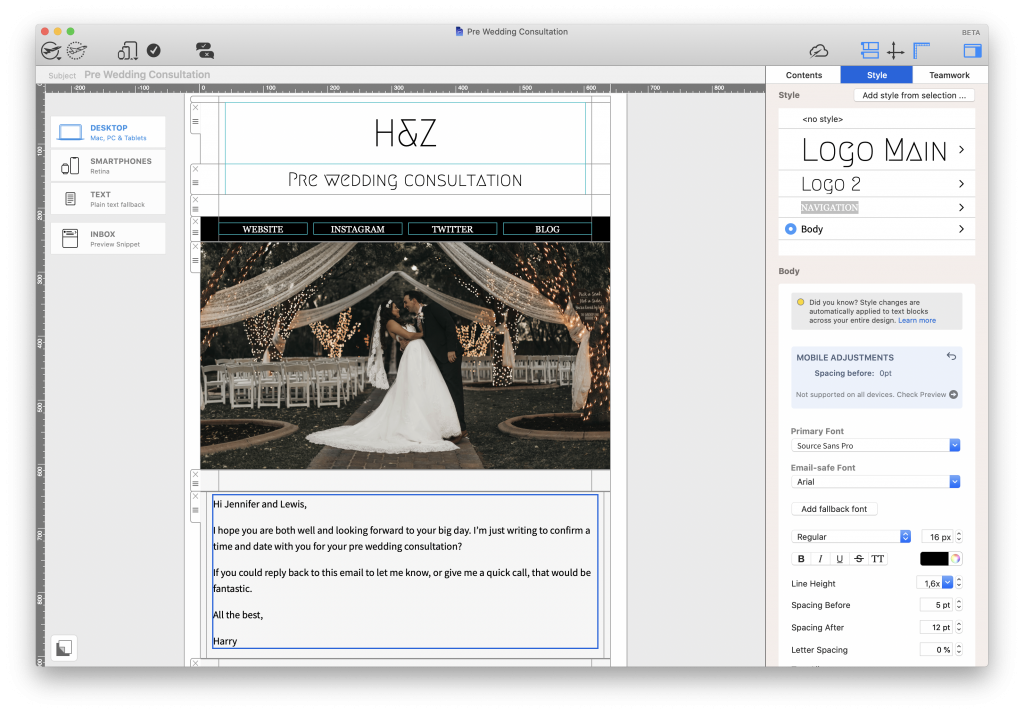
Whether it's the start of the school year, or you're welcoming a new cohort of exchange students, your student body needs to feel at home right away.

Greet new students with an information-packed orientation email. This way, they'll be able to find everything they need in one place.

Student orientation email for colleges and universities

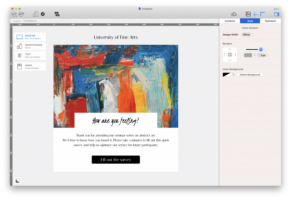
Feedback emails

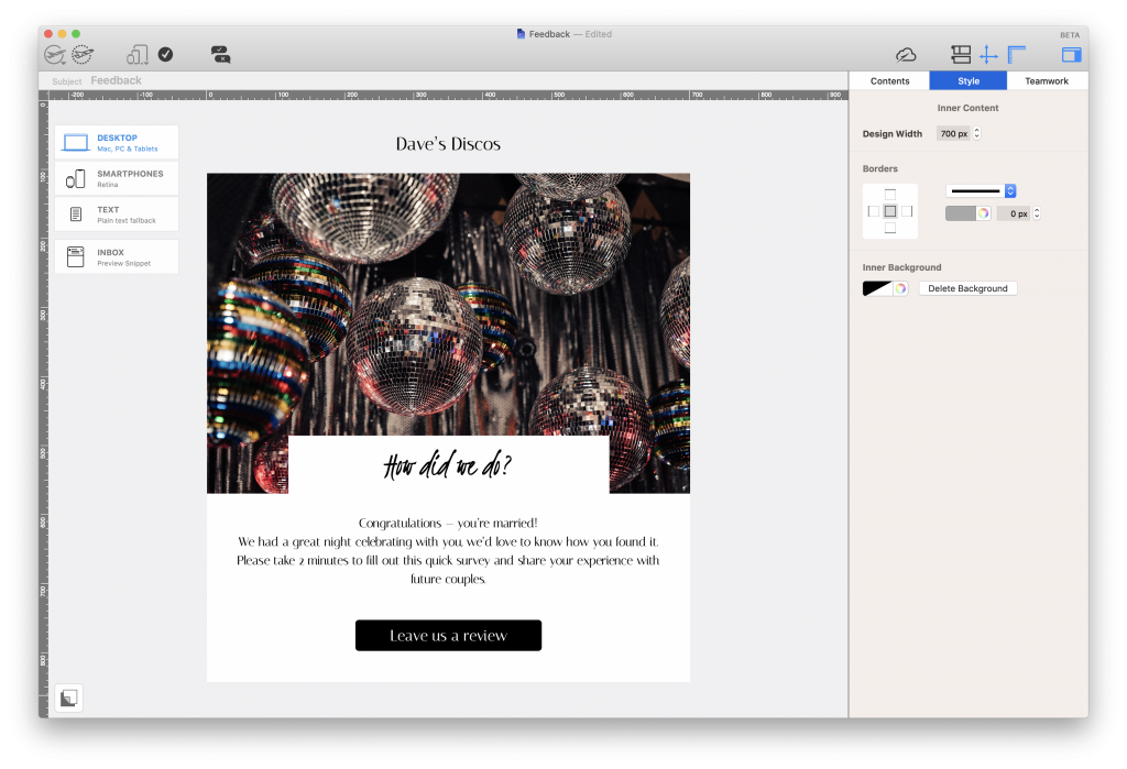
Valuable feedback is an important asset for any educational institution. Getting feedback from students gives you an insight into how they're feeling about their course and what you can do to improve things.

Say goodbye to printed out feedback slips and create a quick and anonymous email questionnaire by linking a Google Form or similar online survey inside your email design. This is an effective way to quickly find out more about your students.

Feedback email for teachers and lecturers.Promotional emails

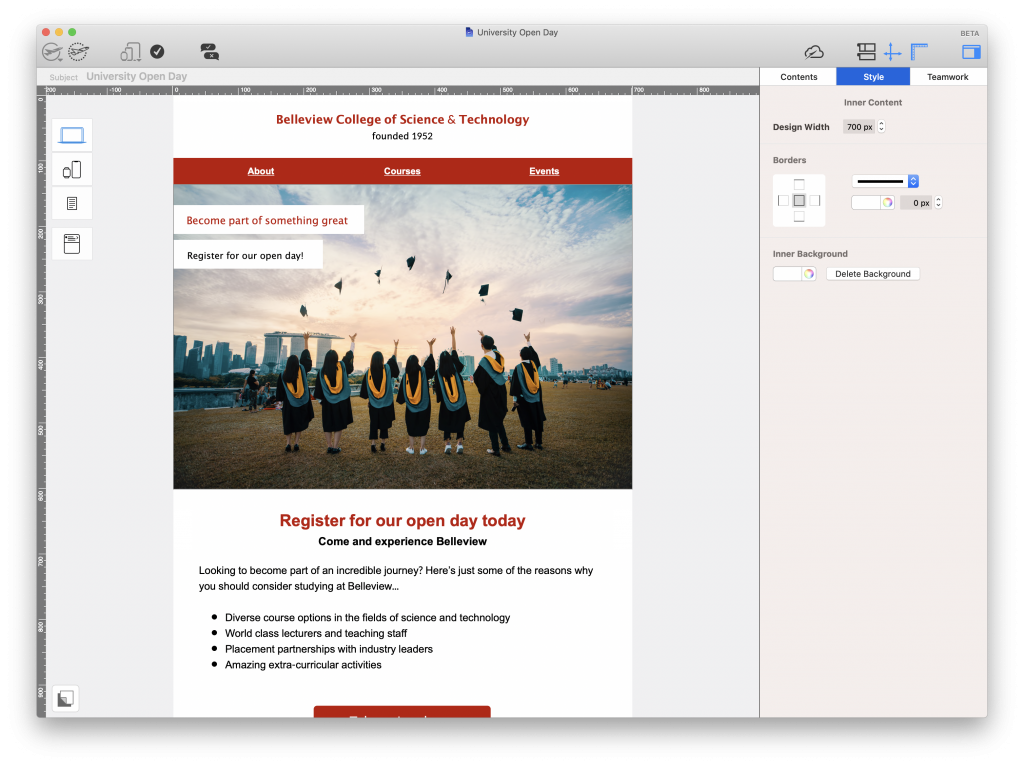
As well as keeping current students informed on the latest news, you can use email as a way to attract prospective new students to your school or university.

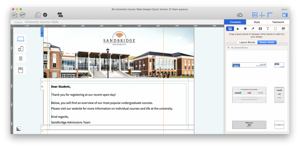
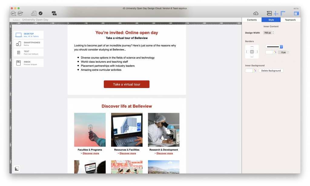
Use email to advertise an upcoming open day, present course options, or showcase your latest research findings. These are all great ways to make your institution stand out against competitors.

Open day email invitation for universities and collegesAlumni outreach

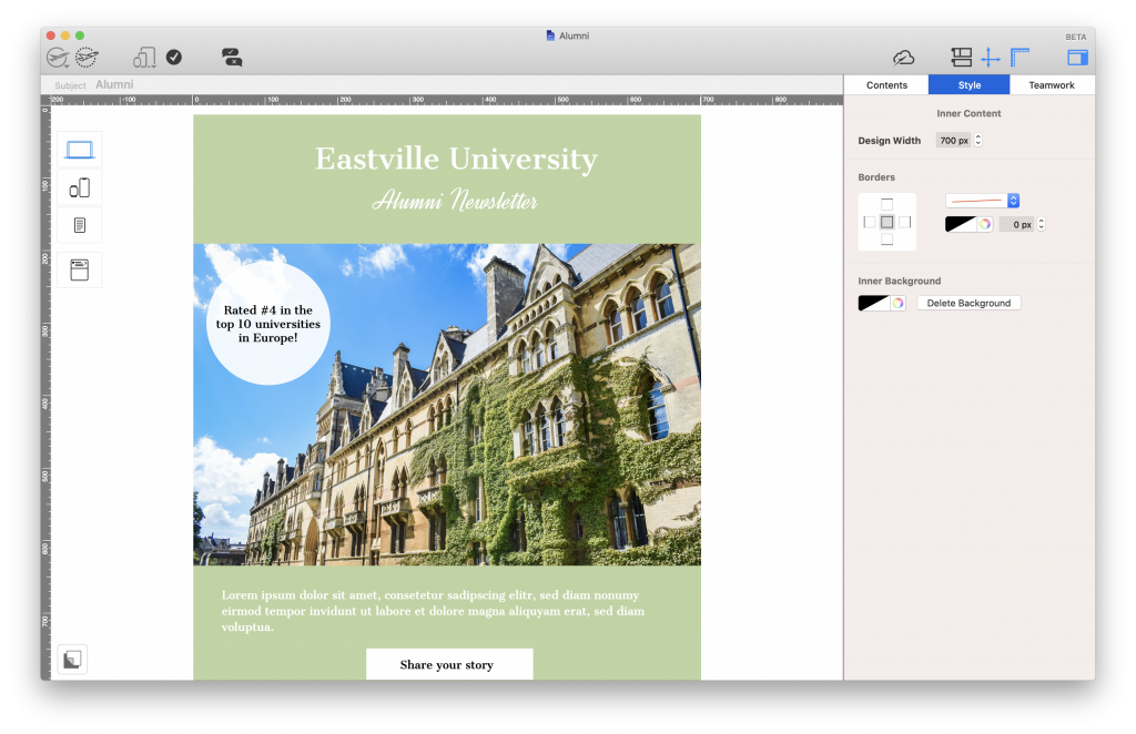
Many schools and universities run successful alumni programs to keep in touch with former students. This is a great way to improve your school's image through testimonials and success stories.

Although some institutions opt to send out letters, this is not a reliable form of contact, especially as young graduates tend to move around a lot. Checking in on former students via a friendly email is the best way to maintain a connection and share your message.

Alumni outreach email for universities and schools

Creating emails for education: Best practice

With a drag & drop email editor like Mail Designer 365, you can build professional email templates for your school or university in minutes. Start with a blank canvas or choose a Design Idea from our selection of email templates for education.

Here are a few key things you should consider along the way...

Branding

Every email you send on behalf of your institution should conform to your brand guidelines. Not only does this make it easier for recipients to recognise that the email has come from you, it also helps you to protect your reputation.

Start by inserting the logo or crest for your school in a prominent place in your design. Usually, this would be the email header. You should also keep other aspects such as the font family and color scheme consistent at all times.

Tip: In Mail Designer 365, you can save your logo header under "My saved blocks" to reuse in all future email designs.

University logo in an email designLayout

Especially when you are presenting large amounts of information to your readers, it's important to opt for a clear layout. There's nothing worse than trying to navigate your way through a cramped email to locate what you're looking for.

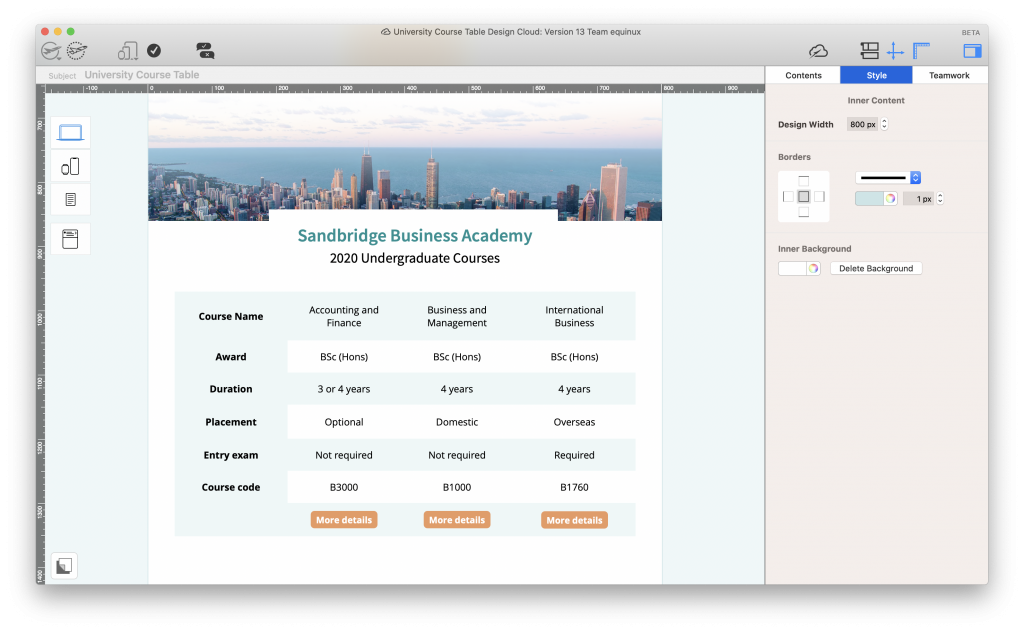
Be sure to use a healthy balance of text and images and use spacers and headlines to separate different sections of your email.

Tip: Mail Designer 365 offers you a wide range of layout options, including mobile-responsive table layouts, which you can use to clearly present important information.

Email with table layout for universities and collegesTone & Style

When putting together your emails, it's also best practice to consider your target group. This will help you determine the tone you use in your email copy, as well as other important style elements, such as graphics and eye-catchers.

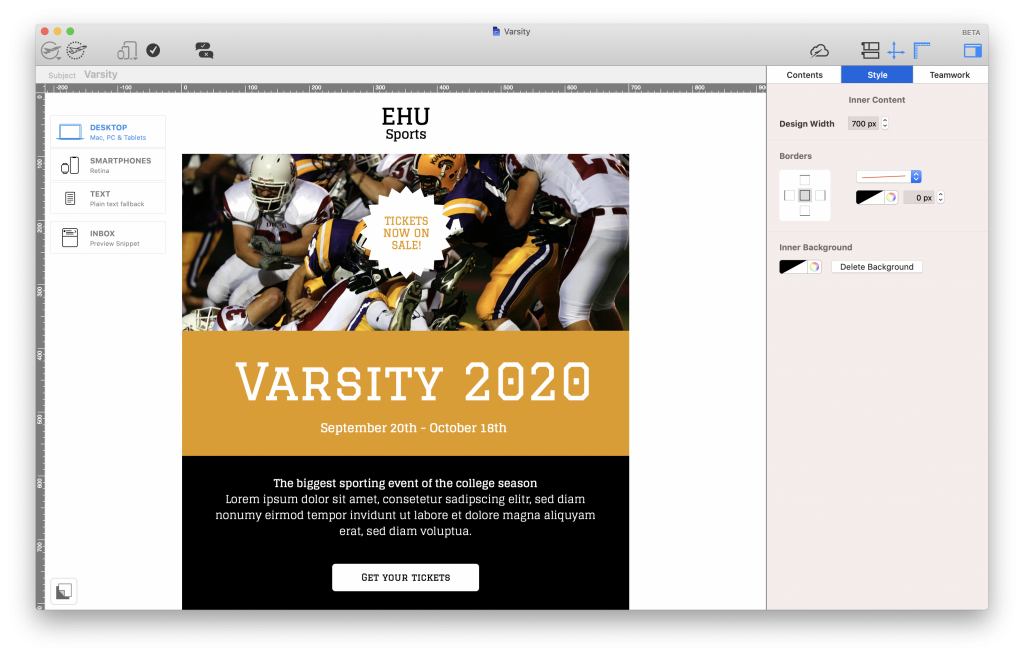
If you are creating email content for a younger audience (i.e. high-schoolers or college students) it's generally fine to use a more relaxed tone and even shake things up visually, e.g. with GIFs, memes, emojis, etc.

On the other hand, if the email is intended for a different audience (i.e. parents, governors, etc.), or you are sharing important information, it's best to keep the tone more formal and to refrain from any style elements which may distract from your key message.

Fun email newsletter for studentsCall to action

Including a call to action (CTA) in your email helps point the recipient towards their next steps. This does not have to be sales-related! Here are a few examples of CTA links you can include in your institution's emails:

  • Sign up for a class/activity/field trip/extra tuition
  • Get tickets for an event/football game/prom
  • Download an eBook/guide/worksheet/timetable
  • Watch a video lecture/webinar
  • Share your class feedback
  • Follow us on Twitter/Instagram/Facebook/etc...

Whatever you opt for, you should ensure your CTA stands out well against the rest of your email and that the text is clear and concise.

Call to action button in a university emailGet started with email marketing

We hope you’ve found this email guide for schools and universities useful and will consider applying some of these tips to your own email strategy. Getting started with email marketing for your institution is easy and affordable:

  1. Open the Mail Designer 365 app (Don’t have a Mail Designer 365 plan yet? Get your free trial here!)
  2. Use one of our dedicated email templates for education, or create your own design from scratch.
  3. Send finished designs directly via the app from your institution's email account, or export to your ESP to send to a larger list

Until next time,

Your Mail Designer 365 Team

Get started with Mail Designer 365 today

Start your 7 day free trial and use your Mac to create stylish email newsletters for your business.

No credit card required
OS X 10.11 - macOS Catalina
the essential guide to email marketing for real estate

The Essential Guide to Email Marketing for Real Estate

By Gabrielle Uncategorized

With real estate being one of the largest industries worldwide, the way you market your services to potential new clients is super important. Gone are the days of splashing out for expensive brochures, flyers and printed ads; communication with clients today needs to be direct and straight to the point, in order for you to be heard.

In this quick guide, we're taking you through the essentials of email marketing for real estate, including best practice tips, template ideas and how to get started.

Why use email marketing for real estate?

There are many reasons why email marketing is a great strategy to explore for your real estate business. First and foremost, email marketing is cost-effective and in comparison to other methods, very easy to implement. In a world where we are constantly checking our smartphones, email marketing is also a proven direct channel straight to your existing clients and potential new customers.

Ideas for real estate emails

Depending on what your agency specialises in, there is a whole world of possibilities for incorporating email into your sales and marketing strategy. Here are some examples of real estate emails you could be sending...

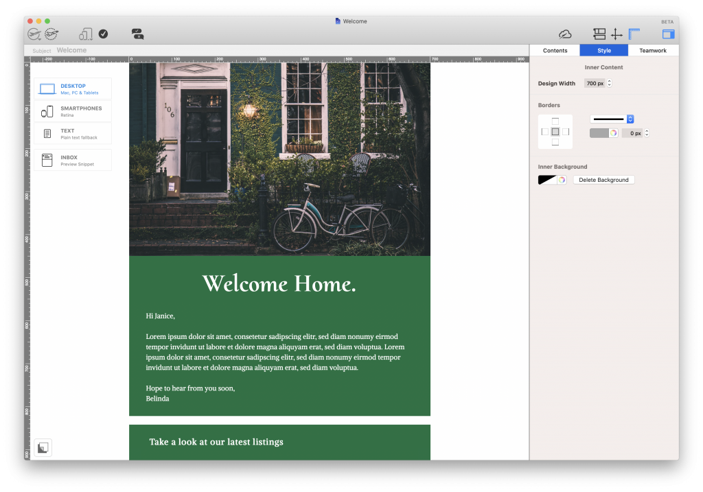
Welcome email

A welcome email is a great way for you to greet new newsletter signups and introduce yourself to new clients. Use a warm and friendly tone to make new clients feel at ease and make sure to show them your current listings.

Welcome email for real estate agencies

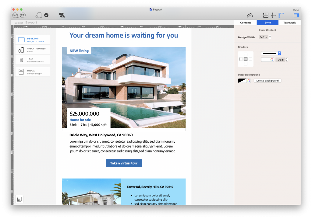
Listing newsletter

Send out regular listing newsletters to showcase new properties to homebuyers and keep your clients up to date with the latest listings.

Listing email for real estate agentsOpen house invitation

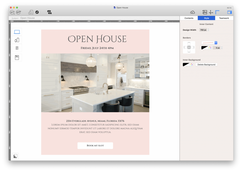
Invite potential buyers to upcoming open house events or viewing appointments with a friendly email invitation.

Open house invitation for real estate agentsEmail digest and tips

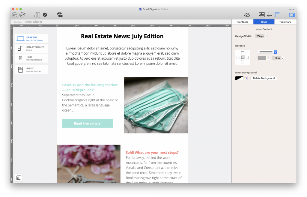
Demonstrate your authority in the real estate sector by sharing blog posts and news in a monthly digest. Sending a regular tips newsletter is a great way to also share your expert tips with first time buyers or sellers who are new to the property market.

Real estate email newsletter ideaFollow up email

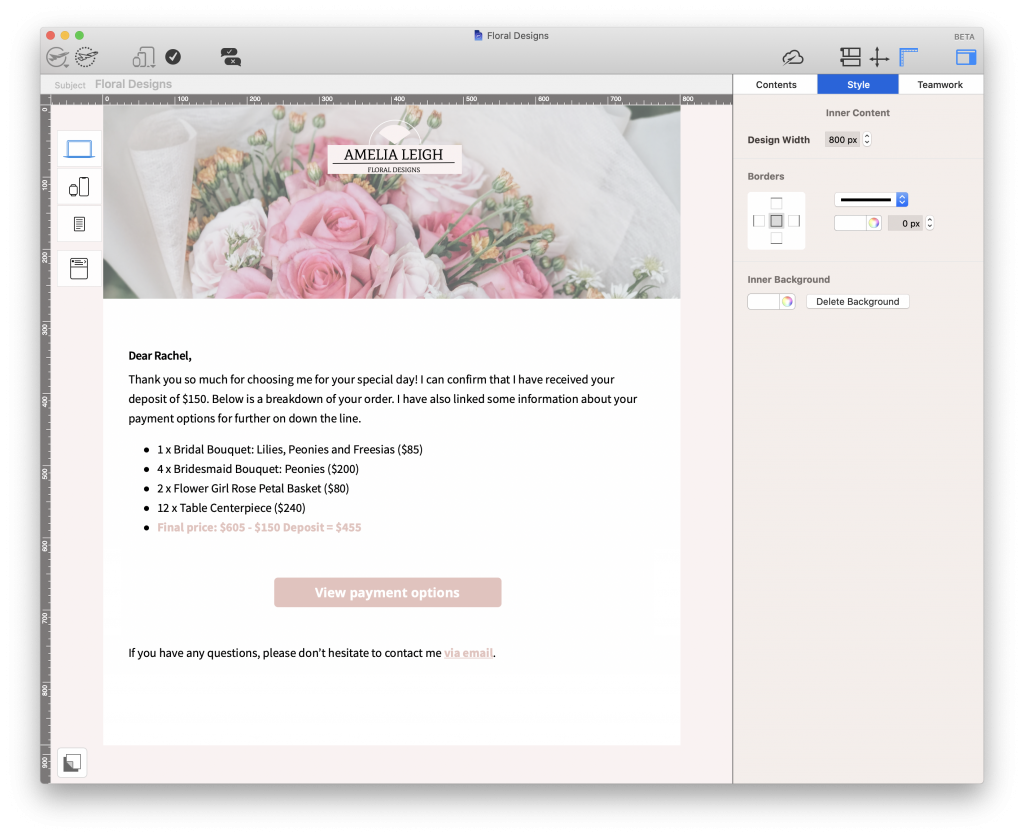
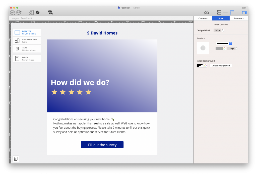
Send a friendly follow up email to maintain customer relationships even after a sale has gone through. This is also a good opportunity to ask for feedback or for a referral of your services.

Buyer feedback request email for real estateHow to create email templates for real estate

Now you have some ideas on real estate emails to send, you're probably asking yourself how to bring them to life. With a drag & drop email editor like Mail Designer 365, you can build professional email templates for your business in minutes. Start with a blank canvas or choose a Design Idea from our selection of real estate email templates.

Here are a few best practice tips to consider along the way...

Brand identity

To get started, make sure your company name and logo is clearly identifiable at the top of every email you send. This demonstrates a sense of professionalism and immediately makes it clear to your clients that the email is from you.

Real estate is a very serious business and it is important your clients feel they can trust you and your business to help them sell their property or find a new home. If you have team photos on hand, it can also be useful to include these in your email so clients recognise a familiar face.

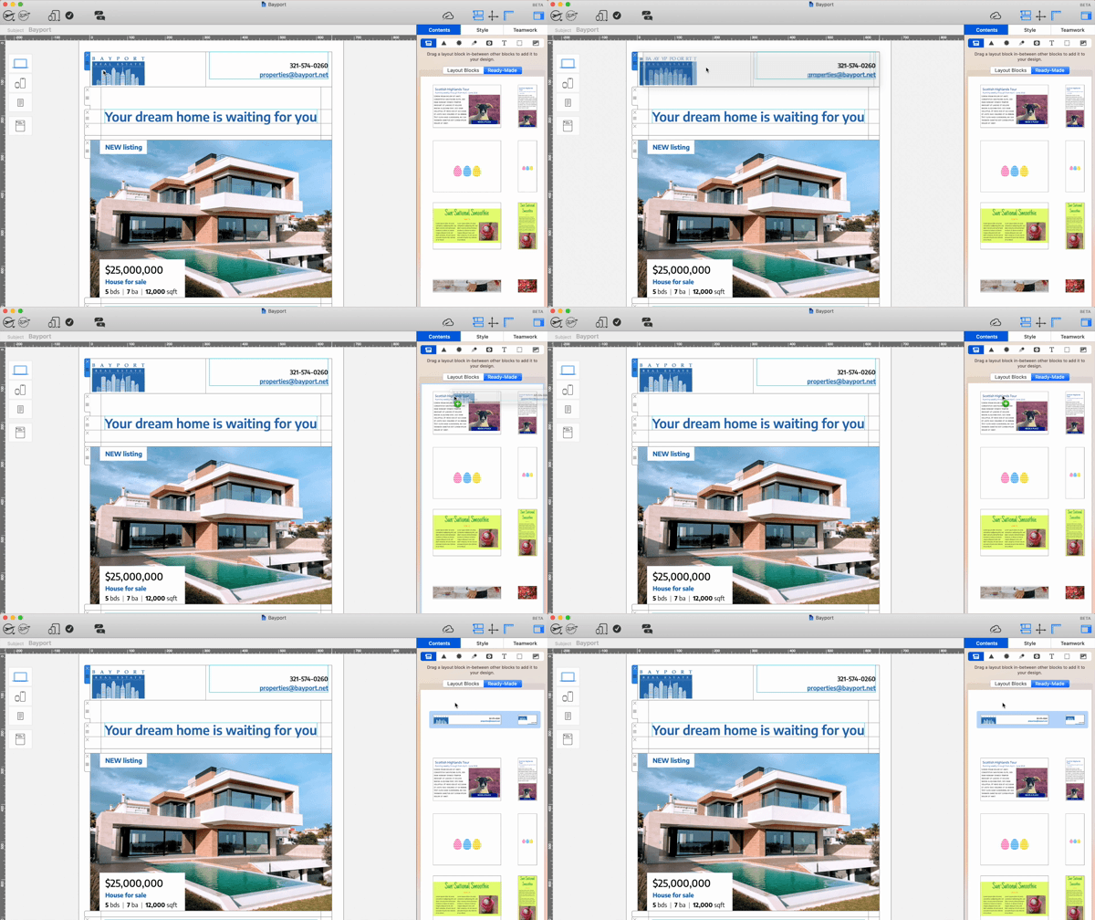
In Mail Designer 365, you can save your company email headers to reuse in future designs and ensure your brand's identity is consistent in all your emails:

Saving a layout block in Mail Designer 365

Layout

The layout you choose for your email design is very important, as it determines the way you present key information to clients. This is particularly relevant when showcasing new listings or updating property information.

Choose a clear layout which clients can quickly scan through to find out more about newly available properties.

Tip: Remember, you don't have to include too much information in the email. List the key selling points for each property to capture clients' interest and include a link to the full listing on your website.

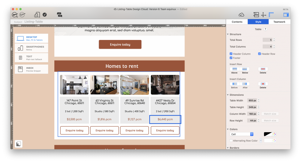
In Mail Designer 365, you can choose from a wide variety of layout options. Use the table editor to present your latest listings in a smart, mobile-optimised table, or explore a range of combi layout blocks to showcase a featured property in more detail.

Property listing table for real estate emails

A table layout is a great way to give clients a clear overview of your latest listings.

Call to action

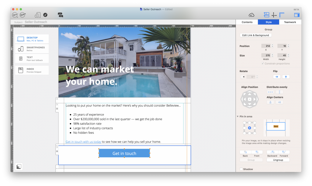
Your call-to-action (CTA) is the most important part of your email as it shows the recipient what they need to do next.

Whatever your intended CTA is, it's important that it is prominent in your email. Generally, this can be achieved by inserting an eye-catching button somewhere in your email. Opt for a color which will stand out in your design and a short and actionable text.

Typical CTAs for real estate emails may include:

  • Get in touch
  • Arrange a callback
  • Enquire today
  • Register now (i.e. for an open house event)
  • Leave a review
Call to Action button in a real estate email

Opt for a vibrant CTA button to help draw your clients in.

Images and eye-catchers

High quality images are a must have for any real estate email. First impressions are important and choosing the best images of your properties will help gain your client's attention and get them onto your website.

Once you've decided on your images, you can integrate them into your layout using the layout block options discussed above. Including an eye-catcher or badge to highlight featured properties is another way to make your design speak volumes.

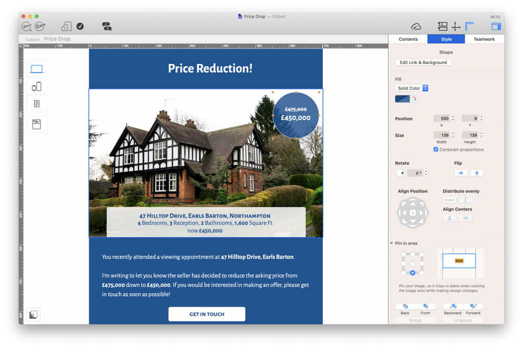
Explore a range of shapes and graphic elements in Mail Designer 365 to create vibrant badges for your email designs. Use these to point readers towards new listings, price reductions and other key information:

Eye-catchers and badges in a real estate email

Inserting eye-catchers and badges into your design help to present important information more effectively.

Contact Information

Finally, make sure your contact information is also easy to locate in the email. If a client sees something that catches their eye, they don't want to then waste time looking all over for your phone number. It's important they are able to get in touch with you quickly and easily.

Add your contact information somewhere prominent in your email design so the recipient can find it faster. Like with your email header and other layout aspects, you can also save this block to use over and over again in future designs.

Including direct mailto and phone links is one super convenient way to make sure clients can reach you directly from your email. In Mail Designer 365, you can even pre-fill email or SMS messages to make things even easier for you and your clients:

Inserting a direct mailto link in a real estate email

Mailto links allow clients to reach you directly from your email

Get started with email marketing for real estate today

We hope you've found this guide to email marketing for real estate useful and will consider applying some of these tips to your own marketing strategy. Getting started with email marketing for your real estate business is easy and affordable:

  1. Download Mail Designer 365 free
  2. Use one of our dedicated real estate email templates, or create your own design from scratch.
  3. Send finished designs directly to clients via Mail Designer 365 Delivery Hub

Get started with Mail Designer 365 today

Start your 7 day free trial and use your Mac to create stylish email newsletters for your business.
No credit card required
Compatible from macOS 10.13 onwards
How to create a successful internal newsletter

Creating a Successful Internal Newsletter Model - An Inside Look

By Mail Designer 365 Newsletter Academy

No matter the size of your organization, sending a regular internal newsletter to employees has many benefits. Not only do internal newsletters greatly help with internal communications, they also provide a good way to boost staff morale and maintain a positive working environment.

Starting up an employee newsletter for the first time can be daunting. Which content to include, how to put it together, when to send... These are all valid questions to consider during the planning process.

To help give you some inspiration, we're giving you an exclusive inside look into the model we use for our own internal newsletter here at Mail Designer 365 HQ, as well as useful tips to consider when creating a successful internal newsletter for your own organization.

How to create a successful internal newsletter

Skip to

Get expert email best practice tips delivered directly to your inbox!


There was a problem registering your email address.
Please check and try again.
Thank you for registering! Please check your email inbox.
We've just sent you an email for you to confirm your email address, if you haven't already.

Benefits of creating an internal newsletter

You may be asking yourself why you should spend the time creating an internal newsletter when there are so many other communication channels available. Here are 3 key benefits:

1. Communication

While Slack and similar internal messaging tools may be more convenient than email, their fast moving nature makes it very easy to miss an important announcement.  In contrast, an internal email newsletter goes straight to your employees' inboxes and is much more likely to be opened.

2. Convenience

The number of communication platforms now available (e.g. messaging channels, intranet, bulletin boards, social media groups, etc.) can result in news and announcements being shared in multiple different places. This can be confusing and makes it hard for staff to keep track.

An internal newsletter allows you to compile all of this information into one convenient email so employees can catch up on anything they may have missed.

3. Corporate Identity

Brand image is an important aspect of any business; both internally and externally. While there are many tools that allow you to communicate with staff, an email newsletter is the best way to ensure you're maintaining your corporate identity whilst doing so.

Creating a custom template for your email newsletter ensures important aspects like your logo, company ethos, brand guidelines, etc., don't go forgotten. This is especially effective in larger organizations, as it helps give everyone in the team a sense of unity, regardless of their physical location.

Our Internal Newsletter Strategy

For obvious reasons, accessing internal newsletters from other companies to show you as examples is not really an option. Because of this (and because we're also super proud of it), we're giving you an insight into how we do things here at Mail Designer 365 HQ.

Here's a quick profile of our internal team newsletter:

  • Name: Zeitpunkt Journal (named after our beloved HQ, Zeitpunkt Haus.)
  • Editor in Chief: Our very own Lisa Heisenberg
  • Sending frequency: Every week on Wednesdays
  • Topics covered: Office announcements, personell news, important reminders, current affairs, team fun, memes, and more!
  • Newsletters sent: As of today (July 15th 2020), 69 issues
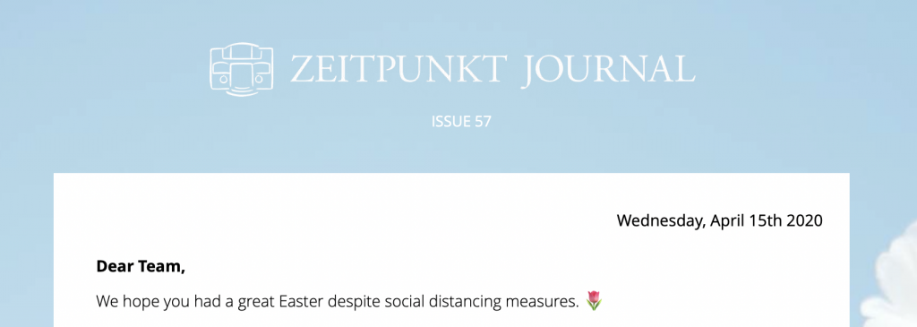
Zeitpunkt Journal logo and internal email header

We start off all our weekly journals with the issue number and a quick introduction message before getting to the main content

What we include in our internal newsletters

Primarily, we use our internal newsletter as a tool to share important news and announcements with the whole team. Good communication is a super important part of our workflow and our newsletter helps keep everyone up to date on new changes.

Here are some recent examples of content we've included in our internal newsletter:

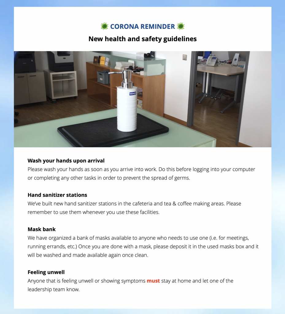
Health and safety guidelines: Covid-19 has been difficult for us all to come to terms with. To help prevent the spread, we (like many other businesses) recently reviewed our health and safety measures and shared the new guidelines in our internal newsletter.

health and safety guidelines in an internal newsletter

Your internal newsletter is THE place to let everyone know about important new changes.

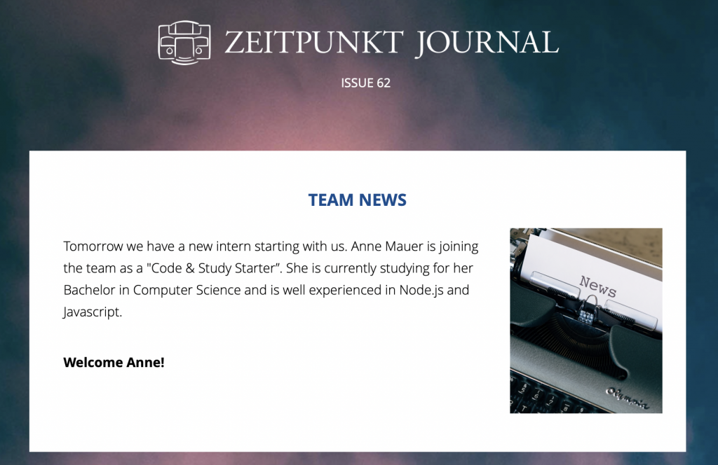
Team updates: We are a growing team and enjoy welcoming new people on board (take a look at our current job offers.) The Zeitpunk Journal is the perfect place for us to announce new staff members to the rest of our team and also help newcomers feel welcome when they start.

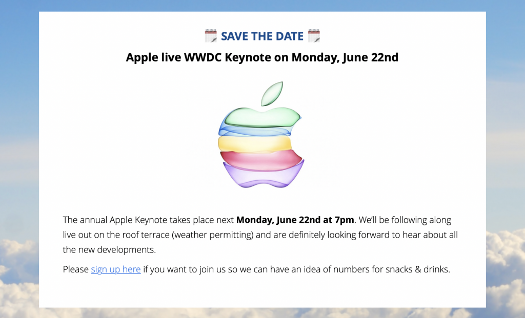
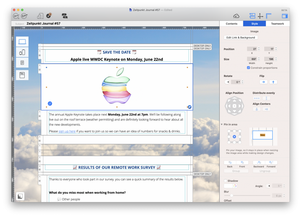
Important dates: Like many businesses, we hold regular events, such as team building activities, meetings, and social activities. We use the Zeitpunkt Journal to remind everyone in the team about upcoming dates and any events they may want to add to their calendar. Here is a recent example for the Apple WWDC Keynote event.

Event reminder in an internal newsletter

Help the team keep track of important dates by including them in your internal newsletter.

Recurring sections in our internal newsletter

Of course, the content we include in our internal newsletter changes from week to week, but there are a few segments we like to keep consistent. Here are some examples of recurring sections you can typically find each week in the Zeitpunkt Journal...

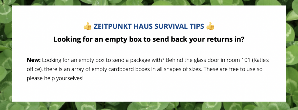
Zeitpunkt Haus Survival Tips: Useful tips and life hacks to help make office life easier.

Example section of an internal company newsletter

Useful tips to help make life in the office easier.

Tweet of the Week: Because who doesn't love Twitter? Here we showcase the funniest content found on Twitter that week.

Tweet of the week segment in our weekly internal newsletter

Sad, but painfully accurate.

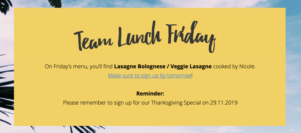
Team Lunch Friday: On Fridays, we get together and cook great food as a team. What better way to announce this than via a segment in our internal newsletter?

Segment example for an internal newsletter

Feeling hungry?

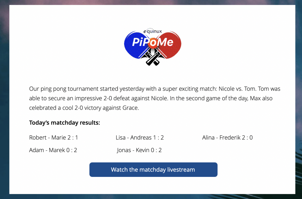
Team activities: When we're not busy working on Mail Designer 365, we also love to partake in fun team building activities. In the last few weeks, the whole team has been taking part in an exciting table tennis tournament. Our internal newsletter has been a great way to keep track of results and upcoming matches.

Segment idea for internal newsletters

Use your internal newsletter to promote team building activities.

How to build an internal newsletter in Mail Designer 365

If you're planning on sending out an internal newsletter each week, you need the right tools to do this with. Of course, we use Mail Designer 365 to build, edit and send our newsletter to the whole team.

Use Mail Designer 365 to build your internal newsletters

Mail Designer 365's drag and drop layout builder makes it easy to create professional email designs in minutes.

Our top tips for creating internal newsletters in Mail Designer 365:

  • Save and duplicate your master template to reuse the layout in all your future newsletters
  • Set up text styles to make editing easy and keep the design consistent
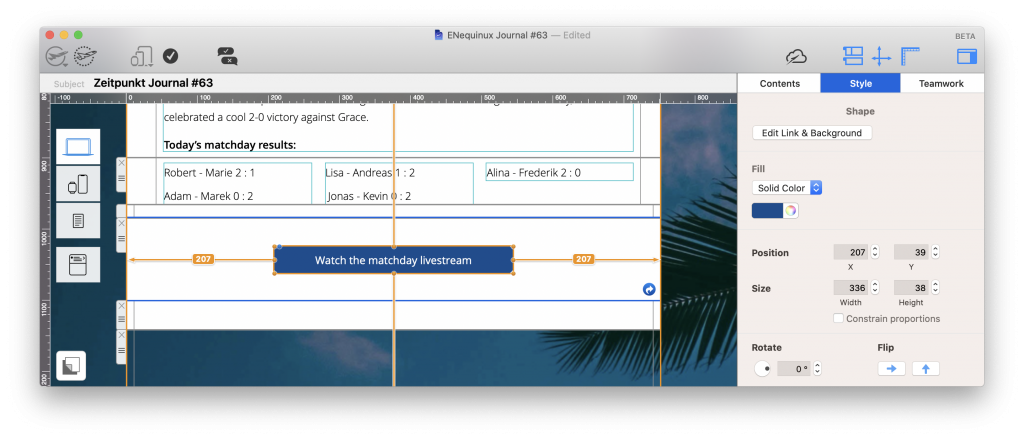
  • Make your designs fun using tools such as the Unsplash library for photo backgrounds and shapes & graphic elements for buttons and eye-catchers
Creating a button for an internal email newsletter

Mail Designer 365 has a wide range of shapes and graphic elements to help you spice up your designs.

  • Use the smartphone view to optimize your design for mobile for those viewing it on the go
  • Send via your work email account in Mail Designer 365 to securely send your newsletter directly to your staff. Here's how to set this up

We hope you have enjoyed your insider look behind the scenes at how we create our internal newsletters here at Mail Designer 365 HQ. Head over to Mail Designer 365 today to test these tips and try your hand at creating an internal newsletter your team will love.

Don't have a Mail Designer 365 plan yet? Sign up for your free trial today to test all these features and discover a wide range of creative tools and HTML email Design Ideas.

Until next time,

Your Mail Designer 365 Team

Get started with Mail Designer 365 today

Start your 7 day free trial and use your Mac to create stylish email newsletters for your business.
No credit card required
OS X 10.11 - macOS Big Sur

Enjoyed this post?

Get more inspirational tips, tricks, and best practice examples in the Mail Designer 365 Newsletter Academy -
your one stop hub for all things email marketing strategy and newsletter design.
How to create a welcome email series for your business

How to Create a Welcome Email Series for Your Business

By Mail Designer 365 Newsletter Academy

First impressions are everything and the way your business welcomes new customers on board plays a critical role in how they interact with your business over time. For this reason, it's especially important you pay great attention to your welcome email strategy.

A welcome email series allows you to create a unique customer experience for anyone coming across your business for the first time.

How to create a welcome email series for your business

In this guide, we'll take you through the most important steps to consider along the customer journey, and show you some great examples of welcome emails we love.

Jump to:

What is a welcome email series?

A welcome email series is an automated string of emails sent out to new customers to help welcome them to your business and guide them towards carrying out a specific action (i.e. making a purchase.)

Your welcome email series works the same way as a restaurant server does. When you arrive, your server will greet you and help you get settled in. They will then point you towards your food and drink options, offer you add-ons, and continue to check up on you throughout your visit.

Types of welcome email series

To begin with, think about your end goal for the welcome campaign. Your chosen CTA (call-to-action) will then help shape your welcome email series and give you the inspiration you need to put together your email content.

Here are a few typical examples of types of welcome email series you may have come across already:

Creating a sales-based welcome email series

This is a common form of welcome email series which you will most typically see from fashion brands and other types of retailer. The CTA tends to revolve purely around sales and the aim of the series is to persuade new customers to make a purchase.

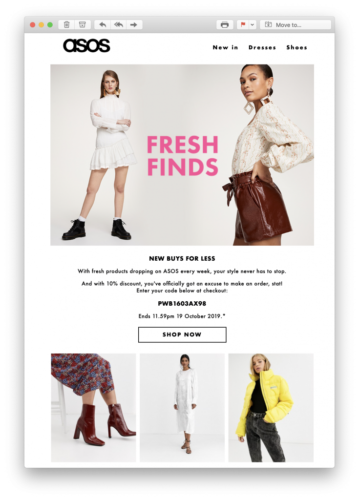
Tactics used often include showcasing new products and offering out discounts and promotional codes. In this example by ASOS, new customers are enticed to start shopping thanks to an exclusive 10% discount.

Email welcome offer by ASOS

A 10% discount helps ASOS get new customers in the mood to shop.

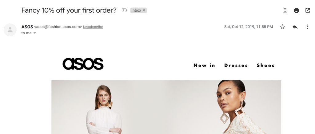
Email subject line in welcome email by ASOS

An effective subject line also helps grab the reader's attention from the start.

Creating an information-based welcome email series

With an information-based welcome email series, the aim is usually to educate new customers about your business. This could be delivered in a tutorial style, as commonly seen in onboarding email campaigns, to help provide new users with all the information they need to get set up.

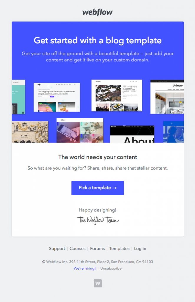
Onboarding email by Webflow

This onboarding email shows new users how to get started with using the service.

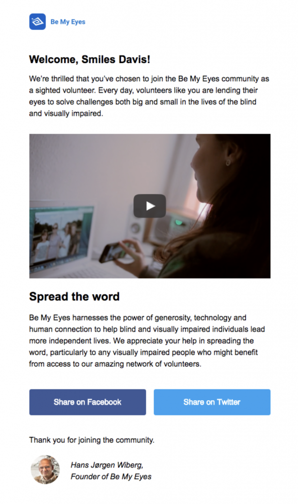
Alternatively, your business may want to use the welcome series to teach new signups more about who you are and what you do. For example, a charity organisation may want to show potential new supporters where their donations are going and provide them with relevant information and stats.

Welcome email by Be My Eyes charity

Explaining more about what you do to new subscribers helps reinforce their reasons for signing up initially.

Creating an engagement-based welcome email series

Finally, an engagement-based welcome series aims to get new customers using your product or service as much as possible so they can reap the benefits. This is generally done by pointing new users towards their next steps and making it easy for them to familiarise themselves with how everything works.

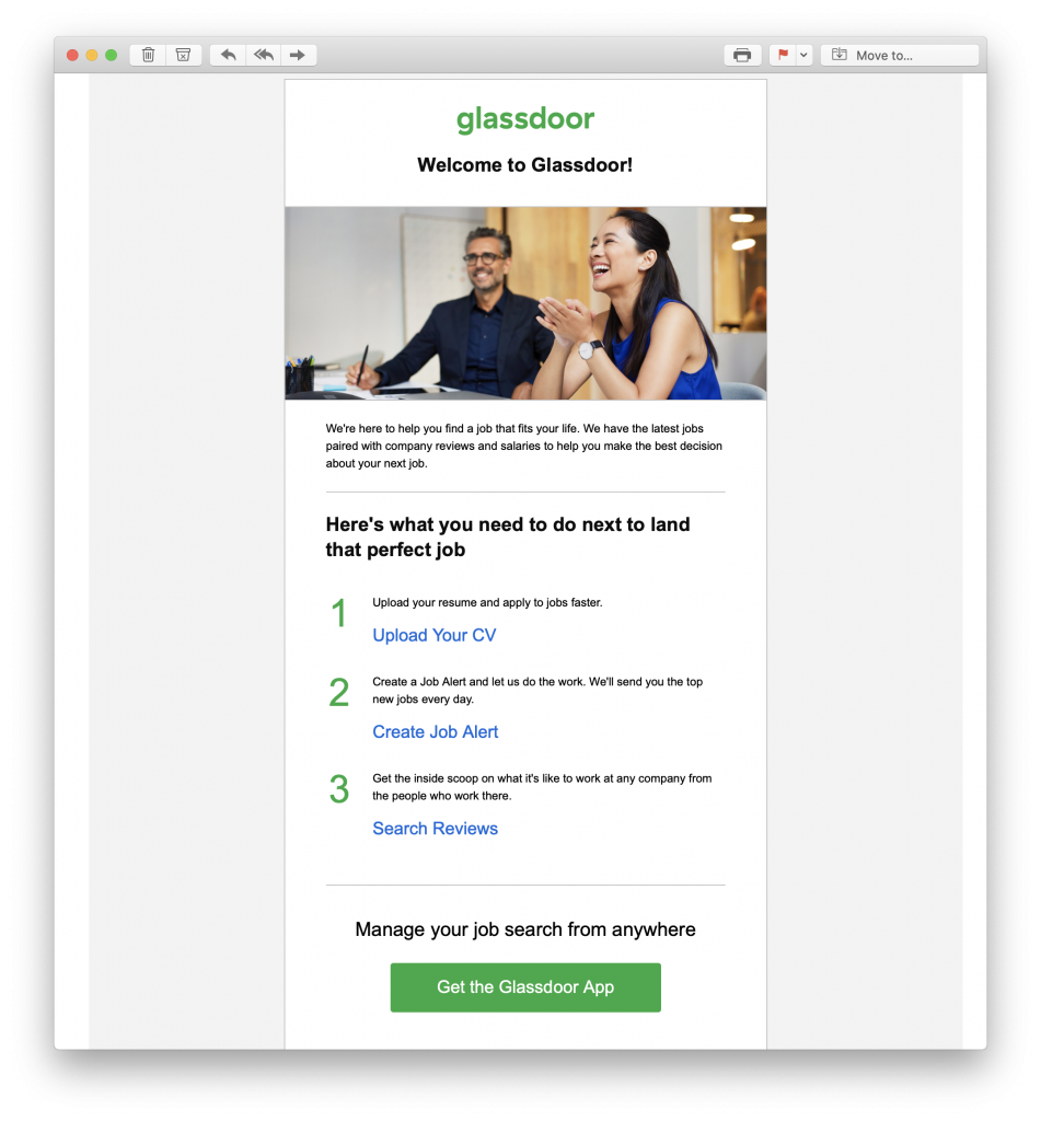
Welcome email by Glassdoor

This 3 step welcome email shows new users exactly how to start using Glassdoor

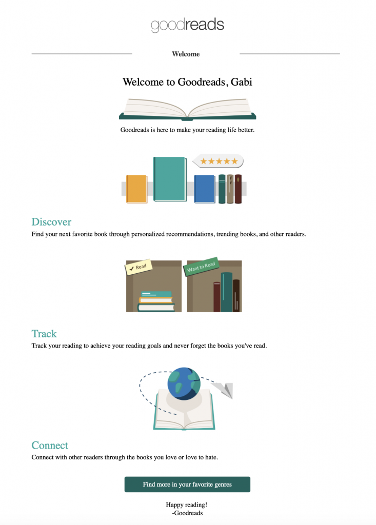
Welcome email by Goodreads

In this example, Goodreads also show new users how to use the service to find new books to add to their list.

What to include in your welcome email series

The customer journey is unique to your business and factors like the time span, contents, CTA and intensity of a welcome campaign will vary.

Here are some ideas for emails which you can choose to include in your welcome email series to help new customers form a connection with your business:

Opt in / Verification

Since the introduction of GDPR, the double opt in has become known as the gold standard for email registration and sending these types of emails has become standard practice for many businesses.

Not only does this process help protect your business from spam bots filling up your email list, it also ensures any new signups are happy and willing to receive your content.

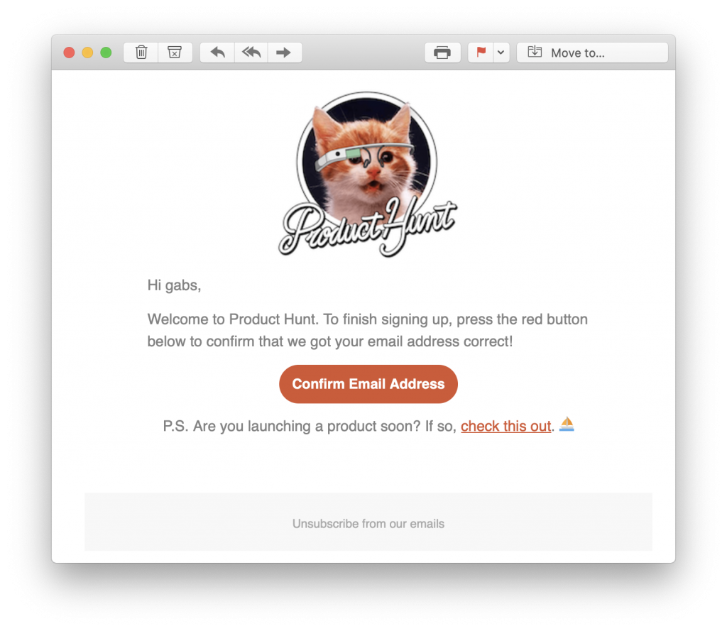
Opt in email by Product Hunt

This simple opt in email by Product Hunt fulfils its purpose while also remaining super on brand.

When to send: Schedule your opt in email to send instantly, so that your new customer doesn't forget to do it later on.

Welcome

This is your brand's first real interaction with your new customer and sets the tone for the rest of your welcome email series. In this email, it's important to firstly thank your customer for signing up, and secondly, make it clear what their next steps should be.

Without a clear CTA in your welcome email, customers are highly likely to ignore it and you will lose your chance to connect with them.

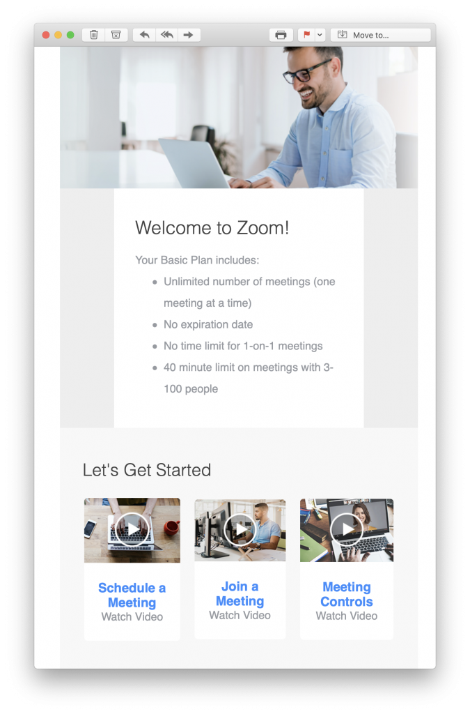
Actionable welcome email by Zoom

Zoom's welcome email is great, as it outlines the details of the user's plan and also points them towards actionable first steps.

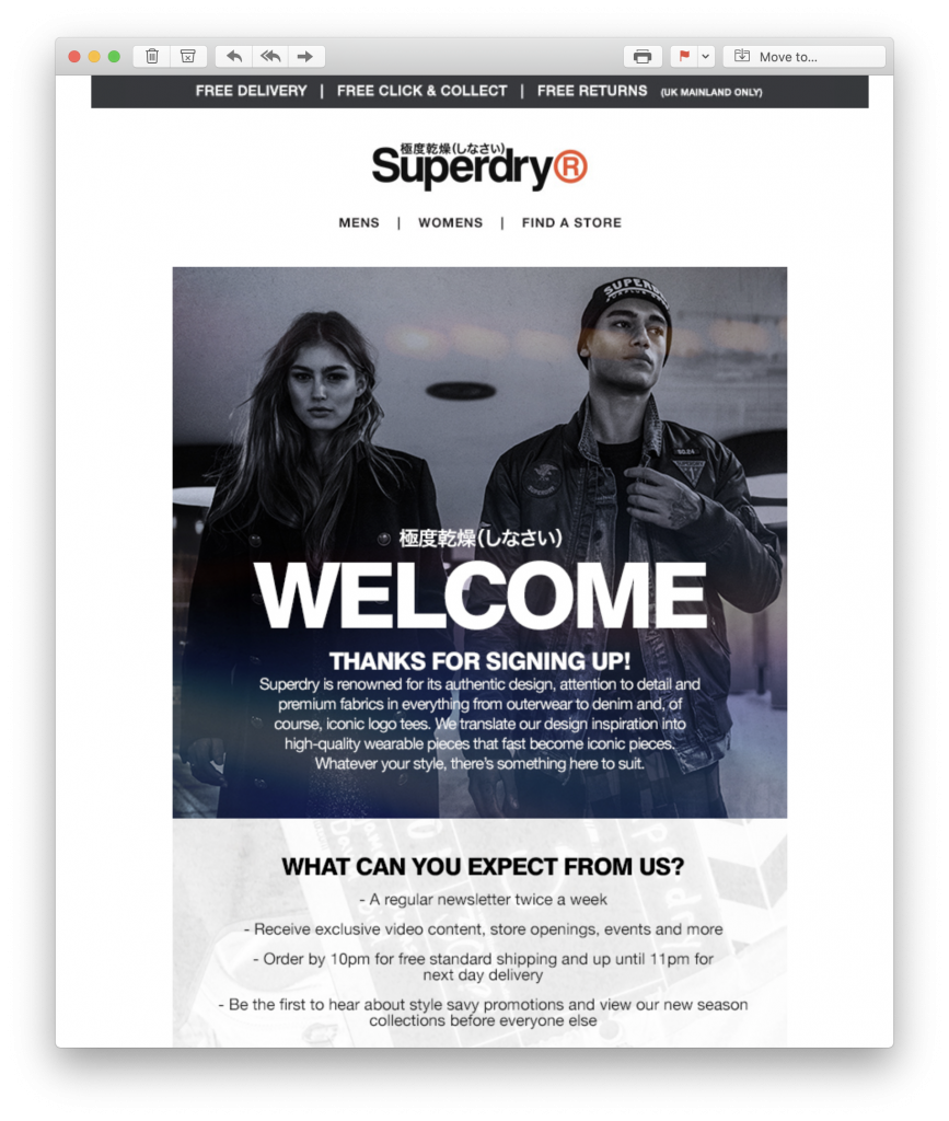
Superdry welcome email

Superdry not only thank new customers for signing up, they also let them know exactly what's in store for them in a useful overview.

When to send: A welcome email should be sent soon after opting in. This ensures your customer is still actively thinking about your business.

Segmentation email

Email segmentation is a key aspect of your email marketing strategy, as it helps ensure your emails are being sent to the optimal recipient.

Use your welcome email series to get to know more about your customers' interests. This will help you tailor your content for them in the future.

Create an email to send to new customers encouraging them to update their email preferences. This will help you find out key information about them, such as location, age, gender, interests, etc. in order to send more relevant email content.

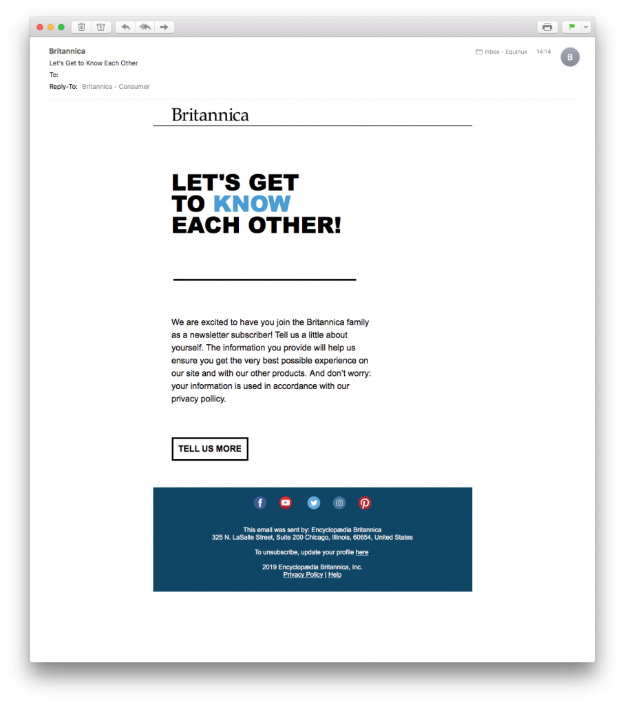
Welcome email by Britannica

Britannica sent out this great welcome mail for better email list segmentation.

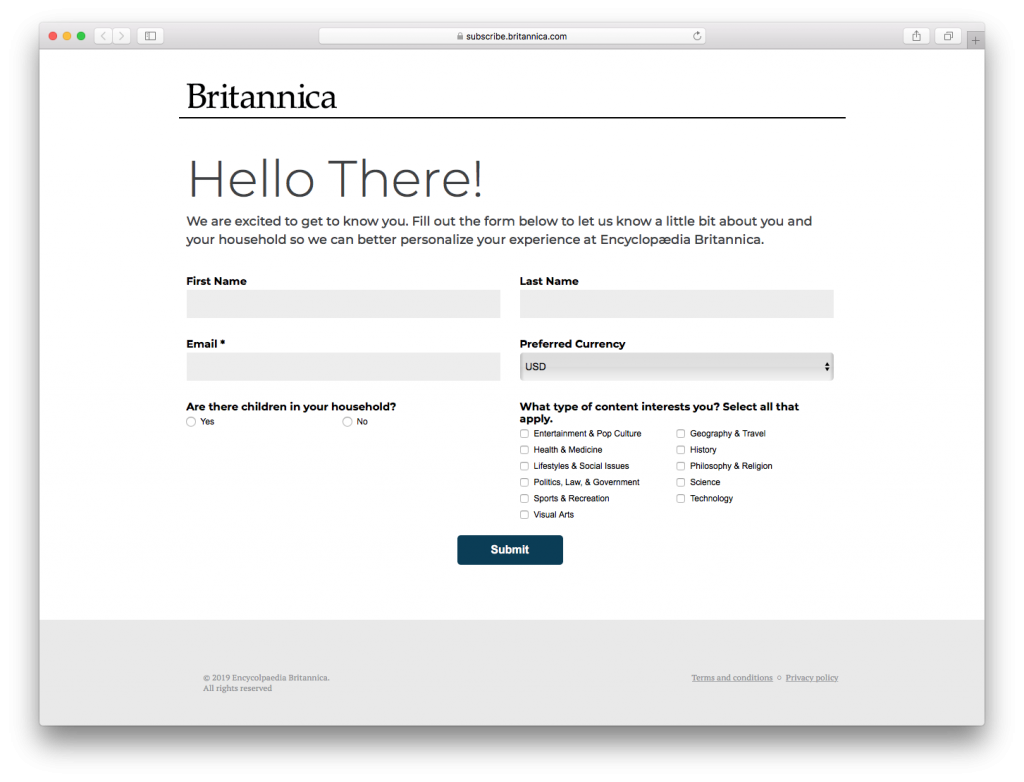
New customer survey from a welcome email by Britannica

The questions in the linked survey help Britannica determine what kind of content the reader wants to receive, thus maximising their chances of higher open rates.

When to send: Send this email a few days after your first welcome email. This way, there will be enough distance between the two emails and your business will still be fresh in the reader's mind.

Action email

Use your next email to direct new customers towards your intended call-of-action. This could be anything, including:

  • Making a purchase from your online store
  • Setting up your first playlist
  • Reading the latest blog post
  • Trying out a new recipe
  • Referring the service to a friend

Make this email super enticing with great email copy, lots of eye-catching visual elements, and a super snappy subject line. This way, new customers won't be able to resist getting started right away.

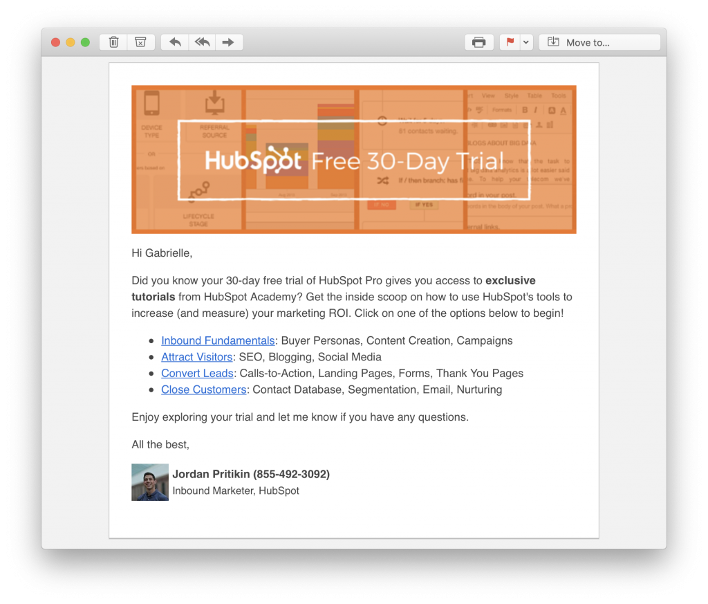
Hubspot action email in welcome email series

This email sent by HubSpot as part of their free trial onboarding series clearly points new users towards their exclusive tutorials.

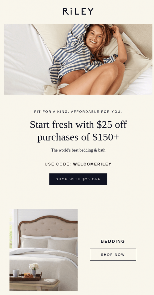
Welcome email promotion by Riley

Riley tempt new customers to start shopping with an enticing $25 discount.

When to send: Give your customers a few days to look around on their own. If you haven't tracked any notable actions, now's the time to send this email prompt and jog their memory.

Feedback email

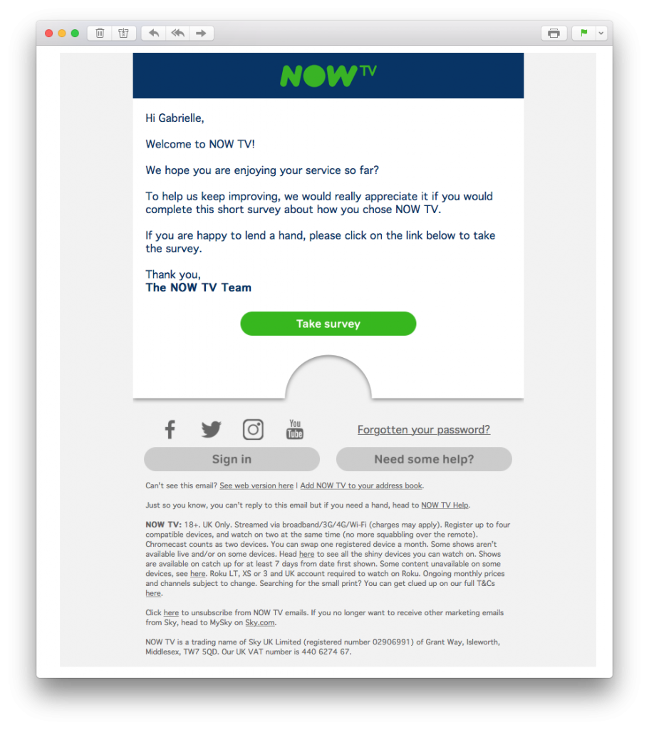
In many cases, it's also a good idea to offer new users the chance to share their thoughts and feedback about their experience so far. Particularly if you offer a demo or free trial period, getting this feedback early can help you address issues directly and prevent customer churn down the line.

If you have a lot of questions, linking out to a targeted feedback form or survey for newcomers can be a great way to find out exactly what you want to know about new customers' experience. Alternatively, it can just be reassuring enough to provide a support email address or telephone number to let the customer know your team are there if they need you.

Feedback email in welcome email series by NOW TVWhen to send: If you are offering customers some kind of demo, aim to send this out towards the end of the trial period. Hopefully by this time, new users would have had a chance to use your product and form an opinion.

Remember, a welcome email series is specific to your business and does not adopt a one size fits all approach. Depending on the nature of your business, there could be other emails you want to include which we haven't mentioned in this article. Some other popular examples include:

  • Referral email (e.g. refer a friend for x% off your next purchase, etc.)
  • Up-sell / cross-promotional email (e.g. you may also like..., upgrade to unlock more features, get premium shipping, etc.)
  • Cross-channel promotional email (e.g. subscribe to our blog / follow us on Twitter / check out our YouTube channel, etc.)
  • Sense of urgency email (e.g. hurry your trial is ending, last chance to get your welcome discount, etc.)

How to create a welcome email series for your business

Creating an automated welcome email series for your business is actually super straightforward. All you need is a well-designed set of email templates and access to marketing automation tools.

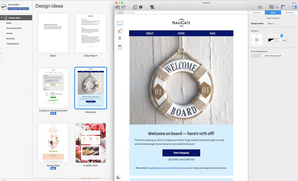
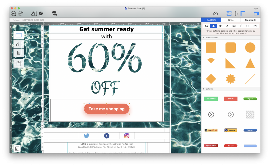
Mail Designer 365 has a wide range of HTML email templates ready for you to adapt for your automated email campaigns. Not only this, the drag & drop email editor makes it easier than ever for you to build your own email templates in minutes - no coding skills needed!

Welcome email template in Mail Designer 365

Discover a huge range of design tools in Mail Designer 365 to create effective email templates for your welcome email series.

Once you've finished creating your set of email templates, you can export them directly to Mailchimp, Campaign Monitor, or Direct Mail, or as HTML to your chosen email service provider or marketing automation platform, including:

  • SendinBlue
  • ActiveCampaign
  • SendGrid
  • Customer.io
  • Drip

Not got a Mail Designer 365 plan yet? Start your free trial today to unlock access to 120+ email templates and a wide range of exciting creative tools for your welcome email series.

Until next time,

Your Mail Designer 365 Team

Get started with the Mail Designer 365 service today for free...

Mail Designer 365 helps you and your team create stylish, professional HTML emails.
Sign up free today to see what you can achieve.
Sign up
Best practice guide for writing email marketing disclaimers

What to Include in Your Email Disclaimer: Email Marketing Best Practice

By Mail Designer 365 Newsletter Academy, Mail Designer 365 Newsletter Academy, Mail Designer 365 Newsletter Academy

Even the most seasoned email marketers shudder when they hear the words "email disclaimer." However in reality, writing an effective email disclaimer is actually far more straightforward than it seems.

In this guide, we're quickly taking you through all the basics of best practice for email disclaimers to make things easier than ever when it comes to sending your next marketing email.

Jump to:

Get expert email best practice tips delivered directly to your inbox!


There was a problem registering your email address.
Please check and try again.
Thank you for registering! Please check your email inbox.
We've just sent you an email for you to confirm your email address, if you haven't already.

What is an email disclaimer?

An email disclaimer is a small section of text typically located within your email footer, separate to the main body of your message. It is one of the most important parts of any email you send, as it protects your business from any potential legal issues and contains key information for your customers.

The laws on what information businesses need to provide recipients with differ from country to country. For this reason, it's imperative that you know exactly what you need to include in your email disclaimer, as your business can receive a hefty fine if certain rules are not adhered to.

Email disclaimer laws by country

Below, you can find a brief summary of the email disclaimer laws for your country or region.

Email Disclaimer Law in the United States

CAN SPAM Act of 2003 requires all businesses sending marketing emails to provide certain information in their email disclaimer. This includes, a physical address for the sender and a clear and functioning unsubscribe option.

You can find more detailed information on this here.

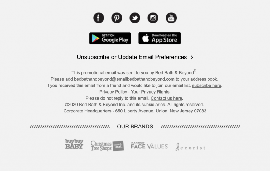
Here is an example by Bed, Bath & Beyond:

Email disclaimer by Bed, Bath & Beyond

Email Disclaimer Law in the European Union

The EU Directive states that all business communication emails must contain a standard disclaimer with the following information:

  • Company registration number
  • Place of registration
  • Registered office address

However, individual countries have slightly different requirements, so it's important to check based on the country your business is based in.

For example, in Germany businesses are required to include:

  • Company name
  • Office location
  • Court register
  • Registration number
  • Name of the managing director and the board of directors

You can find more detailed information about individual EU countries here.

Email Disclaimer Law in the United Kingdom

Along with a clear unsubscribe link, Trading Standards requires registered companies in the UK need to include the following information in all of their business emails:

  • Registered company name
  • Company registration number and place of registration
  • Registered company address

You can find more detailed information on this here.

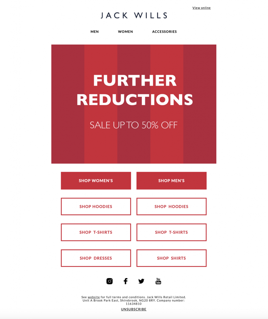
Example by Jack Wills:

Email disclaimer example by Jack Wills

Email Disclaimer Law in Canada

According to CASL (Canada's Anti Spam Law), all businesses need to provide clear contact information for the sender, as well as an opt out link in their electronic marketing messages (including email, SMS, and social media messages.)

Possible fines for non-compliance can reach up to $10 million.

You can find more detailed information on this here.

What else to include in an email disclaimer

As a force of habit, many people receiving your emails will automatically look to the footer area to find important information about your business.

In addition to the mandatory information listed above, there are several other things your business may want to include in your email disclaimer to help protect you from legal issues and also ensure your customers can find the information they are looking for.

Unsubscribe link

As mentioned above, the unsubscribe link is a legal requirement for all marketing emails, with most transactional emails being an exception. Although this does not have to appear in your email footer (some designers opt to place it at the top of the design) the vast majority of customers will expect to find it here.

Your unsubscribe link must be clearly visible and must provide the recipient with a straightforward way to opt out of receiving your emails.

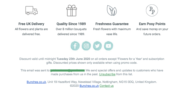
This example by Bunches is great, as it clearly explains to the recipient why they have received the email and where to click to opt out:

Unsubscribe link example by BunchesTerms and conditions

Adding a brief terms and conditions section to your email disclaimer is a good way to clear up any possible confusion surrounding your promotional offer. In this section, you could cover things like offer expiry date, offer validity (e.g. in store or online, on all products or selected, etc.) and eligibility (e.g. new customers only.)

If you wish, you can also use this opportunity to link out to a separate, more detailed terms & conditions landing page.

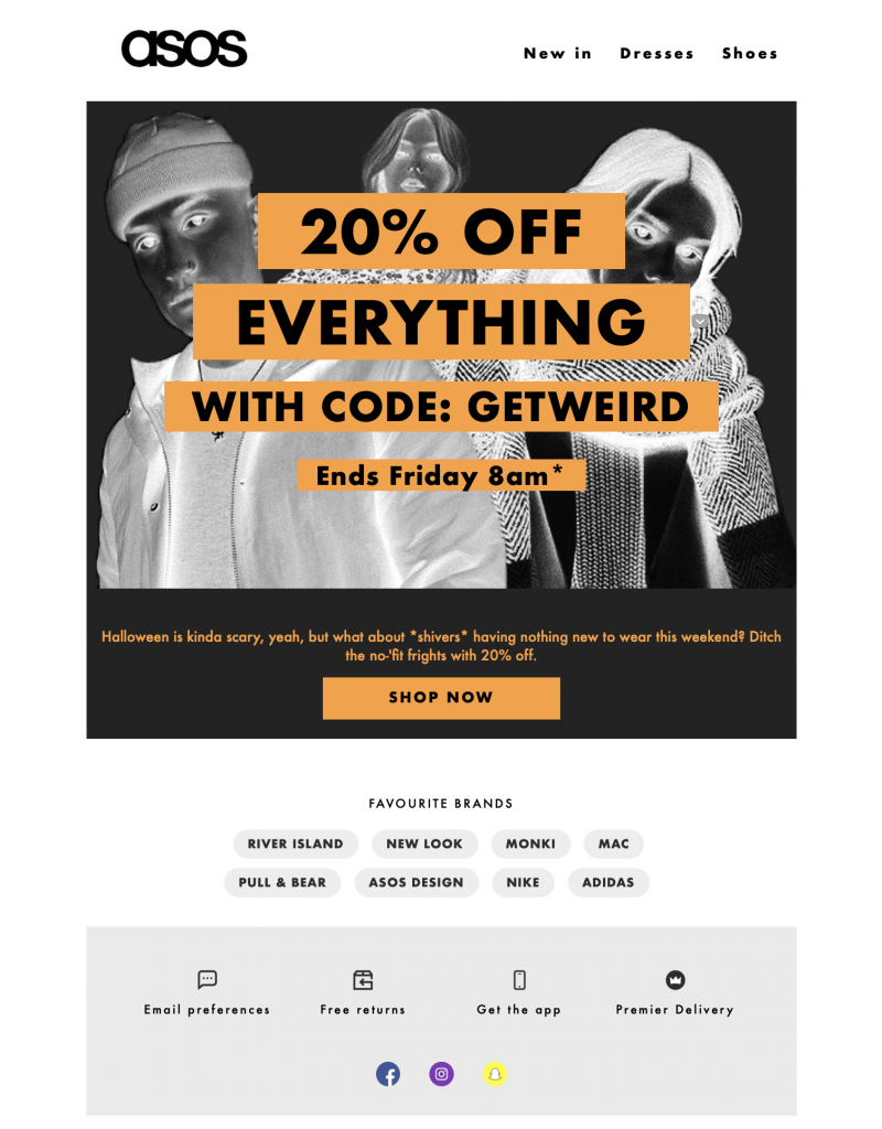
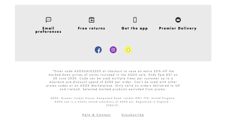
In this promotional email, ASOS clearly outline the terms and conditions of their sale to customers:

Terms and conditions email disclaimer by ASOSPrivacy Policy

Since GDPR came into force, there has been an emphasised importance on data protection and privacy. Many businesses now use their email disclaimer as a place to also refer to their company's privacy policy. This is a good way for recipients with questions to locate the information they need.

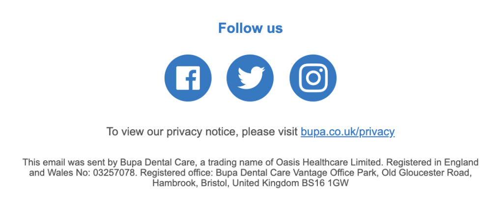
This email by Bupa Dental Care is a great example of how to use your email disclaimer to make readers aware of your privacy policy.

Email Disclaimer for a UK business

Contact information

In addition to the mandatory information required (i.e. company address), it's also best practice to give your customers an easy way to get in touch with you.

Many marketing emails come from no-reply addresses, so including a support email address or a link out to a contact form in your disclaimer allows customers to contact you if they have questions.

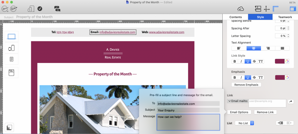
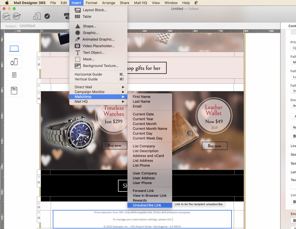
Tip: Use a mailto link so your customers can contact you in just one click. In Mail Designer 365 you can even configure the email subject line and message to make things easier:

Email mailto link options in Mail Designer 365

Provide readers with a direct way to contact you.

Creating an email disclaimer in Mail Designer 365

One key thing to remember about your email disclaimer is that the core content is often the same. Once you've put together an informative disclaimer that meets all the legal requirements, you should be able to keep reusing it in future emails.

Mail Designer 365 allows you to create custom layout combinations and save them for future use. This is perfect for your email footer area:

  • Build up your disclaimer using text blocks, spacers and images
  • Insert all the relevant text, links and contact information
  • Select your group and drag into the sidebar under "Layout Blocks" > "Ready-Made" > "My Saved Blocks" where you can instantly access them in your next design and tweak as needed
Ready made layout blocks for email disclaimers in Mail Designer 365

Drag and drop layout combinations to save them in your ready-made layout blocks collection and use for future emails.

We hope this information has been useful and that you'll bear these tips in mind when working on your email disclaimers.

As well as the practical, ready-made layout blocks feature, Mail Designer 365 also offers a wide range of email templates, text styles, and mobile optimisation tools to make sure your email disclaimers are clear and effective. Not got a Mail Designer 365 plan yet? Sign up today for your free, no-strings-attached trial.

Get started with Mail Designer 365 today

Start your 7 day free trial and use your Mac to create stylish email newsletters for your business.
No credit card required
Compatible from Mac OS X 10.11 onwards

Enjoyed this post?

Get more inspirational tips, tricks, and best practice examples in the Mail Designer 365 Newsletter Academy -
your one stop hub for all things email marketing strategy and newsletter design.
How to write effective announcement emails

How to Write Effective Announcement Emails to Share Important News with Subscribers

By Uncategorized

Whether you're informing customers about an upcoming product launch, sharing a statement, or communicating important changes to subscribers, being able to write effective announcement emails is a key skill needed by businesses of all sizes.

What is an announcement email?

In this article, "announcement email" is very much an umbrella term for your core communication with customers (outside of standard sales emails.) An announcement email can take many forms, including but not limited to:

  • Internal company news
  • Product news or updates
  • Public statements
  • Announcing a show of support OR taking a stand
  • Crisis communication
  • Event invitations
  • Customer information

Also important to consider: Oftentimes, announcement emails are much more text-heavy than a standard marketing-style email, as the sender usually has a lot to say.

Why should I use email for my announcement?

As a business owner, email is the most reliable way to make important announcements to your subscribers. Although social media is booming, complicated algorithms often mean many of your subscribers on platforms like Instagram, Facebook and Twitter don't even see your posts - resulting in important information going unread.

Email is a direct channel between you and your customers with very little background noise to take away from your key message. For this reason, when done correctly, an announcement email has the potential to lock in high open rates and get better conversions.

Here are some useful tips to consider when sending an announcement email, plus some great examples of announcement emails we have collected from around the web and our own personal inbox.

Our recipe for effective announcement emails

Strong email copy

One way of ensuring your announcement email is a success is through great communication. This can be achieved by producing strong and convincing email copy to really make your message clear to readers.

Think carefully about the context of your announcement. This will help you determine the tone you want to use and will help you choose your words more carefully.

For example, if your email announcement is of a serious nature, it is probably more fitting to opt for a formal and professional tone. For an exciting announcement like a product launch or a new store opening, you can afford to have a little fun with your email copy and adopt a more relaxed tone.

Other important aspects that will help elevate your email copy include:

  • Good spelling and grammar
  • Varied sentence structure
  • Clear paragraphs and sub-headings - especially if you are conveying a large amount of information

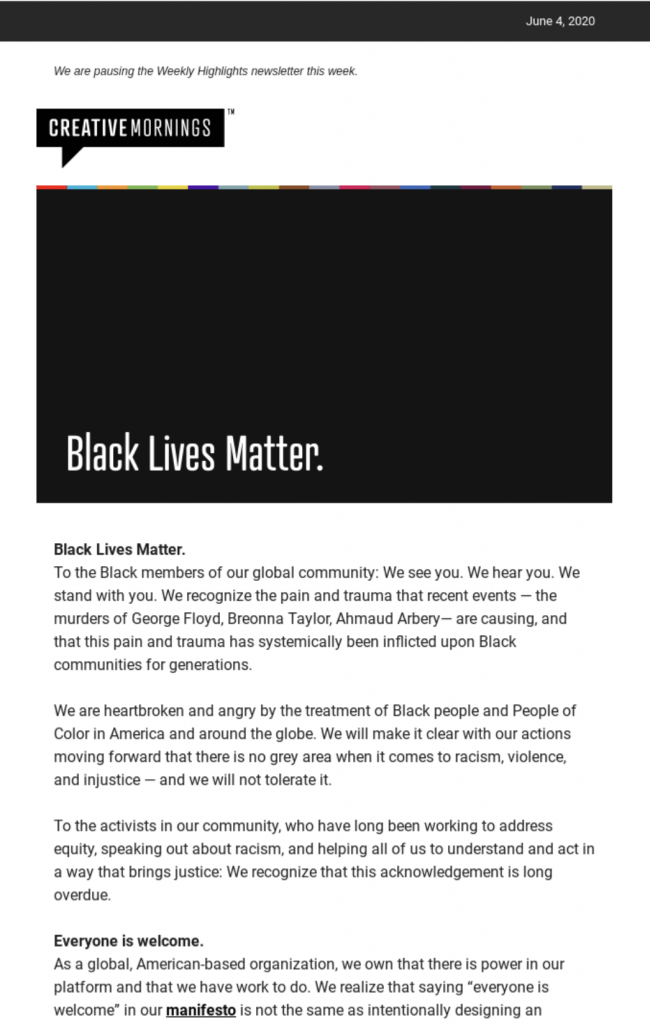
In this email statement, CreativeMornings use powerful, well-thought-out prose and a clear layout to show their solidarity with the #BlackLivesMatter movement.

powerful email statement by creative mornings

CreativeMornings show their support for the #BlackLivesMatter movement through powerful prose.

Great design

The way your email looks is - in many ways - just as important as what it says. An eye-catching header graphic or a strong feature image can be all it takes for your reader to pay more attention to your email.

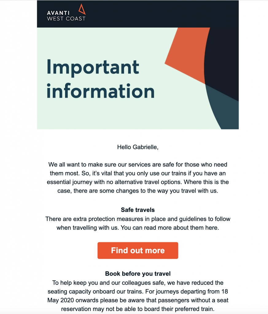
Take this announcement email from Avanti West Coast - Although the rest of the email is quite plain, Avanti do a great job of drawing in readers using a colorful and abstract header design. The simple title "Important information" is enough to let the reader know this is something they should be paying attention to:

email announcement by Avanti West Coast

A great header design helps this announcement email by Avanti capture readers' attention.

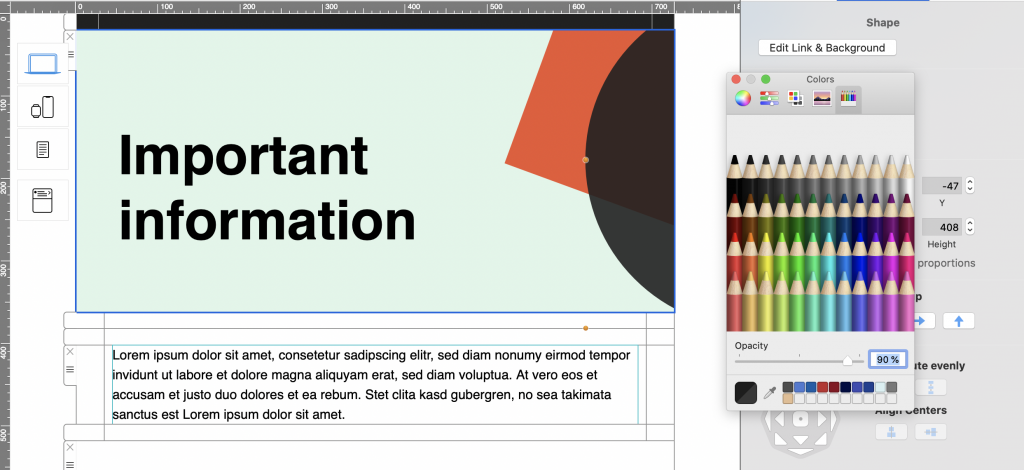
Tip: You can create a similar header effect in Mail Designer 365 by layering shapes and adjusting the opacity:

abstract header graphic for announcement email made in mail designer 365

Another style element which is important to your design's overall effect is your font choice.

While it's tempting to get creative when it comes to fonts, oftentimes, simple is best. Especially when your message is so important, you don't want to run the risk of a poor font choice getting in the way of clear communication.

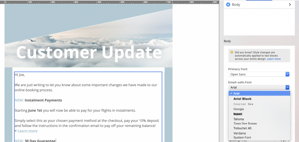
Choose a clean, easy-to-read font in a sensible weight to apply to your email copy. You should also avoid overusing bold or italic, as this appears confusing to readers. When you're done, remember to configure an email-safe "fallback" font to ensure your email text is displayed properly in all clients:

Building an announcement email in Mail Designer 365

Always include an email safe fallback font to ensure better compatibility with other email clients

Clear call-to-action

Any marketing email needs to be able to demonstrate a clear call-to-action. Whether you want your readers to sign up for an event, pre-order a new product, or simply visit a landing page, you need to point them in the right direction first.

Use a CTA (call-to-action) button which clearly stands out against the rest of your email in order to make it prominent to readers. You should also make sure the text of your button is short and snappy and check that the link leads to a sensible destination.

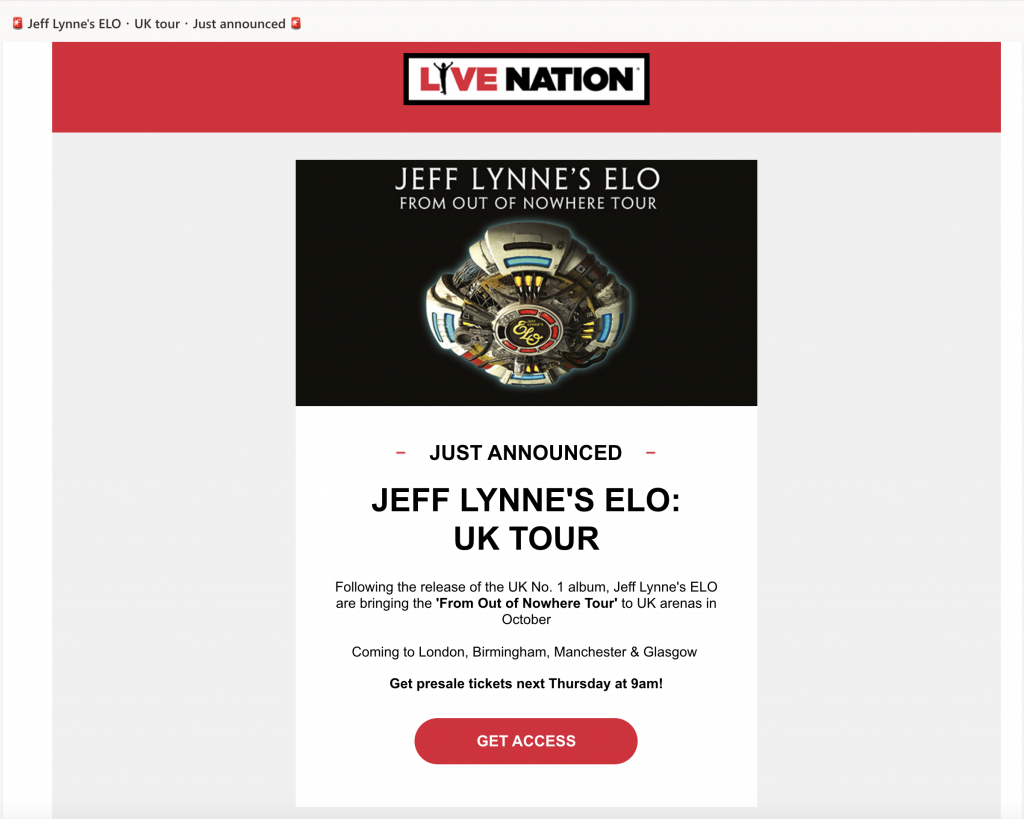
By choosing a vibrant shade of red for the CTA in this tour announcement email, Live Nation are able to convey a sense of urgency and encourage readers to sign up for event access:

Tour announcement email by Live Nation

The bold, red CTA button in this tour announcement email by Live Nation jumps out at readers.

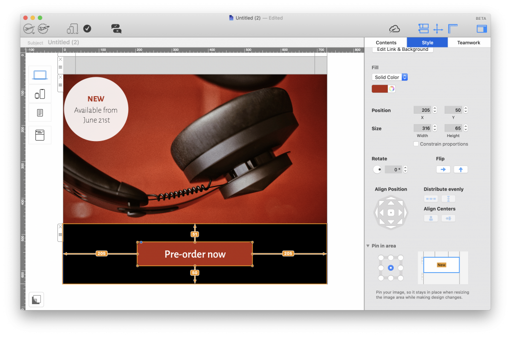
Experiment with shapes and font styles in Mail Designer 365 to create dazzling CTA buttons for your own email designs:

Building a call to action button in Mail Designer 365

Mail Designer 365 has all the shapes and text styles you need to create bold and effective call to action buttons.

Engaging subject line

Your email's subject line is the very first thing that recipients will see and is often the determining factor in whether or not your email gets opened. For this reason, you need to ensure your subject line is interesting and intriguing enough to pique your customers' interest.

When you are coming up with a subject line, be sure to include key words such as "new", "announcement", "exciting news", etc., in order to let your readers know what the email is about. By teasing your new product, upcoming event, important news, etc., you are bound to make your readers curious and encourage them to open up your email.

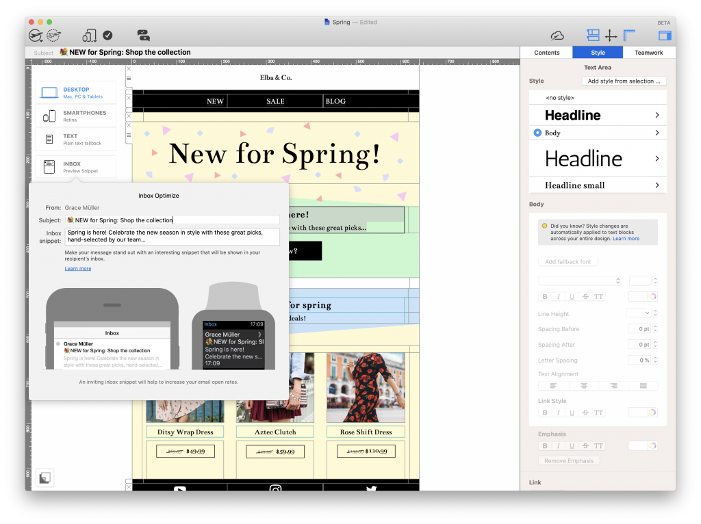
Furthermore, using emojis in your email subject is another great way to ensure it will stand out in their inbox.

Mobile optimization

Because so many people today now check their emails on the go, it's crucial that your announcement email has also been optimized for mobile devices. This is a key part in ensuring that your message is effectively communicated.

Mobile optimization includes aspects such as:

  • Checking the font is legible on mobile devices
  • Choosing target links which make sense on mobile devices (i.e. iOS App Store versus Mac App Store links)
  • Resizing images to look good on mobile devices
  • Including tailored content for mobile users (e.g. special offers, mobile app download links, etc.)

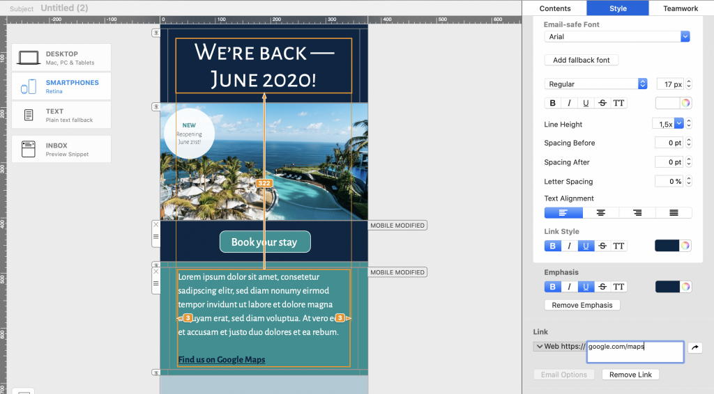
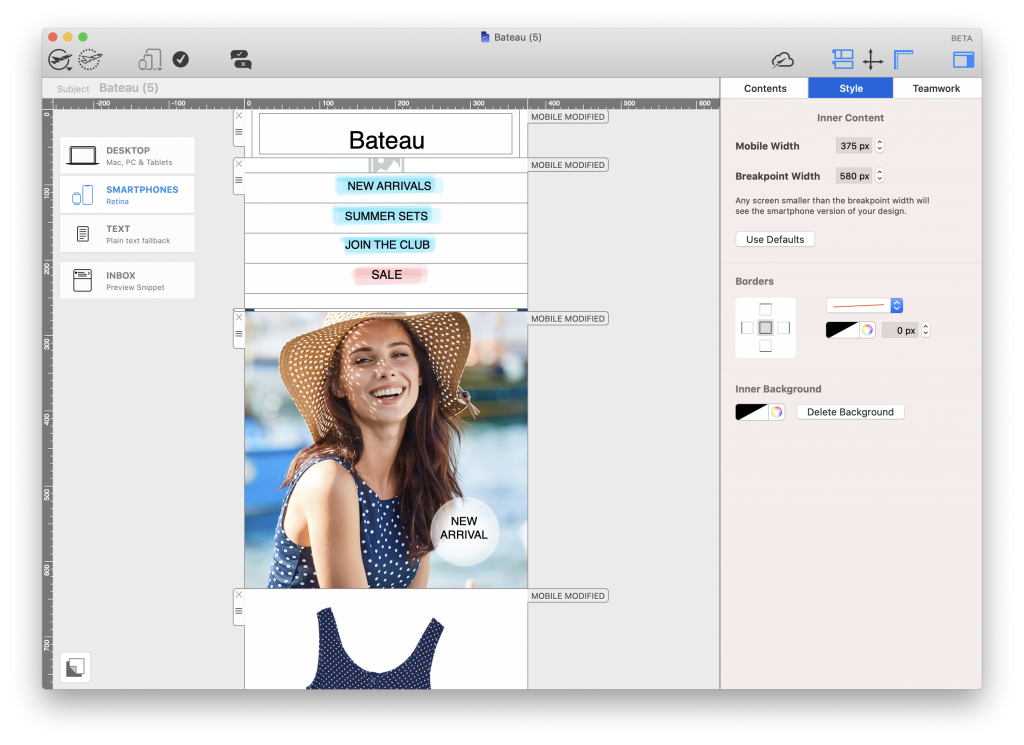
Mail Designer 365 automatically creates a mobile responsive version of your email design, which you can optimize and edit separately to your main desktop design. Simply navigate to the Smartphone view and detach a layout block to begin creating mobile-only content:

Create mobile responsive emails in Mail Designer 365

Use the Mail Designer 365 smartphone editor to create mobile optimized announcement emails.

Smart segmentation

The final way of ensuring your announcement email is a success is by making sure you send it to the right target audience. Sending one email to your entire list is usually a bad idea and is generally only reserved for exceptional circumstances (i.e. major business announcements.)

When you are setting up your campaign in your email marketing platform, think about who will find this information most relevant. This group should be your first priority, as they are more likely to engage with your email. If you can think of other groups who may also find the email beneficial, you can go back to adjust and optimize your template accordingly.

Looking for tips? Here are some useful segmentation techniques you could try out:

Email List Segmentation Techniques to Learn More About Your Subscribers

More examples of great announcement emails

If you are in need of some inspiration, here are a few more announcement emails which we found particularly effective...

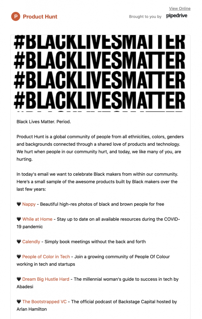
Product Hunt

email statement by Product Hunt

The striking header graphic in this email by Product Hunt gets their important message heard loud and clear.

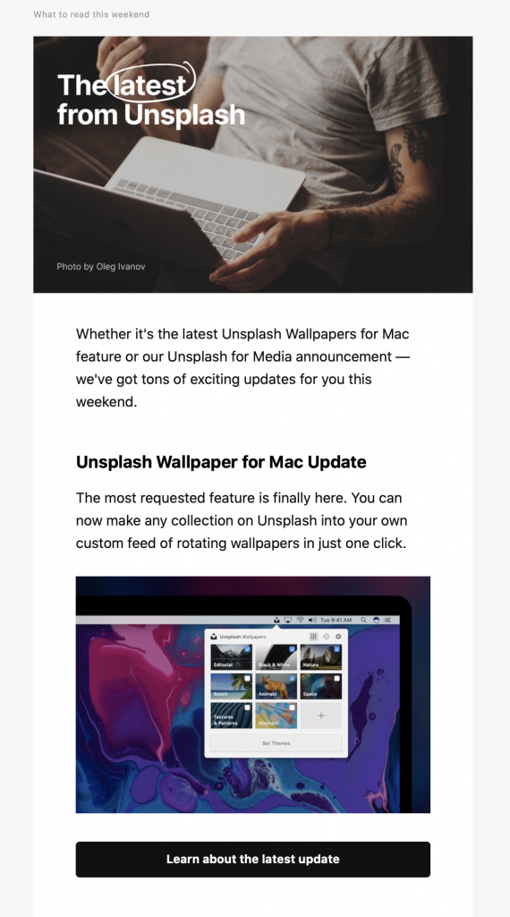
Unsplash

Email newsletter by Unsplash

This simple newsletter-style announcement email by Unsplash is both informative and interesting for users of the service.

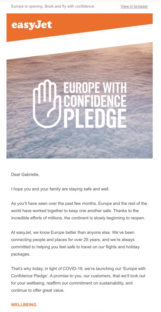
easyJet

email announcement by easyJet

easyJet use the header of this announcement email to grab readers' attention before sharing their important update.

Shinola

new product announcement email by Shinola

Shinola use bold design techniques to win customers' attention in this new product announcement email.

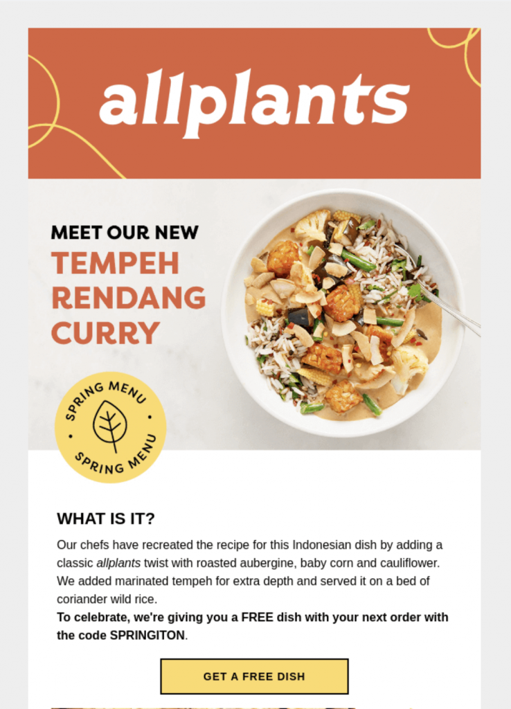
allplants

allplants do a great job of using a colorful CTA button together with a clear layout to introduce a new dish to their menu.

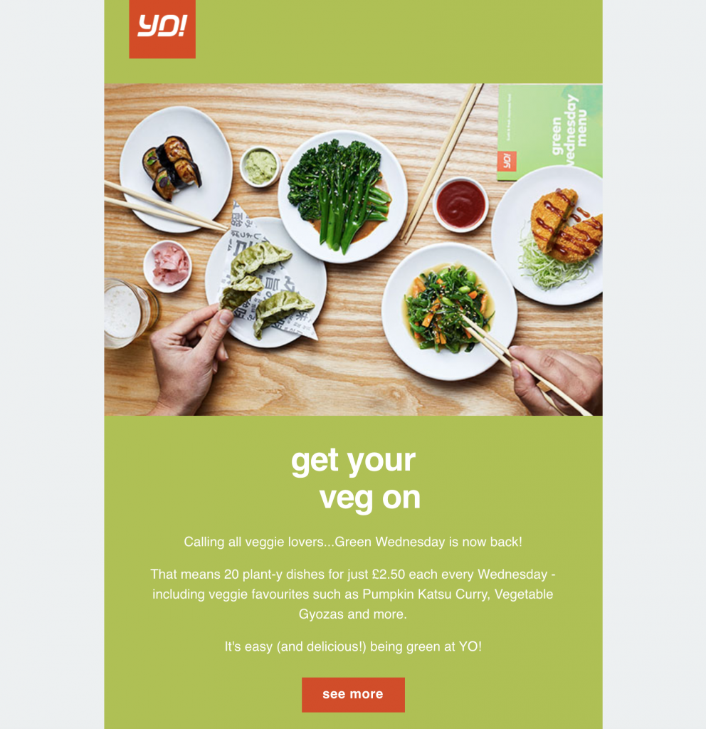
YO!Sushi

email announcement by YO! Sushi

YO!Sushi also mix contrasting color combinations with a big feature image to get customers excited about the return of their "Green Wednesday" promotion.

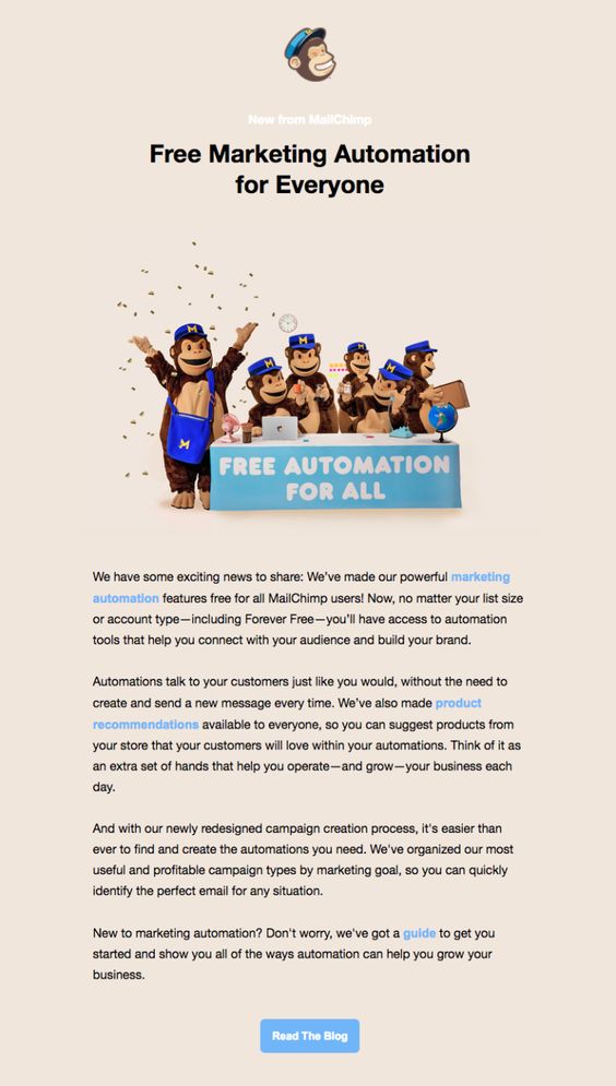
Mailchimp

Mailchimp email announcement

This announcement email by Mailchimp concentrates a lot on great email copy and an effective CTA button.

Discover how Mail Designer 365 can help you build announcement emails

We hope you are feeling inspired and will take these tips on board the next time you ned to make an important announcement for your business.

Mail Designer 365 has all the tools and email template options you need in order to create a fabulous announcement email and share your great news with your subscribers. Sign up today for free to get started!

Get started with the Mail Designer 365 service today for free...

Mail Designer 365 helps you and your team create stylish, professional HTML emails.
Sign up free today to see what you can achieve.
Sign up
Creative online event ideas for businesses

Creative Online Event Ideas for Businesses

By Uncategorized

There's no denying that online events are massively on the rise. If you take a glance at the average business calendar today, you'll likely see event titles that didn't even exist 10 years ago. (Ever heard of a virtual trade fair? I hadn't until researching for this post!)

Of course, as the way we hold events changes, so does the way we market them. In this guide, we talk about some great online event ideas for your business, plus the best tools to help you ensure your event is a success.

Jump to:

Why should I host an online event?

Quite simply put, the main advantage of a virtual event is flexibility. The majority of the time, all your guests need to get involved is a working internet connection - which is definitely not hard to come by these days!

Because online events are so flexible, people can take part from wherever they are - whether it's from the comfort of their own homes, or from their office 5000 miles away from the actual location. This flexibility means your event can reach a much wider audience of new potential leads.

More advantages of hosting an online event include:

  • Diversify your audience - As well as your audience being generally larger, it also has the potential of being much more diverse. With an online event, geographic restrictions don't apply. As long as you choose a fairly neutral time zone, guests from all over the world can attend.
  • Reduce costs - Hiring a venue, paying temporary staff, organising catering and booking transport are all things that can cost your business a huge amount of money. Although there will be some costs associated with your online event, you will save big by removing all the physical elements.
  • Save time - All the elements named above also take a large amount of time to organise and coordinate. Free up your time to focus on the content of your online event rather than planning the theatrics behind a physical event.
  • Lower your carbon footprint - Many people attending large scale events will have to drive a great distance or even fly to get to the location. This results in an extra amount of carbon emissions which can easily be avoided by hosting your event online.
  • Great for brand image - Although online events are definitely on the rise, in many respects, they are still a very new trend. Hosting an online event is a great way to show your target audience that your business is innovative and in touch with the latest technology.

Types of Online Events

Video Meeting

A video meeting does exactly what the name describes. These types of meetings can take place on any scale and for any use case: no matter how big or small. Here are a few popular examples:

  • Daily briefing meeting
  • Job interview
  • Project status update meeting
  • Project review meeting
  • Department meeting
  • Financial planning meeting
  • Shareholder meeting

For many, an offsite meeting means travel costs, food & drink and possibly an overnight stay all being charged to company expenses. Not to mention the time taken to get there and back is time which could have been spent doing other important work. Holding a video meeting means all participants can join from their respective locations and save the company time and money.

Zoom app on mobile phone ready for a video meetingVideo meetings are also a game changer for remote-based teams to stay connected. All you need to get started is a working internet connection, a headset and a video meeting platform to host from.

Webinar

A webinar is an online seminar most typically used to educate viewers on a particular topic. This could be anything from a step-by-step product demonstration (particularly popular with software companies) to a university-style lecture on a given theme (e.g. How to create a website for your small business.)

Most often, a webinar is a mixture of pre-recorded screen sharing with voiceover commentary; however, the webinar host(s) can also choose to livestream the event in order to allow for interactive elements such as a Q&A session or a quiz. Usually, a webinar won't last longer than an hour.

Webinar recording

Pro tip: When you send out your invitations, make sure you outline exactly what will be covered in the webinar so people will be more willing to sign up. For more great tips on how to market your webinar, check out this guide.

Virtual Summits

This type of online event involves you sourcing established guest speakers from your field to come together and collaborate. Participants tend to discuss a chosen topic (i.e. education or technology), or provide solutions for well known industry problems (e.g. how to increase student participation in your classroom.)

Guest speakers will generally prepare material to present and, if held live, offer the audience the chance for a Q&A session.

Conference event livestream

While this type of event is usually less specific to your business, it is a great opportunity for lead generation. Each guest speaker brings a virtual audience with them; all of which become potential leads for your business.

An event like this is also a great way to establish your authority in your industry and gain key contacts.

Pro tip: To ensure things run smoothly, start planning the dynamics of your virtual summit quite far in advance. It can also be beneficial for guest speakers to pre-record their content to make the event appear more seamless on the day.

Online Course & Training

An online course is a type of online learning environment which can be set up to deliver lessons or follow-along courses on a particular subject. An online course can consist of a series of sessions (i.e. for distance learning or online qualifications) or it can be a one-off event.

If held live, online training events are generally best suited to smaller groups, in order to recreate the classroom experience and allow for participants to ask questions. While there is still an element of presentation, an online course is intended to be a much more interactive experience for those involved.

Boy with headphones using a MacBook

Pro tip: After streaming a live lesson, it's a good idea to upload your video to a portal where participants can then watch it back at a later date.

Virtual Tradeshow

Similar to a physical trade fair, a virtual tradeshow is a type of online marketing event which is held to give participants the chance to present their products to potential buyers.

Most typically, each vendor will have a dedicated "booth" in which they can present prepared material including webinars, tutorials and product introductions. Many virtual tradeshows also have e-commerce integration so attendees can purchase directly.

Although the virtual tradeshow may be the biggest change to the real thing, it is a great strategy for companies who want to cut down on costs, or businesses looking to try innovative new methods to reach new customers.

6 Awesome Tools for Online Events

With online events on the rise, more and more awesome tools are becoming available to help businesses guarantee their events are a success. Below, we have highlighted some of the current leading tools for managing and hosting online events. Skim through the list to see the key features and click through to the operator website to find out more!

1. Zoom

Zoom is currently one of the most popular choices for online meetings.

Zoom video meeting platform for businesses

  • Video meeting platform for up to 1000 participants (with up to 49 videos on screen)
  • Webinar services also available
  • Interactive features such as polls for a more engaging experience
  • Free plans available for basic features
  • Learn more about Zoom

2. Google Meet

Google Meet is a brand new video conferencing platform by Google which replaces their Hangouts Meet platform.

Google Meet online video meeting software

  • Video conferences for up to 250 participants
  • Free plans available for conferences with up to 100 participants (starting offer: conferences can last up to 24 hours until September 30th, 2020!)
  • Personalised plans with advanced features and livestream capabilities available for enterprises
  • Learn more about Google Meet

3. Adobe Connect

Adobe Connect is a standalone, advanced web conferencing software.

Adobe Connect web conferencing software

  • Great for training, online classrooms and tutorial-style webinars
  • Create custom layouts to help control what your audience sees and how they interact with your online event
  • Layouts are reusable and can be used again and again - great for maintaining consistency throughout multiple sessions (i.e. online training courses.)
  • Learn more about Adobe Connect

4. Cvent

Cvent is an event management platform for larger online events.

Cvent event management platform

  • Management options help event organizers process registration and attendees
  • Easy to integrate with other apps and programs (i.e. CRM systems and virtual meeting platforms)
  • Built in email marketing tools and HTML editor for custom email designs
  • Platform provides useful after-event analysis to help determine ROI and event insights
  • Learn more about Cvent

5. GoToMeeting by LogMeIn

GoToMeeting is a video meeting tool with dedicated add-ons for conferences and webinars.

GoToMeeting online video meeting platform

  • Video meetings for up to 250 participants
  • Includes GoToWebinar platform for managing live or pre-recorded online webinar events. After event analysis tools also available. (P.S. Learn more about webinar marketing here.)
  • Support for personalised channels to make your webinar content available on demand
  • Meeting transcription tools available in some plans
  • Learn more about GoToMeeting

6. vFairs

vFairs is a virtual events platform that allows users to plan and structure tailor made online events.

  • 3D virtual event environment for a realistic experience
  • Custom event landing pages and bespoke booths for your product
  • Add on tools for webinars plus e-commerce integration
  • After-event analysis and lead collection for networking
  • Learn more about vFairs

Using Mail Designer 365 to Prepare for Your Online Event

The build up to your online event is just as important as the event itself. During this time, you need to successfully promote your event among your target audience and ensure you have as many sign ups as possible.

The best way to generate attention around your online event is with email marketing. A solid email strategy helps you sell your event to invitees and allows you to follow up with potential leads once the event is over.

Mail Designer 365 has all the creative tools you need to build impressive an email invitation for your online event, as well as reminder emails and follow up campaigns. Check out this post to find out more about email strategy for online events.

Zoom meeting announcement email made in Mail Designer 365

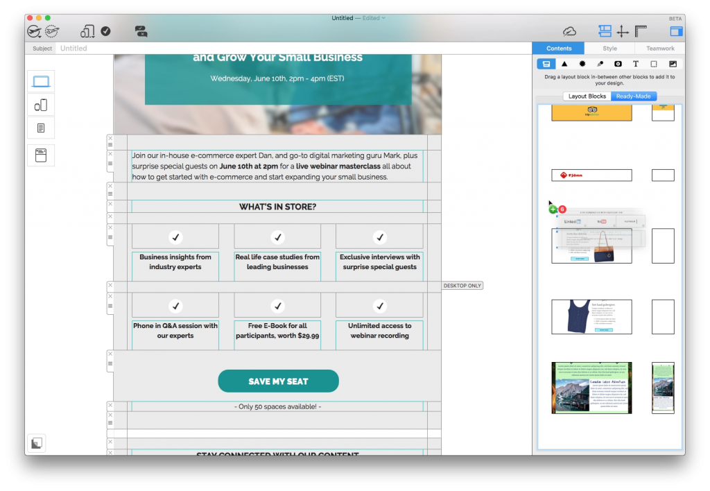
Use this Mail Designer 365 email template to announce a webinar, Zoom meeting, conference, or any other online business event.

Until next time,

Your Mail Designer 365 Team

Get started with Mail Designer 365 today

Start your 7 day free trial and use your Mac to create stylish email newsletters for your business.
No credit card required
OS X 10.11 - macOS Big Sur

Enjoyed this post?

Get more inspirational tips, tricks, and best practice examples in the Mail Designer 365 Newsletter Academy -
your one stop hub for all things email marketing strategy and newsletter design.
How to create an email strategy to promote your webinar

Email Marketing Strategy for Webinars: How to Use Email to Promote Your Webinar

By Mail Designer 365 Newsletter Academy

For B2B organizations, a well-executed webinar is often a great way to generate more leads. However, in order to ensure your webinar is a success, you first need to promote it effectively amongst your target audience. Coming up with a solid email marketing strategy for webinars is one way you can achieve this.

In this guide, you'll find useful tips on developing an effective email marketing strategy you can use to guarantee your webinar is a success.

Jump through this guide:

Getting Started with Webinars

What is a webinar?

A webinar is an online meeting or seminar where participants are invited to discuss a range of topics within a certain field. Usually, the webinar is lead by an expert or group of experts in that field who will present information and answer any questions. The size of a webinar can range from just a handful of people to hundreds of attendees.

Especially in B2B, webinars are also often used as a way to introduce a product or service to potential new leads by means of a tutorial or case study.

Following along with a webinar

Benefits of hosting a webinar

Hosting a webinar gives you the chance to demonstrate your expertise in your field. It is a unique form of content marketing which, when executed correctly, helps establish you as an authority figure to your audience and creates a sense of trust. For example, the team at Really Good Emails upload weekly videos about email design which clearly establishes them as a leading authority in that field.

Here are some more great benefits of hosting a webinar:

  • Lead generation opportunity - Participants signing up for a webinar are great potential leads whose data can help you in future campaigns.
  • Advertising - A webinar is a clever way to promote your product or service to a new audience by showcasing its potential in unique ways. Case studies, live demos, and follow along tutorials are just a few examples.
  • Make your business relatable - Hosting a webinar helps both existing customers and new leads put a friendly face to your business. This works wonders for your relationships with customers.
  • Get to know your audience - One of the hardest aspects of marketing is finding out what your target audience wants. In a webinar, viewers can submit questions and feedback which gives you an insight into their needs and helps you optimize your product or service accordingly.
  • Affordable - A webinar offers many of the same advantages as a physical event but comes without the added costs (i.e. venue hire, travel, food & drink.)
  • Flexible - Your webinar can take place whenever you like, wherever you like. Geographic restrictions don't apply.

Email Marketing Strategy for Webinars

Once you've taken the first steps in deciding you want to host a webinar, you now need to make sure it's a success. Here is our 3 step email marketing strategy for promoting your webinar.

Step one: Email Marketing Strategy in the Build Up to the Webinar

In the weeks building up to your webinar, the focus is on promoting it to the right audience and ensuring you get as many sign ups as possible.

Identifying your target audience

The first step in creating an email marketing strategy for your webinar is identifying your target audience. This will allow you to segment your email list accordingly, and choose the appropriate tone for your email.

Think about the content of your webinar and who will find it most relevant. This will become your target audience. For example, if your webinar is an introductory walkthrough of your product, you will most likely want to consider new sign ups or demo users as a target audience.

Make your invitation a teaser email for the webinar

Once you've identified the segment of your email list you want to target, you can start designing the email invitation. We like to know what we're getting into, so the element of surprise is not desirable here.

In the initial announcement email, be sure to include a preview of the key topics your webinar will be covering. This will help get recipients hyped up for the event and also helps your recipients assess whether the webinar is relevant to them. Whatever the aim of your webinar is, you only want participants who are genuinely interested, as they are more likely to engage.

Webinar invitation email by Teachable

This email by Teachable makes sure those invited know exactly what is being covered in the webinar.

Helpful hint: Using your subject line to convey the main topic of your webinar is a great way to capture readers' attention from the first point of contact with the email.

Make the sign up process easy and straightforward

The best way to encourage more sign ups is through a clear and effective CTA (call-to-action) button. If your recipient has read your email invite and still can't figure out how to register for the event, something has definitely gone wrong.

As a general rule of thumb, your CTA button should...

  • Stand out against the rest of your email,
  • Display a simple and direct command (e.g. "register here", "secure your place"),
  • Lead to a sensible target link (i.e a dedicated landing page or registration form).
Webinar invitation by Litmus

Not only do Litmus choose a striking color for their CTA button, the text is also short and snappy.

Be sure to include all of these characteristics in your email invitation to improve your chances of a high sign up rate.

Time your invitations right

Sending out the invitations to your webinar at the right time is key and bad timing can often lead to you missing out on a huge chunk of potential leads. If you send out an announcement last minute, many of your target audience will already have plans in place - especially if you are targeting busy business users. For this reason, it's important you give invitees plenty of notice for your webinar.

On the other hand, sending out an invitation too far in advance is also not recommended. This not only increases the chance of customers forgetting about your webinar, but could also deter others from signing up if they don't know how their schedule will look that far in the future.

We recommend you send out your first email a few weeks in advance to give attendees the chance to pencil you in to their calendar. Don't forget to also create a calendar event for the webinar and link to this in your email.

Step two: Email Marketing Strategy just before the Webinar

A few days before your webinar takes place, you need to make sure everything is in order. This involves reminder emails, last minute checks and providing key information.

Send out reminder emails with key information

Many of us have super busy schedules and it's natural for things to slip our minds. For this reason, it's important to make the experience as straightforward and accessible as possible. The last thing you want is for previously interested leads to not take part on the day because they forgot about the webinar, can't find the email invitation, or are missing relevant information. You need to be on the ball.

Take the time to send out a reminder email a day or so before the webinar to finalise all the important details participants need to know in order to be prepared. This includes key information such as:

  • The link to join the webinar
  • The date and time it's taking place (remember to think about time zones if you are targeting people in different states/countries)
  • How long it will last
  • What the format is (e.g. Q&A, case study, presentation)
Webinar email by Asana

This email contains all the key info about the webinar which helps attendees get prepared.

With this information all at hand in one helpful email, your participants can look forward to the webinar whilst also feeling sufficiently prepared.

Chase up lost leads and target last minute opt ins

In some cases, your original invitation email may have gone unread, or the recipient may have forgotten to act. To ensure you don't miss out on any potential sign ups, it's also a good idea to chase up any lost leads you may have by sending a secondary invitation email.

Split your original list segment up into leads who signed up and leads who did not. Then, send those who aren't already signed up another email encouraging them to register for your webinar.

Try using time-sensitive language such as "last chance" or "only x hours left" to really emphasise the importance of signing up and generate a sense of urgency. You could also create a sense of urgency for your webinar by implying a shortage of spaces. This plays on the recipient's 'fear of missing out' and may be the final push they need to sign up.

Step three: Email Marketing Strategy after the Webinar

Your webinar has taken place and everything went well. However, the after-event follow up is still a key part of any good email marketing strategy for webinars.

Send out a follow up email with a clear CTA

Now that your webinar is over, you need to make sure you meet your original goal. No matter how many took part, in the end, it's their actions that really count. Be prompt and send out a friendly follow up email shortly after the webinar has finished to target your leads while the content from your webinar is still fresh in their minds.

In this follow up email, be sure to thank participants for joining in with the webinar before leading on to your main call-to-action. For example, if this was a demo of your product, now is the chance to encourage customers to buy. If the webinar was purely informative, pointing new leads to sign up to your email newsletter or follow you on social media is also a proactive way of expanding your audience.

Finally, you should also include the chance for participants to provide you with feedback. This could be feedback to their general experience with your business, or targeted feedback about the webinar. Either way, you can use this to improve for next time!

Create an on demand video to send to customers

Sending a reflection email to share a recording of the webinar has many great benefits. Firstly, participants who tuned in live on the day can watch back and go over any key points they might have missed or want to play back. They also have the chance to share the content with coworkers or other potential new leads; simultaneously promoting your business via word of mouth.

Secondly, an on demand video can also be a good way for those who signed up but did not tune in (i.e. due to illness, lack of time, unforeseen circumstances, etc.) to catch up on what they missed and experience your content in a different way.

Lastly, you could also send this video to other segments of your mailing list in future, to help promote your webinars in general. By giving new users a taster of the great content you produce, you increase the chances of more people signing up next time.

Webinar email by Email on Acid

Email on Acid do a great job of promoting a past webinar by including a link at the end of this email newsletter.

Key Takeaways

Here are the 4 key emails you should be sending as part of the email marketing strategy for your webinar:

  1. The invitation email
  2. The reminder email
  3. The follow up email
  4. The reflection email

Designing an Email Series for Your Webinar

Mail Designer 365 has all the creative tools you need to design email templates to use as part of your webinar email marketing strategy. Here is an example of a webinar email invitation template now available in Mail Designer 365. Sign up free today to try it out for yourself!

Webinar email invitation made in Mail Designer 365

Webinar email invitation Design Idea - exclusively available in Mail Designer 365


You might also like:

How to Convert Keynote or PowerPoint Slides to Email - Our Quick Guide

Design Effective Onboarding Campaigns to Increase Customer Engagement

How to Get More Responses for Your Email Survey - 6 Easy Tips

Until next time,
Your Mail Designer 365 Team

Get started with Mail Designer 365 today

Start your 7 day free trial and use your Mac to create stylish email newsletters for your business.

No credit card required
OS X 10.11 - macOS Big Sur
Privacy Settings / Datenschutz-Einstellungen