Category

Mail Designer 365 Newsletter Academy

Creating Email Campaigns for Giving Tuesday - Ideas and Best Practice

By Mail Designer 365 Newsletter Academy, Mail Designer 365 Newsletter Academy

In the run up to the holidays, it's easy for businesses to get carried away with sales campaigns and promotional emails. Creating a Giving Tuesday email campaign is one good way to give your subscribers a break from sales-heavy content, while also demonstrating your company's values.

This guide covers all you need to know about Giving Tuesday emails, including campaign ideas, best practice tips, and real examples from big name brands.

What is Giving Tuesday?

Giving Tuesday is a relatively new concept that was founded in 2012 and is described as a "global generosity movement." The day encourages participants - whether businesses or regular citizens - to give back and help others.

Giving Tuesday logo

Although founded in the USA, Giving Tuesday is now celebrated in participating countries worldwide, including the UK, Germany, Brazil, India, Australia and Canada - making it a fantastic cause for your business to get involved with.

When is Giving Tuesday?

Giving Tuesday falls annually on the Tuesday after Thanksgiving, which makes it a great event to add to your holiday marketing calendar to break up your sales campaigns.

Ideas for Giving Tuesday Email Campaigns

Depending on the size and nature of your business, there are plenty of campaign ideas you can try out for Giving Tuesday. Here are five great ideas for Giving Tuesday campaigns plus examples from big name brands.

1. Run a promotion

One of the simplest ways to get involved with Giving Tuesday is by running a promotion for a good cause. Instead of presenting this as a typical sales promotion, be sure to emphasise the fact that your proceeds will be going to charity or a similar good cause.

Strategy tip: Hold an exclusive extended Black Friday/Cyber Monday sale and pledge X% of your profits to a charity. You could also choose a particular product and pledge all profits to the cause.

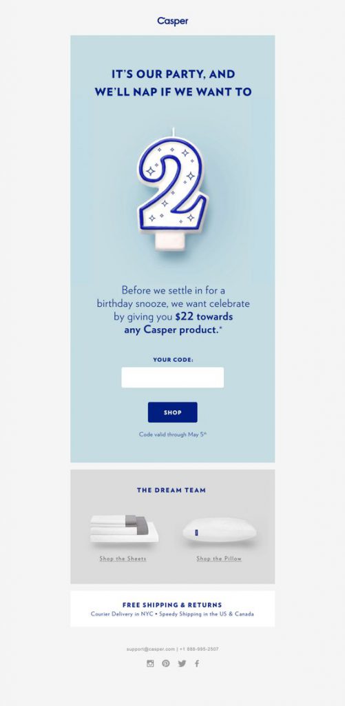
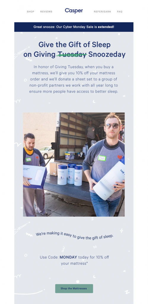
Giving Tuesday email campaign by Casper

Casper use a promotion on their mattresses to give back to a good cause.

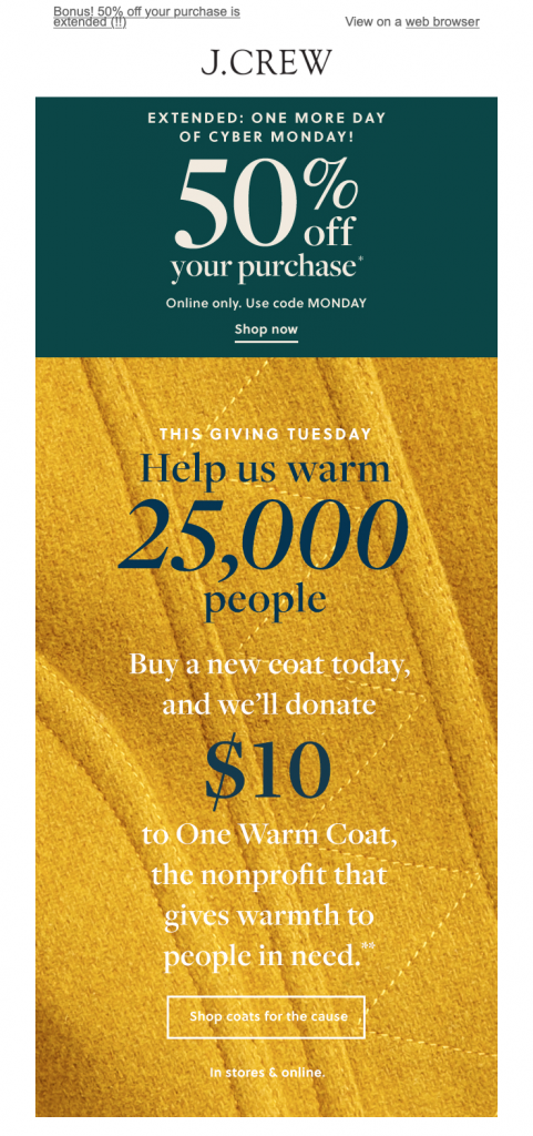
Giving Tuesday promotion by J Crew

J Crew also ran a similar promotion on coats to support those in need during the winter season.

2. Partner up with a charity

This concept may take more planning but can certainly be worthwhile. Partnering up with a charity to release a limited edition product or hold a special event (virtual or physical) is another great way your business can use your platform to give back.

Strategy tip: Inform customers about your new partnership by sending a dedicated email a few weeks before the actual launch. You can also prepare a PR and raise awareness on social media to reach even more people. By the time your event tickets or product go on sale, there will already be a buzz surrounding the launch.

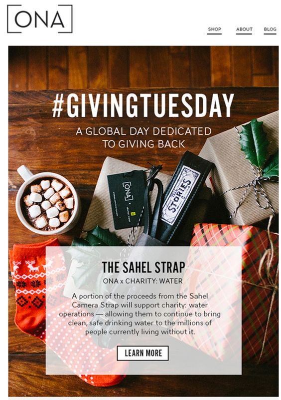
Giving Tuesday campaign by ONA

Camera strap brand ONA partnered up with charity: water to create a limited edition product.

3. Donation matching

Donation matching is another great way to raise awareness of a key cause. Use your email newsletter to encourage customers to donate to a chosen cause by pledging to match their donations.

Strategy tip: Include a section in your newsletter explaining why you've chosen this particular cause. This will help inspire more readers to donate and give your campaign a more personal touch.

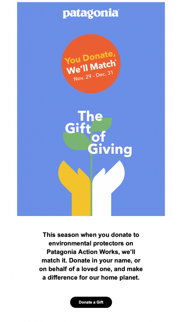
Giving Tuesday email by Patagonia

Patagonia encourage customers to support a good cause with this donation matching campaign.

4. Rounding up to the nearest $/£/€

This is also a good technique to motivate your customers to take action. Encourage customers to round their purchase up to the nearest $/£/€ so you can donate the extra "tip" to a charity of your choice.

Strategy tip: Make the CTA (call-to-action) on your website super appealing so that customers can't resist donating that little extra. You could also try building in a counter to show how much you've raised so far to inspire more people to get involved.

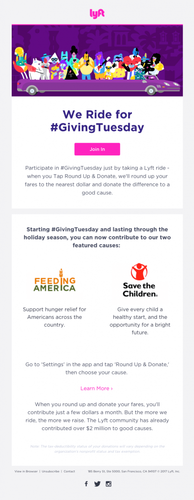
Giving Tuesday campaign by Lyft

Lyft highlighted two good causes to support with their Round Up & Donate campaign.

5. Give back to your local community

Particularly for small businesses, an awareness campaign is also a great idea. Helping out the local community by promoting worthy causes and encouraging customers to donate or volunteer is also an effective way to show support.

Strategy tip: As well as mentioning them in your email newsletter, you can also use your social media platforms to point out key causes such as food banks, homeless shelters, and hospitals which may be in need this holiday season. Of course, if you are able to do so, you can also combine this with any of the above ideas for maximum impact.

What to Include in Your Giving Tuesday Emails

The #GivingTuesday tag and logo

Giving Tuesday is a global movement that is growing each year. If you are running your campaign as part of the movement, it's a good idea to stand in solidarity and show this in your emails. This instantly makes the appeal more familiar to recipients.

The GivingTuesday website has a selection of logos you can use if you're getting involved in the movement.

Powerful imagery

A picture speaks a thousand words. Whether it's a moving photo, or a touching illustration, including powerful imagery in your email design is a guaranteed way to convey your message clearly.

Incorporate a bold headline to create a strong feature graphic that really shows readers the meaning of your Giving Tuesday campaign.

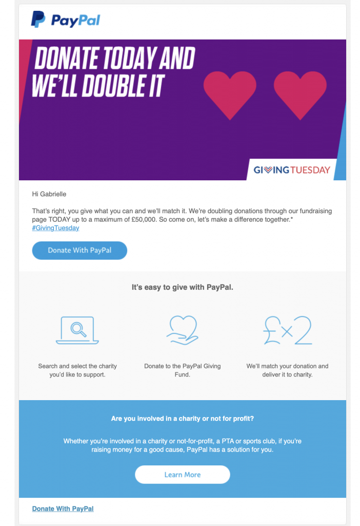
Giving Tuesday campaign by PayPal

PayPal use a simple yet strong header graphic to encourages donations in this campaign.

Personalisation

Using name placeholders in your subject line and email body is a great technique to make your appeal more personal and make the recipient feel directly addressed.

Not only does this help to capture the reader's attention faster, it's also an effective way to appeal to them on a one-to-one basis and encourage more support.

Real life stories

Another way to strengthen your appeal is by including real life stories from the group you are trying to help. Again, this helps you connect with the recipient on a more personal level and makes your campaign more relatable.

Incorporating stories from people in need, or success stories of people who've been helped by your chosen charity helps you convey the importance of your cause.

Giving Tuesday campaign by Charity: Water

This email campaign by Charity: Water shares an encouraging success story with recipients.

A heartfelt call to action

Your call to action (CTA) is what signposts your recipients to your main campaign action. This could be a link to a donation page, your sale's landing page, or a blog post raising awareness.

Whatever your CTA is, make this clear in your email by using actionable, emotive text. If you are using a button, it's also good practice to choose a bold color that stands out well against the rest of your email design. Here are a few ideas:

  • Give back today
  • Support the movement
  • Donate now
  • Help the cause

We hope reading this post has inspired you to join in with Giving Tuesday this year. Creating a campaign for a good cause is your chance to give back to the community and show customers you care.

Until next time,

Your Mail Designer 365 Team

Get started with Mail Designer 365 today

Start your 7 day free trial and use your Mac to create stylish email newsletters for your business.

No credit card required
OS X 10.11 - macOS Big Sur
Adapting your holiday marketing for covid 19

Ways to Adapt your Holiday Email Strategy for Covid-19

By Mail Designer 365 Newsletter Academy

The holidays are a special time for both businesses and consumers worldwide. As well as using email marketing as a method to increase sales, companies can also use email to strengthen their relationship with customers and spread festive cheer.

Although the Covid-19 pandemic means the holiday season may look very different this year, there are still many ways in which you can successfully connect with your email audience and keep the holiday spirit going through challenging times.

In this article, we're sharing five practical ways you can effectively adapt your holiday email strategy for Covid-19 and still benefit from one of the most profitable times of the year.

5 Easy Ways to Adapt Your Holiday Email Strategy for Covid-19

1. Use positive, uplifting copy

With so much doom and gloom in the news, many of your customers will likely be finding it tough to get into the holiday spirit this year. Try coming up with positive email copy to help get customers in the mood for celebration.

Although it's important not to just carry on as normal and completely disregard the situation, you also don't want to appear to be spreading more bad vibes, or worse, attempting to profit from fear.

In your email copy, you should work to find a way to put positive spin on the current situation. Sharing useful ideas for safe ways to enjoy the holiday season (whilst also incorporating your products!) is a good way to keep up your marketing efforts and also remain respectful and sensitive in the context of the pandemic.

2. Stick to traditional themes and motifs to get recipients in the holiday spirit

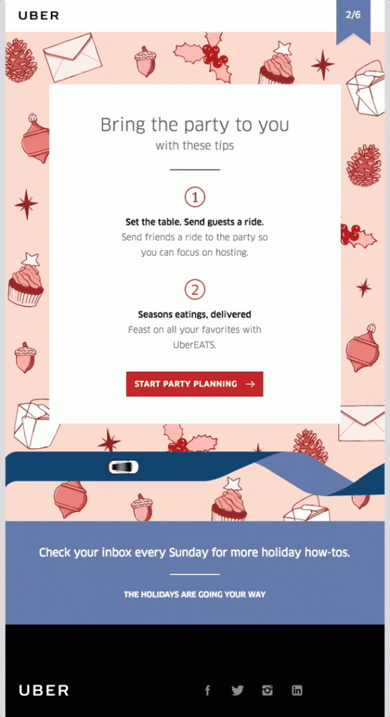
While the holidays may be anything but typical this year, you should still keep to traditional themes. Classic festive design elements such as holiday color schemes, seasonal imagery and winter motifs are all super important for this time of year. Building these into your emails helps get customers feeling festive and in the mood for holiday shopping.

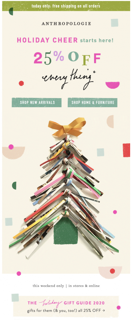
Holiday email design by Anthropologie

Fun, holiday-themed email promotion by Anthropologie.

This sales email by Anthropologie puts a creative, modern twist on traditional Christmas tree motif and definitely sets the holiday tone with a practical gift guide. You can find more fabulous examples of holiday email designs here.

3. Offer free shipping

With so many restrictions in place and a large emphasis on staying at home, online shopping has become even more important for consumers. For this reason, promoting your online store should be a central focus for your email marketing efforts.

One great way to get online orders soaring is by offering free shipping. Oftentimes, high shipping costs are a key reason for abandoned transactions. By centralising your promotion around free/discounted postage, you're providing customers with a safe and attractive alternative to visiting your physical store.

This strategy is especially important for those customers who may be isolating or are concerned about going shopping during the busy holiday period.

4. Optimize your call-to-actions for an optimal online shopping experience

If you do decide to make your online store the centre of your email marketing efforts, you should put extra work into your call-to-action (CTA) buttons.  In this case, an effective CTA should point the customer directly to a particular product or landing page (i.e. for a sale.)

As well as a prominent design, a good CTA also needs an actionable text which speaks clearly to the reader. Actions such as "View online", "Add to cart" or "Shop now" are all super clear and concise.

Looking good is one key thing, but of course the functionality of your buttons is also very important. Before sending, make sure your links are all correct and lead to a sensible destination. Ideally, the customer should be able to jump directly to the advertised product and purchase it in as little steps as possible.

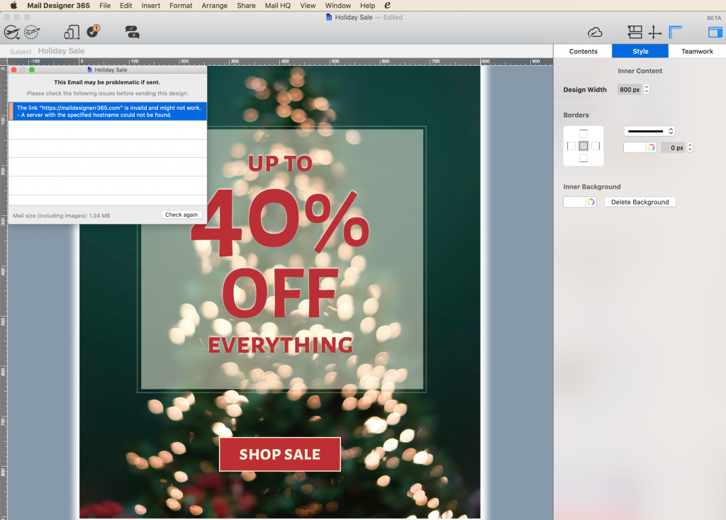
Tip: Mail Designer 365 automatically checks all links in your design and will alert you to any errors:

False link identifier in Mail Designer 365

As part of the pre-flight check system, Mail Designer 365 automatically identifies any incorrect links in your design.

5. Highlight your in-store health and safety measures in your emails

For many of us, holiday shopping is an experience and there will still be customers who would prefer to shop at your physical store. Use your marketing emails to also highlight the health and safety measures you've got in place and help reassure those shoppers that your store is safe for them.

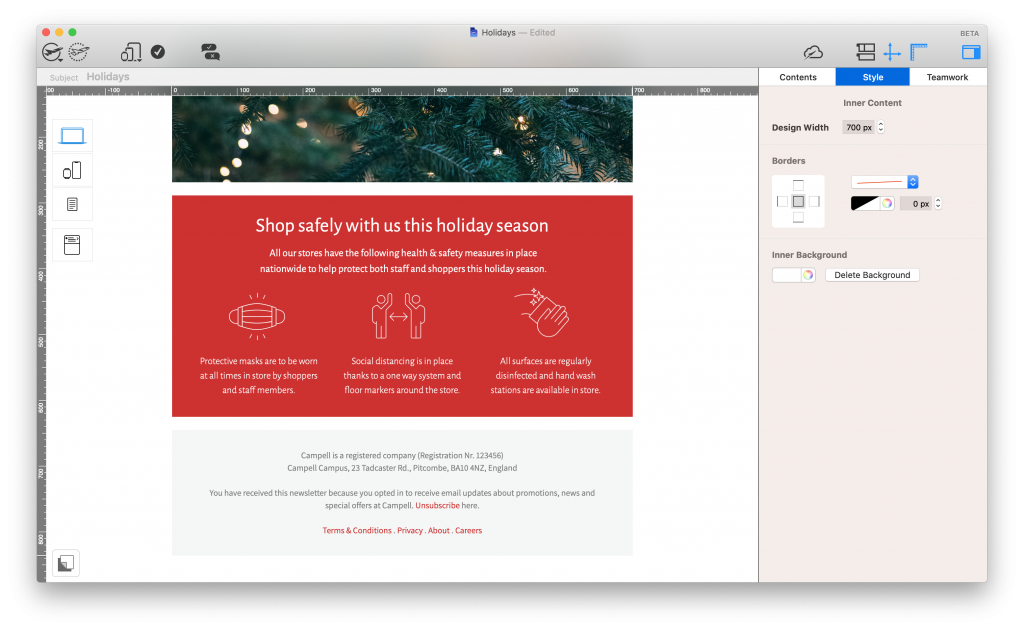
Include a dedicated section in your email design which explains the current health and safety measures in your store. This could include measures such as masks, a one-way system, temperature checks, maximum number of shoppers, or disinfection stations. If you have a large amount of information, linking out to a landing page is a good way to help keep things concise while still keeping customers up to date.

Covid-19 guidelines in an email design

Made in Mail Designer 365: Share your health and safety guidelines with customers in your email design.

Whatever you have in place, it is reassuring for your customers to know what they should expect and also shows your business is taking the situation seriously.

Sending Holiday Emails during Covid-19

Although it will take some adapting from your regular marketing strategy, sending effective marketing emails this holiday season is still very much possible.

Integrating the tips above into your holiday email campaigns will help make your content more suitable for the current situation, while also showing customers you care about their safety and wellbeing.

Happy Holidays and stay safe!

Your Mail Designer 365 Team

Get started with Mail Designer 365 today

Start your 7 day free trial and use your Mac to create stylish email newsletters for your business.

No credit card required
OS X 10.11 - macOS Catalina
Best Halloween emails of 2019 - two grinning pumpkins

The Best Halloween Email Marketing Campaigns from 2019

By Uncategorized

Halloween is one of the highlights of every email marketer's calendar. Whether it's taking a daring design risk, experimenting with new subject line ideas, or simply launching a huge promotion, the holiday brings new and fresh trends every year.

With the spooky season almost upon us, we're taking a look back at some of our favorite Halloween email campaigns from 2019, designed by some big name brands. Scroll through and get inspired for your own designs - you'll also find some devilishly good design tips along the way... Happy Halloween from the Mail Designer 365 Team! ?

The Best Halloween Emails from 2019

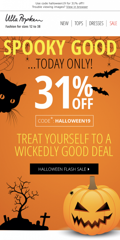
Ulla Popken

To kick things off, we've gone for this classic Halloween themed design by Ulla Popken. As well as the spooky email background with all the traditional Halloween imagery, the use of bold lettering is also super eye-catching and instantly gets the reader pumped for the flash sale.

Halloween email design by Ulla Popken

What we love: Ulla Popken do a great job of generating a sense of urgency by using time sensitive language in their campaign. Knowing the sale is only running for one day makes it even more irresistible to customers and will work wonders for driving click-thru rates and conversions.

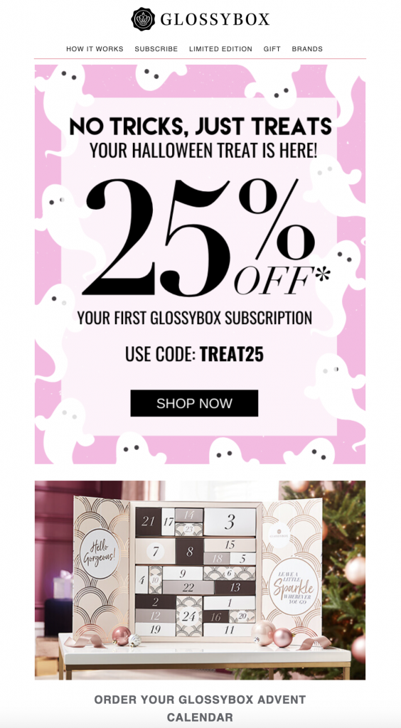
Glossybox

Although the baby pink color scheme may be a little out of the box for a Halloween email design, we love how Glossybox have stuck true to their brand identity with a cute and feminine design. With the ghosts, the Halloween theme is still super apparent and the main message is communicated well.

Email campaign for Halloween by Glossybox


What we love: Incorporating the trick or treat theme is a nice route into Halloween email marketing if your brand doesn't want to venture too far down the "spooky" road. The promo for their advent calendar is also a smart segue into holiday marketing. This gives Glossybox  a little head start while competitors are solely concentrating on Halloween.

Hawke & Co

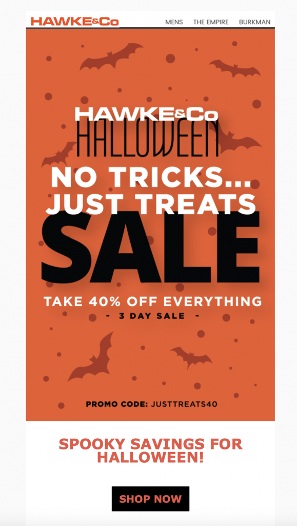
Hawke & Co's 2019 campaign was relatively simple in terms of design, but still managed to pack a punch with bold lettering. The burnt orange background color is effective and automatically creates a connection with Halloween / Fall and the subtle placement of the bats helps take the email one step further.

Halloween email design by Hawke & Co

What we love: Mixing font styles and sizes is a quick and easy way to make a largely text-based design a whole lot more interesting. The emphasis on "sale" means the reader is first drawn to that and the rest of the text finishes off the design well.

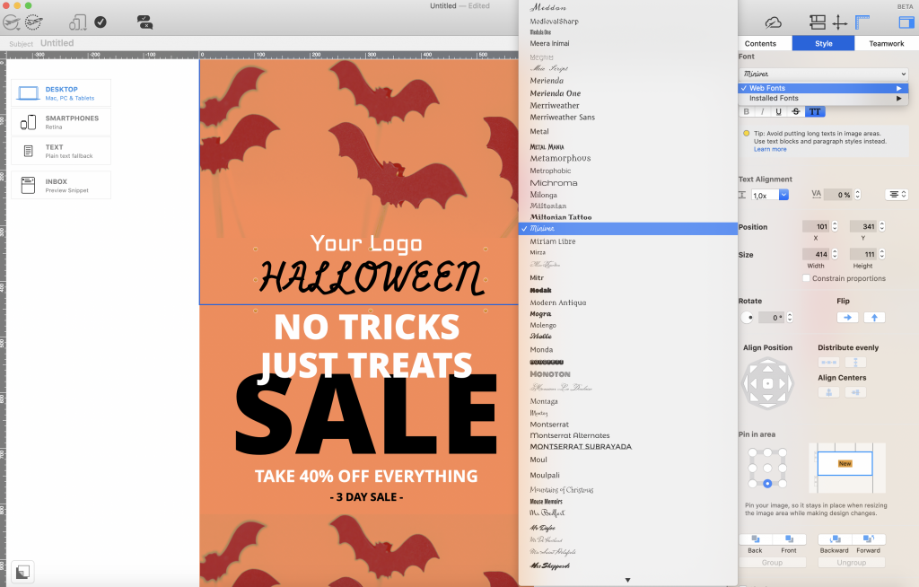
Make it in Mail Designer 365: Mail Designer 365 has a huge variety of web fonts you can use to create text-based designs that still cast a spell on your readers. Play around with size and styling options to create bold statements in your designs.

Using Halloween style web fonts in Mail Designer 365

Explore Mail Designer 365's library of web fonts to create spellbinding text-based designs.

Radley

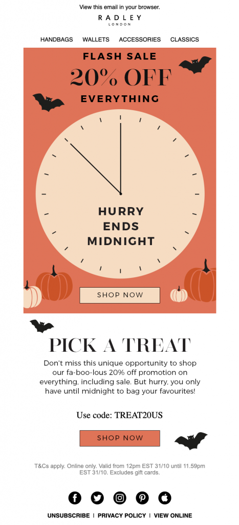
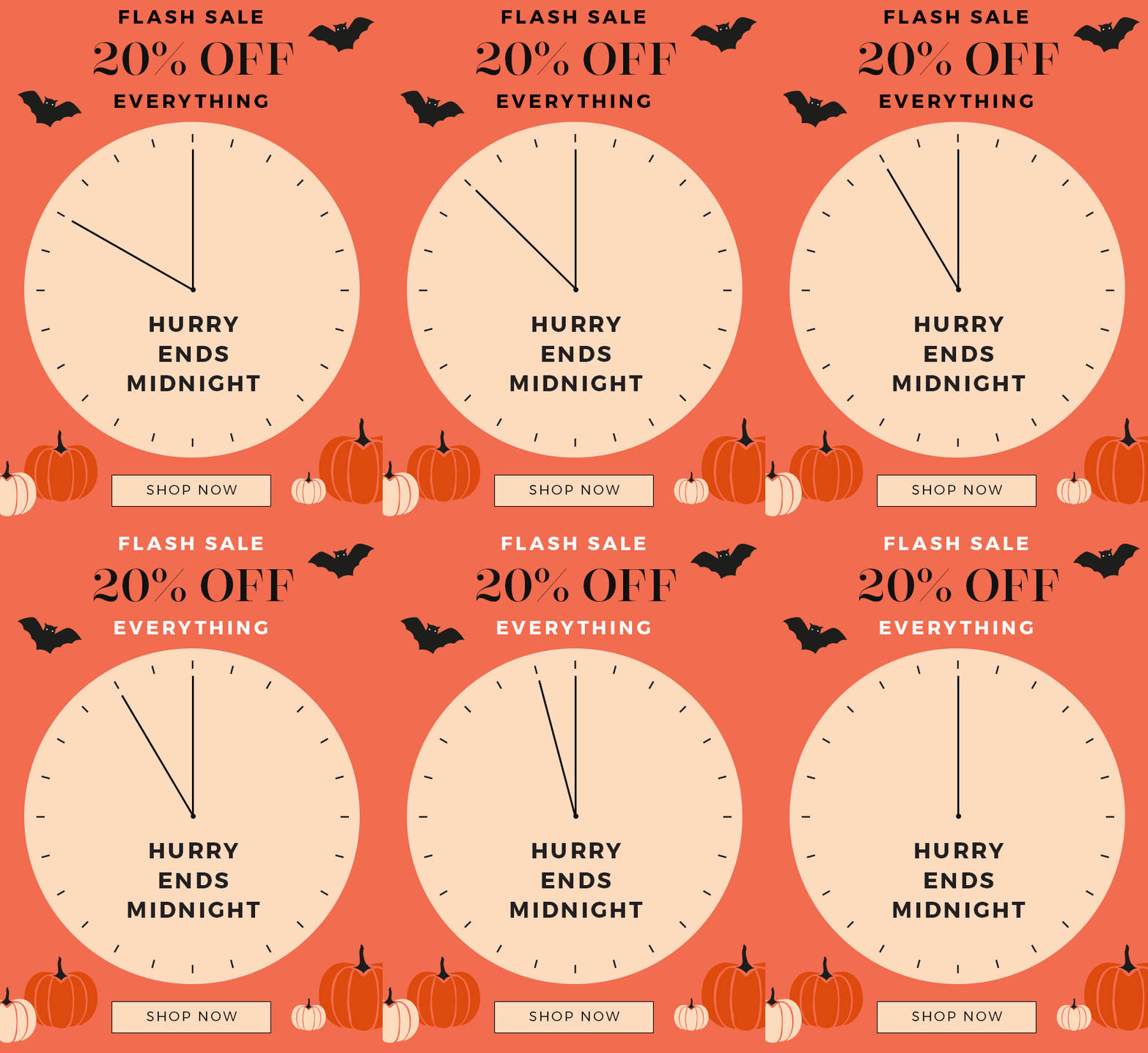
Here we have another Halloween flash sale but this time with an awesome clock GIF to help instil that all important sense of urgency. In addition, Radley also include classic Halloween aspects like bats, pumpkins and an orange and black color scheme.

Halloween email campaign by RadleyClock GIF for Halloween sale by Radley

What we love: The ticking clock GIF is definitely the standout in this email for us. As well as being visually appealing and eye-catching, it also does a great job of creating the time pressure needed for a successful sale.

Taco Bell

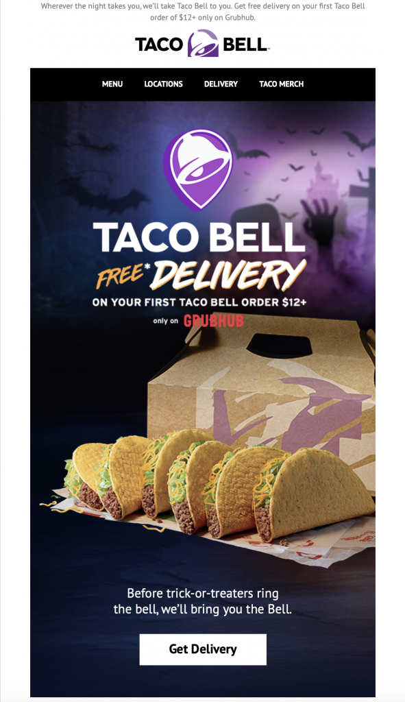
This spooky, graveyard style design by Taco Bell was another great take on a classic Halloween theme. Here is another brand that has opted to move away from the typical orange and black theme and go for something different, yet equally as powerful. Again, mixing font styles and colors is a great way to liven up a headline or slogan.

Halloween email campaign by Taco Bell

What we love: The product placement in this email is also done really well. Even if your product isn't traditionally associated with Halloween, portraying it in a spooky setting helps customers make that connection and automatically makes your campaign more relevant.

Berkshire Blanket & Home Co.

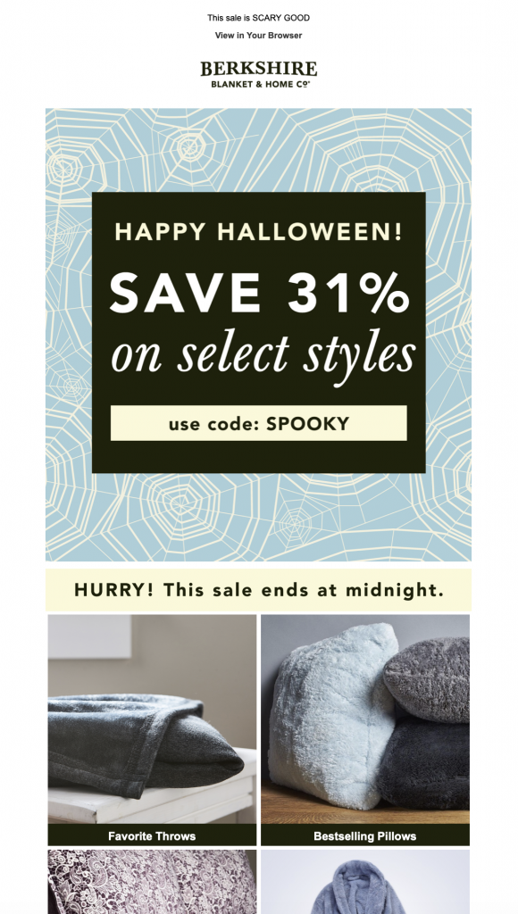
Sometimes low key works just as well. Berkshire Blanket & Home Co. kept things simple and sophisticated in their 2019 Halloween campaign but used a subtle spider web background as a nod to the spooky holiday.

Halloween email by Berkshire Blanket & Home Co.

What we love: This design was refreshing, as it was nice to see something different from the norm. The contrast between the bold, black and cream promo graphic and the softer blue background is powerful and draws the reader into the main offer straight away.

Warby Parker

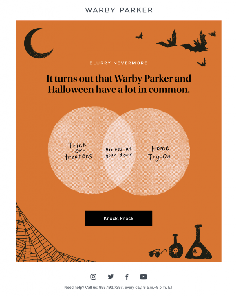
This is a great example of how to integrate the Halloween theme without planning a big sale or promotion. Warby Parker take all the traditional Halloween design elements and merge them to create a simple yet powerful email. The comparison of their home try on service with trick or treaters is also a clever way to halloweenify their standard marketing strategy.

What we love: The CTA (call-to-action) is witty and attention grabbing. Although we usually recommend a clearer and more direct CTA message, this text works great with the Halloween theme and does a good job of drawing in the reader.

More Tips for Sending Halloween Emails

We hope this roundup of the best Halloween emails from 2019 has left you feeling inspired. Check out our other Halloween resource to find even more tips and ideas for creating awesome Halloween email campaigns:

10 Spook-tacular Tricks for Halloween Email Campaigns

5 Things You Can Do to Build Devilishly Good Designs this Halloween

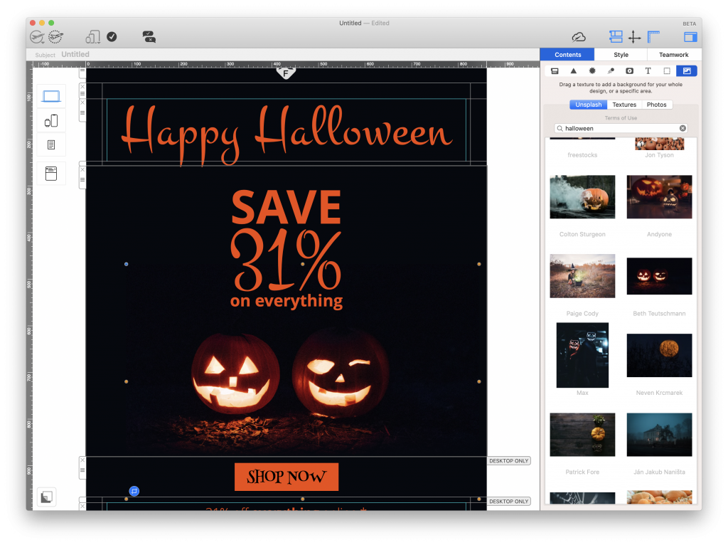
Mail Designer 365 has all the tools you need to build and send bewitchingly brilliant emails this Halloween. Discover Halloween email templates, amazing graphic effects and web fonts to bring those scary vibes to any design.

Unsplash stock photo integration in Mail Designer 365

Don't have a Mail Designer 365 plan yet? Try for free today to get started with email marketing for Halloween!

Until next time,

Your Mail Designer 365 Team

Get started with Mail Designer 365 today

Start your 7 day free trial and use your Mac to create stylish email newsletters for Halloween.

No credit card required
OS X 10.11 - macOS Catalina
Creating the perfect sales newsletter with Mail Designer 365

Create the Perfect Sales Newsletters with Mail Designer 365

By Team equinux Uncategorized

Mail Designer 365 sales email template
5 smart tips on how to become a power seller and win-over every would-be buyer

Sales campaigns make up a huge chunk of your email marketing strategy. Follow these 5 simple hacks to make sure your sales newsletters hit the spot every time...

Create a point of attack for quick buyers
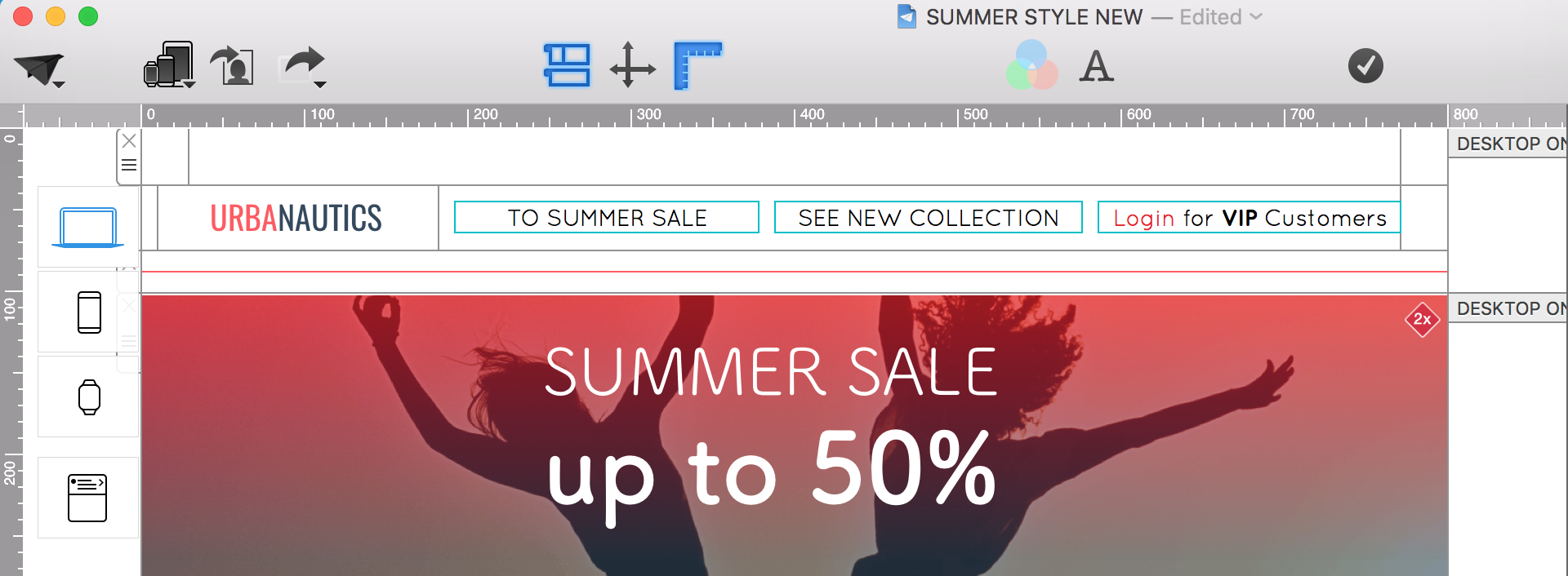
1. Pack all your important links into the email header

Many recipients are motivated to click through to your site and make an immediate purchase when they see a sale being advertised. Take advantage of this and create easy shortcuts by including the most important link targets in the email header.

MDP_Powerseller_Header_Links

Use Mail Designer 365 layout blocks to create headers with your logo and all the most important links. This helps customers shop faster and will also help improve your click-thru rate. Create your own font style for links and regulate aspects like line height, spacing, font family, etc.

In the mobile view, all links are automatically arranged under each other.

When you are happy, you can save this block under "My Layout Blocks" to use again and again in future campaigns.

For reluctant buyers
2. Better hurry… use time pressure to increase the incentive to buy

Limit your offer by making the sale period as short as possible. This encourages your subscribers to make a quick, "spur of the moment" purchase.

To ensure time pressure is always present, every sale should have an eye-catcher showing the limited purchase period.

Position your eye-catcher within the first third of the newsletter. Make sure to indicate the day of the week since it’s easier for recipients to remember. Depending on the time of sending, you could also list the number of hours left.

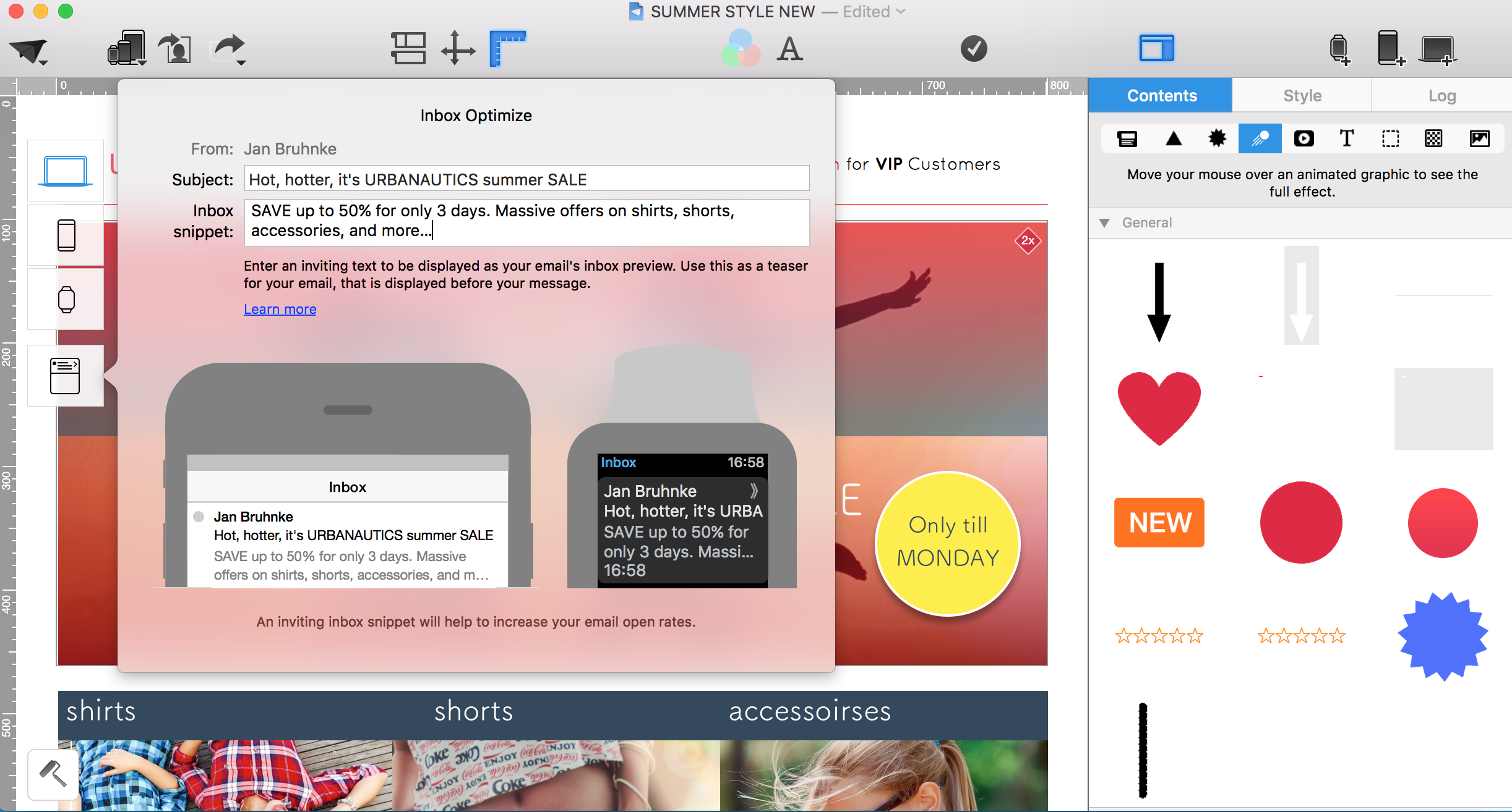
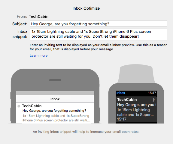
TIP: Indicate the duration of your sale in your preview text, for example: 3 days only, 24 hours - Save 24%. These texts are super easy to edit using the inbox preview tool in Mail Designer 365. This way, customers know all about your sale before they've even opened the newsletter.

MDP_InboxOpti

For the thrifty: price scanner
3. The deal of a lifetime: Using strike-through prices as eye-catchers

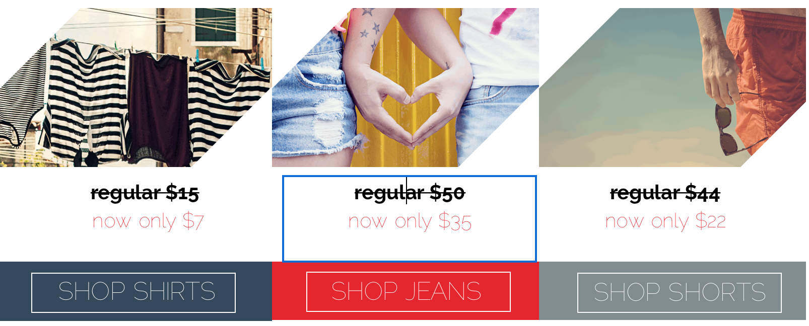
Make it clear to your customers how much they are saving by including a strike-through price in your newsletter. There’s no better feeling than knowing you’re getting a great deal on a product you've had your eye on.

Define your font style as a strike-through text and you can use it at anytime in your newsletter.
MDP_PowerSellerStrike

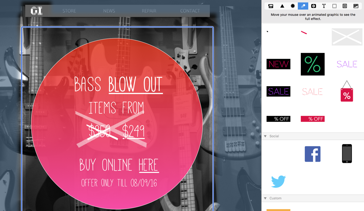
TIP: Make your strike-through text stand out even more by using a GIF animation. Check out the GIF collection in Mail Designer 365, where you’ll find an animated GIF which strikes through a price.

MDP_Strike

A picture speaks a thousand words...
4. Images sell better: Tell your story with large feature images and short product texts

We are all captivated by bold images: 65% of your recipients will opt for image-heavy newsletters over text heavy ones. Play around with your feature image or add a cool background that you can link to your sale landing page.

Make sure to also think about the colours you choose, since they too play an important role in how effective your newsletter is. 85% of newsletter recipients admitted that they have made purchases solely based off the color of a product. So make sure you think about which products you place in your newsletter.

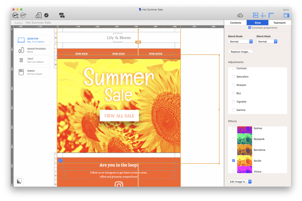
Whether you're going colour crazy with pop art style Duotone Filters, or creating mesmerising effects with Blend Modes, Mail Designer 365 has all the creative tools you need to spice up your newsletter images.

Duotone Filter applied to featured sales image in Mail Designer 35

For the wordy ones
5. Make the most out of your text

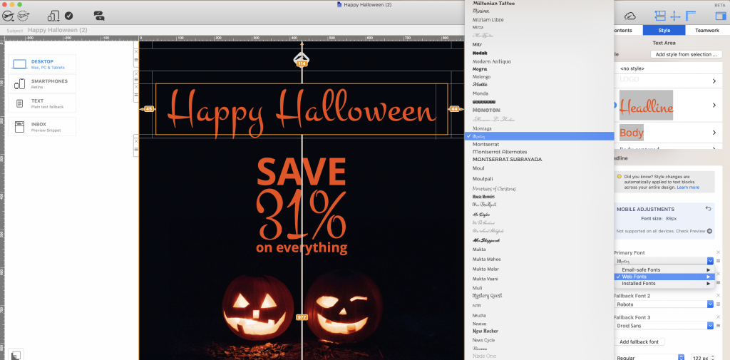
Using web fonts is another way to make your ordinary newsletter text work wonders on your readers. From bold and punchy headlines to modern and sophisticated body text, there is a stylish web font for every use case.

Explore over 700 web font options in Mail Designer 365 to use for headlines, eye-catchers, body text, pricing tables, bullet lists, call-to-actions, and more!

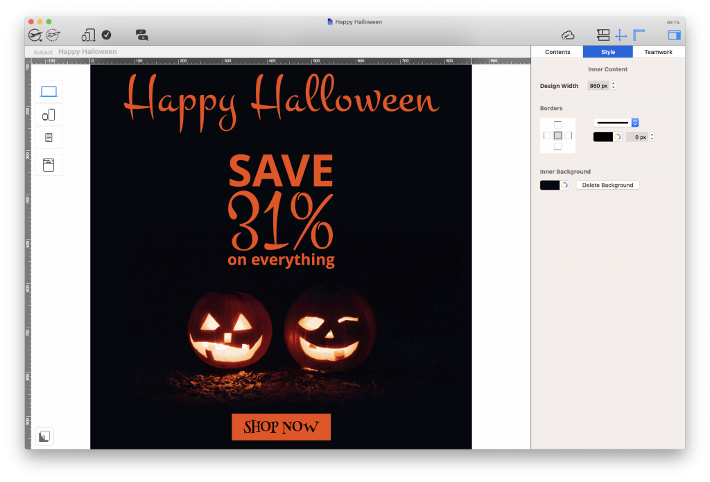
Halloween web font in Mail Designer 365 email design

Until next time,
Your Mail Designer 365 Team

Get started with Mail Designer 365 today

Start your 7 day free trial and use your Mac to create stylish sales newsletters for your business.

No credit card required
OS X 10.11 - macOS Catalina

Enjoyed this post?

Get more inspirational tips, tricks, and best practice examples in the Mail Designer 365 Newsletter Academy -
your one stop hub for all things email marketing strategy and newsletter design.

Must have features for fall email campaigns

5 Must Have Features for Your Fall Email Campaigns

By Mail Designer 365 Newsletter Academy, Mail Designer 365 Newsletter Academy, Mail Designer 365 Newsletter Academy, Mail Designer 365 Newsletter Academy, Mail Designer 365 Newsletter Academy, Mail Designer 365 Newsletter Academy

A change in season makes for a great opportunity to change up your email strategy. Providing your subscribers with fresh, relevant email content is a good way to keep them engaged and interested in your business.

To mark the start of the autumn season, here are 5 must-have features you should be including in your fall email campaigns this year.

What to Include in Fall Email Campaigns

1. Autumnal color scheme

Fall is all about warm, cozy tones. Integrating these into your email design is a great way to immediately set the vibe for customers. Think deep reds, golden yellows and dark orange tones.

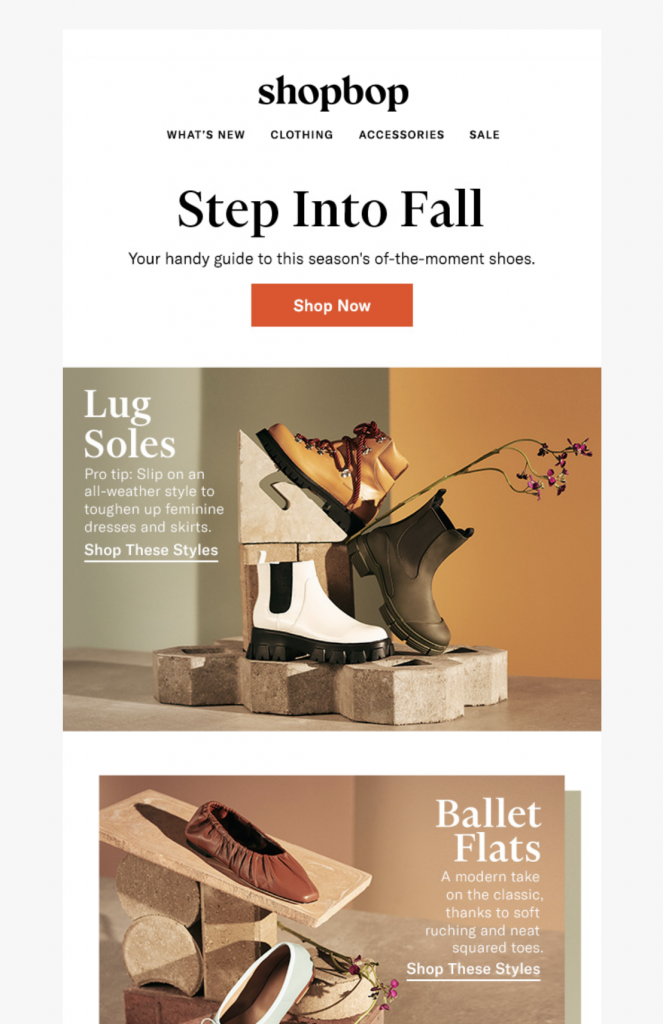
Fall email design by Shopbop

Shopbop use warm, earthy tones in this fall email designs to set the autumn mood.

If you'd rather start subtle and not go all out, incorporating this color scheme into one aspect of your email design - for example, the email header or call-to-action buttons - is also a good strategy. This is a good compromise for a transitional month like September, when some customers may still be in summer mode.

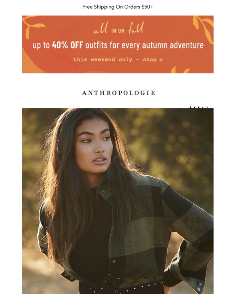
Fall email campaign by Anthropologie

Anthropologie use a warm orange tone in their promotional header to subtly tease the idea of autumn to their subscribers.

Tip: Use the color wheel in Mail Designer 365 to experiment with different autumnal tones and give your email the perfect fall color scheme.

2. Bold fall imagery

As well as a seasonal color scheme, autumnal imagery is also a must in all your email campaigns this fall.

Whatever your business specialises in, getting your customers in the mood for change is important, as it simultaneously triggers their need to start looking at products for the new season.

Whether it's crisp and colorful leaves, a snug indoor setting, a line of pumpkins, or a smoky bonfire - there are tons of classic fall images that will instantly set the scene in your email design. Images like these integrated alongside your product photos makes for a match made in heaven.

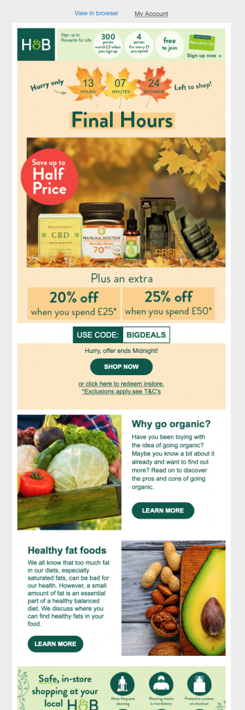
Fall email campaign by Holland & Barrett

Holland & Barrett do a great job of showcasing their products in a typical fall setting to help set the autumnal mood.

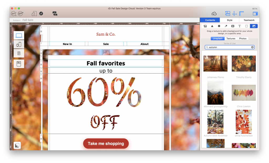
Tip: Use Unsplash integration in Mail Designer 365 to find the perfect fall-themed image and recreate those cosy autumnal vibes in your emails.

Using Unsplash integration in Mail Designer 365 to find autumnal images

Use the Unsplash search tool to access thousands of high quality stock images for your fall email campaigns.

3. Showcase new products

A new season is the perfect time to advertise exciting new products to your customers.

Whether you're launching a brand new collection, or you're simply sharing new ideas for the fall, make sure to put the emphasis on "new". This raises the excitement level and will encourage your readers to check out the rest of your site to see what else you've added for the new season.

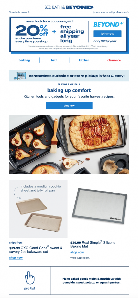
Fall baking campaign by Bed, Bath & beyond

Bed, Bath & Beyond do a great job of giving customers new ideas for fall with this baking themed promotion.

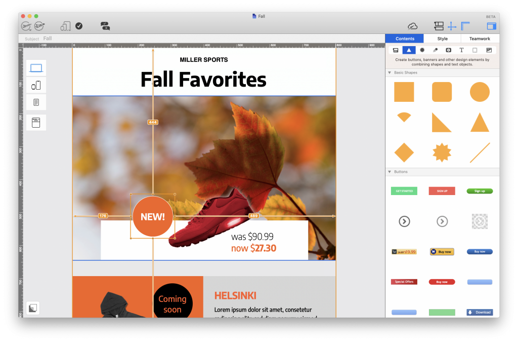
Tip: Insert a fun eye-catcher into your design to draw attention to new products. You can easily create these in Mail Designer 365 by using the shapes library and playing around with color and font styles.

Eye-catcher badge for a fall email campaign - Made in Mail Designer 365

Use badges and eye-catchers to point out new products and liven up your fall emails.

4. Run seasonal promotions

Fall is host to a wide range of major holidays, including Labor Day, Halloween, Singles Day, "Black Friday", and Thanksgiving.

While you don't have to run a big sale or promotion for every one of these events, you should definitely consider adding them to your marketing schedule if you haven't done already. This helps you ensure your emails stay relevant and interesting for readers.

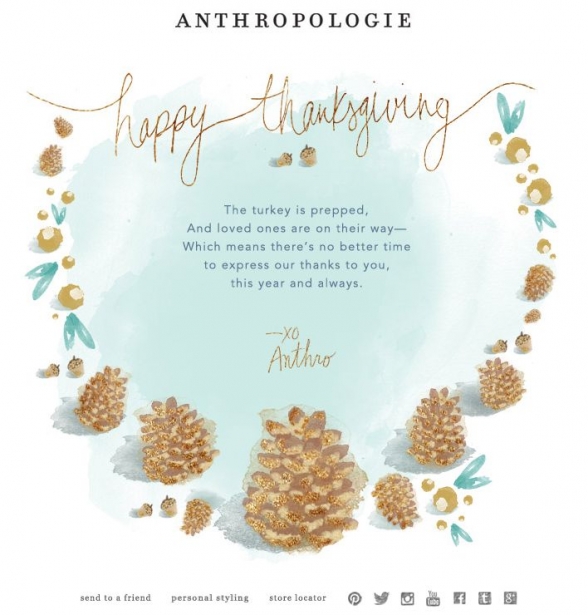
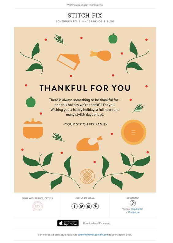
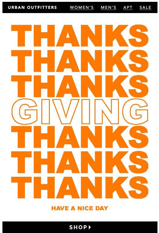
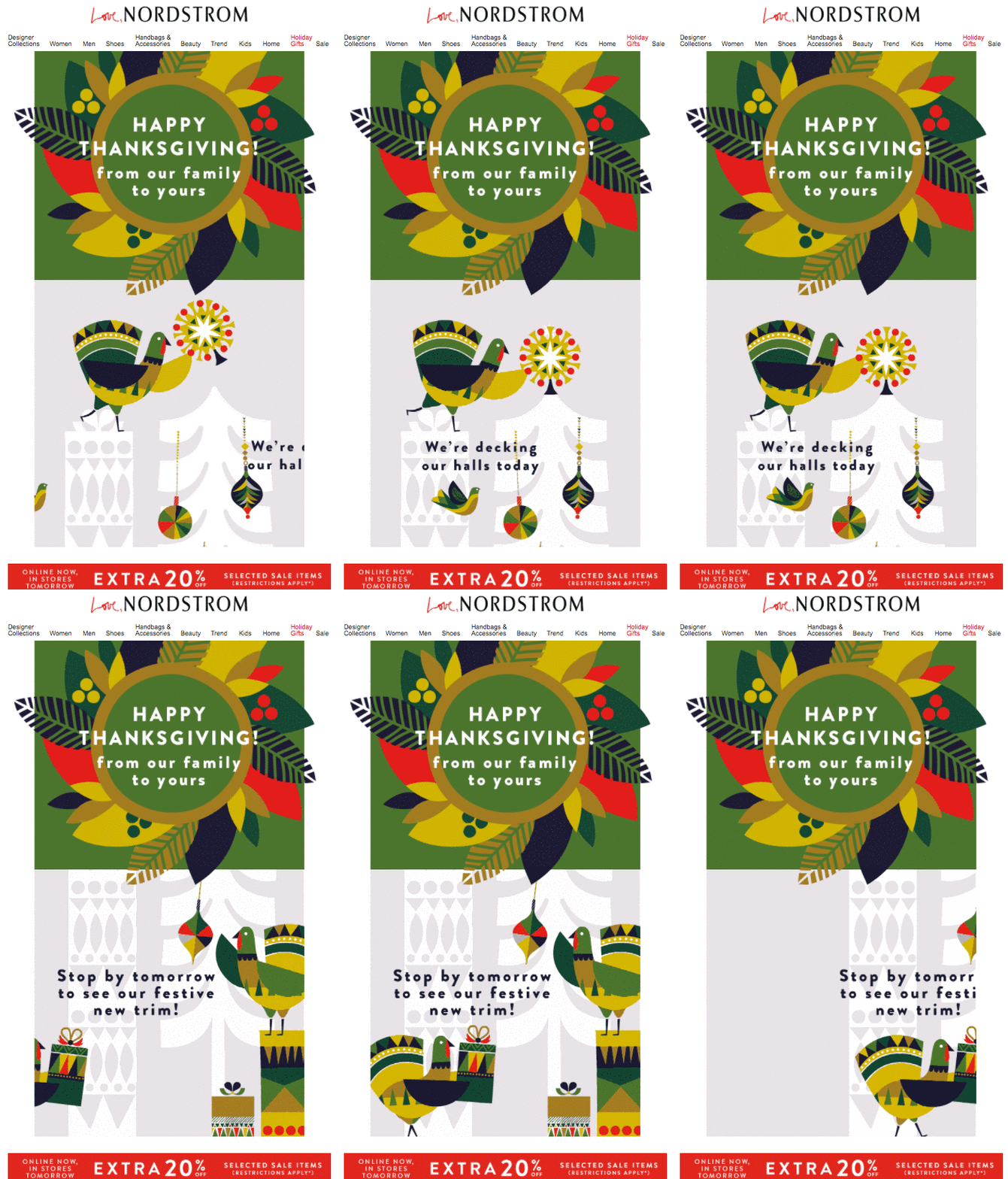
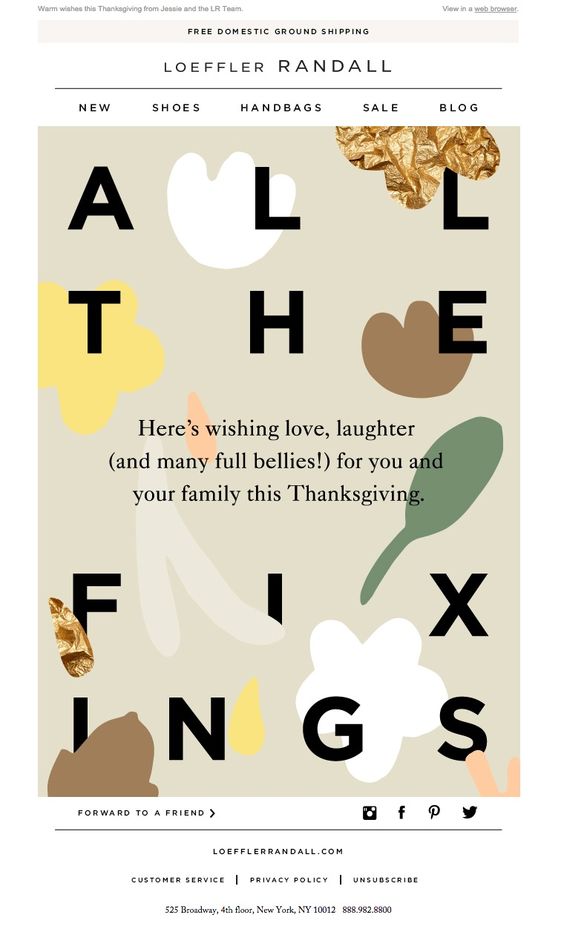
For example, you could incorporate Halloween by using a spooky theme into your email design and then launch a larger "Black Friday" sale a month later. Finish off on a high and celebrate Thanksgiving by sending a thank you email to show customers your appreciation.

Thanksgiving email campaign by Loeffler Randall

Loeffler Randall take on an abstract approach in this cool Thanksgiving greeting.

Tip: Mail Designer 365 has a wide range of ready-to-send sales templates, perfect for fall's major holidays.

Halloween email template in Mail Designer 365

Mail Designer 365 Halloween email template

5. Get customers ready for the holidays

Of course, fall also means that the holidays are right around the corner. Many of your customers will use the fall as a chance to start getting prepared for their holiday shopping.

Get a head start against other brands and put together an early bird holiday gift guide. This is a smart way to get ahead of the competition and inspire customers to shop not only for themselves, but for their loved ones too.

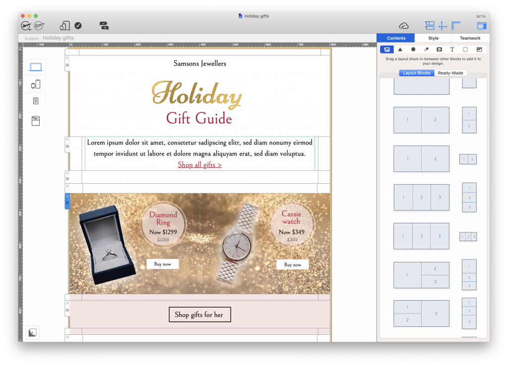
Tip: Explore 1000s of possible layout combinations in Mail Designer 365 and drag and drop to build shop-able email layouts your customers will love.

Holiday gift guide built in Mail Designer 365

Build an attractive sales layout in Mail Designer 365 to make shopping your star deals easier.

Creating Fall Email Campaigns

We hope this post has helped get you in the mood to start working on your fall email campaigns. A new season is always an exciting time for businesses and you can use Mail Designer 365 to share that excitement with your customers.

  1. Use the Mail Designer 365 App for Mac to create a show-stopping email template with all the must have fall vibes.
  2. Go the extra mile with eye-catchers, Unsplash images and stylish sales layouts.
  3. Ready to send? Export your email template to set up in your ESP of choice and send to subscribers

Not got a Mail Designer 365 plan yet? Start your free trial today to create email templates for fall and the rest of the year!

Until next time,

Your Mail Designer 365 Team

Get started with Mail Designer 365 today

Start your 7 day free trial and use your Mac to create stylish email campaigns for fall.

No credit card required
OS X 10.11 - macOS Catalina
Email marketing guide for e-commerce

Email Marketing Strategy for E-Commerce - Best Practice Guide

By Uncategorized

More and more small businesses are turning to e-commerce as a cost effective way to reach new customers and grow their business. With the number of e-commerce stores rising and online shopping being more popular than ever, it's important for small businesses to do all they can to promote their store.

Email marketing is an effective way for businesses of all sizes to connect with customers and drive more traffic to their store. In this guide, you'll find tips and ideas on how to get started with email marketing for your small business or optimize your existing email strategy.

Why is Email Marketing Essential for E-Commerce?

Although marketing strategies like paid ads, SEO and social media campaigns are all effective in their own way, they can't guarantee you a direct channel to customers. Email presents you with the unique chance to speak to your audience on a one-to-one level and create personalized content for them.

Especially in retail, customer loyalty is a strong success factor. Most businesses rely on customers returning to provide a steady stream of sales. Email is a great tool for maintaining relationships with repeat customers and keeping them engaged with your business over time.

Getting started

As long as you have an idea of your goals and knowledge of best practice, email marketing is really straightforward. All you need to get started is an email list, a set of email templates, and an email service provider (ESP.)

Email Lead Generation for E-Commerce Sites

The first step in getting started with email marketing is collecting email subscribers for your list. This is also known as email lead generation.

One common way for e-commerce websites to gain email subscribers is through collecting email addresses at the point of sale. Inserting a field on your online checkout for shoppers to enter their email address allows you to stay in touch with them following the sale.

Important: Remember that data privacy regulations in most countries also require the customer's consent for receiving marketing emails. Make sure you research the opt in requirements in your country before setting this up.

More ways to grow your email list

While the above method provides you with contact information for existing customers, it doesn't take into account those who haven't purchased from your store. Here are a few organic ways to collect more email addresses for your list:

Build opt in forms

This is a popular method for many businesses. Build an opt in form for your website to allow customers to subscribe to your list for regular news and updates. These kind of sign ups are the most valuable, as they are customers with an active interest in your business.

Some good places to include an opt in form are: the footer area of your website, on your "contact" or "about" page, or as a header bar at the top of your site.

Daniel Wellington email opt in form

Daniel Wellington display this email opt in form at the bottom of their website.

Tip: Many leading ESPs offer forms and landing pages which you can easily build into your website.

Set up popup promotions

Offering customers an incentive in exchange for providing their email address can also be effective. One way of doing this is through a discount or promotion. For example, many websites offer new customers money off their first purchase if they enter their email address.

Although this could be part of a regular sign up form, it can be even more effective as an eye-catching pop up window.

Pop up opt in window by JD sports

JD Sports use a popup window to encourage website browsers to sign up to their email list.

Tip: Set your popup to appear to new customers after a few minutes of browsing. This way, you'll know they have an interest in your store.

Run a giveaway

A giveaway or competition is another fun way to increase email signups and get more people engaging with your store. Set up a dedicated landing page where participants can enter their email address for a chance to win.

Tip: Use your social media platforms to promote your giveaway and encourage more people to take part.

Offer "back in stock" notifications

If you have products which are out of stock, use this as an opportunity to encourage more newsletter sign ups. Create a dedicated sign up form for sold out items which customers can use to get notified when the product is available again.

Tip: Use this sign up data to see which products customers are interested in and offer an alternative.

Types of Emails to Send for E-Commerce

When it comes to the types of emails you can send for your e-commerce site, you have a wide range of options. Split your emails into two main categories: automated, transactional emails for everyday use and one-time promotional campaigns. Find out more about each of these below.

Automated email strategy for e-commerce

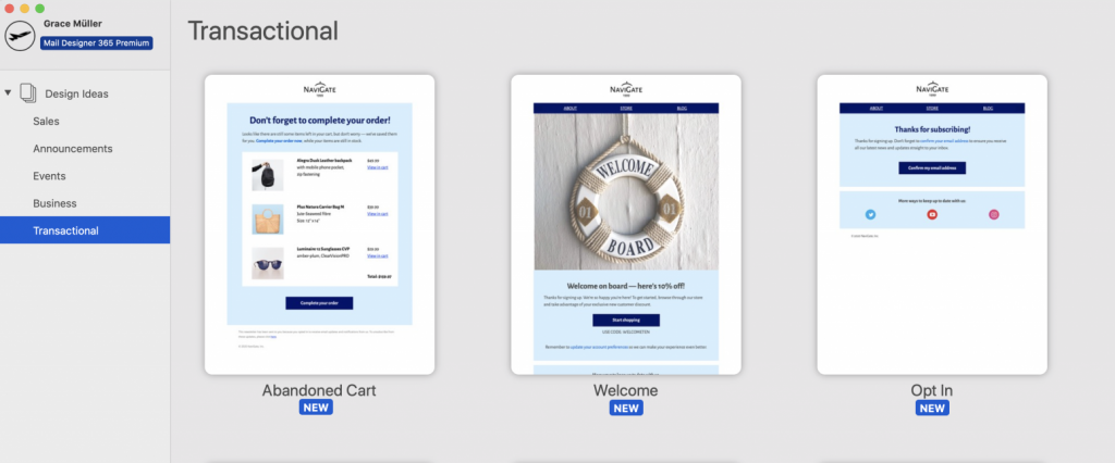
Transactional emails cover the emails a business need to send on a day-to-day basis. They are sent out automatically after a customer performs a certain action or trigger (e.g. making a purchase.) For an online store, this will most often be order confirmation emails and delivery updates.

Every business is unique. Think about your store's general workflow and come up with a set of functional, on-brand templates to simplify this process. This article offers some great tips on how to do this. Once you have created your email templates, you can set them up to use with your automation tool of choice.

Transactional email automation flowchart

Here is an example automation flow for transactional emails to use for your online store.

Tip: Over time, you can optimize your strategy and add more and more templates to respond to different triggers. Here are some more great ideas for transactional emails.

Promotional email strategy for e-commerce

Promotional email campaigns are also a major part of your email marketing strategy. These campaigns help you generate revenue and get more traffic to your store. As one-off campaigns, it will take a little more work to make them stand out and excite customers, so good design is key.

Here are some examples of email promotions you can run for your online store:

Seasonal sale

A seasonal sale is a classic choice for any online retailer. Announce your sale to email subscribers and watch your website traffic skyrocket, as customers try and get hold of a great deal.

Jack Wills sale email

Sale email by Jack Wills to advertise their summer sale to customers.

Tip: Make sure to generate a sense of urgency in your email by using time sensitive language. This plays on customers' FOMO (fear of missing out) and helps ensure they check out your sale faster. When it's gone, it's gone!

"New in" email

Tempt subscribers with your latest products and send an email to announce new stock in your store. Whether it's a new product range, exciting collaboration or restock, your customers will want to know.

Product inspiration

Staying relevant is really important for your small business's survival. Even if you have nothing new to share, you can engage customers by showing them new and creative ways to use your products.

Themed promotion

Similarly to a sale, running a promotion is also an effective way to tempt customers onto your e-commerce site. A promotion can come in many shapes and sizes, covering everything including: free delivery, x% off, free gift with purchase, etc.

ASOS Halloween promotion

Halloween promotional email by ASOS.

Tying in a promotion with a certain theme or event is a good method in making it more relevant to your customers. As well as popular seasonal holidays like Halloween, Thanksgiving and Valentine's Day, there are also a number of alternative occasions throughout the year which provide a great opportunity to hold a promotion with less competition from other brands. Here are a few ideas:

  • International Women's Day (8th March)
  • Singles Day (11th November)
  • Earth Day (22nd April)
  • International Thank You Day (11th January)
  • International Day of Friendship (30th July)

Tip: Running promotions too regularly can often be detrimental to your business, as they will lose their exclusivity and also deter customers from purchasing at full price on a regular day.

Blog content

If you have a blog, this can be another good tool to use to get more visitors to your online store. Curating your latest blog posts and sending them to subscribers alongside fun product recommendations and other news can make for a great newsletter.

Your subscribers signed up because they are interested in your business. Informative, content-based emails are often a welcome break from a sales heavy strategy. It's good to balance out your content every now and again.

Blog topics could include industry news, smart ways to use your products, step-by-step tutorials, or personal stories about your products or business.

Best Practice for Marketing Emails

Now you have an idea of which emails to be sending your customers, you should briefly familiarise yourself with these five, specially selected best practice tips. This helps ensure your marketing emails are effective and will result in more conversions.

Eye-catching subject line

Your email subject line is your first chance to make an impression on your reader. Oftentimes, if the subject line is not interesting enough, the email will be left unread.

When writing your email subject, you should try your best to ensure it is entertaining and also effective in communicating the contents of the email. Advertising a summer sale? Make sure you use these keywords in the subject line! Emojis can also be a great way to make your subject even more striking.

Tip: Mail Designer 365 has a built in inbox preview tool. Use this to keep control of the length and get a feel of how your email subject will look in your recipients' inbox.

Inbox preview tool in Mail Designer 365Sales layout

Most of your promotional emails will be advertising certain products. To make these easier to shop, you should make sure your email layout is practical and easy for readers to navigate.

In addition to good quality product photos, remember to also include a product name and up to date price tag. This helps customers a lot in the shopping process. As well as this, a direct and accurate link to the product is also essential, as customers will quickly lose interest if they are unable to find what they are looking for.

Where possible, you should also ensure that your email layout reflects your store's layout in the best way possible. Consistency is key and helps streamline the transition between your emails and your website.

Tip: Mail Designer 365 offers 1000s of layout combinations which you can use to recreate the look and feel of your store in your email designs. Drag and drop to build.

Sales layouts for emails in Mail Designer 365

Clear call to action

Having a clear call-to-action (CTA) is a must in every email. Your CTA points the customer to their next step and is a critical factor in securing more conversions.

If you have a great email design but no clear next step, your customer will quickly become disengaged and move on. Use a bold CTA button to link to a specific product, to your sale page, your blog, or another destination.

Tip: The shapes library in Mail Designer 365 allows you to easily create an eye-catching button to grab readers' attention and point them towards your store.

Call to action button in Mail Designer 365

Mobile optimization

Just like your online store needs to be mobile friendly, so do your emails! Having great email content for smartphones and other mobile devices is an important part of the user experience for many of your customers.

Tip: Mail Designer 365 automatically creates a mobile responsive version of your email design that you can edit separately in the smartphone view.

Mail Designer 365 smartphone editor

Unsubscribe link

By law, you are required to include an unsubscribe link in every promotional email. This allows subscribers a way to opt out of your list if they are no longer interested.

The email footer is the most common location for an unsubscribe link. When you do set this up, it's best practice to make it well-visible, as not to deceive customers and make things difficult.

Remember, subscribers removing themselves from your list is not all bad. Your goal is to send emails to customers with a genuine interest in your business. With fewer disengaged subscribers on your list, you can hope for better open and click rates in the future.

Tip: Mail Designer 365 supports unsubscribe link placeholders for many ESPs. Insert a placeholder into a text block and format as required.

Adding an unsubscribe placeholder link in Mail Designer 365

Get Started with Email Marketing for Your E-Commerce Business Today

Hopefully, this guide has shown you the benefits of email marketing for e-commerce. Getting started with an email marketing strategy for your e-commerce business is super straightforward:

  1. Build up your email list with innovative lead generation techniques
  2. Use a drag & drop email tool like Mail Designer 365 for Mac to build stylish templates for your online store
  3. Export your email template to use with your ESP and send to customers

Not got a Mail Designer 365 plan yet? Start your free trial today and test all the awesome features mentioned in this guide - plus much more!

Until next time,

Your Mail Designer 365 Team

Get started with Mail Designer 365 today

Start your 7 day free trial and use your Mac to create stylish email newsletters for your e-commerce business.

No credit card required
OS X 10.11 - macOS Catalina

Enjoyed this post?

Get more inspirational tips, tricks, and best practice examples in the Mail Designer 365 Newsletter Academy -
your one stop hub for all things email marketing strategy and newsletter design.
Email Marketing for Wedding Suppliers

Using Email Marketing to Promote Your Wedding Business

By Uncategorized

Success in the wedding industry is all about being seen. In an industry overflowing with talent, you need to ensure your wedding business stands out against the competition.

Whether you're a wedding photographer, bridal make up artist, florist, or entertainment act, coming up with new ways to promote your wedding business should be top of your to do list, as this is what will get you noticed and booked by the happy couple.

Wedding rings and flower display

Email is a highly effective and versatile tool for wedding pros that you can use to advertise your services, track bookings, update customers and follow up after the big day. In this guide, we're sharing our insider tips on how you can use email marketing to promote your wedding business and improve your communication with customers.

Benefits of Email Marketing for Wedding Suppliers

Email has many benefits as both a communication method and a promotional tool. Not only is email marketing easy to implement, it's also much more affordable than other traditional advertising routes such as printed media and gives you full flexibility and control. This is especially useful if you have an important update for customers or want to advertise a promotion.

Email Templates for Your Wedding Business

Wedding suppliers are often self employed small business owners. As well as providing an important service, they also have to manage customer enquiries, communicate with clients, and maintain an online presence.

Creating a set of evergreen email templates is one great way to vastly improve communication for your wedding business whilst also saving yourself time. Think about your typical workflow and see which parts you could convert into an email template. Here are some useful template ideas you could try...

Introduction Email

When a customer first enquires on your website or social media page, responding with a friendly introduction email is a great way to make them feel at home.

As well as a brief introduction to who you are and your areas of expertise, you should include a link out to your portfolio and any relevant contact information. Linking your social media profiles is also a good way to expand your following and show potential customers more of your great work.

Pricing Guide

Nowadays it's common practice for wedding suppliers to offer multiple package options for their services, as a way of catering to various budgets. Although this information most likely exists on your website already, summarising it into an email template is also a good idea.

When searching for suppliers, couples will often contact multiple vendors. Having your pricing information available on demand for those who request it is a practical idea.

Tip: The Table Layout tool in Mail Designer 365 allows you to create mobile-optimised pricing tables which allow your customers to quickly compare and decide on a package. Integrate colors and images to make your tables your own and let your brand speak for itself:

Table layout with pricing information for a wedding photographer

Booking form

If you have an online booking or order system, you can also use a stylish email template to share this with enquiring customers. This is much more impressive than sending out a plain text email with a simple link and already gives potential customers a sense of your professionalism.

In this email, you should provide relevant information on how to book and a clear CTA (call-to-action) button to take the customer to your website or booking form.

Email booking form for a wedding businessBooking/Payment Confirmation

Once a booking has gone through successfully, you could also send a confirmation email. This is useful for the customer to keep in their records and will assist them in the planning process.

Here you should confirm which service they have booked, as well as the date they have booked it for. You can also attach an invoice or receipt, depending on your payment system. Remember to include your phone number or email address here in case the customer has any urgent questions for you.

Payment confirmation email for a wedding florist

Update Email

Most weddings are planned months in advance, so it's good practice to keep in touch with the couple during the run up to the big day. Email is a great way to reach out if you have any important updates to share, such as:

  • Questions about the venue
  • Final arrangements (i.e. preparatory meeting, hair & makeup trials, color preferences, etc.)
  • Payment reminder
  • Updates on your progress
  • Important announcements (i.e changes to the plan, new government guidelines, etc.)

Because these types of update will differ in their nature, it's a good idea to create a standard template with your business logo ready for you to quickly type out a message.

Tip: Mail Designer 365 allows you to set up text styles and save them in your templates. This helps you to ensure your emails are consistent and that you don't need to spend time searching for fonts and styling options. Just type and go! Learn more about text styles.

Wedding update emailFeedback Request

One thing which really helps wedding suppliers to get noticed are positive testimonials. Couples on the search for a supplier will be curious to hear about other couples' experiences before deciding whether to even make an initial enquiry.

Create an email template to reach out to previous customers and ask for a testimonial or rating. Setting up an online form on a platform such as Google Forms or Survey Monkey is one easy way to gather feedback which you can then share on your website and with future customers.

Feedback form for wedding supplier

More Email Marketing Tips for Your Wedding Business

When creating email templates for your wedding business, it's also a good idea to keep these general tips in mind...

Branding

Your business is a brand and this needs to be present in all your emails. Keep branding elements such as font, color scheme and logo consistent across all your emails to help customers form a better connection with you.

Tip: If you have a website, try to make your emails match up with the branding you use there. This makes the transition much smoother for customers contacting you via your site.

Less is more

Try to link out to additional resources where you can. Filling up your email with too much information can overwhelm customers and cause them to go elsewhere.

Make it look good on mobile

Many of us read our emails on our smartphones. When you create an email template, it's also a good idea to check that it also looks good on mobile devices. Sometimes, you may need to adjust the font or size of images to make it more compatible.

Tip: When creating a design in Mail Designer 365, the app will automatically create a mobile version for you which you can edit separately under the Smartphone view.

Creating Email Templates for Your Wedding Business in Mail Designer 365

If you want to get started with creating a set of email templates for your wedding business, Mail Designer 365 is the place to start.

Use the drag & drop editor to quickly put together a mobile-responsive layout and make designs your own by including branding elements and custom text styles. Once you've created your templates, you can save them in the app to use over and over again for new customers. Simply update the information, add personalization where required, and send via your own email address directly from Mail Designer 365.

Give Mail Designer 365 a try today for free: Download free to use on your Mac.

Until next time,
Your Mail Designer 365 Team

Get started with Mail Designer 365 today

Start your 7 day free trial and use your Mac to create stylish email templates for your wedding business.

No credit card required
OS X 10.11 - macOS Big Sur

Enjoyed this post?

Get more inspirational tips, tricks, and best practice examples in the Mail Designer 365 Newsletter Academy -
your one stop hub for all things email marketing strategy and newsletter design.
Privacy Settings / Datenschutz-Einstellungen