Category

Mail Designer 365 Newsletter Academy

using wysiwyg editors to create HTML email designs

How to Build Emails with a WYSIWYG Editor: What to Consider

By Gabrielle Mail Designer 365 Newsletter Academy

In a time where email designers are continuously pushing the boundaries to build awesome email campaigns, creating emails that make a lasting impression can be a challenge.

For many designers, a WYSIWYG email editor is a great solution for easily creating great email content. Not only can you build and test email designs in real time, you'll also save a vast amount of time doing so!

In this guide, we're taking you through the ins and outs of drag and drop email design and sharing firsthand our best practice tips on using WYSIWYG editors effectively.

Get expert email best practice tips delivered directly to your inbox!


There was a problem registering your email address.
Please check and try again.
Thank you for registering! Please check your email inbox.
We've just sent you an email for you to confirm your email address, if you haven't already.

What is WYSIWYG?

WYSIWYG (aka what you see is what you get) is a design tool used to build content, such as websites, and in our case, HTML email templates.

When using a WYSIWYG editor, your design will be updated in realtime as you edit, meaning you can check and preview your content as you go along.

Generally, WYSIWYG editors provide you with ready-made blocks and graphics to make the design process easier (e.g. the Mail Designer 365 content library) and making changes to your layout is done by dragging and dropping elements in to your design.

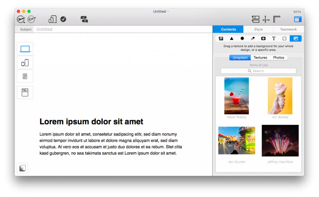
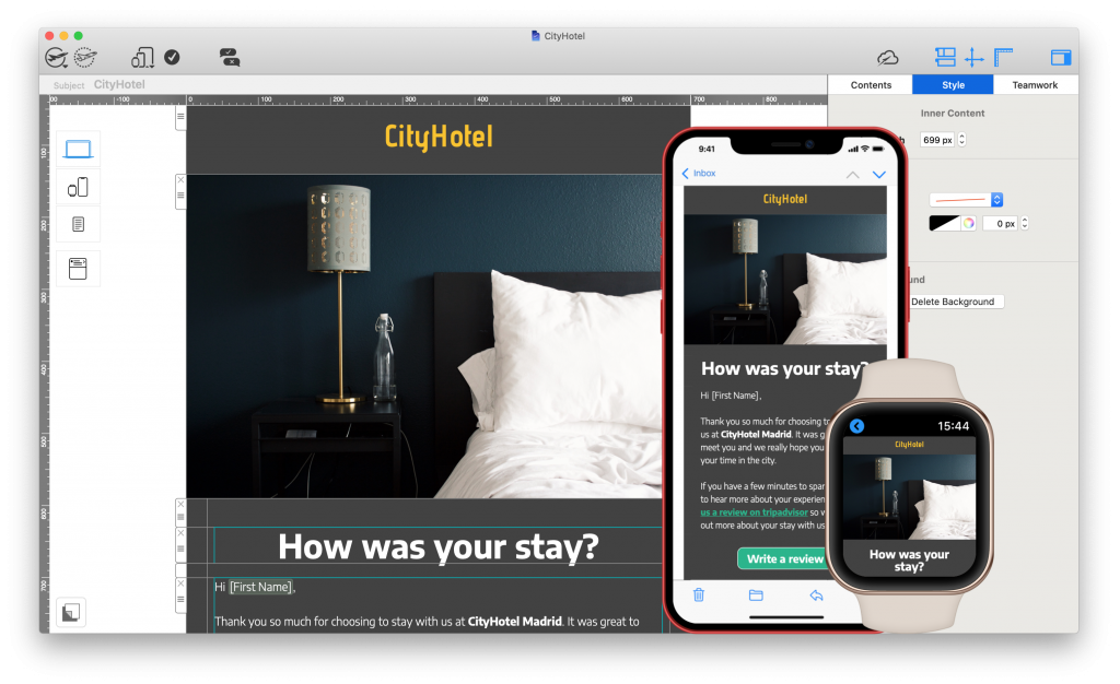
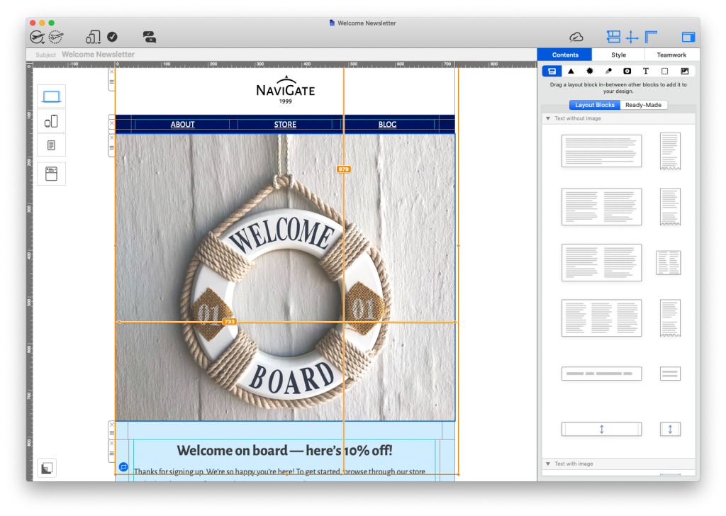
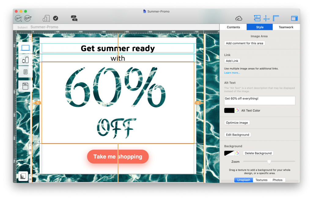
Mail Designer 365's WYSIWYG editor

WYSIWYG email editors allow you to create entire HTML email designs by dragging and dropping in elements.

Benefits of Using a WYSIWYG Editor

When it comes to designing emails, a WYSIWYG editor has many great advantages - particularly if you are short on time or don't have a lot of experience with coding.

Edit and correct as you go

Even the most experienced designers know the frustration of having to continuously revisit email drafts in order to make minor changes. When working in a WYSIWYG editor, you have full control over what you are creating, down to every last pixel.

Change and edit email content with a few clicks, without having to worry about breaking the email code.

Save time for other important tasks

With drag and drop editing, what was previously a largely time consuming job can now be carried out quickly and with ease. This frees up your time to concentrate on other elements of your email marketing strategy.

You've got the design right - now you're free to spend more time crafting an effective subject line, optimizing your email copy, and segmenting your email list.

Accessible to your whole team

Due to its intuitive nature, using a WYSIWYG editor allows everyone on your team to carry out complex design techniques without coding knowledge. This way, everyone can become an email pro!

Built in resources on hand

Most WYSIWYG editors provide you with a basic selection of ready-made graphics such as buttons and social media icons that you can conveniently place into your email templates. Especially if you don't have your own graphics available, this can be a real time saver.

Tips for Creating Emails with a WYSIWYG Editor

Although a WYSIWYG editor makes it much easier to create email templates, there are still some important things to be aware of if you opt to design emails this way.

Email size

Because it's so easy to create emails using a drag and drop interface, it's also easy to quickly get carried away when it comes to the amount of content you are adding.

Adding too many elements to your email design will cause the overall file to become too large when you come to send. This can result in slow loading speeds, cut off emails, or your email not being delivered at all.

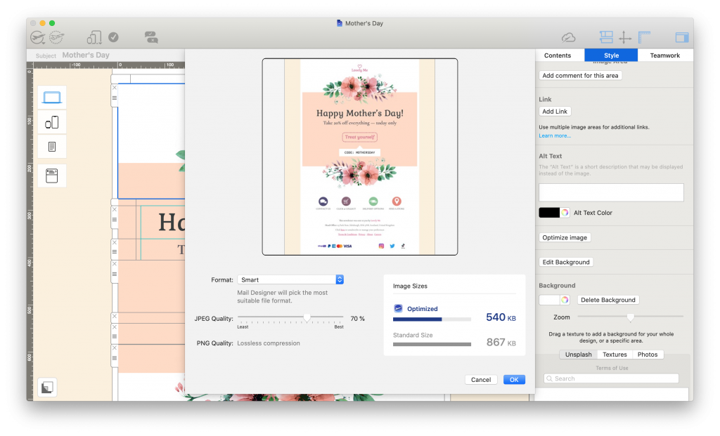
As well as monitoring the amount of layout blocks in your email design, it's also best practice to optimize the images in your email in order to reduce the overall file size.

image optimisation tools in mail designer 365's WYSIWYG editor

Optimize your email's images to ensure the overall size of the exported HTML file is not too big

For more information on this, check out our blog post.

Email compatibility

Compatibility is an important factor of any email design. There are many email clients out there and each one behaves differently. While there is no one size fits all fix, there are steps you can take to ensure your design looks good in all email clients.

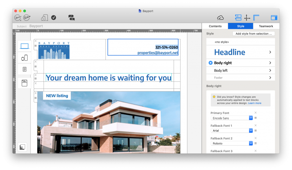
One common issue that often arises when creating emails in a WYSIWYG editor is the wrong font being displayed in certain email clients. This usually happens when a font is not available on the recipient's device. Utilising text styles and email safe fallback fonts is an effective way of preventing this.

adding fallback fonts in Mail Designer 365

Defining text styles and adding fallback fonts helps to avoid compatibility issues in other email clients.

Email accessibility

Accessibility is important however you choose to create your email content. A design that looks good to you may be troublesome for your recipients to process. For this reason, it's important to put the right measures in place before sending.

One of the most important accessibility measures is the use of alt text. Not only is this important for when images can't be loaded properly, it also enables screen readers to describe images and other graphics to visually impaired recipients.


setting up alt texts for an email design in mail designer 365

Alt text makes your design more accessible for visually impaired readers

Learn more about accessible emails in this post.

Email deliverability

Finally, one last thing to be aware of is spam testing and email deliverability. As well as not reaching your audience, having your emails marked as spam could result in you being blacklisted from certain email clients.

With HTML emails, we recommend taking these three key steps to prevent your email message being falsely identified as spam:

  1. Include a mixture of real text and images. Image only emails are more likely to be marked as spam
  2. Include a visible unsubscribe link in your email (this is a legal requirement)
  3. Avoid using spam-like terms in your email subject line (e.g. "win", "free", "money", "$$$", etc.)


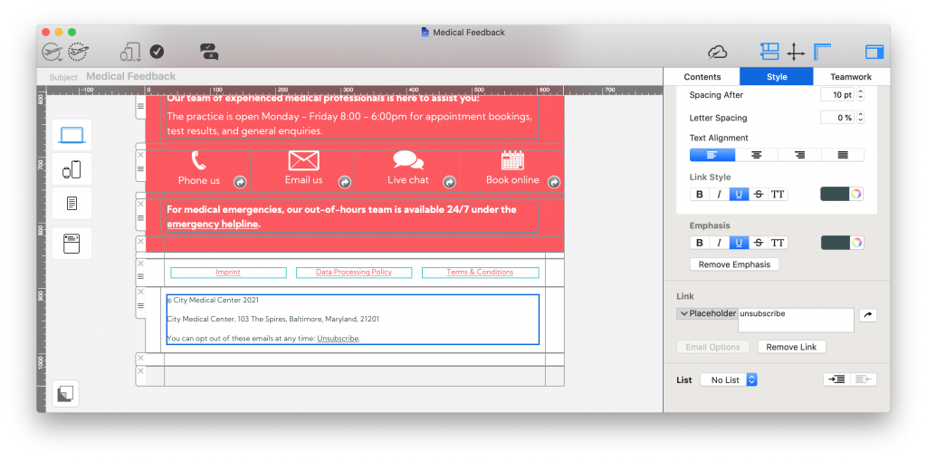
adding an unsubscribe link to an email design

Unsubscribe links are a legal requirement for all promotional emails

This post goes into more detail about how to avoid being marked as spam.

Using the WYSIWYG Editor in Mail Designer 365

Looking for a drag and drop email tool for the Mac? Mail Designer 365 is the best WYSIWYG email editor for macOS.

Alongside a vast collection of ready-made email templates to help you get started, Mail Designer 365 also offers the following great features:

  • Over 1000 possible layout combinations, including table layouts
  • Integrated smartphone view for creating mobile responsive designs
  • Modern preview tools for iPhone, iPad, Apple Watch, and more
  • Dedicated Testmail service
  • Built in web-based Approval tools for easier teamwork (learn more)
  • Direct export to Mailchimp, Campaign Monitor, and Direct Mail plus compatibility with all leading ESPs
create mobile responsive email designs in mail designer 365

Create mobile responsive designs in minutes with Mail Designer 365's WYSIWYG interface.

Get started with Mail Designer 365 today

Start your 7 day free trial and use your Mac to create stylish email newsletters for your business.
No credit card required
OS X 10.11 - macOS Big Sur

Enjoyed this post?

Get more inspirational tips, tricks, and best practice examples in the Mail Designer 365 Newsletter Academy -
your one stop hub for all things email marketing strategy and newsletter design.

planet earth poster by Greenpeace

Creating Email Campaigns for Earth Day - Best Practice Tips

By Gabrielle Mail Designer 365 Newsletter Academy, Mail Designer 365 Newsletter Academy, Mail Designer 365 Newsletter Academy

Planet Earth is our home and we owe her a lot! What better way to celebrate the world we live in than by creating powerful email content for Earth Day?

Whether you're planning an exciting promotion, sharing sustainability tips with subscribers or raising awareness about key environmental issues, you can use email to make this Earth Day really count.

In this post, we're sharing some of our favorite examples of Earth Day email campaigns, including some best practice tips on how to create your own email template for Earth Day.

Get expert email best practice tips delivered directly to your inbox!


There was a problem registering your email address.
Please check and try again.
Thank you for registering! Please check your email inbox.
We've just sent you an email for you to confirm your email address, if you haven't already.

What is Earth Day?

Earth Day is a large global movement, founded in 1970, to promote clean and sustainable living on our planet. It is celebrated worldwide each year on April 22nd.

The focus of Earth Day is on protecting the earth for future generations. This includes raising awareness about important topics such as: climate change, saving energy, wildlife conservation, cutting down on greenhouse gas emissions and reducing waste.

Today, more and more people are actively aiming to become more environmentally friendly. Earth Day provides businesses with a chance to not only raise awareness of topical issues, but also to demonstrate their role in working towards a better, more sustainable world.

planet earth poster by Greenpeace

Earth Day takes place every year on April 22nd and focuses on environmental conservation and sustainability

Best Practice Tips and Ideas for Earth Day Emails

If you're creating an Earth Day email campaign for the first time, you might be wondering where to begin. Follow these key tips to get started...

Craft an engaging subject line

The subject line is the first thing your readers will see and often determines whether or not they will open your email - especially in email providers like Gmail and Outlook, where promotional emails are kept separate.

For this reason, it's important you give it your all when it comes to crafting the subject line. Use keywords relating to Earth Day and try including topical emojis to add a pop of color (🌎💚🌲🌱).

Making your email subject as intriguing and interesting as possible helps guarantee your readers will click through to the rest of your campaign.

Write positive email copy

Earth Day is all about encouraging each other to take care of the planet and become more sustainable for future generations. For this reason, it's best practice to adopt a positive, motivational tone in your emails.

As well as general messages of encouragement, this could also include sharing tips and useful advice on how to become more sustainable, plus highlighting positive progress your business and customers have already achieved.

Include earthy tones in your design

Green, teal, blue and neutral tones are all great for an Earth Day email design. Typically, green is most associated with environmental issues, but including a combination of earthy tones is a great way to mix things up and make your design more visually effective.

Share powerful images

A picture speaks a thousand words. Whether it's images of your business actively contributing to conservation efforts, product photos of a new sustainable product line or powerful stock photos, the right image can make the world of difference to your email.

Check out websites such as Unsplash, Pexels, and Pixabay for access to high quality, license-free stock images to include in your designs. You can also use the image editing tools in Mail Designer 365 to give your images even more emphasis.

Use social media to your advantage

While email is one effective communication channel, you can also use your other social media platforms to continue the conversation online. Instagram, Twitter, YouTube, etc. are all great platforms for connecting with your customers which can be easily cross promoted in your email campaigns.

Make sure all of your emails contain links to your other social media pages and don't forget to use the #EarthDay hashtag for even more exposure.

Our Favorite Earth Day Email Campaigns

Discover email design inspiration for your Earth Day email campaigns from big name brands. Want more great examples? Check out our "Spring" Pinterest board for even more inspiring seasonal designs.

J Crew

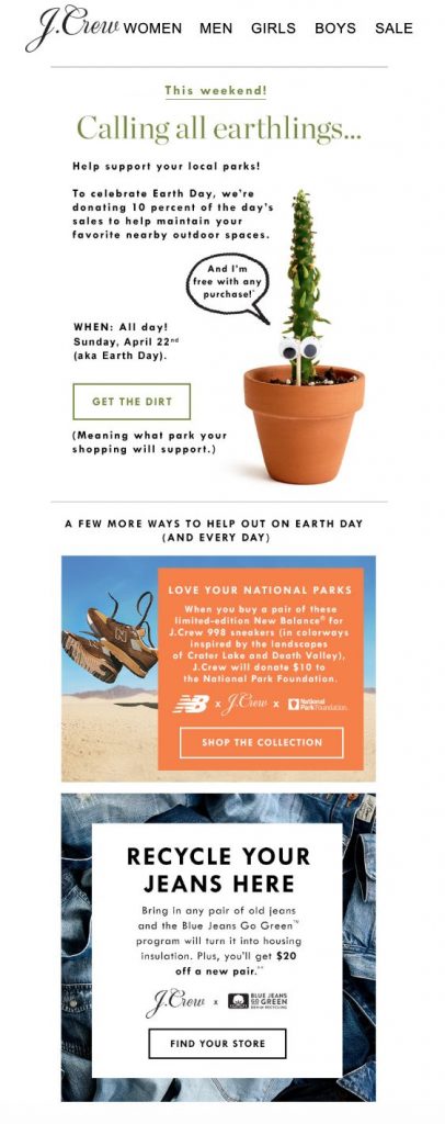
earth day email campaign by j crew

Charitable Earth Day email campaign by J Crew

This powerful campaign by J Crew not only gives back to the Earth by supporting local national parks, it also shares practical tips with readers on how to shop sustainably.

Jurlique

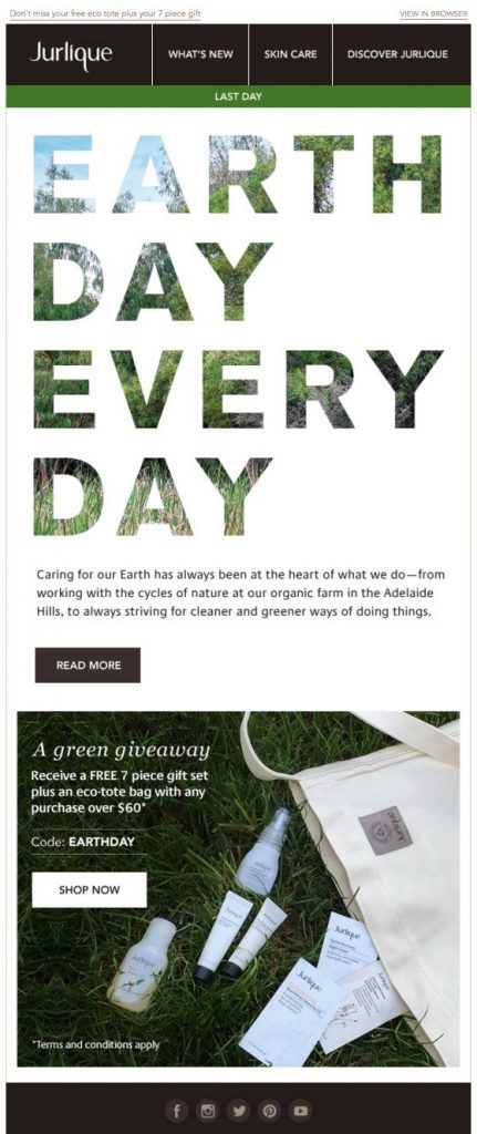
Earth Day email campaign by Jurlique

"Earth Day every day" is the message in this campaign by Jurlique

In their Earth Day campaign, skincare brand Jurlique inform their customers about their efforts to operate sustainably. An eco-friendly free gift promotion also adds an extra element of flair to this email.

P.S. Love the headline effect created in this email? Use Blend Modes in Mail Designer 365 to recreate this cool, natural lettering in your Earth Day campaigns!

Lou & Grey

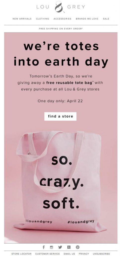
Earth Day email by Lou & Grey

This pink design by Lou & Grey perfectly incorporates key brand elements into a seasonal promotion

This Earth Day email design by Lou & Grey is another good example of a themed giveaway promotion. Although it's not a typical design for the theme, we love how Lou & Grey have stayed true to their branding and were still able to spread awareness about this important event.

Adobe

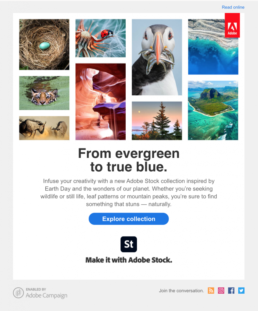
Earth Day email campaign by Adobe

Adobe used this email campaign to celebrate the beauty of planet earth with subscribers.

In this campaign by Adobe Stock, Adobe use powerful imagery to show the beauty of planet earth and promote their dedicated collection of natural images.

Pet Smart

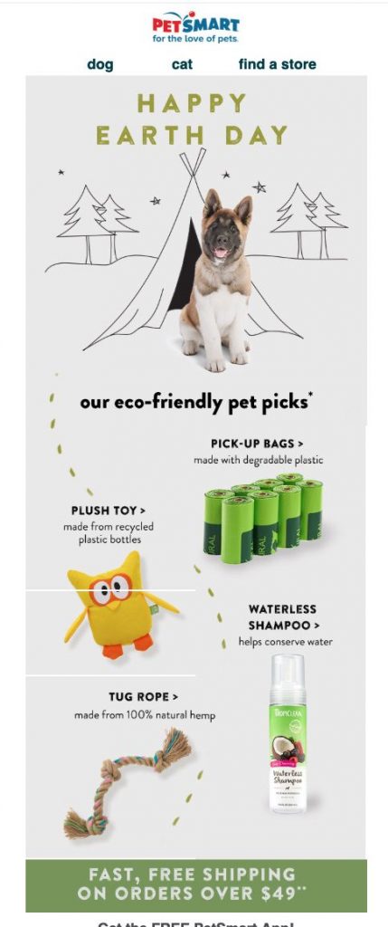
email campaign for Earth Day by Pet Smart

Pet Smart created an email campaign highlighting their most eco-friendly products in honor of Earth Day.

This Earth Day email by Pet Smart showcases some of their top eco-friendly products for customers looking to buy sustainably. The cute dog graphic fits well with the theme and keeps the whole email lighthearted - making the subject matter easier to process and enjoy.

Leesa

Earth Day email promotion by Leesa

Leesa proves their commitment to sustainability with this informative Earth Day campaign

We love the earthy colors and messaging in this Earth Day email by Leesa. In this campaign, they go the extra mile to show their customers how they are actively working to become more sustainable.

Sharing tips and advice with customers is also a great way for them to use their platform for good.

Create Awesome Earth Day Email Templates in Mail Designer 365

Mail Designer 365 has all the tools and resources you need to create powerful email campaigns this Earth Day. From ready-made HTML email templates to eye-catching sustainability graphics, you can build your next email template in minutes - with a little help from the intuitive drag & drop editor.

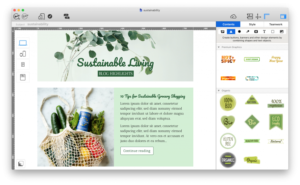
mail designer 365 email template for sustainability tips

Share sustainability tips with this eye-catching email template: exclusively available in Mail Designer 365

Not got a Mail Designer 365 plan yet? Start your free trial today and start creating amazing email designs for Earth Day and all year round.

Get started with Mail Designer 365 today

Start your 7 day free trial and use your Mac to create stylish email newsletters for your business.
No credit card required
OS X 10.11 - macOS Big Sur

Enjoyed this post?

Get more inspirational tips, tricks, and best practice examples in the Mail Designer 365 Newsletter Academy -
your one stop hub for all things email marketing strategy and newsletter design.
women working on a macbook

10 Awesome Email Designs We Have Loved So Far in 2021

By Gabrielle Uncategorized

To say the first few months of this year have been strange would be a a rather large understatement; however, if one thing's certain, it's that the quality and creativity of email designs keeps on getting better.

Whether you're looking for email inspiration for your next campaign or just a general #EmailGeek like we are, you're in the right place!

In this roundup, we're covering our 10 favorite emails of 2021 so far, including seasonal campaigns, announcements, product launches, automated mailings, and more. Keep on reading to scroll through our favorite campaigns of the year and get exclusive tips on how to recreate these styles in your own emails!

10 Awesome Emails We Have Loved So Far in 2021

ASOS

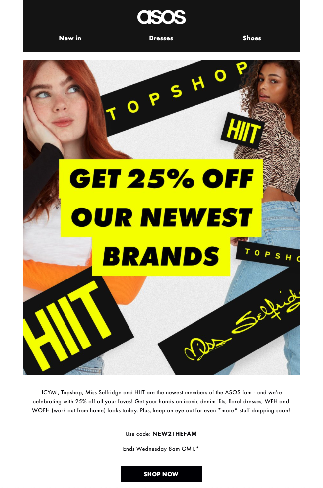
When announcing their acquisition of Topshop, HIIT and Miss Selfridge, ASOS launched an exciting promotion, giving customers 25% off their latest brands.

The bright black and yellow color scheme paired with big, bold text immediately attracts attention and creates an email design that just has to be clicked on.

email promotion by ASOS

The yellow and black theme in this design by ASOS immediately draws the customer in

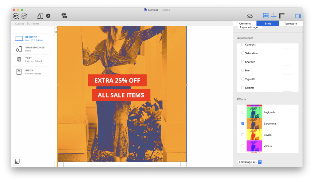
Make it in Mail Designer:

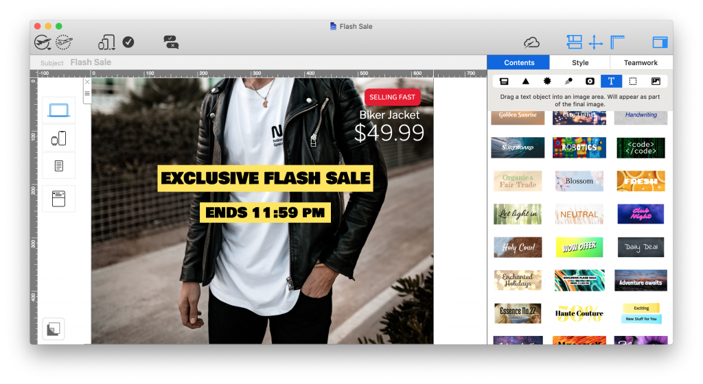
Mail Designer 365 has 1000s of license free web fonts available, as well as ready-made text objects to drag and drop into your design. Use these for call-to-action buttons, eye-catchers, and headlines:

email promotion created in mail designer 365

Really Good Emails

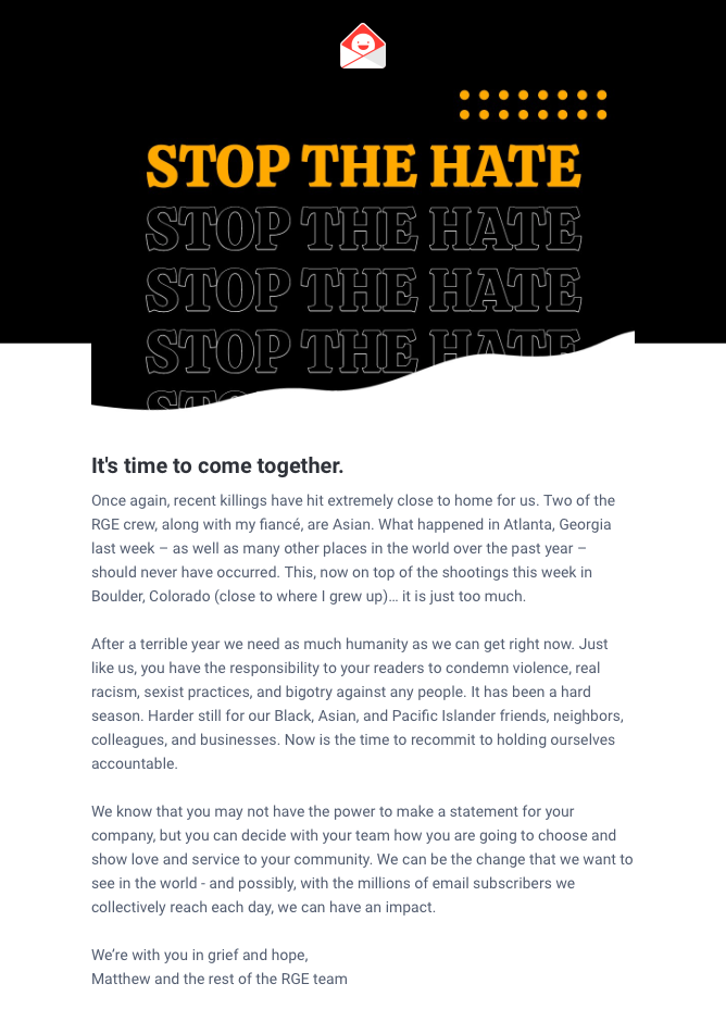
Of course, email campaigns are not always sales and promotion based, as demonstrated here by Really Good Emails. We are all for brands using their platforms to do good and promote key values and that's exactly what can be seen in this statement.

A simple email header does enough to compliment the layout and show the RGE branding without taking away from the importance of the content.

For subscribers, emails such as this contribute positively towards the overall brand image and help improve the CSR (corporate social responsibility) of the company.

company statement email by Really Good Emails

The message in this email by Really Good Emails shines through loud and clear and does a great job of showing the company's stance on an important issue

Make it in Mail Designer 365

Mail Designer 365 has a variety of email templates for company announcements and statements. Simply insert your logo and edit to share your important message with subscribers.

HTML email template for company statements

JUDY

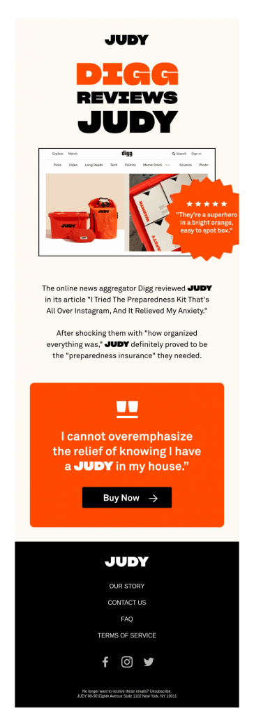
Sharing positive reviews is one great way to generate more buzz around your products - as shown in this bright and colorful email design by JUDY.

We love the emphasis created by using a shape to frame the reviewer quote and the hot orange color scheme is also totally on brand. Including a CTA (call-to-action) right after a positive review is a great way of influencing customers to get their hands on a much-loved product.

email design by JUDY

This colorful design by JUDY promotes their emergency kits by including positive customer reviews

Make it in Mail Designer 365

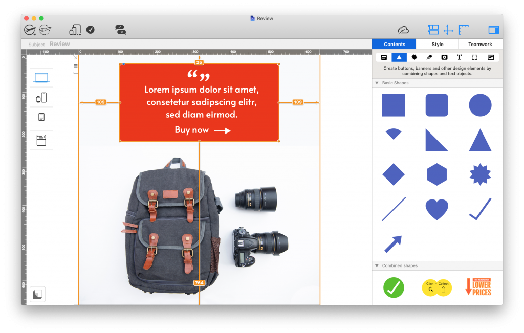
Mail Designer 365  offers a range of shape tools which you can use to create similar eye-catchers in your designs. Whether you're showcasing a review, building CTA buttons or highlighting product features, you can configure shapes to perfectly fit the overall look and feel of your brand:

customer testimonial accent box created in Mail Designer 365

Bunches

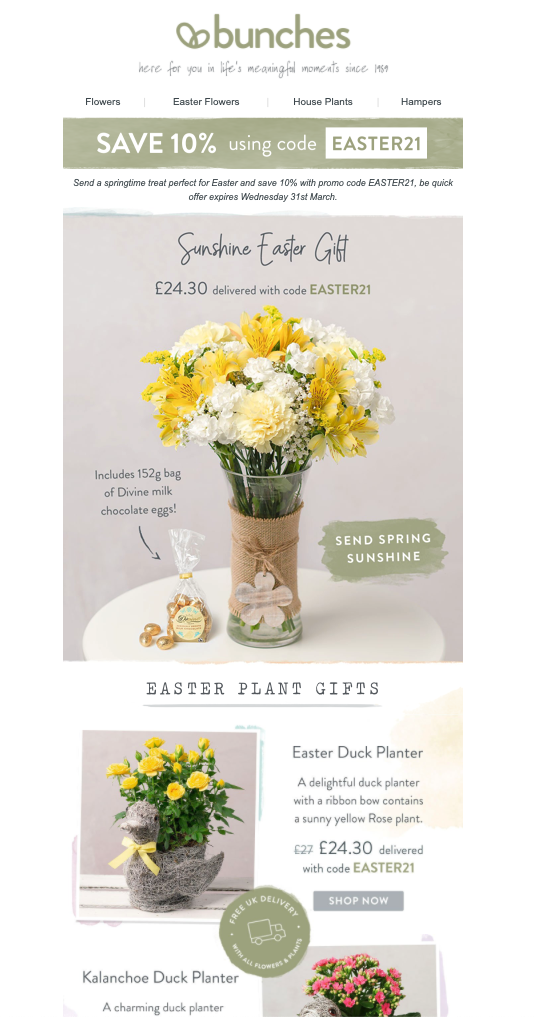
Rule number one of a good gift guide: Include impressive product photos. The rest will come naturally!

This Easter gift guide email by Bunches is a great example of a seasonal promotion. Not only does it stick to the classic Easter color scheme, it also goes the extra mile to point out special details about the advertised products, encouraging the reader to purchase. Of course, the 10% discount also helps seal the deal too!

easter email campaign by Bunches

This warm and inviting gift-guide email by Bunches ticks all the boxes for a classic seasonal campaign with its classic spring coloring

Make it in Mail Designer 365

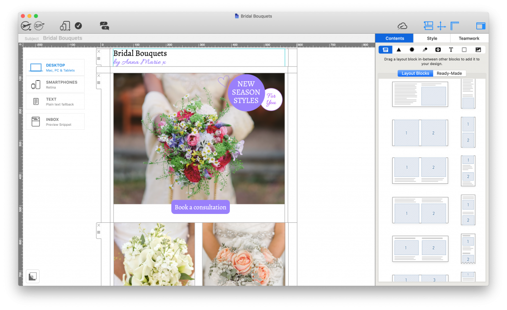
Proudly show off your best products center stage with an array of eye-catching layout options. Whether you're looking for a full-width feature image or smaller combi product blocks, Mail Designer 365 has dozens of practical layout options you can use in your designs to let your products steal the show:

html email layout for better product placement - made in mail designer 365

Quizlet

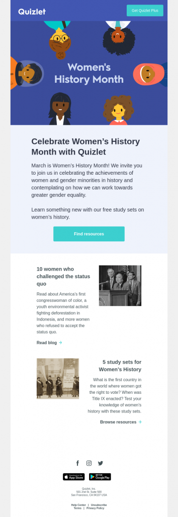
We love businesses that also use their emails to share useful knowledge with customers - just like this email by Quizlet for Women's History Month.

The layout is clean and easy to read and helps the reader discover useful resources to read up on.

email for women's history month by quizlet

We love how this email by Quizlet goes all out to share useful, educational content about women's history with readers.

Canva

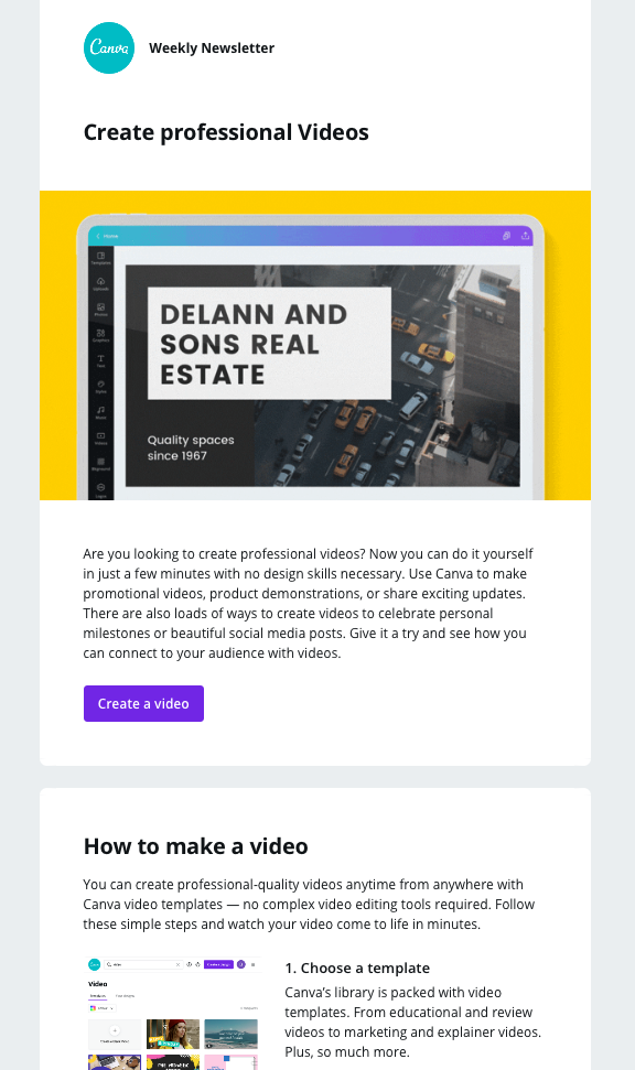
Sticking to the educational theme, this email by Canva is also an in-depth look at how to benefit from their service.

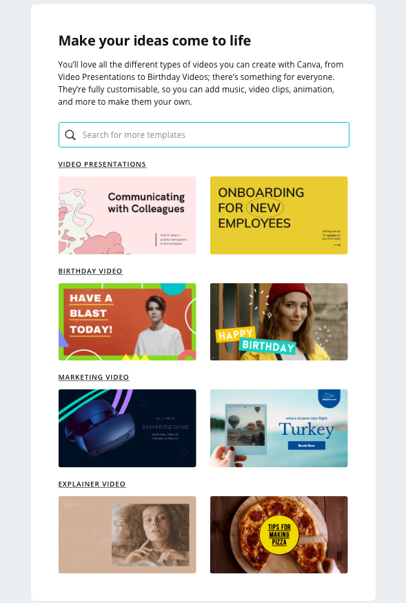
The topic of the email campaign is video creation and its clear structure allows users to process bitesize information and quickly learn more about the topic, without having to leave the email.

Tutorial email by Canva

Tutorial email by Canva

The search box graphic is a smart way for Canva to get more readers on to their website to browse the designs they have available

Thortful

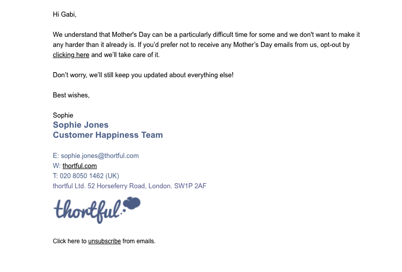
This email by Thortful may not be winning any prizes for its basic design, but the sentiment behind it is deserving of praise and recognition.

Seasonal events like Mother's Day, Father's Day, etc. are huge in the marketing world but can be sensitive to some. By addressing customers in advance in a direct and considerate manner, Thortful are doing a great job of safeguarding them against any content which may not be appealing or relevant.

As well as this, they are also helping to ensure subscribers who do not wish to receive Mother's Day content will not unsubscribe from their list as a result of too many promotional emails.

Not only is the email personalised for each recipient, it also landed in the "Primary" folder in Gmail, making it hard to miss.

Emails like this aren't seen often but have a tremendous impact on the customer's overall experience with your brand

Nintendo

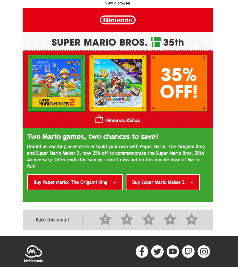
In this eye-catching promotion for the classic and beloved Mario Bros, Nintendo use bold colors and prominent CTAs to tempt recipients into making the most of the 35% off offer.

The star rating at the bottom of the email is also a great way of allowing subscribers to share their response to the email, giving them scope for further optimization in the future.

email promotion by Nintendo

Bold colors, striking CTAs and fun promotional graphics make this sales email by Nintendo one of our favorites of the year

Make it in Mail Designer 365

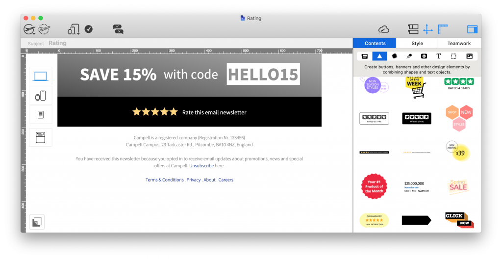
Recreate these all-important star rating charts in Mail Designer 365 using the star shape tool. In a hurry? Find ready-made ratings graphics in the content sidebar:

star ratings graphic made in mail designer 365

Spotify

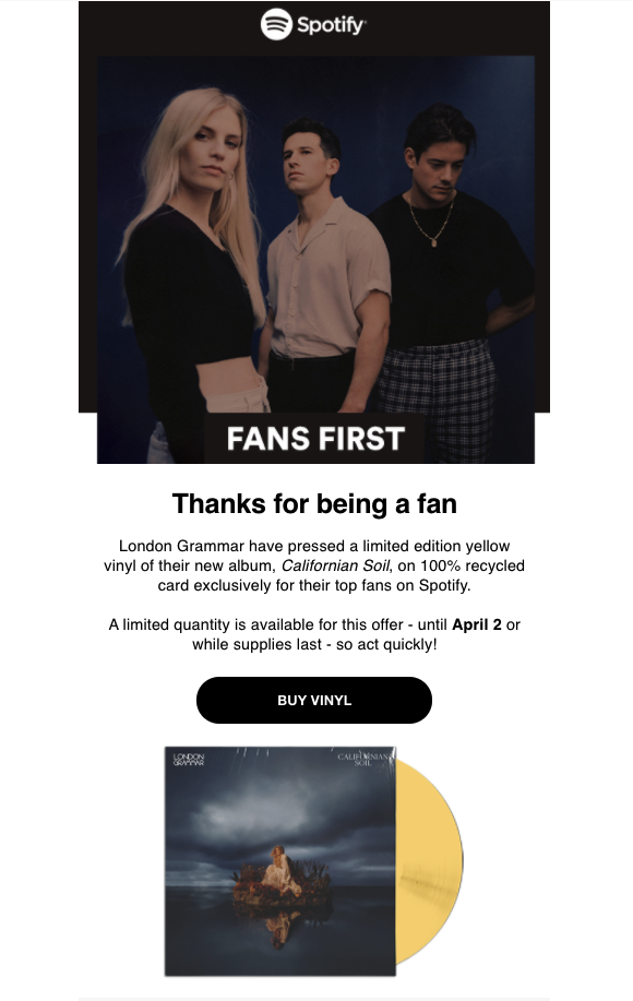
Spotify do a great job of segmenting their email list based on the music preferences of users. This allows them to create tailored content like this email promoting an exclusive London Grammar vinyl.

The engaging email copy, use of personal pronouns in the subject line ("London Grammar made you something special) and "thank you" message all work together to give the recipient the impression they are connecting directly with their favorite artists.

email design by Spotify

This email campaign by Spotify is a great example of personalisation and tailoring email content specifically for smaller target groups.

Buffy Inc

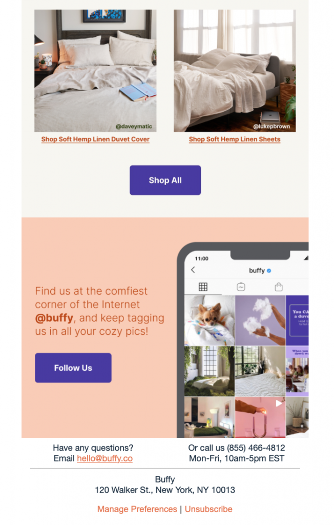
Email is a great tool to promote your other social media platforms, such as your Instagram account, and grow your following even more.

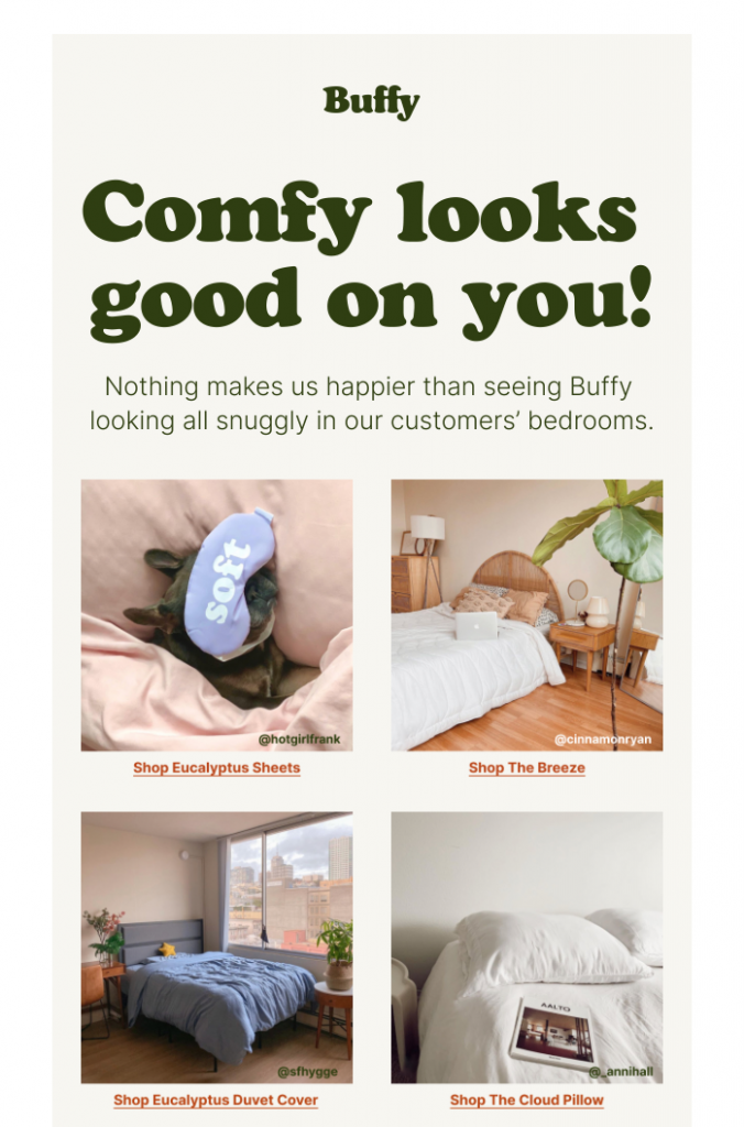
This email by Buffy Inc is a great example of how to promote your products and Instagram account at the same time. The real life product photos serve as informal customer testimonials which help influence your readers and reinforce trust in your products.

The social media CTA box rounds off the Instagram-themed email nicely and even encourages customers to share their own product photos: a win-win for the business!

email template by Buffy Inc

html email design by Buffy Inc

This campaign by Buffy not only shows their products in action, it also draws subscribers' attention to their Instagram account

Make it in Mail Designer 365

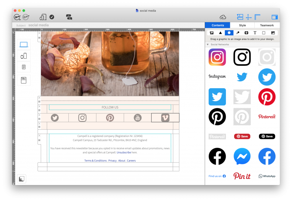
The Mail Designer 365 Contents library contains logos and icons for all leading social media platforms, including Twitter, Instagram, Pinterest, Facebook, YouTube, and Tumblr. This makes it easy to build up social media CTAs and promote your platforms in your emails:

social media call-to-action block made in mail designer 365

Get started with Mail Designer 365 today

Start your 7 day free trial and use your Mac to create stylish email newsletters for your business.
No credit card required
OS X 10.11 - macOS Big Sur

Enjoyed this post?

Get more inspirational tips, tricks, and best practice examples in the Mail Designer 365 Newsletter Academy -
your one stop hub for all things email marketing strategy and newsletter design.
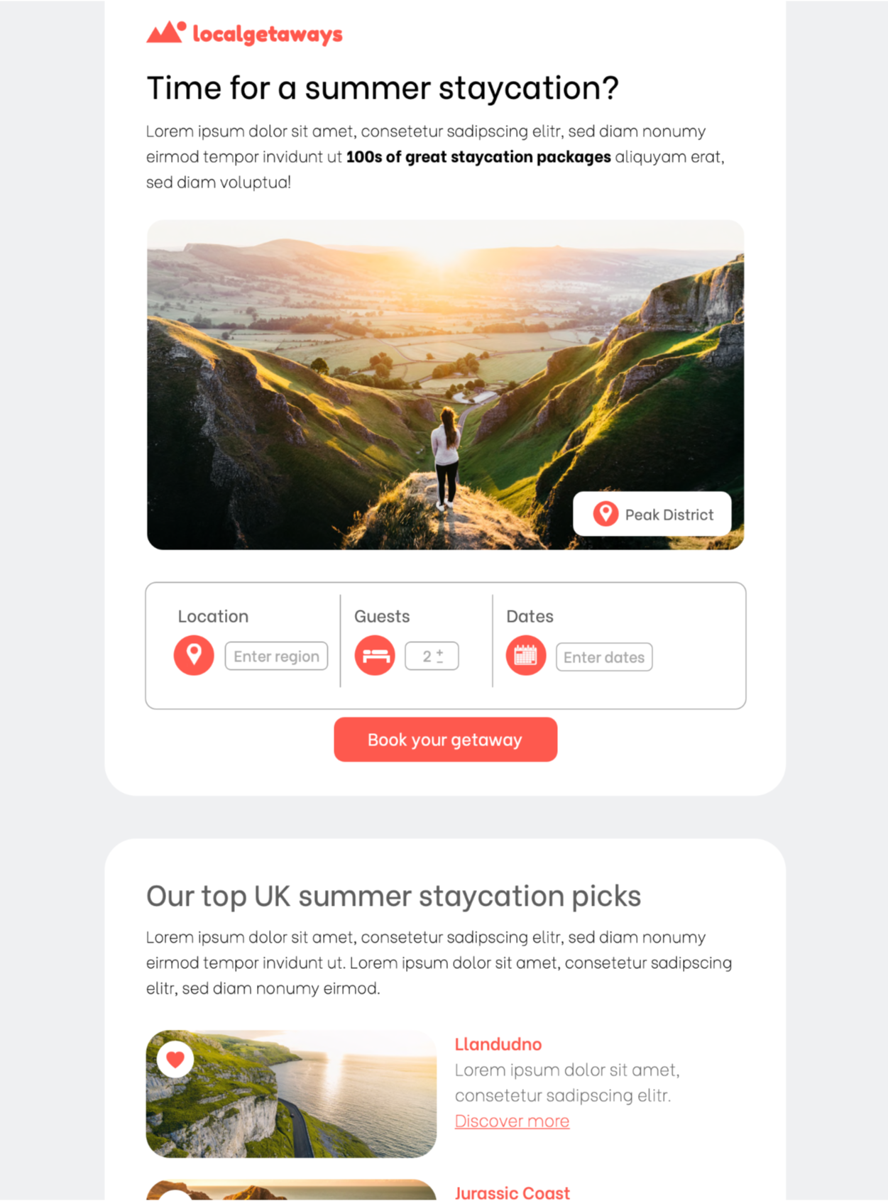
medical professional typing on a MacBook

Email Marketing for the Healthcare Sector - What You Need to Know

By Gabrielle Industry Examples, Mail Designer 365 Newsletter Academy

With the digital age really taking storm, organizations worldwide are looking for ways to use technology to streamline their workflows. The healthcare sector is no exception: With more and more medical practices taking the plunge and switching over to electronic forms of communication, we're looking at how email can be utilized in the healthcare industry.

In this guide, you'll find all you need to know about the benefits of developing an email strategy for your medical practice, as well as some of our best practice tips to get you started!

Why should I use email for my medical practice?

As well as being low cost and super easy to use, email is proven to be a highly effective mode of communication.

Communicating with staff and patients via email is an efficient way to share important news, make big announcements, and help simplify the day-to-day administration of your medical practice.

medical professional typing on a MacBook

What kind of emails are sent in the healthcare sector?

As the healthcare sector spans across such a broad range, the world really is your oyster when it comes to building up an email strategy.

That being said, here are some popular ways medical practices and clinics are utilising email to benefit patients and streamline communications:

  • Welcome emails and important information for new patients
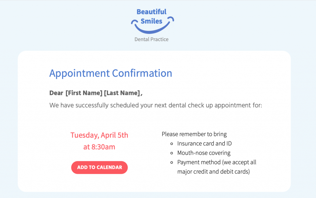
  • Automated emails: Appointment confirmations/reminders, test results, invoices, doctor ratings, feedback forms
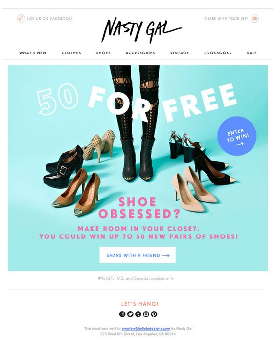
  • Promotions: Discounted cosmetic procedures (i.e. teeth whitening, laser hair removal)
  • Informative Newsletters: Medical tips, healthcare advice, pregnancy advice
  • News & Announcements: Clinic closures, new telephone number/opening hours, new equipment, video consultations
  • Targeted campaigns: Flu jabs, vaccinations, pap smear test, dental check up
  • Internal staff updates, medical board, meeting minutes, health & safety policy

What to Include in Emails for Your Medical Practice: The Essentials

Incorporate your practice's branding

No matter how big or small, every medical practice has its own unique identity which should also be reflected in your emails.

Your branding is what your patients associate with you and often the reason they choose you over other practices. Incorporating important brand elements such as your logo and color scheme helps patients connect the email with your practice and adds to the overall impact.

medical email template in Mail Designer 365

Include your practice's logo in a prominent position within your design to really emphasise your branding

Use personalisation to connect with patient

Connecting to patients on a personal level is an important way of gaining their trust and helping them feel at ease. This also goes for your emails. Using placeholders for personalisation allows you to go the extra mile for patients and tailor emails just for them.

Keep the tone calm, professional and reassuring

In many cases, your emails will be related to sensitive issues such as medical appointments, test results, and important reminders.

It's best practice to ensure the tone of your email copy is calm and reassuring, especially when the aim is to encourage patients to book a check up or attend an appointment.

Keep the email text clear and concise so that your message gets straight to the point.

Use sensible font options

Continuing on from the last point, it is also best to use a simple typeface for your email copy. In most cases, sans serif fonts tend to work best as they are clean and  and usually easier to read.

In contrast, using a more elegant or artistic typeface can take away from the key message of your email and also come across as unprofessional. Moreover, elaborate fonts can also be challenging for any patients with visual impairments or reading difficulties to process, making your emails less accessible.

Read more about accessibility in emails here.

Include a range of contact information

As a medical practice, it's critical your patients are always able to get in touch with you. For this reason, every email you send should contain all your key contact information.

This is particularly useful if patients have questions relating to the content in your email. Having all your contact details on hand makes it easier for them to get the answers they need right away.

Mail Designer 365 offers a range of link types, including mailto links, telephone links and SMS links. Configure your mailto links with a pre-determined subject line and message to speed up the process even more.

configuring contact links in a medical email template in mail designer 365

Configure custom contact links in your emails to make it easier for patients to get in touch

Write a disclaimer and link to your privacy policy

Healthcare is a sensitive topic and for your patients, privacy is key. Ensure every email you send clearly includes all the relevant information in the disclaimer, including links to your practice's privacy policy, imprint and other general information.

Most countries also require you to give recipients the chance to opt out of receiving emails, especially if these emails are of a promotional nature. For this reason, it's best practice to include an unsubscribe link, in order to avoid a hefty fine!


email disclaimer for medical emails

Be sure to include all key links and information in your email disclaimer, including an unsubscribe link

Find out more about best practice for email disclaimers here.

Email Marketing Techniques for the Healthcare Sector

As well as appointment confirmation and reminder emails, your practice can also utilise email as a convenient way of marketing your services or reaching out to patients.

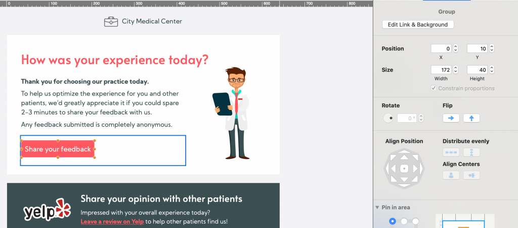
Send feedback request emails

Whether it's a doctor's appointment, a dental check up or a visit to the eye doctor, it's important your patients go in feeling at ease and come out feeling satisfied and ready to recommend you further.

Useful feedback is important in the healthcare sector and you can use email to encourage patients to let you know how they found their experience.

As well as Google and Yelp ratings, there are also a number of online rating platforms for doctors which potential new patients may use when making a decision about your practice. Furthermore, you can also set up an anonymous Google Form or survey to get feedback for your own internal use.

However you collect feedback, making the feedback email part of your email strategy is a convenient way to allow patients to anonymously share their thoughts with you.

medical feedback email created in Mail Designer 365

Sending feedback emails - like this one created in Mail Designer 365 - is a great way to find out more about your patients' experience with your practice

Advertise promotions and new services

If your practice also offers cosmetic procedures such as teeth whitening, teeth straightening, veneers, etc. you can also advertise these in your emails - especially if you have a promotion on!

This also goes for other branches of medicine, including chiropractors, physiotherapists, massage therapists, etc. looking to promote their services.

In addition, if your practice has access to a new piece of medical equipment or state of the art technology, your email newsletter is also a good place to let patients know about this.

Put together targeted medical campaigns 

Flu vaccines, dental check-ups, pap smear tests, eye tests: They're all commonly known for being put off by patients!

Use email strategically to encourage patients to book in for these all important appointments. Don't forget to stress the benefits of regular check ups and include easy links to your booking form.

Tip: Using personalised placeholders in these emails is also super effective in making the recipient feel like you're directly reaching out to them.

Getting Started with an Email Strategy for Your Medical Practice

So, there you have it - our top tips and best practice guidance on utilising email for the healthcare sector. We hope you have enjoyed this guide and will consider taking some of these ideas on board for your medical practice.

Mail Designer 365 has all the tools and resources you need to create a professional collection of email templates for your practice.

How to create an email strategy for your medical practice:

  1. Download the Mail Designer 365 App for free to use on your Mac
  2. Explore a range of pre-made templates and resources, or create your own design with the drag & drop editor
  3. Send your designs directly to patients from Mail Designer 365 via Delivery Hub

Get started with Mail Designer 365 today

Start your 7 day free trial and use your Mac to create stylish email newsletters for your business.
No credit card required
Compatible from macOS 10.13 onwards

Enjoyed this post?

Get more inspirational tips, tricks, and best practice examples in the Mail Designer 365 Newsletter Academy -
your one stop hub for all things email marketing strategy and newsletter design.
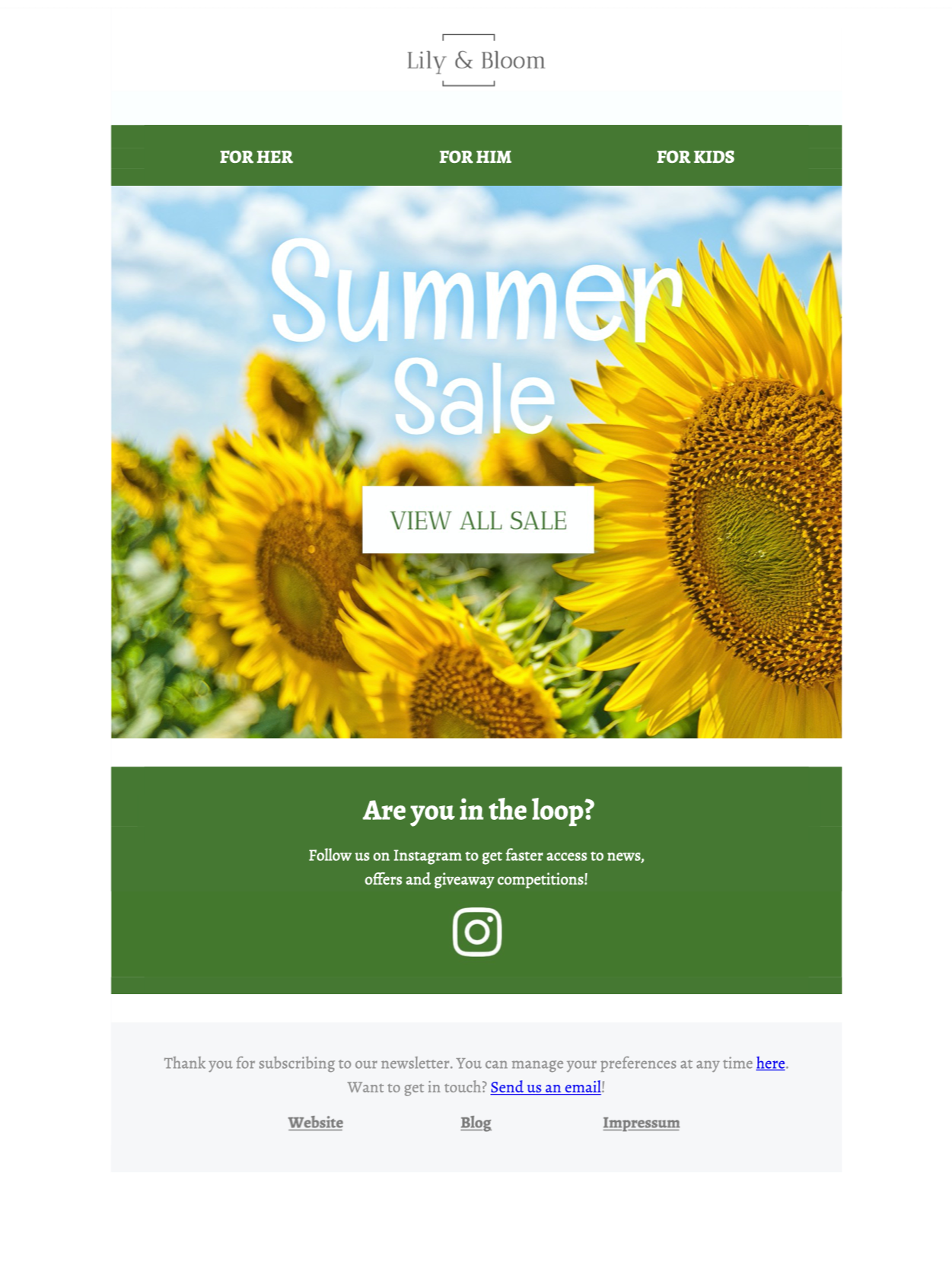
email marketing for events

Email Marketing for Events - Best Practice Tips and Template Inspiration

By Gabrielle Mail Designer 365 Newsletter Academy

Whether it's a virtual meeting, a webinar or a larger physical function, putting together a great business event takes a large amount of hard work and dedication. For this reason, when it comes to promoting your event, you need to have a good strategy in place to ensure all your hard work pays off.

Why should I use email to promote my business event?

Email is a great tool you can utilise as part of your overall event marketing strategy. In comparison to unsustainable flyers, fleeting social media posts, and expensive ads, sending a stylish HTML email is a cost effective way for you to advertise your company's next big event whilst also including all key information for stakeholders and invitees.

In this guide, we're sharing some key best practices with you that you should consider when working on emails to promote your next big event.

Email Marketing Best Practices for Business Events

Use clear branding

Generally, hosting an event is a way for your business to show its expertise in a certain area, as well as demonstrating professionalism and attracting potential new clients. For this reason, it's critical that your event emails are representative of your corporate identity.

When designing your initial announcement emails, be sure to tie in all your usual branding elements. On a visual level, this includes your logo, typeface, color scheme, email layout etc. However, it's also important that your email copy reflects the tone and standard of the copy used on your website and other marketing literature.

Creating a consistent brand image in your emails will only work in your favor, as both potential and existing clients will be more able to form a connection with you.

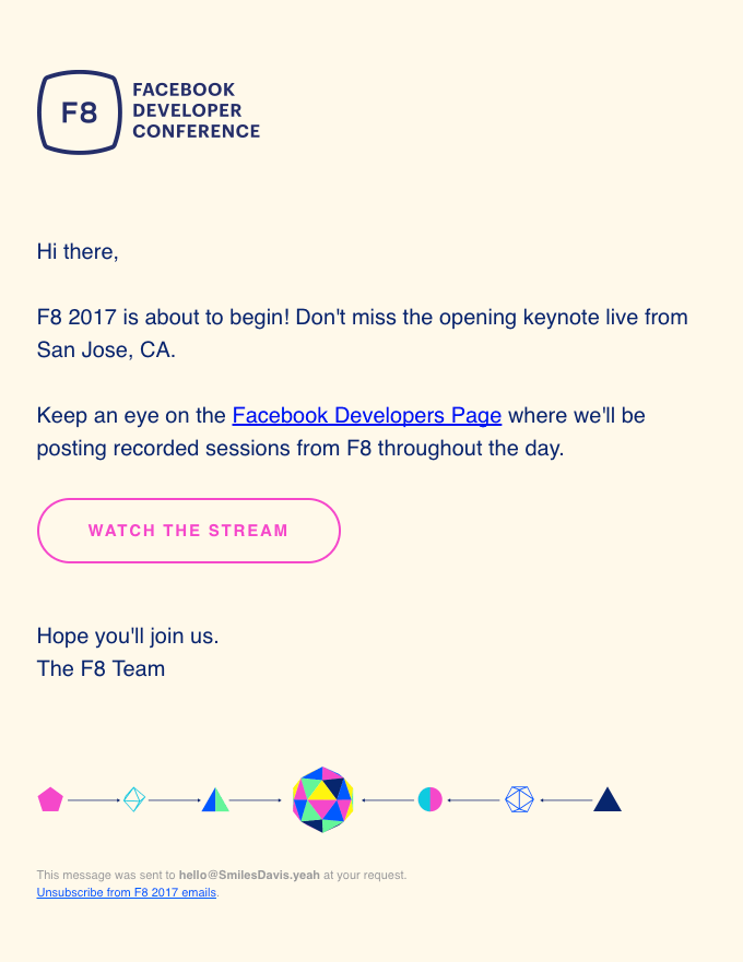
email invitation by Facebook Developer Conference

Although simple, this email perfectly matches the overall branding and style of F8.

Tip: Mail Designer 365 has all the tools you need to truly customise your email designs for your brand. With support for custom color schemes and over 1000 available web fonts (including easy import options for custom fonts), your emails will be truly reflective of your brand's core identity.

List all key details in the email

No matter the size of your event, the initial invitation / announcement email will be the main point of reference for your invitees.

Ensuring all the key event details are listed in one place is a good way for invitees to know exactly where and when your event is taking place, as well as other important information such as:

  • How to register for the event / purchase tickets
  • Online events: Where to access the webinar/livestream/meeting/etc.
  • Equipment needed
  • Travel and accommodation tips
  • Contact information for support and questions

Clearly presenting this information in your email will make it much more useful and informative to the recipient.

Create an event agenda

One way to get invitees really excited for your event is by including an appealing event agenda in your email - this is particularly effective for bigger events like conferences, launch events or retreats.

Not only does this help registered attendees plan for the event and know what to expect, it's also a fantastic way of convincing those on the fence that your event isn't one to miss.

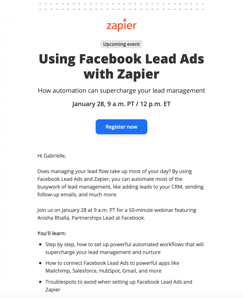
webinar promotion by Zapier

Zapier include a useful breakdown of what to expect in this webinar, including the estimated duration.

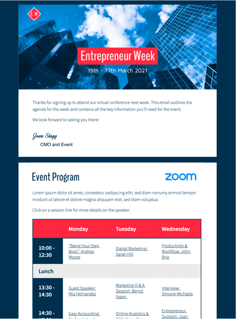
Tip: Using a bold table layout is a great way to clearly present an event agenda, as shown in this Event Agenda Design Idea -  exclusively available in Mail Designer 365:

html email template for event agenda

Attach calendar event

Most leading calendar services allow users to export events as a practical ICS file that others can import into their own calendars. Attaching this file to your email is a great way to make it easier for invitees to keep track of your event.

Here's how to attach a calendar file or link to your Mail Designer 365 email.

Tip: Include a reminder with the event file to ensure invitees don't forget!

Share exciting content from past events

If your event is a recurring one (i.e. an annual conference or monthly webinar), you may want to consider sharing some highlights from previous years. This could include video snippets, presentations, or podcast recordings from successful events of the past.

Not only does this give those first-time invitees a sneak peek of the kind of thing that's in store, it also helps reinforce the value of your event to previous attendees by reminding them of how interesting and entertaining it was the last time!

Include social media cross promotion

Utilising social media is an effective way to generate a buzz around your event. For example, coming up with a dedicated event hashtag allows attendees, hosts and guest speakers to network before the event and also can help attract the attention of those who have not yet registered or purchased a ticket.

Use your event marketing emails to simultaneously promote your social media platforms and encourage guests to join the online conversation. This will also help you grow your social media following longer term!

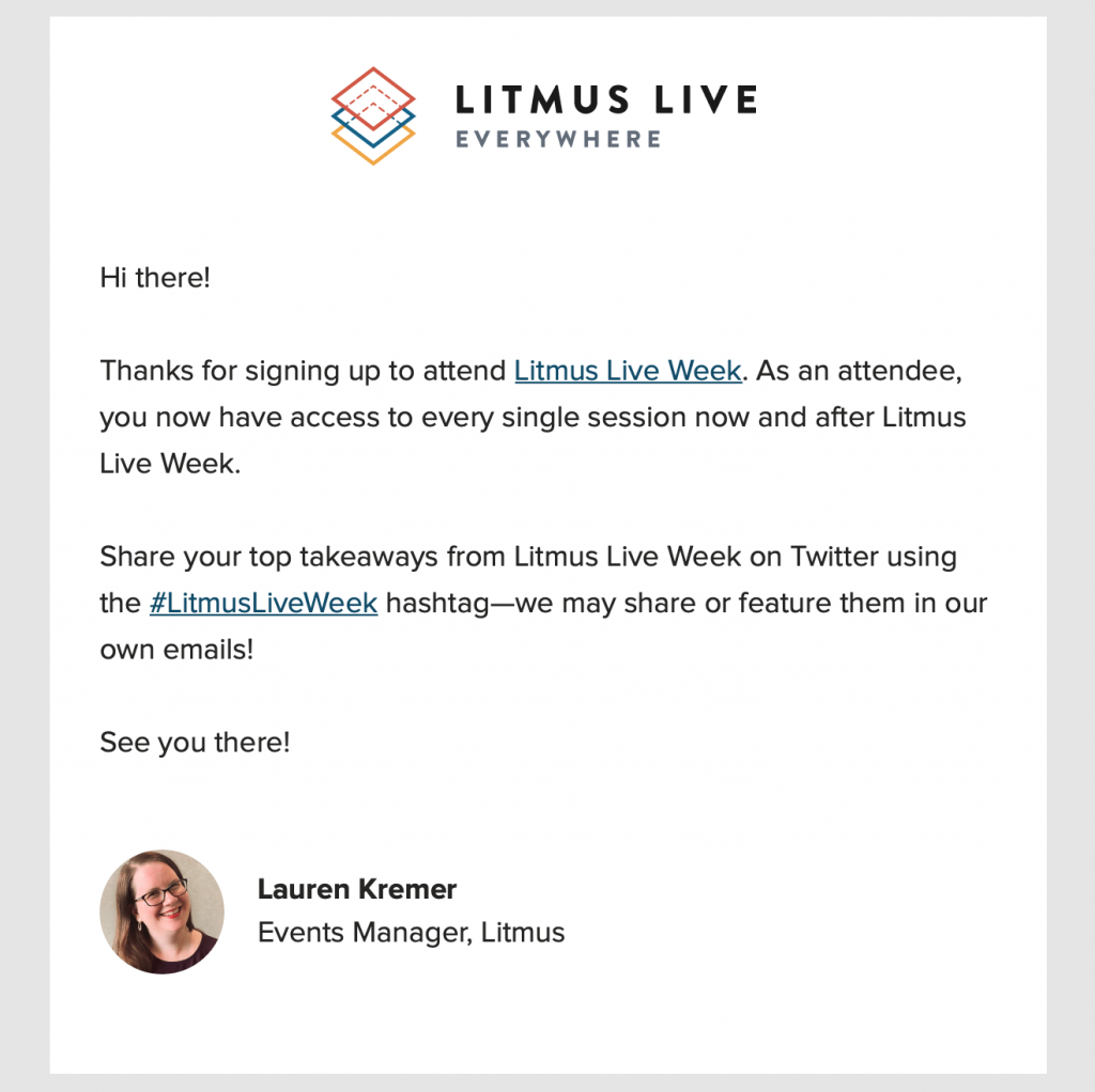
Litmus email promotion for an upcoming event

Litmus do a great job of cross-promoting their Twitter account with a dedicated event hashtag.

Tip: Mail Designer 365 has all the resources you need to build eye-catching social media call-to-actions and direct readers to your Twitter, LinkedIn, Instagram, Facebook, etc.

Send out reminders

Even with an automated calendar invitation, sending out a final reminder email is a friendly way to give attendees all the last minute information they may require before the event.

If there were any final details missing from your previous emails (i.e. specific start times, last minute changes), this email is your chance to keep invitees informed and up to date.

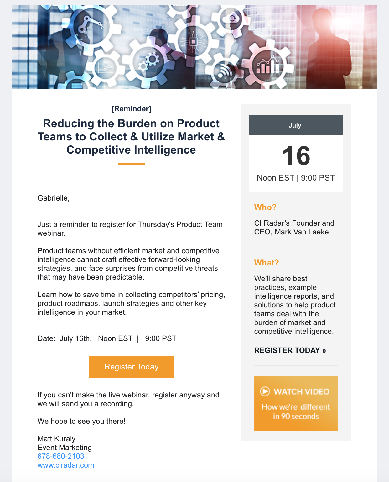
event reminder email by CI Radar

CI Radar provide invitees with a really useful overview in this reminder email.

Be sure to include positive phrases such as "we are looking forward to seeing you there...", "can't wait to connect..." in order to generate more excitement around your event and also make guests feel reassured and welcomed.

Tip: Mail Designer 365 supports custom mailto, sms, and telephone links. Utilise these and add your contact information so invitees can easily get in touch. You can even add a pre-filled message and subject line to help your team keep track more easily.

Thank attendees after the event

Especially if events are a regular part of your business strategy - sending a warm thank you email to attendees is an important part of their overall experience with your organisation. A positive experience all round can also help ensure guests will return again for future events.

You can also use your thank you email as a way to gather feedback after the event has taken place. For example, including a simple star rating will give you a good idea of how satisfied guests were overall.

If you want to go one step further, you could even link out to a more detailed feedback form or survey - especially if there are particular elements of the event you wish to optimise. As an incentive for taking part in the feedback, you could create a giveaway or offer a discount or free gift. The more creative, the better!

Build Up Your Event Marketing Strategy with Mail Designer 365

We hope you will find these tips useful when planning the email marketing strategy for your next event.

Mail Designer 365 is an essential tool for creating stylish and functional emails for your business. As well as email templates for events, Mail Designer also offers a wide range of designs for dozens more use cases, including seasonal, sales, automated, and announcements. See all our HTML Design Ideas here!

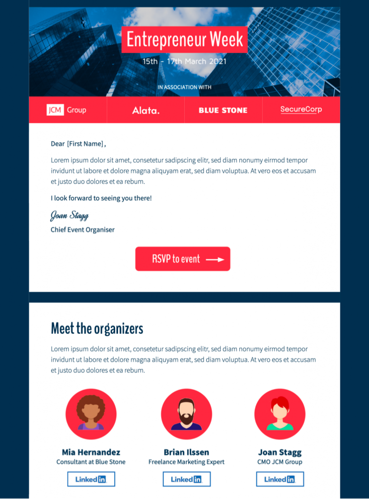
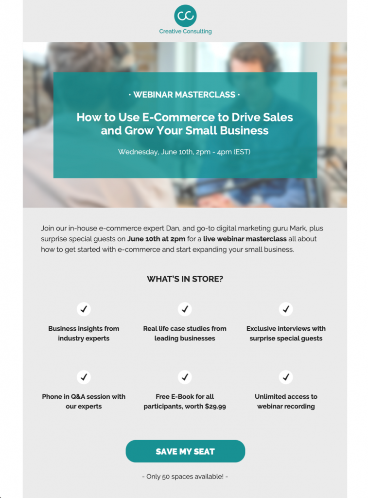
event invitation email template

html email template for online event invitation

html email template for event agenda

Want to create your own design from scratch but don't have the time? Thanks to the intuitive drag & drop editor, Mail Designer 365 makes it easy to build flawless campaigns in no time. Try for free today and see what you can create for your business!

Get started with Mail Designer 365 today

Start your 7 day free trial and use your Mac to create stylish email newsletters for your business.
No credit card required
OS X 10.11 - macOS Big Sur

Enjoyed this post?

Get more inspirational tips, tricks, and best practice examples in the Mail Designer 365 Newsletter Academy -
your one stop hub for all things email marketing strategy and newsletter design.
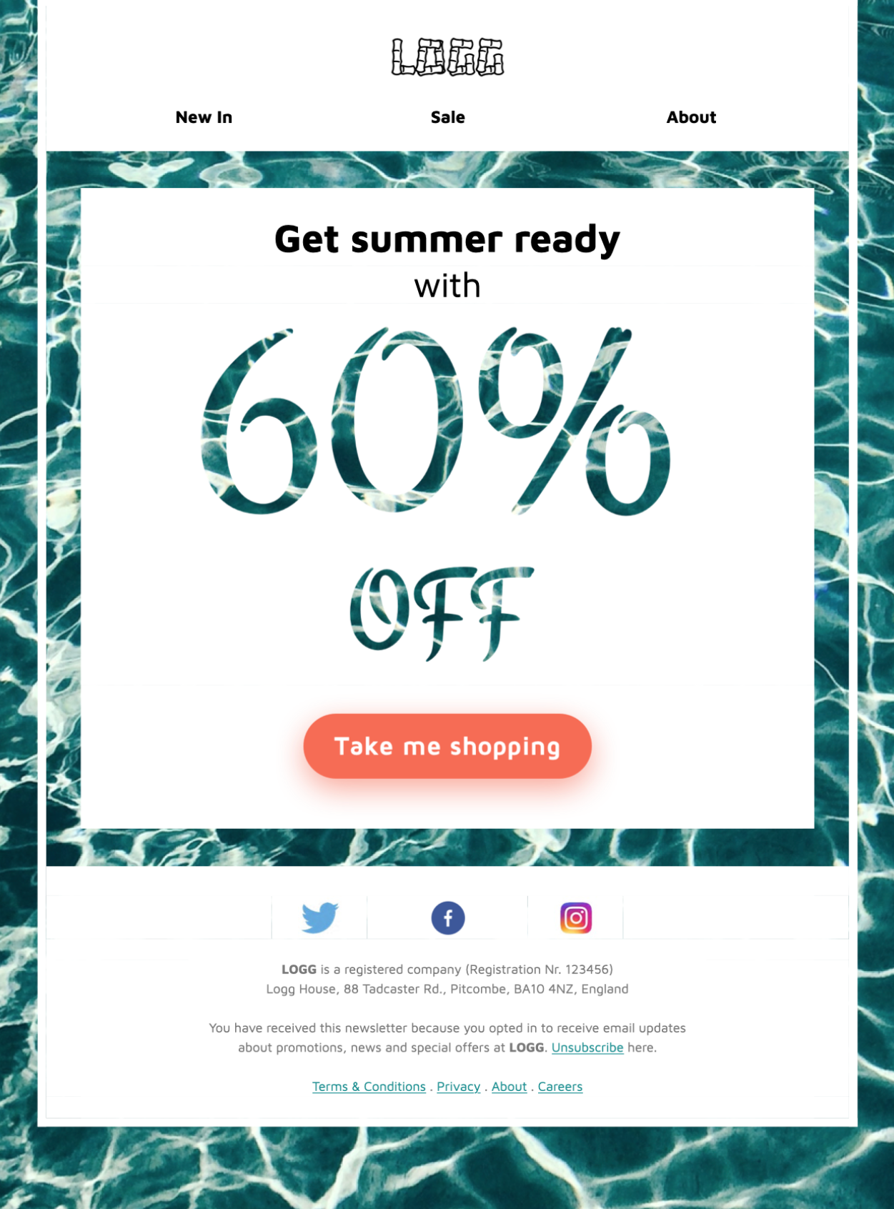
spring email marketing strategy

Spring Email Marketing Strategy: 5 Events You Need on Your Radar

By Gabrielle Mail Designer 365 Newsletter Academy

With spring fast approaching, now is a great time to take another look at your email marketing calendar and start planning your upcoming campaigns for the next few months.

Spring hosts an array of exciting holidays and occasions that you can easily incorporate into your email marketing strategy and produce exciting email content your subscribers will love.

To help you get inspired for the new season, we've listed 5 major events coming up in spring plus, ideas and examples of awesome marketing emails you can try out in your own spring email strategy.

How do seasonal changes affect consumer behaviour?

Weather and seasonal changes play a great role in the way customers perceive your business and how they choose to spend money. Over the years, many studies have been carried out on the correlation between seasonal changes and consumer behaviour and the general consensus shows a change in season influences many shoppers to start stocking up.

For example, with the first glimmers of spring sunshine often comes:

  • a new wardrobe,
  • different recipes and food choices,
  • the urge to get active or start working out at the gym,
  • vacation planning,
  • seasonal events and holidays,
  • a surge in spring cleaning and DIY,
  • a rise in outdoor activities and gardening,
  • and much more!

For this reason, the transition from winter into spring poses the perfect opportunity to target customers getting ready for the new season with a fresh, new campaign.

a family on a spring walk

The start of spring encourages many people to start changing their habits, including taking up outdoor activities again.

5 Major Spring Holidays You Need to Plan for

Recognising major seasonal events ensures your email content remains relevant and interesting to your audience. Spring is a great time for new campaigns, as it welcomes a wide range of key events, including major religious holidays and public holidays.

Want to get started? Check out this list of major spring holidays and discover campaign examples to get inspired!

1. St Patrick's Day Email Campaigns

As a celebration of all things Irish, St Patrick's Day is well known for its fun and frivolity. For this reason, it's a great way to kick off your spring marketing strategy.

Adding a splash of green and some witty wordplay to your email can be enough to give a nod to this fun event. Otherwise, you could go the extra mile with a themed sale or lucky dip style promotion, like this example by J Crew:

st patrick's day email campaign

This St Patrick's Day email campaign by J Crew perfectly captures the fun nature of the holiday

Want more tips? Check out our post on St Patrick's Day email marketing.

2. Easter Email Campaigns

In the western world, Easter is arguably one of the biggest events of the spring and a time for both religious and non-religious families to come together and celebrate.

As well as being an important religious holiday, Easter in general is also seen by many as the height of spring and, depending on the country, often marks the transition into warmer weather.

Take this chance to start integrating warm-weather themes into your campaigns and if relevant to your business, now is also a great time to start promoting outdoor activities and vacations.

Of course, we also can't forget the connection between Easter and sweet treats! Incorporating a chocolate or Easter egg theme is also a great way to go if you're stuck on ideas - like in this tongue-in-cheek example by Jack Threads.

Easter email campaign by Jack Threads

This Easter-themed campaign by Jack Threads is a fun and creative example of how to include traditional Easter themes in a simple sales email.

Want more tips? Check out our post on Easter email campaigns.

3. Ramadan and Eid-al-Fitr Email Campaigns

As almost a quarter of the world's population, Islam is the second largest religion in the world, making Ramadan and Eid two major events in the spring marketing calendar.

Depending on the demographic of your target audience, the Ramadan season and build up to Eid-al-Fitr may be important additions to your email marketing plan.

Similarly to Easter for the Christian population, Eid is a massive occasion for muslims all over the world, usually celebrated with good food and large family gatherings.

Even if you are not planning a specific promotion, if you know you have a large muslim customer base, sending out an "Eid Mubarak" email to those of your subscribers celebrating is a kind gesture.

Ramadan email greeting created in Mail Designer 365.

Ramadan email greeting created in Mail Designer 365.

4. Mother's Day Email Campaigns

The exact date of Mother's Day differs from country to country, but in the majority of countries, Mother's Day falls during the spring.

Mother's Day is a major sales event worldwide and is celebrated by the majority of people. For your business, it presents the opportunity to not only promote gifts and activities for families, but also to thank Mothers all over. This can be done in the form of a special promotion or just a simple appreciation message.

During this time, many businesses opt to create a Mother's Day gift guide to inspire customers, like in this example from Marks and Spencer:

Mother's Day gift guide by Marks & Spencer

A gift guide like this one by Marks & Spencer is a great way to inspire shoppers looking for the perfect present.

Want more tips? Check out this post on Mother's Day email campaigns.

5. Memorial Day Email Campaigns

As spring draws to a close, Memorial Day is the last big holiday before the start of the summer.

The long weekend at the end of May is often a chance for a small getaway or, if you're staying in town, a cookout or get-together.

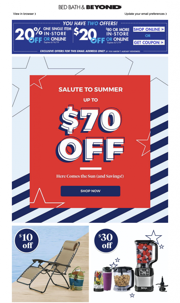
Like any holiday weekend, Memorial Day is a chance for a big promotion while customers are in the mood to spend. This summer-themed promo by Bed, Bath & Beyond is a great way to end the current spring season and start getting ready for a new one!

Memorial Day email campaign by Bed, Bath & Beyond

Use your Memorial Day email campaign to get your customers ready for a long hot summer!

Want more tips? Check out our favorite Memorial Day email campaigns!

More Inspiration for Spring Marketing Campaigns

Our Spring Pinterest board contains tons of great examples of spring email campaigns, designed by the biggest brands. Follow us on Pinterest today to discover our hand-curated collection of top notch email designs and get inspired for spring and the rest of the year!

Follow us on Pinterest

Get started with Mail Designer 365 today

Start your 7 day free trial and use your Mac to create stylish email newsletters for your business.
No credit card required
OS X 10.11 - macOS Big Sur

Enjoyed this post?

Get more inspirational tips, tricks, and best practice examples in the Mail Designer 365 Newsletter Academy -
your one stop hub for all things email marketing strategy and newsletter design.
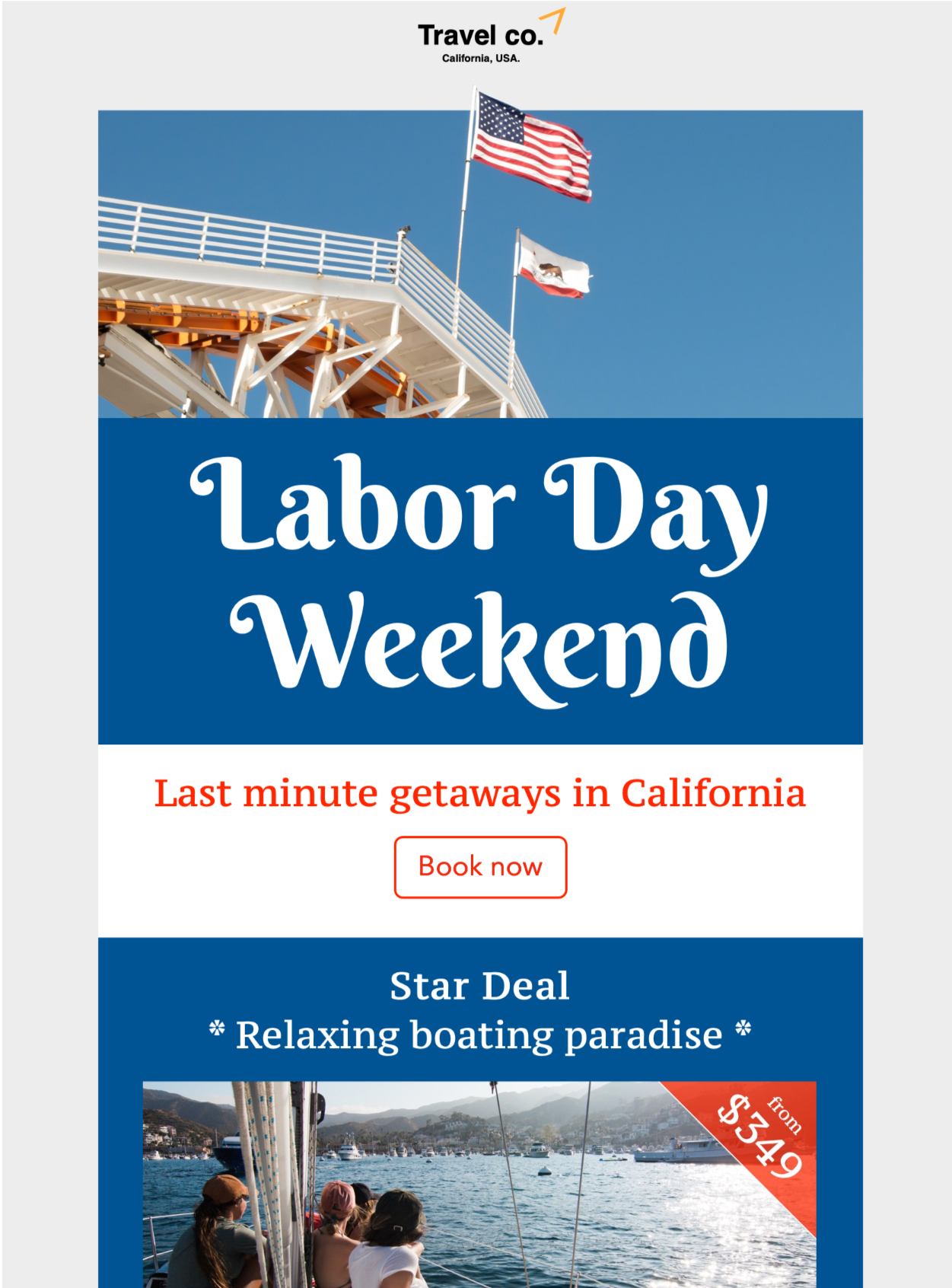
automated emails for fashion brands

5 Essential Automated Emails for Online Clothing Stores

By Mail Designer 365 Newsletter Academy

In particular for fashion brands, having an effective email automation strategy in place plays an important role in determining the experience customers have with your online shop. Setting up automated emails for certain key "trigger" actions is a great way to keep website visitors engaged and personalise their journey with your business.

person using an iPad

Although it's great to get creative with your automation strategy, having a solid foundation in place is the best way to ensure you have all bases covered.

In this post, we're sharing 5 essential automated emails every online fashion retailer needs to set up to help boost sales and drive customer engagement.

Why Should I Set Up Automated Emails for My Online Store?

Big name online fashion retailers such as ASOS, Boohoo, Zalando and Missguided have a lot in common, including an indestructible email marketing strategy.

As well as creating a more personalised experience for your customers, automated emails have a number of other advantages:

  • Save time: Having an automated strategy in place saves you time in the long run and allows you to focus your efforts on larger campaigns
  • Great ROI (return on investment): Building one set of templates won't cost much and will help you maximise sales
  • Onboarding made easy: Welcome newcomers on board with a pre-made set of email templates
  • Reduce support demand: Provide customers with useful billing and shipping information without them having to ask for it
  • Reengage customers: Stop customers slipping through the net by chasing up lost sales and dormant subscribers

5 Automated Email Ideas for Online Fashion Retailers

Here are five useful ideas of automated emails to set up for your online clothing store.

1. Welcome Email

Sending a welcome email is a great way to introduce new customers to your brand. Typically, these emails will be sent following a customer's first purchase or when they first sign up to your email newsletter.

Remember to include a short thank you message to show your appreciation. In addition, a small welcome offer is often the perfect way to start off a new customer relationship on the right foot.

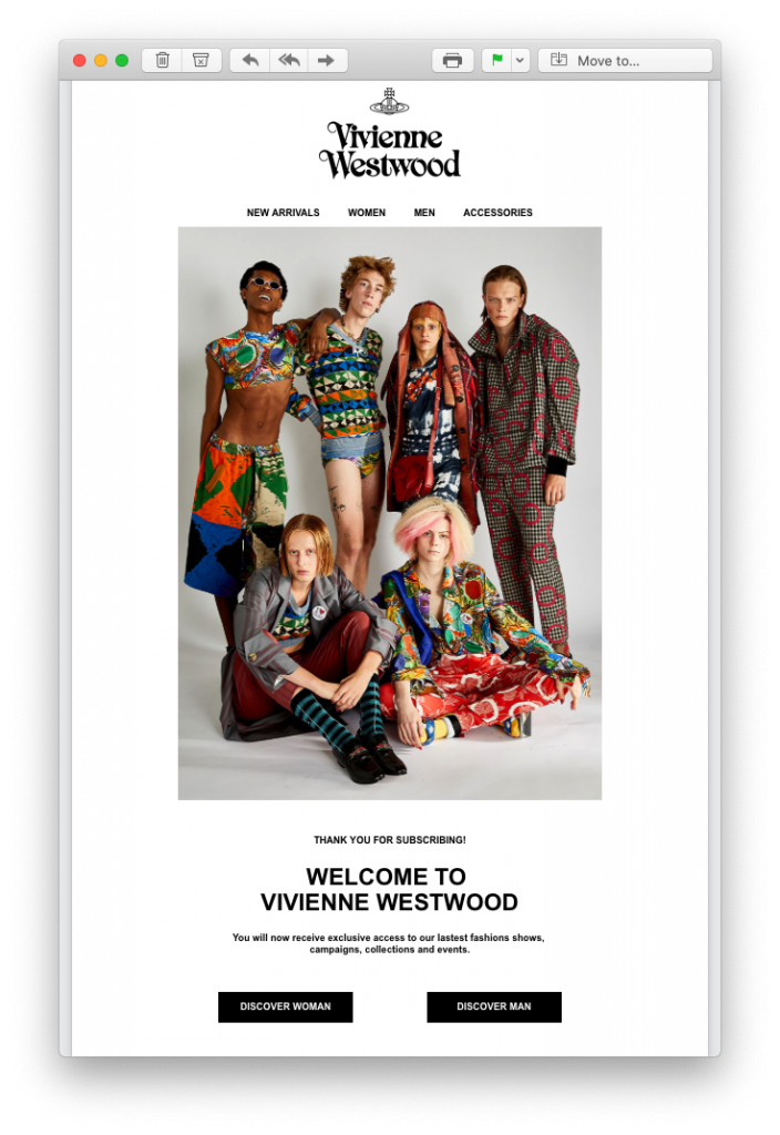
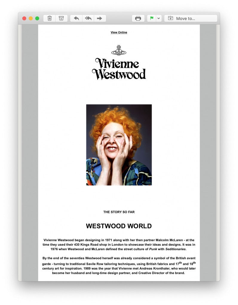
In these examples by Vivienne Westwood, new subscribers are sent two onboarding mails:

welcome email by Vivienne Westwood

welcome email by Vivienne Westwood

The first email is a standard welcome email with a direct pathway to their online store. However, in the second email, new customers instantly learn more about the iconic brand in a brief biography, helping them to quickly form a connection.

2. Abandoned Cart Email

Abandoned shopping carts is one of the biggest reasons for sales falling through. Oftentimes, this is caused by an interruption to the checkout process and not necessarily because the customer is no longer interested in your product.

Some common interruptions to the checkout process include:

  • Loss of internet connection
  • Entering an incorrect payment method
  • Phone battery dying
  • Receiving a phone call or message

To make sure you don't miss out on a sale for an avoidable reason, make sure to set up abandoned cart email reminders to draw those customers back in.

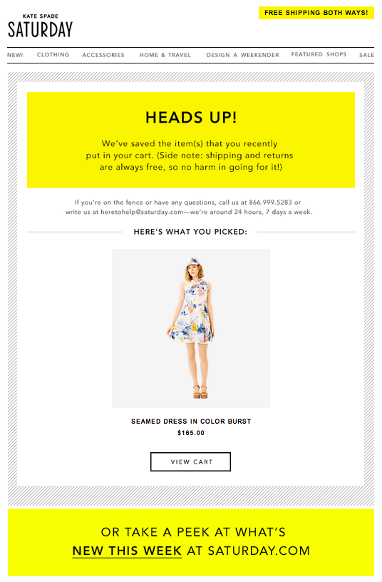
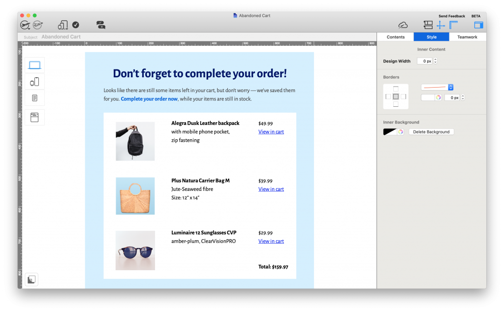
When creating these automated emails, remember to make the product placeholder nice and big so the customer instantly notices the product they originally wanted to purchase. Timing is also key, as sending the email too late could result in the customer losing interest.

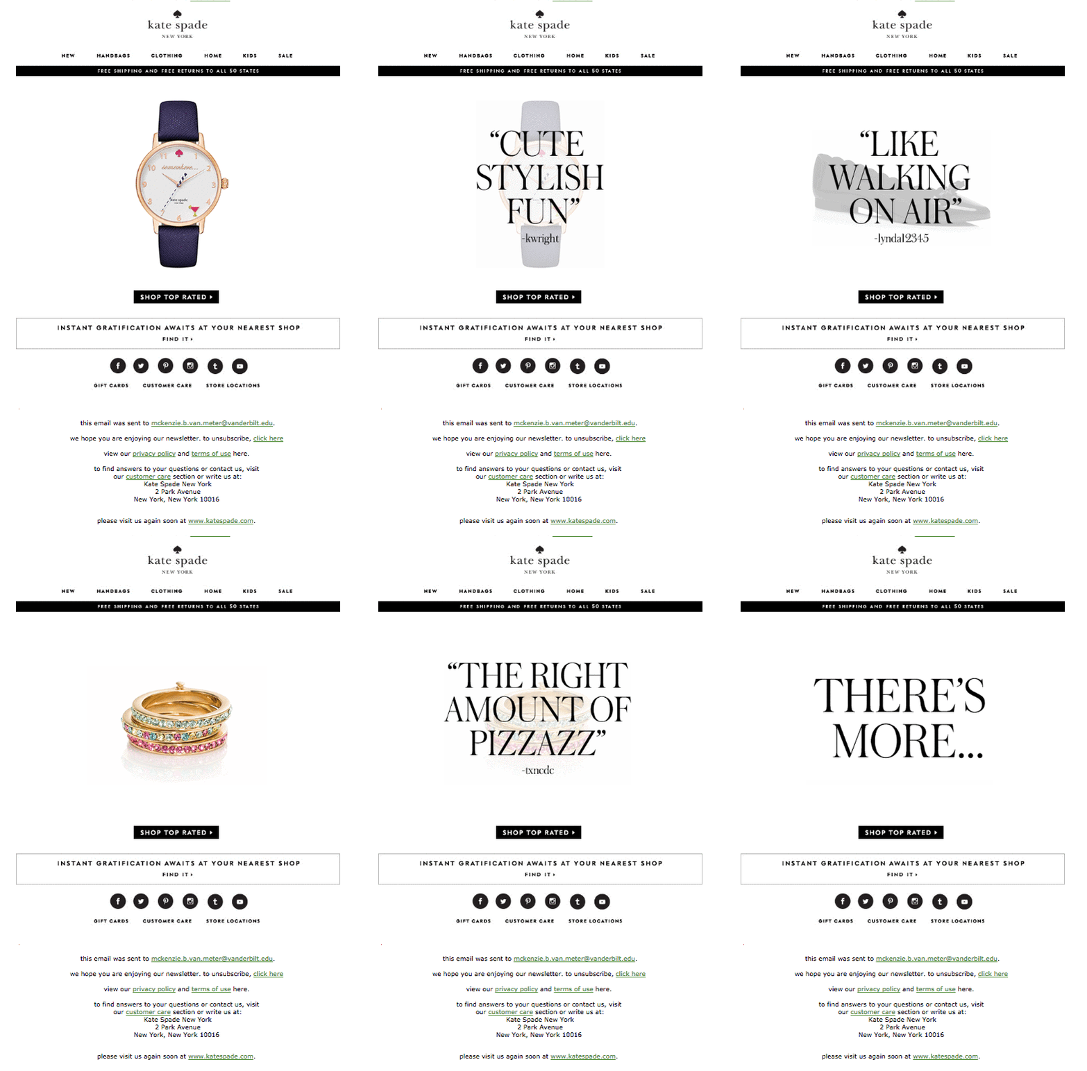
In this abandoned cart email by Kate Spade, the product takes center stage and draws the reader in straight away. In linking to their new in items, Kate Spade also offer the reader an alternative enticement onto their website:

abandoned cart email by Kate Spade

3. Shipping Information Email

Giving customers peace of mind after they place an order from your store is super important. As well as an order confirmation email - which is standard practice for any online business - providing detailed shipping information is also essential.

Knowing how long an order will take to arrive and being able to plan for the delivery both make things much easier for your customers. For this reason, it's a good idea to include a tracking link to your delivery service as well as an estimated delivery date.

As well as being a useful service for your customers, it will also help reduce the number of support enquires you receive about delivery times, freeing up your team's time for other tasks.

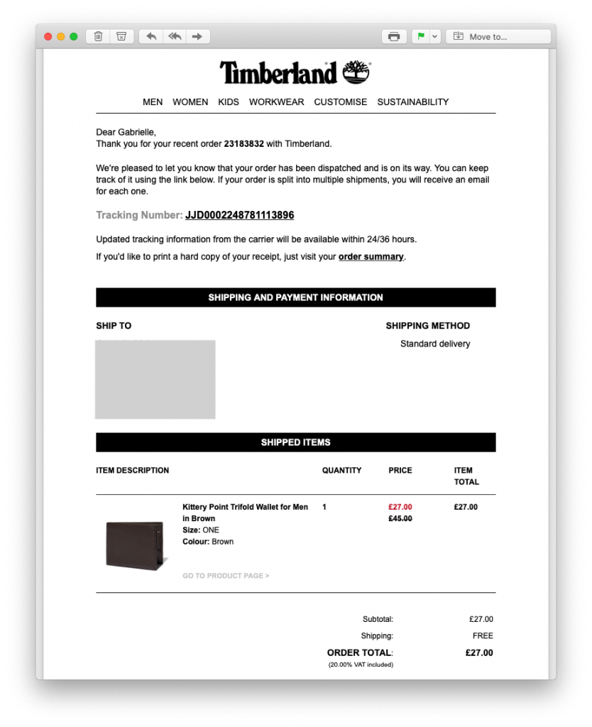
This tracking email by Timberland is a good example of best practice. In addition to including all the relevant information about the order, Timberland also include a prominent tracking link which the customer can use to follow the progress of their order.

Tracking email by Timberland

4. Feedback Email

Receiving reviews for your store and products is valuable for every business owner. Feedback emails are really easy to integrate into an email automation strategy and can be set up to send after any purchase from your store.

Browse through our top tips for putting together excellent feedback emails

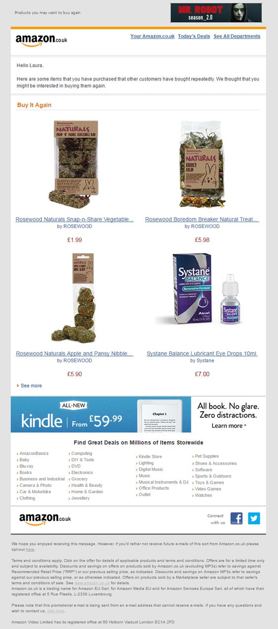
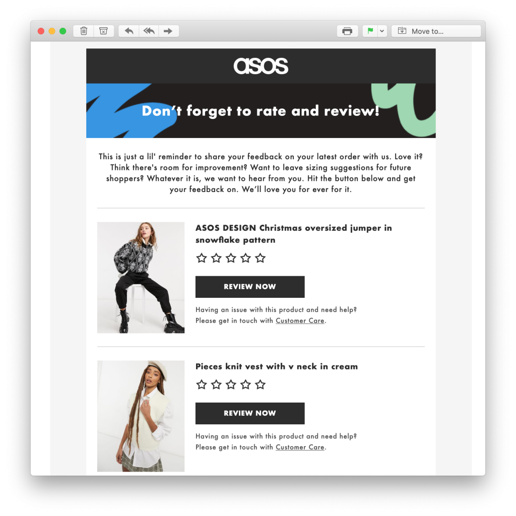
In this example, ASOS sent an interactive feedback email to make it easy for customers to rate items they have recently purchased. Not only does this help the brand learn more about what their customers like, it also helps other undecided shoppers to determine if the product is right for them.

feedback request email by ASOS5. Happy Birthday Email

Last but not least is the Happy Birthday Email. This is another really effective email to add to your automation strategy and only takes a moment to set up in your ESP.

Celebrating with your customers by giving them a discount or special offer for their birthday reminds strengthens the relationship and reminds them you appreciate them.

It's also really likely your shoppers will be in the mood to treat themselves to something special for their birthday - whether it's a new outfit for the big day or that one item they've had their eye on for a while - your birthday promotion could be the final push they need to make that final purchase.

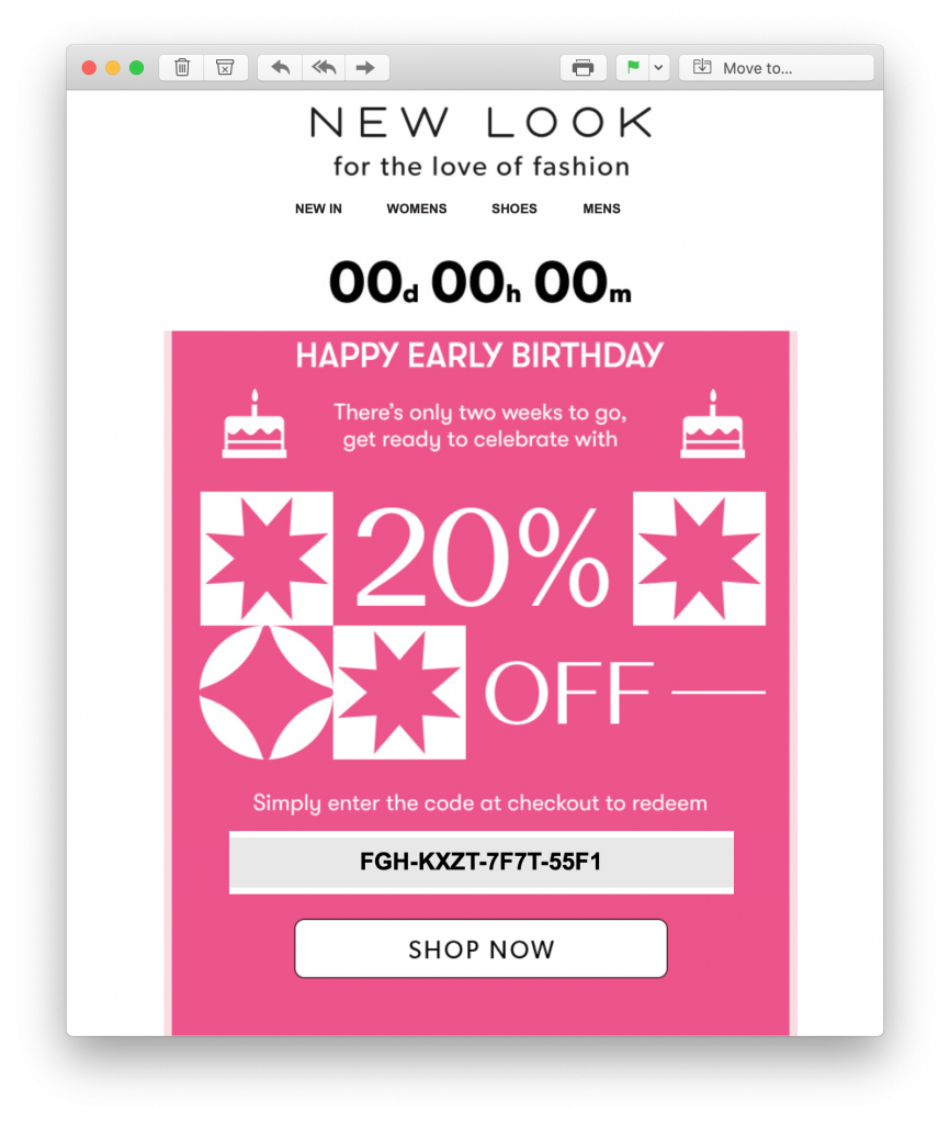
In this fabulous birthday email promotion, New Look give their shoppers more than enough time to scout out their birthday treat and get 20% off! The bold countdown at the top of the design also adds a sense of time pressure, encouraging the customer to buy sooner rather than later:

automated birthday email by new look

Setting Up Automated Emails for Your Online Clothing Shop

We hope you've been inspired by these automated email ideas. Setting up email templates for your automation strategy is easy in Mail Designer 365:

  1. Open Mail Designer 365 or download for free on your Mac
  2. Create a new email design with the responsive, drag and drop editor or choose from one of our automated email templates
  3. Export your finished design directly to Mailchimp, Campaign Monitor or another email automation tool of your choice. Find a list of all compatible services on this page
Abandoned cart automated email template created in Mail Designer 365

Abandoned Cart automated email template - exclusively available in Mail Designer 365

Use Mail Designer 365 to create a stylish range of email templates to use together with your email automation platform.

Until next time!

Your Mail Designer 365 Team

Get started with Mail Designer 365 today

Start your 7 day free trial and use your Mac to create stylish email newsletters for your business.

No credit card required
OS X 10.11 - macOS Big Sur

Enjoyed this post?

Get more inspirational tips, tricks, and best practice examples in the Mail Designer 365 Newsletter Academy -
your one stop hub for all things email marketing strategy and newsletter design.
5 emails you need to be sending in 2021

5 Marketing Emails You Need to be Sending in 2021

By Mail Designer 365 Newsletter Academy

The start of a new year offers you a clean slate and a chance to start looking at your email strategy. With email trends changing so quickly, the last year alone has presented tons of new ideas for emails which you can easily adopt into your own plan.

P.S. Have you got your hands on our 2021 Marketing Calendar and Email Campaign Planner yet? Get yours free here to ensure perfect email planning for 2021.

2021 marketing calendar and campaign planner

In this post, we're showcasing 5 must-have marketing emails  for 2021, plus tips on how to recreate them for your own business.

5 Marketing Emails You Need to be Sending in 2021

Freshen up your email strategy right in time for the New Year! Here are 5 inspiring ideas for marketing emails you need to be sending in 2021. Discover examples ranging from automated mailings to standalone campaigns...

1. Abandoned Browse Emails

We all know of the abandoned cart email, but the abandoned browse email takes things one step further. With online shopping becoming a significant part of consumers' everyday lives, your automated sales workflow needs to be taken up a notch.

This abandoned browse email by Vivienne Westwood packs a punch and catches the reader's attention by reminding them about products they've recently viewed. Adding a "you may also like" section gives the customer even more relevant purchase options and can help tempt them back to your online store for another look:

Abandoned browse automated email by Vivienne Westwood

Abandoned browse emails go the extra mile for boosting online sales.

What to consider:

  • Timing: Don't wait too long to send these emails, as you risk the customer losing interest or finding an alternative elsewhere.
  • Design: A bold CTA (call-to-action) leading to the product page plus eye-catching product images really are all you need.
  • Subject line: Mention the product in the subject line or use an emoji to quickly pique interest.
Abandoned browse email in Mail Designer 365

You can easily adapt Mail Designer 365's "Abandoned Cart" email template for an abandoned browse message.

Get this template here.

2. Milestone Emails

Whether it's an anniversary, a significant event, or you've reached a key goal  - sending milestone emails is a great way to celebrate achievements and special occasions with your customers.

Your subscribers opted into your email list because they have a genuine interest in your business. Keeping your subscribers up to date on exciting business milestones gives them a look behind the scenes and makes your brand seem more relatable.

In this email by Casper, the brand celebrate their 2nd birthday milestone with subscribers. As well as a fun design, the email is also great as customers are offered an exclusive $22 discount in celebration of their business anniversary:

Anniversary email by Casper

Casper use email to celebrate a key milestone by offering customers an exclusive discount.

Here are some more examples of milestones you could celebrate in 2021:

  • Donation milestones - $X raised for your charity
  • Product milestones - X years of your product
  • Customer milestones - X customers served / signed up to your service

All of these milestones could be used as an exciting email promotion, or a simple thank you email to customers.

3. Feedback Emails

Obtaining true, honest customer feedback is majorly important for businesses of all shapes and sizes. Knowing what makes your customers tick, and understanding their habits and preferences allows you to optimise your strategy for them.

Putting together an email survey that readers will respond to is a fine art and takes a lot of trial and error. However, when the valuable feedback starts rolling in, the hard work will certainly pay off.

In this feedback email by Campaign Monitor, customers are given a massive incentive to take part, in the form of a $20 gift card. They are also super transparent in advising how long the survey will take, and make sure to thank their customers in advance:

Feedback email by Campaign Monitor

This feedback email by Campaign Monitor is super inviting.

Other incentives for taking part could include:

  • Holding a giveaway
  • A discount code for their next purchase
  • A free gift
Customer survey email template in Mail Designer 365

This personalised template gets straight to the point and offers readers an incentive to take part in the survey - exclusively available in Mail Designer 365

Get this template here.

4. Digest Emails

Content marketing is on the rise and more and more businesses are using email to showcase their latest content.

Whether it's a run down of your recent Instagram posts, a selection of relevant blogs, useful infographics or guides - sharing great content with your subscribers is an effective way to drive engagement and increase website traffic.

Wedding website service The Knot regularly share relevant blog content with their customers via email. The emails always come with an intriguing subject line and carefully curated content which is guaranteed to speak to the recipient and get them clicking through to their website:

Content marketing newsletter by The Knot

Using email to share relevant blog posts with subscribers can help drive website traffic.

What to consider:

  • Structure: Include a mix of images, article headlines and teaser text to make your posts more appealing - Mail Designer 365 has an array of practical layout options for this.
  • Call to action: Entice subscribers to continue reading your post, watch your video, download your eBook, etc. with a bold CTA button.

5. Online Event Invitation Emails

2020 was undeniably the year that online events really took off; with businesses becoming more and more open to digital events, including webinars, online live classes, virtual conferences and trade fairs, and "Zoom parties".

If your business is looking to branch into the world of online events in 2021, you need to incorporate this into your marketing strategy. Sending online event invitation emails is a smart and efficient way to make subscribers aware of what you have coming up. It also provides them with a useful reference of all the key details.

In this email invitation by Litmus, recipients are shown the basics which will be covered in the webinar and the date and time it's scheduled to take place. A vibrant feature image showing the special guests is another way to quickly draw in potential participants:

Webinar invitation by Litmus

Litmus tick all the right boxes with this informative and stylish webinar invitation email.

What to consider:

  • Email copy: Keep this short and sweet. Discuss the main details of the event and what participants should expect.
  • Call-to-action: Use a bold, central CTA button to give readers an easy way to sign up for your event.
  • Branding: The event is all about you and your business. Include typical brand assets like your logo and signature typeface.
Mail Designer 365 template for online events

This email template offers a stylish layout to list the key details and selling points of your online event - exclusively available in Mail Designer 365

Get this template here.

Give your email strategy an upgrade for 2021

We hope these emails have given you some inspiration for your 2021 planning. Don't forget to secure your free marketing calendar and campaign planner for 2021!

Mail Designer 365 has all the creative tools you need to build amazing HTML emails on your Mac. For a full overview of all ready-to-send HTML email templates, check out our online gallery!

Don't have a Mail Designer 365 plan yet? Try it today for free!

Until next time,

Your Mail Designer 365 Team

Get started with Mail Designer 365 today

Start your 7 day free trial and use your Mac to create stylish email newsletters for your business.

No credit card required
OS X 10.11 - macOS Big Sur

Enjoyed this post?

Get more inspirational tips, tricks, and best practice examples in the Mail Designer 365 Newsletter Academy -
your one stop hub for all things email marketing strategy and newsletter design.
Privacy Settings / Datenschutz-Einstellungen