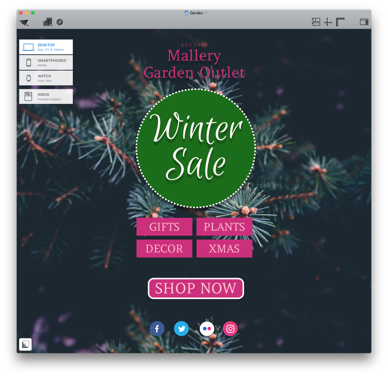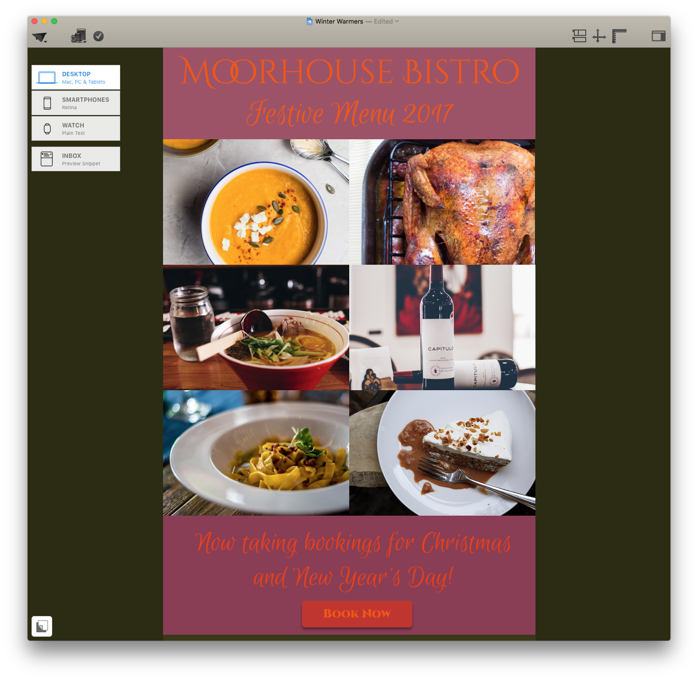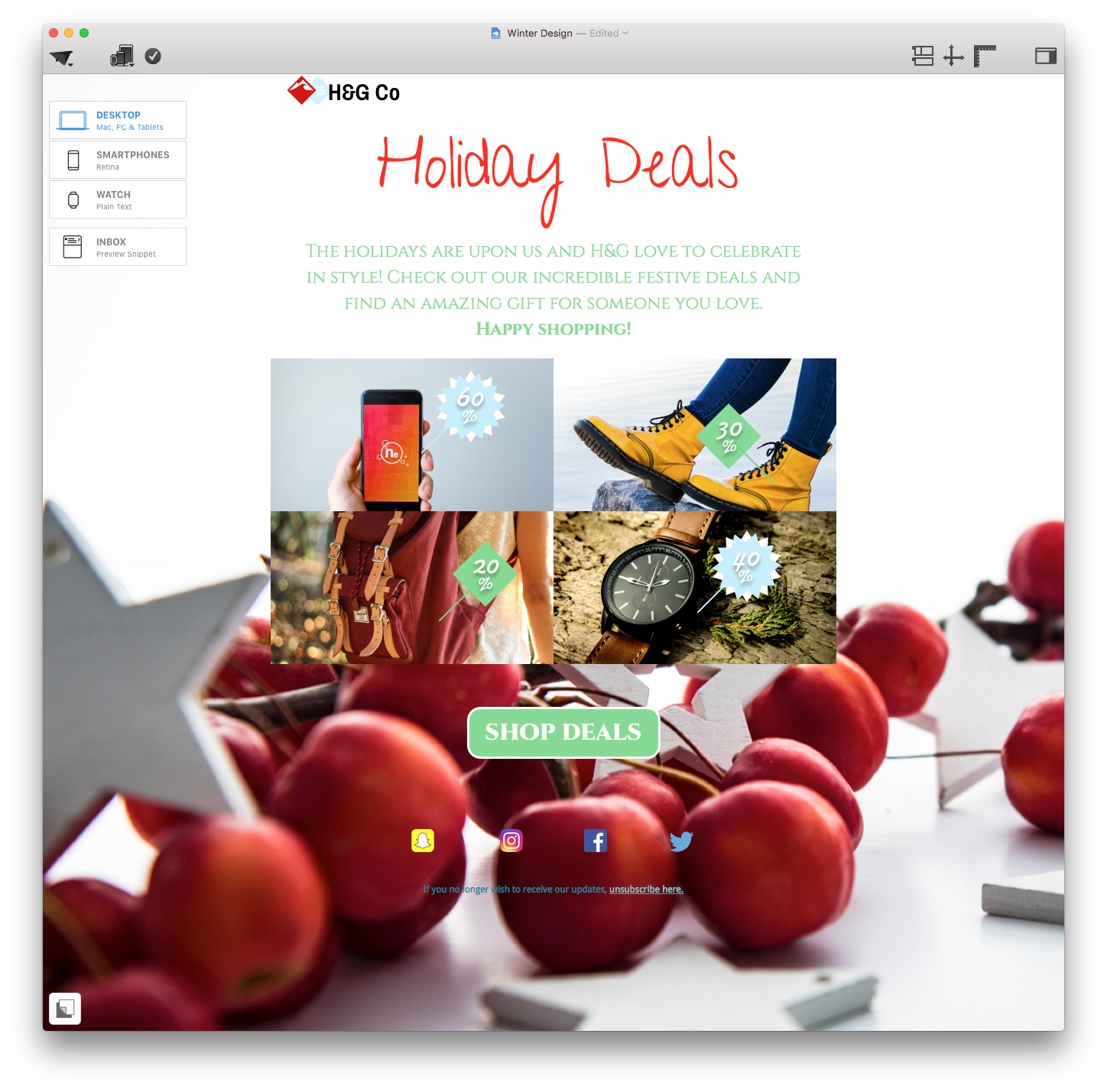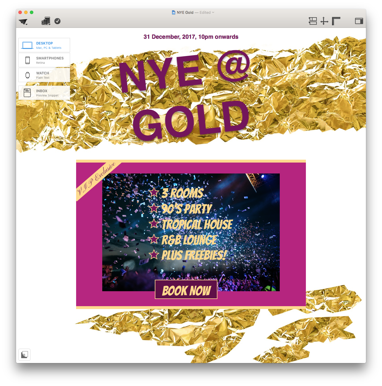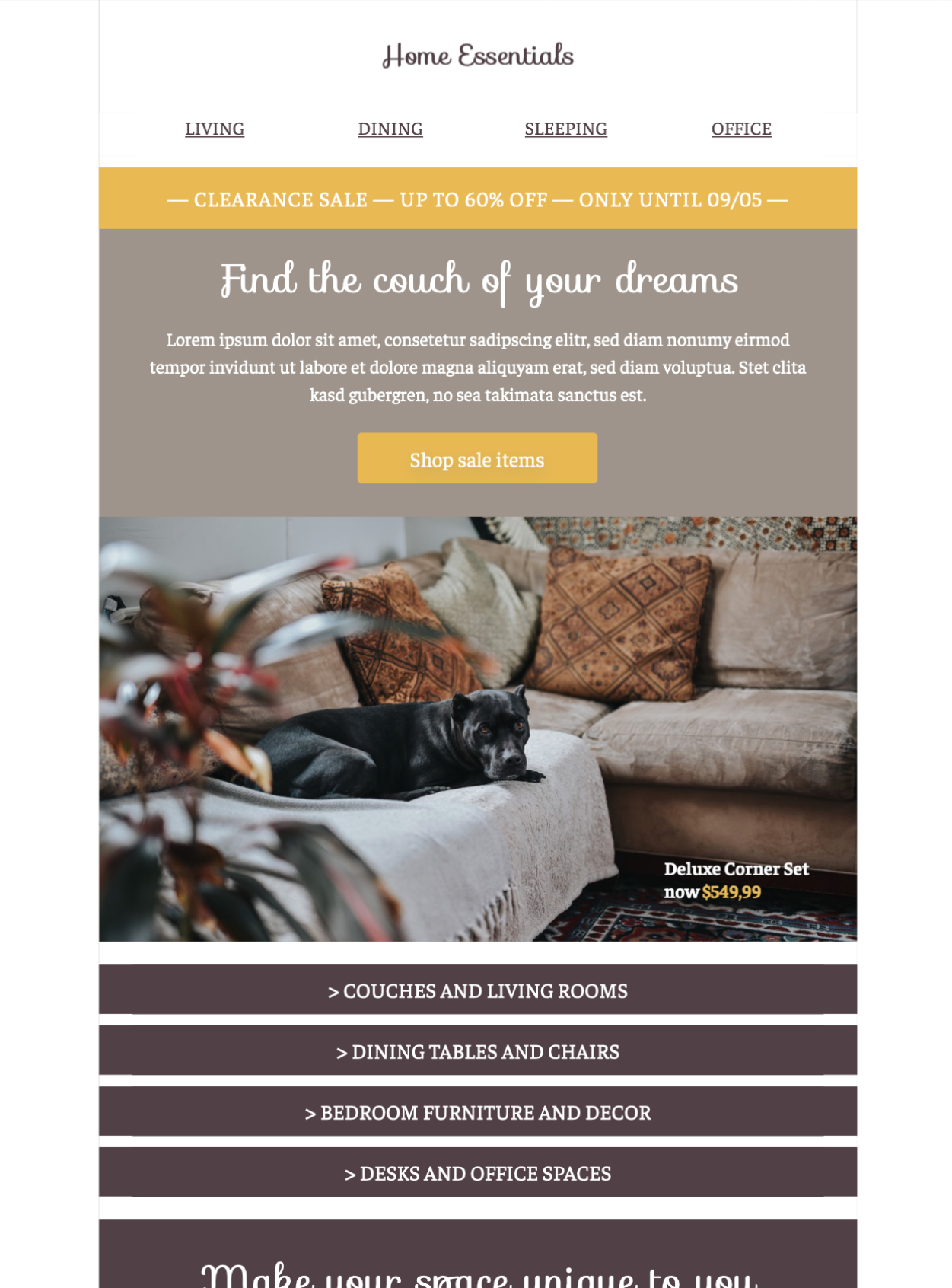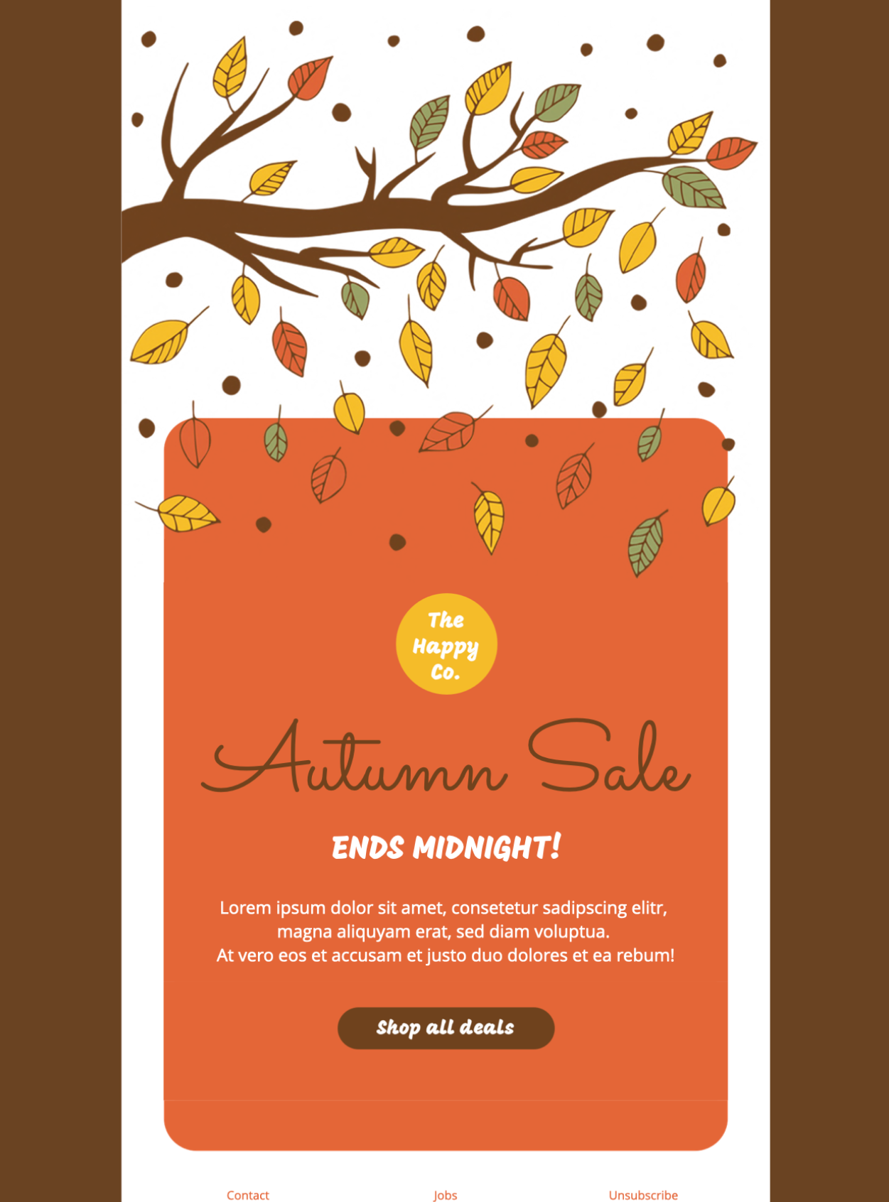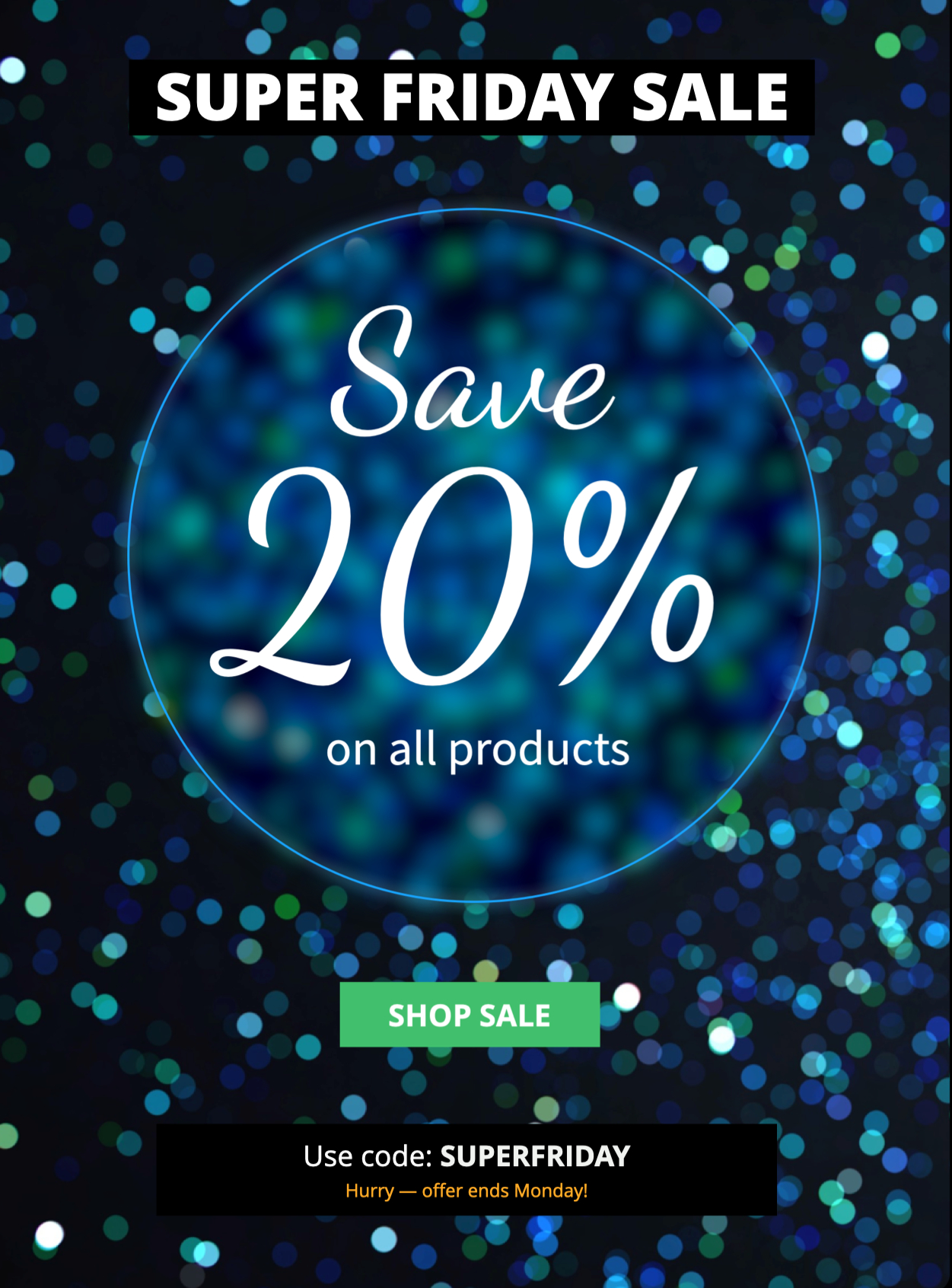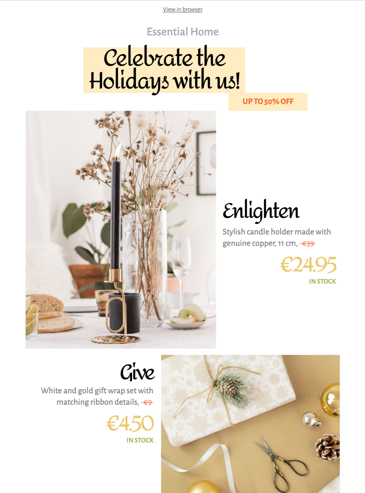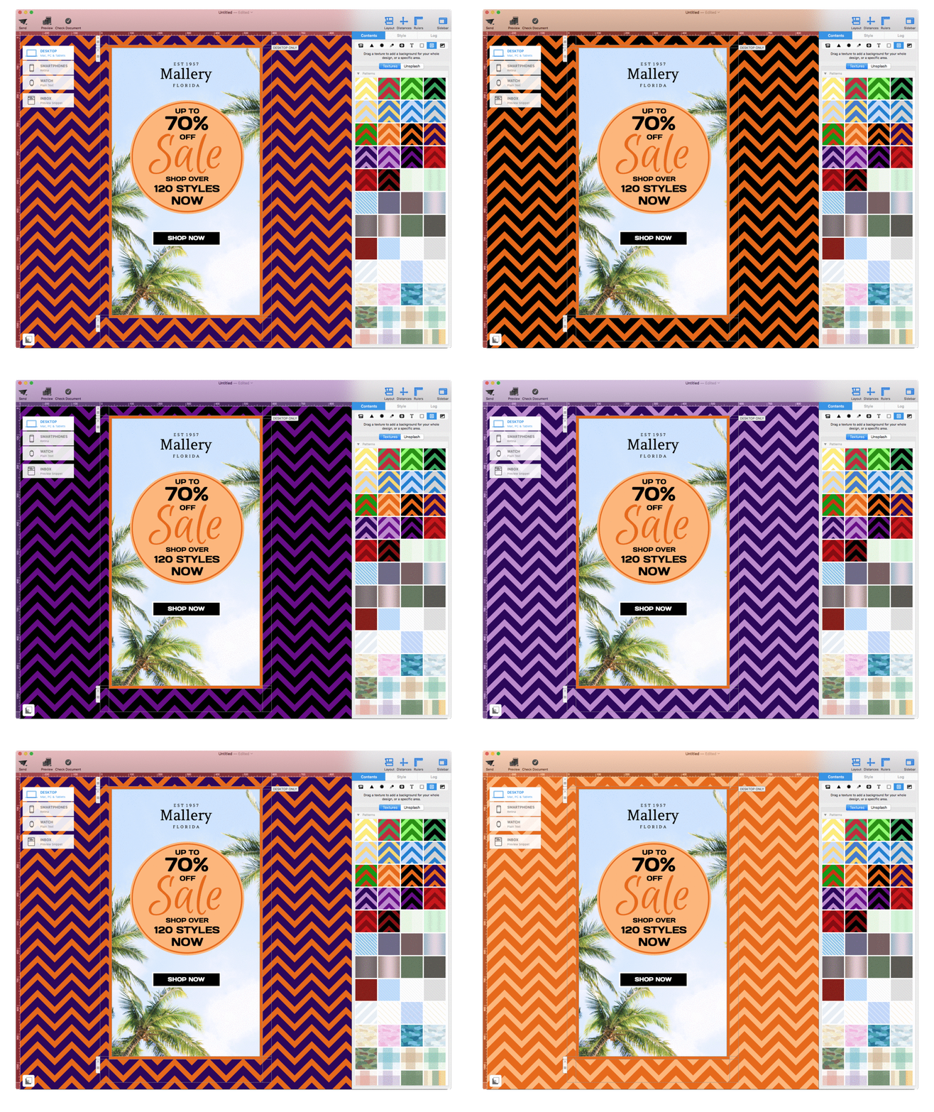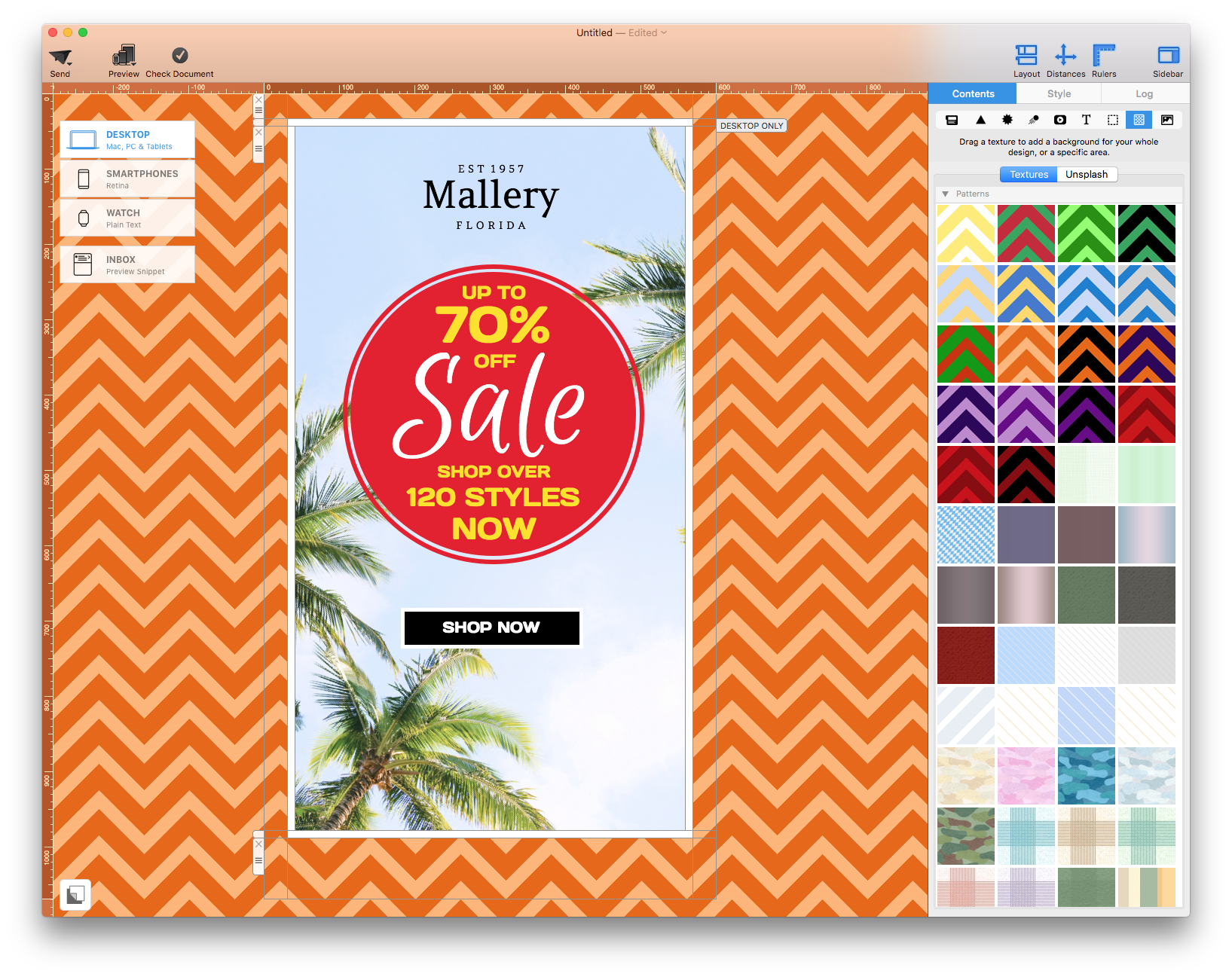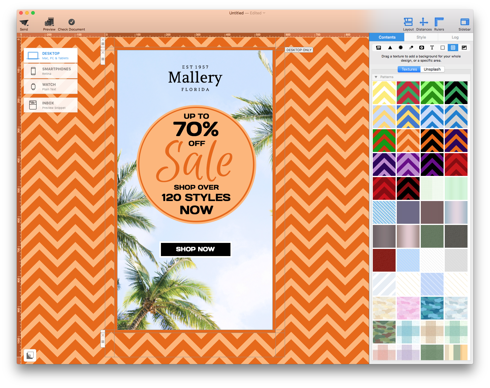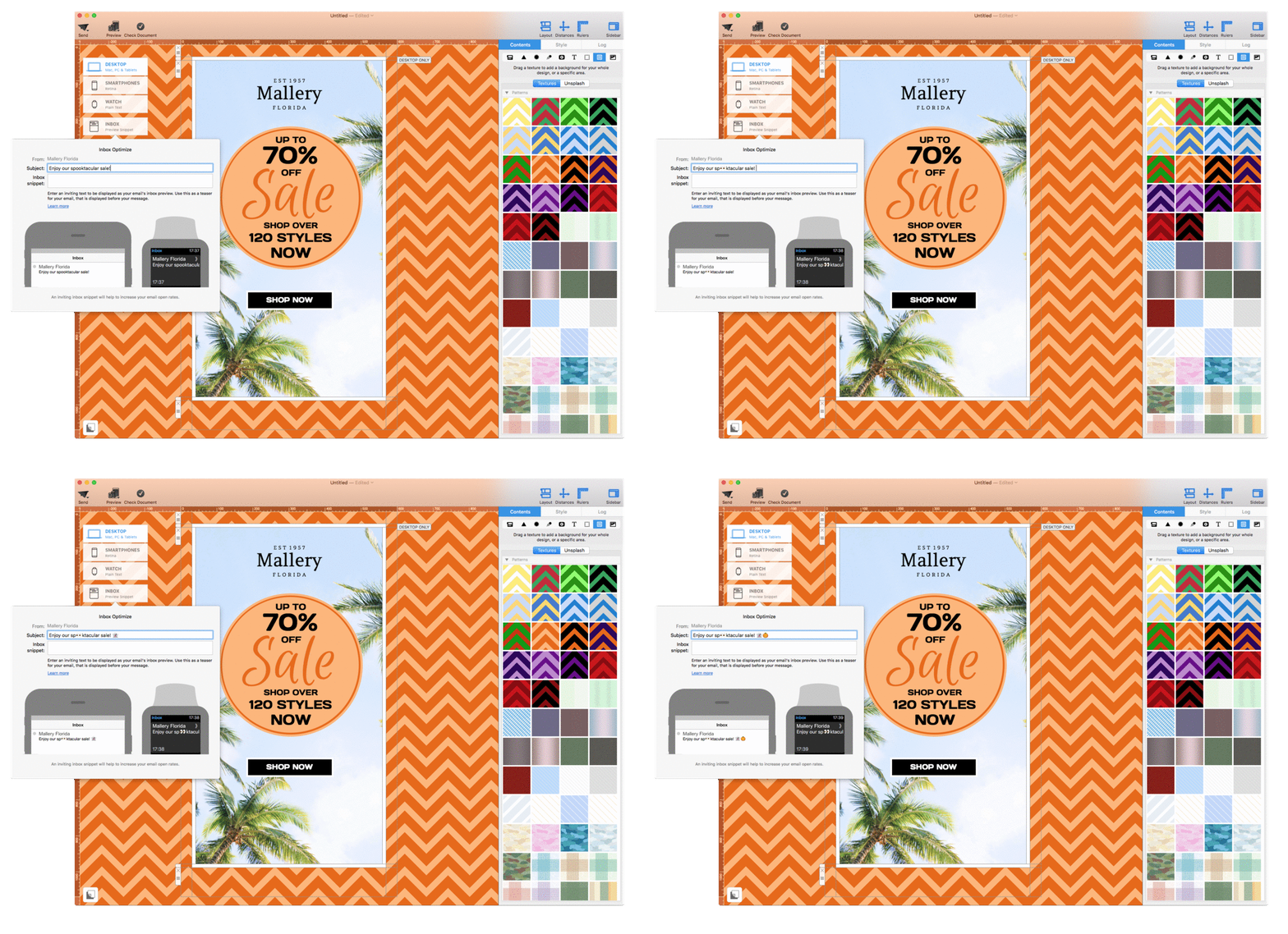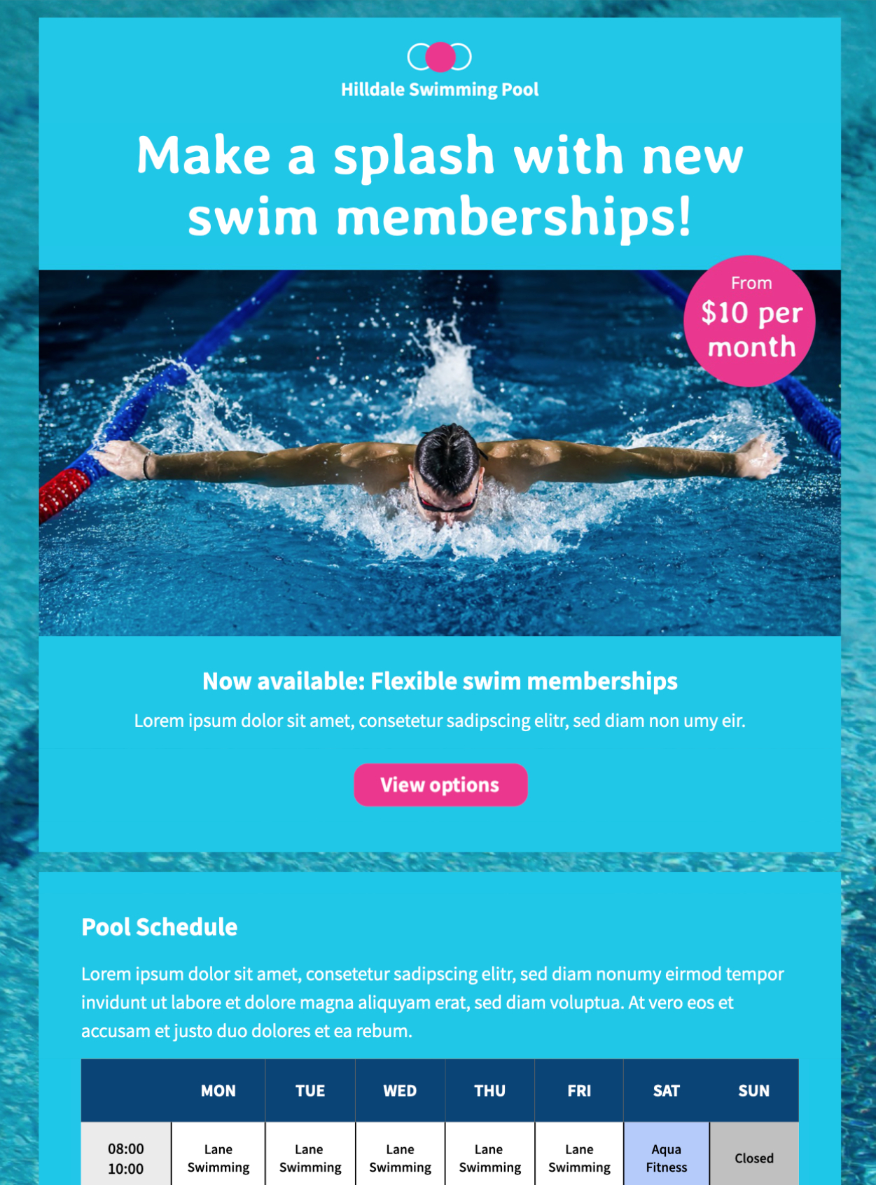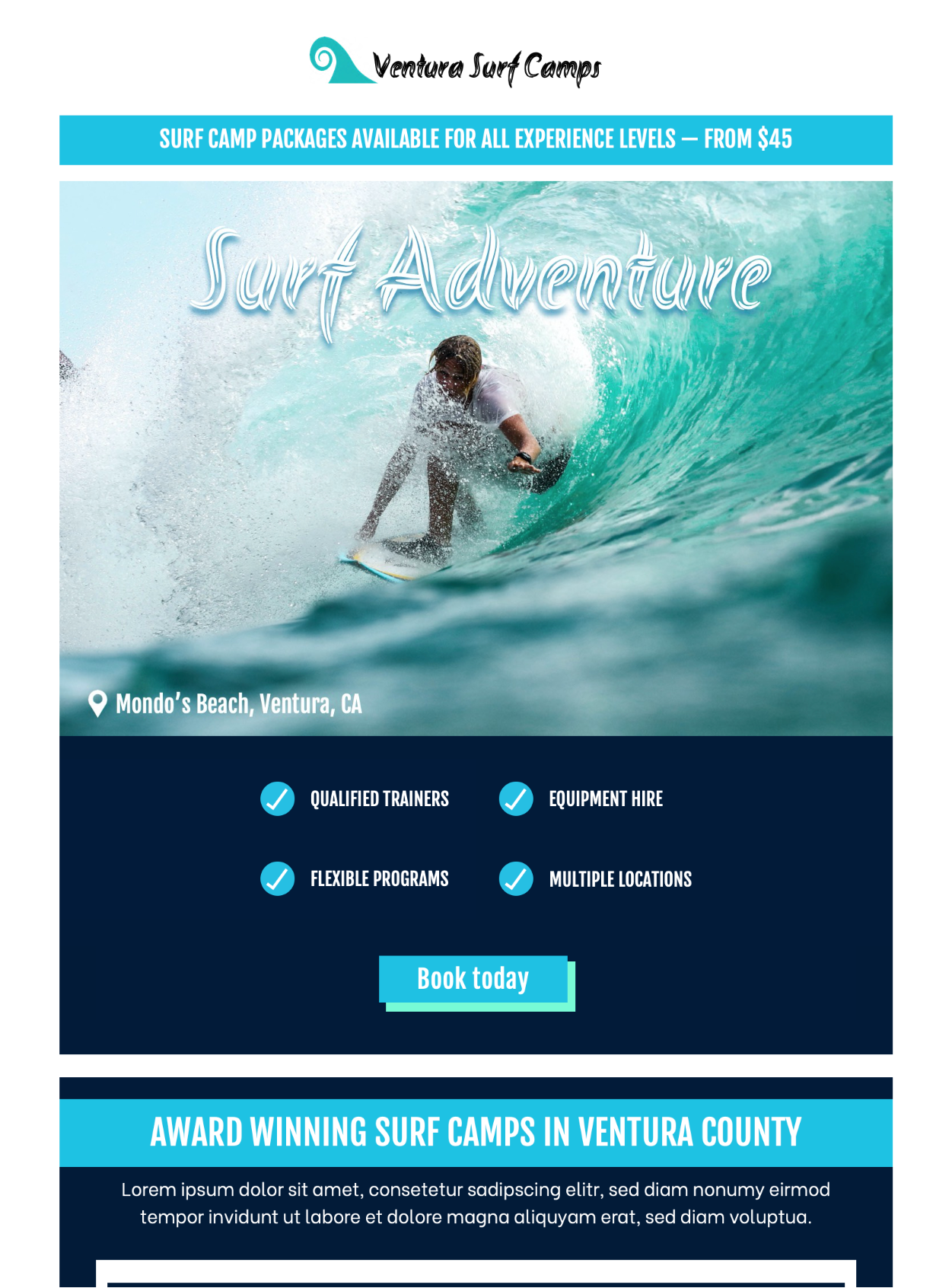
It's that time of the year again - time to paint the town green! The national holiday of the Irish is celebrated worldwide and presents a great opportunity for marketers.
Here's everything you should consider when creating your St Patrick's Day email campaigns, plus some awesome examples...
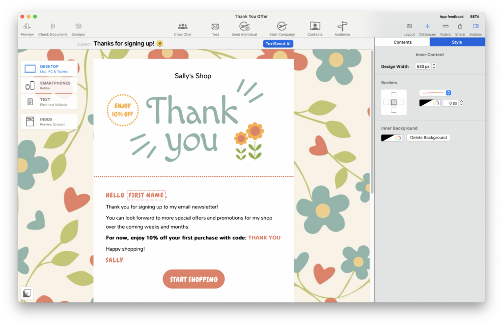
HTML Email Template for St Patrick's Day
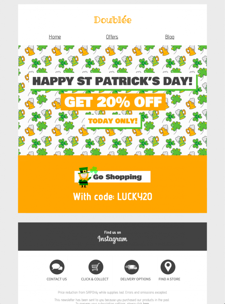
Exclusively available in Mail Designer 365! Promote a special St Patrick’s Day event or create an exciting campaign with this bold template.
Tips for your St Patrick's Day Email Campaign
Go green!
Traditionally, the color green has been associated with Ireland for centuries. Because of this, it makes perfect sense to incorporate as much green as you can into your email design to make the theme clear from the get go.
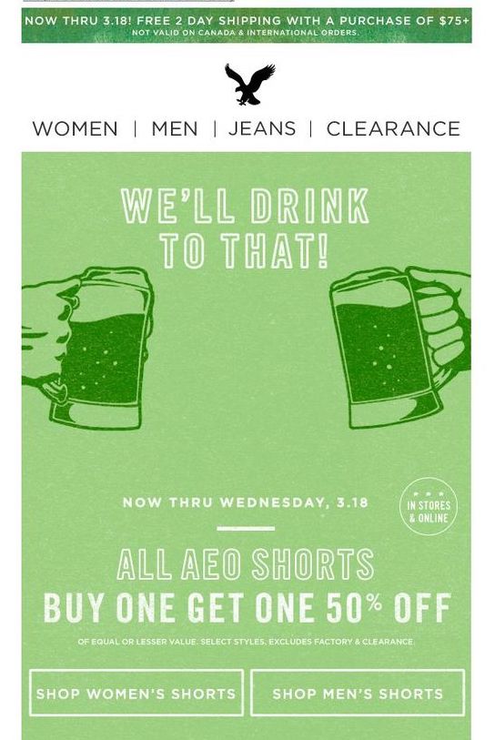
American Eagle Outfitters go greener than ever in this bold email design.
Use themed emojis
Emojis have been proven to improve email open rates, and what's even better is that readers will instantly associate your email with St Patrick's Day. Here are some of our favorite choices for the theme...
Did you know? A common misconception is that the four-leaved clover is the symbol for Ireland. This is false! Although strongly associated with luck and good fortune, the four-leaved clover is not the true symbol of Ireland.
If you want to keep to tradition, use the shamrock ☘ - this is the symbol of Saint Patrick and has been synonymous with Ireland for centuries.
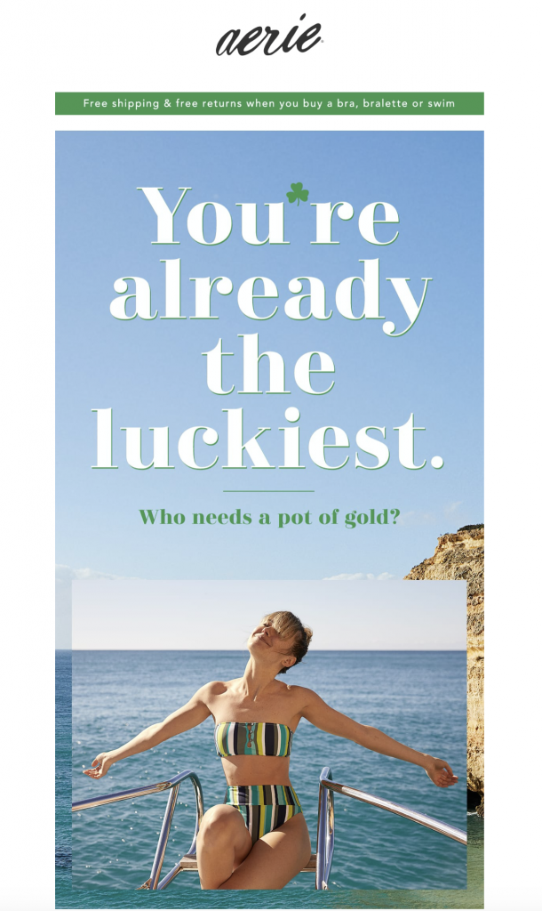
Aerie stay true to tradition by including the shamrock in this email design.
Run a St Patrick's Day competition
Ever heard the phrase "the luck of the Irish"? It exists for a reason! Good fortune and St Patrick's Day go hand in hand, as luck has always been associated with the Irish. (If you're interested, check out this fascinating story.)
Take advantage of this and start a competition or a giveaway. This is a great way to get your customers involved and hopefully boost exposure for your business too!
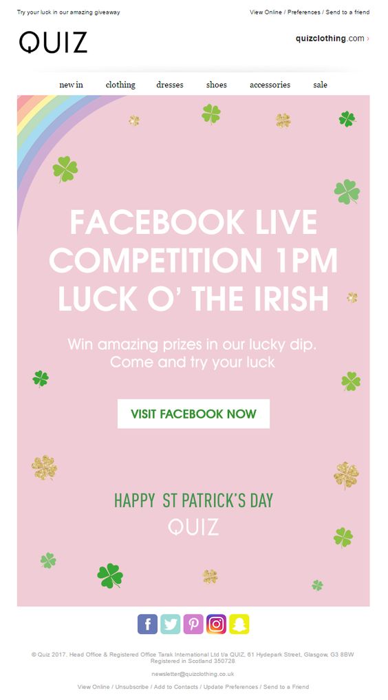
Quiz used this email to promote their St Patrick's Day Facebook competition.
Hold an event
St Patrick's night is usually the perfect opportunity to throw a party. Whether you're Irish or not, people love to celebrate and have a good time.
Even if you can't hold a physical event, you can still use the party theme to your advantage. Nourish Snacks were super clever in marketing their healthy snack range as a tasty at-home hangover cure.
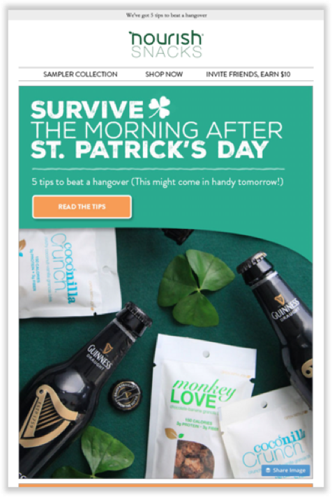
Thinking of creative ways to tie your business with St Patrick's Day is a good way to stay relevant.
More fun ideas include holding a virtual St Paddy's night, or providing your customers with all they need to throw a fun and safe party at home.
How to Send a St Patrick's Day Email Campaign
- Use our dedicated template or build your own St Patrick's Day email template using the creative tools in the Mail Designer 365 App for Mac
- Upload to Mail Designer 365 Approval to get feedback and ideas from your colleagues
- Export your template to send to your email subscribers via your email service provider
Get started with Mail Designer 365 today
Enjoyed this post?
Get more inspirational tips, tricks, and best practice examples in the Mail Designer 365 Newsletter Academy -
your one stop hub for all things email marketing strategy and newsletter design.

