The phrase “thank you” is powerful in commerce. Whether you are selling a service or a product, showing your appreciation with a thank you email can help foster long-lasting relationships with potential leads and customers.
Why should I send a thank you email?
Saying “Thank you” acknowledges that your subscribers are not just a statistic or an unknown face to you. It also shows that you actually care about the customer and that you value the relationship you have with them.

Here are some unique ways to use email to say thank you to your customers and encourage them to keep coming back.
Before you get started:
Cheatsheet for Thank You Emails
Before you get started, download this free PDF cheatsheet to use while creating and sending thank you emails.
Guide includes:
- Best practice: Writing a thank you email
- Checklist: What to include in your thank you emails
- Thank you email template
Please check and try again.
8 opportunities to send thank you emails to subscribers or potential leads:
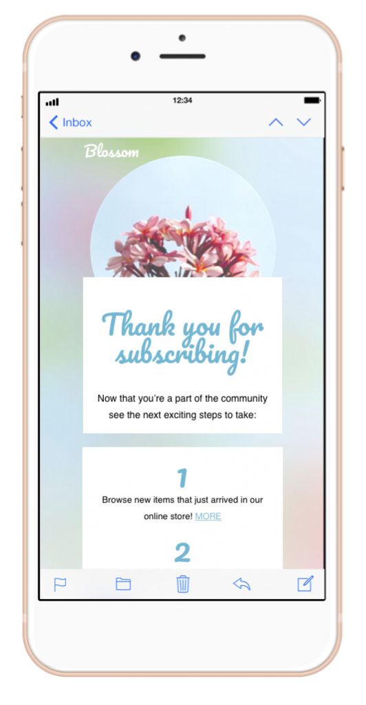
1. Thanks for signing up
Kick off by thanking your subscribers for signing up for your email newsletters. Saying thank you is a great way to start off a positive relationship with your newly added subscribers and welcome them to your brand's family. It shows that you appreciate their interest and are happy that they want to stay up-to-date with your brand.
It is also a great way to let your subscriber know that you received their request to subscribe to your newsletters. Take this email to the next level by adding a call-to-action button linking to your website or store, paving the way to drive your potential leads further along the sales cycle.
2. Thanks for your purchase
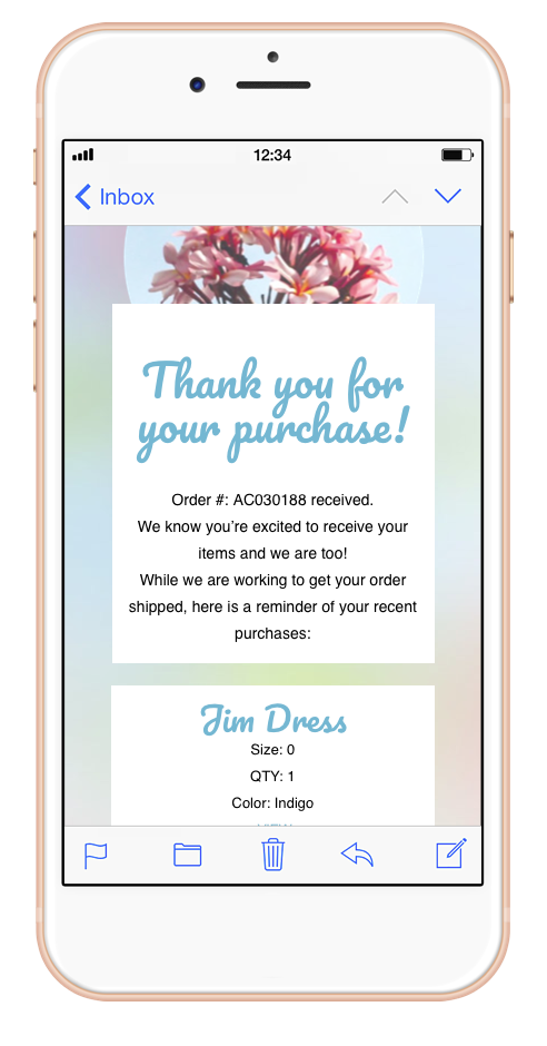
Whenever a customer buys something, you should send them a thank you email for shopping with you. Thank you after purchase emails are a great way to let your customers know that you have received their order and that you want to thank them for doing business with you.
By showing your appreciation, you acknowledge that both your customer and your customer’s business are important to you. Also, take this time to remind them of what they have purchased by including a list of their purchased items or services. In doing so, you are providing great quality customer service even after the point of purchase.
3. Thanks for being part of the community
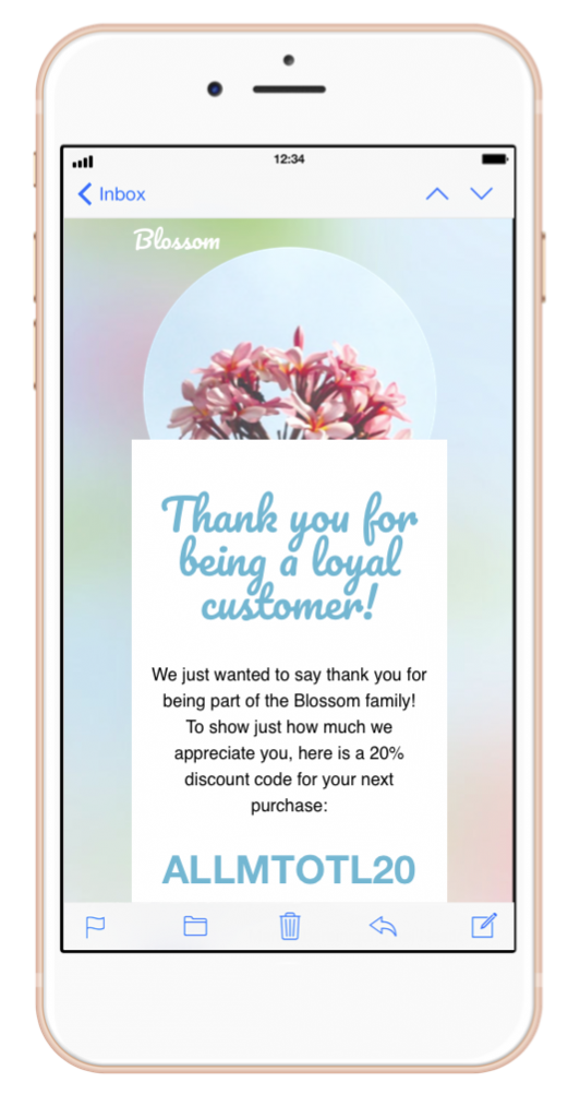
Loyal customers are essential to any business. It is more likely that a repeat customer will purchase something from you than a new customer AND it is more likely that a repeat customer will spend more money at your store than a new customer.
Ignoring the importance of customer retention may be detrimental to your business. To help ensure that you keep fostering a long-lasting relationship with your subscribers, make sure to occasionally send them a thank you email for their loyalty to your brand. Also, you can give them a discount code to show that you recognize that they have been a loyal customer and that your business is lucky to have them. These random moments of thanks will not go unnoticed.
4. Thanks for your recent visit
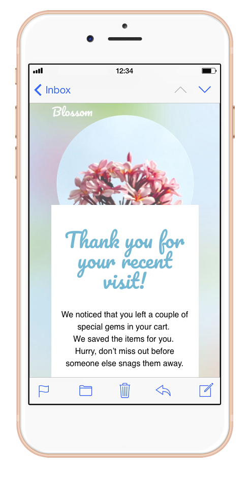
Sometimes customers do not complete the sales process and end up abandoning the items in their cart. You can send an email to remind them that they left a couple of items in the basket or cart. However, instead of only reminding them that they left something in the cart, add a little thank you note in the email and thank them for visiting your site.
Tip: Email is a powerful tool at re-engaging abandoned carts, so why not take it up a notch by showing your gratitude at their interest. You can even feature other links to products that you think they may be interested in based on the items that the customer left in the cart.
Free Download:
Cheatsheet for Thank You Emails
Please check and try again.
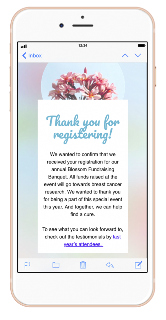
5. Thanks for registering for an event
With any event, we encourage having some type of signup form online. Do not forget to send a thank you when someone registers for the event. In the thank you email, show them what they can look forward to. Include social proof of past events you hosted and try to add pictures and testimonials from former attendees.
Don’t forget to include a call-to-action button that asks the people who registered to also sign up for your official mailing list!
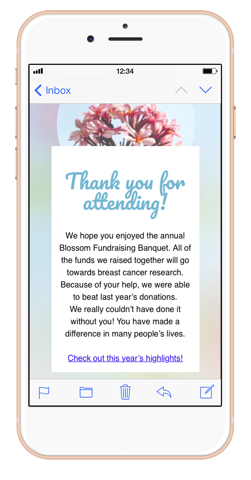
6. Thanks for attending
If you ended up hosting an event, do not forget to send a thank you to all the attendees. Your thank you email can show your appreciation as well as be used as a way to increase customer loyalty.
Thank you emails can also help increase the chances of hosting another successful event as they can raise awareness of your brand and of your event. We suggest to also include snippets of the events, whether they are photos or direct quotations from the attendees.
You can also include a call-to-action button that asks them to sign up for your regular newsletters to stay up-to-date, or to visit your main page, or to visit your store. This is a subtle way to continue the conversation with the attendees as well as potentially increase customer acquisition.
7. Thanks for your review
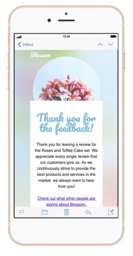
Whether a person leaves a positive or negative review on your website or store, make sure to send a thank you email to them. Acknowledge that the individual made an effort and took some time out of his or her day to write a review.
Regardless if you receive a positive or negative rating, you can use the feedback to improve your products and/or services. Also, this is great way to keep harnessing social proof. People are more likely to buy an item that has some sort of rating or feedback from other customers than an item with no rating and no feedback.
When you send a thank you email to a customer for reviewing your products/services, you help create an environment where you encourage feedback from your customers. This shows that your customers' needs and opinions are actually important to you.
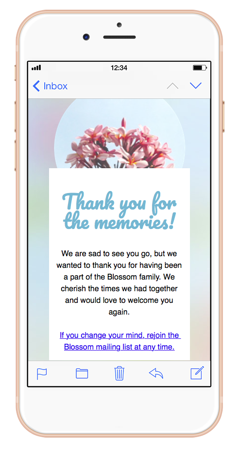
8. Thanks even when you have to say goodbye
In case someone decides to unsubscribe from your mailing list, a simple thank you email may change their mind. Thank them for having been a part of your subscriber family and let them know that you appreciate the business you had with them.
Tip: Before they depart, you can also add a call-to-action button or link that allows them re-subscribe in case they change their minds. This way, you are creating an easy way for them to opt-in once again.
Key takeaways:
We hope you have found these ideas for thank you emails inspiring and will consider integrating them into your own email strategy. To recap, here are some key points to remember:
- Thank you emails help foster long-lasting relationships with customers
- Customer retention is vital to any business
- There are plenty of different opportunities to send thank you emails to your subscribers
Enjoyed this post?
Get more inspirational tips, tricks, and best practice examples in the Mail Designer 365 Newsletter Academy -
your one stop hub for all things email marketing strategy and newsletter design.


