Category

Mail Designer 365 Newsletter Academy

Keep Customers in the Loop: How to Craft an Engaging Email Newsletter

By Mail Designer 365 Newsletter Academy

We're all familiar with the typical email marketer's arsenal; you have the standard set of transactional emails, as well as the odd sales or promotional email, but there's one more thing which often goes overlooked - the email newsletter.

Although widely accepted as a key part of email marketing, the email newsletter is not something which is utilised by every business. This is a mistake! An engaging email newsletter is the perfect way to keep your customers up to date and informed about what is going on in your business. Unlike a generic sales or transactional email, the newsletter gives you the opportunity to combine multiple marketing elements into one email and, at the same time, provide your customers with interesting content about your field of business. Here are our top tips for crafting engaging email newsletters.

The eye-catcher

To kick off your newsletter, it's a good idea to include an eye-catching graphic or header image to set the tone of the email, and, most importantly, grab your reader's attention. This could be an image, text style, or a GIF, but the main thing to think about is whether it is fitting to your email message and on brand for your business. Don't forget to prominently position your logo at the top of the email design so that your readers know straight away the email is from you. In this Valentine's Day themed email from Philosophy, the brand's logo takes center stage at the top of the page, followed by a dazzling pink graphic which conveys the theme of the email straight away.

The colors in this vibrant design are great at generating attention

Introduce the theme

In an email newsletter, it can be beneficial to include a short and friendly introduction to give readers overview of the theme of your newsletter. This should get them on board from the get go. Make your introduction snappy, engaging and, most of all, interesting enough that customers will want to read more. In this example from Boots, the reader receives a nice welcome to the newsletter, giving  them a quick overview about the theme of the email and enticing them to read on for more information.

Include a welcome message like this one from Boots to introduce your theme

Layout

The layout of your newsletter is important, as it determines whether or not your reader will be able to clearly follow the information you have provided. Too much text is long and boring, and too many images make the email difficult to load and may cause viewing problems in some email clients. Try to include a healthy balance of text and images in your email layouts. We would always recommend including at least one main text block so recipients who have disabled images in their email client can still see the main message of your email.

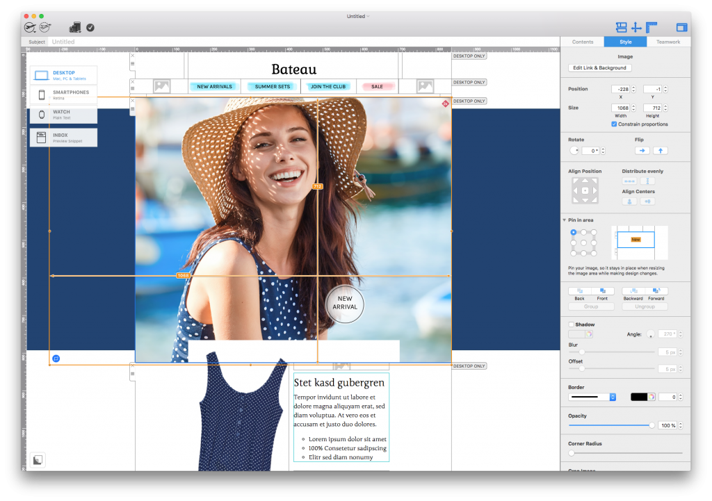
Try out the combi layout blocks in Mail Designer 365 to create a clear and stylish design.

Great content

Of course, the most important aspect of your email newsletter is the content you include. If this content does not interest your readers, they will be less likely to open your emails, and could even choose to unsubscribe. There are three key things you can work on to make sure your content is engaging for your email newsletter:

1. Relevance: Is this content relevant to my field of business and to my target audience? Your customers have most likely chosen to subscribe to your newsletter as they have an interest in the industry you are in and want to hear more about it. It is good practice to consider how relevant your newsletter content really is before deciding to include it in the final draft.

2. Variety: Is this content unique and interesting? There's nothing worse than sending dull and repetitive emails, your customers will soon get bored and lose interest. Try to make sure you have a good amount of variation when it comes to your newsletter. You can try switching between factual articles, review-style blog posts, featured product launches, news about your business, or other media such as gifs and videos, to keep things vibrant and interesting.

We like the variety included in this newsletter by Typeform.

3. Promotion: Is this content helpful in promoting my product or service? Although email newsletters go further than the standard sales email, the main goal is still to market your business. Make sure that your content always works to promote your product or service. You could include product reviews, customer testimonials, example of how your product could help solve a common problem in the industry, useful tips or tutorials, and more, to paint your business in the best possible light.

Call-to-Action

Your email newsletter goes way beyond the email itself. As with any marketing material, your newsletter should contain at least one CTA (call-to-action) to direct customers towards your website, online store, blog, or whatever it is you are trying to promote. This post will tell you more about how to create CTA buttons that shine, but the main thing is to remember to make them stand out amongst the rest of your content. The bright pink CTA buttons in this design from Oasis are standout and work great with the summery theme of the email.

Vibrant CTAs like these ones from Oasis are super effective

Don't forget the footer

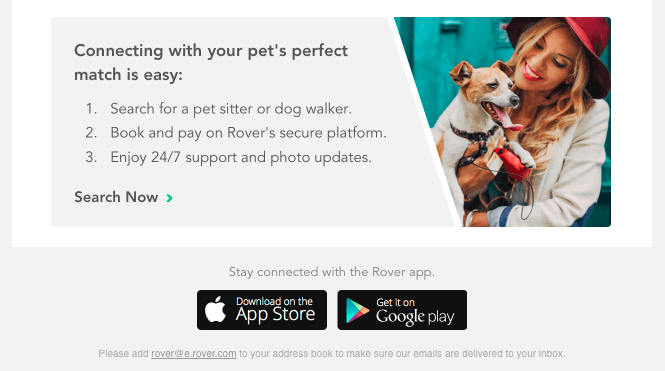
Last but certainly not least, the footer. As well as giving you the chance to leave a lasting impression on your readers, this is also the most common place to insert any useful company information, disclaimers, and contact details, as well as the super important unsubscribe link.

We recommend that you always use a standard footer and only edit the information when absolutely necessary. That way, your designs remain consistent for your readers and you can be sure that you have all of the necessary information. Use the footer to link to your social media sites, your blog, or your customer support system.

Make sure your design footer contains relevant and essential information

This footer by H&M is informative and provides readers with all important links such as social media sites and the sign up page for a customer loyalty card. In addition, the company also protect themselves by including a legal disclaimer and an unsubscribe link.

Final thoughts

If you stick to these tips, you should be well on the way to crafting amazing email newsletters full of engaging content that your recipients will want to read. To go one step further, it's great practice to also stick to a regular sending schedule (i.e. once a week every Tuesday or the first of each month.) This will help to get your customers used to your email newsletter and look forward to your emails, and also helps you to provide consistent content and plan better. Happy Designing!

Until next time,

Your Mail Designer 365 Team

Give Mail Designer 365 a try today for free...

Mail Designer 365 helps you create stylish, professional HTML emails on your Mac. Download for free to see what you can achieve.


Try for free

GDPR Damage Control: How to Rebuild Your Email Lists

By Uncategorized

It was inevitable, something we all saw coming. Following months of updating data protection and privacy policy, and not to mention frantically sending out opt in campaigns, GDPR came, saw and, well... conquered. As a result, many of you have probably seen a significant drop in your email subscribers, but don't worry, there's still hope! Here are some tips and tricks to help get you back on track and rebuild your email lists.

Out with the old and in with the new

In some ways, GDPR has actually done you all a favour. It's a known fact that quantity does not equal quality, and having a large list of email subscribers isn't necessarily a good thing for your email marketing campaigns. In fact, it can almost be quite detrimental if a large proportion of your list is made up of inactive, disengaged subscribers. Inactive subscribers negatively impact upon your open rates and click-through rates and prevent you from seeing how effective your email campaign really is. In removing such subscribers from your lists, you'll have an email list made up of customers who want to receive your emails and are much more likely to actively engage. Great news, right?

With this in mind, you can now go forward with a more positive outlook. Focus your efforts on gaining new, interested email subscribers who have actively chosen to opt in to receiving your content.

Promotion is key

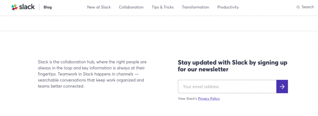
The first way to ensure people will sign up to your email lists is by promoting your email newsletter wherever you can. There are many opportunities to do this, but one of the most effective ways is to include a prominent sign up box on your website or blog. If a potential customer is already looking through your website or reading your blog, they're most likely interested in your content. Make the most of this opportunity by pointing out your newsletter as a way for them to stay in touch with you. This cooking blog has a prominent sign up box in the sidebar, prompting readers to subscribe for even more content.

Include a sign up box on your website or blog

If you don't have a blog, make one!

A blog is a great way for you to show your customers what kind of content they can expect from your business. It is also another way for you to promote your product or service without having to invest too much time, energy, or money. The more engaging your blog content is, the more likely your readers are to want to sign up. You can encourage blog visitors to subscribe to your email list to receive updates whenever you publish a new blog post. This is enticing, as they will already know that the content they will receive emails about will be of interest to them and won't be spam. 1Life make sure their subscribers will never miss out on a new blog post:

Create a blog to get customers interested in your content

Use social media

Social media is a quick and instant way to communicate shorter blasts of information to your customers. It's possible that many of your social media followers may not be aware of the fact you have an email newsletter. Take this chance to inform them that more detailed news about your business, promotions, or releases is available in your email newsletter. It's likely that many of your followers will take interest, because, again, they are following you for your interesting content. Check out this example from Hydrogen, which could have been made even better with a link!

Use social media to promote your email newsletter

Upload older newsletters to your website

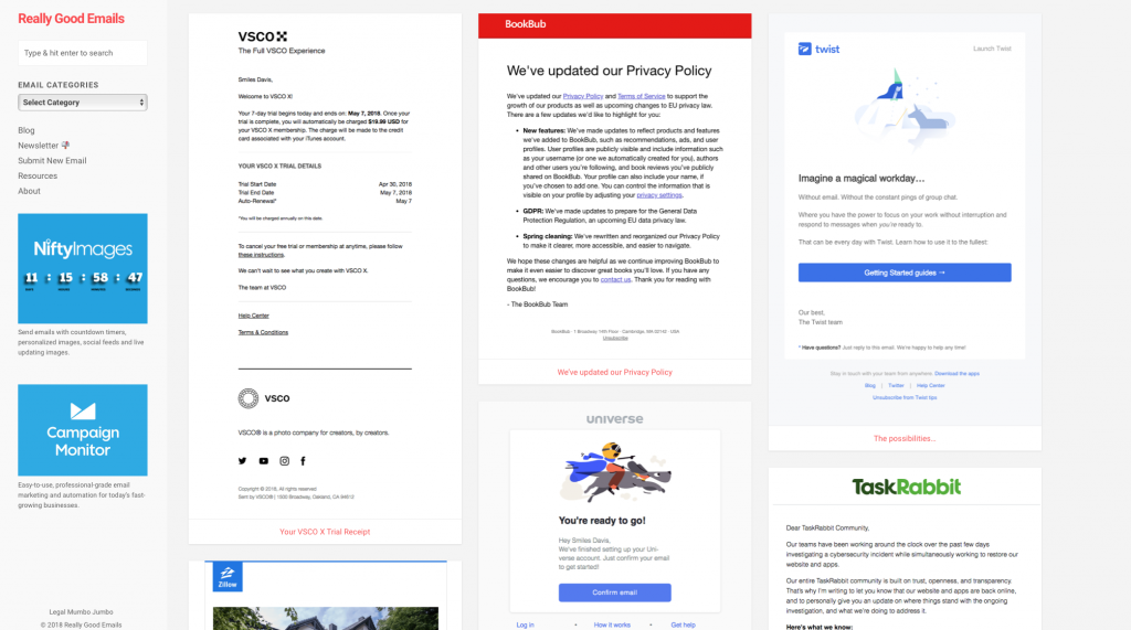
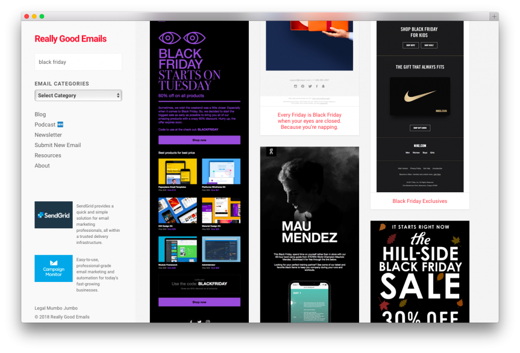
Just like with the blog, by uploading previous newsletters, you're showing potential subscribers what they are in store for if they sign up to receive your newsletter. Although you may be concerned that making your newsletter available online might deter people from subscribing, it's actually a lot more effort for them to have to search for it online than it is to conveniently receive it in your inbox. You can also choose to not post your latest newsletters until the next one is sent out. It's a good idea to show that you include exclusive special offers, promotions, and current news to generate FOMO (fear of missing out) and push customers to subscribe. reallygoodemails.com have an archive of their old newsletters to encourage new customers to sign up:

Archive older newsletters so customers know what to expect when they sign up

With these tips in mind, it should be easy for you to get back up on your feet after the initial GDPR shock. As the saying goes, keep calm and carry on and you should be fine!

Until next time!

Your Mail Designer 365 Team

Give Mail Designer 365 a try today for free...

Mail Designer 365 helps you create stylish, professional HTML emails on your Mac. Download for free to see what you can achieve.
 

Try for free

5 Ways You Can Create Sizzling Memorial Day Email Campaigns

By Uncategorized

For your American customers, May means it's almost time for Memorial Day. This holiday gives consumers a three day weekend, and there's nothing quite like a long weekend to get business booming!

Before you fire up the grill, or pour yourself a drink, check out our 5 tips for creating a sizzling Memorial Weekend email campaign.

Go stars and stripes crazy

As this is a super patriotic holiday, you should do your best to try and represent this in your email design. This makes the theme of your email clear from the get go, as well as making things a bit more fun and interesting for your email subscribers. Try to incorporate red, white and blue into your color scheme, and bonus points for you if you can include some American flag imagery in there, too!

In this example, Ralph Lauren have got their color scheme down to a T and the inclusion of the stars and stripes flag is a great way to get the theme across to customers.

The stars and stripes in this Ralph Lauren email are super patriotic

Use a sense of urgency

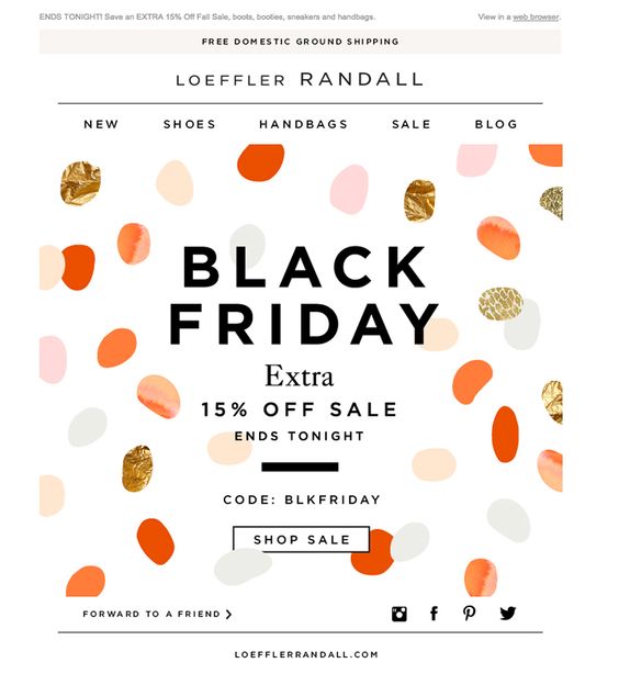
As one of the oldest tricks in the marketing playbook, the sense of urgency is always a good way to engage your customers into participating with your sale or special offer. As the Memorial Day holiday is only spread across a couple of days, it provides your business with the perfect opportunity to have a quick-fire sale or event.

This bright design from Aldo definitely creates a sense of urgency with its "Today only" graphic. Try something similar in your designs to get customers rushing to check out your sale.

Including the "ends tonight" line adds a sense of urgency to this email

Inspire subscribers to make the most of their time off

Remember your email campaign does not have to begin on Memorial Day weekend, you can get started right away! Encourage your subscribers to start planning their backyard BBQ in advance, or suggest fun activities to do at home over the family weekend.

There's loads of ways to get involved and it doesn't have to be a themed sale. Get creative and it will pay off. Your customers will definitely thank you for the inspiration! Check out this example made with Mail Designer 365.

Give your customers ideas for things to do to celebrate the holiday

Use a summery theme

For many of your customers, Memorial Day weekend is the start of their summer. The weather is getting warmer and many of them will not have to go to school or work. Your subscribers will have summer and sun on the brain, so the more you highlight this in your email campaign using a summery theme, the more likely they are to click.

This cute and summery design from Revolve is a clever way to inspire your customers to start shopping for the summer.

This packing theme from Revolve gets customers in the mood for a vacation

Don't forget what the day is all about

As with all holidays and special occasions, it's easy to forget the true meaning of the celebration. It's good to include a reference to what the day is all about. This will not only make your business come across more genuine, it's also a sign of respect to your customers who may have lost loved ones fighting in the military. You could do this by inserting a short but heartfelt message or by hosting a special event and donating to a veteran's charity.

This design from Alex and Ani has got the balance just right. We love the patriotic heart!

A heartfelt design saying thanks to American troops for all they've done

Tip: Don't forget to segment your email lists for this one! It may seem obvious, but it is important you only send your Memorial Campaign out to your US customers.

Until next time!

Your Mail Designer 365 Team

Give Mail Designer 365 a try today for free...

Mail Designer 365 helps you create stylish, professional HTML emails on your Mac. Download for free to see what you can achieve.
 

Try for free

Types of color schemes and how they affect your email design

By Uncategorized

Research shows that it takes just 0.05 seconds for a web page to make an impression on the average person; whether this is a good or bad impression is up to you. The visual appearance of your email is crucial in determining how readers will respond to your campaign. Here's how you can effectively use color schemes to optimise your email designs...

Monochromatic color schemes

A monochromatic design is made up of the different shades of just one main color. It's particularly effective if it highlights something within your email design and indicates a clear theme. Try this out for colors which are seasonal (e.g. red at Christmas or orange at Halloween) or for targeted product promotion.

This example from Morphe is highly effective. Not only does the hot pink stand out to readers, it also does a great job of promoting their lipgloss of the same color:

Monochromatic color schemes are a brilliant way to highlight the vibrant, colorful nature of your product.

Complementary color schemes

Complementary color schemes are made up of colors which are directly opposite each other in the color wheel. Some complementary pairing examples are red and blue, yellow and purple, and pink and green.

These colors create a strong contrast, but, when pulled off correctly, can add something special to your design. For example, this design from Cotton On utilises a complementary color scheme by clashing red and teal together to create an interesting effect for their otherwise ordinary sale advertisement.

Use a vibrant complementary color scheme to bring an otherwise simple design to life.

Achromatic color schemes

For a particularly sleek and serious design, you should consider using an achromatic color scheme. This refers to color schemes made up of shades of black and white. In terms of branding, this is a sleek and stylish option for those of you striving to maintain a more sophisticated look in your emails.

Hudson Jeans are looking chic as ever in this achromatic welcome email. This design does a great job of introducing subscribers to the fashionable nature of the brand and remaining interesting at the same time.

Achromatic color schemes add an element of style and edge - particularly for fashion brands.

Analagous color schemes

An analagous color scheme is made up of one main color and then the two colors either side of it on the color wheel. For example, red paired with deep orange and hot pink or blue paired with indigo and turquoise. This is a great color scheme to try out on a more standard design like a transactional email, where you don't want to be too experimental.

This brand have created a soft, yet effective color scheme for this design. The red paired with pink and orange is a nice way to incorporate color without going overboard.

An analogous color scheme is a subtle yet stylish way to introduce different colors into your email designs.

We hope you take these color schemes into consideration for your next email campaign. Together with an understanding of seasonal trends and the effect of different colors, this is a great way to make sure your email design is effective as possible.

Until next time!

Your Mail Designer 365 Team

Give Mail Designer 365 a try today for free...

Mail Designer 365 helps you create stylish, professional HTML emails on your Mac. Download for free to see what you can achieve.
 

Try for free

The Best Fonts for Email Marketing

By Mail Designer 365 Newsletter Academy

We love fonts here at Mail Designer 365. However, with so many different fonts to choose from and so many styles and sizes, it can be difficult to choose the right one for your design. This week we're going to take you through some of our favorite fonts and show you how you can use them effectively in your email designs. Let's get started!

Email-safe font options

When designing an email newsletter, you have two main font options for your design: "Email-safe fonts" and web fonts.

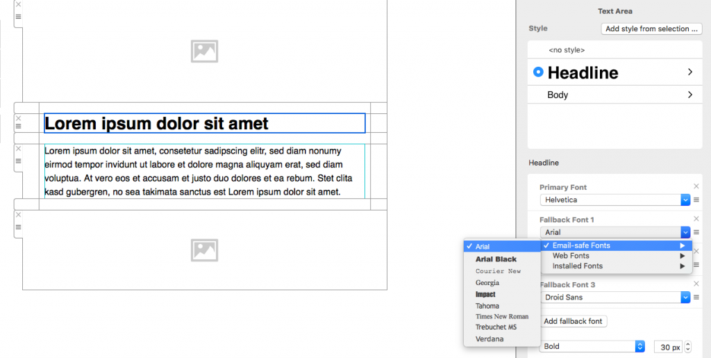
Email-safe fonts are the standard font types which are supported universally in every email client. Some examples of common email-safe fonts are: Arial, Georgia, and Times New Roman.

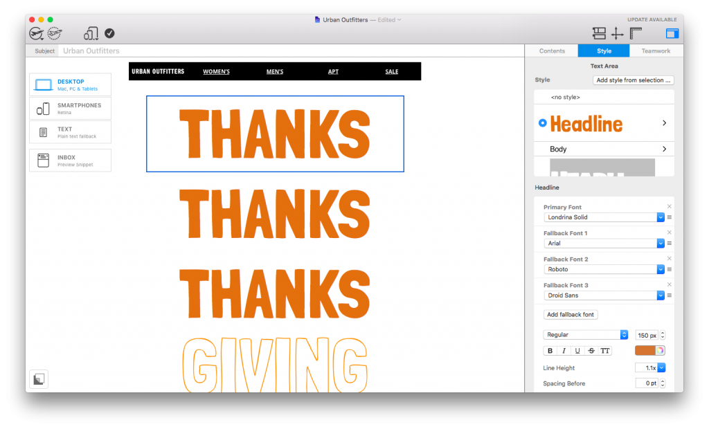
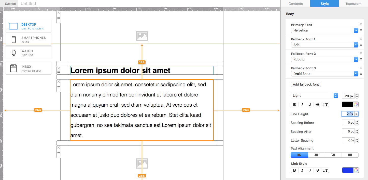
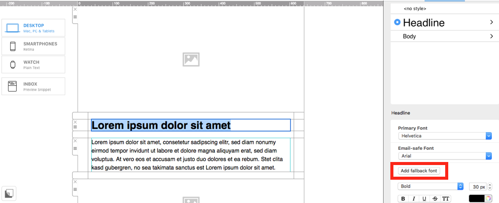
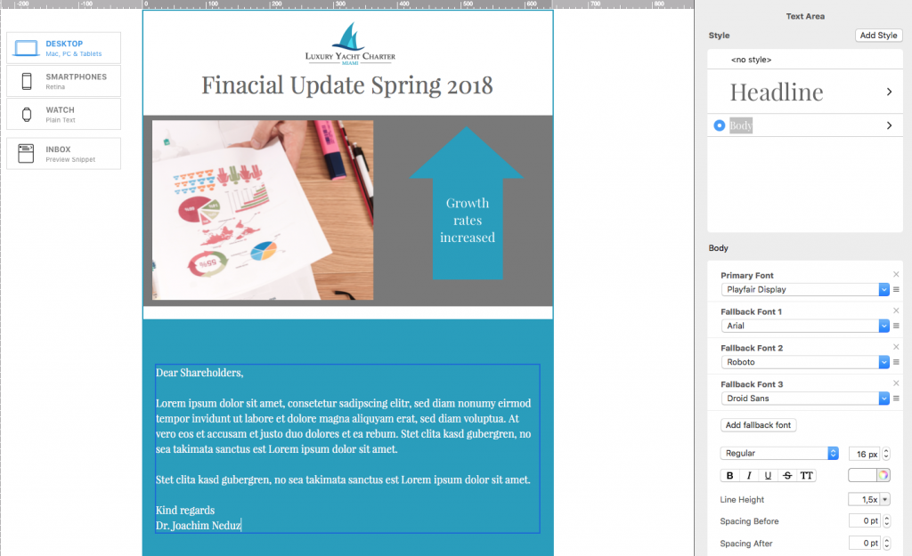
With Mail Designer 365, you have the option to always include an email safe "fallback" font in all of your text areas to ensure your text will always be displayed.

Email-safe fonts

Email-safe font choices

This being said, you are by no means restricted to these nine fonts in your designs.

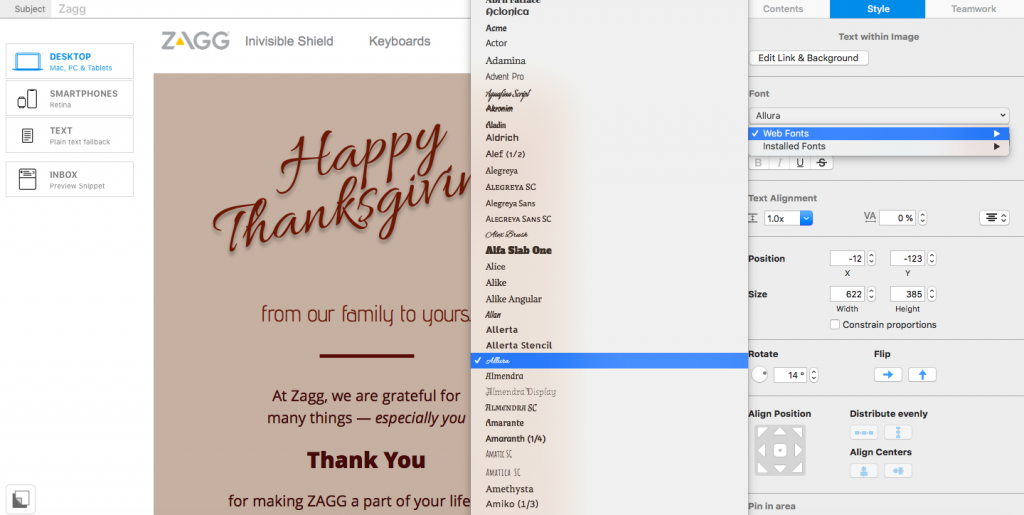
Web fonts are fonts which are designed for use online and can be downloaded from the internet and installed in Mail Designer 365. We always source ours from Google Fonts, because they are free to download and open source, so you don't need a license to use them in your designs.

Web fonts are a great way to make your design unique, eye-catching, and most importantly, well-suited to your brand.

Google Fonts are also fully supported in some of the most popular email service providers including, Apple Mail, AOL Mail, iOS Mail, Android's native mail app, Lotus Notes, and most versions of Microsoft Outlook.

Here are some more great benefits of web fonts:

  • Displayed regardless of whether images are supported.
  • Quick to load.
  • Crisp and sharp in designs in comparison to images, which can sometimes be out of focus, or low resolution.
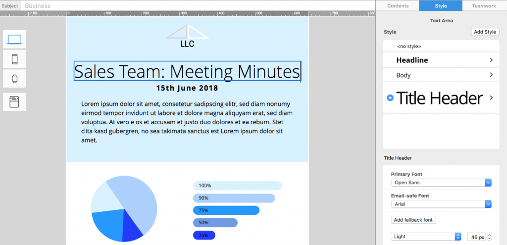
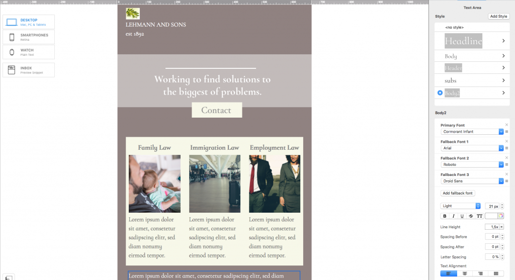
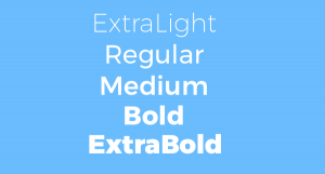
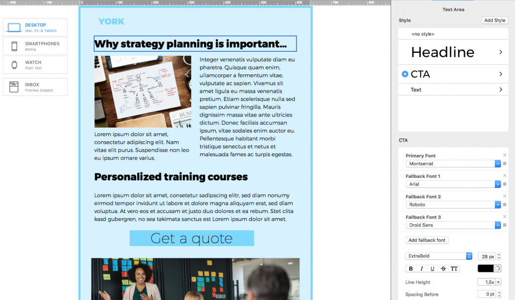
  • Super easy to import into Mail Designer 365. Here's how!

Here are some ideas on how you can use web fonts in your designs. For even more font inspiration, you can check out our font infographics on Pinterest!

Fonts for Headlines

The job of a headline is to catch the reader's eye and alert them towards the most important parts of your email. This means a good headline should be able to stand out in your design. In terms of email-safe fonts, both Impact and Arial Black offer a HD effect to your headline, but if you want to be more adventurous, try one of these three Google fonts:

Molle

Full of character and style, Molle has a slight retro vibe and looks great in a fun, informal newsletter design.

Julius Sans One

This ultra light font is a great choice for a more fashionable and modern headline. Try it out for your online clothing store.

Abril Fatface

This smart font is perfect for a more professional design. It's a great eye-catcher and stays classy at the same time.

Fonts for Body Text

The main body of your email needs to be a font that's clear and easy to read, so that your email subscribers really pay attention to what you're saying. A serif font is usually a more traditional typeface which is normally used for lengthier and more formal text such as newspapers, academic writing, etc. In terms of serif email-safe font options, Times New Roman and Georgia are both good and reliable options. However, when it comes to web fonts, there is a lot more choice. For a sophisticated effect, we particularly like:

Antic Didone

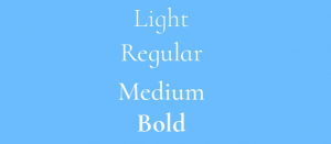
Cormorant Garamond

Sans serif fonts are a lot more informal and work really well for blogs, generic email text (i.e. welcome messages) or statistics. Email-safe sans serif fonts include Arial and Tahoma. As for web fonts, the Mail Designer 365 brand always uses Open Sans, but for a cool and modern look, we especially like:

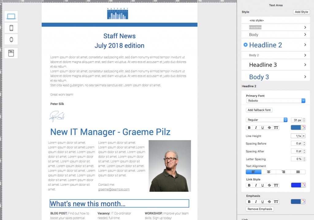
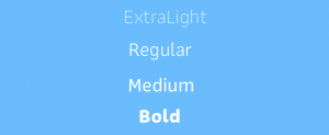
Roboto Light

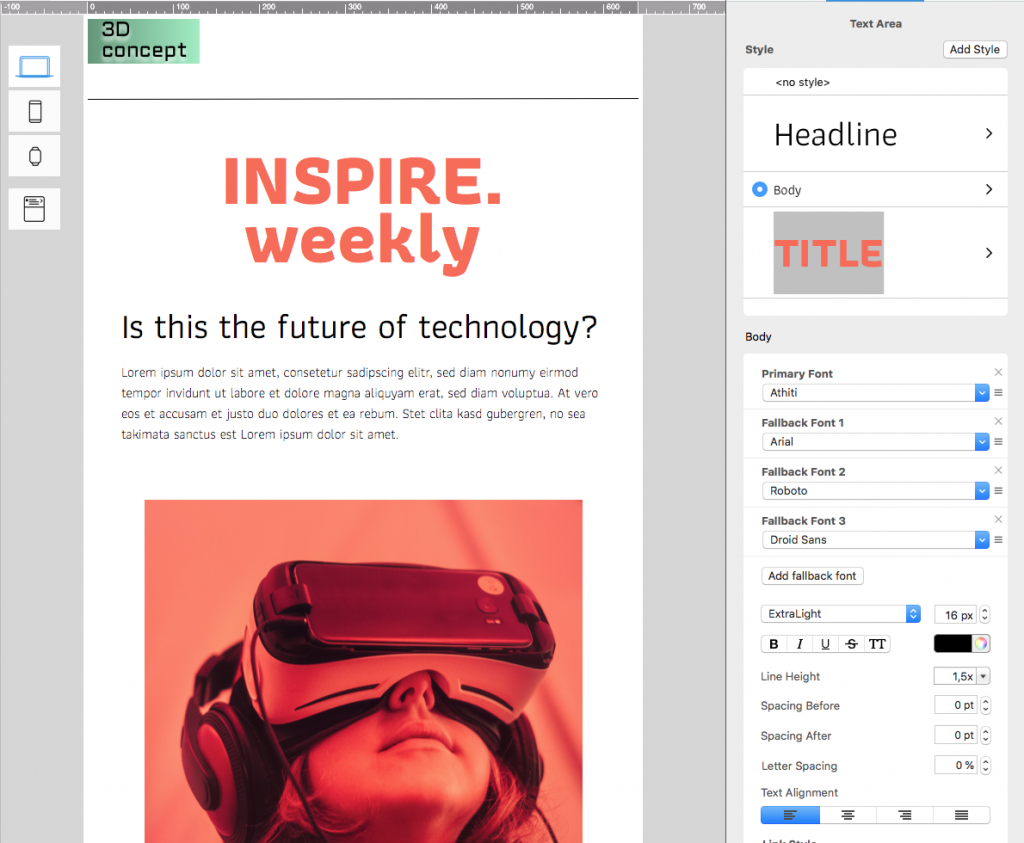
Didact Gothic

Other Font Styles

Perhaps you want your font to stand out from the crowd. No problem! The great thing about web fonts is that there is a font available for every possible use case. Here are some ideas of font styles you may want to use in your designs:

Handwriting Style

A handwriting style font can really add a personal touch to your email design. You can this style of font to sign off an email and give the illusion of a signature, or to make your subscribers feel extra special when inviting them to an exclusive event.

Handwriting style fonts

Brush style

Brush fonts are glamorous and sophisticated and work really well for headlines if you're looking for something a bit more artistic and outside of the box. The right brush font can work wonders on a standard design and transform it into an elegant masterpiece.

Brush style fonts

Typewriter style

Typewriter fonts are a classic and perfect for adding a vintage vibe to your design. Think murder mystery night or exclusive first look at your new book draft. Typewriter typefaces are here to stay!

Typewriter style fonts

Alternative

This covers everything from festive font types, to flower power, to artistic typography. In Mail Designer 365 you can find an alternative font for practically anything. Here are some of our most abstract examples...

Abstract font styles

We hope you were able to take some inspiration from these font styles. The most important thing is that your font effectively reflects your brand and the message you are trying to communicate in your email design. Sign up free and try some of these unique and eye-catching web fonts out in Mail Designer 365 today!

Until next time,

Your Mail Designer 365 Team

Get expert tips straight to your inbox!

Sign up here for our email newsletter and enjoy regular tips, tricks and advice for everything relating to email design – delivered directly to your inbox.
 
 
There was a problem registering your email address.
Please check and try again.
Thank you for registering! Please check your email inbox.
We've just sent you an email for you to confirm your email address, if you haven't already.

Give Mail Designer 365 a try today for free...

Mail Designer 365 helps you create stylish, professional HTML emails on your Mac. Sign up for free to see what you can achieve.


Try for free
Privacy Settings / Datenschutz-Einstellungen