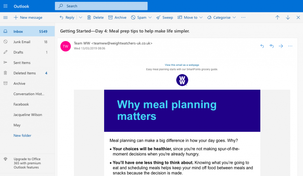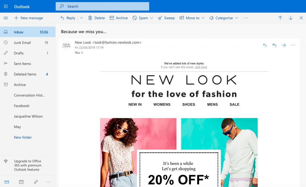
Today, businesses rely more and more on their online image as a means of strengthening their reputation and standing out from competitors.
Most potential customers are massively influenced by what your previous customers have to say. In fact, 97% of potential buyers depend upon online reviews when deciding whether to purchase. Thanks to the recent rise in review sites, all it takes is quickly googling the name of a business to help a customer make up their mind.

People care a lot about reviews when choosing a product or service.
If a customer wants information about your business and can't find anything online, they are much more likely to seek out a competitor whose customers have left testimonials. Because of this, it's more important than ever for you to build up your profile of online reviews.
Getting customers to share their experiences of your business online can be hard. Even if a customer had a great time at your restaurant or loved your hair salon, there's no guarantee that they'll rave about it online. For some, the process is too time consuming, others will wonder what's in it for them and a lot of customers will simply forget.
In this guide, we'll take you through some key tips to consider when using email as a strategy to increase your online reviews and strengthen your brand image...
Sign up to a review website
There are so many independent review platforms available today. Rather than go it alone, take advantage of the options available and consider signing up to a review site. Your customers will feel much more motivated to leave a review on a popular, third-party platform, as they are independent, trustworthy sites that aren't screened.
Here are just a few examples of reputable platforms you could start using:
- Google My Business - Use the world's #1 search engine to give customers the chance to write or read reviews about your business.
- TripAdvisor or Airbnb - Perfect for those of you in the travel and tourism industry looking for more exposure.
- Amazon - Great for small businesses wanting to give their products a larger platform.
- Facebook - A free and easy way for local businesses to connect with customers in their area and let them share their experiences.
- Trustpilot - A convenient, independent platform for customers to review any type of business.
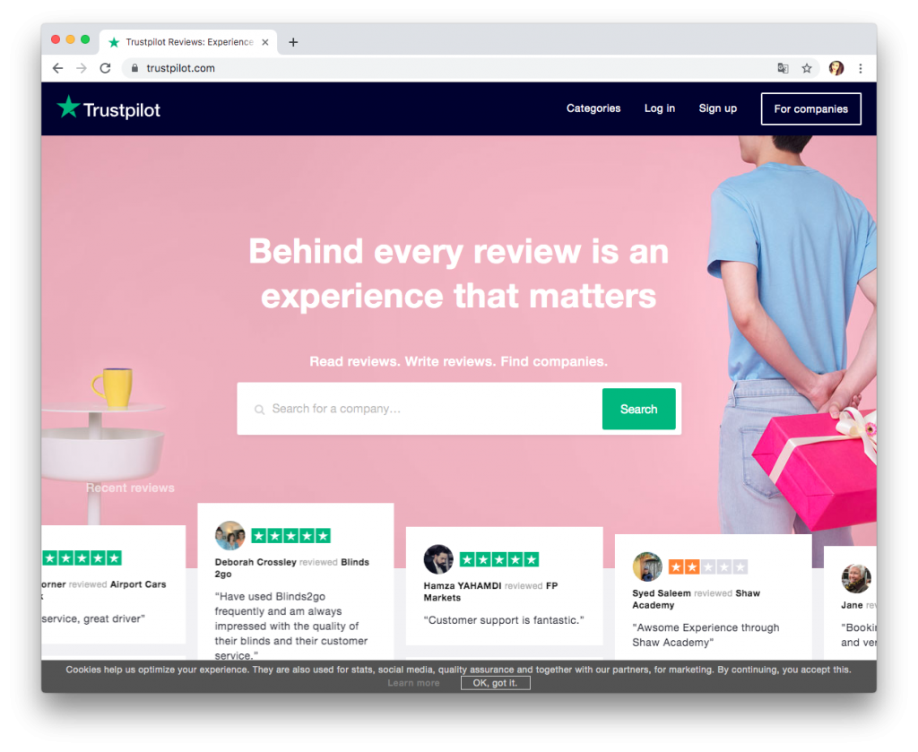
Popular, independent review sites such as Trustpilot are a great place to collect customers' experiences of your business.
Once you have established yourself on one of these platforms, you can use your email to directly link customers to your business's review page. Make sure to include the logo of the site in your email to make it more recognisable to customers. This is a much more clean cut way of asking for a review.
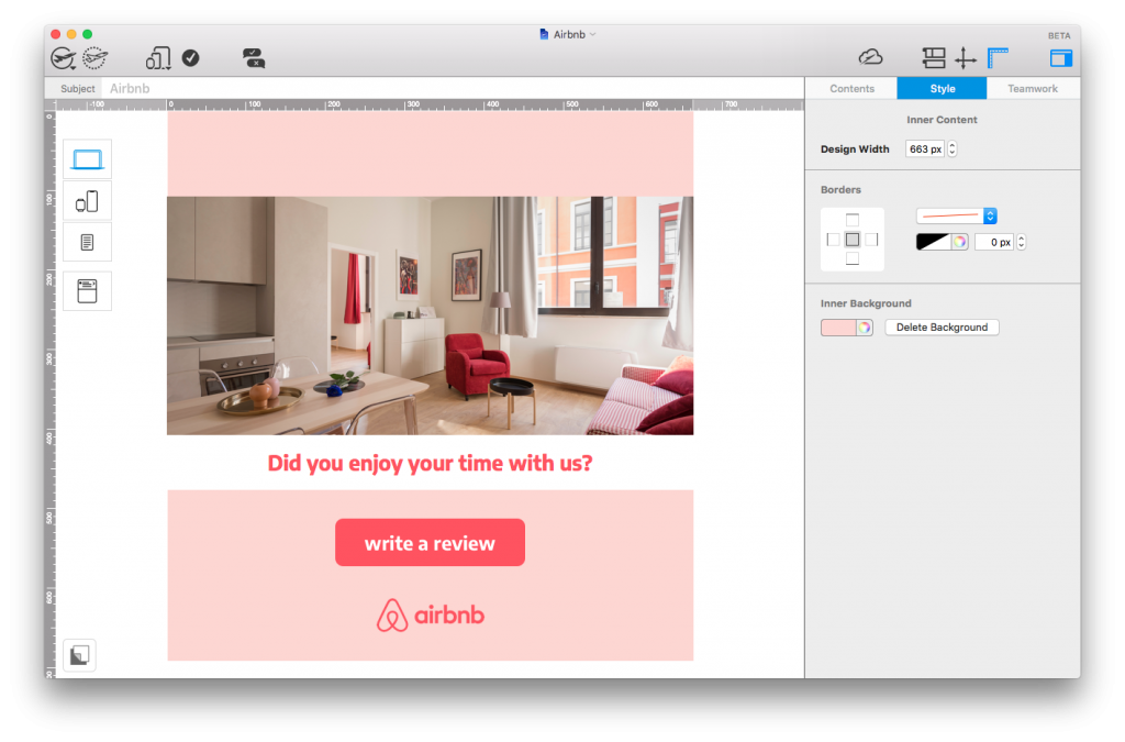
Include a link or call-to-action box to an independent review site to give your email a more clean-cut feel.
Remember to thank the customer
When writing your email copy, keep in mind that you are sending out your review requests to customers who have already bought your product. This means that thanking them for their purchase should be high on your list of priorities. Show your customer that you appreciate them and include a brief thank you message in your email.
In this example, eFlorist does a great job of politely thanking the customer before proceeding to ask for a quick rating:
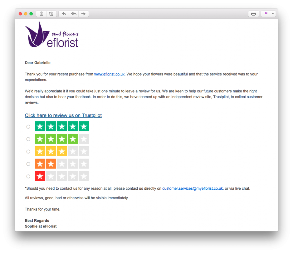
Before asking your customer to leave a review, remember to thank them for their purchase.
Timing is everything
In order for your emails to be most effective, you have to ensure the timing is right.
If you leave it too long to ask your customers for a review, their experience of your business may no longer be fresh in their minds and they won't have much to say. Similarly, if you ask a customer too soon to review a product they have just purchased, they may not have had the chance to test it yet.
For this reason, it's important you send your emails out at the right time. Naturally, every business is different, so there is no one size fits all model. One good strategy to adopt here is A/B testing. Try sending the same email out at different time periods after purchase and analyse which gets the best response from customers.
Offer different review options
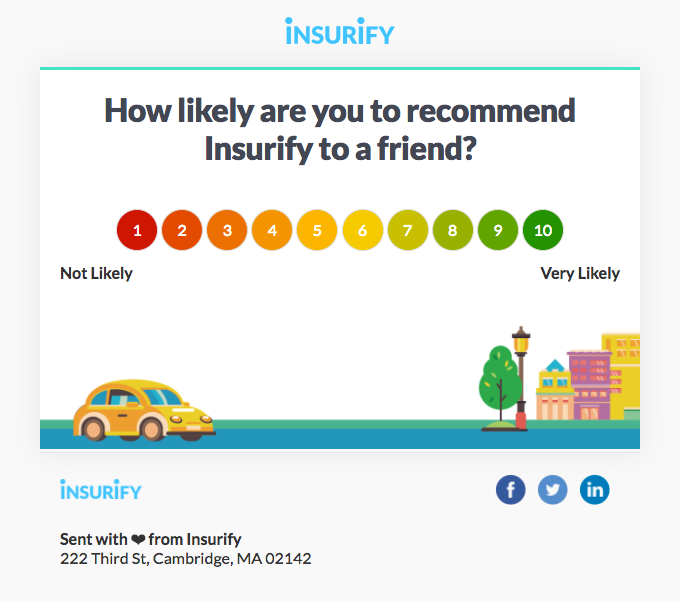
Sometimes the classic review style isn't for everyone. For customers who don't have time to leave a full text review of your business, a scale rating is a fast and easy alternative. With just one click, customers can review your business numerically; letting you know exactly how you are doing in your customers' eyes.
Tip: Remember to create some sort of a landing page for once your customer has clicked on one of the star ratings. Here you can also give the customer the opportunity to leave further comments, or simply thank them again for taking part.
This example by BarkBox is super straightforward and easily allows readers to submit their rating:
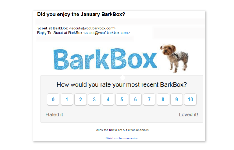
Scale ratings are an easy way for customers to quickly review your business.
Making a rating panel in Mail Designer 365 is easy thanks to the library of shapes and layout blocks, but remember to only include one link per image area.. Here's an example ratings chart for you to try out:
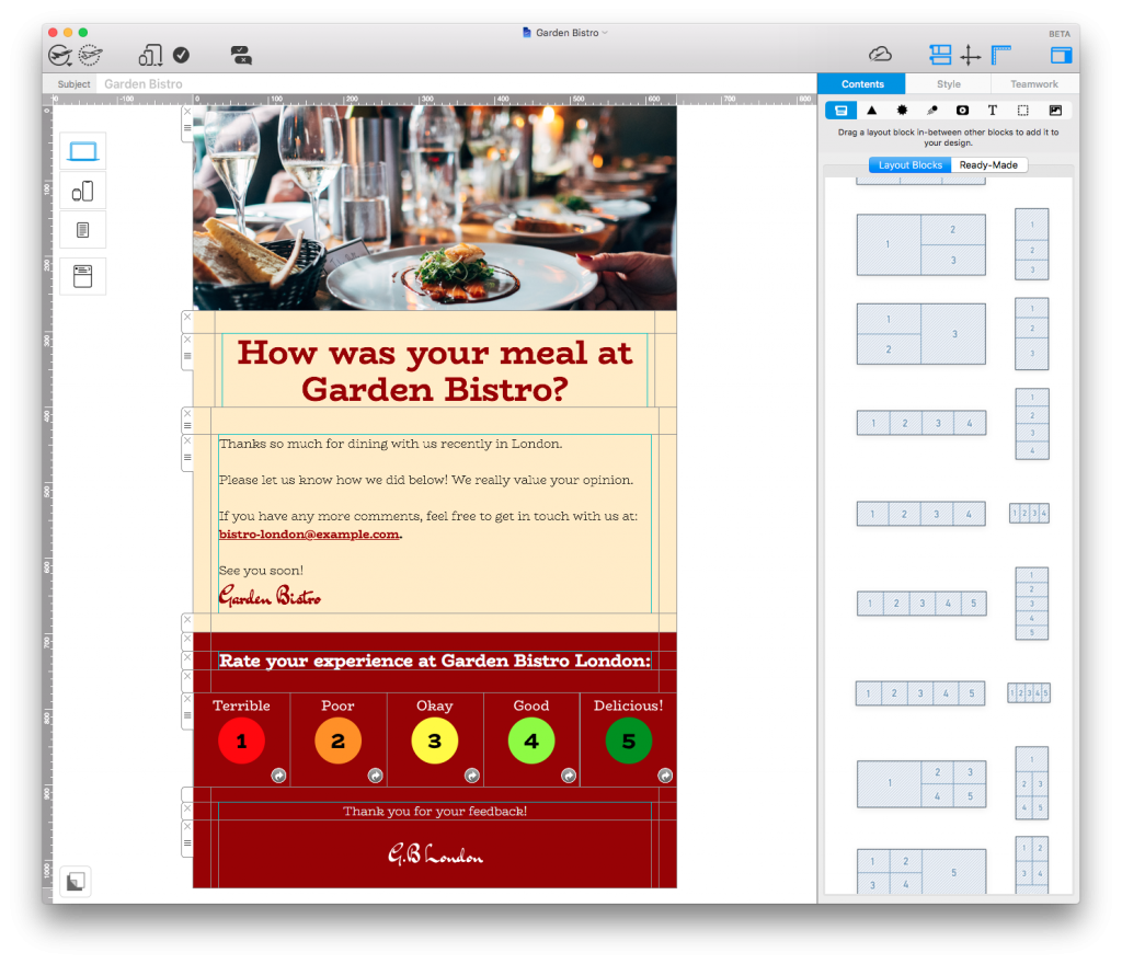
Use the tools and layout options in Mail Designer 365 to create a colorful rating panel for your customers.
Try to incentivise
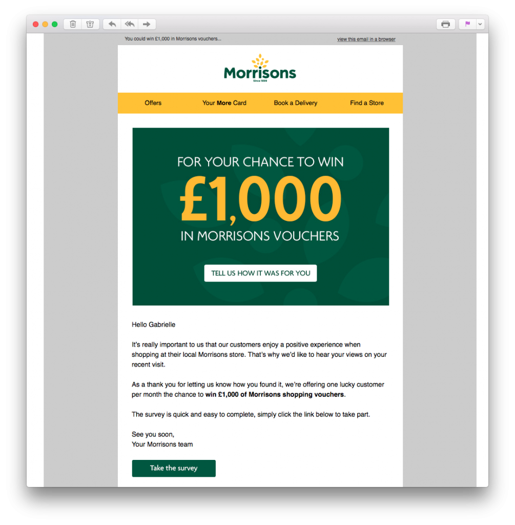
Because most customers won't feel the need to leave you a review, providing an incentive is an effective way to get more of your customers on board. By offering customers something in return for an honest review, they are much more likely to take the time to share their experience.
In this email by Argos, the customer is given the chance to enter into a £100 voucher giveaway. Including a 2 week time limit is also effective here, as it subtly creates a sense of urgency. For the customer, it's definitely a great tradeoff, considering a review only takes two minutes to write.
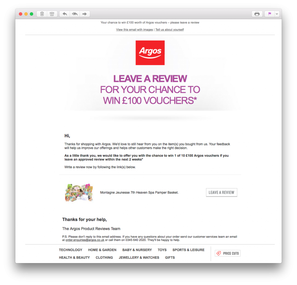
Provide some kind of incentive to motivate customers to leave a review.
Don't send too many emails
One mistake which is also easy to make is sending out too many emails asking the same thing. Ultimately, if a customer was willing to leave you a review, they would likely have done so after the first email. Persistence is good in some cases, but it's important to not become too forceful, as this could lead to customers unsubscribing completely.
Sending the same email multiple times is bad practice and could even be perceived as spam. If you are going to send a repeat email, be sure to try a different strategy. For example, if your first email is ignored, you could follow up the next week with an offer of an incentive. This way you'll have covered all bases and will know when it's time to back down.
Secure more online reviews with Mail Designer 365
We hope you have enjoyed reading through these tips. In today's business environment, online reviews are crucial to building up a strong brand reputation and finding out how your customers really feel about your business.
Strengthen your chances of getting more online reviews with the 'CityHotel' Design Idea in Mail Designer 365:
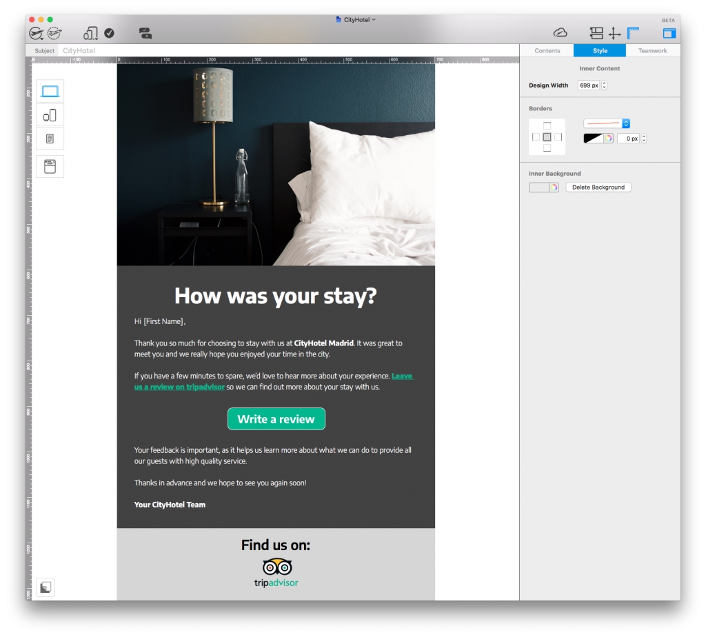
The template has all you need to convince your customers to review your business online. Open in the app to start editing or download Mail Designer 365 free to get started.
Stay creative,
Your Mail Designer 365 Team
Subscribe for more great tips!
Please check and try again.
We've just sent you an email for you to confirm your email address, if you haven't already.



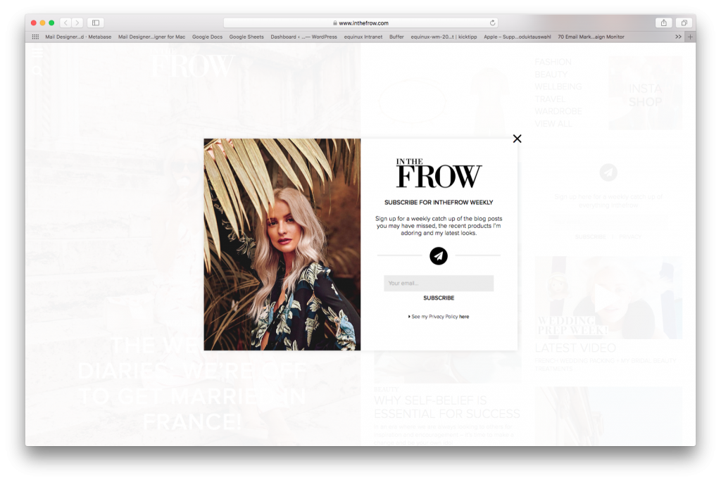
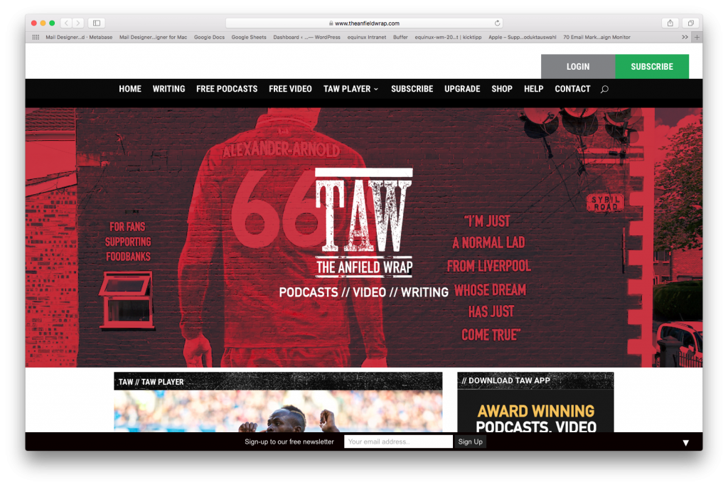
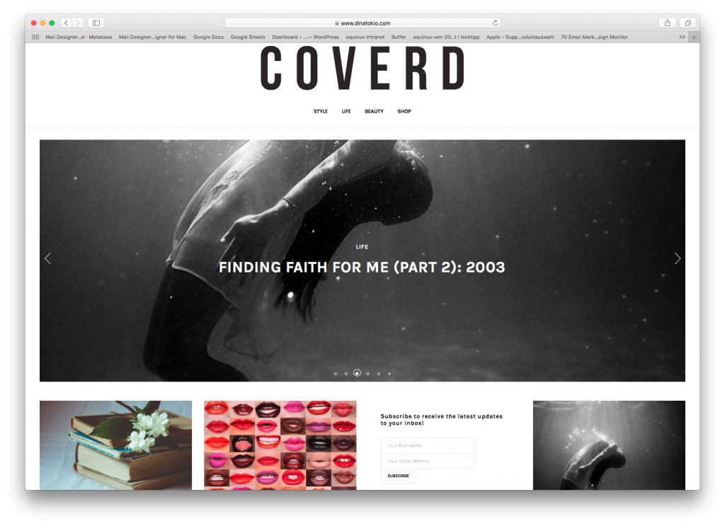
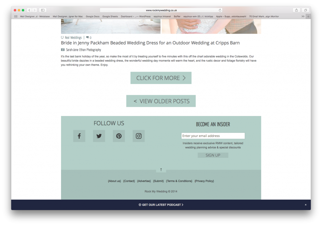

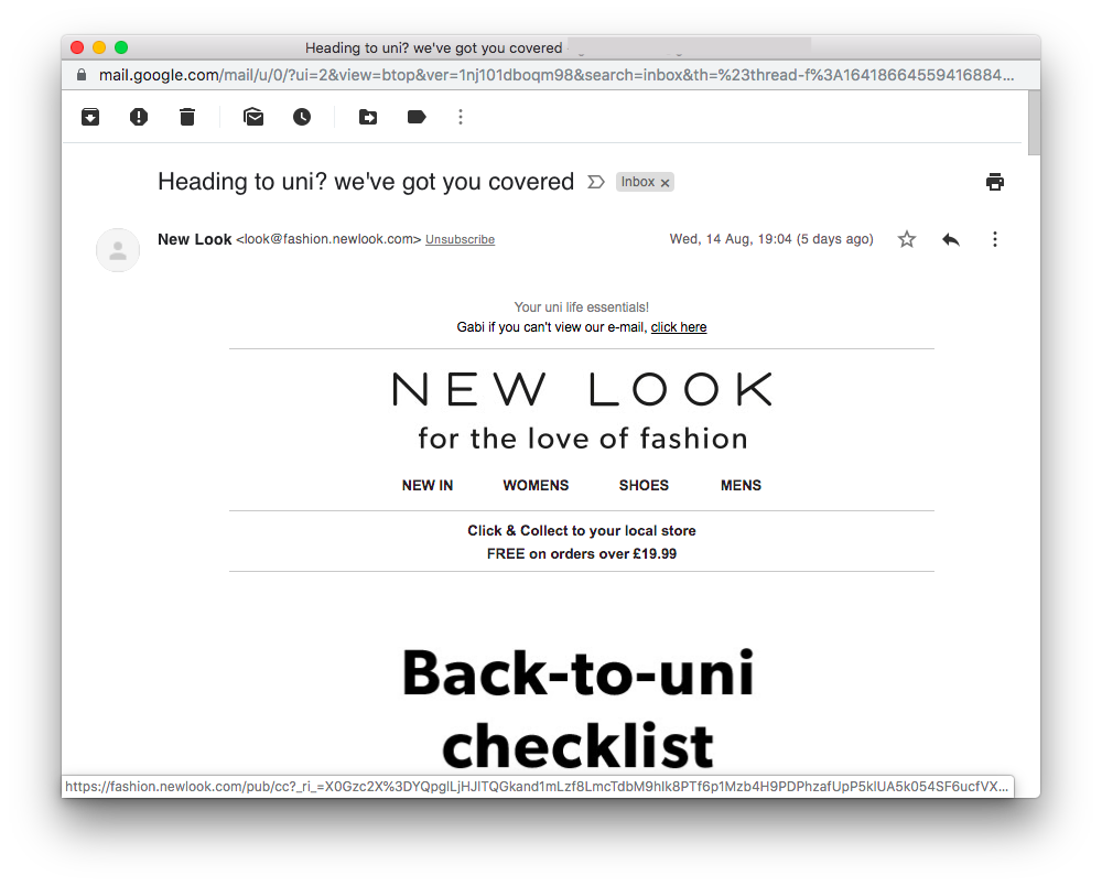
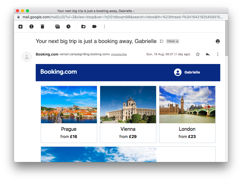
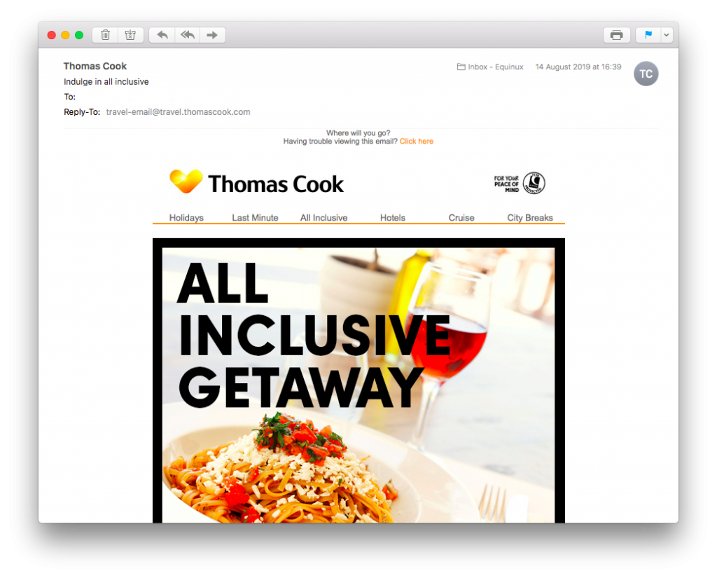
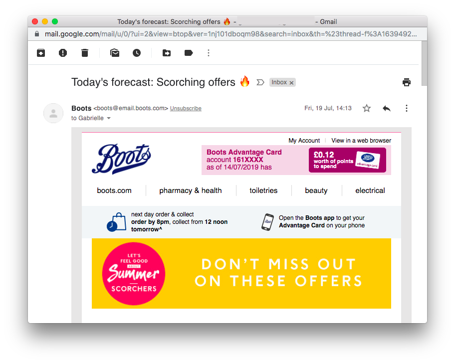

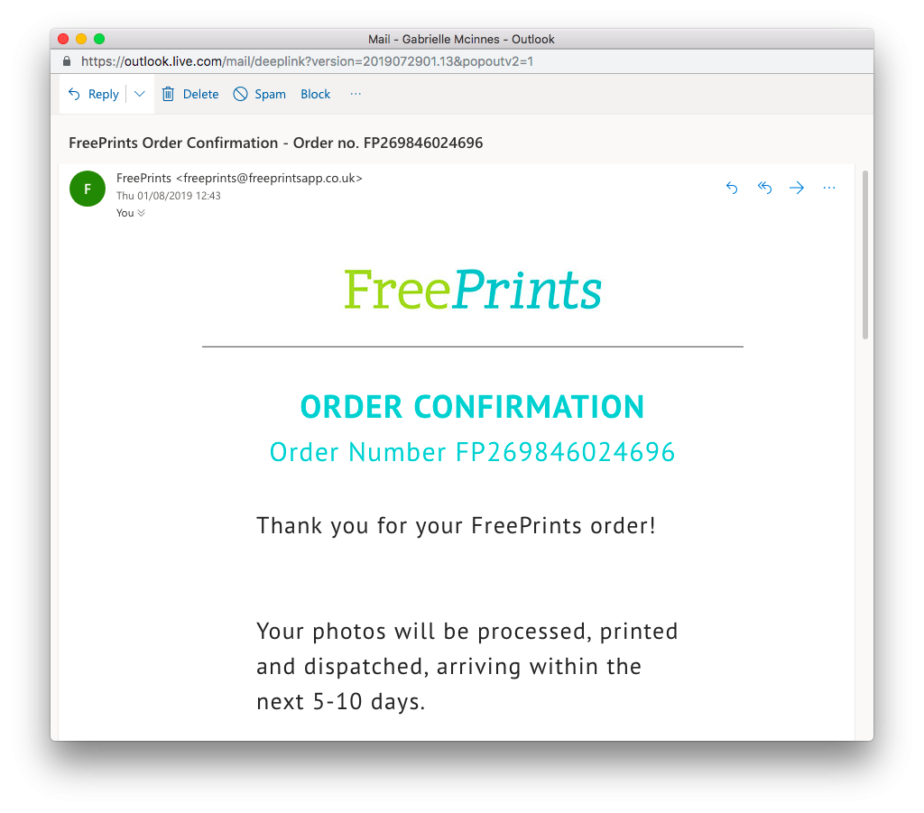
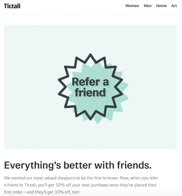

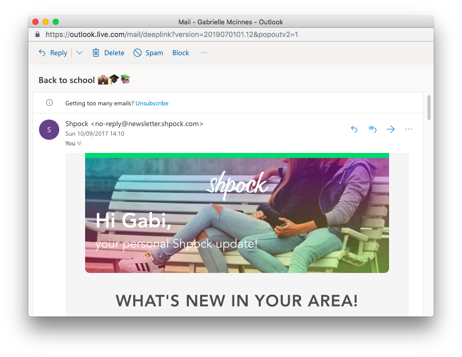
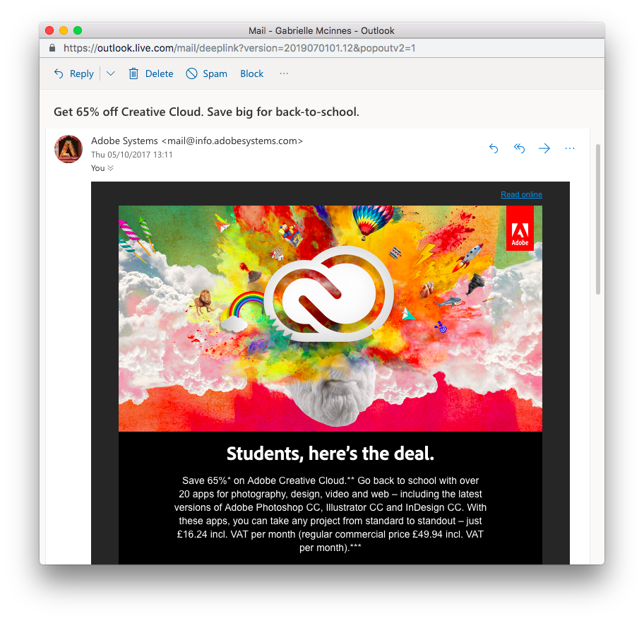





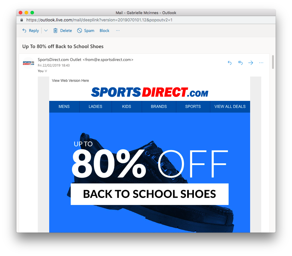
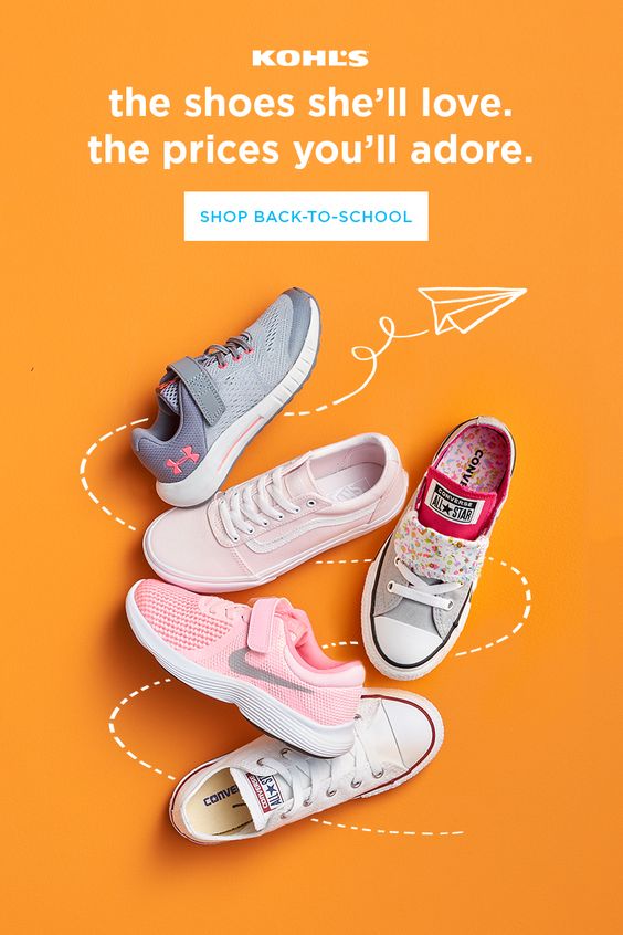
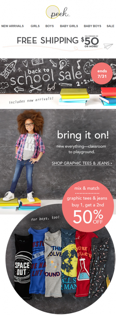

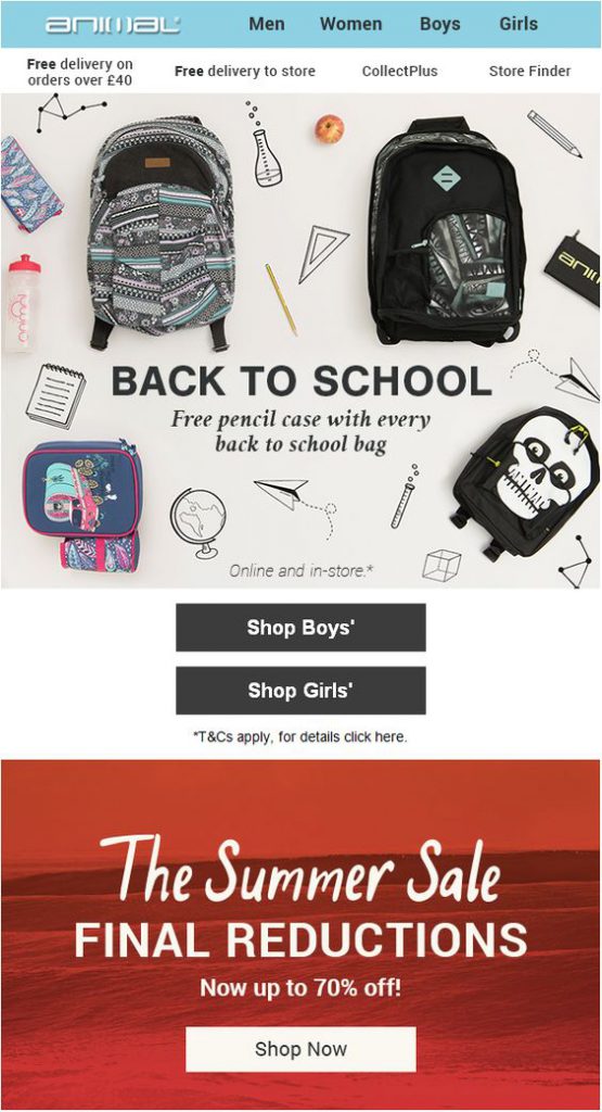
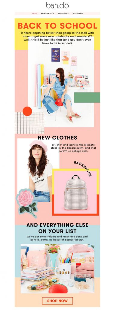
 We hope these tips and ideas will come in useful when you're creating your Back to School email campaigns this summer. Don't forget to




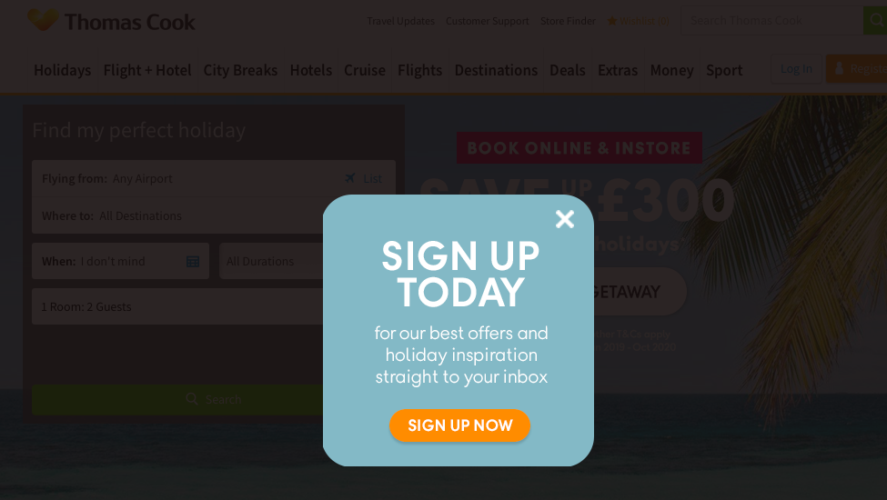
 Thomas Cook

 5. Transactional emails