Although they may appear dull and insignificant to some of us, transactional emails are probably the most important type of email you will send out to your customers. They're also your most likely source of clicks - especially seeing as 64% of consumers find them the most valuable type of email in their inbox.
If you perfect your transactional emails, you are making the most of the opportunity to show your customers who you are as a business by taking advantage of high open rates.
What counts as a transactional email?
A transactional email is a confirmation of an exchange made between you and your customer. These emails usually contain information which a customer is likely to want to find and use again. Most often, they take the form of a sales receipt, but other types of emails can also fall into the transactional category. Here are some popular examples:
- Account creation (welcome emails)
- Shipping/Delivery information
- Booking/reservation confirmation
- Event sign up
- Newsletter registration
- Notifications (new followers, comments, etc.)
- Password change confirmation
Here are our top tips on how to create transactional emails that shine...
Give the email a clear subject line
Your subject line is the chance for you to explain the gist of your email in just a few words and make readers aware that it's relevant to them. With transactional emails, it's more important than ever to make this subject line concise and to the point so your readers don't scroll past it in their crowded inboxes.
For example, "Your order has been dispatched!" is a great way of clearly communicating a shipping confirmation. It's clear and concise: your customer knows exactly what the email is about and will be much more likely to open it and view the information.
Think about personalization
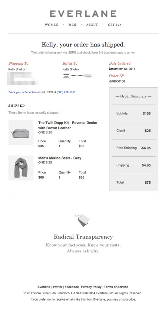
In order to make the recipient feel valued, you should consider incorporating personalisation placeholders into your transactional emails. One really easy way of doing this is by including the customer's name somewhere in the message. We love this email from Everlane as an example of personalization. The customer's name takes centre stage!
Adding placeholders in Mail Designer 365
Mail Designer 365 gives you the option to add common placeholders for popular email services to your emails. To add personalisation to your design, click inside the text block where you would like to insert the placeholder, then go to "Insert" in the app menu, where you will find options for Mailchimp and Campaign Monitor.
Mail Designer 365 also supports the use of custom placeholder variables for other email services. If you would like to use these in your design, please be sure to check with your email service provider first. Learn more.
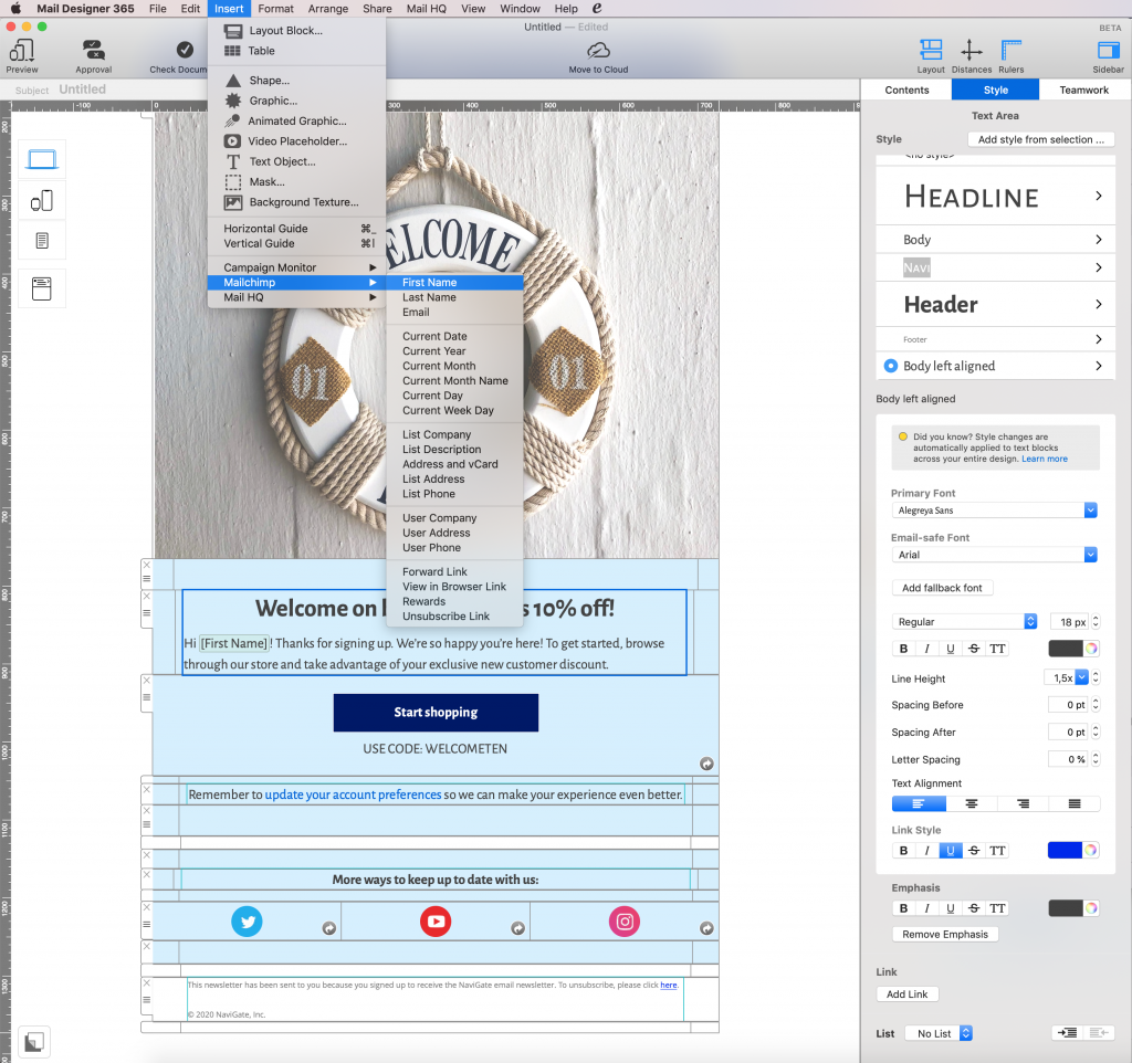
Add placeholders to your email templates to make the message more personalised.
Don't be afraid to upsell
In order to maximise on potential sales, it's important to try and upsell as much as you can to customers. Advertise new products, offers, and featured deals in your transactional mails, and you will benefit from maximum exposure. As illustrated in the example below from Shoedazzle, it can even be effective to advertise to customers who have just placed an order.
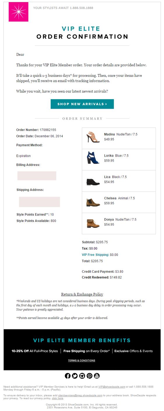
Don't be afraid to up-sell to customers by advertising new arrivals in your order confirmation emails.
Tip: Most transactional emails don't require an unsubscribe link, as they are providing the customer with important information (e.g. account registration, sales confirmation, etc.) However, if you are adding in extra offers, you will need an unsubscribe link, as the email will meet the criteria of a marketing email.
Let the design speak for your brand
Your business most likely sends out dozens of transactional emails every day - making them the face of your brand (think the digital version of customer service staff.) For this reason, your transactional email designs should be vibrant, eye-catching, and interesting. Experiment with colors, fonts, design elements, and more to create the perfect transactional template for your business.
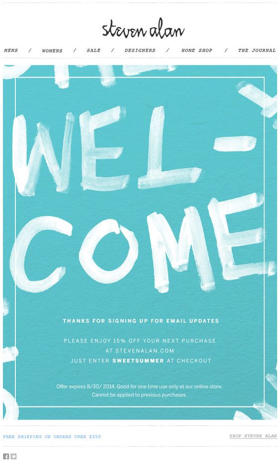
This email design from Steven Alan is an inspiring example of how you can make even a simple welcome email standout and represent your brand.
Include CTAs to increase engagement
To take advantage of the high open rates of transactional emails, you can also add a CTA (call-to-action) to the email body. One effective CTA is the social media sign-up. Inspire your customers to follow you on social media by including a CTA and a link to your Twitter/Facebook/Instagram at the end of the email message.
This example from Crate & Barrel is a proactive way of using a thank you email/purchase confirmation to subtly point customers towards your social media sites:
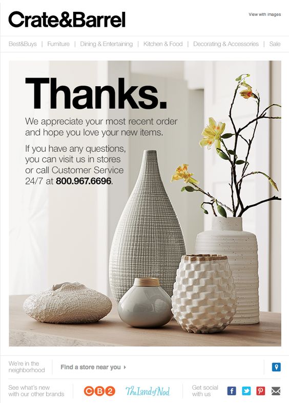
Include links to your social media platforms to let customers know where they can connect with your brand.
Creating transactional email templates in Mail Designer 365
We hope you found these tips for transactional emails useful. Take this opportunity to really benefit from the hidden gem of the email marketing world!
As well as a stylish selection of easy-to-adapt, ready-made transactional email templates to fit all these use cases, Mail Designer 365 also provides you with all the creative tools you need to design effective transactional emails from scratch.
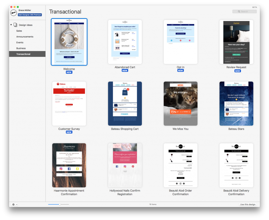
Mail Designer 365 offers you an array of ready-to-send transactional email templates.
Once your template is ready, explore a variety of export options to use it with the automation tools provided by your chosen ESP. Export directly to Mailchimp, DirectMail or Campaign Monitor, or export your design as HTML to use with all leading ESPs and marketing tools.
Not got a Mail Designer 365 Plan yet? Sign up to Mail Designer 365 today for free and start creating transactional email templates for your automated email strategy.
Until next time,
Your Mail Designer 365 Team
Originally published: February 2018
Updated: June 2020


