Did you catch the changes with Apple’s fonts? Apple relied on really thin fonts. But on the new iPad, Apple decided to go for a bolder look with their own in-house San Francisco font. Check out the San Francisco font in their headlines - thicker and easier to read the letters. Yes! Bold is in style again! So go on and take the time to explore different Google fonts! See which bold fonts are well suited for your newsletter designs.
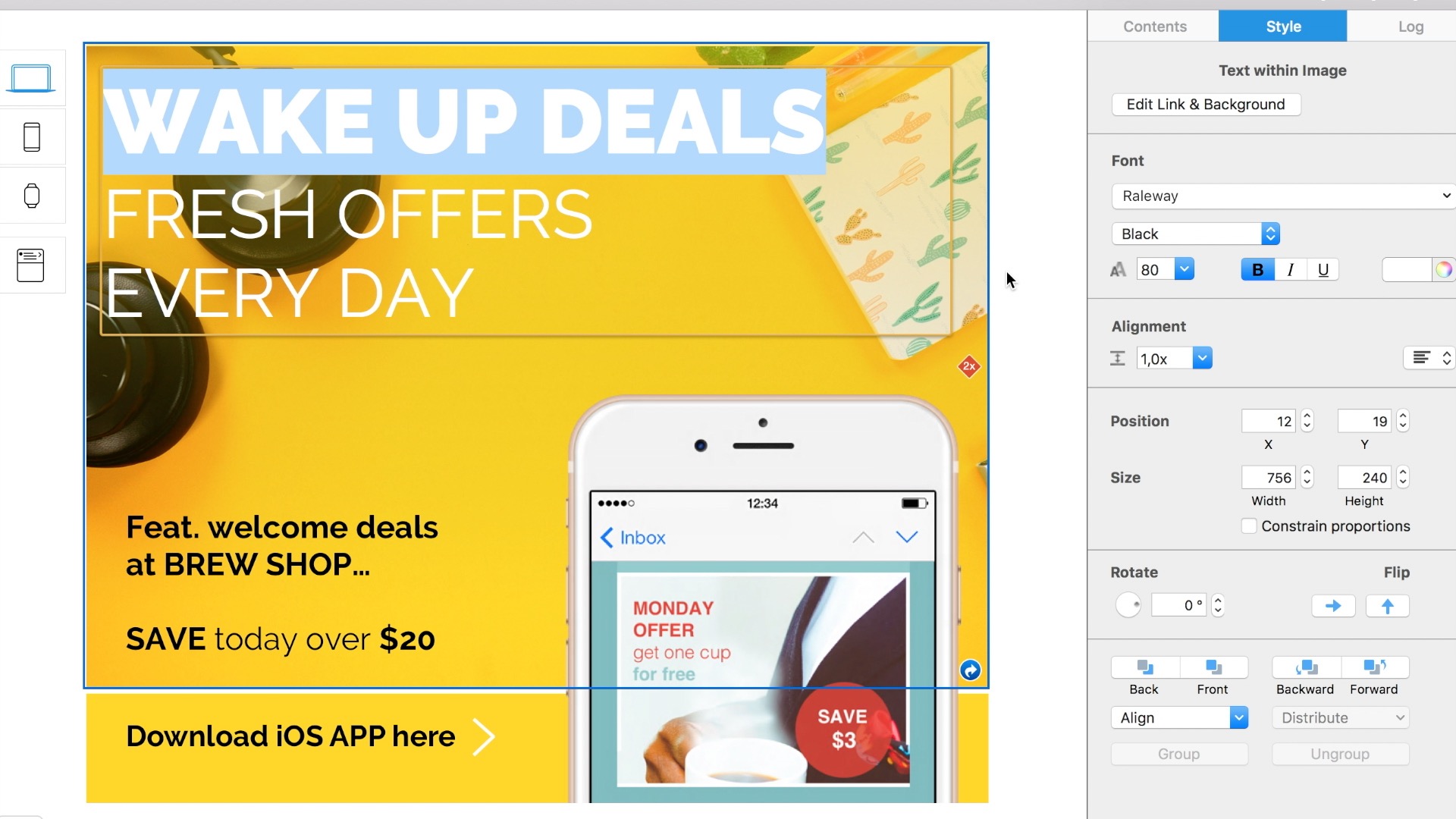
#1 Raleway
The font “Raleway” is known for the super-extravagant "W." Its slim version is a great choice for fashion and style news. Slim fonts are not your style? Fear not - it can also be used in the heavy-weight Bold or Extra-Bold font-weights, which makes the font easier to read. Whatever style you choose, this font remains a real hit!
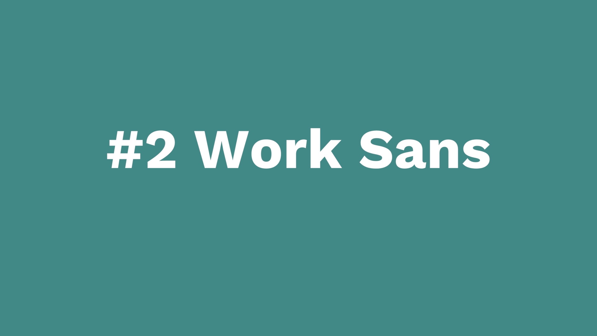 #2 Work Sans
Thick, straight, direct. This is a great font choice for headlines using uppercase letters, which will give the Work Sans an even more powerful and charismatic aesthetic.
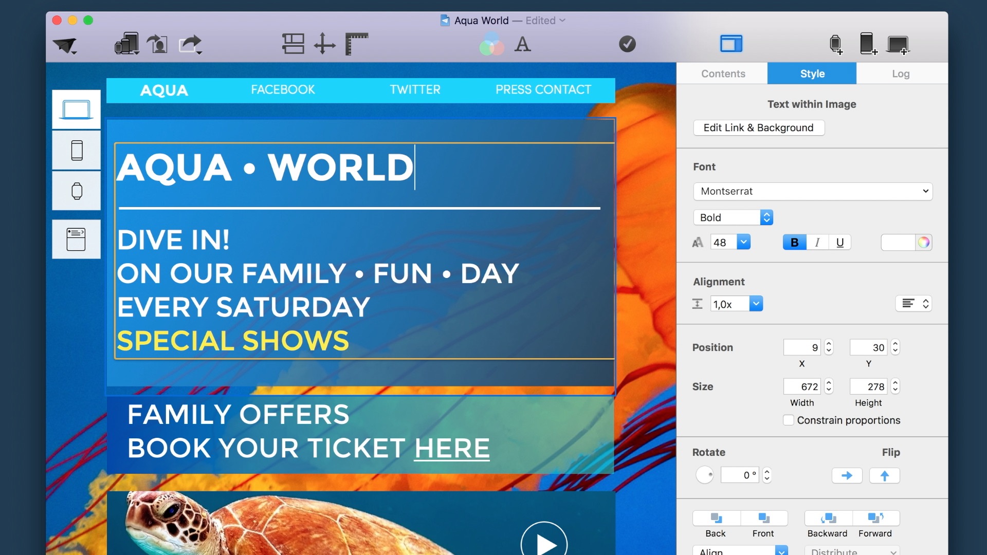 #3 Montserrat
Thick, fresh and funky. A real specialist for catchy headlines with a striking outlier like the sweeping "Q". This is the font of choice for exhibit invitations.
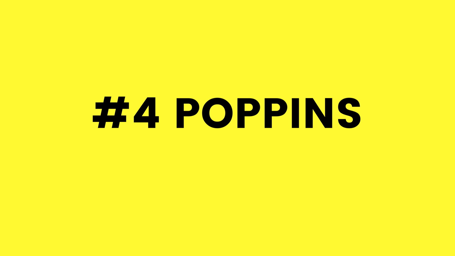 #4 Poppins
A light 60s touch with the cheeky poppins. It also offers a wide range from thin to powerful and bold versions. Welcome to the club!
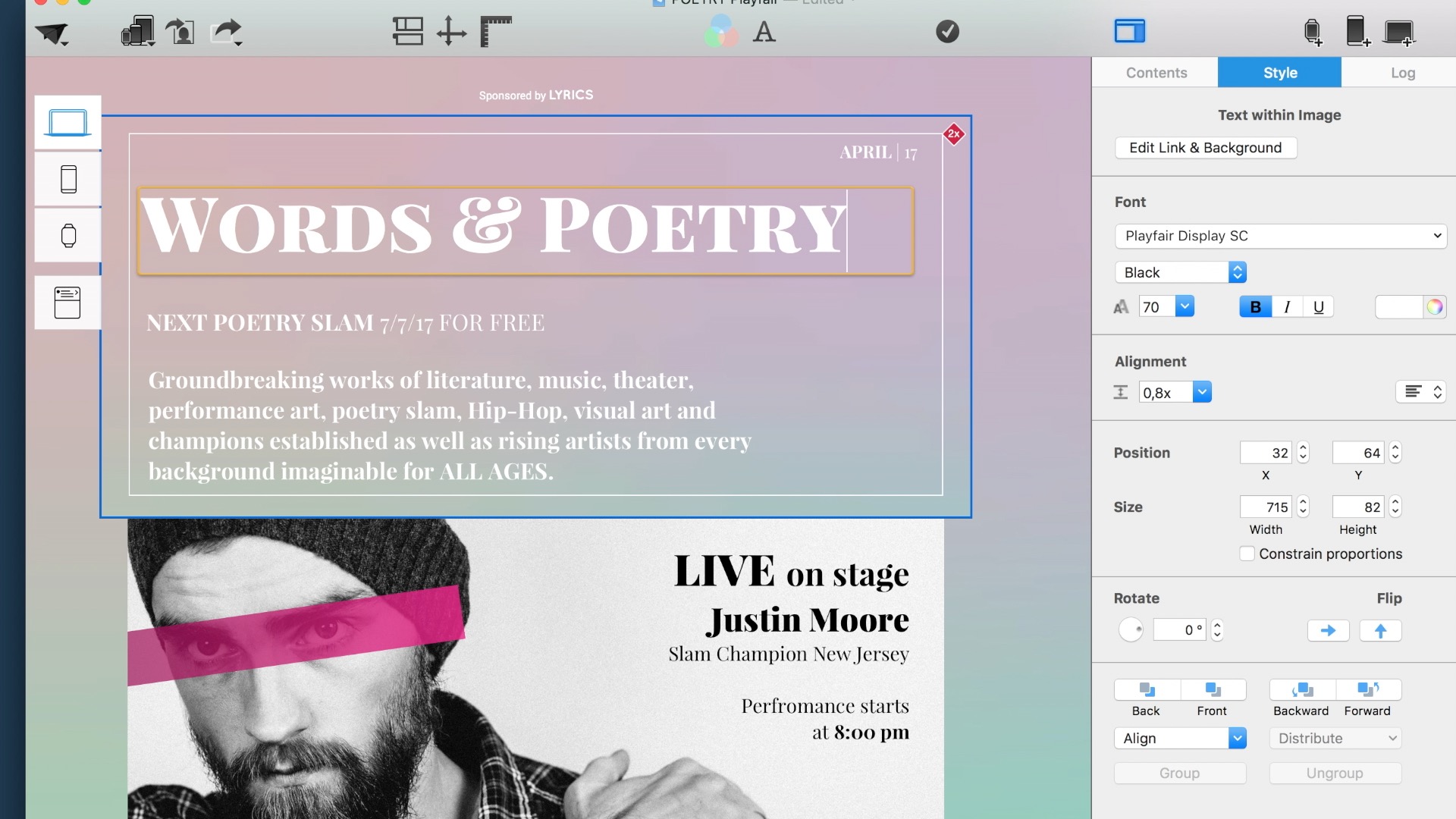 #5 Playfair Display
Choose this font if you want large letters that are more on the conservative side. This is perfect for text-oriented newsletters or for announcing the next event of your Poetry Slams.
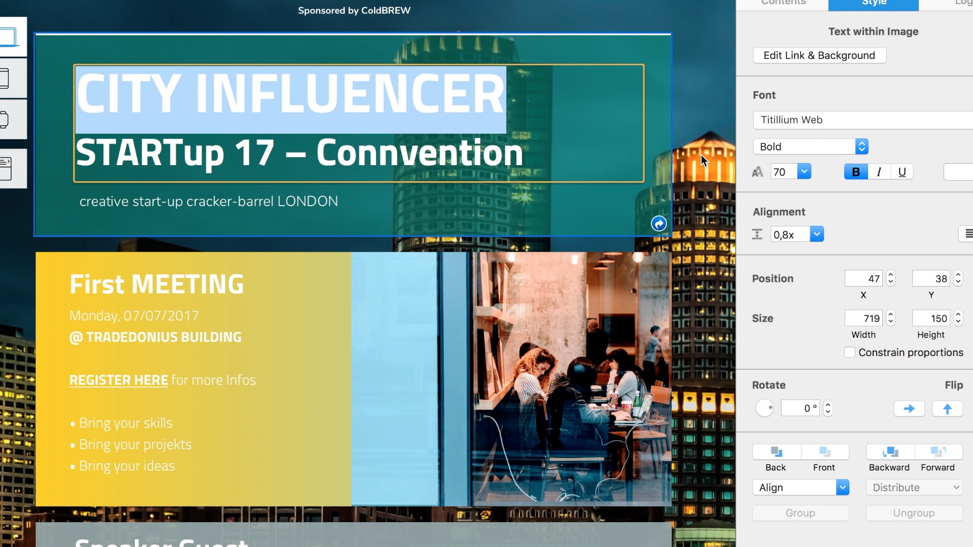 #6 Titillium Web
The Titillium Web can be delicate but can also be quite impressive with its powerful cuts and lines. A real all-rounder for every kind of newsletter: from start-up mail to e-bike rental.
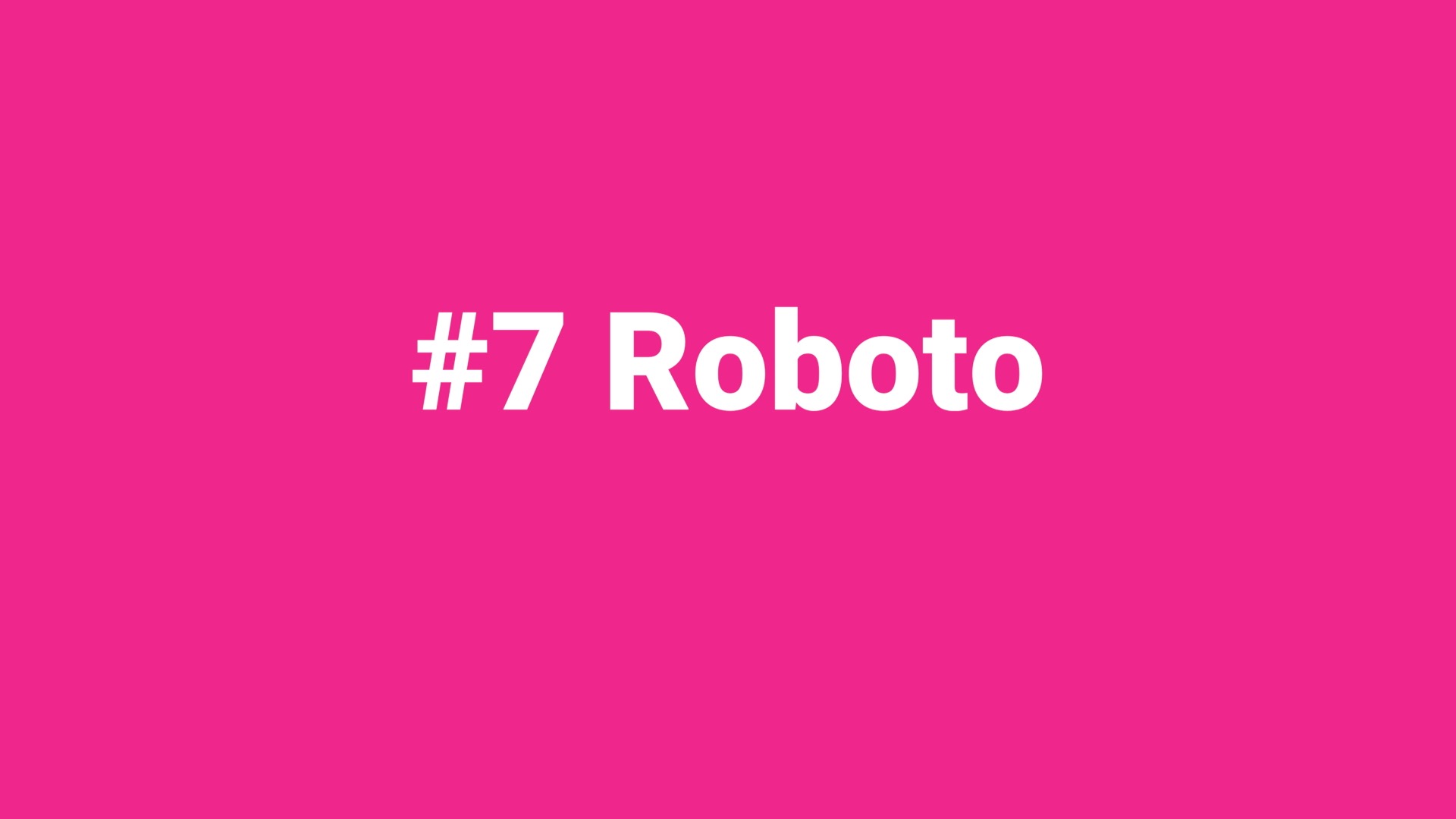 #7 Roboto
Clear yet elegant with its monolithic, concrete-like structure. Roboto sets a clear design statement with every headline.
Until next time,
Your Mail Designer 365 team
