Email design in different devices
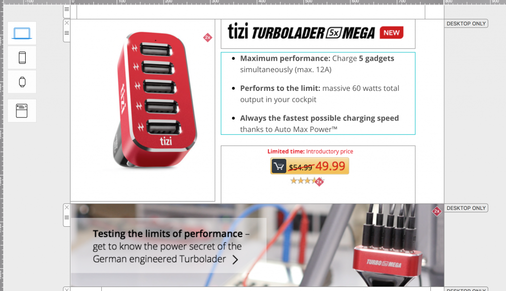
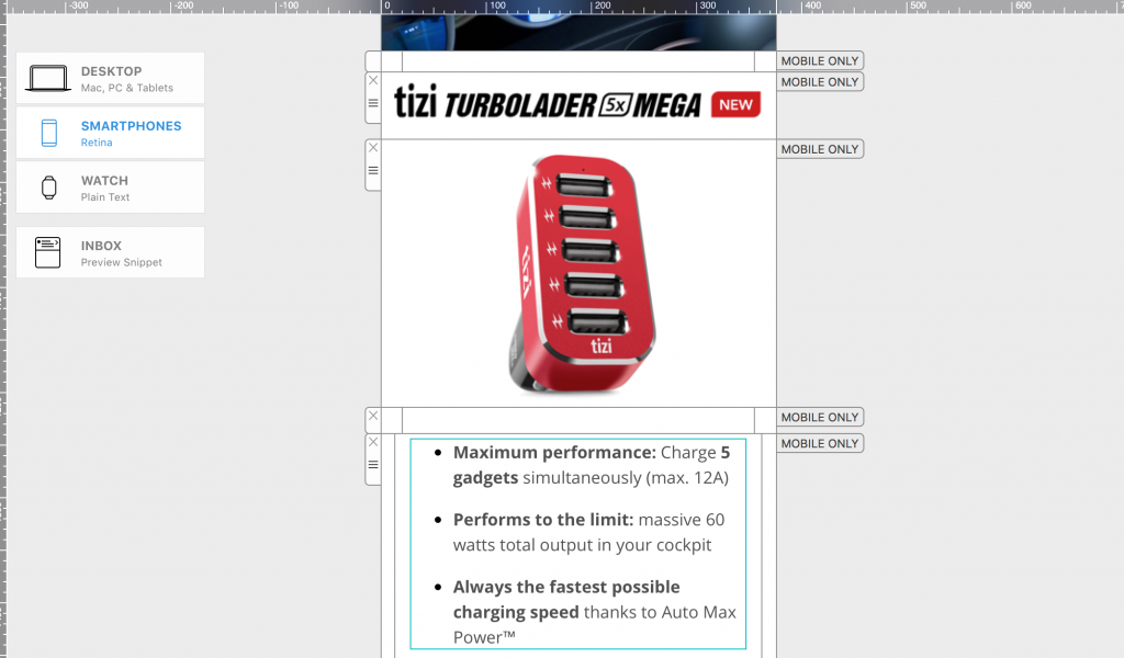
Sometimes, creating a template that looks perfect on your recipients' desktop and mobile devices require some modifications. If the font size is too large on a desktop version, then the overall email design will look off. However, smaller font size or big images containing text and graphics might be difficult to read on a mobile device.
Editing image areas
You can change certain images, like your company logo, for certain layout blocks. You don’t have to manually detach the whole layout block from the desktop version.
Just remove the old image from the image area. Then, drag the new banner image or logo onto the image area. Yes, it's that easy! Mail Designer 365 will automatically detach the image area of the mobile version from the image area of the desktop version. All of your other content will stay unchanged.


How Can We Help?
A Quick Tour of Mail Designer 365
Background
Layout Blocks
TextScout
Editing Text
Links and Buttons
Configuring Text Styles
Tables
Image Areas
Images
Using Retina Images with your Design
Graphics and Other Objects
Creative Tools
Advanced Design Techniques
Blend Modes
Optimizing your Template for Mobile
Plain Text
Preview your Design
Preparing your Design for Sending
Email Delivery
HTML Export
Other Sharing Options
