Halloween is one of the highlights of every email marketer's calendar. Whether it's taking a daring design risk, experimenting with new subject line ideas, or simply launching a huge promotion, the holiday brings new and fresh trends every year.
With the spooky season almost upon us, we're taking a look back at some of our favorite Halloween email campaigns from 2019, designed by some big name brands. Scroll through and get inspired for your own designs - you'll also find some devilishly good design tips along the way... Happy Halloween from the Mail Designer 365 Team! ?
The Best Halloween Emails from 2019
Ulla Popken
To kick things off, we've gone for this classic Halloween themed design by Ulla Popken. As well as the spooky email background with all the traditional Halloween imagery, the use of bold lettering is also super eye-catching and instantly gets the reader pumped for the flash sale.
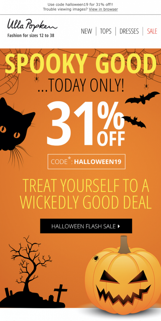
What we love: Ulla Popken do a great job of generating a sense of urgency by using time sensitive language in their campaign. Knowing the sale is only running for one day makes it even more irresistible to customers and will work wonders for driving click-thru rates and conversions.
Glossybox
Although the baby pink color scheme may be a little out of the box for a Halloween email design, we love how Glossybox have stuck true to their brand identity with a cute and feminine design. With the ghosts, the Halloween theme is still super apparent and the main message is communicated well.
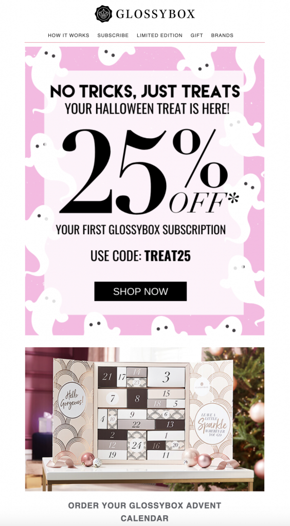
What we love: Incorporating the trick or treat theme is a nice route into Halloween email marketing if your brand doesn't want to venture too far down the "spooky" road. The promo for their advent calendar is also a smart segue into holiday marketing. This gives Glossybox a little head start while competitors are solely concentrating on Halloween.
Hawke & Co
Hawke & Co's 2019 campaign was relatively simple in terms of design, but still managed to pack a punch with bold lettering. The burnt orange background color is effective and automatically creates a connection with Halloween / Fall and the subtle placement of the bats helps take the email one step further.
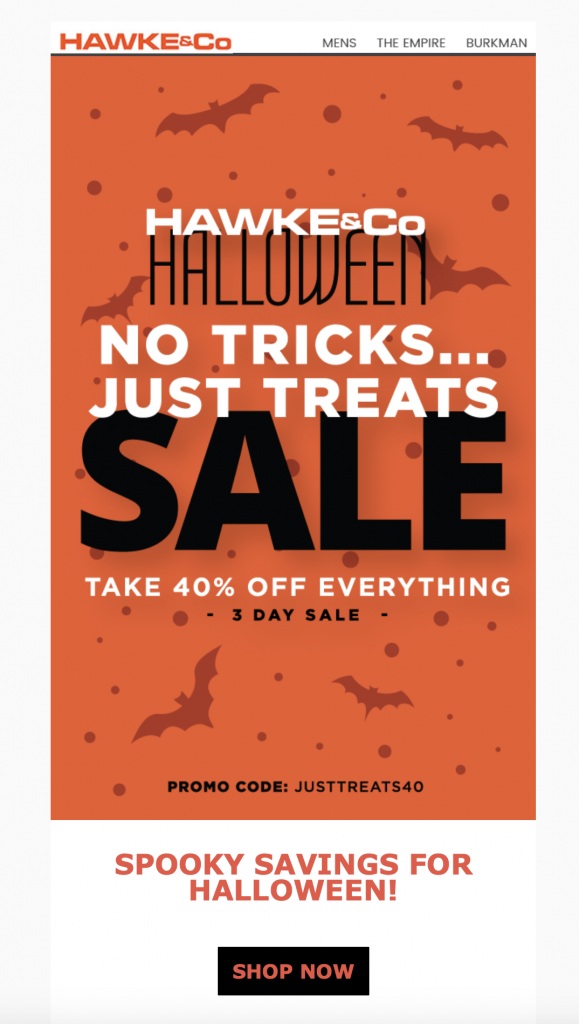
What we love: Mixing font styles and sizes is a quick and easy way to make a largely text-based design a whole lot more interesting. The emphasis on "sale" means the reader is first drawn to that and the rest of the text finishes off the design well.
Make it in Mail Designer 365: Mail Designer 365 has a huge variety of web fonts you can use to create text-based designs that still cast a spell on your readers. Play around with size and styling options to create bold statements in your designs.
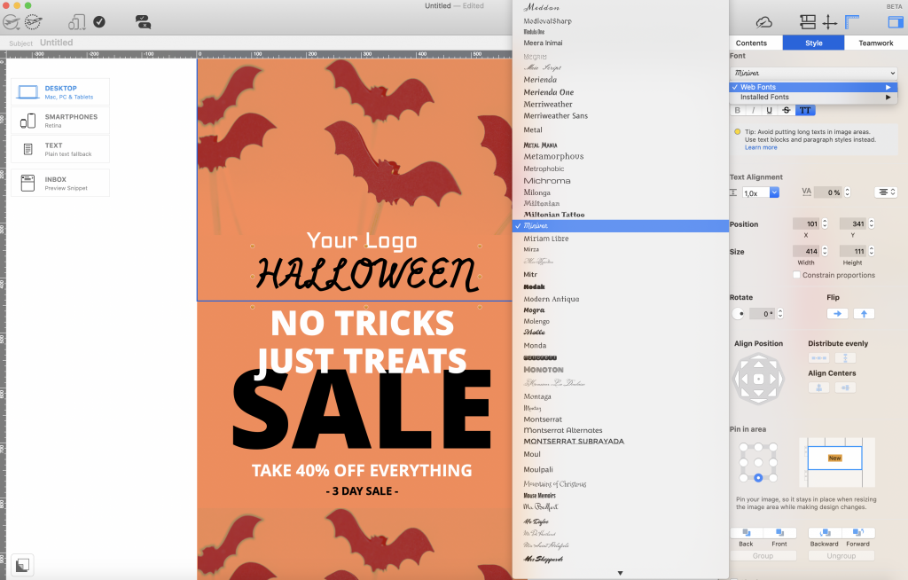
Explore Mail Designer 365's library of web fonts to create spellbinding text-based designs.
Radley
Here we have another Halloween flash sale but this time with an awesome clock GIF to help instil that all important sense of urgency. In addition, Radley also include classic Halloween aspects like bats, pumpkins and an orange and black color scheme.
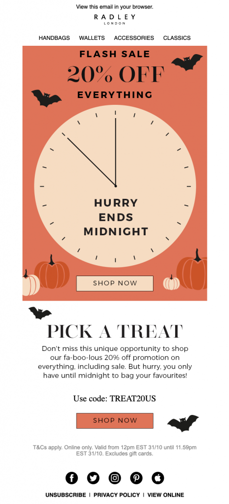
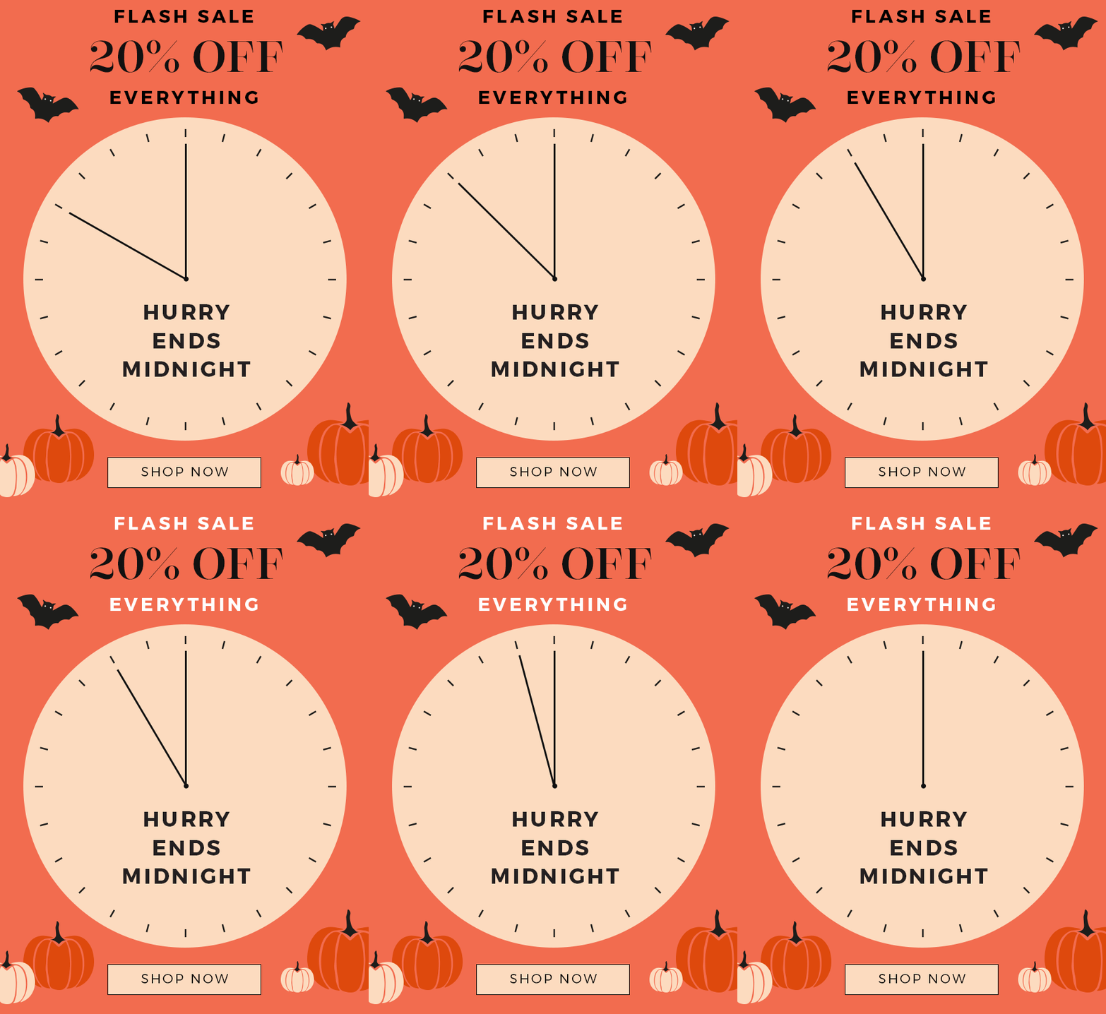
What we love: The ticking clock GIF is definitely the standout in this email for us. As well as being visually appealing and eye-catching, it also does a great job of creating the time pressure needed for a successful sale.
Taco Bell
This spooky, graveyard style design by Taco Bell was another great take on a classic Halloween theme. Here is another brand that has opted to move away from the typical orange and black theme and go for something different, yet equally as powerful. Again, mixing font styles and colors is a great way to liven up a headline or slogan.
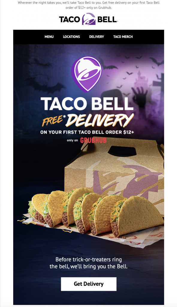
What we love: The product placement in this email is also done really well. Even if your product isn't traditionally associated with Halloween, portraying it in a spooky setting helps customers make that connection and automatically makes your campaign more relevant.
Berkshire Blanket & Home Co.
Sometimes low key works just as well. Berkshire Blanket & Home Co. kept things simple and sophisticated in their 2019 Halloween campaign but used a subtle spider web background as a nod to the spooky holiday.
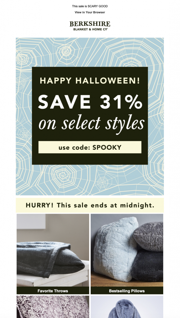
What we love: This design was refreshing, as it was nice to see something different from the norm. The contrast between the bold, black and cream promo graphic and the softer blue background is powerful and draws the reader into the main offer straight away.
Warby Parker
This is a great example of how to integrate the Halloween theme without planning a big sale or promotion. Warby Parker take all the traditional Halloween design elements and merge them to create a simple yet powerful email. The comparison of their home try on service with trick or treaters is also a clever way to halloweenify their standard marketing strategy.
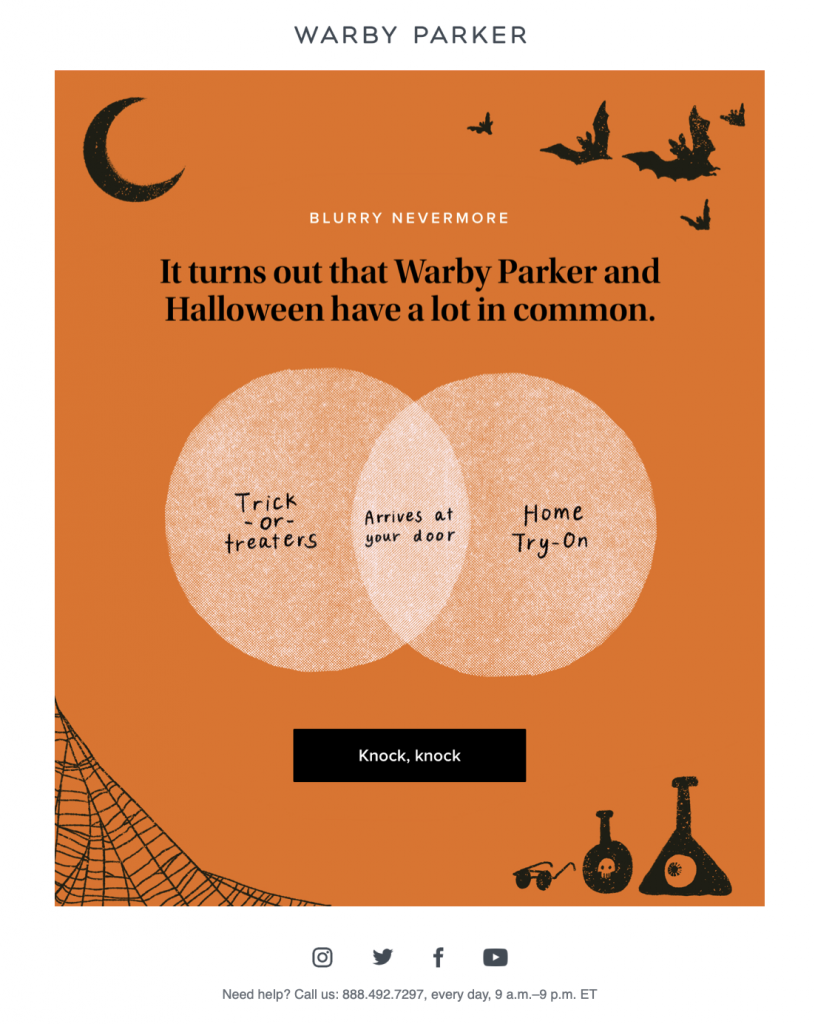
What we love: The CTA (call-to-action) is witty and attention grabbing. Although we usually recommend a clearer and more direct CTA message, this text works great with the Halloween theme and does a good job of drawing in the reader.
More Tips for Sending Halloween Emails
We hope this roundup of the best Halloween emails from 2019 has left you feeling inspired. Check out our other Halloween resource to find even more tips and ideas for creating awesome Halloween email campaigns:
5 Things You Can Do to Build Devilishly Good Designs this Halloween
Mail Designer 365 has all the tools you need to build and send bewitchingly brilliant emails this Halloween. Discover Halloween email templates, amazing graphic effects and web fonts to bring those scary vibes to any design.
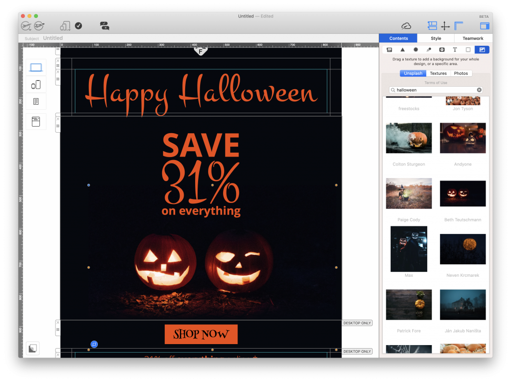
Don't have a Mail Designer 365 plan yet? Try for free today to get started with email marketing for Halloween!
Until next time,
Your Mail Designer 365 Team

