As one of the biggest dates on the email marketing calendar for many businesses, "Black Friday" is an event that raises the bar for you and your marketing strategy. Building an effective email campaign is a crucial part of your business's success.
Getting Started
As always, the key is to start planning early so you are feeling confident in your campaign when the big day comes around. This way, you avoid any last minute panic and have time to tackle any obstacles encountered along the way.
The pressure to create an email campaign that stands out against competitors and drives sales is something every business owner knows all too well. To make things a little easier, we're sharing some awesome examples of businesses who really got it right in previous years.
Keep reading to discover excellent email campaign examples, plus tips on how to steal these expert ideas for your own campaigns...
21 of the Very Best "Black Friday" Email Campaigns
1. Tradesy
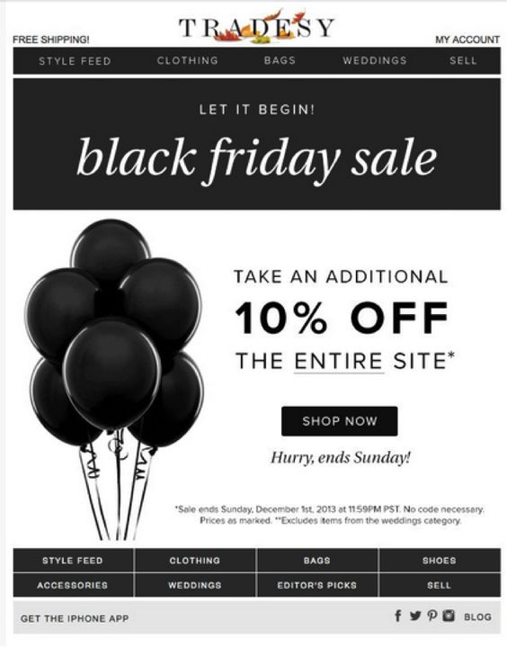
What better way to to celebrate a sale than with balloons? This monochrome email design by Tradesy is a slick and sophisticated way to advertise an exciting "Black Friday" promotion.
2. Office
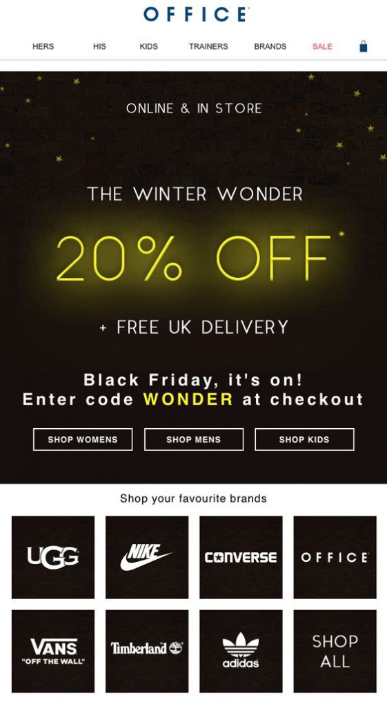
The yellow accents in this email by Office work great as eye-catchers. The 20% discount stands out and really manages to grab the reader's attention.
Recreate this effect in Mail Designer 365: Create glowing text effects with the shadow tool. Choose your colour, blur and offset angle to create eye-catching shadow effects.
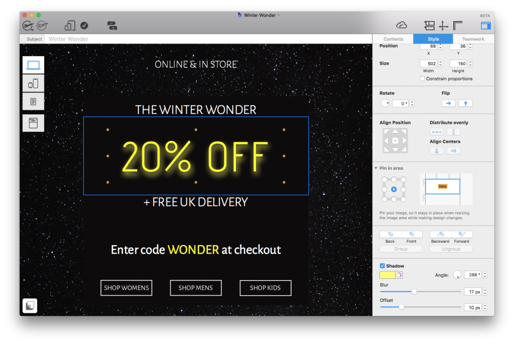
Use the shadow tool to highlight important elements of your design with a vibrant, glowing effect.
3. Jack Spade
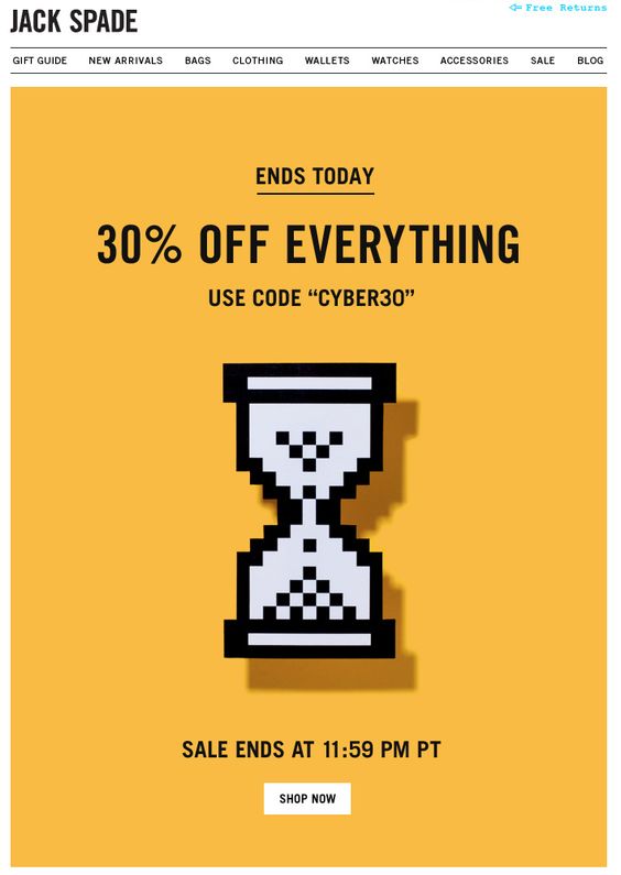
Cyber Monday is essentially the online equivalent to "Black Friday" and you should definitely factor it into your email campaign.
Jack Spade cleverly generates a sense of urgency by using a timer as their main graphic. We love how it's pixelated to stay in line with the "cyber" theme.
4. Boohoo
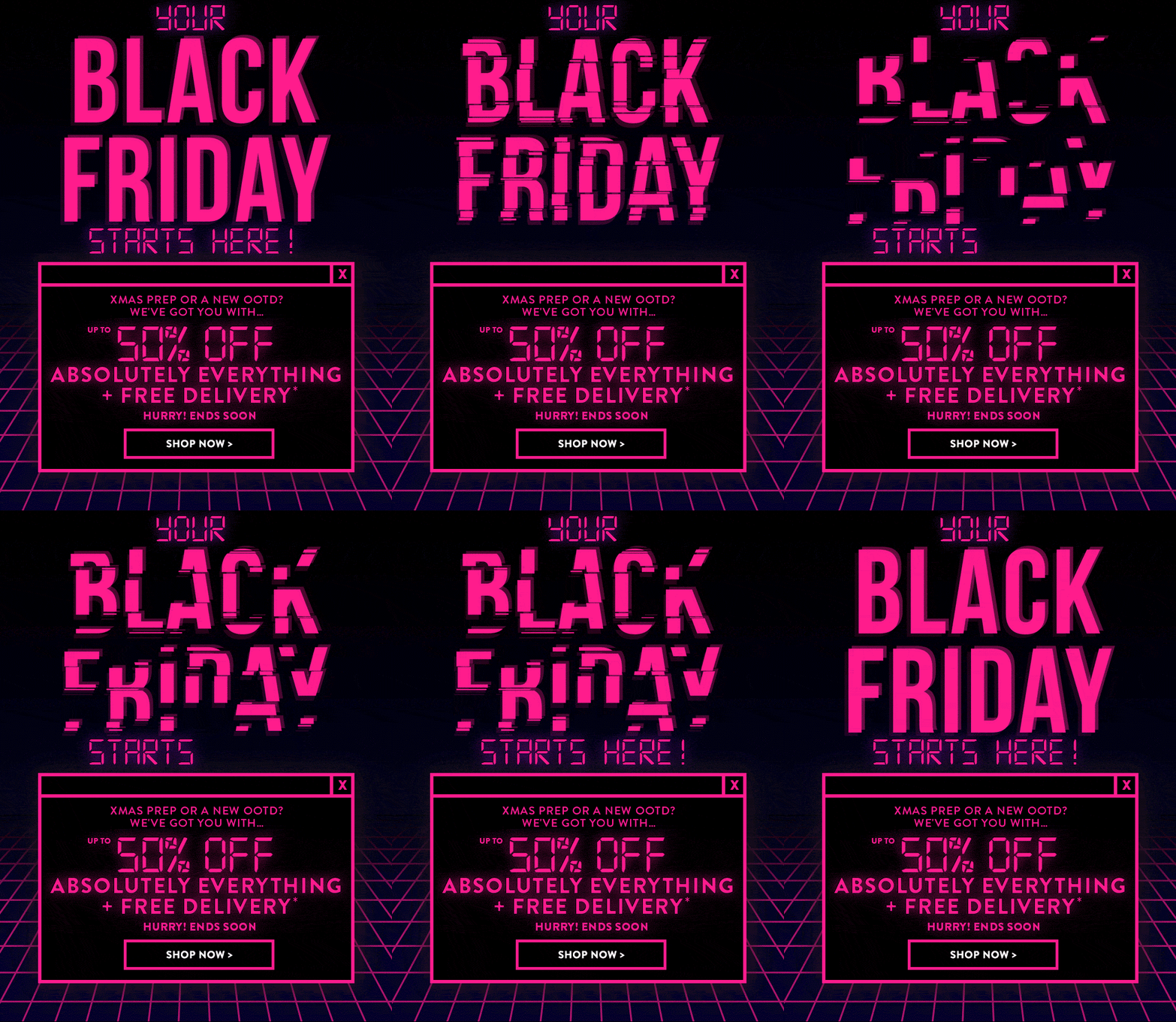 This fun design by Boohoo also adopts a clear cyber theme. The bright pink GIF is great at drawing attention the the message of the campaign and the design as a whole is certainly unique enough to win over customers.
5. Urban Outfitters
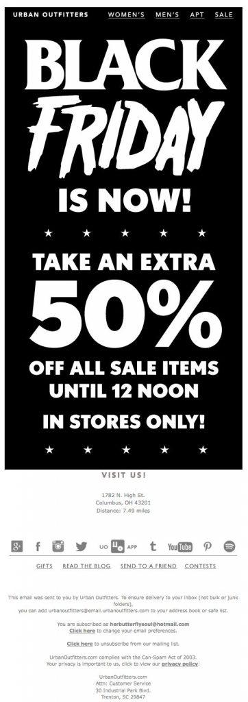 This monochrome design is basically all text but gets straight to the point. Urban Outfitters do a good job here of using contrasting fonts to give their simple design more character.
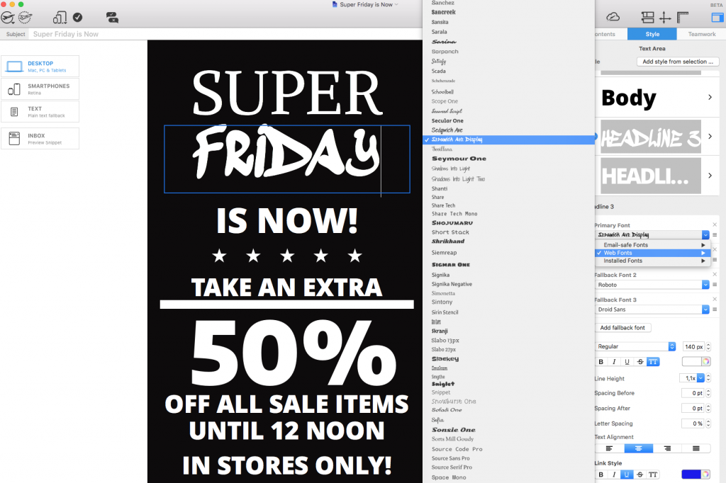
Recreate this in Mail Designer 365: Experiment with different web fonts to give your email campaign more of a unique edge. Remember to use text layout blocks to avoid any compatibility issues:
 6. Chicago Tribune
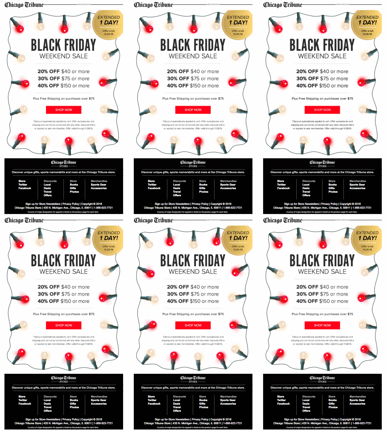 The Chicago Tribune gets super festive with this colorful email design. The fairy lights GIF is a good way to attract attention while also getting readers in the holiday shopping mood.
7. Jack Wills
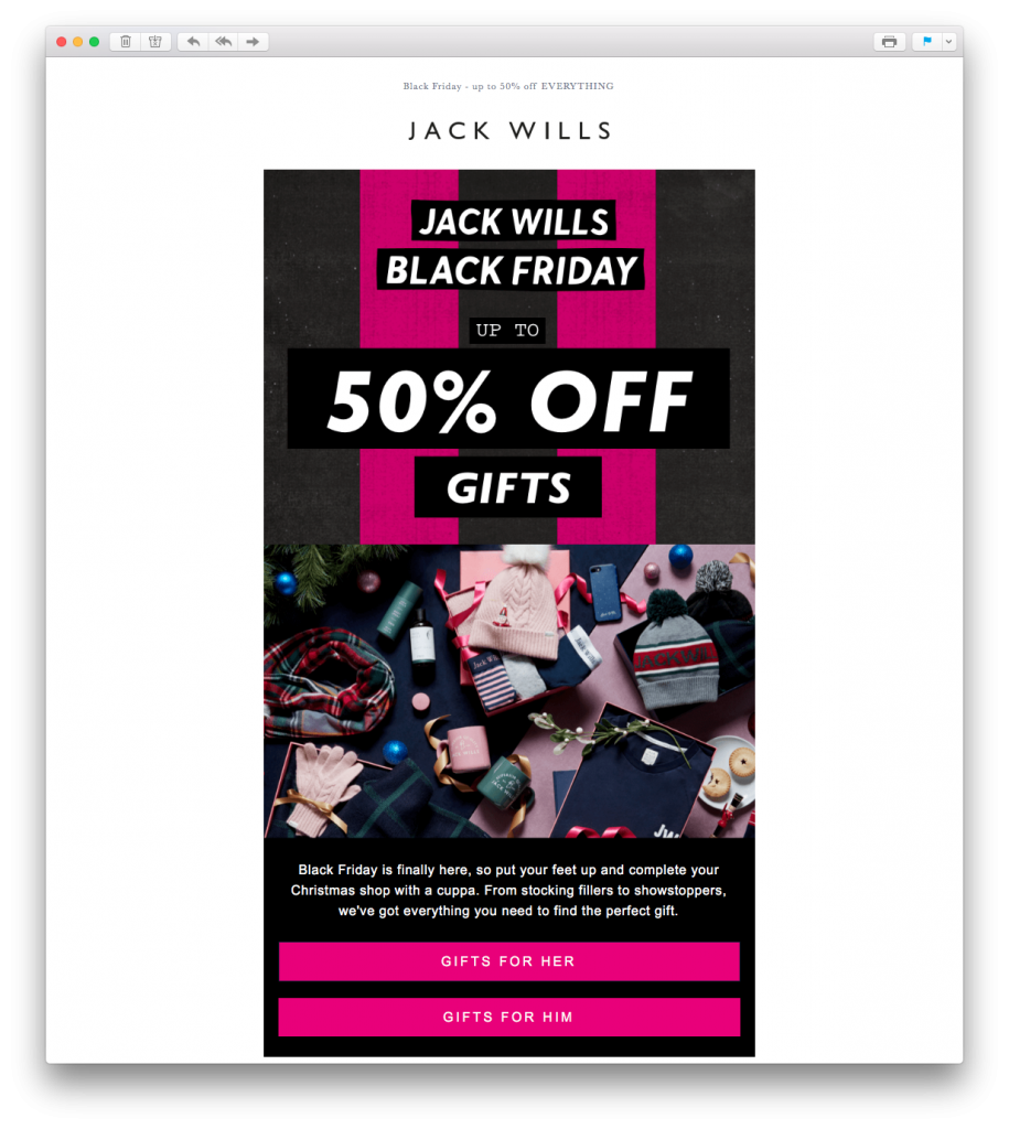 This email by Jack Wills definitely gets us in the holiday mood. The festive feature image is really effective in recreating the ultimate Christmas morning feeling. The pink striped background also creates a gift wrap effect and fits perfectly with the theme of holiday gift shopping.
8. 10 Store
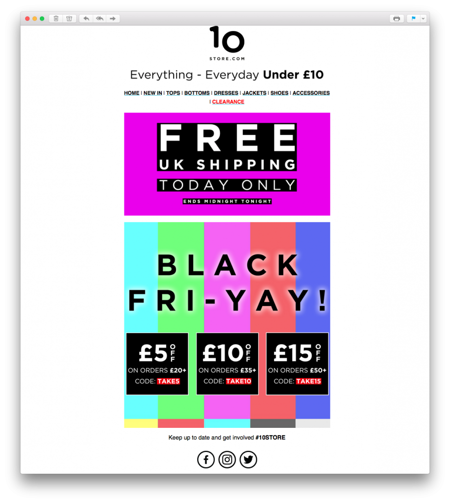 Here's a risk that paid off. Although perhaps a little adventurous for some, there's no denying that this loud, colorful email design by 10 Store grabs your attention straight away.
9. Bluefly
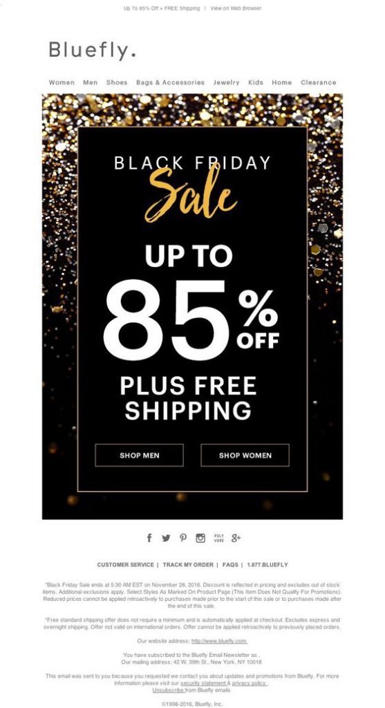 The gold, glittery vibe of this email campaign by Bluefly is super festive and exciting. The combination of black, gold and white works great for a big sales event and the text is big and bold enough to instantly make the message clear.
10. FatFace
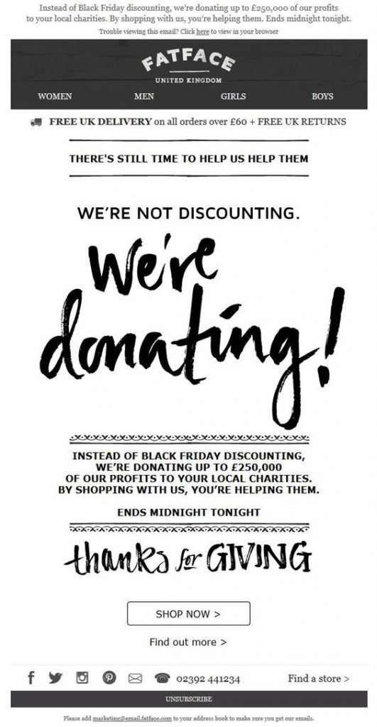 This campaign by FatFace has a really nice sentiment and makes a change from standard sales emails. Giving back campaigns such as this one are very effective around the holidays. Customers are encouraged to shop in order to put their money towards worthwhile causes.
11. Mothercare
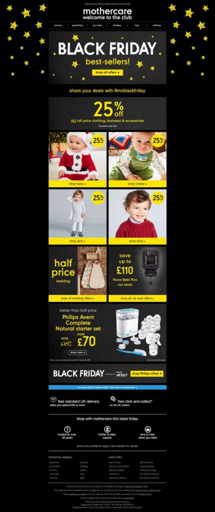 Mothercare show off their star offers in this stellar email design. The contrast between black and yellow tones make the CTAs (call-to-actions) and eye-catchers really pop in this email. The catalogue layout also makes accessing the deals much easier; which is great on this busy shopping occasion.
Recreate this in Mail Designer 365: Experiment with shapes to make CTAs and explore different layout options to recreate this catalogue style design.
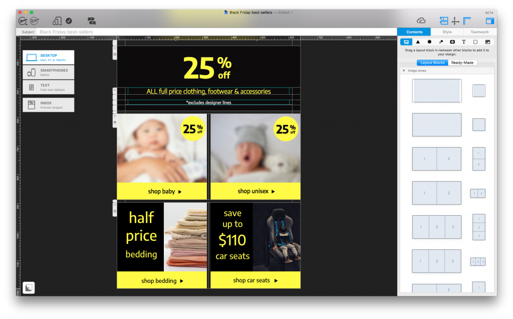
Build a similar catalogue layout with bold CTAs and eye-catchers using shapes and layout blocks.
12. Odeon
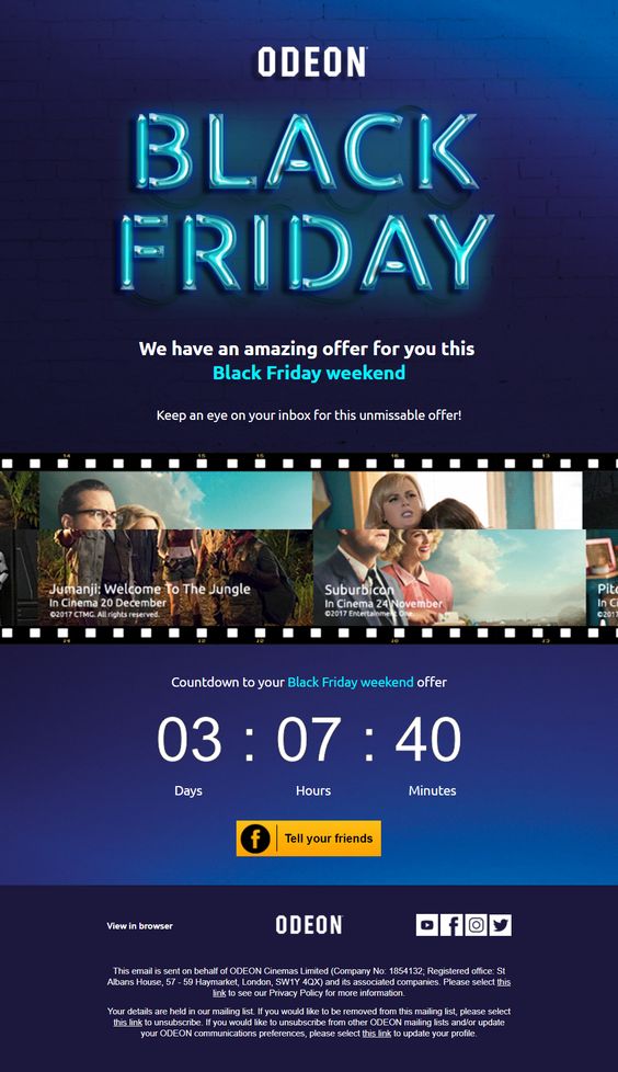 As shown here by Odeon, a bold feature font is a nice way of grabbing your readers' attention. The countdown is also a great touch to get customers geared up for your special promotion.
13. NYX
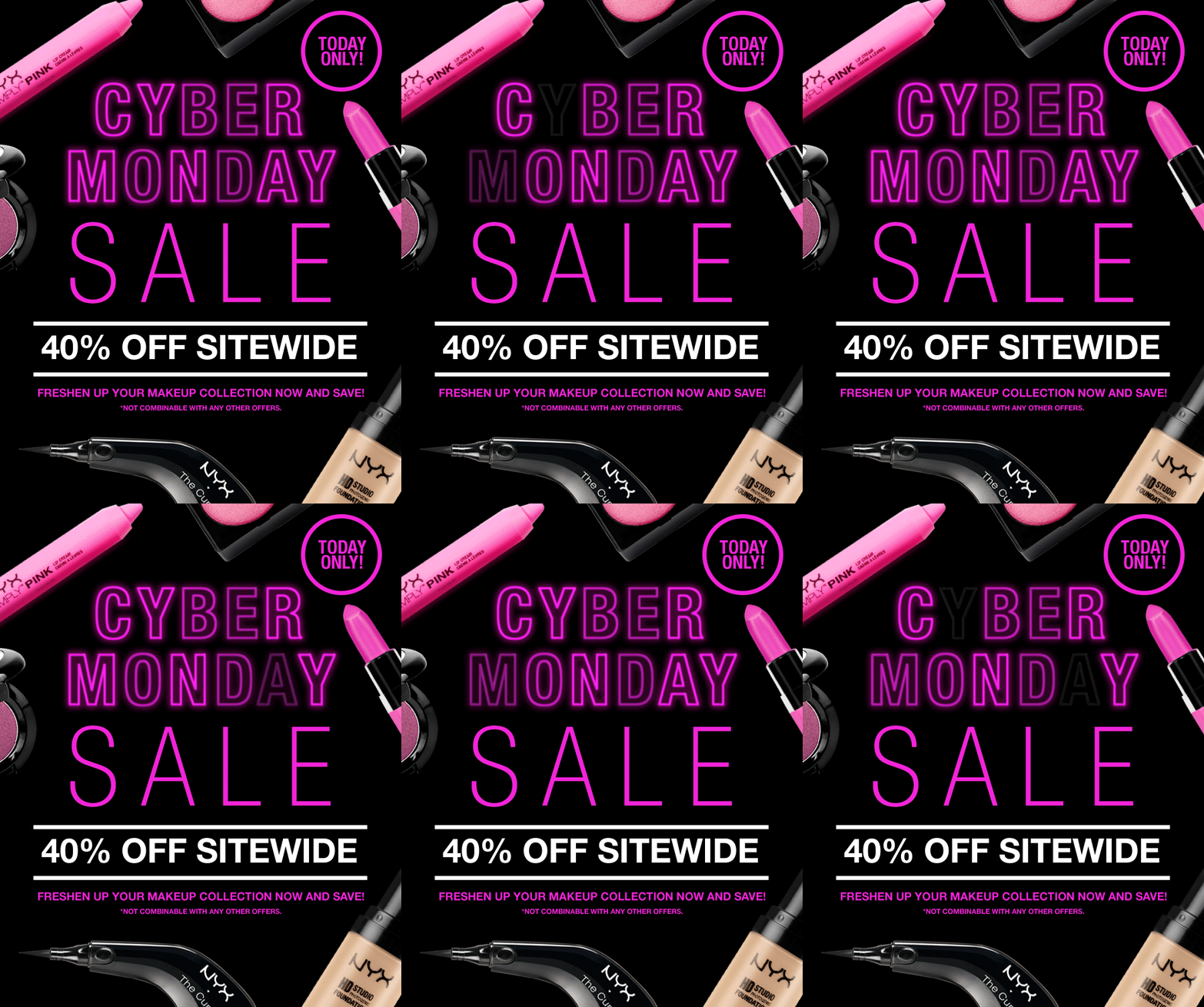 NYX really promote their products with this inventive layout. Hot pink accents make the message hard to miss and the LED effect GIF is both cool and creative. The "today only" tag is also a clever way to generate a sense of urgency.
14. Aldo
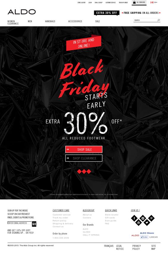 Aldo keep things pretty simple in this design, but the festive red combined with the cool, textured black background creates a noticeable contrast. Again, they've gone for a mix of font styles to liven up the design even more.
15. Julep
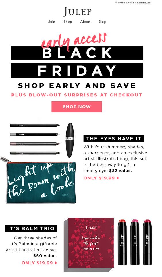 In this campaign, Julep have gone for a slightly different approach. The "early access" sale gets customers shopping before the big day and alluding to surprises at the checkout will certainly boost those click-through rates. We also like the design's balance between images and text to keep things visually interesting yet still informative.
Recreate this in Mail Designer 365: Combi layout blocks are a great way to balance out text and images side by side. Write inspiring product descriptions or include a bullet list of key features:
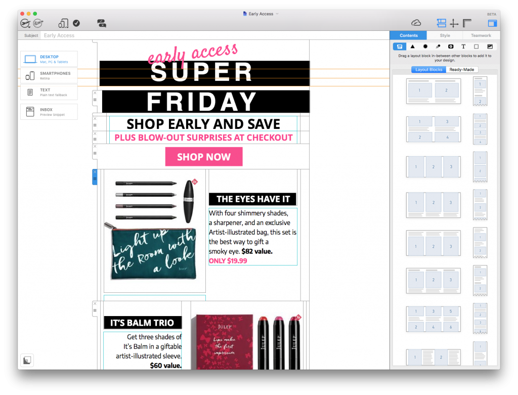
Try out combi layout block styles to balance out images with interesting product descriptions.
16. Graze
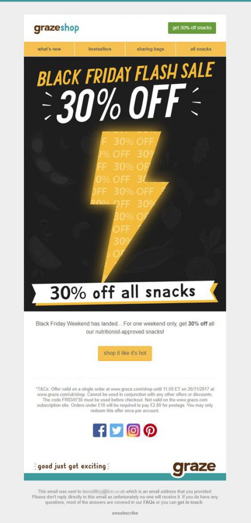 Graze have taken us by storm with this lightning bolt design. This is a great way to stand out from competitors and the color combination also hits the spot.
17. Rent the Runway
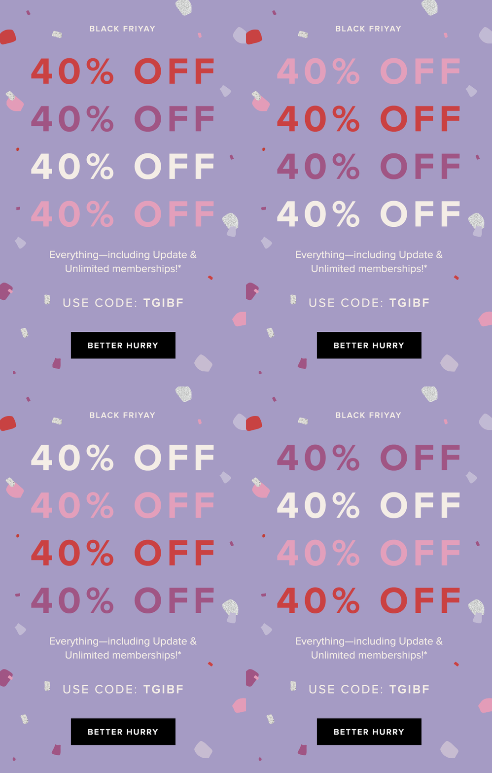 As shown here by Rent the Runway, sometimes simple does the trick. The bold GIF clearly highlights their 40% off promotion whilst also bringing some fun to the design. The "better hurry" CTA button is also inventive and adds a sense of urgency to the campaign.
18. Dr. Martens
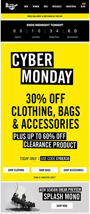 Dr. Martens demonstrate yet another drastic color scheme with this vibrant design. The countdown at the top again creates a sense of urgency and big, bold lettering communicates their offer well. It's also smart how they think ahead and include a product preview at the bottom of the email.
"Black Friday" email campaigns get some of the highest open rates, so you might as well use the chance to promote your business while you can!
19. Forever 21
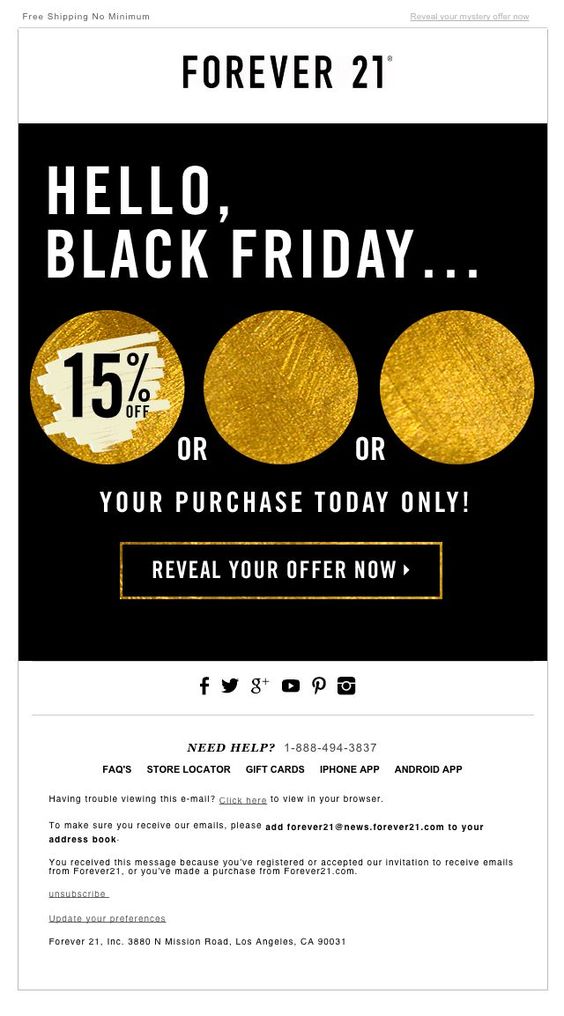 Forever 21 sneak an element of mystery into this "Black Friday" themed design. The temptation to click and reveal their discount is too much for many customers to resist. The gold accents also add a festive tone to the design and get customers in the money-spending mood.
20. Wolf & Badger
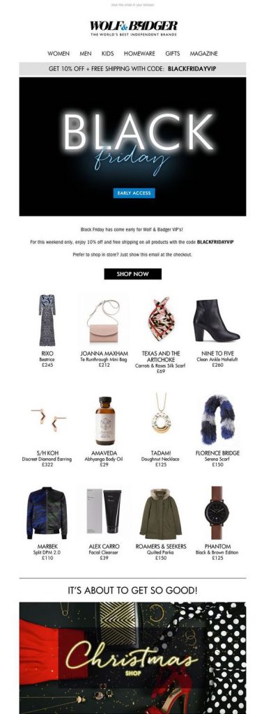 In this email, Wolf & Badger proudly showcase their best products to celebrate with their customers. As well as the eye-catching feature graphic, the clear layout also makes the promotion more effective and the deals easier to shop. The Christmas Shop graphic in the bottom of the email also does a good job of getting readers ready for holiday shopping.
21. Flannels
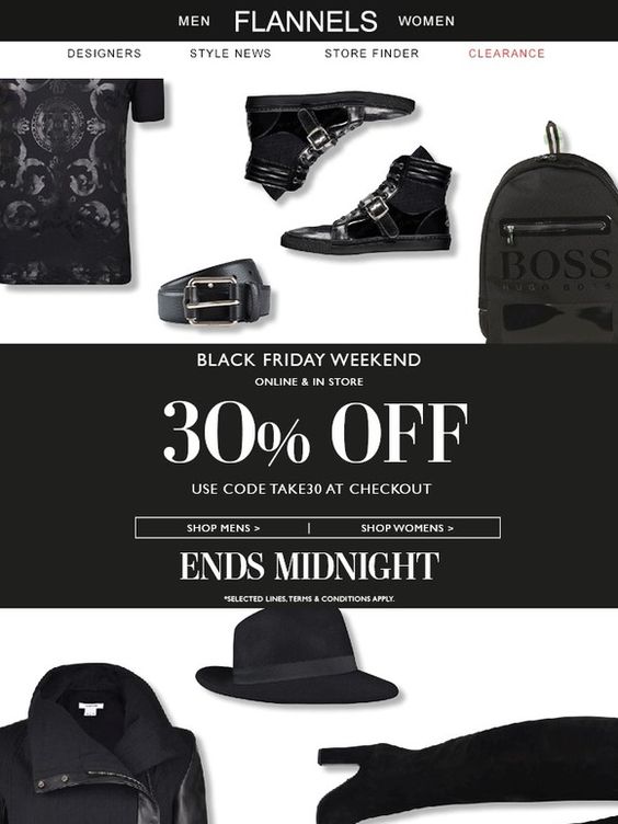 This monochrome design by Flannels is super cool. Using only black products in the background of the email is a clever take on the "Black Friday" theme. The font choices are also bold and stylish, and the "Ends Midnight" tagline incorporates that all-important sense of urgency to the campaign.
Start building your email campaigns today
Whether you're planning a promotion for "Black Friday" or holding another large sales event, we hope these 21 awesome examples have come in useful, and that you will try out some of the techniques and ideas mentioned in this article when designing your own emails.
Read more on topic Sales, Promotions & "Black Friday":
- Tried & Tested: Our Exclusive Insider Tips for Brilliant Sales Campaigns
- Our Answers to the Toughest Black Friday questions revealed
Want to get started? Sign up free to the Mail Designer 365 service today to test all of the tips in this article.
Good luck & until next time!
Your Mail Designer 365 Team
Get expert tips straight to your inbox!
Please check and try again.
We've just sent you an email for you to confirm your email address, if you haven't already.

