Fonts make a great impact to the overall look of your email design. It's no wonder that many business are combining fonts together to create a unique look and feel to their newsletters. If you are new to email design, you may feel a bit overwhelmed at all of the font choices. We understand, but we'll share tips for creating your own font combinations. We promise that you do not have to be a design expert to start developing an eye for font combinations.
Here are 9 tips you should keep in mind:
1. Pair fonts that can balance one another
When selecting fonts, we recommend having a balance. Combining an attention-grabbing font with a conservative font can be visually appealing. The contrast helps make the eyes focus on key messages.
With any font pairings, you want to make sure that you select an attention-grabbing font, which is a font that stands out from the rest of the text. These types of fonts tend to have a strong personality, whether it’s curly, script, or a bold typeface.
Once you have picked your attention-grabbing font, choose a font that is more conservative. These fonts are neutral and non-distracting. They are easy to read and will not take the attention from your attention-grabbing text.
Remember that the more “character” that your attention-grabbing font has, the more simple your “conservative” font should be.
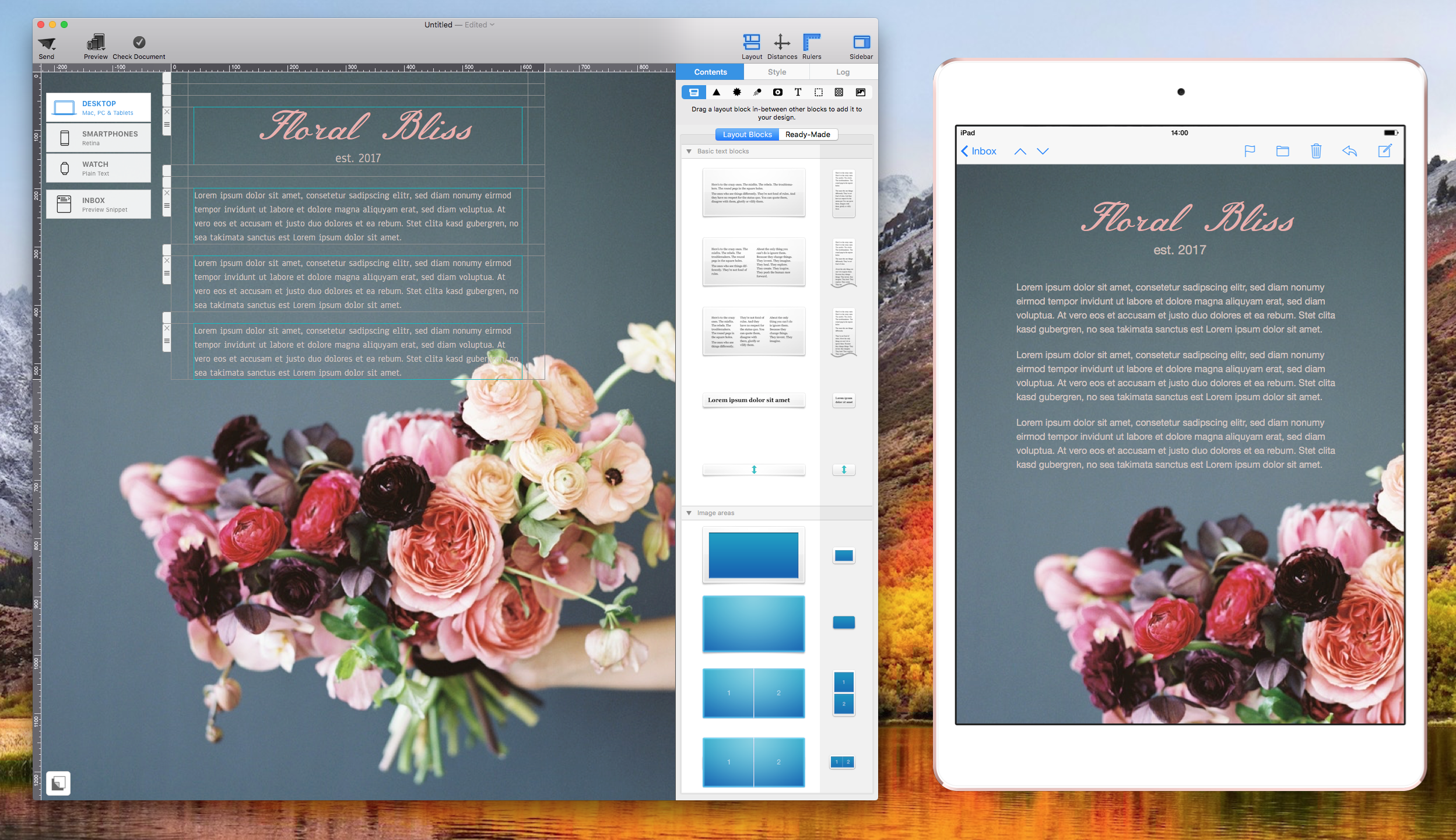
In this example, we chose "Meie Script" as our attention-grabbing font. Then, we chose a relatively more conservative font called "Anaheim" to balance the email copy:
2. Use font combinations to design a visual hierarchy
Different fonts can help separate different parts of text visually. You can use a font for headlines that is different from the body of text. For the parts of the email copy that you want your subscribers to look at first, choose fonts that are bolder or bigger. Bold and bigger fonts command attention. Our eyes will be drawn to these areas first at the initial glance.
You can also choose a unique font for captions. Depending how important the captions are, choose your fonts according. The more important the caption is relative to the rest of the email copy, the more eye-catching your captions should be.
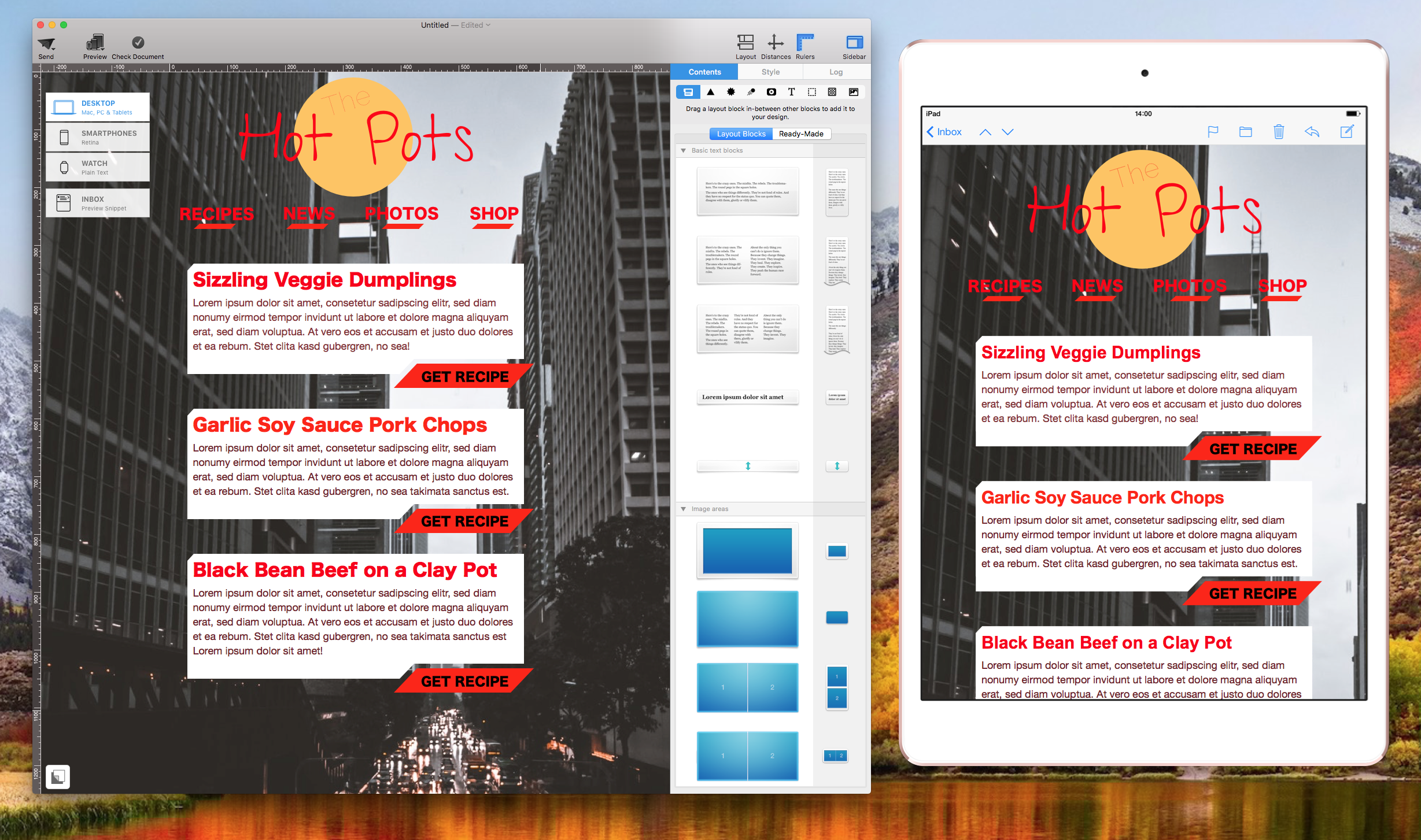
In this example, we used "Hiragino Kaku Gothic Std" as the font for headlines. For the body of the text, we used "Helvetic Neue." To ensure that a clear hierarchy can be seen, the parts of the email that we want people's eyes to focus on are much bigger in size and in bright red.
3. When combining fonts with similar proportions, assign different sizes to establish hierarchy
Fonts that have similar proportions tend to complement each other, as long as the different fonts have different sizes. In this context, proportions refer to the width of the characters relative to the height of the characters.
The easiest way to do this is to compare the letter "x" within the font. If the x's proportions are similar to each other, then it's likely that the fonts in general have similar proportions.
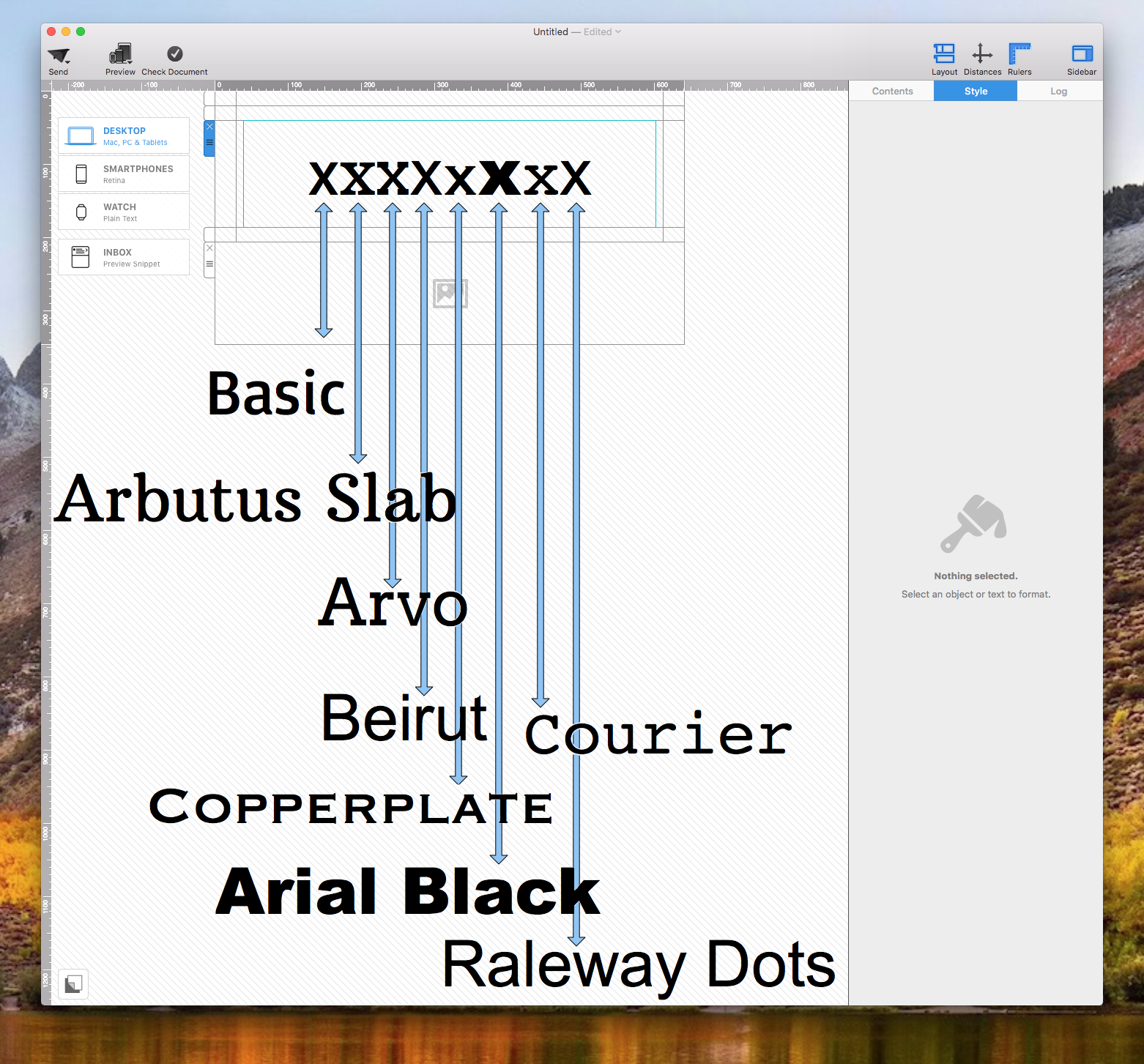
As you can see, these fonts have similar proportions:
- Basic
- Beirut
- Raleway Dots
These fonts have similar proportions:
- Arbutus Slab
- Arvo
These fonts have similar proportions:
- Copperplate
- Courier
Arial Black is the one that stands out from the rest. Its width is much wider compared to the other fonts.
4. Consider the mood of the font
For font combinations, the mood is essential. Just like the images, backgrounds, and colors, the type of font can also help fortify the mood of the newsletter.
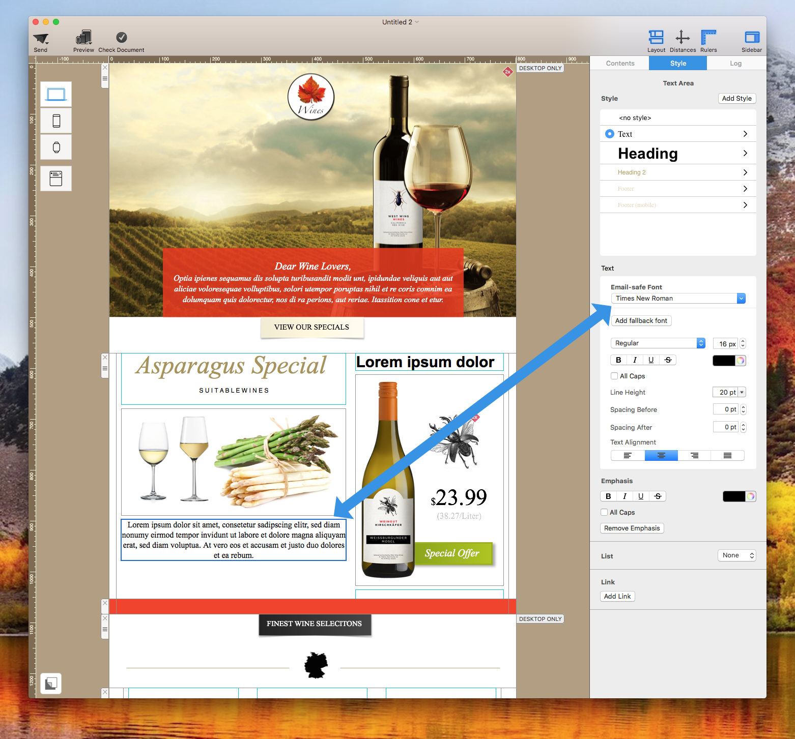
Some fonts are formal and professional, such as "Times New Roman."
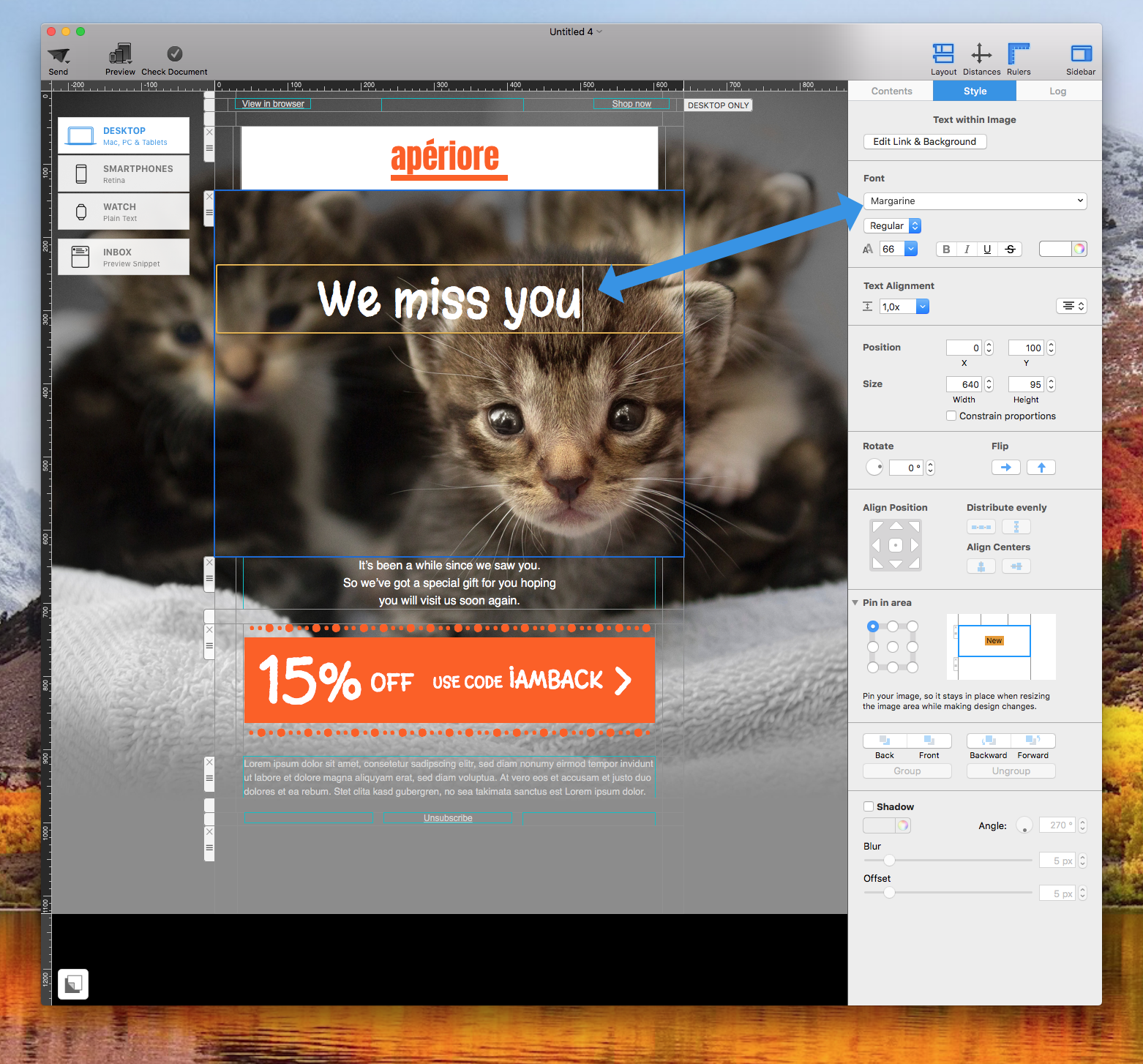
Other fonts give a light feeling, such as "Margarine."
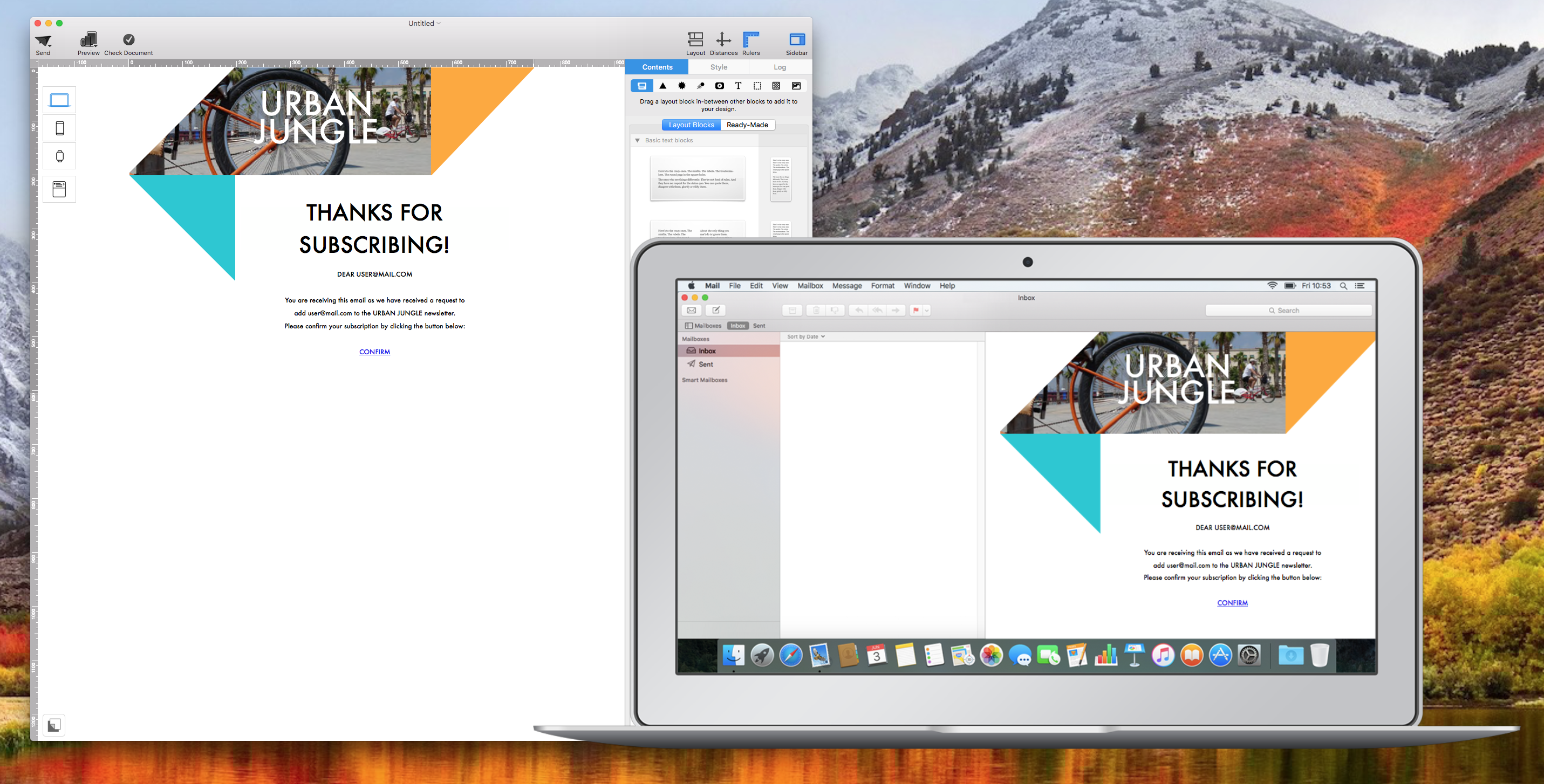
And some fonts give a modern or urban vibe like "Futura:"
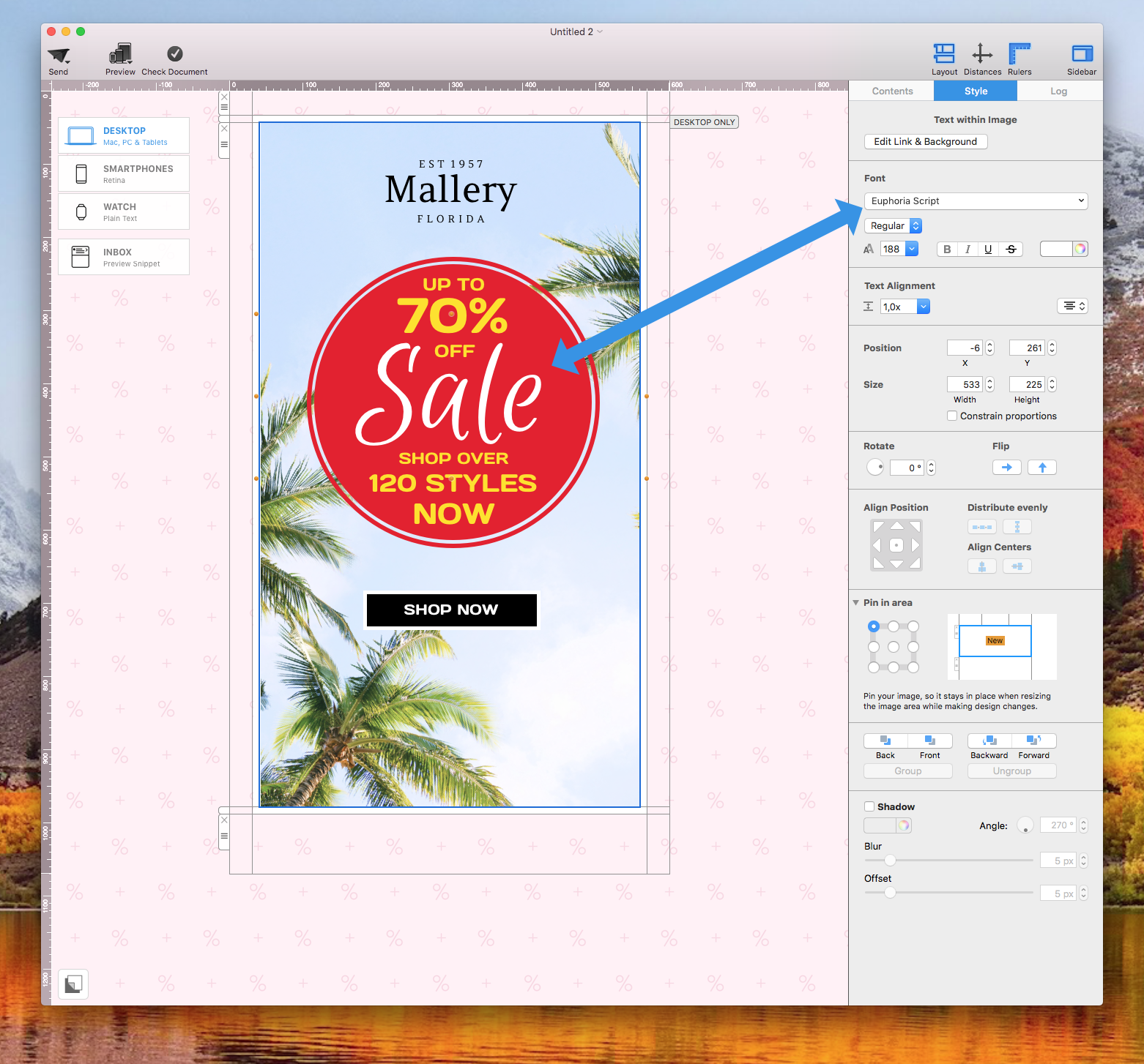
Other fonts can also give a lively or happy feeling like "Euphoria Script."
On the other hand, some fonts give a neutral vibe, such as "Helvetica" or "Helvetica Neue:"
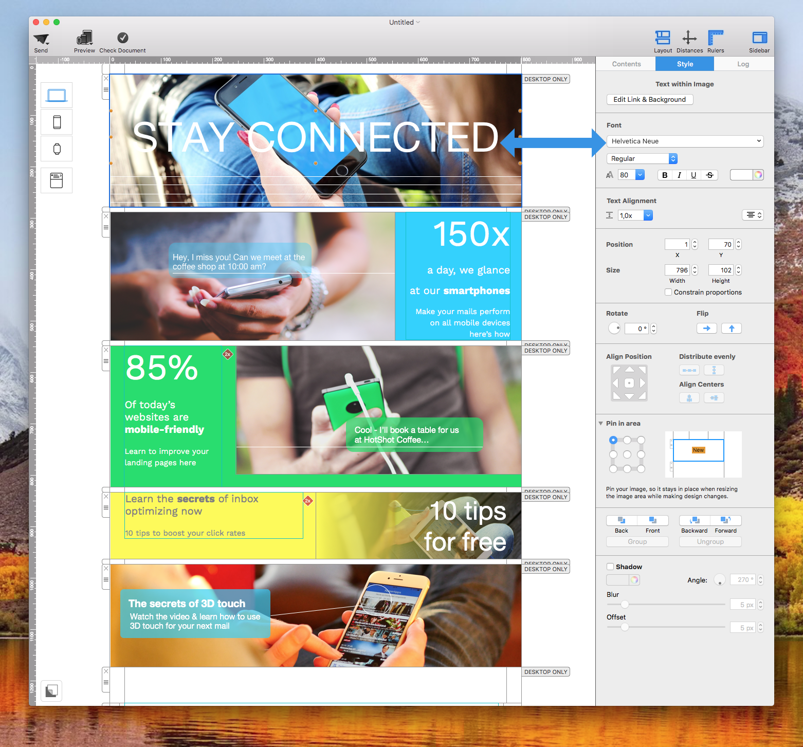
Neutral fonts help take on the mood of surrounding elements, including the photos and colors used within the email design. You can also take advantage of neutral fonts because they can pair nicely with other fonts that may off a specific mood.
Remember, fonts have a wide assortment of emotions. It's best to pay attention to what is your goal, what type look and feel you are aiming for, and then choose your fonts.
Extra tip: You can also pair fonts that give similar vibes to bring a harmonious feeling within the email body. Refrain from pairing two fonts that exudes completely different moods.
5. Try pairing a serif with a sans-serif for a classic combination
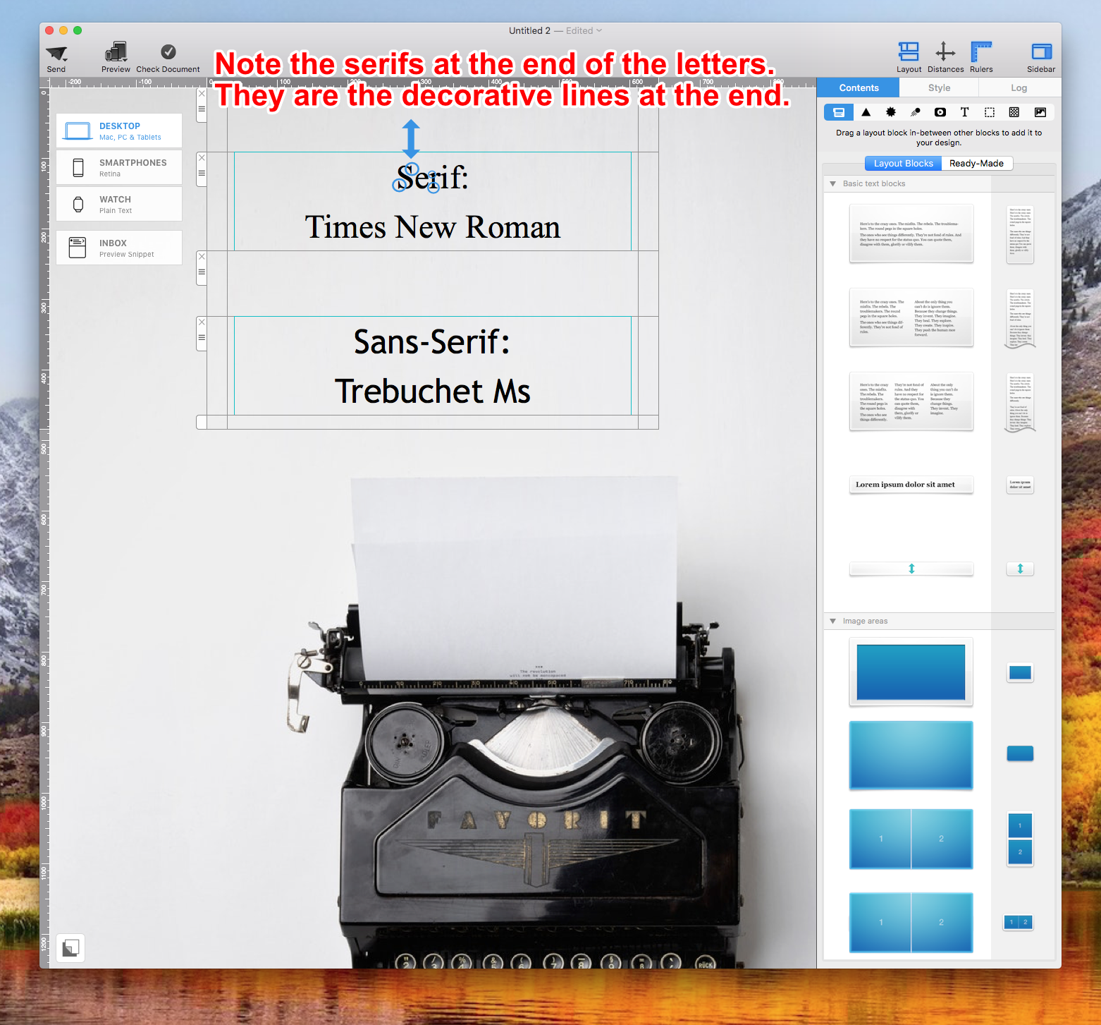
For a tried and true technique, you can combine a Serif with a Sans-Serif font. Typically, you will want to choose a Sans-Serif font for the header. Then, choose a Serif font for the email body.
A Sans-Serif font is a font without the decorative lines (aka the serifs) at the end of the characters. In contrast, a Serif font is a font with the decorative lines at the end of the characters.
6. Use fonts from the same typeface
If you are new to font combinations, you can also start off by using fonts from the same typeface.
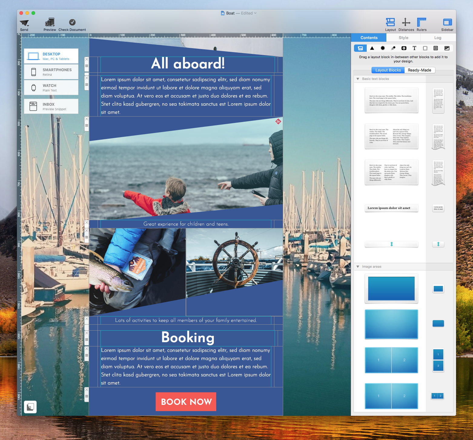
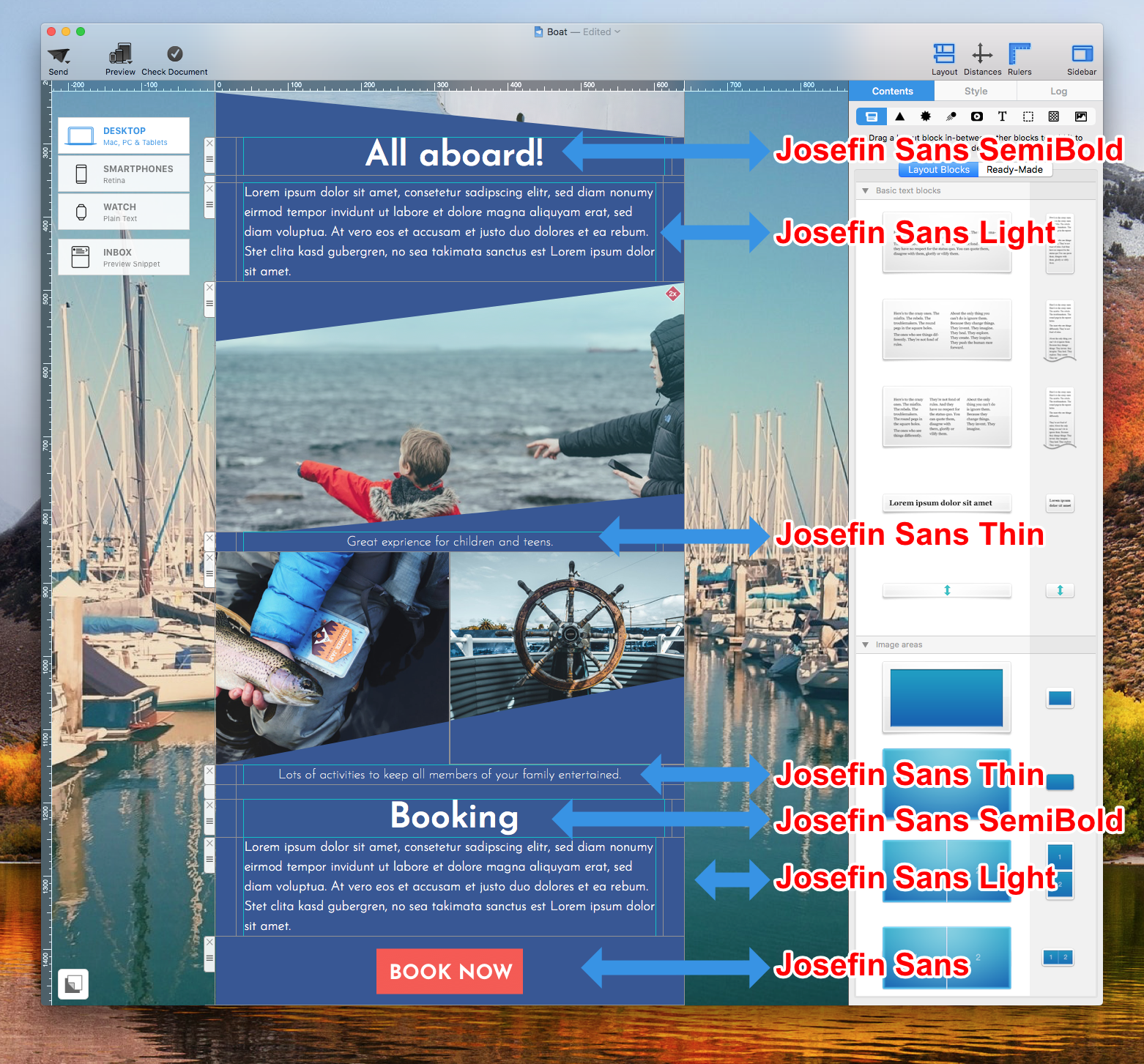
For instance, the font Josefin Sans has a lot of different types:
- Josefin Sans
- Josefin Sans Light
- Josefin Sans SemiBold
- Josefin Sans Thin
Use the bolder Josefin Sans SemiBold for the parts of the email that you want your subscribers eyes be directed to. Then, try using Josefin Sans Light or Josefin Sans Thin for the email body.
7. Do not use more than 3 different fonts
We recommend using at least 2 different fonts but no more than 3. You can create a beautiful email copy with just 2 different fonts. If you wish to use 4 or more, then this can be too distracting for the readers. You may actually do more harm than good in the overall look and feel of your email design.
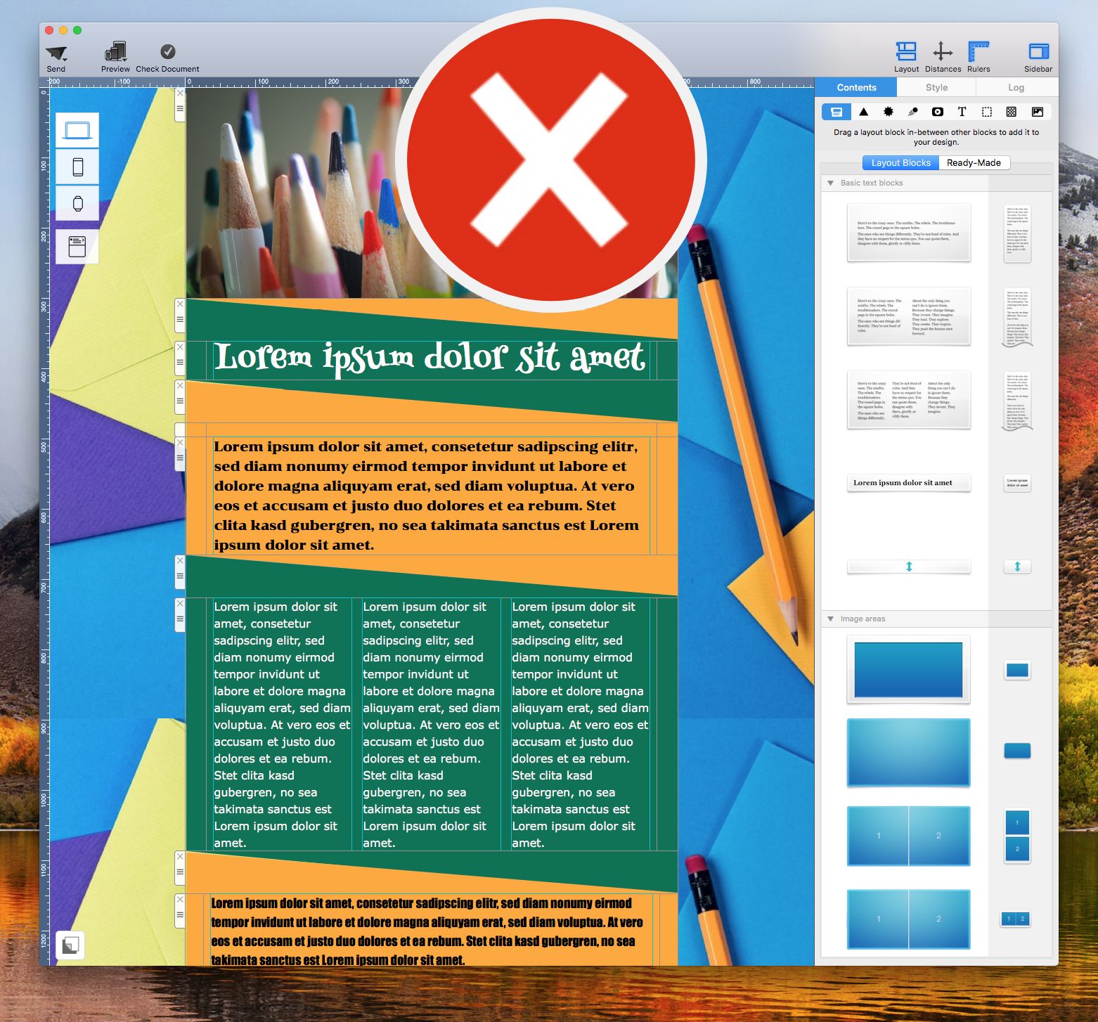
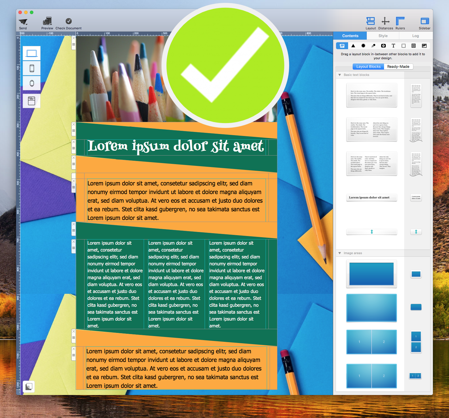
8. Avoid combining fonts with similar classifications
If you combine fonts with similar classifications, then these two fonts may end up competing for attention. For instance, if you were to combine two different script fonts, then the overall email copy can be visually overwhelming. At first glance, our eyes will not know which text they should focus on.
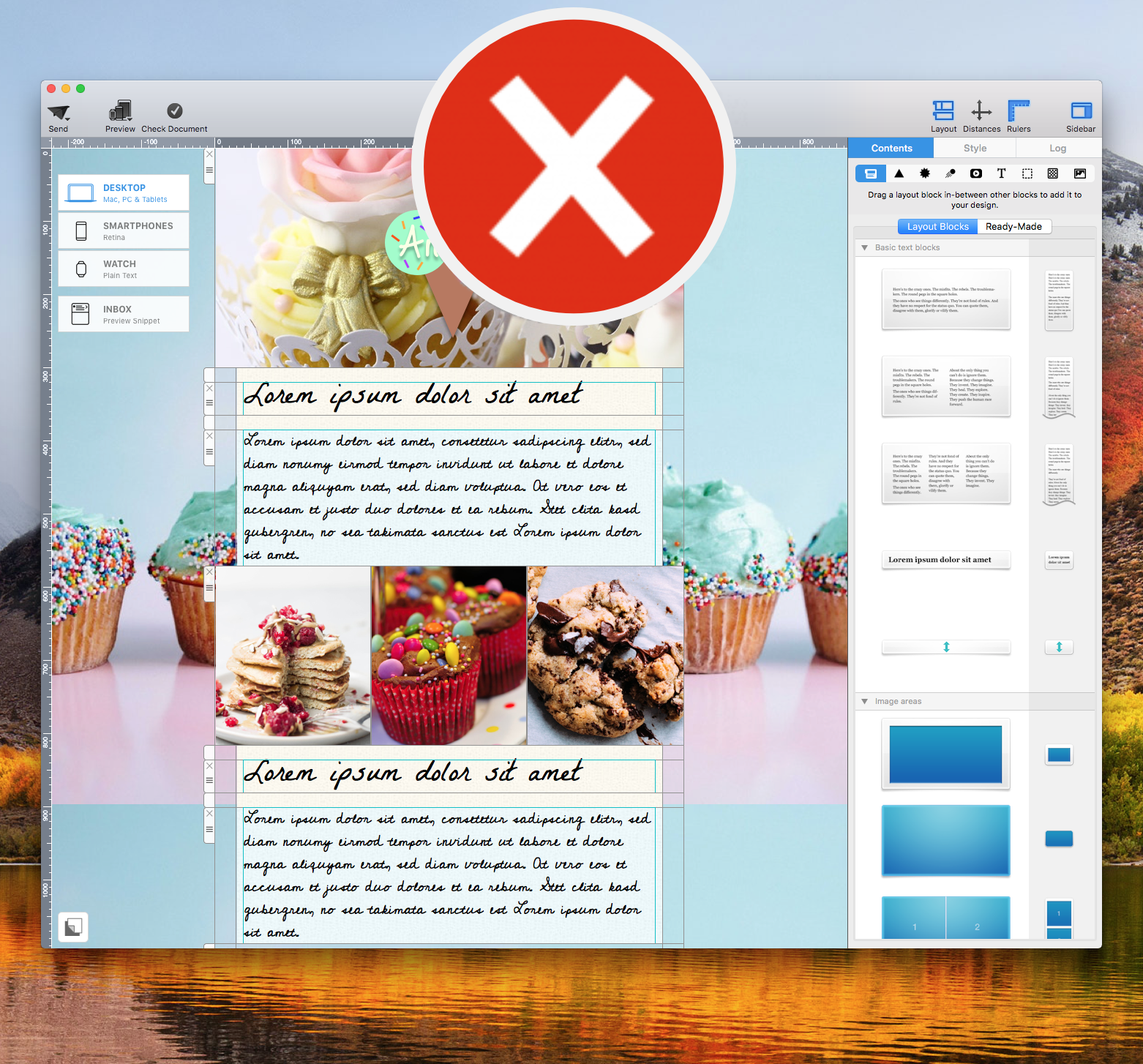
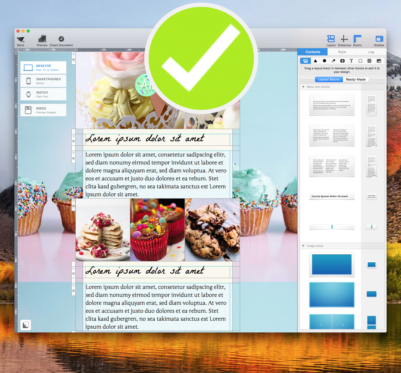
9. Find inspiration on Pinterest
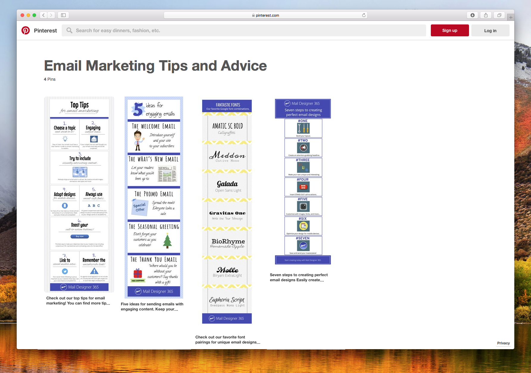
Pinterest is a great resource for design ideas, including recommendations for font combinations. Our team has also curated suggestions for font pairings that you can use within Mail Designer 365. Check out our board here.
Extra tip: Don't forget that you can download additional web fonts in Mail Designer 365. Check out our manual guide on how you can access more fonts.
Key takeaways:
- Pair a font with a lot personality with a font that's more conservative
- Use different fonts and sizes to create a visual hierarchy
- Every font gives off a feeling
- For an easy combination, pair a serif with a sans-serif
- Try using fonts from the same typeface (font family) for a simple look
- Don't use more than 3 fonts in your design
- Try not to use multiple fonts from the same classification (like script with script)
- Use outside resources to get inspired like Pinterest
Until next time,
Your Mail Designer 365 team

