So you've finally finished designing your email... Are you ready to hit that launch button? Before you do, we want to share some important elements you should check before you click send.
Review your email template with our pre-flight checklist:
#1 Spell check!
Growing up, your English teachers have probably nagged you to use spell check before you submit your papers. If it still hasn’t come second nature to you, we’ll take this time to nag you one last time.
Since you have worked hard to design an awesome email with incredible content, you don’t want your subscribers to be thrown off with spelling errors. Typos can make your emails harder to read, and they can also make you look unprofessional. Although it's easy to make spelling errors, they are just as easy to correct with spell check. So before you hit that launch button, be sure to use spell check on your document.
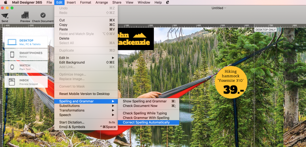
Tip: In Mail Designer 365, you can check your document for spelling errors by choosing “Edit” > “Spelling and Grammar” > “Check Document Now.” You can also set up Mail Designer 365 to check for spelling errors automatically. Just choose “Edit” > “Spelling and Grammar” > “Correct Spelling Automatically.”
#2 Double-check the subject line
Check for errors - typos, spacing, etc. Then, ask yourself, “Is the subject line interesting enough? Does it pique my interest me when I read it?” If not, go back to the drawing board and try something different.
Other things to consider:
Personalization: Did you personalize the email? If not, consider adding a name placeholder in the subject line. Personalized emails have a better chance of being noticed.
Sense of urgency or scarcity: Did you include phrases that will make people want to jump to action? If not, consider phrases that suggest that if they don’t act now, they will miss out on something great. Time-based or quantity-based phrases are effective at provoking action. Examples include:
Time-based (urgency):
“Sale ends tomorrow”
“Coupon expires tonight”
“24-hours only”
Quantity-based (scarcity):
“2 spots left”
“Only 20 made worldwide”
“While supplies last”
Short and to the point: Don’t exceed more than one line. Your subject line should fit within the number of allotted characters. The goal: your subscribers can easily tell what the email is all about from the subject line.
Emojis: Emojis add color and can pique interest when added to the subject line. However, is the subject fairly casual enough that you can add emojis? First, consider tone. What’s the tone of your email copy? Is it happy, energetic, etc.? Second, what type of emojis will make sense with the subject line. Think about the product or service you are trying to sell, the season (if applicable to the message), and symbols that can depict the emotion you are trying to convey. Here are examples to help you get started:
⚡️= Flash sale
? = Hot deal
? = Thanksgiving and Black Friday
? = Boxing Day
? = Fall collection launch
? = Easter sale
? = Limited time offer
? = Deal of the day
? = Buy more, save more
? = Sample sale
#3 Footer and Unsubscribe Link:
The footer typically contains important legal information such as an unsubscribe link, privacy statement, company address, company phone number, etc. Confirm that all of the information you have entered within the footer are correct and up-to-date.
Also, check that the links within the footer are working. You want to make sure that the landing pages to those links are working. This is extremely important when it comes to the unsubscribe landing page. You are legally required to comply with all unsubscribe requests. If possible, use an email service provider with easy list management that automatically removes unsubscribers from your emailing list. For instance, Elite Email and Mailjet both offer automatic unsubscribe compliance feature.

#4 Social Links:
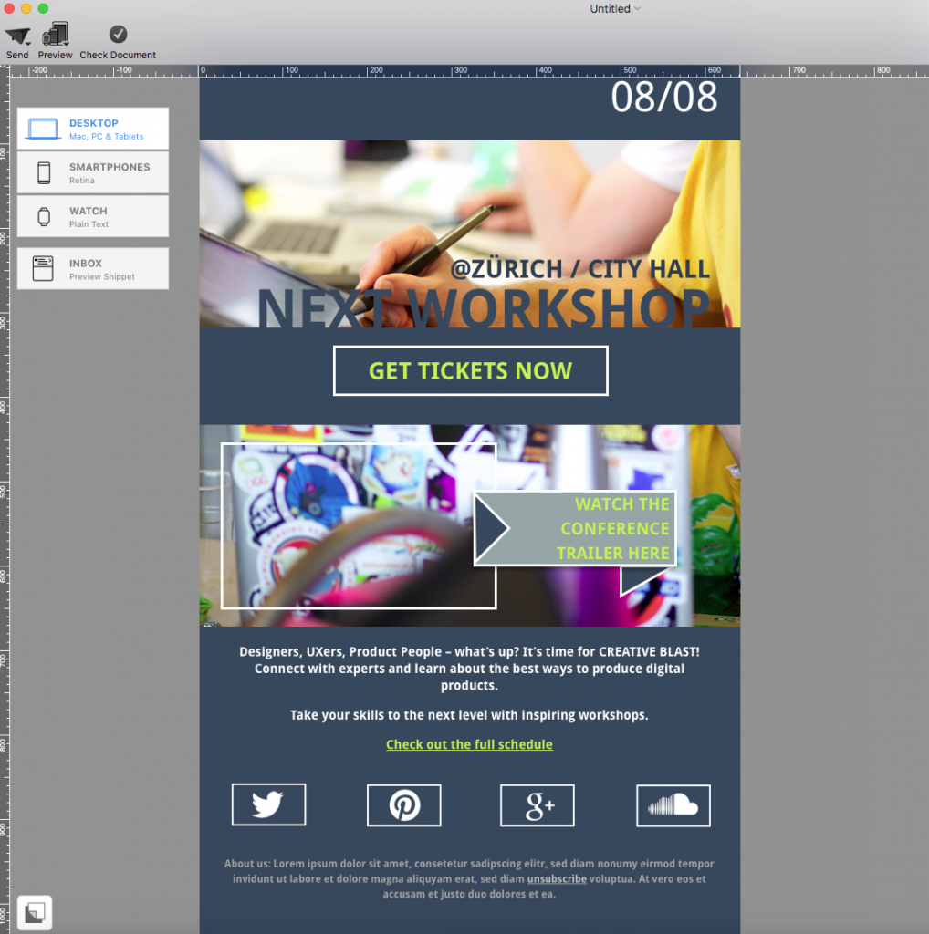
Have you added any links to your social media pages? If you haven’t, this is the perfect time to do so. Generally, you will find social media links at the bottom of the email template. However, feel free to change it up and add them on the top. We just don’t recommend adding them in the middle of your email copy. You want to reserve the middle area of your template for your main email messages (like product spotlights, event recap, success stories, etc.).
Tip: Try to use icons instead of text hyperlinks. Icons are easier to notice within the template. Also, they look easier to click, especially for mobile-users.
Extra tip: Check out our guide on how to properly add different buttons with different links using Mail Designer 365.
#5 Text fonts (Email-Safe Options)
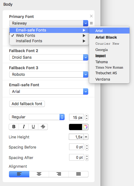
For your text areas, check if you added an email-safe font. It’s best practice to add an email-safe font as a fallback font, in case the recipient does not have the font installed on his or her device. Email-safe fonts are standard fonts that all devices typically come with.
Tip: In Mail Designer 365, you can always choose whichever font you want as the primary font, whether it’s a web font, an email-safe font, or an installed font. However, you can also add an email-safe font as a fallback font.
#6 Images (Licensing and Alt-Text)
When it comes to images, know the source of your images. We recommend using your own photos, so that you don’t need to worry about copyright infringement. Another option is to use photos on the web that are published under Creative Commons (CC). Be aware that there are different CC licensing types. So you need to remember to check if the images are allowed to be used for commercial purposes and if you need to pay attribution to the creator. Look for photos that are published under CC0 license, which means that the curator agrees to "no rights reserved."
Tip: Here are websites you can check out to get public domain images:
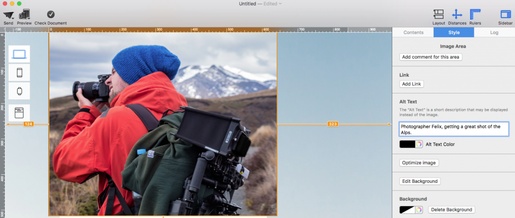
Another important thing to remember when working with images is to add alternative text to your images. In case an image does not show up for a subscriber, it’s good to have an alt-text that will show up instead of an error box. Your alt-text could describe what the image is supposed to be or what a product does.
#7 Inbox preview
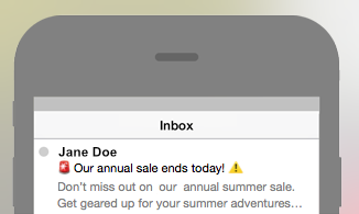
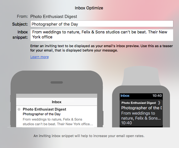
Sometimes, you thought of an awesome sentence to start your email, but the full sentence does not show up. Inbox preview is always a good step to take to ensure that your inbox snippet is not awkwardly cut off. You have the option of re-wording your inbox snippet to get your point across in fewer words. Or you can reorganize the order of your sentence so that the statement before the cut-off still makes sense.
Tip: With Mail Designer 365, you have more control when it comes to the message of your inbox snippet. Just click “Inbox” on the right side of the window. Then, you’re able to edit the inbox preview snippet.
#8 Testing
If there's one thing that must be on your pre-flight checklist, it's testing. Before you launch your email campaign, do an email test. In case something gets skewed on your test email, you’re able to make the necessary adjustments so that your designs will look perfect during launch. Send a test email to yourself and/or to team members. It’s also a great way to get some feedback on your template. Sometimes, other team members may catch a mistake or provide new ideas to improve your newletter.
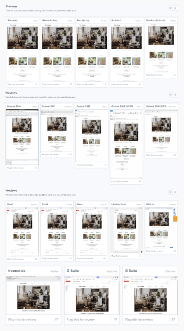
Tip: You can also try Litmus to visualize how your email template will look like on various email clients. This is a great way to test how different email clients read and interpret your email design. For step-by-step instruction on how to use Litmus, feel free to follow our "Checking Your Design on Different Email Clients" guide.
Key takeaways:
- Spell check your document
- Create a subject line that piques interest and provokes action
- Add all important legal information at the footer
- Use big icons for social media links
- Assign an email-safe font as a fallback font
- Add alt-text to your images
- Edit your inbox preview snippet
- Send a test email
Until next time,
Your Mail Designer 365 team

