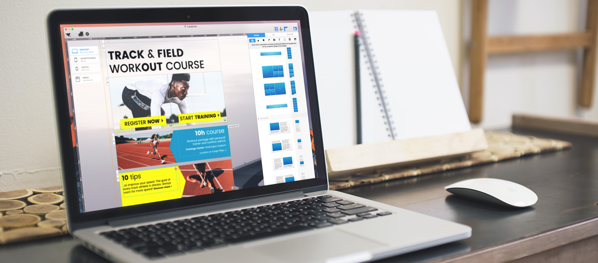
 Layout blocks are the main building blocks in any Mail Designer newsletter. They help you build your content's structure and let you design with structure and style. We're going to highlight 6 techniques you can create using different layout blocks.
Image areas: the all-round talent
Image areas are one of the basic layout block types Mail Designer Pro supports. They are flexible content containers for any design elements – photos, texts, or graphics. Anything you add to an image area will be saved as an image, so you can be sure it'll look exactly as you intended in your design.
If you have a stylized text or a decorative headline, you can also use an image area to place it in your newsletter.
Tips
• You can add multiple links to your header image by splitting your header image up across multiple image areas, as shown with the running photo below. By splitting the photo across two image areas in one layout block, we can use separate links.
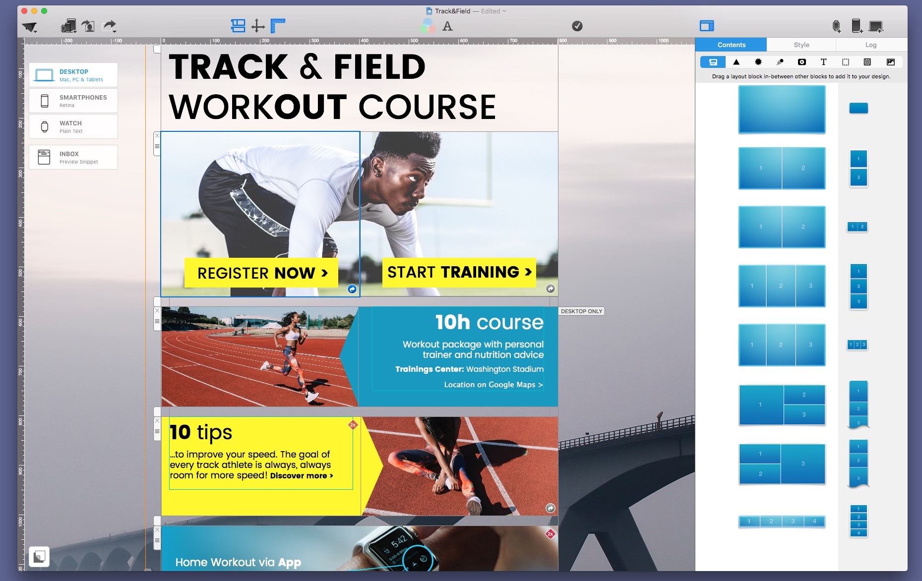
• To make your text easier to read on a background photo, add a shape and use the color gradient tools to give it a semi-tranpsarent background. It'll make your text stand out more and by combining trendy colors with a semi-translucent effect, you an achieve a really great look – all with the built-in Shape tools in Mail Designer Pro.
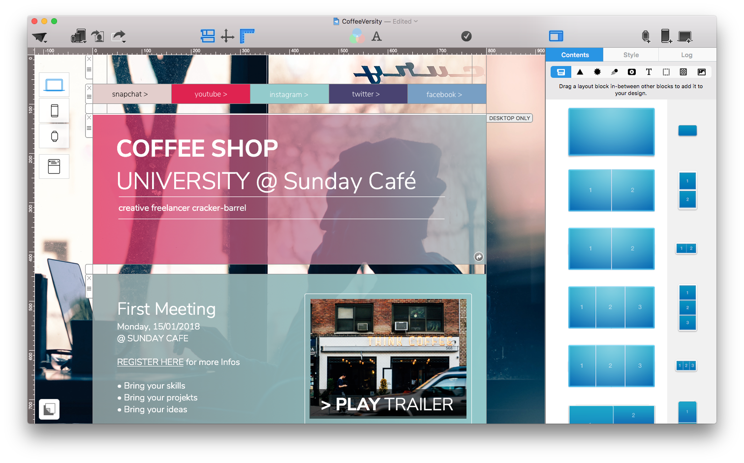 • Use a fine line (1px or 2px), to separate your header from the rest of your layout.
Spacer blocks: Give your content room to breath
The spacer layout block can be used to add some space between newsletter sections. It's hard to overstate the importance of giving your content enough space – if you cram everything close together, your design will feel cramped. By adding spacers, your design will feel that much more professional.
Tips
• To add a transparent space, select your spacer and hit Backspace on your keyboard, or select "Delete background" in the sidebar. The fill color will be deleted and you'll be able to see your background shining through.
• Try to use same sized spacers throughout your newsletter – consistency is key!
Poster-style headers: Magazine flair for newsletters
The new poster-style layout block is perfect for re-creating web- or magazine-style header images. Combine one large image with two smaller, related photos for a stunning layout.
 Tips
Tips
• This image area layout block is great for one main message plus two alternative call-to-actions.
• Perfect for products: Show your main product shot and two photos highlighting a feature in more detail.
• There are two magazine layout blocks – you'll want to pay attention to the order in which they are displayed on mobile devices, where all three are displayed vertically.
Words are better with pictures: Text- and image layout blocks
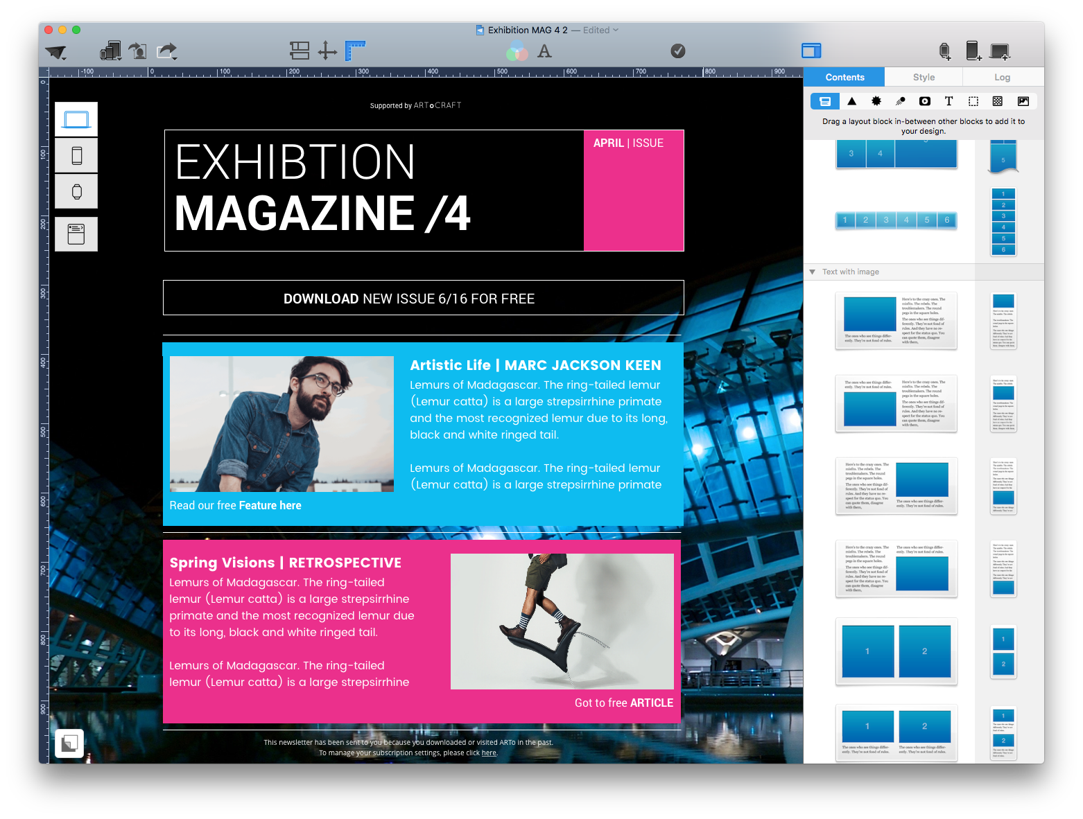
Use text + image layout blocks to illustrate longer text paragraphs with an image.
 Tips
Tips
• In text areas, you can use more interesting web-fonts to give your design more personality. Just make sure you also add an email-safe font which will be displayed in email clients that don't support web-fonts.
• If you need to add more space in-between sections of text, don't hit that return key! Instead, use a separator layout block (see above) and then start a new text section.
• For more fine-grained control you can also use the text-formatting controls to add space "Before paragraph" or "After paragraph".
Selling and introducing: Perfect product layout blocks
Sometimes you'll want to build an entire section by using multiple layout blocks, e.g. to introduce a new product sale and to show links to multiple store items:
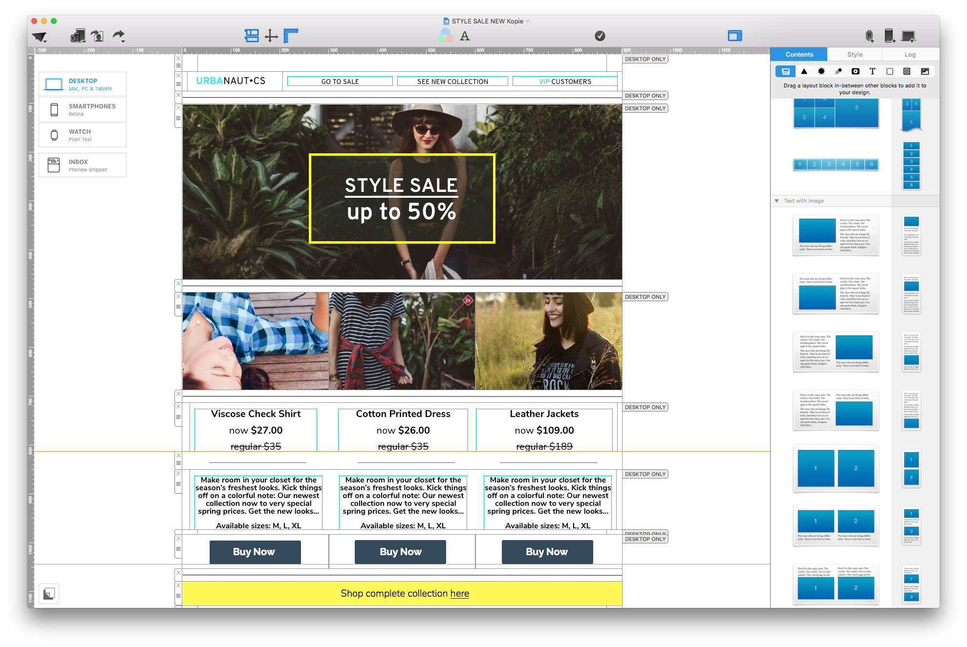
- Use a spacer layout block to separate your product links from the intro header image
- Use a 3-section edge-to-edge image layout block for your product shots
- Add a 3-section text block for your product name, features and pricing info. Tip: Choose Strikethrough from the Style sidebar to highlight sale prices.
- Add another spacer
- Use another 3-section text layout block for your product descriptions.
- More space! 🙂
- Drag in a 3-section image area and add your call-to-action buttons
Tip: A simpler alternative to this approach is using layout block that combines header images and text into one. However you won't be able to use edge-to-edge photos.
Build a navigation header with your logo and links
There are a few different layout blocks you can use for a great navigation header. One great example is the layout block with a single image are for your logo and multiple text sections for navigation links.

If you like Mail Designer Pro, we’d appreciate a short review on the Mac App Store.
To get the latest version of Mail Designer Pro, click here.
If you have any questions or comments, please contact us.
Until next time,
Your Mail Designer Pro team
