With the help of the color picker and color matching tool, you can create professional color combinations for your newsletters without the need for a graphic designer.
Let us show you how...
When you use many graphic elements and different background surfaces, a good color scheme raises the bar of your email design. Choosing the right colors instantly boosts the overall aesthetic of your email newsletters.
With our tips, you'll quickly find the right complementary color for your layout - whether to add a contrast-rich action button or to use the right amount of toning to match your product images.
The best color matching tools for email designs

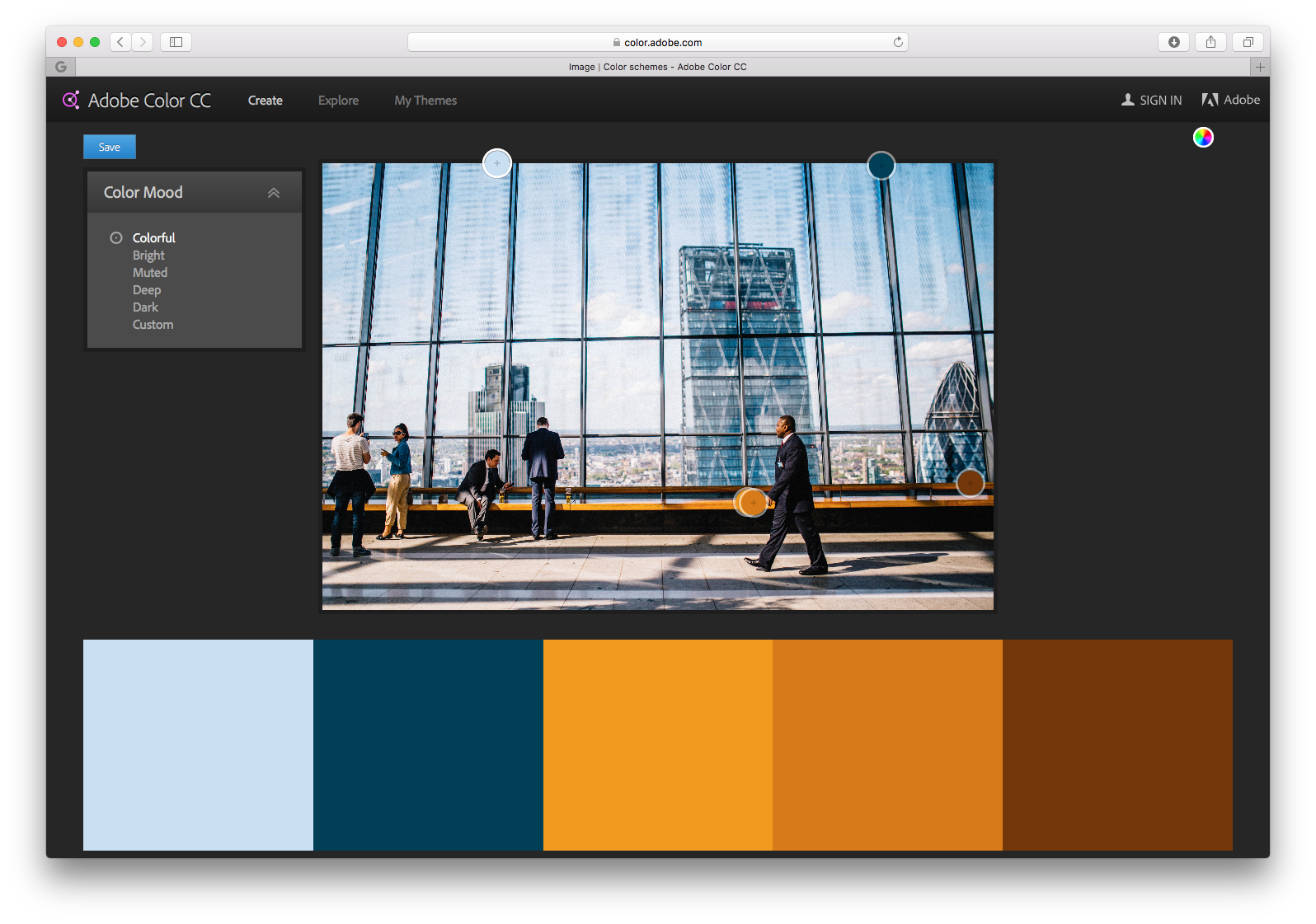
Adobe Color CC is one of the most popular tools for finding creative color combinations. Pick a main color (which can be your CI color) and it suggests appropriate color schemes (based on monochromatic, triad and complementary colors).
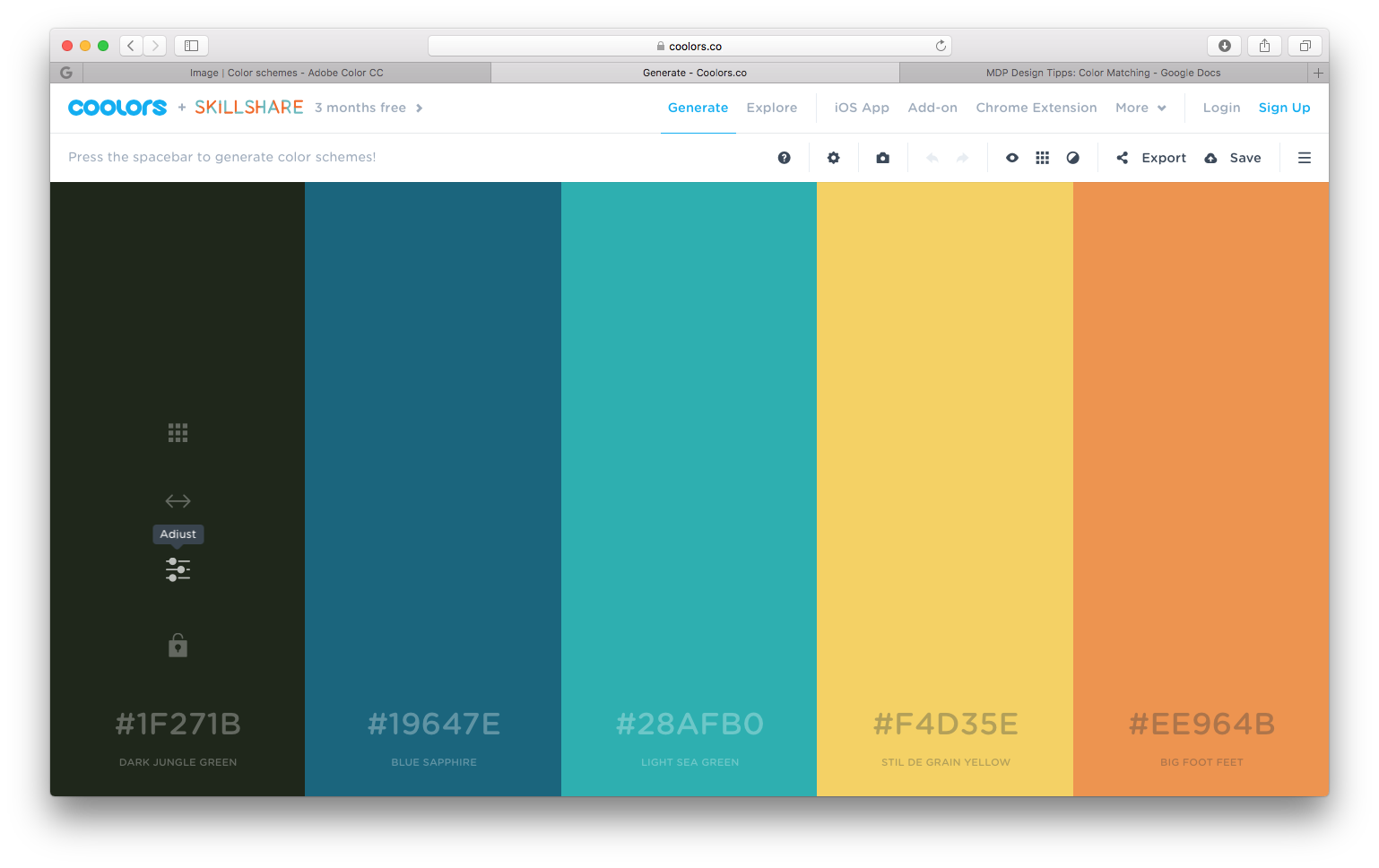
With COOLORS, coloring can even be done faster. Select your main color and press the space bar. Get instant color matching! If you like a color, fix it for yourself with a mouse click.

More tools for color palettes:
- ColourCode online color palette generator
- With Canva, you can easily generate colors from images
- A practical color scheme generator that has been around for over 15 years is Paletton
Sending colors to Mail Designer 365 is easy
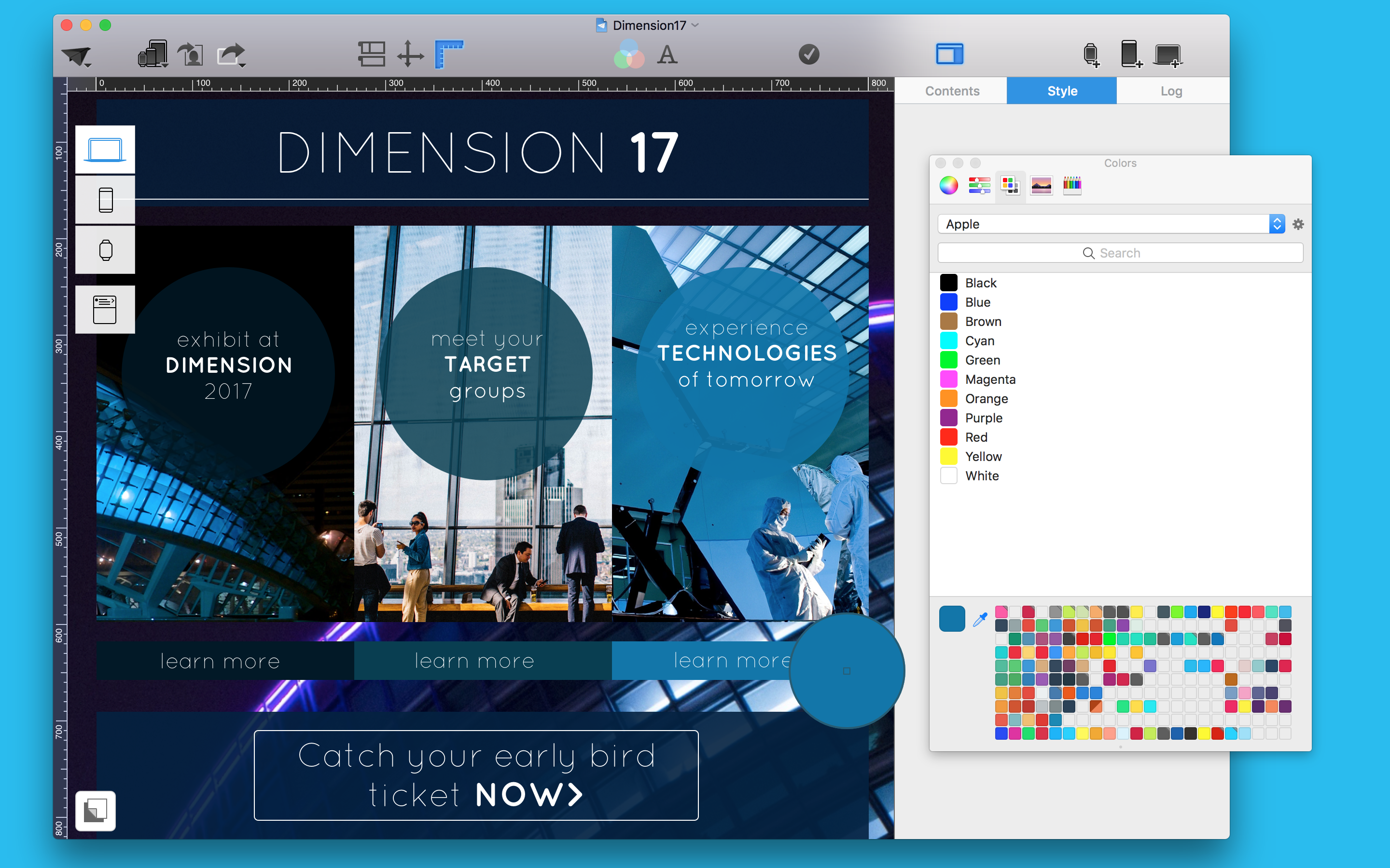
Open the color palette from any color chooser in the sidebar.

- Choose the small pipette, which is on the lower left, then simply click a color on your screen
- Once you have the color selected, you can drag it into a slot at the bottom of the Color Picker to save it for later
Tip: In the second tab the Color Picker, if you switch to RGB mode, you can also enter hex color codes from tools like Color CC or COOLORS
With the pipette tool, you can "pull" colors from a newsletter background image. This can help you to match existing color elements in your design.
Easily adjust images with different color schemes

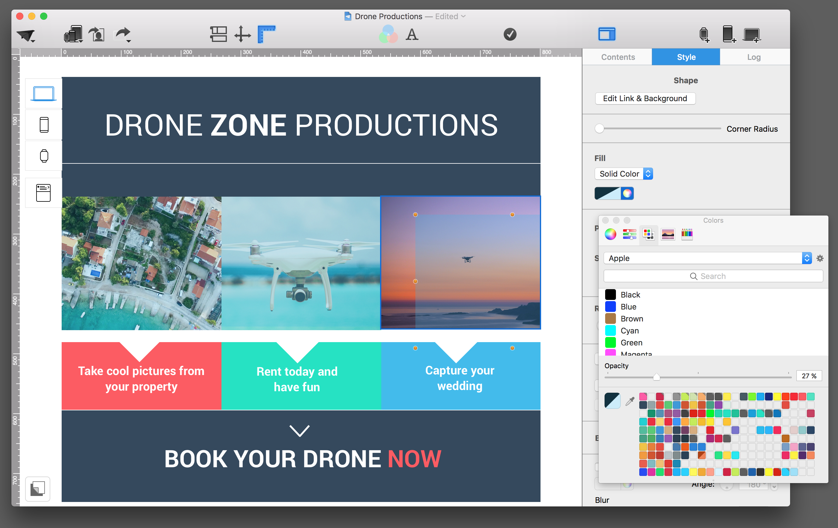
Create a rectangle shape in an image layout block and adjust its color to other elements in your design. Place the shape completely over the first image and lower the opacity. Now, you can copy it onto other photos in your design, which will create a similar vibe. With this trick, all your pictures will have a similar tint and match a lot better.
Whether fonts, buttons, backgrounds, boundaries or links - the right color combinations will give your layout the right touch. They play an important role on your performance and branding.
Remember: colors also have a psychological effect on your readers and only a contrasting color of a CTA button can help improve conversion.
In this VANDELAY DESIGN article, Shane Barker analyzed the effects of colors. Check it out! We challenge you to apply it to your next email design!
