Get the most out of your Halloween emails
Halloween emails are some of the most creative emails that businesses send every year. Whether you aim to get a little spooky or get a little nostalgic, it’s that time when you can really have extra fun as an email designer! Moreover, getting in the spirit of Halloween can be quite lucrative: The total sales of products at Halloween reach billions of dollars each year.
Push your imaginative side and apply these Halloween email marketing tips this season:
Get expert email best practice tips delivered directly to your inbox!
Please check and try again.
We've just sent you an email for you to confirm your email address, if you haven't already.
1. Get creative with GIFs
GIFs really make amazing eye-catchers, especially for Halloween. You can create GIFs that can make your subscribers’ teeth chatter. Or you can create cute GIFs that give the Halloween vibe but still manage to be suitable for young children.
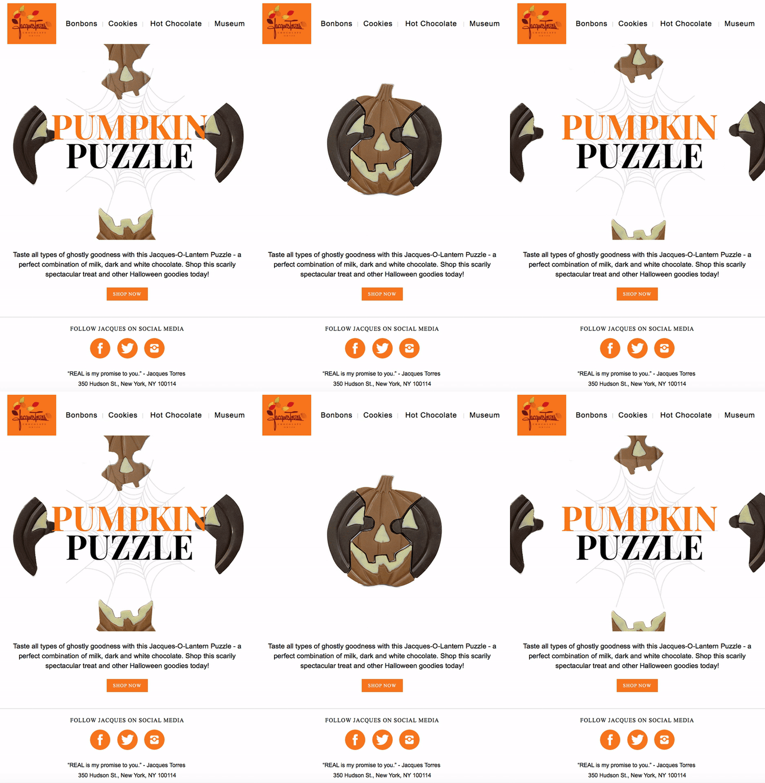
Here is an example from Jacques Torres Chocolate
Why do we like it? Jacques Torres Chocolate creates a GIF that is very eye catching - hard to miss and hard to ignore. When you open the email, the GIF is the first thing that you see. Everything else is simple and not too distracting. And you can’t really think about jack-o-lanterns without thinking about Halloween. Another aspect that we enjoy about this GIF is that it includes one of the company's Halloween products, taking the Halloween theme to the next level.
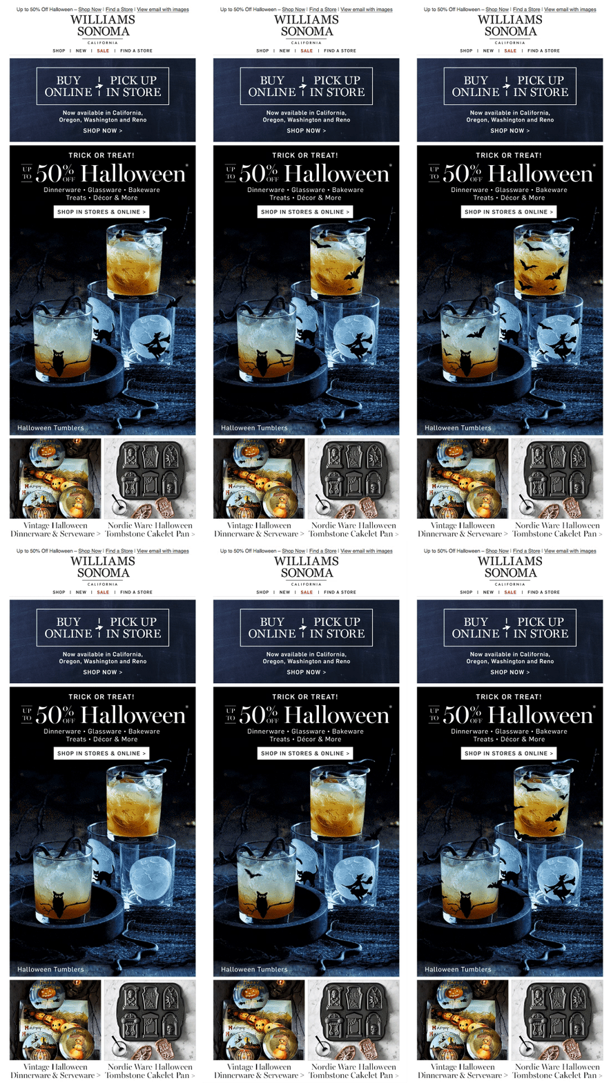
Here is an example from Williams Sonoma
Why do we like it? Williams Sonoma incorporates animation with their products. Essentially, Williams Sonoma uses the animation to bring its products to life. Instead of having an image that only displays Halloween-themed products, this company utilizes animations to make it seem like the print on the products are in motion.
2. Use Halloween-themed backgrounds
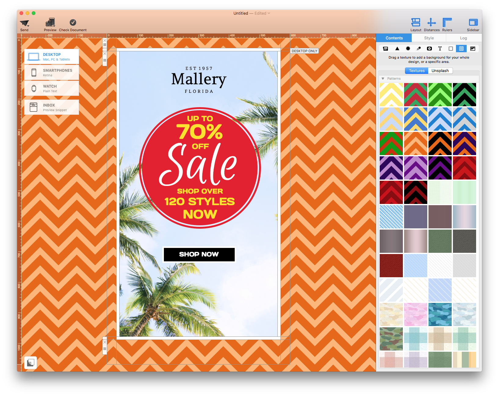
Nothing screams Halloween quite like a good Halloween background for your emails. Although in some cases, the plain black background works, we dare you to try something bolder for Halloween. You can get into the spirit easily with a background of pumpkins, bats, ghosts, creepy forest trees, etc.
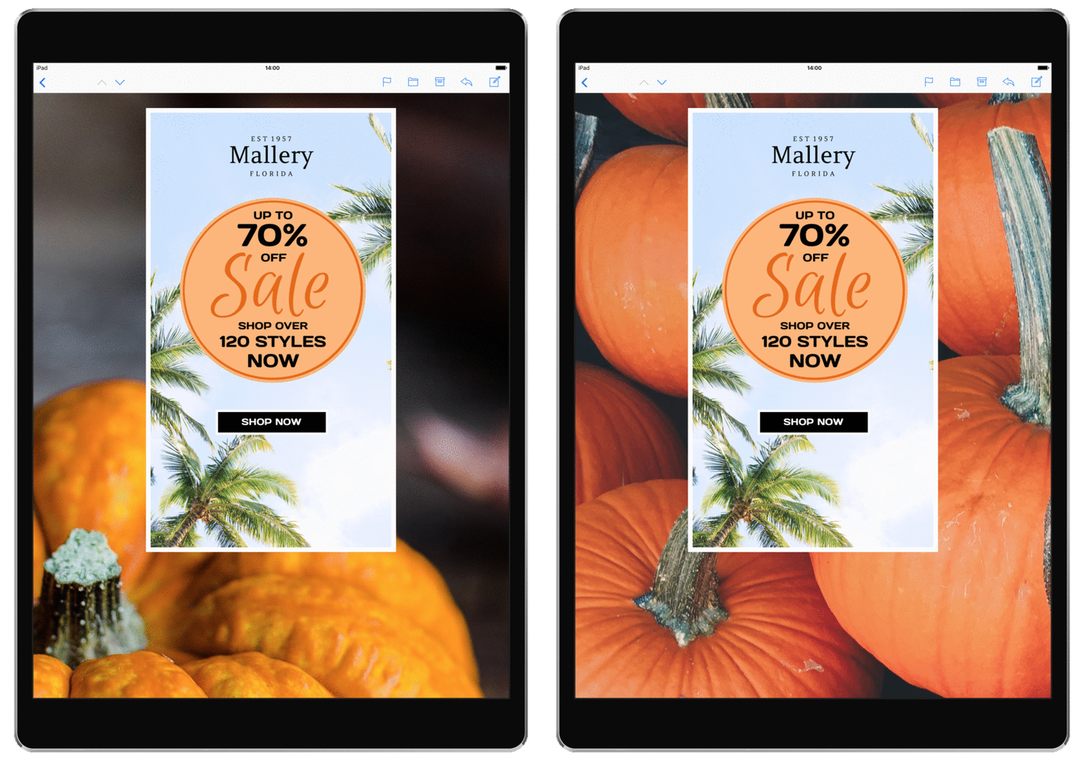
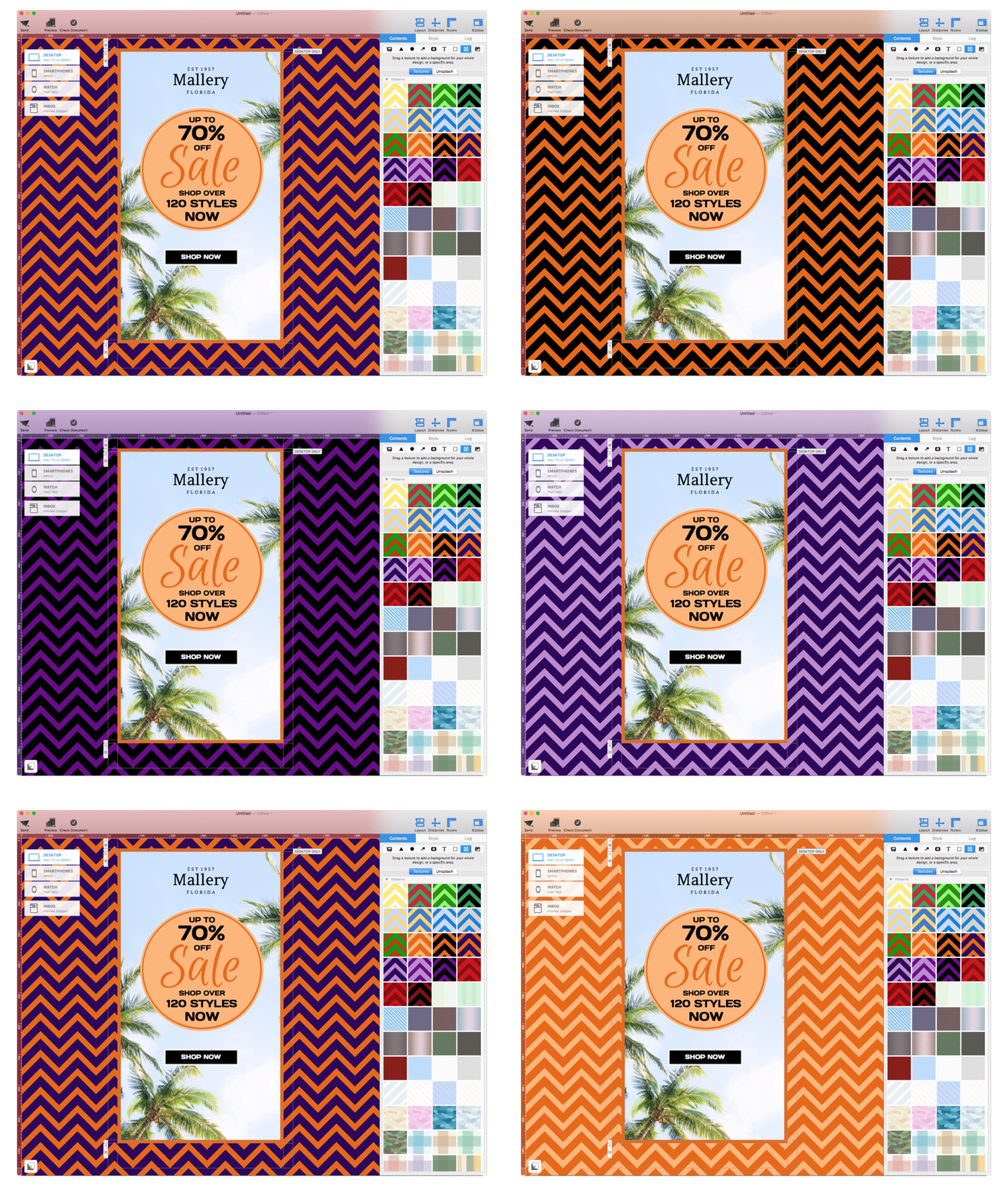
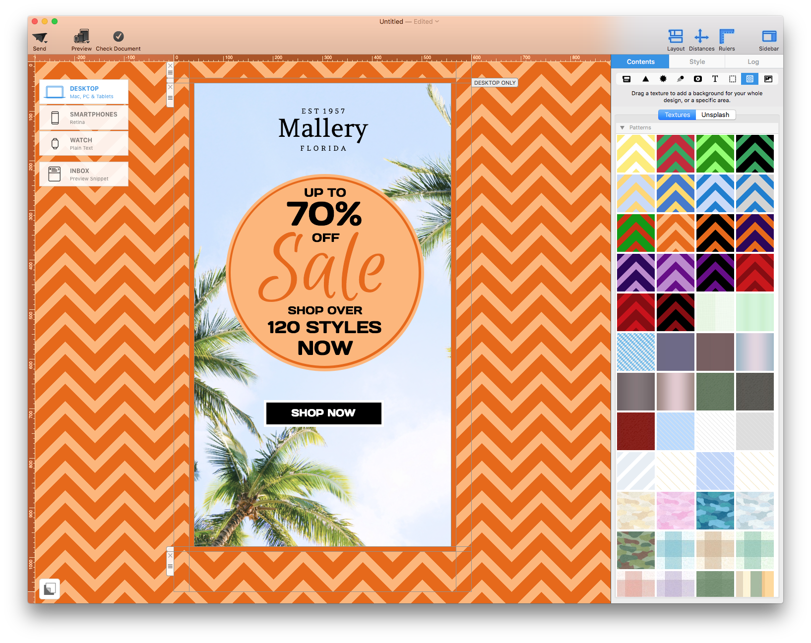
And don’t forget about color-themed backgrounds. Purple and orange are the go-to colors for this holiday. In Mail Designer 365, you can enjoy any of our patterned backgrounds. Try one of our zigzag colors for your Halloween-themed email design.
3. Select a Halloween-inspired color theme for your text
Let’s say you have picked an amazing background to work with. Awesome! Now, it’s time to get to the nitty gritty details. Using a color theme for your text can make a huge difference in the overall impression that you give with your email design.
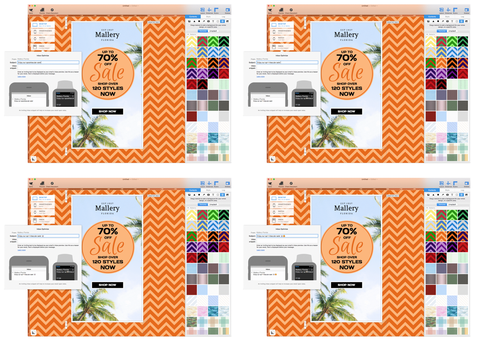
4. Emojify your subject line
When done properly, emojis are great attention-grabbers in the subject line. They add a little bit of character and fun to the typical black and white text that normally plagues our inbox. Halloween is one of the best times of the year when you can go a little crazy with emojis. It's a time for celebration and when people are more open to jokes and tricks. Have a little bit of fun with emojis. Try the ghost ?, pumpkin ?, vampires ?♂️?♀️, zombies ?♀️?♂️, etc.
5. Step out of your comfort zone and try a unique font
There are plenty of web-fonts available in Mail Designer 365 that can work well in any Halloween-themed email newsletter. You can step back from the typical fonts that you use and try one of these fonts:
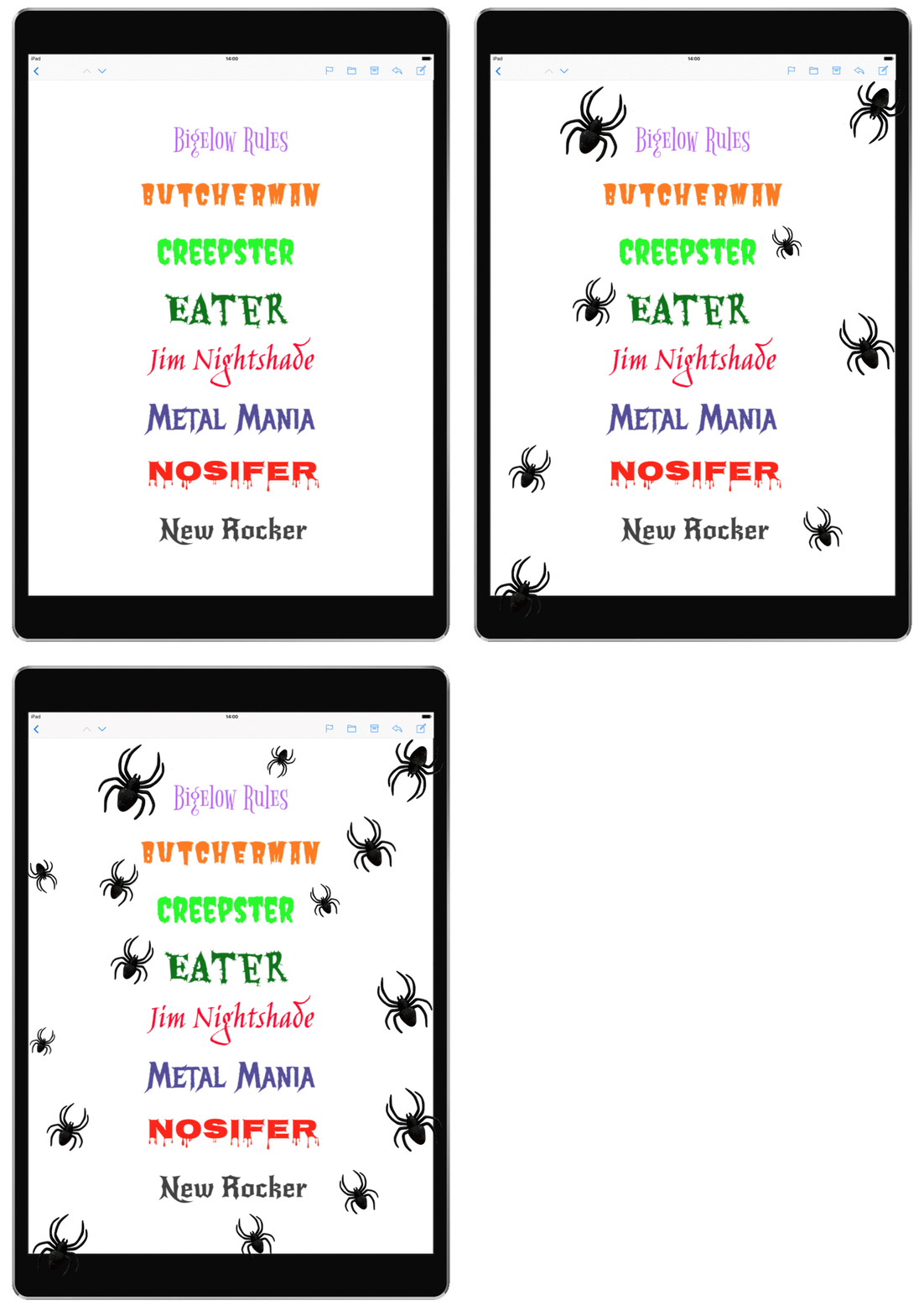
In case you have not downloaded all the additional web fonts, check out our tutorial on how you can download additional web fonts on Mail Designer 365.
6. Offer freebies or discounts!
With billion dollars in revenue each year from Halloween goods, it may help to offer some type of a freebie as an additional incentive to make a purchase. Try to offer free shipping or a free Halloween-themed item.
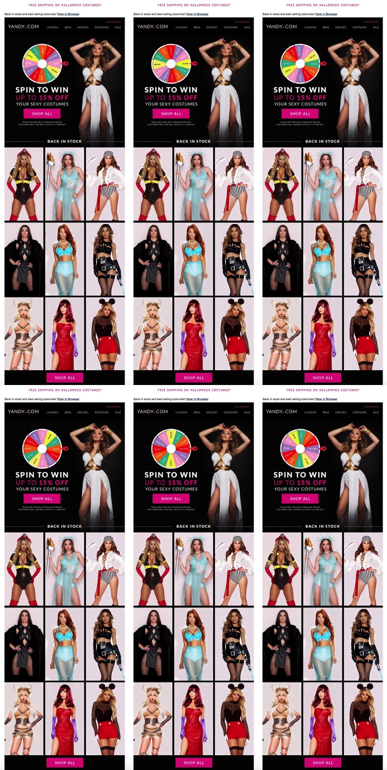
Here is an example from Yandy
Why do we like it? To help incentivize people to shop for their Halloween costumes, Yandy offers free shipping for this particular group of items. On top of that, you can spin the wheel for a chance to win additional discount codes that you can apply to any of the Halloween costumes. This is a great example on how you can provide that extra push that a lead may need to get them to buy a product.
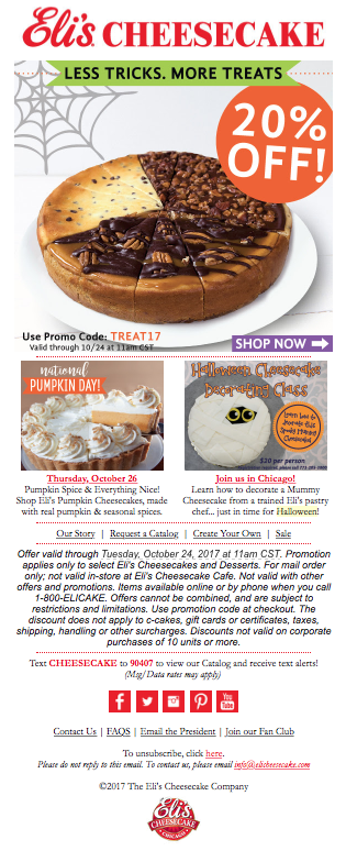
Here is an example from Eli's Cheesecake
Why do we like it? If you can't offer freebies, try offering a discount code. Discount codes are also great incentives to offer to people. Also, you can create codes that have Halloween-related words to showcase your Halloween spirit. This is a great option if you do not sell any Halloween-themed items. A great example is by Eli's Cheesecake. Eli's Cheesecake celebrates Halloween by offering a 20% discount code to its subscribers.
7. Get clever with puns
Whether you want to have some fun in the subject lines or add a PUN-tastic phrase in the email body, puns work great during the Halloween season. Puns help make your brand seem more approachable because they show that your brand knows how to have some fun too. Alongside with some fun Halloween graphics, images, or GIFs, try adding a pun or two in your Halloween email campaign.
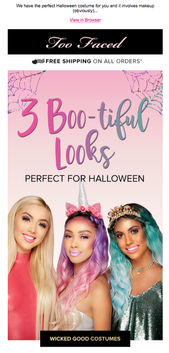
Here is an example from Too Faced
Why do we like it? Too Faced knows exactly how to play with words in their Halloween email by using "Boo-tiful" right at the top of the newsletter. It's the perfect pun for any beauty company.
Here is an example from Chipotle
Why do we like it? Chipotle also gets into the Halloween spirit with a clever pun "Boorito." They even added a Jack-o'-lantern design on their aluminium foil wrapped burritos.

8. Include a family-oriented photo
For many families, Halloween is a family-oriented holiday. And for millions of people, Halloween can be nostalgic. You do not need to use scary, spooky images to get into the Halloween spirit. You can also tug at people’s heartstrings with a family-oriented Halloween photo.
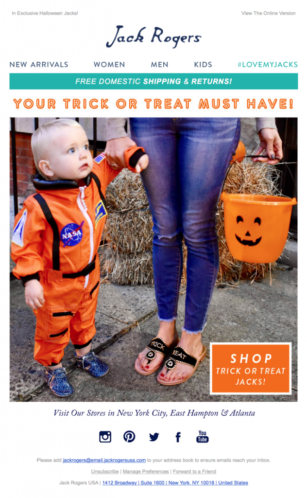
Here is example from Jack Rogers
Why do we like it? Jack Rogers does a great job by including a simple photo that many people can relate to: trick-or-treating! From trick-or-treating as a kid to trick-or-treating as a parent, many people have fun memories of dressing up and going out during Halloween. What's even better is that Jack Rogers manages to do this while also subtly showcasing its products - shoes.
9. When in doubt, draw it out
Sometimes, you just have a picture of your products to work it. And that is perfectly fine! You don’t need fancy graphics to take part in Halloween email marketing. You can make an impression just by drawing Halloween-related objects or characters on top of the pictures, such as ghosts, pumpkins, witches, etc.
Here is an example from Redbubble
Why do we like it? Redbubble does a spook-tacular job by including drawings of ghosts on top of a photo.
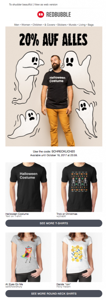
You can also include a big drawing in your email newsletter that takes the place of photos or additional graphics. If an entire drawing composes the majority of the newsletter, it can really make a unique and stylish impression.
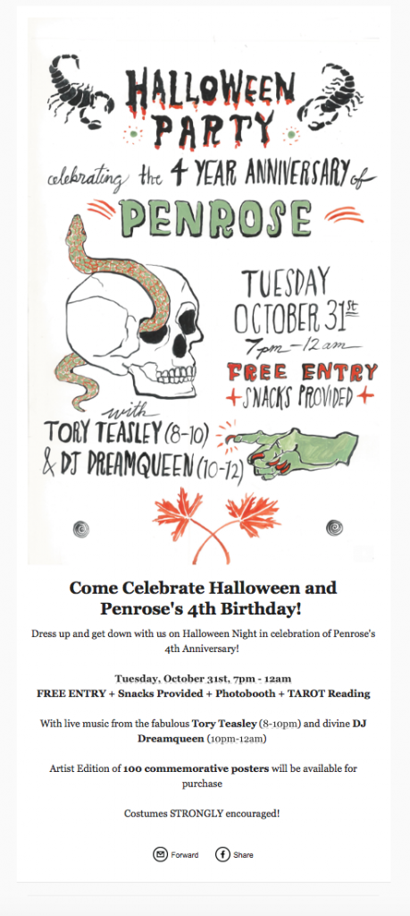
Here is an example from Penrose
Why do we like it? Penrose stands out from the rest by having the entire visuals of this email be solely based on a drawing. This email is eye-catching but maintains a casual vibe. Also, Penrose includes additional information in text form at the bottom of the email, which is a smart way to reiterate the message of the email.
10. Start sending your Halloween email campaigns early!
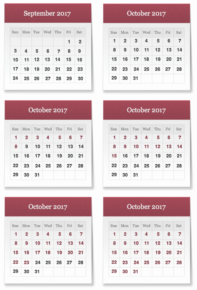
We recommend sending your Halloween emails as early as the last week of September or at the beginning of October. Send multiple emails throughout the month of October to showcase different products or services. Having at least a month also gives your subscribers enough time to check out the items in your shops or online stores and make a purchase.
Key takeaways:
- Use GIFs as attention grabbers in your Halloween emails
- Apply Halloween-themed backgrounds, colors, and fonts in your email body
- Try adding emojis in the subject line or using puns to give a light-hearted vibe
- Add an incentive like a discount code or freebie
- Start sending Halloween email campaigns at least a month early
Get started with Mail Designer 365 today
Enjoyed this post?
Get more inspirational tips, tricks, and best practice examples in the Mail Designer 365 Newsletter Academy -
your one stop hub for all things email marketing strategy and newsletter design.
