To say the first few months of this year have been strange would be a a rather large understatement; however, if one thing's certain, it's that the quality and creativity of email designs keeps on getting better.
Whether you're looking for email inspiration for your next campaign or just a general #EmailGeek like we are, you're in the right place!
In this roundup, we're covering our 10 favorite emails of 2021 so far, including seasonal campaigns, announcements, product launches, automated mailings, and more. Keep on reading to scroll through our favorite campaigns of the year and get exclusive tips on how to recreate these styles in your own emails!
10 Awesome Emails We Have Loved So Far in 2021
ASOS
When announcing their acquisition of Topshop, HIIT and Miss Selfridge, ASOS launched an exciting promotion, giving customers 25% off their latest brands.
The bright black and yellow color scheme paired with big, bold text immediately attracts attention and creates an email design that just has to be clicked on.
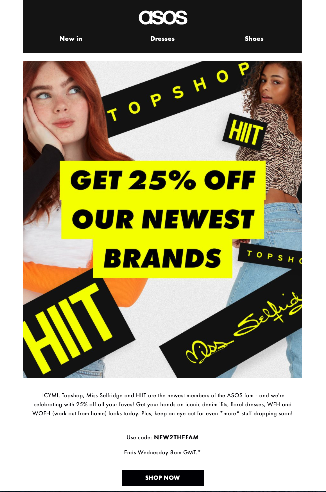
The yellow and black theme in this design by ASOS immediately draws the customer in
Make it in Mail Designer:
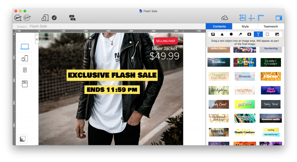
Mail Designer 365 has 1000s of license free web fonts available, as well as ready-made text objects to drag and drop into your design. Use these for call-to-action buttons, eye-catchers, and headlines:
Really Good Emails
Of course, email campaigns are not always sales and promotion based, as demonstrated here by Really Good Emails. We are all for brands using their platforms to do good and promote key values and that's exactly what can be seen in this statement.
A simple email header does enough to compliment the layout and show the RGE branding without taking away from the importance of the content.
For subscribers, emails such as this contribute positively towards the overall brand image and help improve the CSR (corporate social responsibility) of the company.
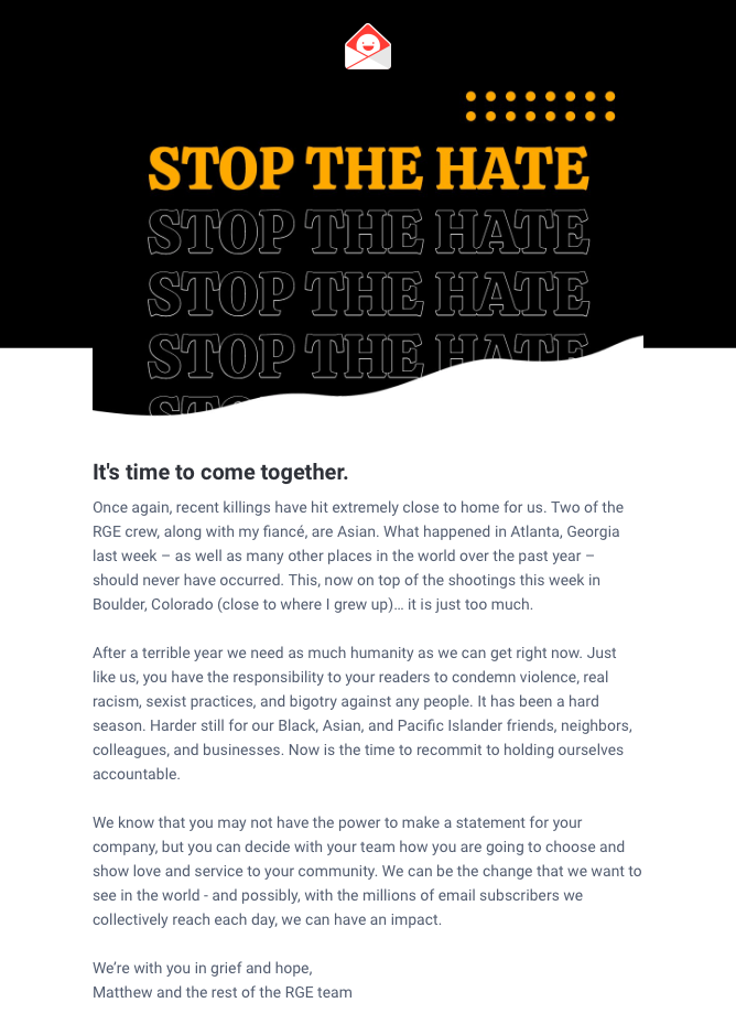
The message in this email by Really Good Emails shines through loud and clear and does a great job of showing the company's stance on an important issue
Make it in Mail Designer 365
Mail Designer 365 has a variety of email templates for company announcements and statements. Simply insert your logo and edit to share your important message with subscribers.
JUDY
Sharing positive reviews is one great way to generate more buzz around your products - as shown in this bright and colorful email design by JUDY.
We love the emphasis created by using a shape to frame the reviewer quote and the hot orange color scheme is also totally on brand. Including a CTA (call-to-action) right after a positive review is a great way of influencing customers to get their hands on a much-loved product.
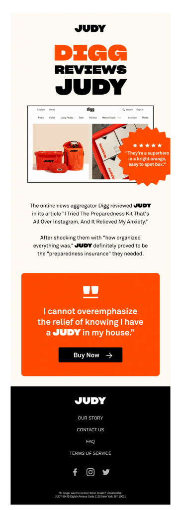
This colorful design by JUDY promotes their emergency kits by including positive customer reviews
Make it in Mail Designer 365
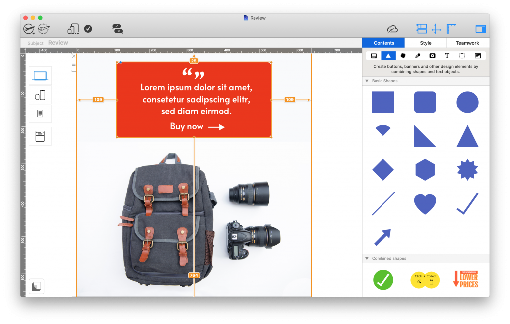
Mail Designer 365 offers a range of shape tools which you can use to create similar eye-catchers in your designs. Whether you're showcasing a review, building CTA buttons or highlighting product features, you can configure shapes to perfectly fit the overall look and feel of your brand:
Bunches
Rule number one of a good gift guide: Include impressive product photos. The rest will come naturally!
This Easter gift guide email by Bunches is a great example of a seasonal promotion. Not only does it stick to the classic Easter color scheme, it also goes the extra mile to point out special details about the advertised products, encouraging the reader to purchase. Of course, the 10% discount also helps seal the deal too!
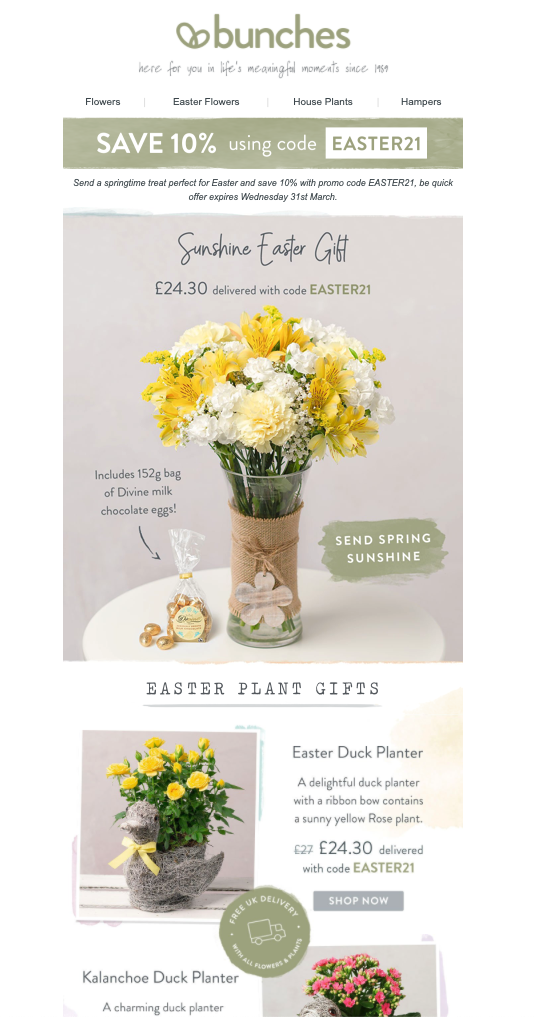
This warm and inviting gift-guide email by Bunches ticks all the boxes for a classic seasonal campaign with its classic spring coloring
Make it in Mail Designer 365
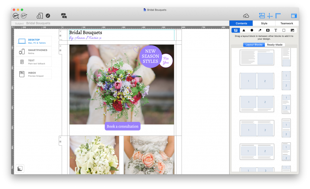
Proudly show off your best products center stage with an array of eye-catching layout options. Whether you're looking for a full-width feature image or smaller combi product blocks, Mail Designer 365 has dozens of practical layout options you can use in your designs to let your products steal the show:
Quizlet
We love businesses that also use their emails to share useful knowledge with customers - just like this email by Quizlet for Women's History Month.
The layout is clean and easy to read and helps the reader discover useful resources to read up on.
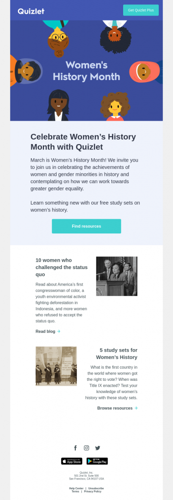
We love how this email by Quizlet goes all out to share useful, educational content about women's history with readers.
Canva
Sticking to the educational theme, this email by Canva is also an in-depth look at how to benefit from their service.
The topic of the email campaign is video creation and its clear structure allows users to process bitesize information and quickly learn more about the topic, without having to leave the email.
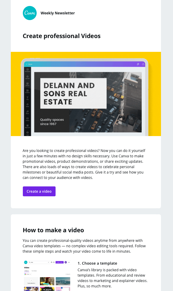
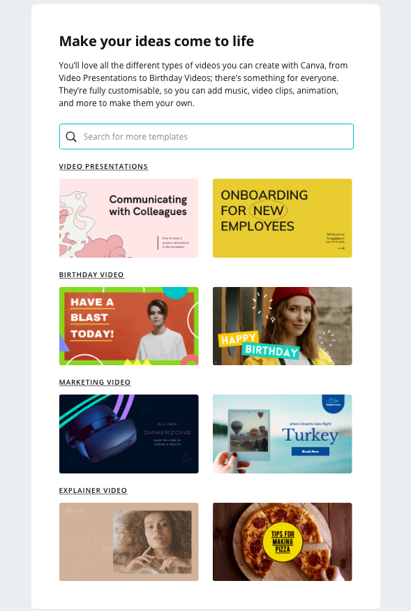
The search box graphic is a smart way for Canva to get more readers on to their website to browse the designs they have available
Thortful
This email by Thortful may not be winning any prizes for its basic design, but the sentiment behind it is deserving of praise and recognition.
Seasonal events like Mother's Day, Father's Day, etc. are huge in the marketing world but can be sensitive to some. By addressing customers in advance in a direct and considerate manner, Thortful are doing a great job of safeguarding them against any content which may not be appealing or relevant.
As well as this, they are also helping to ensure subscribers who do not wish to receive Mother's Day content will not unsubscribe from their list as a result of too many promotional emails.
Not only is the email personalised for each recipient, it also landed in the "Primary" folder in Gmail, making it hard to miss.
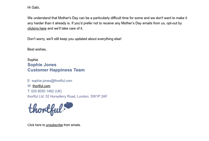
Emails like this aren't seen often but have a tremendous impact on the customer's overall experience with your brand
Nintendo
In this eye-catching promotion for the classic and beloved Mario Bros, Nintendo use bold colors and prominent CTAs to tempt recipients into making the most of the 35% off offer.
The star rating at the bottom of the email is also a great way of allowing subscribers to share their response to the email, giving them scope for further optimization in the future.
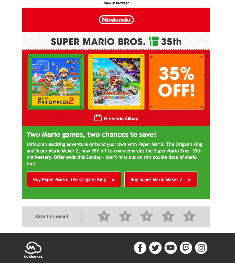
Bold colors, striking CTAs and fun promotional graphics make this sales email by Nintendo one of our favorites of the year
Make it in Mail Designer 365
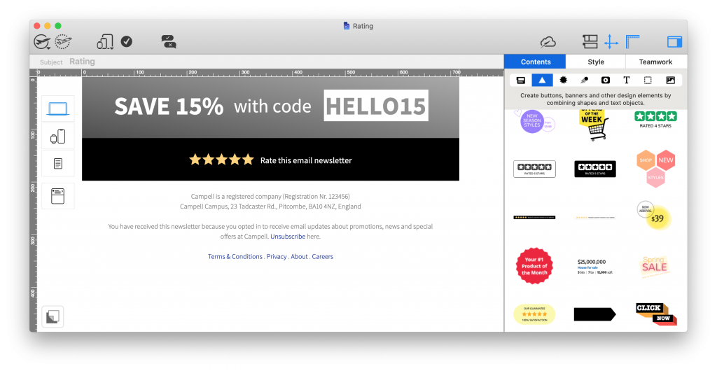
Recreate these all-important star rating charts in Mail Designer 365 using the star shape tool. In a hurry? Find ready-made ratings graphics in the content sidebar:
Spotify
Spotify do a great job of segmenting their email list based on the music preferences of users. This allows them to create tailored content like this email promoting an exclusive London Grammar vinyl.
The engaging email copy, use of personal pronouns in the subject line ("London Grammar made you something special) and "thank you" message all work together to give the recipient the impression they are connecting directly with their favorite artists.
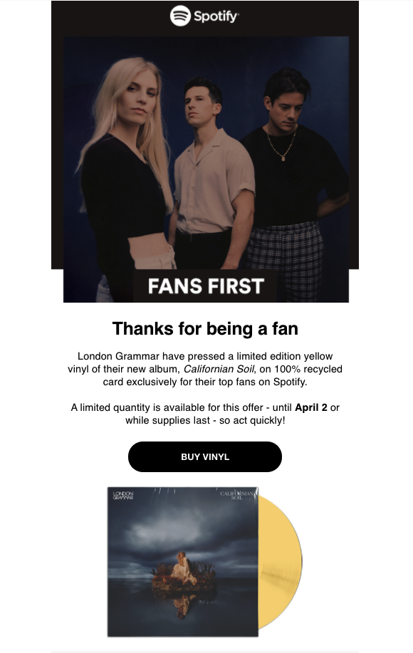
This email campaign by Spotify is a great example of personalisation and tailoring email content specifically for smaller target groups.
Buffy Inc
Email is a great tool to promote your other social media platforms, such as your Instagram account, and grow your following even more.
This email by Buffy Inc is a great example of how to promote your products and Instagram account at the same time. The real life product photos serve as informal customer testimonials which help influence your readers and reinforce trust in your products.
The social media CTA box rounds off the Instagram-themed email nicely and even encourages customers to share their own product photos: a win-win for the business!
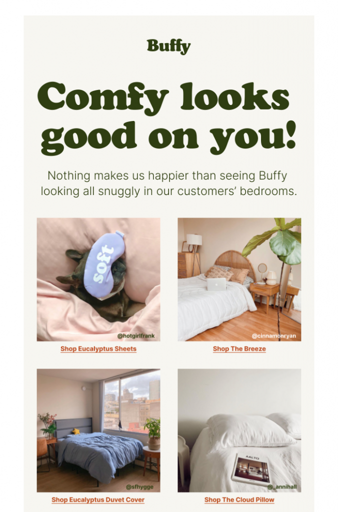
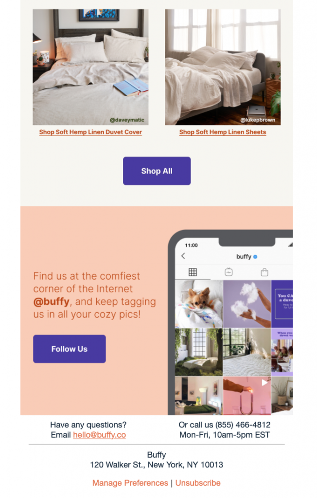
This campaign by Buffy not only shows their products in action, it also draws subscribers' attention to their Instagram account
Make it in Mail Designer 365
The Mail Designer 365 Contents library contains logos and icons for all leading social media platforms, including Twitter, Instagram, Pinterest, Facebook, YouTube, and Tumblr. This makes it easy to build up social media CTAs and promote your platforms in your emails:
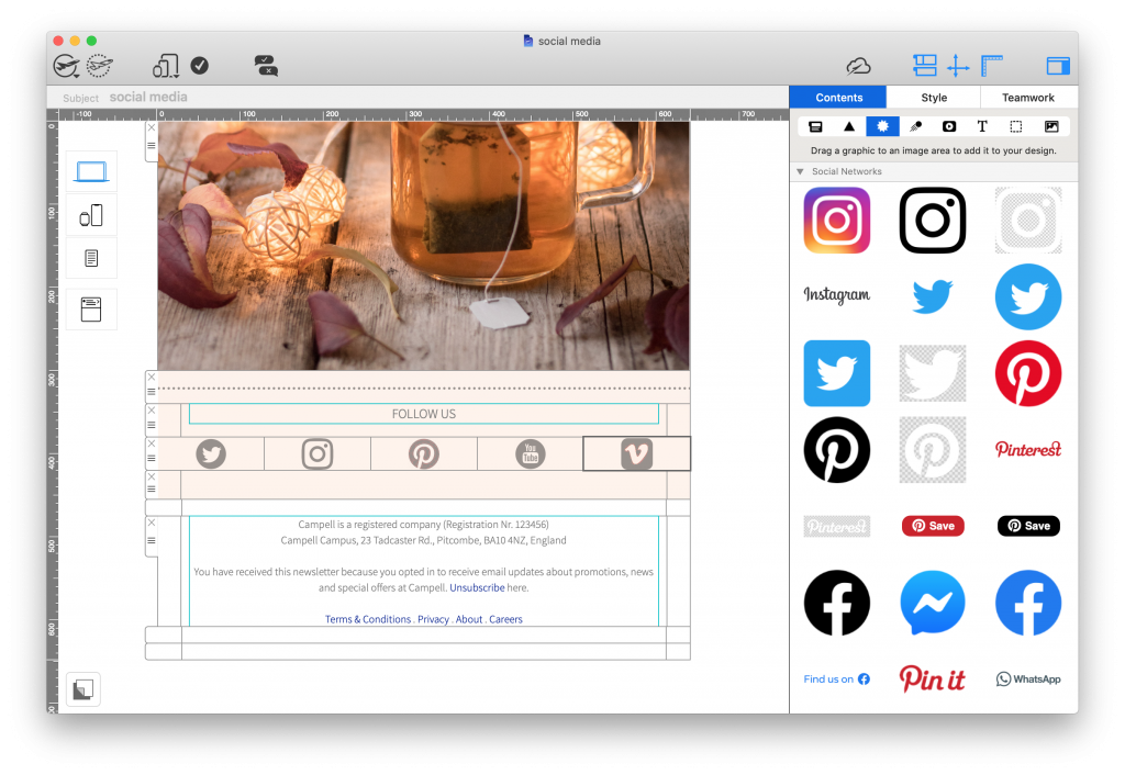
Get started with Mail Designer 365 today
Enjoyed this post?
Get more inspirational tips, tricks, and best practice examples in the Mail Designer 365 Newsletter Academy -
your one stop hub for all things email marketing strategy and newsletter design.
